k00283712
Gen
First year Art & Design Student 22 // Exploring the brief “Festival” with cultural themes
46 posts
Don't wanna be here? Send us removal request.
Last Seen Blogs

existingtm
ExistingTM
jackskellingtonrighthandgirl
♥️𝔍𝔞𝔠𝔨𝔰𝔨𝔢𝔩𝔩𝔦𝔫𝔤𝔱𝔬
kentraymundo
Kent Raymundo
aetheticelf
giving girls cocaine

kutchi-art
Untitled
Text
Project Inspiration & Typography / Font Research

Final piece
9 notes
·
View notes
Text
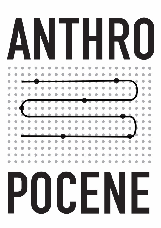
Anthony Burrill project

I was given this image, then thought to incorporate it as a half tone effect, but that didn’t really work out


Final piece after consultation with Lorraine, (based off the “time” and “past” aspect of Anthropocene, did a timeline in the middle of the image)
0 notes
Text
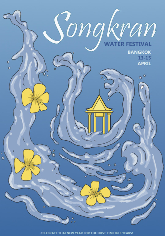
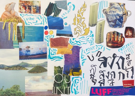
GDC Week 02
Firstly, we made an analogue moodboard with magazine bits in the GDC studio, this was to capture the vibe of the poster
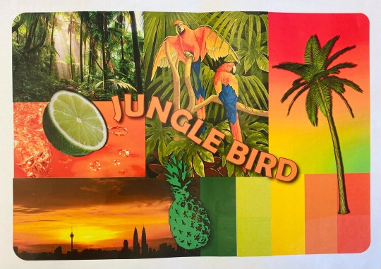
Then, to get a feel for Adobe illustrator we got randomly chosen cocktails to make a moodboard of. I got the Jungle Bird cocktail, and created a moodboard based off that vibe, then after feedback added more exploratory elements

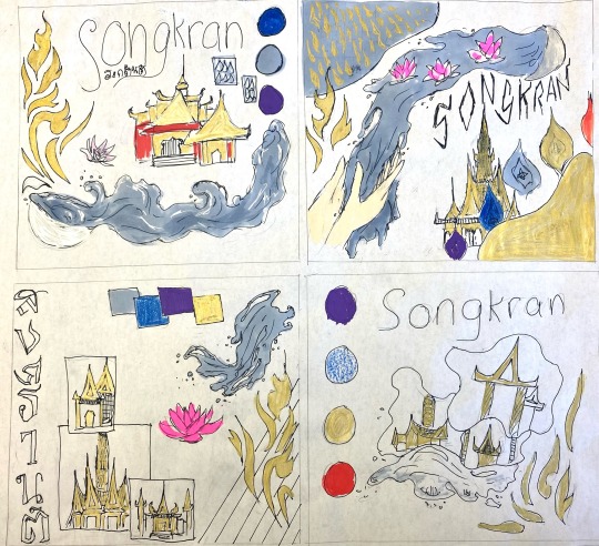
We made 4 analogue thumbnails of our plan for our official poster moodboard
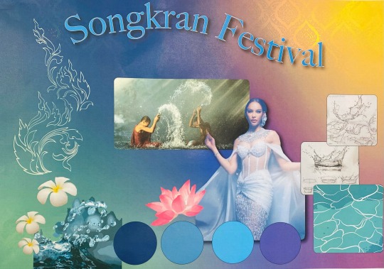
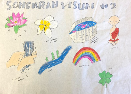
And finally created our digital moodboard for the poster in Illustrator, I focused a lot on the religious elements with darker colours & gold patterns. I also used a lot of water imagery/ colours because of the way the main focus of the festival is water splashing & throwing
After finishing the digital moodboard, we presented to the class for crits
Finally, we made 4 layouts for how the final poster will look like & got tutorials from Sharon & Lorraine for the final product


3 notes
·
View notes
Text
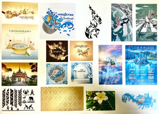
GDC Week 01
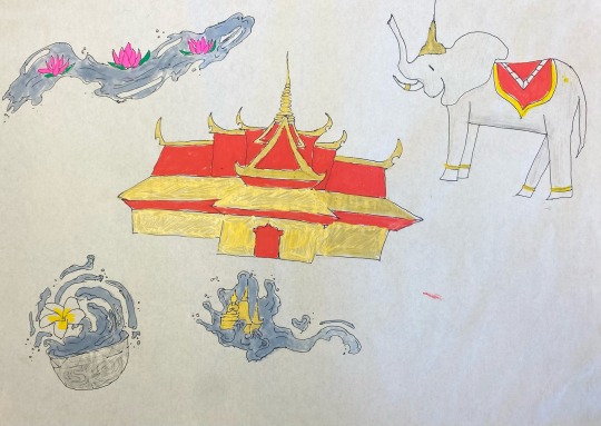
For the first week of GDC we were given our brief for a festival poster. I chose to do the Songkran Festival held in Thailand
The first part of the brief consisted of mindmaps and finding as many words and nouns as possible, we then circled the ones we should draw on a visual mindmap later on


We did 3 pages of visual mindmaps, which were then voted on by the gdc class for further work

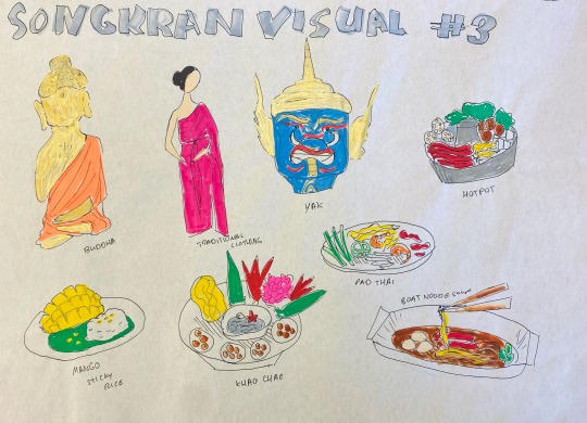
Finally, after conversation with Sharon & Lorraine we combined the visuals we thought were important together in another draft
3 notes
·
View notes
Text
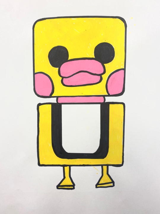
GDC 01
For GDC on Monday we did quick thumbnails as an ice breaker & introduction to how GDC works :)
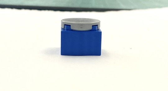

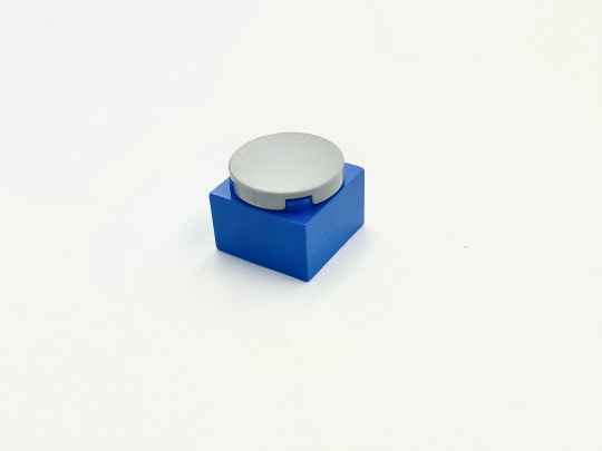
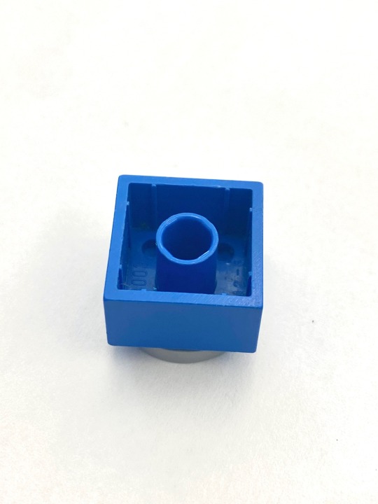
Firstly we chose a mystery lego piece and made 4 quick sketches of what objects can be made from its different angles.
I saw a water bottle, an egg on a plate, a salt shaker & a face

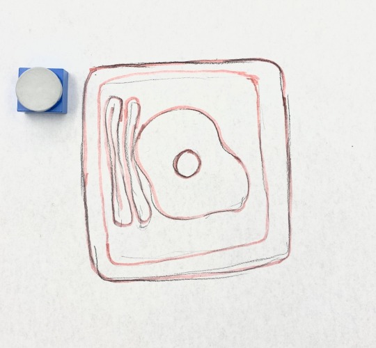
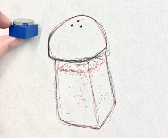

We later voted on which one we loved most from each othet’s work, and then worked on that a further two times.
I ended up with a duck-robot creature who I eventually named Robert <3
9 notes
·
View notes
Text
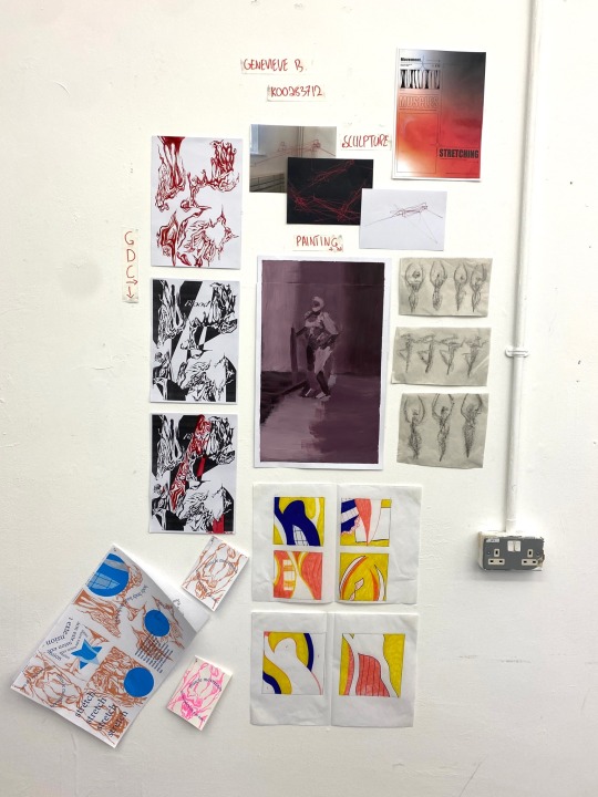
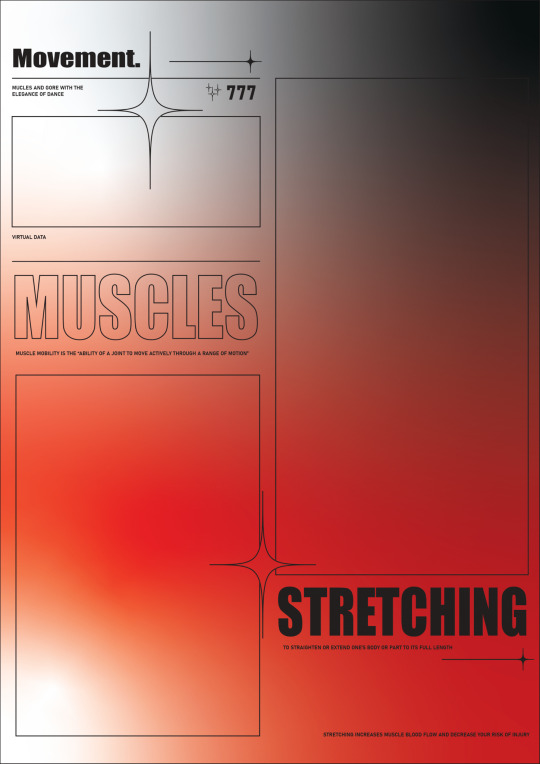
Movement Project Statement:
When I first heard the word “Movement” the first word that came into my mind was muscle mobility, I immediately thought of the time in ballet i pulled my hamstring & couldn’t get it out of my head.
In my first few weeks of semester 2 I worked on conveying that vibe of muscle mobility through the elegance of the dance ballet, I then realised I had a greater interest in something more ‘painful’ and gory
I found a pattern / style I really enjoyed doing and ended up focusing on that later on. Overall, I’m quite satisfied with the development of my project though I do wish I participated more in my painting discipline
GDC: I did this my first two weeks of the semester, it was definitely the first thing I wanted to do & I don’t regret it at all. I learned so much about patterns, the basics of Adobe, zine making & combining digital with analogue and it gave me the courage to try more on my own. I was mostly inspired by the artwork of Takato Yamamoto
Sculpture: I did sculpture in my next 2 weeks which ended up revolving around the word “stretch”. I was very inspired by chiharu shiota’s “the soul trembles” in the way where all the individual pieces of string were stretched out but all together looked more soft and fuzzy. I had a few plans for this with a brick however unfortunately that didn’t work out. I’m quite grateful for sculpture letting me explore and learn about materials I never used before
Painting: Unfortunately I did not get much time to do this however the figure painting with Jeff taught me a lot about tones and limited palettes. I take a lot of comfort in painting & wish I could do more, though I did participate in a lot of mixed media with my other disciplines in my own time!
Overall I am quite happy with my level of exploration in this project :)
3 notes
·
View notes
Text
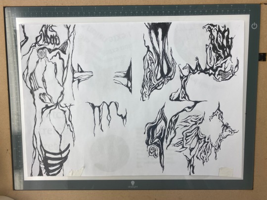
Update from illustrator to riso workshop
Recalling my second GDC workshop, I remembered I never got my second polished drafts in the riso.
With my newfound confidence in using illustrator I would try simulating a riso-like effect in photoshop (this is my first time using Photoshop but I had experience with a similar mobile app, so I had a bit of confidence in myself)
I scanned my analogue sheet into the printer and from there it was a solid hour of trying to brute force my way into learning how to use adjustment layers & hue sliders
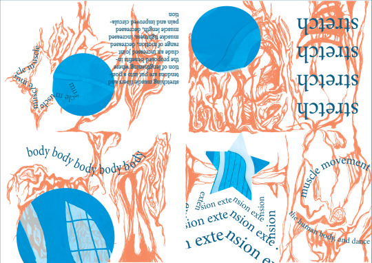
I overestimated myself just a smidge but i did get the job done!
Reflections
Though it was my first time seriously using photoshop I had a lot of fun learning the more complicated features, it took a lot of willpower not to quit and to just transfer my progress onto my phone and work from an app i was more comfortable with but I’m glad I powered through
1 note
·
View note
Text

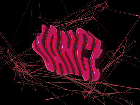
GDC X SCULPTURE
I felt like my work with sculpture was a bit lacking, and it couldn’t be viewed from my wall (as it’s nailed to the corners of the sculpture room) so I figured I’d try something with printing it & painting it in analogue
I first masked out everything except for the string & then thought to put it on a black background


The quality of the piece ended up being quite low so I duplicated it a few times and put it in Illustrator with the image trace tool

I really liked the end result but wanted to add a but of oomf to it. I was playing around with 3D effects and text in illustrator and created these cool text effects with inflate and the warp to shape option. I really wanted to make it work with the final result but unfortunately it didn’t turn out well.


4 notes
·
View notes
Text
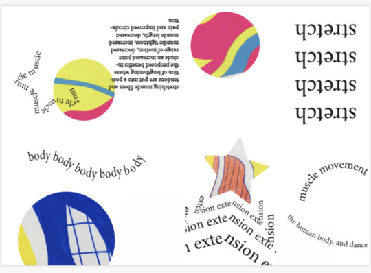
Illustrator x Painting Posters
I wanted to get better at using both Adobe Illustrator & Adobe photoshop so I gave myself the task of doing 2 posters with Illustrator & attempting to brute force my way into learning-by-doing
In hindsight this was quite honestly the worst way to go about trying to master something with a steep learning curve but after 5 hours of making one poster I found myself quite comfortable with basic operations.

The following poster was made loosely following a short tutorial I found on Youtube. It took an excessively long amount of time trying to figure out how to make stars & small little details but I’m quite satisfied with how it turned out. Unfortunately I couldn’t add any photos into the rectangular parts as I accidentally did something (I don’t know what I did, I’ll be honest) that made it so I couldn’t simply mask my images on
I later made a few attempts at painting on top of a printed version of it but it didn’t turn out the way I liked. (I don’t have a photo but it’s on my wall)
In my second poster attempt I took a photo of a part of the analogue sheet of my riso and imported it to Illustrator, I used Image Trace for the first time and had a significantly easier time operating Illustrator. I messed around with a few settings and typography & overall let loose and had a bit more fun with using the programme.

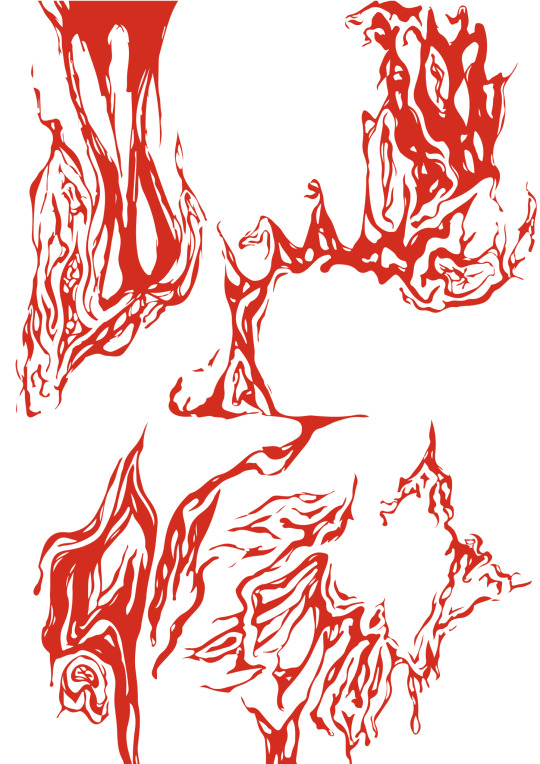
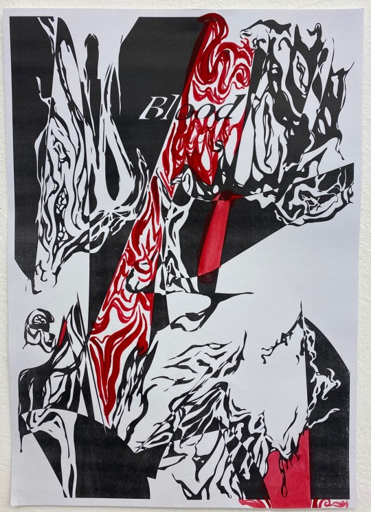
I wanted to turn it red in illustrator but later imported it to my mobile app and did it myself, though I didn’t like the results

I ended up expanding the whole thing and messing around with individual points to create this poster, I’m quite happy with the results but still wanted to paint over a print version, I used gouache and originally wanted to paint the word “flow” with red paint, however it didn’t turn out nice so I turned it into a sort of red blood flow.
I am incredibly happy with the results! It sort of captured the gore vibes I wanted to go for!
4 notes
·
View notes
Text

Painting workshop with Sylvia:
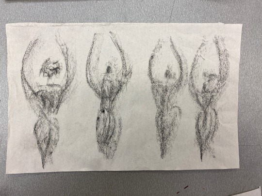
I only have one photo of my work here unfortunately, however my painting workshop with Sylvia taught me a lot about figure painting & about benefits of using a limited pallette. My only regret is painting Jeff much smaller than intended however I’d love to do the workshop again!
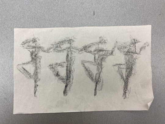
I unfortunately missed the gesture drawing workshop, so I took it upon myself to draw some in my own time. These are drawings of a dancer in my former ballet school doing a basic routine

Reflections
I wish I did more painting in this semester because I found it very useful & calming
I did overall have a good time & from my illustrator to riso workshop thought of a few ways to implement a mix of graphic design & painting into my project which I had a lot of fun with!
3 notes
·
View notes
Text

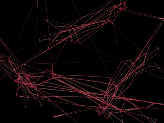
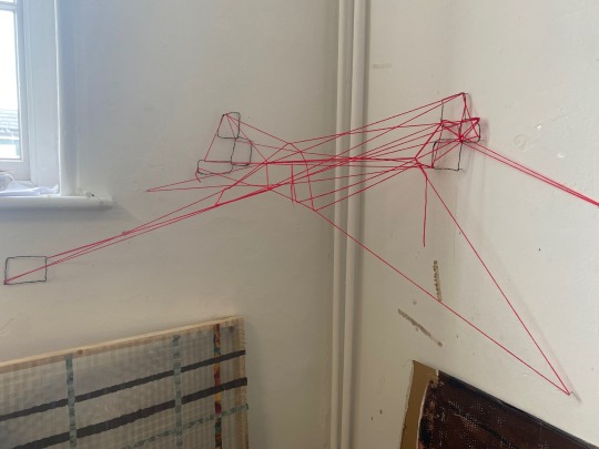
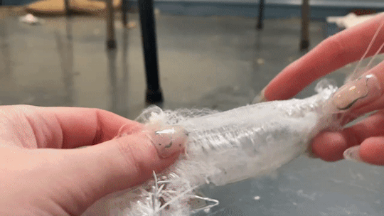
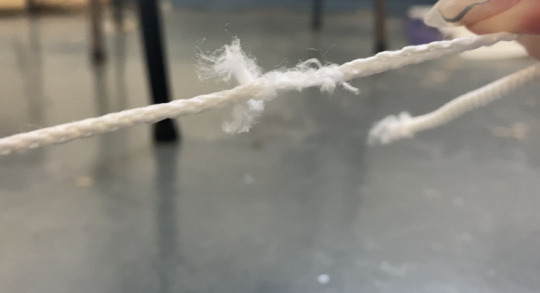
Sculpture exploration
I wanted to achieve a bigger version of the “latex-elastic” stretch demo I made previously however it didn’t turn out the way I liked so I put the latex aside for now (though it was very fun learning how to use it!)


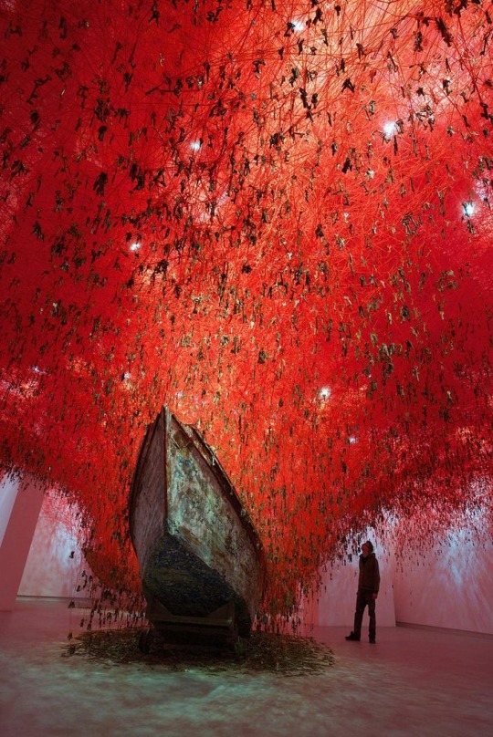
I turned to Chiharu Shiota’s work, especially “The Soul Trembles” because I was drawn to the reds & the way the yarn stretches over each other yet the overall shape feels somehow organic or as if a spider made a red web
This inspired me to attempt my own version in the corner of the sculpture room, I made squares out of wire to loop thread around. I feel like it captured the word “stretch” very well
Reflection:
Pretty happy with my new direction! I’d like to further explore with latex however this is the final piece:
5 notes
·
View notes
Text
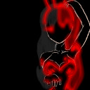
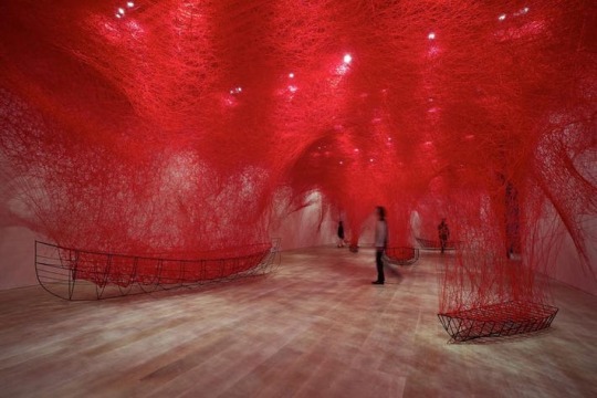
ARTIST RESEARCH - CHIHARU SHIOTA
Chiharu Shiota is a Japanese performance and installation artist. Educated in Japan, Australia, and Germany, Shiota interweaves materiality and the psychic perception of the space to explore ideas around the body and flesh, personal narratives that engage with memory, territory, and alienation. Her signature installations, which consist of dazzling, intricate networks of threads stretching across gallery rooms, made the artist rise to fame in the 2000s.
Her work really astounded me when I first came across pictures online. I really liked how sort of ‘bloody’ the red thread / overall installation (specifically below) was. I also loved her other installations with black thread & realised that I wants to try something similar with my own sculpture because of how stretched & weblike the thread was, as well as how it seemed to take over the room.
3 notes
·
View notes
Text
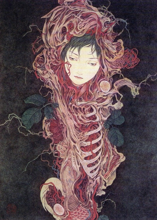


ARTIST RESEARCH - TAKATO YAMAMOTO
Takato Yamamoto is best known for a unique style that he calls “Heisei Estheticism,” which draws on the genres of traditional Ukiyo-e, manga, and contemporary gothic horror.
I absolutely love and adore his work, especially the first piece. I took inspiration from his work with the analogue portion of my risograph (gdc workshop with Lorraine) and I feel like when I saw his work it made me realise that I really wanted to play around with the gory, more painful side of muscle movement in contrast to the elegance of ballet. I ended up really liking how I did this in the gdc workshop and will continue to work towards this in future plans
6 notes
·
View notes
Text

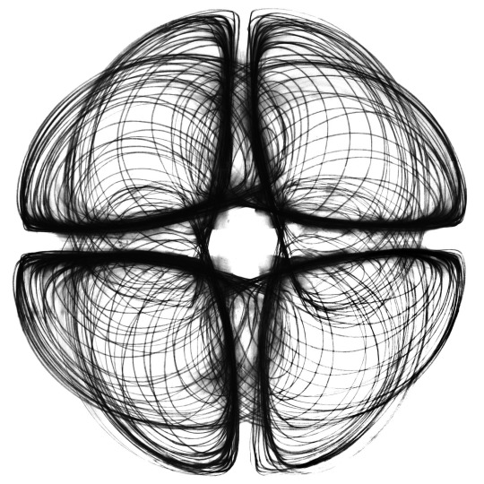

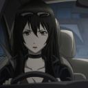
ARTIST RESEARCH - HEATHER HANSEN
Heather Hansen is a performative and visual artist known for her kinetic drawings currently based in Los Angeles.
I was recommended to research Heather Hansen as a performative artist for my project’s links & ties to dance / ballet. I really like Heather Hansen’s line work & the way it reminds me of parts of the body (blood flow, capillaries, intestines, that type of thing) yet keeps it sort of ‘clean’ & ‘elegant’
I tried dancing ballet on a piece of paper with a charcoal and bamboo stick but I didn’t like how it turned out
(this is the only picture of the finished piece available as unfortunately it was removed) I want to experiment a little with this somehow in the future, I think I can achieve something nice by combining it with sculpture

Heather Hansen’s “Emptied Gestures” youtube video
youtube
4 notes
·
View notes
Text
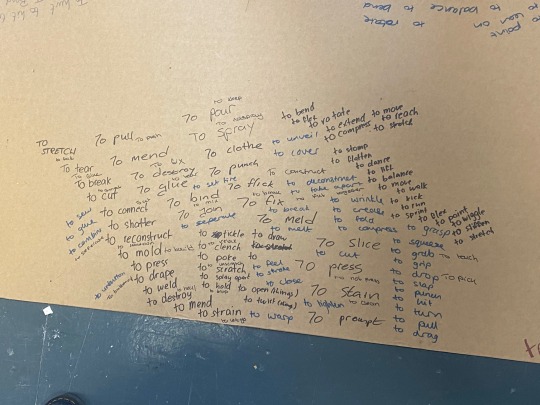

Workshop - Sculpture (ideas development)
Started with brain-storming verbs, from verbs we could do with our hands to feet, antonyms, and materials

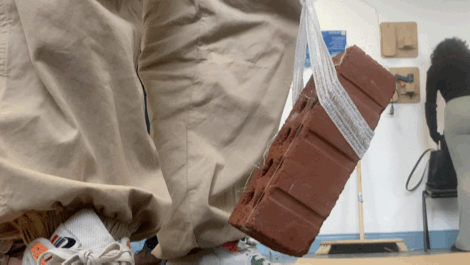
I chose “to stretch” with the material rope, I then found a stretchy elastic material and a few other bits and bobs & after discussion with Sarah thought to use the brick as a weight (didn’t work but provided a few ideas for that tension & to invoke that sense of fear)


(this is also the first time I’ve tried sculpture, which was pretty exciting)
Later thought of doing this (was inspired by a tufted rug video I saw a while ago but I unfortunately can’t find it anymore)
Will continue tomorrow

3 notes
·
View notes
Text
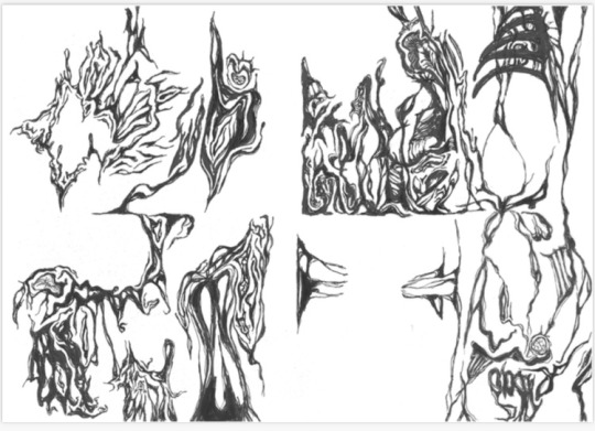
Workshops - GDC with Lorraine
Illustrator to Riso zine workshop, follow up to be posted
We first learned the basics of using Illustrator, which was really fun and showed me the ropes to the program! We used a zine template as guidelines for our typography / pictures for the zine
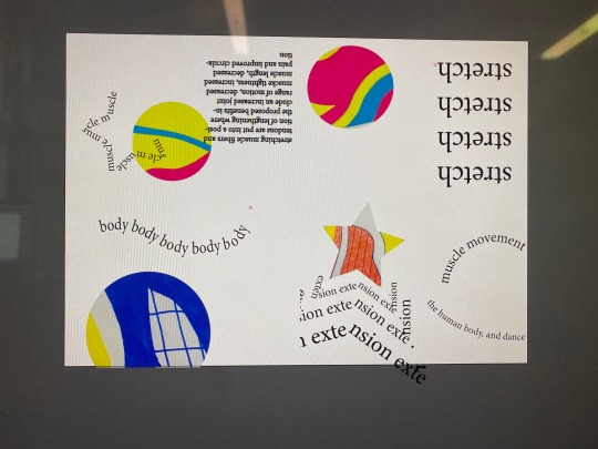
In the analogue phase I thought to draw something more organic and flow-y (inspired by takato yamamoto’s work) which I thought turned out really well


I worked on the analogue portion further throughout the week, because I felt like it could be done better
Reflections:
moving from exploration of movement with muscles through ballet to the (muscular?) elegance of ballet with the gore of muscles and the body
7 notes
·
View notes
Text
Workshop - GDC with Sharon
In my workshop with Sharon we developed on our design process, finding physical sources & creating patterns through them that we can further work on for our project
1 - photographs
We first began with 10 minutes to take photos of our theme. I ended up with 4 (though tumblr has an image limit), of which I picked the first one to further develop into my pattern


2 - Pattern making
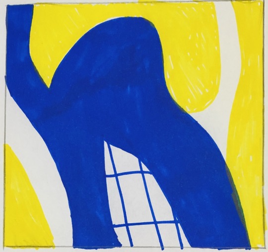


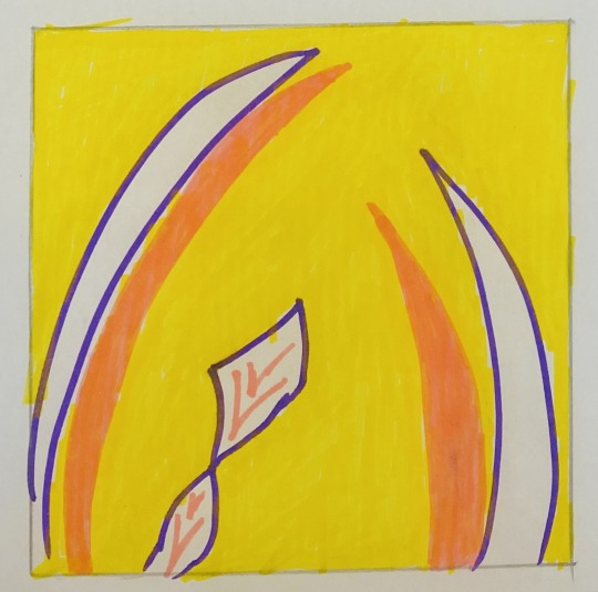
From the picture chosen, I drew shapes that I saw onto 4 different squares & tried to simplify it down to easier shapes and colours. My peers then picked out one of them for me to further develop on, which is the first drawing
3 - Polishing
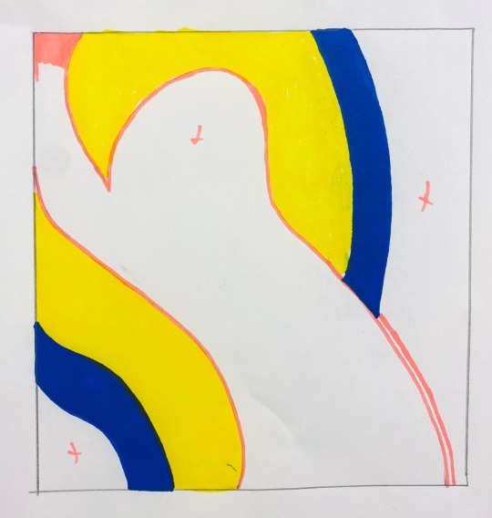
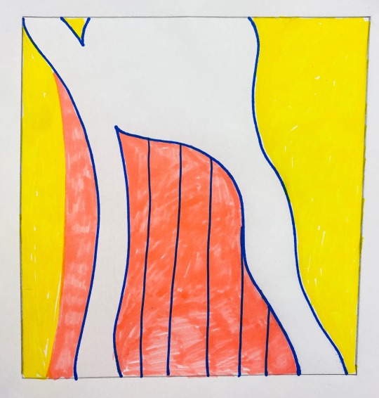
I recreated the image twice, adding parts of other patterns into it that I thought was nice
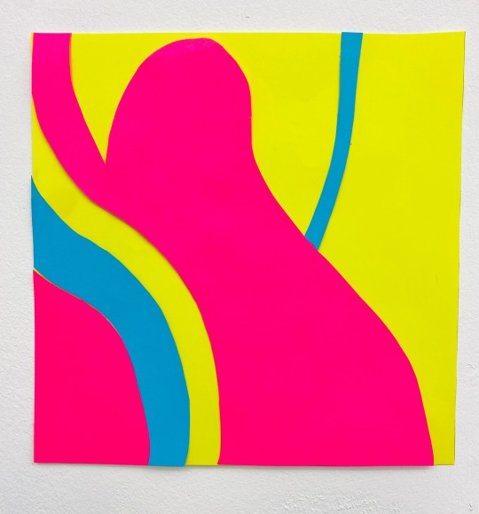
3 - Final result & reflection
Cutting pieces of paper into the shapes I needed, I ended up with this piece. I spoke with Sharon & came up with a few ideas to further develop on these primary sources. I found the workshop really good for finding sources & inspiration, I think I’ll do this exercise again in my own time later on but so far I have a lot to work with which I’m quite happy with
5 notes
·
View notes