
Last Seen Blogs

imjustrandom
Untitled

aperint
Apertura Intelectual
fallofasparrowiv
Have you ever been sketched? ;)

laurasylv
Banana Milk

buttsbottomsandbooties
buttsbottomsandbooties
Text


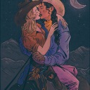
这是我朋友@Alexander-ncc1701 的约稿,他以前的账号@alexanderkirk 已经不能使用,非常遗憾由我代发
5 notes
·
View notes


Note
很有帮助
Hi! I really love the way you color, and I was wondering If you could make a tutorial about it, I of course completely understand if you Can't/don't want to do it thanks in advance If you decided to do it and have a good day/night.
Hello hello!
Ooooh, a color tutorial! I've never done one before so I'm not sure if I'll be any good at it haha. But I don't mind sharing my thinking process when it comes to coloring my works.
So when it comes to color, I very much have a traditional painter's approach since that's how I learned color in art college. My painting professor never allowed us to use black or white paint, we could only use other colors to create darker colors or new colors altogether. And you're probably thinking, "What the hell? That's insane." And I wouldn't blame you haha. But this approach helped me a lot to not rely on tints (colors mixed with white) and shades (colors mixed with black) when I color. For the most part, I purely thinking about value and hues when I'm coloring.
Finding the right values:

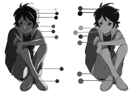
So for this drawing, I did two different takes (one with direct harsh lighting and one without). The reason why I'm showing this is because when it comes to color it's very important that your values aren't clashing with each other. When I started out, all my coloring felt flat because I was using colors with the same values so there was little to no depth. A lot of people don't realize this but color does have value!
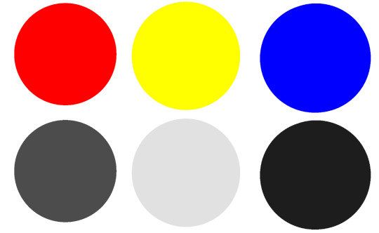
If we put the primary colors on greyscale, you notice how each color has its own value. Blue tends to be a dark value, red has a mid to dark value , and yellow is a much lighter value. This is why if you ever look at my work, the color I use for shadows lean into blue/purple tones. You can also have warm shadows since red does have a deeper value compared to yellow. But these values are when the primary colors are at the highest saturation. What would happen if we knocked down the saturation levels?
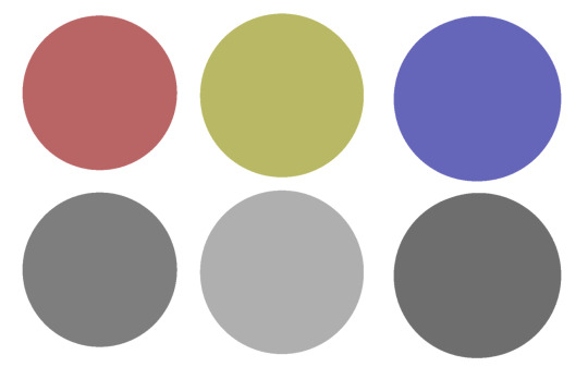
The values start to become more similar. Since we're not always using the most saturated colors, it's important to understand the values behind the colors you'll use. Once you unlock that, you can pretty much do whatever you want with color haha. That's why I hardly ever use black or white in my digital art when mixing (also I don't mix color with a brush, I just pick from the color wheel which might be insane).
While it's not wrong to use white or black to create darker/lighter colors, color in real life doesn't always act that way. Shadows and highlights can have color. For myself, letting go of white and black has opened a world of color combinations that I didn't think of before taking my first ever traditional painting class. Now, I can freely pick colors and experiment with palettes since I've blocked out what values I need (like the image below).
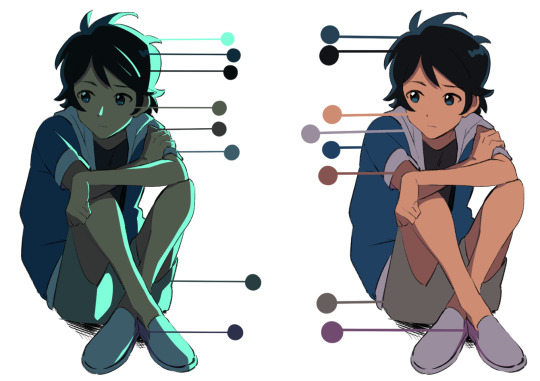
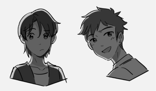
Even if I'm using blending modes like in the next image, I'm always thinking about making clear value separations. If I can't understand the image in black and white, then I'll have a hard time seeing it in color.

And when you get very comfortable, you can start placing characters in different color environments and match them (which essentially is the job of a color designer in TV animation).
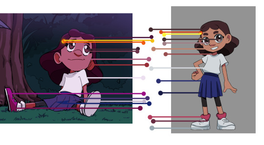
The right image is the official color palette for my character which already uses a lot of blue/purple for the shadows. But on the left side, she's in a night-time environment so I leaned even more into the cool colors to the point that the white T-shirt is actually a very very light purple/pink color haha.
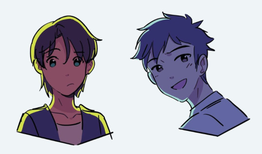
Or like this example where the left drawing gives a more sunset/golden hour lighting while the right one is more blue hour/night time lighting. But you can read the colors clearly 'cause the values are clear to begin with.
While that wasn't really a tutorial this is pretty much my thought process when I'm coloring my digital works. ^^; I very much do follow an academic approach to color theory but even then I think it's okay to break the rules. As long as you have understanding of colors' value, I think you'll be able to unlock any color style you want!
I hope that answered your question and was helpful!
229 notes
·
View notes