lottieholland
lottie
UCA Fashion Promotion Student (2115781)
111 posts
Don't wanna be here? Send us removal request.
Last Seen Blogs


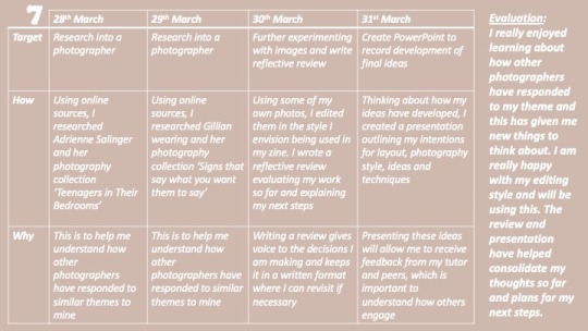


Text
Evaluation
This project was probably my favourite one so far. I really enjoyed having the freedom to choose exactly what I wanted to produce and what theme I wanted to explore. From my three themes that I originally selected, I combined the ideas of two of these, arriving at the theme of culture and identity. I am really happy I chose this theme as it gave me lots of different pathways to explore and is a topic that genuinely interests me.
In terms of skills and methods, I feel that I successfully challenged myself in many different ways through my project. The main skills and methods I improved during this project are; Photoshop and InDesign, photography, editing and designing. The first skill I have definitely improved is my ability to use Photoshop, and most importantly InDesign. As digital softwares like this took up so much of my project, it was really important that I was proficient with using these. Although, I faced some technical issues with storage and photoshop, I feel that on the whole I used both applications in ways that I previously hadn't done - to produce products that I am truly proud of. I’ve also learnt how to correctly design a book, which is a new and very useful skill that I acquired. Secondly, I also used this project to improve my photography skills. Having never been given an opportunity to explore photography before enrolling on this course, I started as a complete novice and really enjoyed learning about composition and lighting in the practical application of my own work. Photography was a main part of my final project and I am really happy with the outcome of all of my photographs. Editing the photographs was also a big part of this, I really like the style I found and it perfectly reflects the outcome I wanted. Although, I did not manage to visit all the skills I had originally planned to, I realise that this was quite an ambitious aim, and I am very happy with having used my time to build stronger skills in the areas that were the most important. All in all, I think I utilised and learnt new skills in a really successful way. In terms of areas for improvement, I wish I had understood how to properly compose a book earlier on, as this would have saved me a lot of time redesigning my zine.
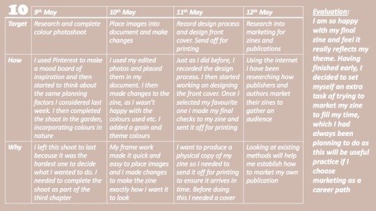
I think my research for this project was very thorough and consequently successful. This was facilitated by me understanding exactly what my theme was, making it easier to find the information I needed to reflect on this. Although, a lot of my research came from online sources, most of this was articles from blogs or newspapers that I wouldn't have otherwise been able to access. I also used a lot of books for design inspiration, which was really useful. I used PowerPoint to record my research, which made referring back to information a lot easier than in my sketchbook. It also meant that I could lay it out in a more sophisticated and easy to read way. All the research I did was relevant to my theme of Culture and Identity, and consequently this influenced my final project. For example, Adrienne Salinger’s photography collection and Gunner Stahl’s photography zine both really impacted my final publication. Originally I had intended to use a wider variety of sources such as journals and books for my information, however, the information I needed wasn’t available in these. The only thing I would do to improve my research skills is have made better use of the library. I could have looked at specific books and magazines that had the exact information I needed.
My time management on a whole was quite good throughout this project. I managed to finish a couple of weeks early, so set myself some extra tasks to keep myself busy. Furthermore, I successfully managed to meet all the deadlines I needed to throughout the course. There was a patch throughout the middle of the project where I don't think I was using my time especially effectively. This was because I wasn’t happy with the work I was producing as I had chosen a style that didn't really feel like my own. This caused me to completely restart the designing process and not use a photoshoot which arguably was not the best use of time, however I am really glad that I made this decision and actually wish that I had made it sooner. Apart from this, my time was used effectively throughout the whole project, and I found ways of saving time, such as having the whole framework of my zine so I could easily add the photographs to it. I'm not sure that there is much I could have done to change or improve this, especially considering I successfully managed to finish all the work before my final deadline.
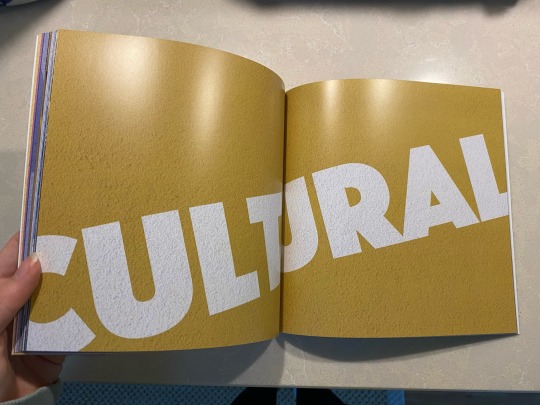
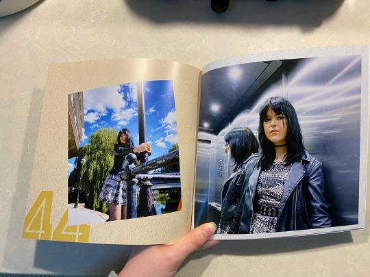
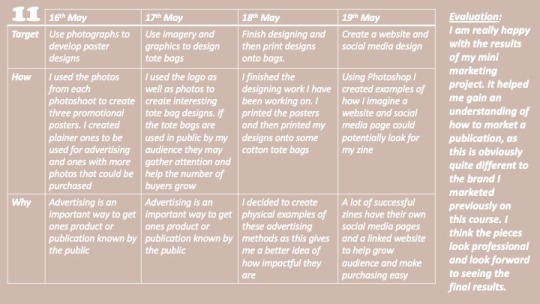
In terms of my final out come, I have created a publication that I can say I am very proud of. Each chapter reflects on a different areas of my chosen theme, which I decided to make more niche so that I could closely explore identity and culture within teenagers and youths. The first chapter of ‘mundane life’ reflects on identity in the daily life, the second chapter of ‘identity and colour’ explores the link between colour and identity in culture, while the final chapter on ‘cultural urbanity’ explores identity within cities. I am really proud of my final zine and am glad I decided to swap to a style that is more my own. Although the final product doesn't exactly line up to my original plans and inspiration, I much prefer my final result and think it picks up on the aspects that I really wanted I was really keen on, such as the wide range of colours used throughout. I think I successfully used my original ideas and developed these logically throughout the project, with the help of research, before arriving at my final outcome. This project challenged me in many ways, in terms of the skills needed, however I feel that I successfully overcame these issues and arrived at final book that looks professional and is effective in communicating my theme. I am glad I used my extra time at the end of the project to add to my final piece by creating tote bags and posters as marketing tools as this allowed to to practice marketing techniques, which was important as marketing is a career path that I am very interested in. I am not sure that there is much I would change about my final outcome. I love my final publication and think that I demonstrated clear decision making throughout the project, as I frequently referenced decisions and why I was making changes. I also recorded processes I used throughout the project. The only thing I might change would have been designing the zine earlier, meaning that I could have had more time to play around with marketing and advertising. Apart from this, I think my project was a success!
0 notes
Text
Link to virtual exhibition
https://www.artsteps.com/profile/628bcff8af6b932db9a98a46
0 notes
Text
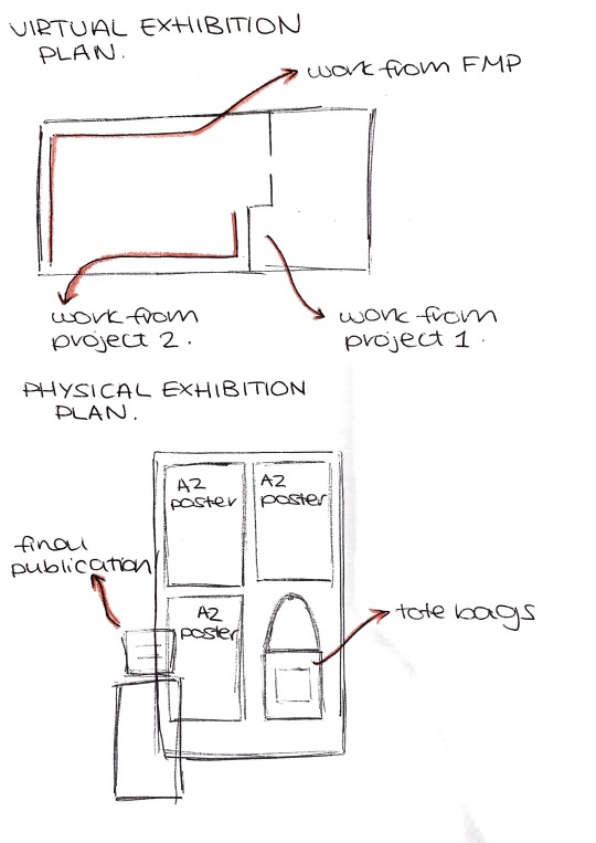
Exhibition Plans
Here I have put together a couple of quick sketches for how I could use spaces for my virtual and physical exhibitions. The virtual one is planned around a space on Artscape and as I am not sure what space I will have in the physical exhibition, I am assuming that I will have access to a board where I can display my posters and tote bags, and some sort of stand to hold my zine
0 notes


Text
Printed A2 posters
0 notes
Photo


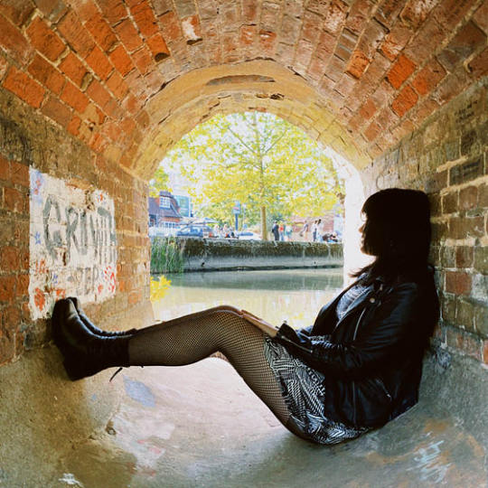
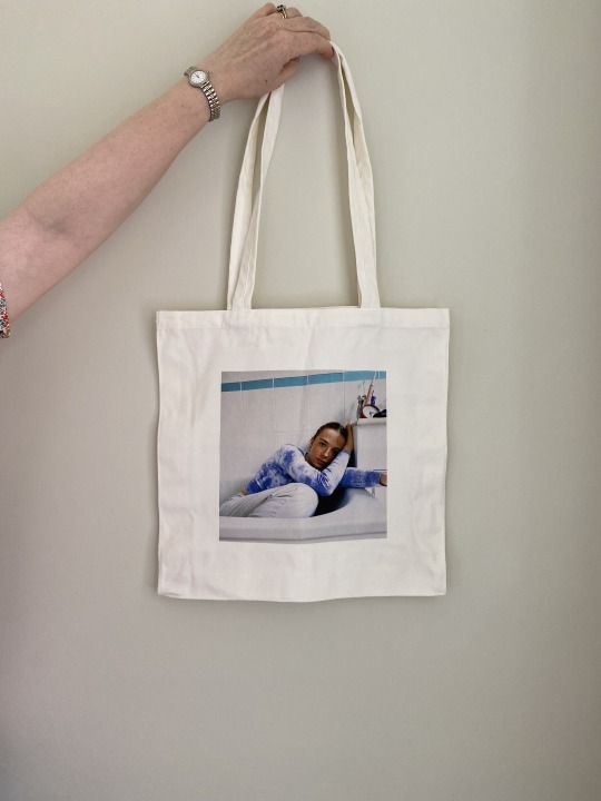
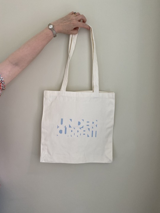
Tote Prints
After playing around with different layouts and colours, I eventually decided that simple was better. As the tote bags are a square shape, I decided that square photos would be best as well, this also maintains consistency with the square shape of the zine. As the logo shape is quite a long rectangle, I couldn't find a way to combine this with a square photograph where I was happy with the end result. The logo always looked disjointed, regardless of the colour, positioning or orientation. However, not having the logo isn't necessarily a bad thing, the photos by themselves stand out a lot more, causing them to look a lot more interesting, and a smaller logo could easily be added to the reverse side of the bag, to ensure the branding is on there. I also decided to do a design with the same design as the front cover of the zine, I tried using different colours, but this one seemed the best, and I think it will still look effective with the cream colour of the bag replacing the white. By using the colours and imagery used in this issue of the publication, it means that a new collection of bits and pieces like the tote bags can be released as part of a collection with each issue.
Again, the totes could either be freebies given as a gift to subscribing customers, or they could be available to purchase for a small fee. Either way, tote bags are a great way to help with getting a brands name out there, as people using the totes in public will help spread the name of the zine and making it more well known, eventually making it more recognisable.
0 notes
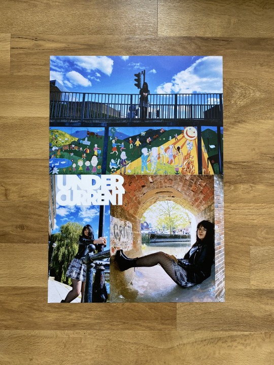
Photo


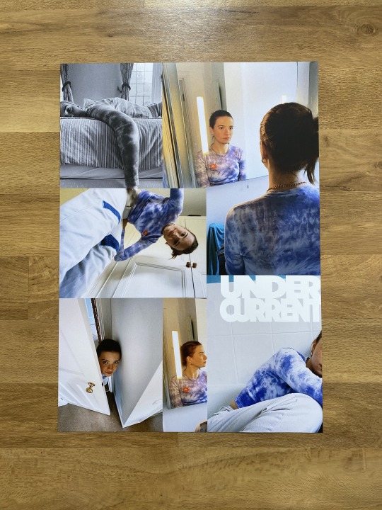
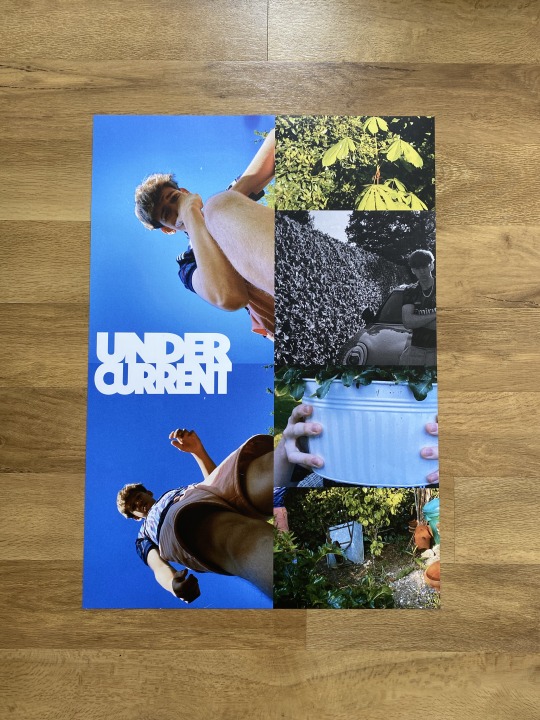
Poster designs
These are examples of advertising posters that could be used by my zine. I really enjoyed trying to create angles and shapes throughout, as this reflects the edgy and unusual style that I had originally wanted to use for my zine. I wanted the images to kind of blend into each other, so it was unclear which was which, and I think this was quite successful, especially in the first one where some of the mirror photos look like entirely different photographs. I think they turned out really well and look really captivating and enticing, which was what I hoped to achieve. The abstract and surreal shapes created make reference to my research into abstract and fauvist art that I did at the start of the project, but I applied it in more of a geometric format.
I feel that the posters themselves may be too busy to be used as commercial advertising posters, and the logo is potentially too discrete, so these could either be given to buyers as freebies if they were to buys a years subscription for example, or they could also be purchased as a further product.
1 note
·
View note
Text
Next Steps
11/5/22
As I have just over two weeks left on my project I have decided to use my time to develop a mini marketing campaign for my project like I had initially planned to.
I plan to use the rest of this week to research marketing campaigns for such projects. This will help me generate ideas and gain an understanding of marketing and advertising for publications.
I will then use a week to come up with advertisements and merchandise. I expect this to be posters and keepsakes such as tote bags, as these will be time effective to design and produce.
My final week will be used to evaluate my work and my final product. I will also use this time to design both my physical and online displays.
0 notes