mi401leiascott
Visual Language and Introduction
23 posts
Don't wanna be here? Send us removal request.
Last Seen Blogs
fawnfulart
Brain Rot Central
invictus-rp
UNDEFEATED.

lancefeurtado-blog
Untitled

wolcichyczas
Cichy Czas

gruballergy
Untitled
Text

Final Product, The worst animator Butch Hartman:
For this animation, it was to choose what animator to do a 30-second of clip. It was a bit vague but was a lot clearer by the end. There were many terrible animators though I have chosen Butch as my subject. I have gone with Butch because I thought it was an intriguing idea to explore the actions of what happens after fame and fortune get to one's head. I was going to do a project that I was going to enjoy and know what I would be able to complete. It was a combination of things that made this idea. There was one that was too dark to cover, one that didn't have enough info about, and the last one that was surprisingly boring. I nearly didn't go with Hartman because I was confused if we had to talk about the works. They clarified that we could talk about their life. I thought through the concepts a bit more, writing them down on paper with sketches, bullet notes, and a tiny amount of thumbnailing. I left the design elements for last, as I wanted to focus on the slapstick humor more. I wasn't pleased with the initial animations and returned my attention to thumbnailing. I am glad that I decided to plan my project in digital first. It gave me more space and time to quickly see what ideas worked best in animatic form rather than paper. At some point, I knew I needed to add something paper based on what I was doing in some way. So I came up with mixed media, e.g., "Dairy Of A Wimpy Kid" or "The Amazing World Gumball." It was linked because his audience was young, and it would be like a kid drawing in their notebooks. I also liked that it added personality to the animations. I also limited my color pallets to highlighters, making it seem like they weren't paying attention to class as they should be. Methods I used is that I used the dragon frame room, moved the assets to a separate folder, and dragged them onto the already-made animations. I used the printed pieces of paper as a guide and traced over them as well. During the process, I started to lose time. So I reused some assets and copied lined paper to draw over to save on completion. I lost one of the animations and ended up remaking it unembellished because of the time restraints. If I had to do this again, the changes would be to add more of my background. I mostly pulled stock-free images from google to add to mixed media. It would've been a bit better to take photographs to make it feel more personal. I would have also focused a bit more so that it has been more detailed and planned out what limits I could do.
Overall I am happy that I completed the projects and enjoyed the experience. I liked making the slapstick, music choice, and sound making. What would I do for the future moving forward is to focus more and try removing distractions.
0 notes
Text
Puppet Animation: We had a lecture where the class had to make a puppet with our shown animator. The first step is to model out the puppet with drawing and make sure it is doable in real life. Second was making the base of the model, the class was taught how to use the drill machine. Afterwards a special clay called silly putty was used to make the joints stronger and left to dry overnight. Then the final step came to put on the plastersen, it was hard work because colours kept mixing, which made it look messy. When it came to animating the final product. It came out smoothly and had a nice backdrop but the only thing I would change is the blue tack underneath. It made my character look like they sprung around and left a trail behind. I ended up losing the animation, so I redone it.
0 notes
Text
Improvements in Animation: I took back the feedback on my last attempts at this medium. The one I started with was the ball because I thought there was not to be much to change. However, I realised that the little details did matter when redoing. First thing I noticed was that it hit the baseline and gave the ball more weight than the original. The second was the colours and background were more interesting. I got an image of a theatre to pull the clip together and coloured in the ball to make it look clearer. It made it feel more like a bouncing ball than a weightless ghost.
For the walk, it felt like a considerable improvement in how the character carried themselves. The walk felt all the more fluid with the arms added on. Before changing the walk cycle, I had tried to add personality to the movement when it led to me not putting on my arms. So I left them out because I thought it could look janky with them, and in the end, it looked shaky without them. So this time around, I took the route of following more of the rules before going to breaking them. I had once again put down a baseline, reference photos, and looked at my work more closely. The little things helped make it more free-flowing and feel natural.
The final improvement I made was the head turn. It was admittedly the least favourite I had out of the bunch. For this one, I made it more cartoony and easier to draw. The last one did feel too detailed to capture the person's looks. I failed to realise that cartoons don't copy everything about a person but their likeness to a person. I also added the 3/4 view to help make it a better spin. I am more pleased with the new one than the old one.
Bonus content, with all the techniques combined. I was able to create something that I thought I could never do. It is for practice purposes, but I found it paid off when doing the work in itself. It is not finished yet, but happy with the progress so far.
0 notes
Text
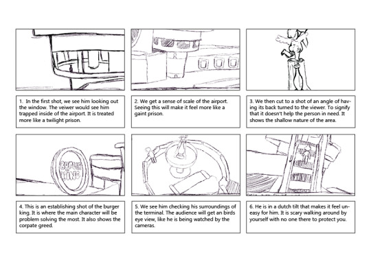
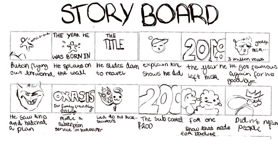
Story board
StoryBoards: When the concept pieces were too detailed, I had to scale back the designs into something more simple. There were two reasons for this, one being that it was going to take long to complete and two was going to quickly burn me out. So it was now just quick sketches. I tried putting in shading to make it more dynamic shading but it ended up blocking out most of the details that made it hard to see. I was originally not going to use indesign for my storyboards because I had felt that it was going to take up time trying. In the end, I had to push myself to learn new software. It was because the handwriting wasn’t going to cut it, so using boxes made it feel more professional. It was difficult figuring out how to import materials and admittedly I had gotten help at one point when I needed it. So when I learned that there was a nicer way of using it. The software became more manageable to use.
As for the storyboards themselves I will explain it for each shot. When doing them, I started off just the places and then went on a creative course of action with the other shots.
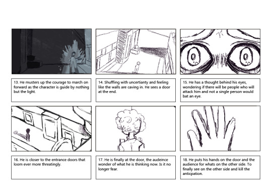
This shot is the establishing area of the airport and my reasoning for this one was to make it look like the character was stuck in a glass casing. When we had a lecture about heterotopia and how places can change their meanings depending on a certain situation. For example a terminal like this one is supposed to have a person leave and enter a country. However this one can’t leave because his country is no longer valid due to a war and he also can’t go to a shelter area since he isn’t a “real victim” in the eyes of the government.
Shot number two exists to expand on the size of the airport and where he will go next. To show that it is set up more like a prison and less like a place you come and go to escape your problems but this is his burden that he carries with him.
The angel shows that no matter how serious of an issue it really is, even cupid has his back turned to the main character. He is the butt of the joke and no one helps in any way.
It is foreshadowing of where the character is going to have things turn around for him later and what the US airport really represents. The greed and the amusement of only the people in higher positions.
We watch him under a bird's eye view of him, adjusting to his surroundings. Him checking every area. Seeing what he finds in every way that he can.
The camera is on a dutch tilt to establish that it doesn’t feel right even when we are watching suffer alone.
He is not in a rush to get down, he sways with each step.
We see how empty it is, it appears like a ghost town and we are always viewing him like a security camera.
We see his tired sunken eyes and hunger bursting through the seams. He is scared of being left in here by himself.
He slowly saunters over to the phone booth and shrinks into a ball on the ground. Waiting to hear anyone pick up the call that he desperately needs to know.
He is standing on the edge far away and distant to steal his resolve.
He is shaking his hand, the fear persists.
He marches forward anyways to say that he must find somewhere to sleep.
The dutch tilt is also used here in the liminal hallway, where it feels like it stretches for long.
You hear him breathing heavily as he inches more, and see the panic well in his eyes but you don’t know he is thinking.
We see him reaching closer to the doors.
He pauses for a brief moment to have his back turned away from the camera at all times because he feels distant from his feelings except for when it is fear.
He puts his hand on the door, and cuts to the next scene. The viewer won’t know until the next scene in the morning after.
I wanted to put on a more scary factor about it because it would be scary to wander alone to have no one help you and your family being in danger. All that the main character wanted to do was collect a small thing to go back with him yet he was stuck in a cage.

0 notes
Text


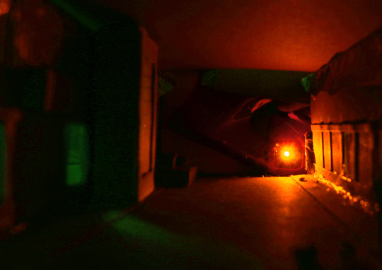
Photos: These are photos I have edited to make them feel more cleaned up or to have an airport background. I tried to find ones that differ from each other in colours, moods, and angles. In Picture A, there wasn’t much editing I had done. The first step was zooming in the image, second was selecting around the model then cutting it out and lastly was finding an image to put in the foreground. So once I found an image, I then blurred that image and then changed around the values to blue to match the image. I was happy with the lighting and felt that it didn’t need that much editing. The only thing I would say that could be improved is the black line underneath the hallway. It looks messy in hindi sight because of how much I tried to make it not look photoshopped. Other than that, I had picked photo A because it had a warm feeling about the image yet it was quite sad. It gave a sense of hope and goodwill to the main character. That it will get better for him and the audiences.
In picture B, there was a lot of lighting and contrasting that I did. The balance was put in to make the image pop. More contrast was brought in to show more of the green and orange. Then I put in more green in by drawing more green over it with an overlay. Reduced the harsh line with the blur tool. After that, I was happy with the overall result. I went with this image as well to contrast A, the picture shows the dark sides. It is made to make you feel scared and worried for the character.
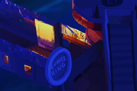
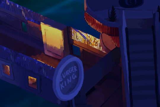
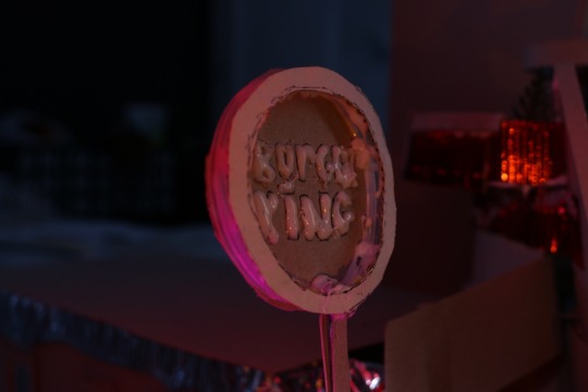
With picture C is my least favourite because I made more mistakes when I tried to clean up. I tried selecting an area, copying that area and tried pasting over the gaps. The first mistake was trying to blend it but it ended up having a patchy look. Then when I tried covering the white bits of glue up by painting over it, it ended up looking just plastered on and unnatural. So, I went back in again to fix those tiny mistakes by blending the shadows more, adding more painting over the top, and liquefying the sign so that it was skinnier. I also added the burger king logo because I wasn’t pleased with the glue being unclear on what it said. It is now to the point where I am content with the look. For this image, it was to compare the two images. B showed failure of the place and C showed success with a lighter green. The yellow is now used for absolute joy, pride and optimism.
Lastly picture D, this one also didn't do too much editing either though there was some tightening up. I painted over the missing gaps, grabbed a picture of an airport, then multiplied the image and erased the areas. The picture now shows a strange side to the terminal. Almost like it's a twilight zone, it is like being stuck between space and time.
0 notes
Text


These are the story boards I have made thus far, I however changed some things around. For starters, I had changed 5 and 6 because it was taking too much time. I also made it a little easier to animate all in one round. The second was adding more information and context to make it sense, which added more interest to the visuals. Thirdly there was more dynamic transitions to the shots.
0 notes
Text
The chosen animator
Animation Update: Previously from the other post, I had made the key decision to go with Butch Hartman. But at the time I wanted to explore another option as well, so plan B was made in mind. I looked at Hunter Hancock, and it almost made the final cut. Though at the last minute, it was ultimately the original idea that stuck. Before we step into the reasoning to why Butch was chosen, context needs to be applied.
At the time, it was starting to get confusing whether or not to look at the artist's life as a whole. Or if it was to look at the work that has people polarised in the first place with different explanations. To look at their life as a creator and see where the art comes into the picture. So having this thought, Hunter was being on the chopping block of possibility. I wanted to look at him because he is known for turning child friendly characters to dark, disturbing monsters. So in finding him, I found an interview podcast explaining and talking about his life. Didn’t find it all that interesting but began wondering again. It wasn’t until a task was involved where the class had to make an answer to the fake interview about the artist. It had me realise, that I wanted to go more of the direction of Butch instead because it made more for more comedic effect to talk about the actions of the worst person. So instead of getting rid of Hunter completely, he will be an inspiration for the comedy.
For the animation style, it will be in a notepad paper style. I wanted to make it feel like a child drawing in their school book. His stories often were of a kid going to school or wishing for something better to come along. It will also have an interesting style with the lines moving while the actual animation happens. I started doing it digital because I wanted to print the animation out and then have a way of tracing on the paper.
When I showed my work the good feedback I got on was the editing and the slapstick humour. What sold the humour was the sound effects, I had made a little of my own sounds on Garageband on the Ipad. I used a cork sound effect and a horse sound then made it echo, after that I found Free sound to find a baby crying. It was a little difficult trying to make it transfer sound files to Filmora. But after fensting it, it was then imported there. The app required a specific type of file and not just from apple. There was also a library of free sounds in the app. For certain animations I have done, the one with the bowl spilling was hard to do with a renfence. So I had a classmate help film a bowl falling to get the perspective correct.
*For the storyboard, I went for some simple black and white sketches with annotations and made them cleaner with Indesign because it was harder seeing the hand written ones.
The Feedback for what could be improved was making the animations link more together. For example, having the cloud of smoke for the fart sound or having a hand underneath the spilling paint. The most improvement would have to be when Butch walks away the ball doesn’t shrink. In conclusion I am happy with how it is going so far, it needs a couple more animations and slight fixing.
Sources:
Freesound.org. (2011). Freesound - tags. [online] Available at: https://freesound.org/browse/tags/sound-effects/
www.youtube.com. (n.d.). HUNTER HANCOCK (MEATCANYON) | Double Toasted Interview. [online] Available at: https://www.youtube.com/watch?v=F7HWdKYVAe0&t=211s [Accessed 9 Dec. 2022].
0 notes
Text


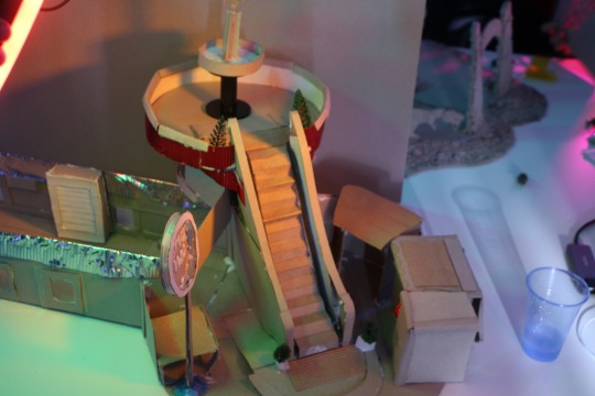
The new assignment involved making a card board model based on the movie “terminal”. However the task also asked the students to interpret the films in their own style. Before we gotten to making the medium, there had to be a mood-board first. It is to test the feel of what direction is suited for the set design and elements that would come into later. For the mood-board that I did. It was liminal spacing, malls, airports and most of all Burger King. A liminal space is often places that are big, empty, pleasant yet eerie. It could be things like an arcade or a long hotel lobby that evokes nostalgia but there is something off about the locations. Since the setting was an American airport, it was important to emphasis the attitudes of the US. The United States attitudes are typically know for exaggerated sizes and capitalism. So, an airport would make sense and encapsulates the sense of feeling small, lost and trapped within. The reason why the Burger King and the shops are essential was because it is where the main character problem solves, fails, succeeds, develops, etc.
Another step that was needed was the concept art, planning out the structural layout. The group decided that the base would be round, with a second floor that had an escalator. It was to be set up like a shopping area but feeling like it was congested. Then the statues and plants are there to make it look a cooperate way of making the place feel lively.
0 notes
Text


Concept art: The concept art was originally going to be part of the storyboards. However, There were time restraints that made it unrealistic to complete. So the idea was scrapped and made into detailed concepts instead. The two I picked for the pieces were to show conflicting emotions to one another. One showed rage and fear from being stuck in an airport by himself. While the other shows sadness, though there is an underlying hopefulness. It has harsh reds, greens, and yellows for picture A to make the mood feel scary. The yellow has a caution for what's in there. It's red, signifying the dangers of walking through the empty and abandoned part of the terminal. A sickly green represents the uneasy feeling of being away from his family, not knowing whether they are alive. The only clear thing is the light shining through the dingy halls and him just standing away from the camera. Not only does he not understand his feelings, but the audience does too. Even if the person doesn't understand, they still worry about the main character.
In Picture B, however, yellow is used differently alongside red. It has a much more inviting emotion paired with the cold blue. Despite the loneliness, there is that hope that things will get better. Yellow is now used for the determination of the face of injustice. Red uses luck and confidence as things turn around for him, with the help of compassion and never giving up on a challenge. The blue, on the other hand, is still the existence of a lonely journey. At this point, he still has no friends, but more good things will come his way.
A little for the back story of the painting process itself, I had painted over the picture to save time from sketching and understanding where the light needed to be placed. I used an oil paint texture to give a semi-real feel to match the film's theme. The only one that was slightly edited was picture B. The lighting was too strong, so I duplicated the image and made it bluer, then turned down the opacity of the previous image.
0 notes
Text

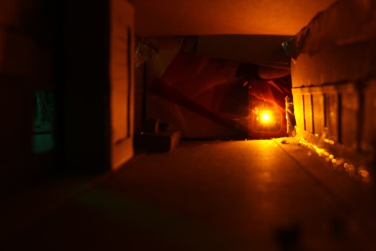


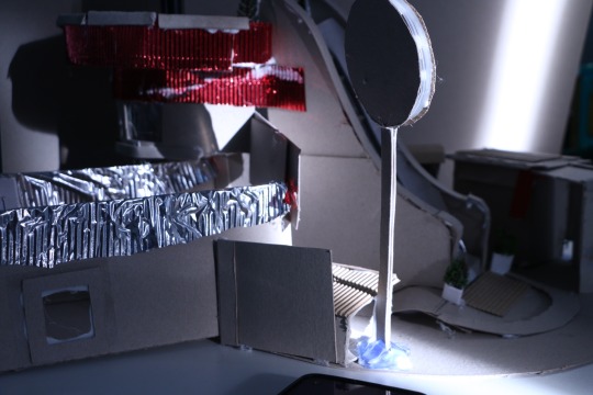
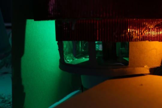
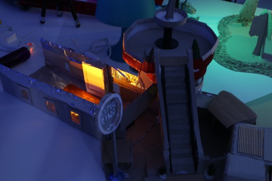
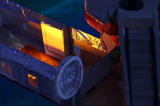
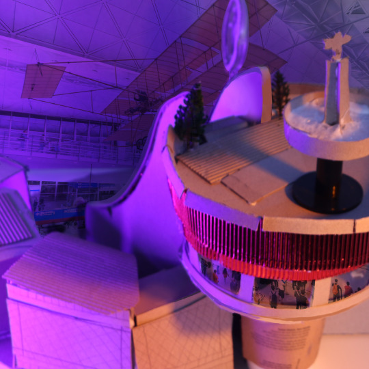
Card board model Photoshoot: It was finally time to do the photography work but before we took the pictures. Me and Liam put on last minute touches to make sure it was presentable for when we draw them. After we put on those touches, we had the teacher show us how to use the cameras and lighting. Liam was mainly the one doing the camera work, Craig brought in his ring light, me and scott using our flash lights for the colour filters. The green was used to make it look sickly and clinical, almost like a disgusting feeling from being in airport all time. But it was also used for a lighter feeling with the soft yellow for a fresh new hope found when success hits. We also took advantage of the natural light to show morning as well. However when compare it to 9, 10 and 2 they give completely different feelings. With number 2 it gives a scary feel in the long dark hallway because the person is completely alone with no else around if they get hurt and no family. Then with number 9 it is a creepy night time area and 10 gives sad hope with the blue. When we did the pinks, blues and purples; it was to make it feel like corporate fun but it is an airport. The strongest ones are 10 and 2 because they have the clearest and strong shadows for effect. The least strongest was number 7 because the light doesn’t pop as much compared to others.
0 notes
Text


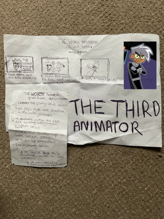
The research animator: For this task, the assignment asked that we choose an animator and make a 30 second clip of their life or work. However the animator in question can’t be an obvious choice. The first option was to do the creator of food fight by Lawrence Kanasoff, I ended up with not going with him because he didn’t have enough information, it was mostly about the works he did and I wanted to know how one gets there to create the most awful film. The second option was the creator of Ren and Stimpy, though the story behind the creator was too dark of a subject to touch for a 30 second video. Lastly was Butch Hartman, he had just enough information and he was not as dark. I wanted to cover the worst animators for my assignment because it didn’t say specifically that you had to liked them and I thought it was an interesting idea to do terrible artist. To summarise what he did, he had ended up scamming people after he had left Nickelodeon with subscription service that was $200. I started working on the story boards and little animations early on, though I began questioning again on what I wanted to cover. I looked at the brief again and it said “animators that inspire you.” I thought again on that sentence and thought “is it a matter of being inspired to learn, be wary and do better than the previous animators actions or be inspired by the body of work disturbed yet loved pieces?” So the next thing I might do for my project is choose the final animator.
Sources and links:
www.YouTube.com (n.d). The Fairy Odd Scams Of Butch Hartman. Corporate Casket. [online] Available at: https://YouTube.be/sxnj0ZWWVB [Accessed 14 Nov.2022]
https://www.imdb.com/name/nm0440415/?ref_=nv_sr_srsg_4
0 notes
Text
The Reel and The Feedback: The lecture had us show our own and everyones so that we can critique each other’s work. With mine it’s most positive feedback was the paper cut animation. They liked the spider being 3D, the background and the style. However there was lots that needed to be improved upon the others. The weakest one was the ball animation, they gotten quite confused wether the ball was floating because it didn’t have a base line and didn’t concave weight. With the head turn and walk they stutter because it didn’t have an extra pose.
0 notes
Text
Walk cycle: the lesson talked about the different types of walks. For example saunter, stroll, meander, stagger, trudge and etc. This exercise was to get us to think about all types of walks and we had to talk one another about the walk cycle we gotten from a generated definition. Mine was a saunter, that would mean walking slowly with a purpose. The lesson goes on talking at length about how the cycle is a lot more complex than one must think. Once I had begun animating it, it was difficult figuring how a saunters works. I had gotten the posing right but there was an ingredient that was missing. It was more of a skip than a walk, however one book that is famously know to animators is the book. They say “its all in the timing”Williams, R. (2009). Director of animation ‘who framed Roger Rabbit’ The animator’s survival kit : expanded edition. London: Faber And Faber. But that’s what is confusing me, it can be tricky figuring it out.
0 notes
Text
Bouncing ball: The first method was to use a drawing reference for the ball and then testing out with digital animation on iArtbook. Once satisfied with the results, I took it to the dragon frame room to do traditional. Kept the same method as before however the problem came in when the ball was reaching the end. The camera wasn’t setup correctly and was to close the paper. It ended up with the edge of the paper being shown but couldn’t just crop it out. Mostly content with the product, though would improve the camera work of the sizing and scaling.
0 notes
Text
Head Turn: the task had involved making a head turn of the partners next to us. So I took some photos and simplified the person next to me at the time, I had used Filmeroa on my tablet to edit. The head turn was easy to cut out though the problem was that it was moving too quickly. It also jittered when it came to the back of the head when spinning. What was good about was the consistency of how it kept its shape.
0 notes
Text
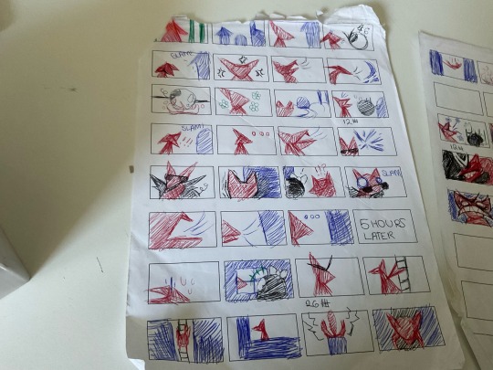

We had to do the story board for the three little pigs and had to do a take of our own. The story goes that the wolf was walking around the woods and stumbles upon three little houses. He lives in the forest, so the wolf goes to greet the new neighbours. The wolf goes to knock on the house of hay, when the pig says some awful things his way. Instead of being sad forever, he is more annoyed than ever. So he huffs and puffs and blows the house down. He roasts the pig on a open fire, then comes back the next day with a optimistic smile. He knocks on the house of sticks. The wolf happily yips away to the nervous little piggy and eventually slams the door. The wolf is shocked but calmly does the same thing to pig as the last one. He walks way from the explosion and this time turns the pig into a leather jacket. The last one, he was more pessimistic. He knocks on the house of bricks, it is then revealed that it is his EX. He panic’s and he starts puffing but it isn’t working. He gives up trying to blow it down as the pig laughs. He finally had enough, he gets the latter, climbs up and wiggles his way in. Before he knows it, he falls into the fire. The pig stare at the burning body then eats whats left of the wolf. The end
After that we had to choose which story board we were going to remake. I chose to do number 26 because it didn’t concave rage all that well or have comedic effect.
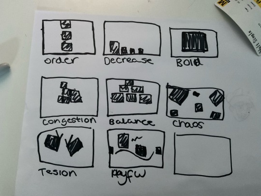
We also had the black squares exercise, where we couldn't change the squares. So we place them in different places and ways all on what the theme is.
0 notes