
Last Seen Blogs
fanak
Day Before Yesterday, I Saw A Rabbit
thatdeadmikey
This world is rotten
urheartsamess
you raise me up

ewwww-what
I cast fireball.
Text
References
Apartamento Magazine. (2021) Apartamento magazine pages. [Online Image.] Available at: https://www.apartamentomagazine.com/ (Accessed: 22 May 2021).
Art Bead Scene Studio. (2018) The Secret Lives of Colour pages. [Online Image.] Available at: https://www.artbeadscenestudio.com/book-reviewthe-secret-lives-of-color-by-kassia-st-clair/ (Accessed: 23 April 2021).
Arthipo. (n.d.) Andy Warhol Marilyn Monroe portrait. [Online Image.] Available at: https://www.arthipo.com/andy-warhol-shot-marilyns.html (Accessed: 23 April 2021).
BBC. (2020) Community is Kindness billboard. [Online Image]. Available at: https://www.bbc.co.uk/news/uk-england-london-52315966 (Accessed: 13 April 2021).
Britannica, The Editors of Encyclopaedia (2020). Rorschach test. Encyclopedia Britannica. Available at: https://www.britannica.com/science/Rorschach-Test (Accessed: 20 April 2021).
Canva. (n.d.) Scarlet red. [Online Image.] Available at: https://www.canva.com/colors/color-meanings/scarlet/ (Accessed: 23 April 2021).
Carlos Vigil. (2008) Thank you have a nice day packaging illustration. [Online Image.] Available at: https://www.behance.net/gallery/132772/THANK-YOU (Accessed: 22 May 2021).
Chelsea and Westminster Hospital. (2020) NHS rainbow logo. [Online Image.] Available at: https://www.chelwest.nhs.uk/about-us/organisation/our-way-of-working/equality-diversity/nhs-rainbow-badges-initiative (Accessed: 23 April 2021).
Cleveland Clinic. (2020) Color Blindness. Available at: https://my.clevelandclinic.org/health/diseases/11604-color-blindness#:~:text=Color%20blindness%20%E2%80%94%20also%20known%20as,missing%20or%20not%20working%20correctly (Accessed: 20 April 2021).
Daily Mail. (2015) Disney’s Cinderella dress change scene. [Online Image.] Available at: https://www.dailymail.co.uk/femail/article-3283677/Bibbidi-Bobbidi-Boo-Woman-creates-clever-Cinderella-costume-transforms-wearer-pauper-princess-just-speedy-spins.html (Accessed: 24 May 2021).
Design Sponge. (2013) Japanese saddle stitch example. [Online Image]. Available at: https://www.designsponge.com/2013/03/bookbinding-101-japanese-four-hold-binding.html (Accessed: 24 May 2021).
Digital Synopsis. (n.d.) Red colour chart. [Online Image.] Available at: https://digitalsynopsis.com/design/color-thesaurus-correct-names-of-shades/ (Accessed: 23 April 2021).
English History. (2015). Mary Queen of Scots. [Online Image.] Available at: https://englishhistory.net/tudor/relative/mary-queen-of-scots/ (Accessed: 23 April 2021).
Genius. (2015) Halsey Colors cover. [Online Image.] Available at: https://genius.com/album_cover_arts/348922 (Accessed: 27 April 2021).
Healthline. (2018) What is synesthesia? Available at: https://www.healthline.com/health/synesthesia (Accessed: 23 April 2021).
Hubblesite. (2019) The electromagnetic epectrum. [Online Image.] Available at: https://hubblesite.org/contents/articles/the-electromagnetic-spectrum (Accessed: 23 April 2021).
Hype Beast. (2020). Pangaia World Oceans Day collection blue outfit. [Online Image.] Available at: https://hypebeast.com/2020/6/pangaia-world-oceans-day-collection-details (Accessed: 13 April 2021).
I Weigh. (2019) Brighton pride love wins drawing. [Online Image.] Available at: https://www.instagram.com/p/B0skJ_wHre1/ (Accessed: 20 March 2021).
Lesley University. (n.d.) What the Stroop Effect Reveals About Our Minds. Available at: https://lesley.edu/article/what-the-stroop-effect-reveals-about-our-minds#:~:text=First%20described%20in%20the%201930s,name%20of%20a%20different%20color (Accessed: 20 April 2021).
Madhappy. (2020) Three pastel sweatshirts. [Online Image.] Available at: https://www.instagram.com/p/CJocUoej4Ly/ (Accessed: 19 March 2021).
Nasa Science. (n.d.) Visible light spectrum. [Online Image.] Available at: https://science.nasa.gov/ems/09_visiblelight (Accessed: 23 April 2021).
Neuroscience For Kids. (2020) Stroop Test example. [Online Image.] Available at: http://faculty.washington.edu/chudler/words.html (Accessed: 23 April 2021).
NHS Key Worker Windows. (2020) NHS rainbow drawings in window. [Online Image.] Available at: https://www.instagram.com/p/CAvdHdZA1Na/ (Accessed: 19 March 2021).
NHS. (n.d.) Charles Bonnet syndrome. Available at: https://www.nhs.uk/conditions/charles-bonnet-syndrome/ (Accessed: 23 April 2021).
SoapyCub. (2015) Emperor’s New Grove tent scene. [Online Image.] Available at: https://www.youtube.com/watch?v=rPtduh2h5Os (Accessed: 24 May 2021).
St Clair, K.(2016) The Secret Lives of Colour. 1st ed. London: John Murray Press, pp.13-15, 135-139.
Stir World. (2020) Blue room at children’s hospital in Thailand. [Online Image.] Available at: https://www.stirworld.com/see-features-integrated-field-places-a-yellow-slide-inside-ekh-children-s-hospital-thailand (Accessed: 19 March 2021).
Swallow Tail. (n.d.) Perfect binding paperback book. [Online Image.] Available at: https://www.swallowtailprint.co.uk/news/articles/post/161-why-use-perfect-binding (Accessed: 24 May 2021).
Teuta Matoshi. (2021) Pastel pink gown back view. [Online Image.] Available at: https://www.teutamatoshi.com/collections/all-products/products/pastel-ethereal-gown (Accessed: 19 May 2021).
Teuta Matoshi. (2021) Pastel pink gown top half. [Online Image.] Available at: https://www.teutamatoshi.com/collections/all-products/products/pastel-ethereal-gown (Accessed: 19 May 2021).
Teuta Matoshi. (2021) Purple-pink rose sleeve dress back view. [Online Image.] Available at: https://www.teutamatoshi.com/collections/all-products/products/eternal-rose-gown (Accessed: 19 May 2021).
The Courier. (2016) Drawing of two babies wearing pink and blue. [Online Image.] Available at: https://www.thecourier.co.uk/fp/news/scotland/325310/pink-girls-blue-boys-investigating-colours-gender-stereotyping/ (Accessed: 23 April 2021).
The Guardian. (2017) Rorschach test doctor with patient. [Online Image.] Available at: https://www.theguardian.com/science/2017/feb/21/rorschach-test-inkblots-history (Accessed: 23 April 2021).
The Guardian. (2017) Rorscharch test inkblot. [Online Image.] Available at: https://www.theguardian.com/science/2017/feb/21/rorschach-test-inkblots-history (Accessed: 23 April 2021).
The Guardian. (2019) Older man surrounded by rainbow flags at Brighton parade. [Online Image.] Available at: https://www.theguardian.com/world/gallery/2019/aug/03/brighton-pride-2019-the-annual-lgbt-parade-in-pictures (Accessed: 23 April 2021)
The Happy Reader. (2020) Page with dusty hand of The Happy Reader magazine. [Online Image.] Available at: https://www.instagram.com/p/CG2PXmBgpWl/ (Accessed: 22 May 2021).
Theory Test. (n.d.) Traffic light sequence. [Online Image.] Available at: https://theorytest.org.uk/traffic-lights/ (Accessed: 23 April 2021).
Thought Co. (2020) What do blind people see. Available at: https://www.thoughtco.com/what-do-blind-people-see-4153577 (Accessed: 23 April 2021).
Vincent Van Gogh. (n.d.) Starry Night painting. [Online Image.] Available at: https://www.vincentvangogh.org/starry-night.jsp (Accessed: 23 April 2021)
Waterstones. (2021) The Secret Lives of Colour book cover. [Online Image]. Available at: https://www.waterstones.com/book/the-secret-lives-of-colour/kassia-st-clair/9781473630833 (Accessed: 21March 2021).
WGSN . (2021) Mental Wellness mood board. [Online Image.] Available at: https://www-wgsn-com.ezproxy.bcu.ac.uk/fashion/article/87643 (Accessed: 13 April 2021).
WGSN. (2021) Activism mood board. [Online Image.] Available at: https://www-wgsn-com.ezproxy.bcu.ac.uk/fashion/article/87643 (Accessed: 13 April 2021).
WGSN. (2021) Colour for Good mood board. [Online Image.] Available at: https://www-wgsn-com.ezproxy.bcu.ac.uk/fashion/article/87643 (Accessed: 13 April 2021).
WGSN. (2021) Nourishing Nature mood board. [Online Image.] Available at: https://www-wgsn-com.ezproxy.bcu.ac.uk/fashion/article/87643 (Accessed: 13 April 2021).
WGSN. (2021) Radical Optimism mood board. [Online Image.] Available at: https://www-wgsn-com.ezproxy.bcu.ac.uk/fashion/article/87643 (Accessed: 13 April 2021).
WGSN. (2021) Social Distancing Safety mood board. [Online Image.] Available at: https://www-wgsn-com.ezproxy.bcu.ac.uk/fashion/article/87643 (Accessed: 13 April 2021).
WGSN. (2021) The Emotional Power of Colour. Available at: https://www-wgsn-com.ezproxy.bcu.ac.uk/fashion/article/87643 (Accessed: 13 April 2021).
Wikipedia. (n.d.) Holtzman inkblot card. [Online Image.] Available at: https://en.wikipedia.org/wiki/Holtzman_inkblot_technique (Accessed: 23 April 2021).
Wikipedia. (n.d.) Synesthesia. [Online Image.] Available at: https://en.wikipedia.org/wiki/Synesthesia#:~:text=Synesthesia%20or%20synaesthesia%20is%20a,experiences%20are%20known%20as%20synesthetes (Accessed: 23 April 2021).
0 notes
Text
Evaluation
Throughout this project, I aimed to create a body of work to enhance my next steps onto my degree programme. I had to choose a subject that would sustain the 9-week project. I chose to focus on colour and the perceptions that people derive from different colours. Colour is a very broad subject area but the importance of it is constantly overlooked. Therefore, I wanted to research into the different aspects surrounding colour before creating my own work around it. I was inspired to do this through the book The Secret Lives of Colour by Kassia St. Clair. In the book she dives into many shades of colours and talks about studies or historic moments that involve the colour, shedding a light on how much it impacts day-to-day life. This book fascinated me, so I decided I wanted to create my own body of work surrounding colour.
I researched many things involving colour to broaden my understanding of how important it is. I investigated tests involving colour, such as the Stroop Test and the Rorschach test. I looked into music that used colour as metaphors to tell stories through the lyrics, as well as looking into colour in day-to-day life and colour stereotypes. I conducted interviews with six people about their personal perceptions of colour. By researching these different aspects, it showed me how much colour influences everybody everyday without us even noticing, as well as how people perceive colours in very different ways.
To follow up on my research, I decided to create illustrations that displayed the many different perceptions of colour. I chose to do this as I thought it was fascinating how people had the same perception for one colour, but a completely different perception for another. I wanted to share this concept with others to show them how much colour influences us.
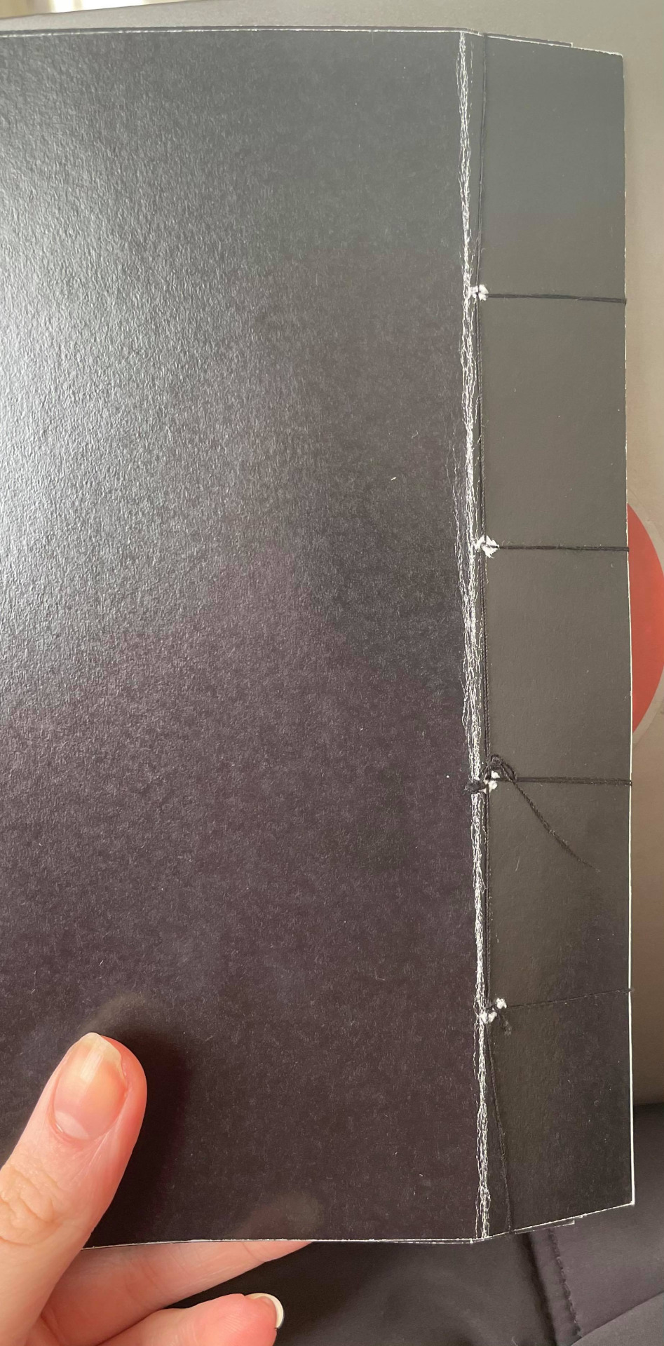
I created hand-drawn pieces and transferred them into Adobe Photoshop to produce clean and precise illustrations that communicated the information people had given to me in their interviews. Through creating these illustrations, I have learnt how to use a singular tool, the brush tool, to create complex and beautiful drawings, as well as learning more about Adobe InDesign. I did this through creating a digital sketchbook to document my sample process, as well as setting up the structure of my final piece. I, also, learnt how to create a binding on a book with a simple needle and thread.
In my opinion, my experimentation through my project was very successful as I created a beautiful and well thought out piece at the end. However, to refine my experimentation, I could have explored more options with each illustration to ensure that I am portraying people’s perceptions of colour in the best way possible. For many of the pages, my first idea for the illustration was the one I used. If I had explored more ideas, I could possibly have created even better illustrations.
My plan for this project was to conduct a good amount of research around different subject areas of colour before I even thought of what to do for my final piece. This gave me an amazing understanding of the importance behind colour and helped me to create ideas later in the project. This, also, helped me to inform my interviewees as to why I was conducting the interviews with them and broaden their understanding of the importance of colour as well.
One problem I had in this project was developing an idea for the illustration for the colour purple. When conducting the interviews, each person said a very different perception on the colour and not one perception was the same. Therefore, in comparison to the other colours, there were many things I felt I had to include in the illustration to show all of these perceptions. This became very overwhelming so to combat this, I decided to break each perception down. Using each perception of purple, I thought of one object that could represent their perception as a whole. For example, one person said that they thought of sleeping because lavender is used in sleep sprays for when people have trouble sleeping. For this I chose to include a bed in the illustration. I did this for each interview before putting the objects together to create the final illustration.
The development process of my project was very thorough and time-consuming but made me well-informed on my subject area. This gave me the tools to create a full small book of perceptions of colour told through visuals.
I am very pleased with the way my final outcome developed. The pieces came out exactly how I envisioned it and created a very aesthetically pleasing and beautiful book. The inclusion of snippets of the interview gives the viewer an idea of what the illustration is about, but also gives them the opportunity to come to the conclusion themselves. One way I could further develop this piece would be to make the binding of the book cleaner. Although I am happy with the way the binding made the book flow together, it does look a little bit messy. To combat this I would create holes using a hole cutter rather than poking a needle through. This would take away any excess paper that is raised around the hole to give it a cleaner finish.
0 notes
Text
Personal Brief
Mia Swetnam
Fashion and Textile Foundation
Fashion Business and Promotion
The Story of Colour
Aim:
An exploration of colours through multiple avenues of everyday life and history, for a focused audience.
Brief Statement:
The aim of this project is to create a form of media, such as a magazine or video, surrounding the one subject about colour, whether that be the history or perceptions of it. This media will capture the constantly developing world around colour as well as it's history, creating a space for consumers to broaden their minds on the subject. Developments of this journey will be displayed in a digital sketchbook, as well as a written blog which will go into further detail about the process.
Objectives:
- Create a form of media featuring a visual or written display from interviews, surveys and research
- A reflective blog of the journey
- A digital sketchbook which will visually communicate the development process
- Conduct adequate research to be fully informed on multiple subject areas of colour to ensure a well thought out final piece
0 notes


Text
Binding
For the physical print of my work, I had to look into different types of binding to see which would be most appropriate for my work.
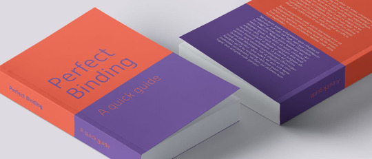
The first I looked into was Perfect Binding. This style of binding tends to be used for pieces with a significant amount of pages, such as a magazine or a book. It creates a very clean and polished finish to the piece. Although the look of the binding would work for my final piece, I felt as though the amount of pages in my book would be too small for it. Also, as my pages vary in size, I thought the finish of the book would not look as clean as a standard book would, as the smaller pages may struggle to be turned with the tight binding.
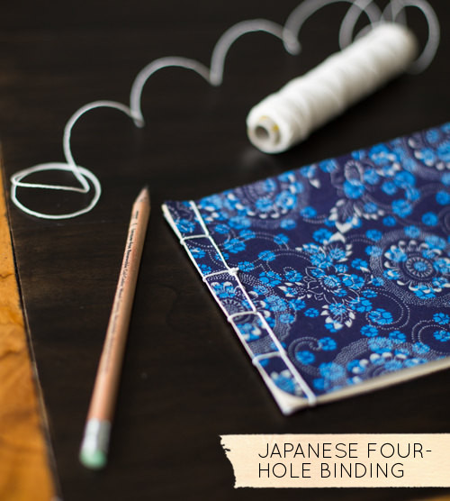
The second type of binding I looked into was Japanese saddle stitch binding. This is created by sewing thread through the pages to create a book. Pages are stacked on top of each other and held together by the thread. This style of binding was more appealing to me as with the different page sizes of my book, It would hold them together very neatly without there being trouble to turn the pages.

When printing my work, I added a black border to the left side of the pages. I did this so there would be extra room for me to create my saddle stitch.
I used black thread to create the Japanese saddle stitch on my book. I created four holes in equal sections down the black border and then thread the needle through the holes to create the binding.
When opening the book, the pages worked perfectly with the saddle stitch and there was no disruptions with the pages when looking through the book.
0 notes
Text
Content and Colour Pages
For my mini book/ magazine, I wanted to include a short content page which explained what the book was about. It would be a simple paragraph explaining the concept of the book, which is to display different perceptions of colour, as well as explaining how I conducted interviews with people about these perceptions.

My first idea for the page was to create an orange page, as that was the colour I cut out of the illustrations. To continue with the handwritten theme that carries throughout my book, I handwrote the paragraph. However, it looks very messy and the overall page didn’t fit well with the book.

I completed a second trial of the page and decided to use a font instead of writing it out. However, this did not change the fact that it did not fit in with my book. I decided to cut out the content page from the book, as the viewers would be able to infer from the interview pages that this book is depicting opinions of different colours.
The next set of pages I wanted to add to the book was a simple introduction to the colour. This would fill in the space between a previous illustration as well as creating a flow of the colour across a double page spread. I used a simple sans serif font for each colour and coloured the background the same shade as the interview page.
Although I wanted this page to be very simple, I felt as though it was too simply to be next to such detailed illustrations as well as the messy handwriting on the interview pages.

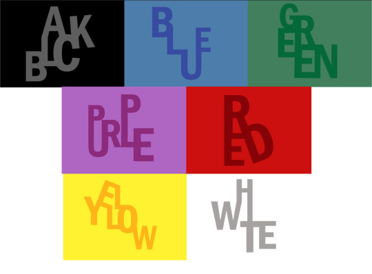
I chose to keep the same font but altered the composition of the letters. I arranged each letter of the colours to link to the next letter in the word. This still keeps the page very simple with minimal items on the page, but makes it slightly more interesting to match the aura of the other pages in the sequence.
0 notes
Text
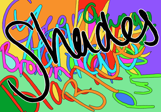
Front Cover
This is the development stages for the front cover of my book.
For my front cover, I wanted it to stand out from other standard book covers. Therefore, I wanted it to be slightly messy but still relating to my theme.

Using the brush tool with a stylus, I wrote out names of colours in different directions across the page. Noticeably, the colour of the font does not match to the word I have written. I did this to include some influence from the Stroop Test. The Stroop Test was created to test how the brain processes information. The participant is asked to say the colour of the word, rather than the name of the colour presented. For example, if the word blue was typed in a red font, the person would have to say red rather than blue. This disrupts the way the brain processes information so the reaction time would be slower than if they were to say the word.
When researching this test, I found the results particularly interesting, so I decided I wanted to use it in my final piece. Although it is a subtle way to pay homage to the Stroop Test, it is still eye-catching to the viewer as the colours of the writing do not match the word that is written.
In the blank spaces in between the writing, I filled them with the colours used the write out the colours. This created a morph of colours which would stand out against a standard book.
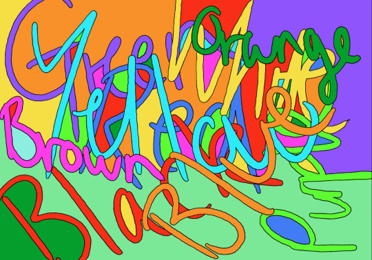
I added an outline to the words to create a cleaner finish on the words. By doing this it made the words more legible so that the viewer can see the words clearer.


The name of my mini book/ magazine is ‘Shades’. I chose this name as shades refers to the different colours within primary and secondary colours. For example, lilac is a shade of purple. I thought that the title fit with the theme of the book as it is associated with colour.
I trialed four different fonts to use for my title page. I used present fonts and then one in my own handwriting. When looking through the fonts, I wanted to find a thick font that would stand out against the bright and cluttered background of the page. I found three different fonts that stood out against the background. I trialed each one against the background but the contrast between the fonts and the clutter of the background did not mix well. Therefore, I decided to continue to use my own handwriting to use as the title. I used black colouring for the title as it would stand out against the bright background and would draw the viewer’s attention to it.

To complete the front page, I outlined the title with white. This made it jump out against the background and made the title look more polished, as the outline did with the names of the colours in the background.
0 notes
Text
Interview Pages
In my mini book/ magazine, I decided that I wanted to include pages with small quotes from the interviews I had conducted. I chose to do this as it will give context to the illustrations that I have created and will allow the viewer to spot all the different aspects of the illustrations.
To make the book more interesting for the viewer, I decided to change the size of these pages. I chose to make them one third of the width of the illustration but the same height. These pages will be placed before the illustration pages, so that a big portion of the illustration is visible when looking at the page. This gives a better experience for the viewer as it adds variation to the work.

My first trial was based around the quotes from the colour yellow. I started by choosing a simple bumblebee yellow as the background. I chose to use a typewriter font for the quotes as it is a very simple font, but is not as standard as a comic sans or calibri font. When placing the quotes on the page, I attempted to use the same gap in between the quotes as well as around the perimeter of the page.
The font of the page did not fit the look I was going for. As all of the illustrations were created by hand, I thought that having such a formal font did not fit the overall theme of my work.
I changed the font and decided to write all of the quotes in my own handwriting. I decided to do this as it is real people who have given these perceptions of the colour, so by having handwritten quotes, it makes them seem more personal. Also, by having the pages as quite messy and disproportioned, it makes the writing stand out against the writing used in any other book. No other book is going to have the same type of font/handwriting as mine so it adds something unique to the book. Personally, I think it adds character to the book rather than it been flat and formal text on a page. It looks as though the interviewees have actually wrote these words and phrases themselves, rather than being polished for a book.
0 notes
Text
Black Illustration
This is my development process for my black illustration page.

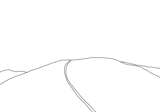
This is my first drawing of my illustration idea for the colour black. The most common things mentioned in the interviews were funerals and gravestones, so I decided that this needed to be included in the page. I drew a hill with multiple designs of gravestones covering it. At the bottom of the hill, I drew a hole and a shovel with a coffin at the side of it. This was obviously to symbolise the word funeral that was used in the interviews.
Another thing mentioned was spiders, so I drew two spiders at the side of the page. However, I did not like the look of having the spiders in the illustration as it seemed very cliché to put in. I dismissed adding the spiders when I created the new and improved drawing.
Oblivion and black holes were mentioned in the interviews. Oblivion is the thought of being unaware of what is happening around you which leads to the feeling of nothingness, which links to a black hole. A black hole is a space where gravity is so strong that everything around it is sucked into it and there is no suggestion as to where the objects go when they are pulled into a black hole. It could be that the things live in the black hole, they are destroyed or transported to somewhere else. This links to the nothingness as it is possible that once something is submerged into a black hole that that thing does not exist anymore. I wanted to include this in my illustration as oblivion and black holes are very fascinating to me and was a very dark but original answer that was given in the interviews.
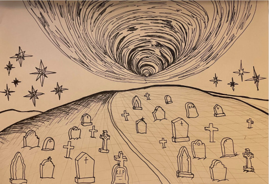
This is my final drawing of the black illustration. I changed the shaping of the hill to fill more of the centre of the page. I did this so that I could draw the black hole over the top of the hill rather than to the side of it. I added more designs of gravestones to the hill, as well as stars to the sky surrounding the black hole. One person said that black reminds them of a pitch black midnight sky with tiny stars littered around it. Another said that it reminds them of the night sky because they like to take walks at night to calm themselves. By adding the stars to the sky, it incorporates both of these answers into the illustration.

The first part I drew in photoshop was the hill. I used the brush tool to draw the outline and to colour it in. I used a light shade of grey for the majority of the hill, with some dark shadows around the sides and on the middle of it. I used a darker grey for the parts of the hill behind the main section to create levels in the page.
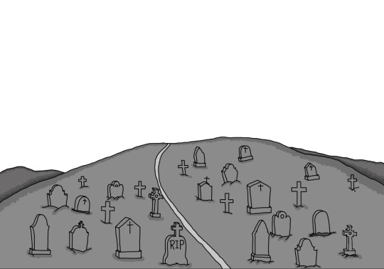
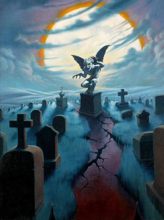
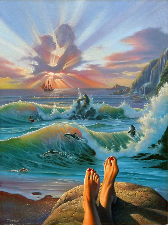
The next area I added was the drawings of the gravestones. For the designs of the gravestones, I took inspiration from a piece from Jim Warren. It is a piece of a graveyard with the focal point being a statue of a gargoyle on a stand. To create my gravestones, I used some of the designs from this piece to draw onto my work.

I then coloured the gravestones in with a dark, cool-toned grey. Most gravestones are this colour, especially when they are older and deteriorate. The colour I chose is similar to the colour in the Jim Warren used for the gravestones in his piece.
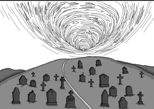

I added the drawing of the black hole. Although the object is called a black hole, in order to get the details that I drew I coloured it with shades of dark grey. To create the circular hole in the sky, I alternated between two shades of grey to show these rings in the black hole. I added a dark grey in the background as well to show a dark sky that was mentioned in the interviews.
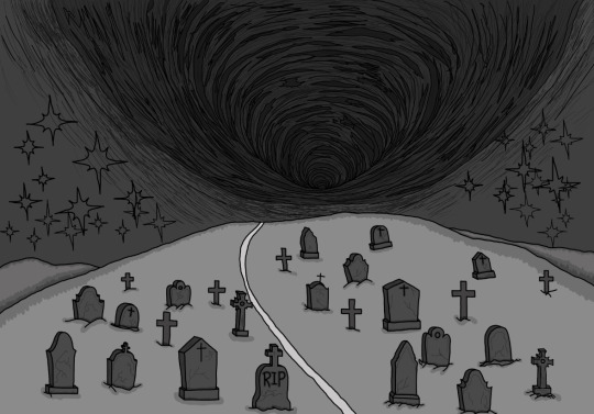
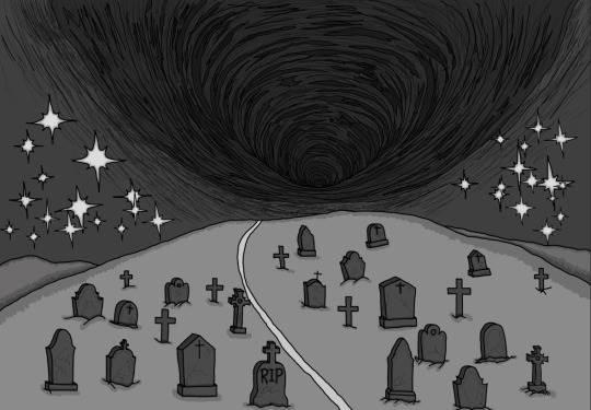
The last thing I added to the illustration were the small stars that were mentioned in two of the interviews I conducted. I used the brush tool to draw the overlapping stars and then coloured them in using a very light grey. I used a slightly darker grey to outline the light grey to make them have that sparkly look that is shown above.
0 notes
Text
White Illustration
This is my development process of my white illustration page.
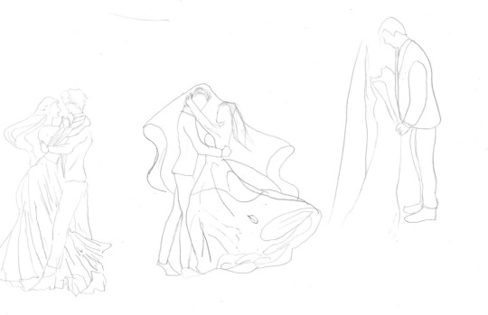
To start the process of designing the page, I drew some figures of couple in their wedding clothes. I wanted to include a married couple as weddings and weddings dresses were heavily mentioned in the interviews I conducted. Above are the first drawings of the couples I created. I liked the idea of having the couples mid-way through a dance, as at a wedding the first dance is a very important part.
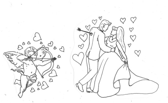
This is my final drawing of the bride and groom. As I previously stated, I wanted to couple mid-way through a dance to symbolise the first dance a couple share at the reception of their wedding. Another element I wanted to add in was the angel Cupid. Angels and Cupid were mentioned in the interviews I conducted so I thought that the angel of love, Cupid, would fit perfectly with the theme of a weddings. I drew Cupid with his bow and arrow surrounded by love hearts. I added an arrow in the back of the groom to indicate that he has been shot by Cupid. I then added a small cluster of love hearts around the bride and groom to match the aura of Cupid.
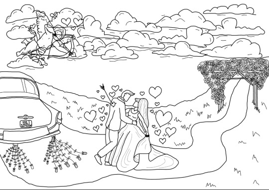
This is my final drawing of the white illustration. I added clouds around Cupid to display that he is up in the sky as angels are known to be. I placed the couple outside on a path. I added an arch of flowers at one end of the path. Many outdoor weddings include a flower arch surrounding the officiant and the soon-to-be-married couple.
On the left side of the path, I added a drawing of a car with a sign saying ‘Just Married’ on the back. In many films, there is a feature at the end of a wedding where a newlywed couple drives away in a vintage car with the ‘Just Married’ sign on the back and cans attached to the bumper to create sounds when they are driving away. I chose to include this in my illustration as it would reinforce to the viewer that this is set at a wedding outside. On the license plate of the car, I added the word yes spelt like Y35, like they would spell it on a standard license plate. This is supposed to represent the person saying yes when the person asks them to marry them, as well as the ‘I do’ said in the ceremony. Underneath the word yes, I wrote the word love spelt as 1OV3. Again, that it how it would be spelt on a license plate and shows the love between the couple and that Cupid has bestowed on them. Love was one word that was mentioned in an interview when talking about the colour white as well.
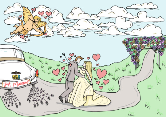
I used the brush tool to draw the scene as well as to fill it in with colour. For the colours on the drawing of Cupid, I decided to use gold-hued yellow. In my personal perception of Cupid, he would have a gold bow, gold wings and would be wearing gold clothing with a pale complexion. As he is one of the most well-known angels, I thought that he would be one of the most important. Therefore, in my opinion, gold would show his status as it is associated with richness.
I kept the colour of the car white and simply added small blocks of colour for the details on the car, such as the license plate and the lights. I added lines of a light grey around the boot of the car to show the curves in the framework.
0 notes
Text
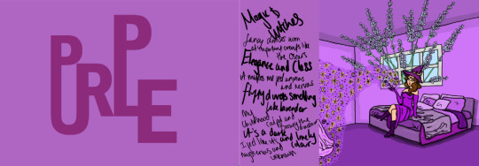
Purple Illustration
This is my development process for my purple illustration page.
When I conducted the interviews about different colours, every person had a different perceptions of purple, ranging from it being fancy and luxurious to symbolising illness. To create an illustration for this colour, I attempted to add small sections from each person’s perception to create an overall picture of the colour.
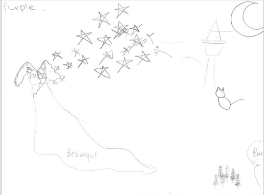
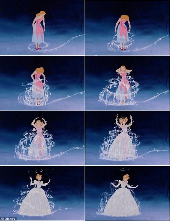
The first drawing I created focused on the magic and luxury that was mentioned. I drew a simply drawing of a witch in the right corner with a wand pointing to a dress. There are stars which show the magic travelling from the wand to the dress. My idea was for the dress to be similar to the story of Cinderella, where a fairy godmother changes her dress from a pile of rags into a beautiful blue dress. I wanted to show this transition to illustrate the magic from the witch. However, this illustration only used two elements of the interviews which would be cutting out big sections, so I decided to draw some other versions of it.


My next idea was to create a forest of big tall strands of lavender, which one person said they thought of when thinking of purple, with the witch peaking from them. I then added a bed, as one person said that purple makes them think of sleeping and their bed with lavender sleep sprays. I wanted to add a woman in a beautiful purple dress sleeping on top of it. This would link the sleeping with the elegant dresses that were mentioned by two different interviewees. Another person mentioned that purple reminded them of their childhood and things like Barney the Dinosaur. I wanted to add a small drawing of Barney the Dinosaur to incorporate this into the illustration.
Although this idea included more things mentioned in the interviews, the composition of the object did not work as well as I wanted them to. It seemed to be very mismatched and did not work well together.
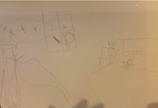
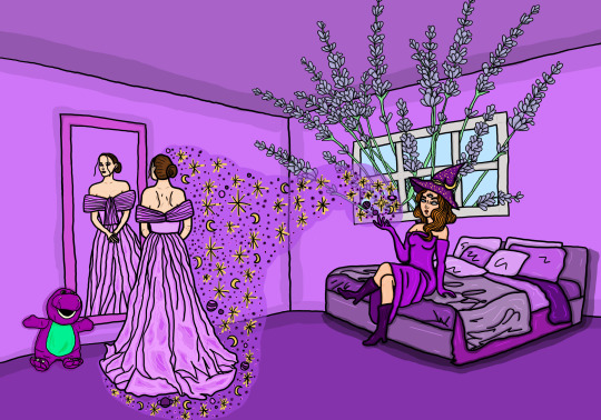
This was my final idea for the purple illustration. I decided to set it in a bedroom instead of outside. I chose this setting as it would clearly link back to the sleeping and the bed that one of the interviewees mentioned. I added a window with the witch peaking around with her magic wand. Then, I drew a cloud of magic that led to a woman looking at herself in a mirror. The woman is wearing a beautiful and elegant dress, linking to fancy and luxurious. I added a teddy bear of Barney the Dinosaur on the bed as well as a plant pot that contained lavender. This idea flowed much better together whilst including many elements from the interviews.
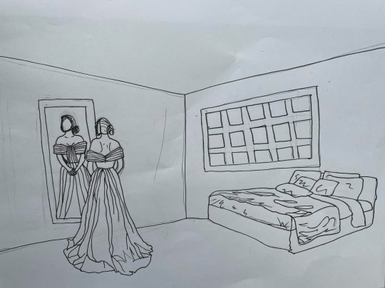
This is a more detailed drawing I created of the key details of the room. I drew the overall shape of the room, the window, the bed and the woman looking in the mirror.


My inspiration behind the drawing of the dress was from two dresses by Teuta Matoshi. The brand is known for making stunning dresses that would be seen in princess films. I chose two dresses that both fit different aspects that I wanted for my dress drawing. The first dress I chose was a purple-pink colour gown with pleats in the skirt and rose shaped sleeves. The skirt was the aspect of the dress that I wanted to use. The way it fell to the floor in pleats with a slight trail is exactly what I wanted my dress to look like. The second dress I chose was a pastel pink gown with petals attached at the waist and an off-shoulder sleeve. I wanted to take inspiration from the top section of the dress. The way a light mesh fabric is used to drape over the arms and across the bust is beautiful and elegant. Using both of these dresses as inspiration, I incorporated both elements to create the dress that I put onto the woman.


To start the illustration, I scanned the drawing into Photoshop and drew the room. I used three different shades of purple for the walls, the ceiling and the floor. I used a lilac for the walls, a violet for the floor and a shade in between for the ceiling. I then chose a darker colour for each section and used that to create a line next to the outline of the walls. This made the blocks of colour look more like a room setting rather than flat shapes of colour.

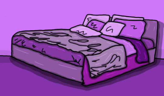
The next piece I added was the bed. Once again, I used the brush tool to create the outline. I added many shades of purple to the bed, separating the different pillows and blankets. With previous illustrations, I chose to use similar toned shades of the colour for the illustration as there seemed to be common themes running throughout each colour. However, this colour had many varying responses which seemed to be mismatched. By adding all tones and shades of purple, it is a subtle way to display this in the work.
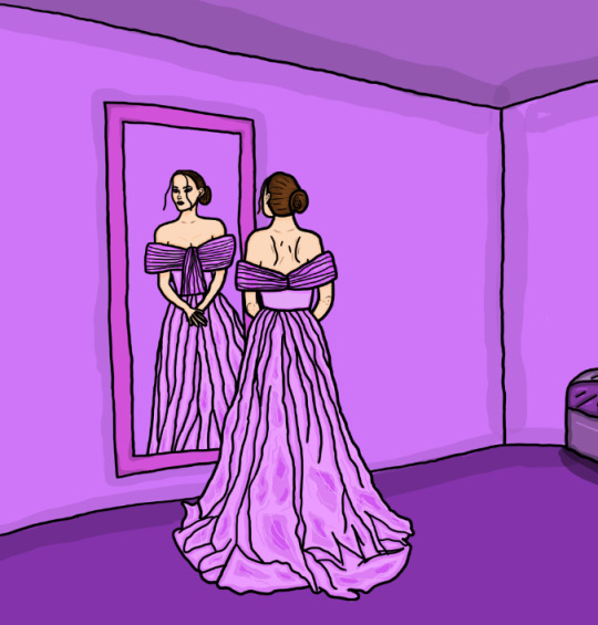
I drew the outline of the dress then coloured the dress in a lilac colour. I added detailing by using big sections of colour across the fabric on the bottom. I did this as when gowns are laying on the ground like the images of the Teuta Matoshi dress, there tends to be big creases and folds in the dress that create darker sections when the light hits it. To make the gown slightly more realistic, I added in these sections to the bottom.
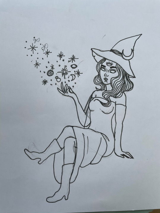
When I drew up the ideas for this illustration, the one consistent thing was the witch featured in all three. I decided to alter the placement of the witch to sitting on the bed rather than peaking through the window. As there is a lot of open space in this illustration, I thought that by adding the witch in the room it would make the illustration more full. I added a stereotypical witches hat, but made the drawing more modern by adding full locks of hair and a stylish dress to compliment it. I did not want to add a stereotypical witch with a simple hat and a big nose to my illustration as I thought it was too simple and overdone. Therefore, by changing the standard features and dress code of a witch, it made it interesting for the viewer. I chose to add the third eye onto the head to link back to the devil in the red illustration. In the red illustration, I drew a pentagram on the devil’s head as it is a sign of worshiping satanism. Witches have the same symbol, as witchcraft was seen as a sin and a sign of the devil. However, I did not want to include this in this illustration so I did not confuse the viewer of what this person is. I added the eye to allude to a supernatural being without the pentagram.


I added the witch into photoshop and used the brush tool to add the tones of purple on the hat and on the outfit as well. I coloured the drawings to represent the magic coming from her fingers the same colour as her hat. I did this to link the colours together to reinforce the view that the magic is coming from her. I then added the witch into the illustration, sitting on the bed.

The next object I added was the window. i changed the structure of the window slightly to the drawing. In the drawing, I felt as though I had drew too many sections of the window, so I changed it so that there were only six sections on it.

I originally wanted to incorporate the lavender into the illustration by having a simple lavender plant next to the bed. However, as I chose to move the witch to sitting on the bed rather than looking through the window, I decided to change the placement of the lavender. I drew the lavender stalks coming through the window and then coloured them in by using the brush tool. I thought this was an interesting way to include the lavender in the illustration as it is not overpowering the illustration, but is still a big part of it.


To finish the illustration, I added a cloud of magic surrounding the dress coming from the hand of the witch. I continued the trail of stars and planets into the cloud to ensure it is cohesive throughout. The last object I added was the small teddy of Barney the Dinosaur in the bottom left corner. Although it is not a big figure within the illustration, it is still eye-catching as it is something that a lot of people will recognise when they look at the page.
To improve this page, I would add more of the aspects from the interview. For example, I did not include the negative emotions or situations that were mentioned in the interviews, such as nervousness and illness. By not including these negative emotions, I missed two people’s perspectives of the colour, which is not what I intended to do when creating my pieces.
0 notes
Text
Green Illustration
This is my development process for my green illustration page.
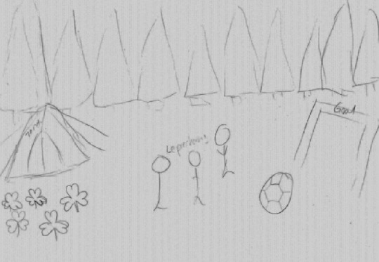
This is my first brief drawing of my idea for my green illustration page. Every person I interviewed mentioned nature or forests when I asked about the colour green. Therefore, I decided to set my scene in the forest. I wanted trees in the background as that was another object mentioned in the interviews. One person said that nature reminds them of going camping with their friends so I added a drawing of a tent to the left side of the drawing. Another person said that green reminded them of St. Patricks Day, leprechauns and shamrocks. I added small drawings of shamrocks which I wanted to be spread across the page when I drew it in Photoshop, as well as three leprechauns. Football pitches and football games were other things mentioned in the interviews, so I decided to link two of the things said by the interviewees together. To do this, I drew a goal and a football so that it would look at though the leprechauns are playing football, linking the two interviews together.
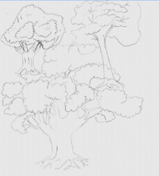
I created three different drawings of trees to see which style I wanted to use in my illustration. The first one I created in the left corner had too many curves around the bush of the tree, as well as being at an angle. The second tree I created on the right corner was too simple for me to use in my work as it did not have much emphasis on the leaves of the tree but more on the trunk. The last drawing I did was the best one. The trunk of the tree was big enough for it to look full but not too big as to draw attention away from the green of the tree. The general shape of the leaves of the tree was good but I did not like how many sections there were on it. Therefore, when I added the trees to the drawing, I would keep the overall structure of the drawings but merge the sections of the leaves together.


This was my final drawing of my green illustration page. I cleaned up the drawings of the trees and added small lines of detail to both the bush of the tree and the trunk. I decided to use a triangle shaped tent as it reminded me of the type of tents I saw in films when I was younger, such as in the film The Emporer’s New Grove. In one of the scenes there is a large purple tent that is similar in structure to the drawing I created.
I then added more detail to the drawings of the leprechauns by adding beards and hats to them. I decided to leave facial features out of the drawings of these figures as I wanted the focus to be on the whole scene rather than it surrounding the figures. I felt as though if I included facial features onto the leprechauns, it would put the sole focus onto them, rather than the different features of the illustration.


As I did with the previous illustrations, I scanned the drawings into Photoshop and used the brush tool to outline and colour them in. I used a lighter green for the trees in front and a darker green for the ones behind. This adds dimension to the illustration to make it look less flat. I added small lines of highlights onto the trees to make some sections protrude out more than others, adding even more dimension to the illustration.
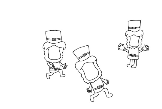

As with the trees, I used the scanned drawing to create the illustration of the leprechauns. I added a belt onto the hat to match the clothing they were wearing as it made the figures more cohesive. I used orange for the hair and beard are leprechauns are stereotypically ginger, as well as varying shades of green for the clothing. On the third leprechaun, I added goalie gloves as he is standing in the goal. This further shows that the leprechauns are playing a game of football.
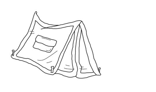

Creating the outline using the brush tool, I also added colour to the tent. Instead of the purple seen in the tent from Emperor’s New Grove, I used colours to match the theme of the page. I use cool-toned greens for the tent. I used these colours as it reminded me of the colours used in a camouflage pattern and that was mentioned within the interviews. I thought using the camouflage print would overpower the illustration so I decided to use the standard colours it it instead.
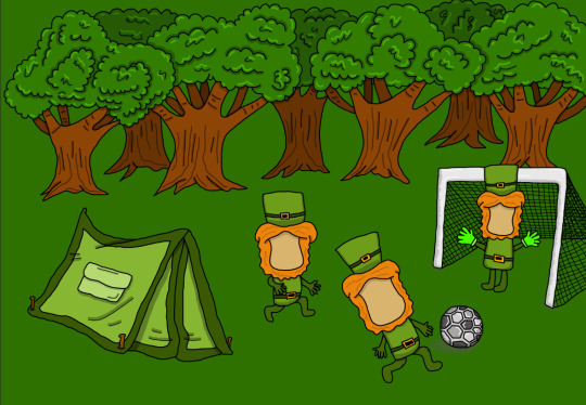
I then added the goal and football to the scene. When I added the goal, I decided I would rid the drawing of the posts that I created to bend towards the back of a goal. A standard goal at a football stadium does not have the post going towards the back of the goal and simply has a net instead, so I chose to remove them to make it resemble this.
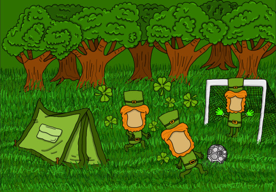
To finish the illustration, I used the pen tool with varying shades of green to create the texture of grass on the floor of the illustration. This further adds to the scene to symbolise nature and that it is set in a forest. Also, I added small shamrocks that surround the leprechauns, which would link pack to St. Patrick’s Day.
0 notes
Text
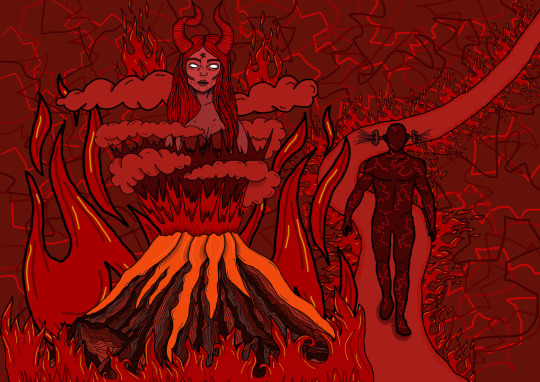
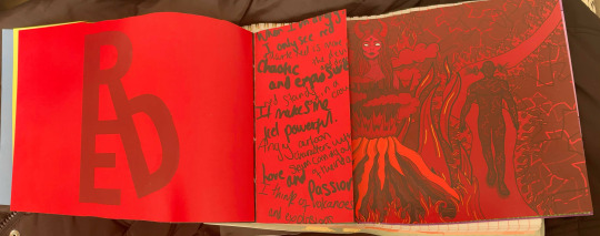
Red Illustration
This is my development process for my red illustration page.
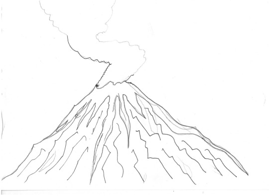
I started this page by drawing images of volcanoes. I wanted to include a volcano in this page as one person said that the colour red reminded them of volcanoes and the lava coming out of them. There were other things mentioned in the interviews that could describe a volcano, such as chaotic, explosive and hot. There is no control on when a volcano erupts, so it could be seen as chaotic, as well as it being very damaging to surrounding areas. It is explosive as it erupts lava, so it explodes from the volcano a hot molten liquid, linking another word to the volcano.
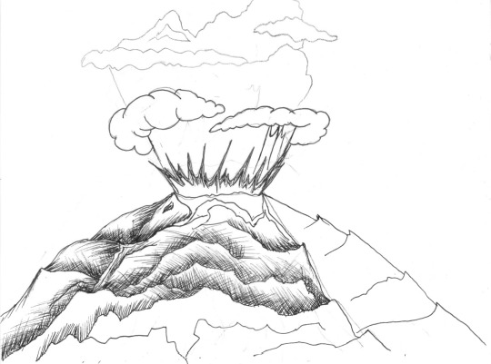
My first two drawings of the volcano were not capturing the look of a standard volcano. The first drawing I created had more of a resemblance to a mountain rather than a volcano, but did have the ridges going up through it that created the texture of it. The second drawing was too circular and soft to resemble a volcano, as the structure of it flowed together rather than being rigid and hard as a volcano should be. However, the explosion out the top of the volcano was closer to the look I wanted for the volcano. It explodes out of the top of the drawing rather than simply having smoke as the previous drawing does,
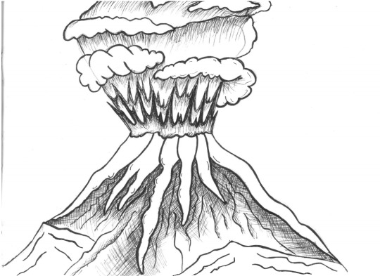
I combined the things I liked about the previous two drawings to create a whole new drawing of a volcano. It had the rigidness and structure of the first drawing with simple changes to the bottom section of the volcano, as well as the explosion out of the top of the volcano. I added lava running down the ridges of the volcano to add to the stereotypical composition of a colcano
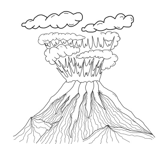
I used photoshop to trace and redraw the volcano. I added more prominent ridges in the structure by using long lines down the rock of the volcano, as well as making the smoke clouds above the volcano slightly more rounded. I did this to make the illustration look more graphic rather than a depiction of a real-life volcano.

To add colour to the volcano, I used varying shades of red to add to the rock. This added variation to the rocks and emphasises the ridges within the structure of the rock of the volcano. I used different shades of red to create the explosion out of the top of the volcano, as well as the smoke clouds around the explosions. I wanted to add as many shades of red as possible to this illustration as I thought it would create an interesting and eye-catching piece for the viewer.
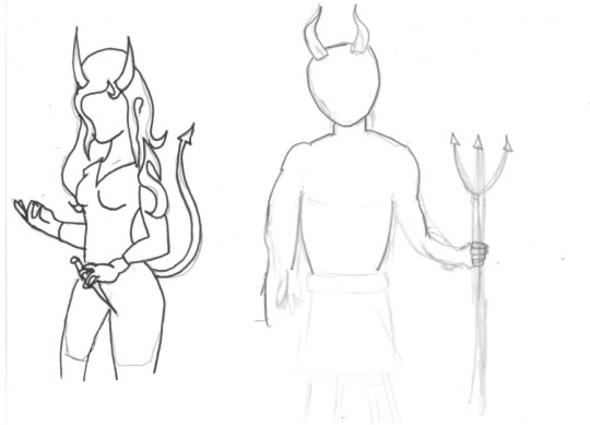

Another thing mentioned in the interviews was the devil. The devil is known to be a personification of evil in many religions. It is stereotypically a red man with horns carrying a pitch fork. My first drawing if the devil replicated this stereotypical image. However, the devil is known as a being and, similarly to God, has never been given a specific gender title. Therefore, I decided to switch the drawing to the devil as a woman. The person who said that the colour red reminds them of the devil was a woman so I thought it would be fitting to change it to a woman.
I trailed one drawing with a tail and a knife but it did not seem to come across as well. I decided to change the focus to the features of the devil rather than the objects that tend to be seen with it. I created a close-up drawing of a female devil with big horns and a gaunt-looking face shape. Personally, I think of the devil having very sharp and prominent features. This is because someone with soft features would be seen as nice and more child-like, as soft would be associated with a ‘soft’ personality. In contrast, if someone were to have sharp features, they would be seen as having sharp characteristics, which I assume the devil would have. I added a pentagram to the chest as it is the symbol of the Church of Satan. As Satan is another name for the devil, I thought that by including this it would reinforce to the viewer that this is the devil.
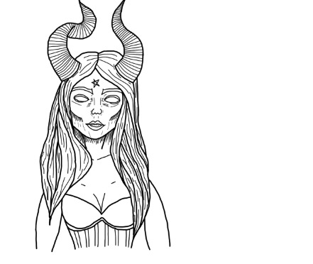

I scanned the drawing into Photoshop and used it to draw the details of the devil. I moved the pentagram from the chest to the forehead as it is not as overpowering but still as effective in its placement. Also, many people who worship the devil will draw or even tattoo this symbol on their forehead to display their faith. I used deep shades of red to colour the devil, with more cool-tone and blood reds. I did this as the devil reminds me of pain and suffering, which in turn would be associated with blood and the colour of it.
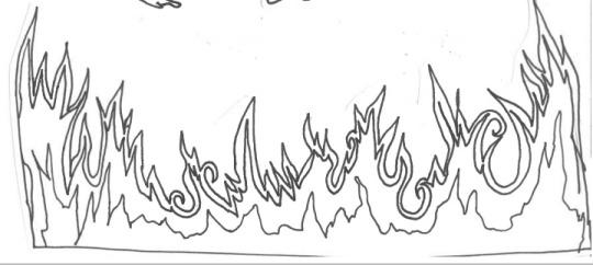
I decided that I wanted to add drawings of fire into the illustration. As the illustration will be based around the devil and hell, I thought it would be fitting to include it as hell stereotypically is flaming hot and filled with fire. I drew two smaller fires and one longer strip of fire. I did this so I could add the smaller fires around the devil and have the strip of fire across the bottom of the page, similar to the positioning of the daffodils in the previous illustration page.

I scanned them into Photoshop and traced the outline using the brush tool. I used warmer-toned reds for the colouring of the flames. I did this as fire produces heat and light when lit, so I thought a warmer, more yellow-toned red would be suitable to illustrate this.
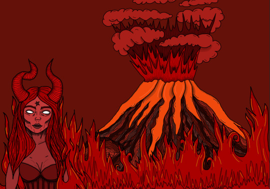
This was my first idea of placement for the object I had drawn. I placed the volcano in the background. with the devil being close to the front of the illustration at the left side. Although I like all the pieces that I have drawn, the way I placed them together in this makes the image look very flat and boring. One of the words that I wanted to use from the interviews was ‘chaotic’, but this does not replicate that word. Therefore, I decided to change the layout of the figures.
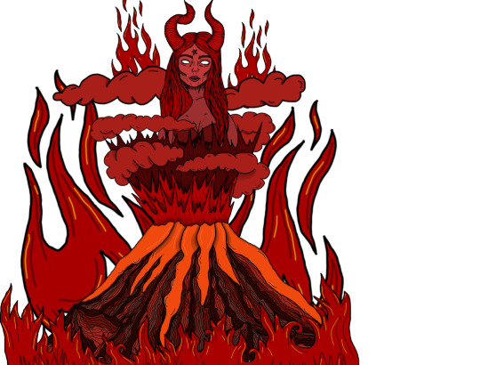
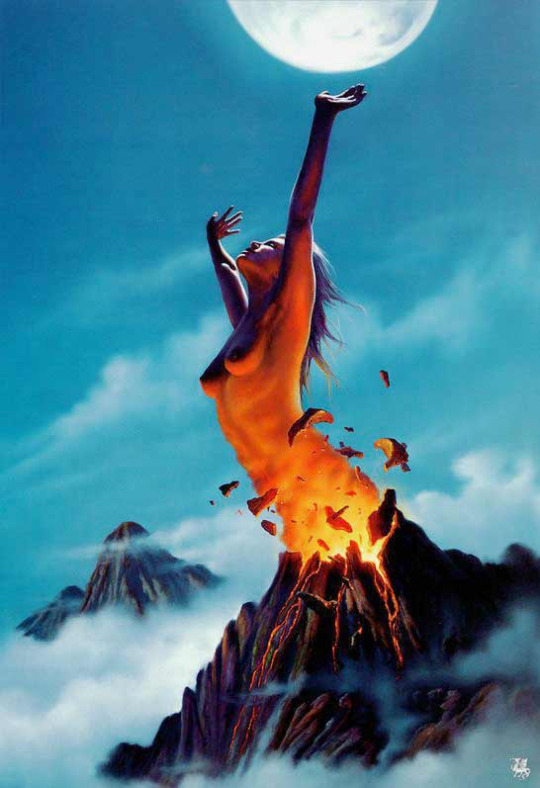
This is the changed placement of the objects I previously drew. I decided to place the devil within the explosion of the volcano surrounded by the smoke clouds. This gives the illusion that the devil is emerging through the explosion and out of the volcano, which would link back to the more chaotic side of the colour red. I took inspiration for this concept from Jim Warren. One of his fine-art pieces was an illustration of a woman breaking out of a volcano with the volcano glowing from inside. I thought it would be good to use in my work as it would be the devil exploding from the volcano rather than just a standard woman.
Instead of having the strip of fire across the whole page, I moved it to lining the front of the volcano. This made the picture flow better as it matches with the flames in the background, as well at the explosion from the top of the volcano.
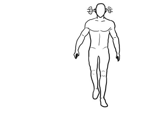
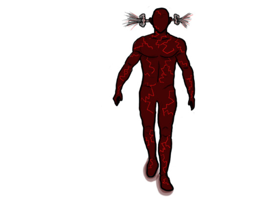
Another person mentioned thinking of angry cartoon characters with steam coming out of their ears. I decided to create my own take on this concept. Similarly to the blue illustration, I wanted to create a figure that represented the anger, rather than having a man who is angry. I used the same structure for the figure as I did in the blue illustration, with no facial features of hair. I added the steam bursting from the figure’s ears. When I coloured in the figure, I used a dark, deep red with cracks of a lighter crimson red peaking through. I did this as every person who stated that they thought of the word ‘anger’ when talking about red pictured a bright crimson red. As this figure is meant to represent anger, I thought that by adding the lines of red, it would look as though the red is cracking through and taking over the darker colour of the skin. I did this to show the colour red taking over as the figure got angrier. A few of the interviewees said they either felt red whilst angry, or could only see red. I drew the red coming from within to display these two statements.
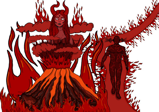
I added a red path surrounded by fire for the figure to walk on. When I picture an angry cartoon figure with the steam coming out of their ears, I picture them storming towards something. Although I created the man in a walking stance, by adding the path I thought that it further enforced that he is walking towards somewhere, possibly to take the anger out on something or someone.

For the background, I replicated the pattern I used on the angry figure. As anger was the main response to the colour red, I thought that by further adding this crack and mess of shades of red, it would go with the chaotic and explosive vocabulary used in the interviews, as if the anger is cracking the background and waiting to break through.
To improve this illustration, I would try to add in the element of love and passion that was mentioned in the interviews. One person mentioned red being associated with Valentines Day and with love, so this is something that I failed to demonstrate in this illustration. To add this in, I could possibly add this into the background. Another piece by Jim Warren featured a figure of a couple in the clouds, so I could have possibly created red smoke clouds that morphed into a couple with a heart surrounding them. If I were to do this again, I would include this in the illustration.
0 notes
Text
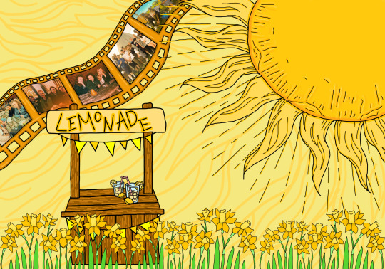
Yellow Illustration
This is the development process for my yellow illustration page.
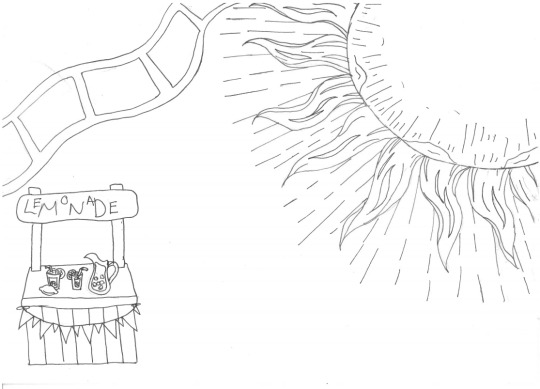
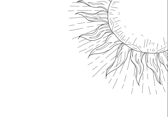
This is the first drawing I created for the yellow illustration. Every person that I interviewed mentioned either the sun or sunshine when questioned about the colour yellow. Therefore, I decided to make it a big part of the illustration. I drew the sun so that it took over one third of the page. I did this so that it was a big focus of the page but there was still some emphasis on the other parts of the page.
The second item I added was a lemonade stands with glasses of lemonade on it. I added this as one interviewee said that yellow reminded them of lemonade. They said that they thought of lemonade stands and glasses with a cut lemon on the rim.
The added a drawing of a film roll to the top left corner of the page. One person said that yellow made them think of an old montage of summer and pictures with their friends that are tinted an orange-yellow colour.
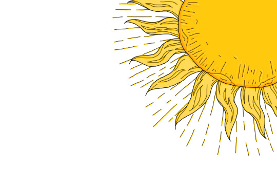
The first step I did was to draw and colour the sun. I used the brush tool to outline the whole sun. I then created a layer underneath the outline layer and proceeded to use the brush tool to add colour to the drawing. I added outlines of a darker yellow in positions where there were lines of detailing to add dimension to it.
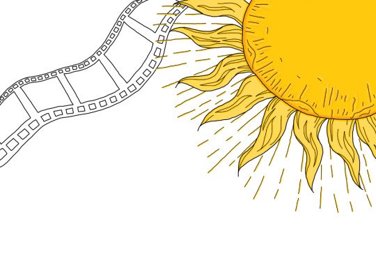

I then added the film roll along with colouring it in. When drawing the outline for the film roll, I added small squares to the top and bottom of the roll. This replicates the actual film roll that would have been used in disposable cameras to create these images. Instead of having the film roll black as it is supposed to be, I used a darker yellow to give it more of a gold look. I took inspiration from the MGM logo that is seen at the start of many films. Around a picture of a tiger, they use a gold film roll that swirls around the image. This logo is used at the beginning of many older films, which made me think of the vintage description given to the film roll.
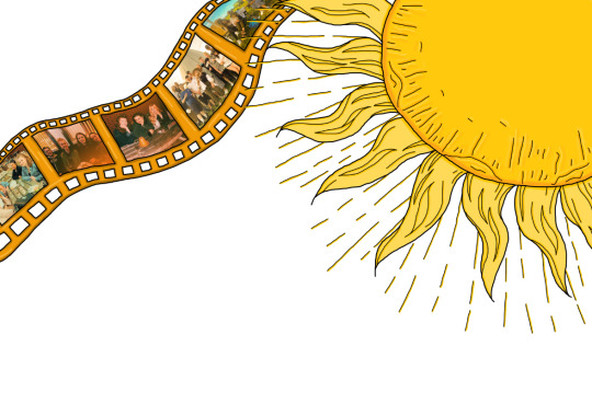
When adding the photographs to the film roll, I chose to use images of me and my friends in the summer. The person said that they thought the film montage would be filled with photographs of friends having fun in the summer, so I decided to use my own pictures to demonstrate this in my work. This added mixed-media to the page which will make it more interesting when the viewer looks at it. I used the warp tool to curve the images to fit into the film roll.

I then added the lemonade stand. I created two drawings of a lemonade stand, as well as two drawings of the glasses to be placed onto the stand. I decided to use the drawing on the left for the lemonade stand, as I thought it had a more youthful look with the multiple banners as well as the mismatched font on the sign of the stand. I chose the smaller drawing of the lemonade glass as I thought it linked clearer to the description that that interviewee gave about the glass. I t is easy to see that it is a lemon on the rim of the glass, whereas with the other drawing, it could be mistaken for another fruit and possibly made the liquid look like a cocktail rather than lemonade.
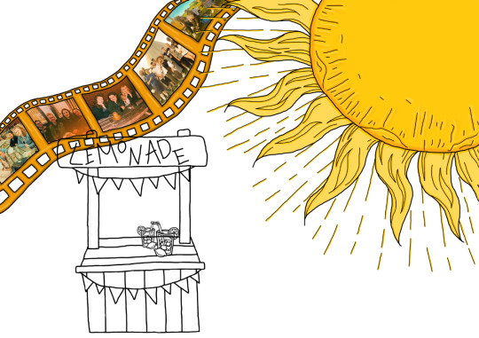


I scanned the drawing into photoshop and used the brush tool to outline the drawing. I then used a yellow-toned brown to colour the stand. I chose to use brown as lemonade stands are typically handmade and images or videos of lemonade stands tend to be wooden. An example of this would be from the video ‘The Duck Song’ on YouTube. It was a viral video uploaded to YouTube in 2009 where a lemonade stand is featured. The lemonade stand is coloured brown and is obviously made out of wood.

The next piece I added to the illustration were daffodils. One person said that yellow reminds them of spring because they buy daffodils at that time of the year. I drew a cluster of daffodils to add to the bottom of the illustration
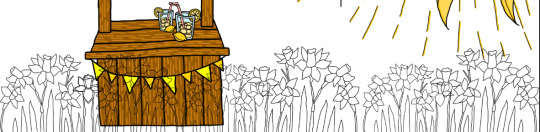

I used the drawing to trace the outlines onto photoshop. Once I did this, I duplicated and reflected the outlines to create a full row of daffodils across the bottom of the page. By doing this it created varying heights of the daffodils which made the composition slightly more interesting a realistic for the viewer. I used the brush tool to add the colouring to the daffodils, using a lighter yellow for the centre of the flower and a darker yellow for the petals, just as the real flower is.
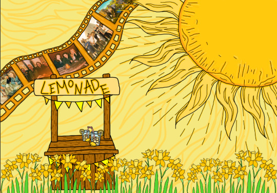
In the background of the illustration, I added a simple light yellow firstly. I then used the brush tool with a slightly darker yellow to create a pattern. I replicated the rays that are coming from the sun and drew them all across the background. I chose to do this so that the background was slightly more interesting but did not take away from the illustration as a whole.
0 notes
Text
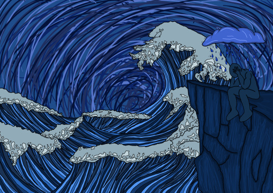
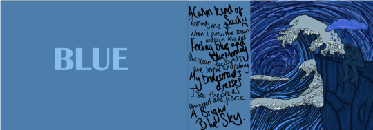
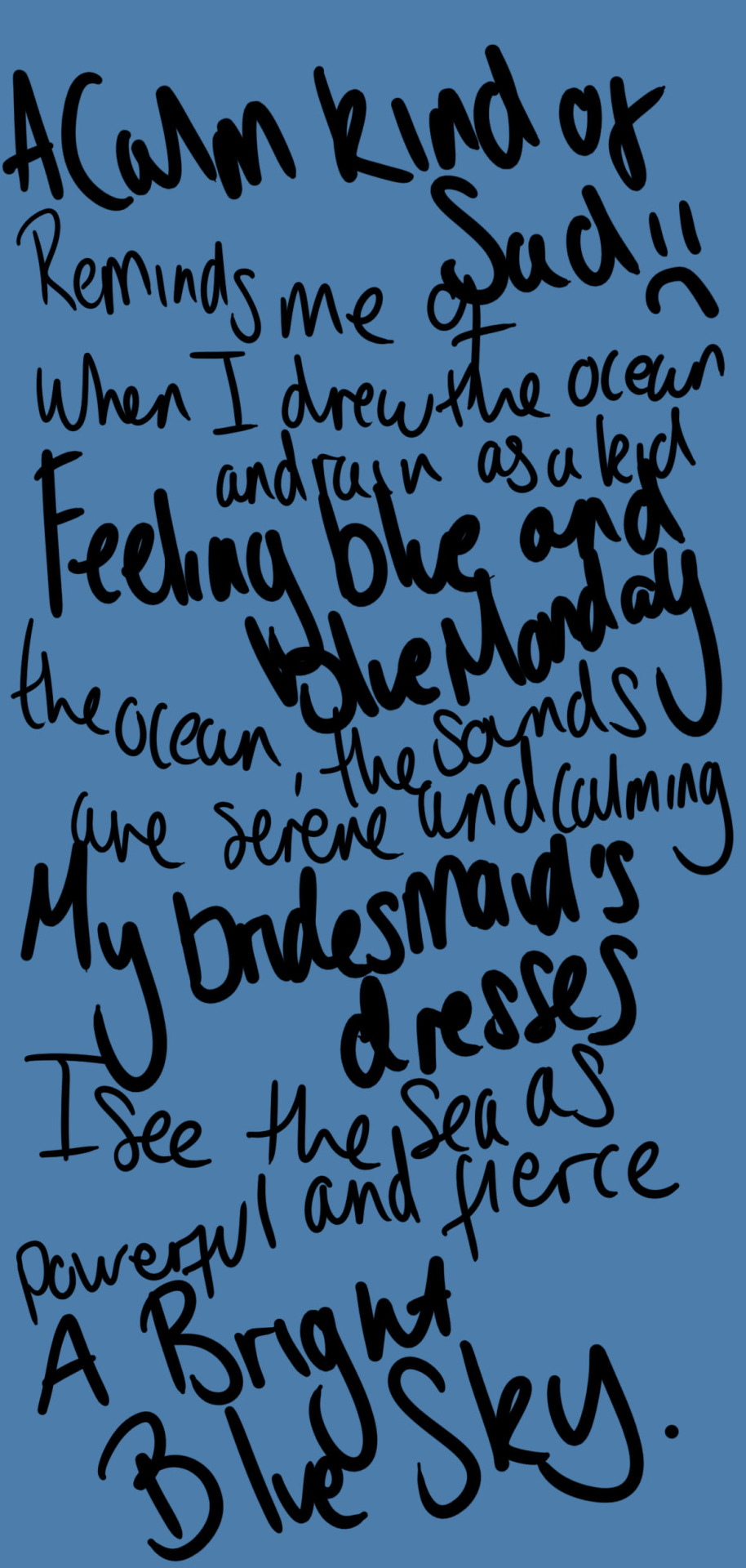
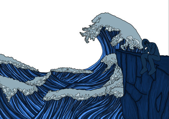
Blue Illustration Page
After conducting interviews surrounding people’s perception of colour, I used their answers to create illustrations around one colour. This is my development of the illustration for the colour blue.

This is my first drawing of the sea for the illustration. The sea was heavily mentioned in the interviews, with one person describing the sea as powerful and fierce. To demonstrate this, I wanted to create big waves that leaned more towards the powerful description of the sea.
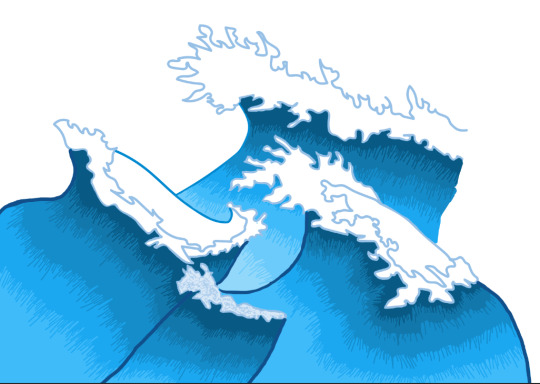
I scanned the drawing and placed the image into Photoshop. I then used the brush tool to draw the outlines of the sea, and used the same tool to fill in the colour of the sea. This drawing is very basic and did not display the powerfulness of the ocean. Although you can decipher that it is an illustration of the sea, the drawing and shading of it is very basic, therefore it is not as obvious as I wanted it to be. I decided that I would dismiss this illustration of the ocean and create a better drawing.
This is my second drawing of the sea. I drew differing directions of the waves to make it seem as though the waves are crashing together. I added more detail to the water by drawing lines from the bottom to the top of the waves, which gave the waves a sense of direction as well as making them flow together. I drew the froth at the peak of all the waves as when water is crashing around harshly, it creates the froth within the sea. Therefore, adding the froth to the waves further displays that powerfulness that was described by one of the interviewees.
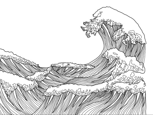

As I did with the previous drawing, I scanned it and placed it in Photoshop before tracing over it with the brush tool. I cleaned up some of the edges as well as adding in some thicker stripes to the waves to give them more dimension. Then, I used the paint tool to add colour to the ocean. I used a cool-toned pale blue for the froth, with an even lighter blue for the highlights. I then used varying shades of blue, from light blue to dark blue, to fill in the water for the waves. I did this to further display the curves of the waves.

My illustration of the ocean was influenced by Florence Manlik. She created many pieces that have a similar flow to the colours on my own illustration. She created a commission of an ocean piece that was green in colour and featured sharks within the water. The way she drew the waves inspired my own drawing of the sea, as it had rising waves which demonstrate the fierceness of it. She used sections of colour to show the curves of the waves, which I used in my own work. Her work is very soft-looking and flows beautifully, whereas my work has more of a graphic element to it. By bringing the two together, it created a beautiful illustration of the waves that were portrayed the way I set out to.
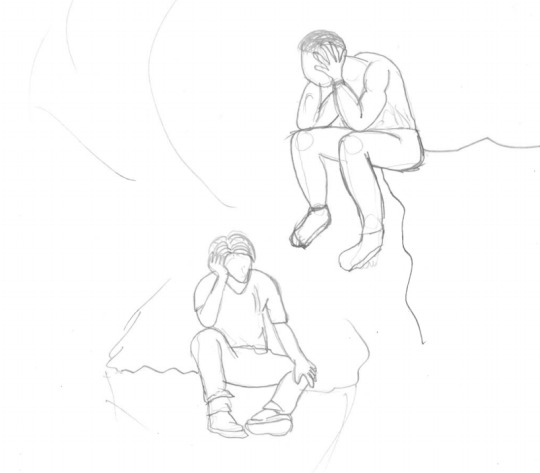
My next step was to incorporate sadness into the page. Every person said that blue was a sad colour as when someone is sad, they are often said to be ‘feeling blue’. I chose to show this by having a figure looking down with their had in their hands, as this is a universally recognised expression of being sad or frustrated. I drew two mock-up drawings of different positions for me to choose for the sad figure. The first drawing is a man sitting with his legs spread and one hand holding up his head. Although I liked the drawing, I thought it was conveying more frustration or boredom than sadness, so I decided to draw a second drawing. The second drawing had their legs dangling off the place he was sitting on, with both of his hands on his head whilst his head is turned down. In my opinion, this conveyed the sad look I was hoping for, as the position makes the figure look fed up with life which would portray a sad emotion.
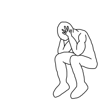
As with the previous drawings, I scanned the drawing into Photoshop and used the brush tool to draw the figure. I cleaned up the edges of the drawing, as well as removing the hair from it. I chose to do this as I wanted the figure to be a representation of sadness, rather than a drawing of a person who is simply feeling sad. By removing the hair and not adding any facial features, it indicates to the viewer that this drawing is an adaptation of the emotion and not a person feeling that emotion.
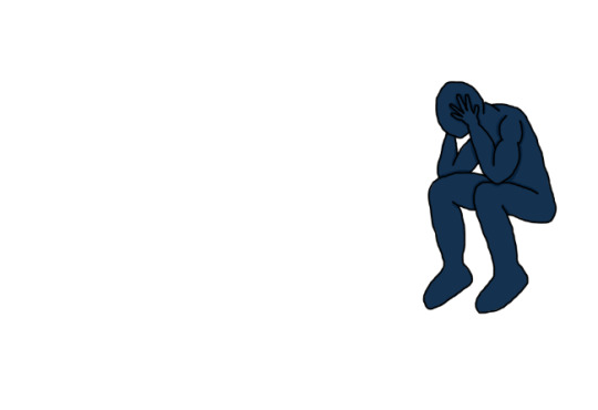
As the figure represents sadness and feeling blue, I decided to use the brush tool to colour it in with a darker blue. I chose a darker blue as feeling sad is often seen as a ‘dark’ emotion, as it would be classified as a negative emotion. A lighter blue would not have conveyed the sadness, as a lighter colour would be seen as happy and calm. This is because when someone is feeling happy or content, they are often described as feeling light in themselves. Therefore, if someone is feeling the opposite emotion, such as sadness, the opposite shade of colour would be appropriate to convey this.

To add to the illustration, I chose to add a cliff on the right side of the drawing. This would give a place for the sad figure to sit on, as well as going with the scene. Often there are cliffs seen next to the ocean where the waves crash against it, so by adding this, it would fit with the theme of the drawing.
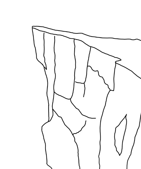

I scanned the drawing into photoshop and used the brush tool to outline the image. I then used the brush tool to add colour to the cliff. Originally, I used a very cool-toned, almost grey coloured blue. I did this as I thought it would be closer to the colouring of a real-life cliff whilst fitting with the colour scheme. However, as most of the other tones of the blue and a deeper, yellow-toned blue, the cliff looked out of place on the page.
I changed the colours of the cliff to a deeper blue. This fit better with the theme as the colour tones matched well with the stripes of colour I used for the sea. I added small highlights with a slightly lighter blue. I did this to add texture to the cliff so that the viewer can clearly see the rock shapes on it.

The final piece I wanted to incorporate into the piece was rain. One person said that blue reminds them of drawing the ocean and rain when they were younger. When thinking about sadness and rain, I think of movie scenes when something happens to a character and they start crying whilst it is raining. One scene in particular that I think of is in the film Bruce Almighty. He starts to cry when he is in control of too many things and proceeds to tell God that he wants him to take back control of his life and to tell him what to do. These types of crying scenes are seen in many films, such as The Notebook, and tend to make the viewer connect to the film more in those scenes. I wanted to add a rain cloud over the top of the sad figure, as I thought it would represent that rain only tends to be featured in a sad and dramatic scene. Many illustrations of sadness will add a rain cloud over the top of the sad person to further display the sadness of them.
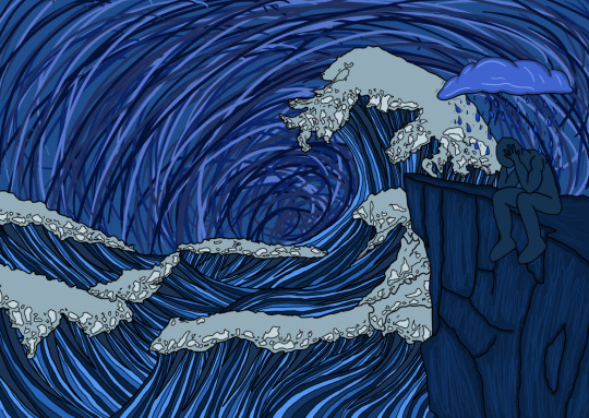

For the background of the page, I took inspiration from Van Gogh’s famous Starry Night painting. The way he displayed the background in his painting through swirls of thick paint strokes is very original and stunning. Van Gogh had a very specific way of painting and his work was very recognisable and something I admire. When researching into different perceptions of colour, Van Gogh was one of the artists I looked into. The way he displays colour is something that I admire and is different to other impressionist artists like Monet. Therefore, I wanted to pay homage to this in my work in a subtle way. I chose to use longer brush strokes but kept to the same curves that he used in his painting.
0 notes
Text
Interviews
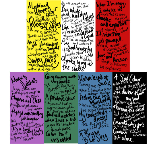
For my final piece, I want to create illustrations based on the colour perceptions of people with varying ages and backgrounds. I interviewed six people with ages ranging from 12 to 75 years old.
The interview was conducted using two sections. I chose eight colours, red, orange, yellow, green, blue, purple, black and white. In the first section of the interview, I told the person that I was going to say a colour and that they could say up to five things that popped into their head. I did this in order to get their instincts about the colour and so that they would not have a chance to think and distort their answers. The section section was an elaboration of the first section. I asked the specific shade they pictured of the colour, and then asked them to explain the words they said in the first section.
BLUE - First section
The most consistent word for blue in the first section of the interview was the word ‘sad’. The second were either ‘sky’ or ‘ocean’/’sea’. Other words mentioned were ‘happy’, ‘powerful’, ‘rain’, ‘favourite’ and ‘calm’.
BLUE - Second section
When asked to elaborate on why people felt the colour blue was associated with being ‘sad’, every person answered that when you are sad you are known to be ‘feeling blue’. Another answer was that it reminded someone of Blue Monday in January, which is thought of to be the saddest day of the year.
When questioned about the sea, there was more variety in answers. For example, one person said that the ocean made them feel powerful, not sad, as it can create big powerful waves and can do a lot of damage. In contrast, another person said that it reminded them of when they used to draw the ocean as a child and they would colour the whole section in blue.
‘Calm’ and ‘happy’ were two other words mentioned. When asked to elaborate, one person said that the sounds of the ocean makes them feel calm and content, whilst another person said that the sea makes them think of the beach, which makes them feel happy.
When asked why one person said the word ‘favourite’ their response was that it was their favourite colour. They used a light blue for their bridesmaids dresses at their wedding, so it makes them think of happy and positive memories.
The most consistent shade of blue mentioned was a simple ‘light blue’, with only one person saying that they pictured ‘navy blue’ when they think of the colour.
RED - First section
The word ‘anger’ was the most consistent for the colour red. Other words mentioned were ‘confident’, ‘devil’, ‘volcanoes’, ‘love’ and ‘passion’.
RED - Second section
I asked each person who said the word ‘anger’ to elaborate on why they said it. Consistently, each person said that its the stereotypical ‘going red with anger’. One person said that when they are angry, all they see is red. Another said that they picture red cartoon characters from when they were a child with steam blowing out of their ears.
Although only one person said the word ‘volcanoes’, when asking to elaborate on ‘anger’, some people said words that related to it. For example, one person said they picture red and chaotic, fiery and explosive, which link in with the theme of a volcano. Another person said that they feel like the colour red it hot, again linking with the volcano with the heat from the lava.
The word ‘devil’ was mentioned a few times. This came from the stereotypical look of the devil being bright red, as well as hell, the place the devil lives, being red and filled with fire.
‘Confident’ was another prominent word in the interviews. Multiple people said that it makes a person stand out from a crowd and that when they are wearing the colour, they feel confident and sexy in themselves.
Most people said the shade of red they pictured was a bright crimson red, linking to the anger they associated with it. Another shade two people mentioned were a dark red, like burgundy, which was more to do with the devil and confidence.
YELLOW - First section
The most prominent words with the colour yellow were ‘happy’ and ‘sun’. Other words mentioned were ‘flowers’, ‘Coldplay’, ‘spring’ and ‘daffodils’.
YELLOW - Second section
When asked to elaborate on why most people said ‘happy’ when thinking of yellow, they said that it reminded them of good times with friends in the summer. Also, that it was a light and easy-going colour and made them think of graphic smiley faces, which tend to be yellow in colour.
One person said that the colour yellow makes them think of an old film montage of summer parties and festivals with friends. Two others said that when they thought of the sun, it made them think of the baby in the sun from the TV show the Teletubbies.
I asked how yellow made one person think of spring, to which they replied that they thought of the daffodils they purchased every Easter, as well as Easter eggs and the small fake chicks that are used for decorations.
When asked why the colour yellow made them think of the band Coldplay, the person said that they immediately thought of their song which is named after the colour. They said that they had good memories of it, even though it seems to be more of a sad and slow-paced song.
Every person said that they pictured a bright yellow, which would replicate the colour of the sun and the colour of the smiley face graphics.
ORANGE - First section
Words used to describe the colour orange were ‘bright’, ‘young’ and ‘fruit’. Two people said that they could not think of any words to describe orange.
ORANGE - Second section
All of the interviewees said that the colour orange does not make them think or feel anything. There seemed to be no reasoning behind the words that they had said in the first section, if they said any at all.
When asked to elaborate on what they thought about the colour orange, no person had an explanation as to why they thought it was ‘young’ or ‘bright’, other than the colour simply being those things.
The interviewees could describe why they said the word ‘fruit’, as orange is the name of a fruit as well as a colour.
No person could name a specific shade of orange, and simply said just a standard shade of orange.
GREEN - First section
The most prominent words used to describe the colour green were ‘nature’ and ‘grass’. Other words mentioned were ‘camping’, ‘positive’, ‘happy’ and ‘football pitch’.
GREEN - Second section
Every person said the word ‘nature’ when asked to describe the colour green. They each said that they either pictured a forest or fields filled with grass, both of which would be predominantly green in colour.
When asked why it was a ‘positive’ colour, one person answered that it is usually used to symbolise ‘go’. For example, on traffic lights, or when a question is answered right it tends to go green.
I asked one person why they thought it was a happy colour. They responded that the colour just made them feel happy and that it was a different kind of happiness than yellow, more like a content happiness.
‘Football pitch’ was another phrase mentioned in the first section. The person said that the colour green reminded them of football pitches and those reminded them of going to watch football games when they were younger.
PURPLE - First section
Many contrasting words were used to describe the colour purple, ranging from ‘luxurious’ to ‘illness’. Some of the other words used to describe it were ‘fancy’, ‘nervous’, ‘sleep’, ‘calm’, ‘Barney’, ‘magic’ and ‘mysterious’.
PURPLE - Second section
As shown in the first section, every person seemed to have an entirely different perception of the colour purple. Starting with the words ‘luxurious’ and ‘fancy’, the person said that they felt as though purple signified elegance. They thought of people wearing fancy purple dresses at important events such as the Oscars.
In contrast, another person thought the colour represented ‘illness’. This person has been brought up in the Catholic faith. In the Catholic church, purple is worn during Advent and Lent and is meant to reflect sorrow and suffering. During the season of Lent, Jesus is sacrificed and nailed to the cross. This may be why the person thought of purple as illness and sadness, as it is associated in this way in the Catholic church.
Another person said that the colour purple makes them feel quite nervous. This person wears purple as their school uniform, so they said this may be why they felt nervous thinking of the colour. Also, they said it reminded them of the character ‘Fear’ from the film Inside Out, as it is a purple character who represents fear and nervousness throughout the film.
The next person said that the colour made them feel ‘calm’. They associated it with their bed and going to sleep. They reasoned that this may be because they use a lavender sleep spray to help them sleep, and as the colour of the lavender plant is a blue-purple colour, that may be the reason as to why.
One person said that the colour reminded them of things from their childhood. Their examples were the medicine Calpol, which came in a purple bottle, and Barney The Dinosaur, which was a purple-coloured character on a children’s TV show.
The last person said that it reminded them of ‘magic’. They said that they associated it with witches, who stereotypically dress in purple. They also said that they thought of the Harry Potter films, in which a character named Dumbledore has a cloak with purple running through it.
WHITE - First section
When asked about the colour white, many people said the words ‘innocent’ and ‘weddings’. Other words stated were ‘angels’, ‘clouds’, ‘clean’ and ‘pure’.
WHITE - Second section
I asked the interviewees to elaborate on why they thought the colour white was ‘innocent’. Most said that it white shows purity, such as in Christianity, as well as a white dress used for a bride to show their purity. One person said that white is innocent as it makes them think of angels with pure white wings.
Leading on from the angels, one person said that they thought of the angel Cupid, who is said to use a bow and arrows to strike people to fall in love.
One person said that they thought about clouds. They stated that when they were younger, they wanted to touch the clouds to see how they felt, whether they would be soft or if their hand would go right through it.
Two people stated that it was a fragile colour. They both said that it was very easy to get dirty or to even destroy the colour, as it is so pure.
BLACK - First section
The colour black was described as a ‘confident’ colour. Other things mentioned were ‘night’, ‘soul’, ‘oblivion’, ‘sad’ and ‘funeral’.
BLACK - Second section
The most prominent thing associated with black was funerals, whether that be due to the grey of the gravestones or people wearing black to mourn the dead at funerals. Sadness was associated with black as well, which may be due to the funerals and the sadness surrounding these occasions.
‘Confidence’ was another prominent word in the interviews. According to the interviewees, when they are wearing black, it makes them feels confident but comfortable at the same time. It is a different type of confidence to red, as red was associated with standing out confidence. Black was seen as them feeling confident in themselves rather than confident towards other people.
One person said that it reminded them of looking up at the pitch black sky with tiny stars littering it al around. Another said it reminds them of the nighttime walks that they take to calm themselves down.
‘Oblivion’ was mentioned by one person. They said that oblivion is a big black hole and is simply a hole of nothingness, therefore, it made them feel quite empty and hollow.
NEXT STEPS
By conducting these interviews, I have found the many different and similar perceptions that people have surrounding colours. The main points said within each colour is what I will use to create my illustrations which will capture the diverse opinions within these interviews.
Through my interviews, I decided that I would cut out the colour orange from my final piece. Most of the interviewees did not have any perception on the colour orange and seemed to be trying to think of anything random in order to give an answer. Therefore, I did not want to include a colour that did not have many things to base it on, also that may be inaccurate.
0 notes
Text
Final Piece Ideas Development
For my final piece, I decided I wanted to look into different people’s perceptions of colours and create some sort of media to show the things that they said. To gather these perceptions, I wanted to do interviews with people of varying backgrounds and ages to see whether their perceptions overlap or are different to each other.
My first idea was to present these findings in a video. I would create graphic illustrations which would flow into different colours throughout the video based on the information I received from the interviews. This was my first idea as it would present a clear visual to a viewer as to how people have differing opinions on different subjects, as well as informing them on how people can perceive things differently. Beside this, I would do a small book of the illustrations so that there would be a follow on to the video. Within the book, I would explain the purpose of the video as well as the full details of each interview, rather than simply having the graphics.
However, I chose to dismiss this idea. I felt as though the execution of the video would need to be flawless in order for the point of it to come across to the viewer. As I do not have any prior experience in video making, I decided that I would not be able to accomplish this and it would be better for me to find a more suitable form of media for me to showcase my findings.
The second idea I had was to create a magazine. It would be surrounding the concepts of colour, with the issue I am creating being focused around the perceptions of colour. The magazine would be aimed to a specific niche of people who would take interest in this subject. I thought it would be interesting to do as other magazines with a similar specific but loyal fanbase seem to do really well in their areas.

An example I looked at was Apartamento. This magazine is made for a very specific group of people. It focuses on interiors of many people and the stories behind those interiors. They have many people’s homes featured in the magazine, whether it be someone famous or someone less well-known. This magazine caters to a small group but as they are the only magazine to create this type of space, people are more consistent in supporting the magazine.

Another example would The Happy Reader. This magazine is for people to read about reading. The magazine is published biannually, with the first half of the magazine detailing a long form interview with a book extremist and the second half exploring one classic work of literature. Similarly to Apartamento, it caters to a very specific audience that are interested in this subject matter. This is why I wanted to create a magazine specifically around colour, as no other magazine does this so it would create a space for people who want to learn more about it, creating a loyal audience.


To trial this idea, I created simple templates that I could possibly use within my magazine. The first one I created was a simple split page design. As I had previously stated, there are many colour stereotypes, such as pink for girls and blue for boys. This page I created above was one way of demonstrating this stereotyping of colours. I added a blue background on one side and a pink of the other side. I typed the words BOYS and GIRLS multiple times on each side in the opposing colour. This style of duplication on the words was inspired by the ‘Thank you Have a Nice Day’ poster by Carlos Vigil. It was created to be printed onto plastic bags. I liked the way the repetition was eye-catching so I decided to use it as inspiration for this page.
The next template I created was a page I could use to add some key words about a colour. I added placeholder text into it to demonstrate where the keywords would be. I used various fonts on the page as it draws attention to each individual word. By changing the text font and size, it keeps the reader engaged when they are looking at the information. I added blocks of the colour purple, which is simple enough for the reader to visualise the colour, but the sporadic composition of the blocks of colour still makes it interesting to view.

Similarly, I created an introduction page to the colour green. I left one side free of text so that there is enough negative space to give the reader a pause, but to also draw their attention to the opposite page. I added a large letter ‘G’ to further display that this is the introduction to the colour green. I added strips of text underneath the letter with placeholder text. This would be filled with quotes from the interviews I conduct or information about the colour green, such as information from the book The Secret Lives of Colour. I took inspiration for this placement from the stereotypical green coding images that are used in many films. They use a simple text with differing lengths across, so I decided to create that with my work.

This is another example of a colour introduction page for the colour red. I used large bold letters for the word red and placed them askew on the page to keep with the graphic look of the previous pages. I added the names of different shades of red in multiple different fonts. Similarly to one of the previous templates, it works to draw the reader’s attention to the different words. This template does not work as well as the previous one as it looks as though it is a jumbled page rather than strategically placed text.

For the last two templates, I used actual images to mock up placements I could use. For the first one, I covered the entire right page with the image, whilst adding placeholder text for keywords on the left. These could be key words about the colour or from the interviews. The second template is a simple placement of images that may create a break for the reader when they are looking at the magazine.
My decision for my final piece was to merge the two previous ideas together to create a short book/zine that would show the perception of colour. I still wanted to incorporate illustrations of the perceptions of colour seen through interviews with others, but I did not want to do this through a video. To compromise, I decided to create a book/zine that would use still illustrations of the perceptions to display the findings. The book/zine would still be catered towards a specific audience as Apartamento and The Happy Reader does, but would be a shorter version of these magazines. The sole purpose of the mini book/zine would be to demonstrate the perceptions of colour found throughout the interviews I conduct. The people who would want to read this would want to see how their own perceptions compare to others, creating a small but specific target audience.
Also, this would be similar to the book The Secret Lives of Colour that I have looked into previously. The book is targeting a specific audience that wants to learn about colour and the history surrounding it, which means that the audience who bought The Secret Lives of Colour would be inclined to view my mini book/ zine as well.
0 notes