Last Seen Blogs

fcmous-blog
* && palace.

faeghost
Quills and Ink

chinnychinchillaz
Coming Soon...
madrewrites
madre writes

huntersurfer360
huntersurfer

Photo

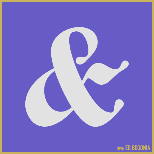
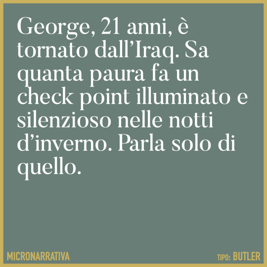
Butler is a serif typeface designed by Fabian De Smet in 2015. It’s available with both normal and stencil variations. The design was inspired by Bodoni, with the stencil cut drawing inspiration from Commercial Type’s Dala Floda.
0 notes

Photo

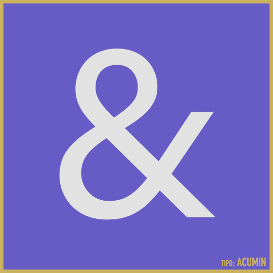
Acumin is a sans-serif typeface designed by Robert Slimbach and published through Adobe in 2015. Slimbach set out to design a contemporary neo-grotesque that could work as a text face. Designer Jeffrey Zeldman describes Acumin as “a Helvetica for readers”.
0 notes


Photo
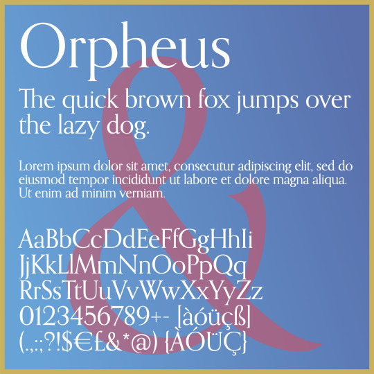
Orpheus is a serif typeface originally designed by Walter Tiemann in 1926 for Klingspor Foundry. Tiemann designed a separate italic version of Orpheus under the name Euphorion in 1936. In 2011, Canada Type released a digital revision of these two typefaces, combining them into one family with the name Orpheus Pro. The typeface features a beautiful, flowing italic design that takes on a calligraphic feel, especially in the huge collection of ornate ligatures, alternate and swash characters.
0 notes

Photo

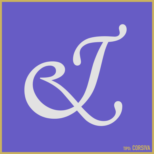
Corsiva is an italic typeface made in the style of the early Italian cursives as exemplified by the work of the writing master, Ludovico degli Arrighi, in the sixteenth century. It was designed by Patricia Saunders for Monotype in 1995. The capitals are of swash design, with characteristic flourishes, designed primarily for use as initial letters. Corsiva can be used for short text passages in advertising but is best used to add sparkle to invitations, greetings cards and menus and to give a sense of occasion to certificates and awards.
0 notes

Photo

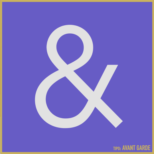
Inspired by the 1920s German Bauhaus movement, Avant Garde was designed by Herb Lubalin and Tom Carnase for ITC in 1970. The typeface design was based off the logo Lubalin created for Avant Garde magazine. One cool thing I like about Avant Garde is all the crazy alternate characters it contains like the sloped A and V, although it’s easy to go too far with the alternates—Ed Benguiat once said, “The only place Avant Garde looks good is in the words Avant Garde.” Avant Garde is famously used in the Adidas logo.
0 notes