rorysart2020
UCA 2020/2021
art student, fashion promotion
50 posts
Don't wanna be here? Send us removal request.
Last Seen Blogs

alanahleadership
Alanah's Leadership Blog
lauren-lopez-owns-me
Starkid And TCB Own Me
jedishywalker
Dr. JediShywalker

angery-mug-blog
:0 ur so pretty :0
littleocdancers
Dancers Of OC


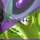
Photo
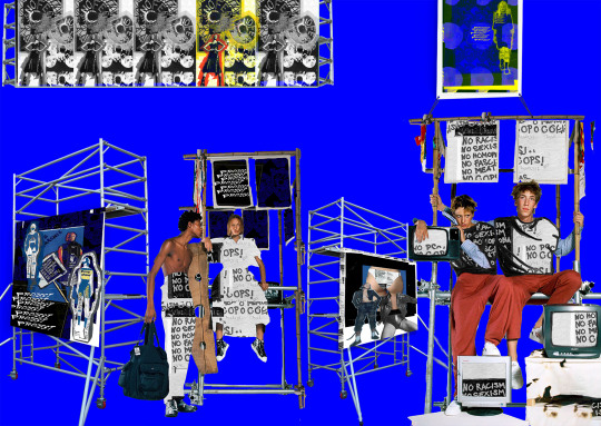
(CLICK TO VIEW IN BETTER DETAIL)
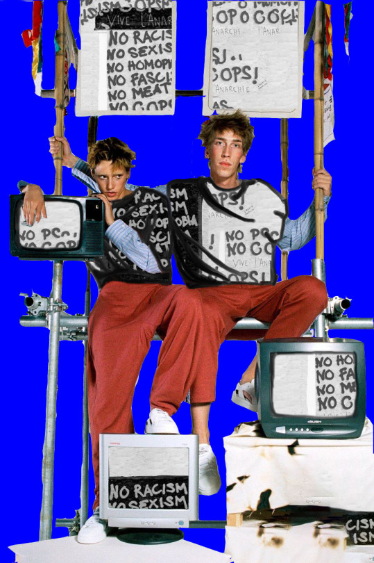
MY FINAL PIECE FOR FMP.
REFLECTION/SELF EVALUATION
My intention when creating this piece was to create an image with elements of construction, with lots of places for posters and signs and banners to be hung from. The inspiration for that came from the Vivienne Westwood adverts I used to create some of my earlier work, which is also prominently featured in this final piece. Arranging the various sets of scaffolding to allow for varied depth gave this piece a more life-like perspective, as without the blue background it could be interpreted as having been photographed in an actual location, rather than edited together in a virtual one. With COVID restrictions and travel bans, fashion shows have developed multiple new ways of displaying new collections and releases by brands, such as virtual clothing and runway shows. I wanted to produce something similar to that, so I used photoshop to create an artificial stage-set to put my models, props and posters on. The outcome is something that I am very pleased with; the visual impact is immense and effective. The colour scheme for this piece was very carefully selected, with small isolated pops of the other two primary colours (red and yellow) against the almost overwhelmingly blue background. However, blue is a cool colour and that does mean that its perceived as a background colour, which is what allows the edited objects and other things stand out as starkly as they do. The addition of black and white helps to balance the image, and is also a colour combination I’ve been exploring the impact of throughout my development and response stages (particularly my response to Vivienne Westwood).
Overall, this piece communicates the themes of protest, defiance and rebellion that I aimed for, as well as showing off my improving technical skills and my (developing) design aesthetic. It has elements inspired and influenced by my research of both history and fashion, and I believe I have also utilised the feedback given to me by peers and tutors as effectively as I could considering the constraints I was under for this project. This final piece is a perfect culmination of my project and the work I’ve been producing over the year, as well as my desired outcome for this concept.
#FINAL MAJOR PROJECT#FINAL PIECE#ART#ORIGINAL ART#DIGITAL ART#PHOTOSHOP#FASHION PROMOTION#FASHION#ADVERTISEMENT#FASHION EDIT#ANALYSIS#CONCEPT ANALYSIS#STUDY#STUDENT
1 note
·
View note
Photo


SCREENSHOTS:
These screenshots show the progress I’ve made during this project with my technical skills in editing on adobe photohsop, as well as the process I go through to produce my work. These screenshots in particular display how I use the original images as inspiration for my editing, by allowing the fundamental composition, colour scheme and the shapes present to help achieve a balanced and cohesive outcome. With the concept for these pieces being protest and politics, the themes and specific messages of each production are all a little bit different - I’m not using this project to advocate for one singular cause, so I’m using my research into political fashion designers with well-known brands to influence what I am communicating to a viewer (eg. Vivienne Westwood’s punk and anti-capitalism, Katharine Hamnett’s punchy slogan t-shirts and environmentalism). To keep my work from appearing disjointed or oppositional, I’ve utilised a specific set of colours (black, blue, white) to incorporate into my productions, as well as featuring my original prints throughout my work for this project to create a more cohesive, visually appealing collection of images instead of multiple single works. This way, my work can be looked at by itself or as a series. There is a level of commerciality in this that applies well to my project and concept, as my final production for my FMP is a slightly urban landscape with posters, banners and a billboard with my photoshopped works on them. I want to use typical fashion advertising methods to display my protest+politcal art, as I think that it would be the best way to show my project.
1 note
·
View note
Photo
ANALYSIS OF PROCESS AND OUTCOMES:
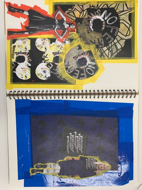
I decided to print out some of my photoshop productions and arrange them in my sketchbook in a collage, much like the collage I made near the beginning of my project when I was exploring concept and theme. To add some dimension to the flat images of my printed out images, I used different magazine papers and a mixture of both glossy and matte tape - it added borders to the images as if they were framed artworks, but with the layering of pieces on top of this border created more depth. I plan to use similar methods in my final outcome to create perspective through a flat image. Originally I had been thinking of creating an actual 3D production virtually through artsteps, but after experimenting with blending options and perspective tools on photoshop I have decided to use that to create my final piece for this project. I want to incorporate these sketchbook pages into my final piece for my FMP as they were the products of the same images and concepts that I developed and edited and improved upon throughout most of the project.

SKETCHBOOK DISPLAY
2 notes
·
View notes
Photo


PIECES FOR MY FMP: POLITICS + PROTEST + FASHION, TO BE INCLUDED IN FINAL PIECE.
Because I found myself drawn to the layout and aesthetic of my sketchbook collages so much, I scanned them into photoshop to make minor edits and add frames and ‘noise’ to the images. I wanted to create the impression that these pieces were posters that had been plastered over old billboards, leaving patches of old ads visible in places there had weathering and peeling. This adds an industrial vibe to the images, and the elements of deconstruction and deterioration present are a clear reference to punk. Punk was a large influence in this project, and my research into it has helped provide a higher level of comprehension in regards to design aesthetics and elements.
Including cut-outs of models in these images, I created an explicit visual representation of the fashion industry, as fashion design and advertising are key to my project and to my personal interests. Models are integral to the fashion industry, and to consumers. To allow my work to be both successful in communicating my concept, as well as have a certain level of interest commercially, I had to include some form of modelling in my final pieces to achieve my intended goals for my FMP.
#FASHION PROMOTION#FASHION#EDIT#FASHION EDIT#ORIGINAL ART#ORIGINAL PRINT#GRAPHIC DESIGN#PHOTOSHOP#CAMPAIGN#SKETCHBOOK#MY ART#STUDENT#CONCEPT ANALYSIS#ANALYSIS
3 notes
·
View notes
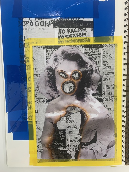
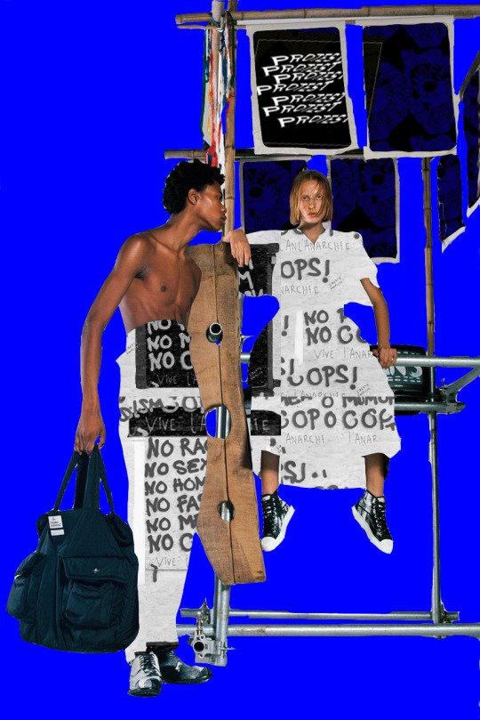
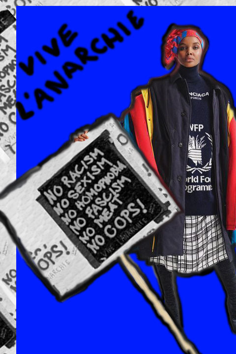
Photo

PRINTS AND POSTERS; EXPLORING DISPLAY AND CONTRAST
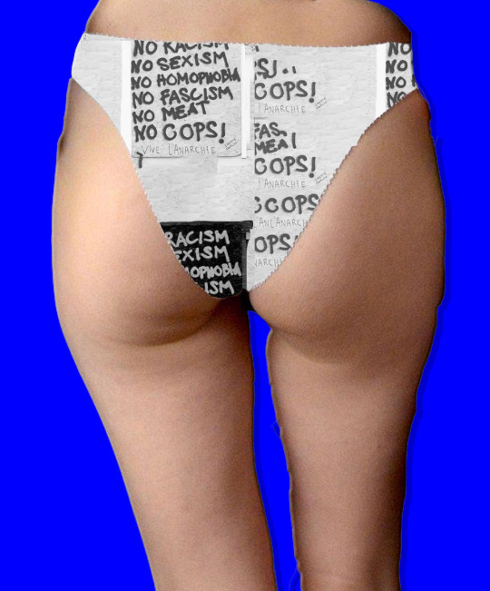
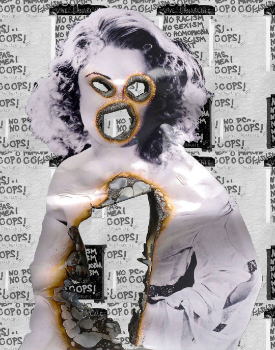
Print made out of an old found photograph:
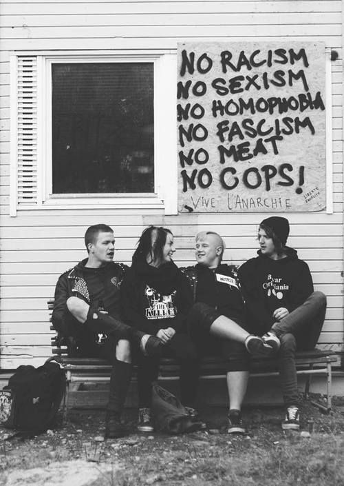
The punk themes in this photograph align with my concept, but what I was most interested in was the graffitied sign featured in the image. The slightly aggressive tone and the graffiti itself held an immense impact both visually and emotionally - a list of things that everyone can find at least one thing that resonates personally with them. With my FMP trying to explore how politics and protest can be used effectively in fashion, I made a print out of the sign into an original pattern on photoshop. The black and white on top of each other combined with the text has some resemblance to newsprint, but the erratic arrangement of the text moves the print away from being flat and uninspiring.
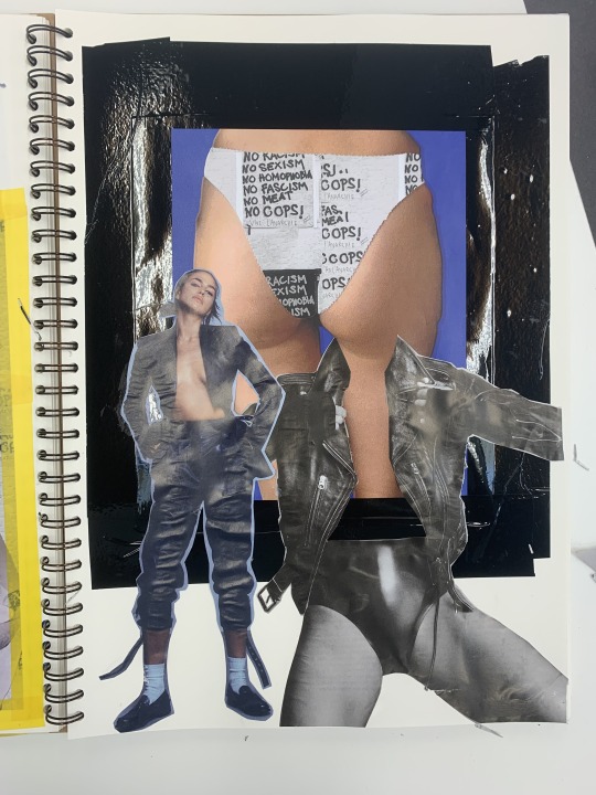
When creating the print on photoshop, the text of ‘NO COPS’ ended up a dominant part of the overall print, which I felt was both appropriate with the current issues of police misconduct and brutality - it also inspired me to apply the print in different, more politically effective ways. For example, with the case of Sarah Everard and the police’s violent response to the peaceful protesters at her vigil, I found a vintage photo of a woman that had been burnt out at the features and centre, and combined it with my print underneath it. It is, in my opinion, the most aggressive image in my FMP, as well as the most direct. The effect is haunting and provocative, and as part of my concept of protest, my goals with this project is to provoke response from viewers. I also applied this print to a pair of women's underwear for a similar reason and different impact - this image ended being more cheeky (in more than one way) and was provocative in a different way, and I wanted to have an emotional contrast between these two images whilst communicating a similar message.
The image of the model holding the sign in front of her was sourced from a cover of Harpers Bazaar about the collaboration between Balenciaga and the World Food Programme. The elements of protest were already present in this image, which I edited to fit my project and to change the aesthetic.The asymmetrical frame of my black and white print makes the image appear more editorial, like it was made for a magazine cover or a billboard promotion. The blue background that I’ve been including in more and more of my pieces lately is bright and eye-catching, and raises the contrast in the rest of the image. It has also made my work more cohesive and I plan to continue to include the colour for my final production.
The scaffolding images - as I’ve been calling them - were edited out of a Vivienne Westwood campaign about sustainability. With Westwood being a large influence in my project, both design wise and politically, I found it fitting to convert these adverts into my own. Applying my print onto the models’ clothes was difficult, as in some parts a flat image taking up these spaces where bodies are supposed to be made the image messy and visually unimpressive. To combat this, I used the brush tool on photoshop to define the folds of the fabric where needed. In my other scaffolding image, the clothing itself was more identifiable in shapes, so I left the print flat without trying to create folds and dimension with the brush tool. This image (the top photo in this post) also features my blue and black ‘protest’ print I made out of my textile piece on top of the fabric pieces attached and hanging from the scaffolding. The combination of both prints in the image displays my work and theme more clearly with a viewer, and with the associations between construction work and the working class also refers to the origins of the punk movement, which had its roots in working class Britain after/during the recession.
Overall, these pieces I've produced for my FMP communicate my concept effectively, in the bright, punky and youthful aesthetic that I wanted. It also displays my improved technical skills as well as my better understanding of fashion history and the influences the punk movement has on modern fashion and politics of the fashion industry.
#ANALYSIS#CONCEPT ANALYSIS#ART#ORIGINAL ART#PHOTOSHOP#FASHION PROMOTION#FASHION HISTORY#FASHION EDIT#DIGITAL ART#ORIGINAL PRINT#REFLECTION#STUDENT#PROJECT#PUNK#PHOTGRAPHY
5 notes
·
View notes
Photo

EDITING MY PRINTS ONTO EXISED CLOTHING: considering I don't have the means (or the technical knowledge) to sew and make my own clothes for this project, I have used found images to display my original prints onto existing pieces, to reimagine them for my concept. This image is a discovery of how to create and apply my patterns on photoshop, as well as how to effectively edit small, specific areas of a photo without compromising the legibility. Overall, I consider this production a success and plan to produce similar images for my FMP as part of a ‘collection’.
#ANALYSIS#REFLECTION#ART#FASHION#PHOTOSHOP#STUDENT#PROJECT#FMP#FASHION PROMOTION#DIGITAL#FASHION DESIGN
0 notes
Photo

EXPLORING COLOUR, PATTERN AND LIGHTING - visual experiments for my FMP. Photoshop.
0 notes
Photo


REFLECTION ON SKETCHBOOK DEVELOPMENTS + EXPERIMENTS FOR FINAL MAJOR PROJECT:
I printed out a series of my photoshopped prints/textile patterns to explore alternative ways of laying out and displaying my final productions for my FMP, and how it effects the impact and communication of my concept - protest. I explored how colour theory could be utilised in my final piece (a display of models, signs and and posters in a 3D space) to refer to the punk eras of fashion history, with its contrary use of the bold primary colours alongside black. With how bright and starkly contrasting it can be, the yellow in my sketchbook experiments overwhelmed the overall image, especially when it’s coupled with all of the accenting yellow tones in my photoshopped textile prints. When using yellow in my next pieces, I plan to use it sparingly for the greatest contrast and visual impact. On the other hand, ‘overwhelming’ is an appropriate aesthetic for my FMP considering the nature of protests and marches is to overwhelm and arrest attention. Either way, I prefer the use of the bright blue and red along with the blacks/darks in my pieces, as it is more reminiscent of the plaid/flannel sported by punks in the 70s and early 80s. In particular, I found myself inspired by one of Vivienne Westwood’s pieces:

The inclusion of models posing and walking in this sketchbook spread were intended to strengthen the visual relationship between my pieces and the fashion industry, which is what I’m using as my platform to explore politics and protest for this project. With Covid restricting my access to photographing my own models, I have collected various cut-outs from runway collections and magazines to edit into my work. Whilst the body language of the models has some effect on the tone and impression of what I am communicating, my main focus regarding people and portraits in my work is to manipulate the items of clothing and the accessories worn in the photographs - this is what I edit my original designs and prints onto to make the pieces my own, and more cohesive with my concept.
I plan to use this sketchbook spread as a template/guide for when I am constructing my own virtual fashion display on artsteps - I may even decide to create most of the images for this display in my sketchbook or by hand, and then scan it into the program to add virtual and 3D elements. The effectiveness of a hand-rendered piece, along with its added sense of personalisation from coming straight from the hands of an artist rather than from through a screen fits better into my FMP and the references to hand-made/home-made signs and posters used by protesters.
#ANALYSIS#CONCEPT ANALYSIS#SKETCHBOOK#SKETCHBOOK SPREAD#COLLAGE#VIVIENNE WESTWOOD#FASHION#FASHION HISTORY#FASHION PROMOTION#DEVELOPMENTS#ART#ORIGINAL ART
12 notes
·
View notes
Photo

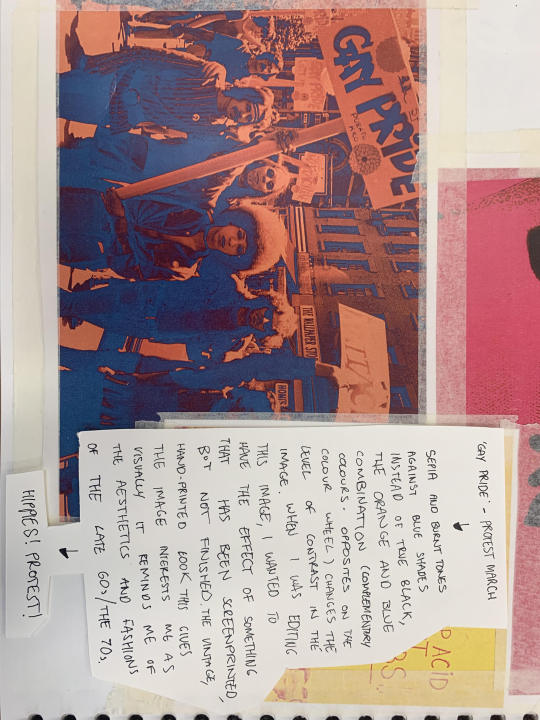

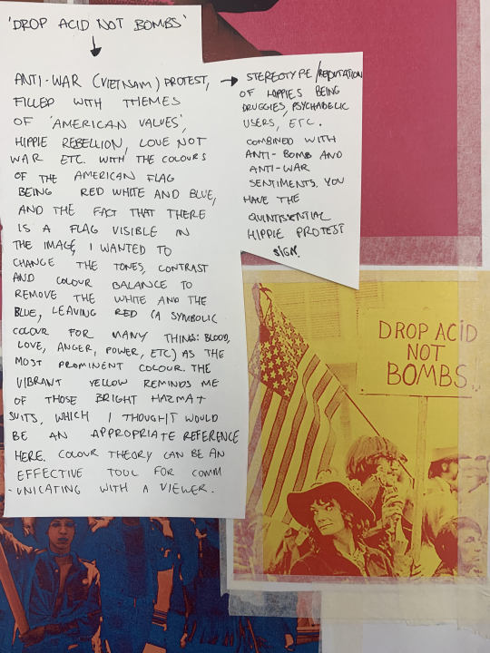
ANALYSIS/REFLECTION OF POSTER IMAGES I MADE. (MIGHT HAVE TO TURN IMAGE TO READ)
#ANALYSIS#ART#SKETCHBOOK#HIPPIE#PROTEST#FASHION#FASHION PROMOTION#FASHION POLITICS#FASHION HISTORY#PROJECT
1 note
·
View note
Photo
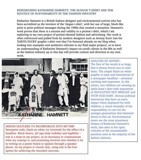

KATHARINE HAMNETT AND SLOGAN T-SHIRTS:
I chose to research British designer Katharine Hamnett for my FMP because of the relationship Hamnett’s designs have with politics - she's credited as the inventor of the slogan t-shirt, which is now an often copied staple of most fashion brands. Slogan t-shirts and items of clothing printed with statements and text are elements that I am featuring in my own work - designs with political themes printed on computer-rendered clothes. With Hamnett’s advocacy for various causes like environmental sustainability, gay rights, supporting Africa through the famines and AIDs crisis. My project is less specific in which political and social issues I’m protesting, as my project is more about the act and art of protest itself. The topics and subjects featured in my work are broad and relevant to current events, such as police brutality and corruption, violence against women, the climate crisis (and how the fashion industry contributes), and LGBTQ+ rights. One ‘slogan’ that I have incorporated into my work so far is an interpretation of a quote from Nina Simone, “I'll tell you what freedom is to me: no fear.’ from which I embroidered onto my own textile sample as ‘FREEDOM MEANS NO FEAR’ (partly for a shorter, punchier statement and partly because it would have taken me much longer to hand stitch the original quote).
#KATHARINE HAMNETT#RESEARCH#ARTIST RSEARCH#STUDY#ANALYSIS#CONCEPT ANALYSIS#FASHION#FASHION HISTORY#FASHION PROMOTION#PROJECT
2 notes
·
View notes
Photo
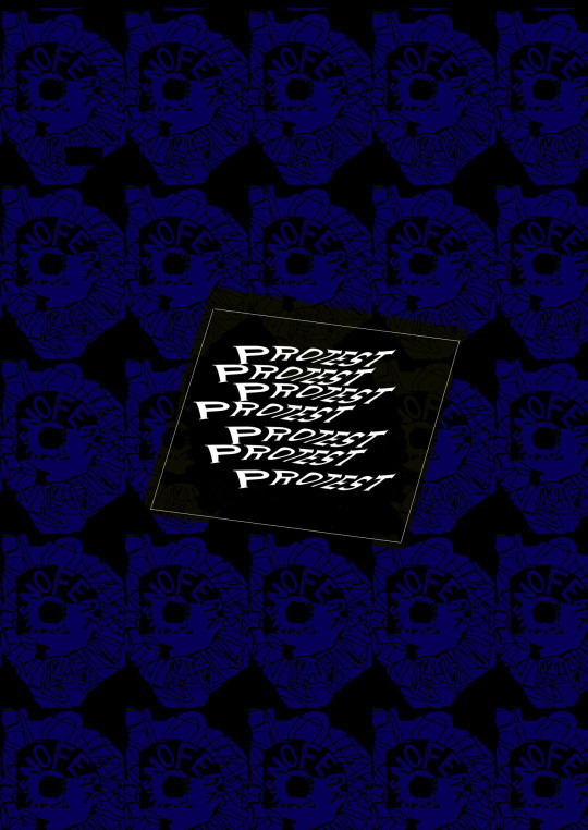
POSTER FOR MY FINAL MAJOR PROJECT, MADE ON PHOTOSHOP.
This image was edited on adobe photoshop - the original photograph was a scanned image of my hand-embroidered textile piece that I turned into a pattern on photoshop. Using the paint brush tool, I drew lines over the ares of the scan where there were threads exposed to create a different texture. The visual impact is more significant after being reduced to a flat, two colour image - the spiral of the textile combined with the dense, dark colours almost resembles an iris and pupil. It’s just a little bit unsettling to a viewer in the sense that it feels like the poster is looking back at you. This creates a reference to the casual consumption of political issues on social media, how we look at a post and for a second and continue scrolling through our feeds; not stopping to allow what we read to fully impact us. With this poster, there is that phantom feeling of making eye contact with someone, which makes the image instantly more personally effective. And in the centre, I have cutout a black space to repetitively paste a lightly twisted, white text reading ‘PROTEST’. The text is simple so the overall image doesn't loose its heavy impact - a complex statement or longer sentence would have lost the symmetry and pattern in the poster. To prevent the text from being too jarring against the background, I've used the transform tool to change the centre and weight of the text, giving it a similar appearance to the print without compromising the legibility.
The text itself, while simple, is both relevant to my project (as I am exploring how fashion designers incorporate themes of politics and protest in their collections) and a punchy message - it's an action word, and can be read as an instruction. The way it’s presented in that tilted rectangular box bares similarity to a home-made sign protesters use at marches - the intention was to give the same sense of personal involvement as a cardboard sign held up amongst a crowd of other signs and banners.
The colour scheme for this poster was inspired by a pair of Vivienne Westwood kilt/bondage trousers I looked at in previous research - the blue and black against each other is a reference to the blue and black tartan of Westwood’s piece. With Westwood being an icon for punk, the influence of her in the process of making this poster leads to the poster itself having that punk aesthetic - a little rough and ugly, but arresting and strangely appealing in an aesthetic sense.
#GRAPHIC DESIGN#POSTER#ART#ORIGINAL ART#ORIGINAL PRINT#FASHION PROMOTION#FASHION HISTORY#POLITICS#FASHION POLITICS#PROTEST#ANALYSIS#EVALUATION#REFLECTION#CONCEPT ANALYSIS#FMP#PROJECT#VIVIENNE WESTWOOD#PUNK
4 notes
·
View notes
Photo


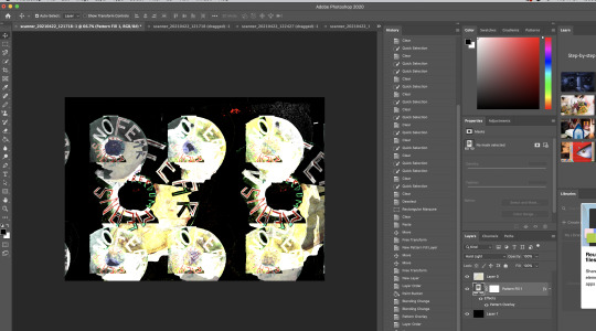
SCREENSHOTS OF PHOTOSHOP PROCESSES.
1 note
·
View note
Photo

DEVELOPING MY CONCEPT- MOOD BOARD REFLECTION (rotate to read)
0 notes
Photo
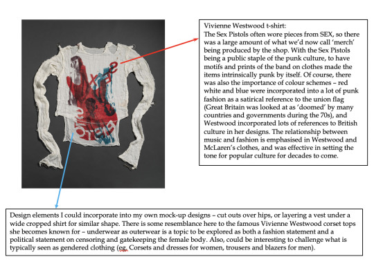
VIVIENNE WESTWOOD, MALCOLM MACLAREN, SEX PISTOLS, PUNK.
7 notes
·
View notes
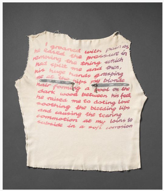
Photo

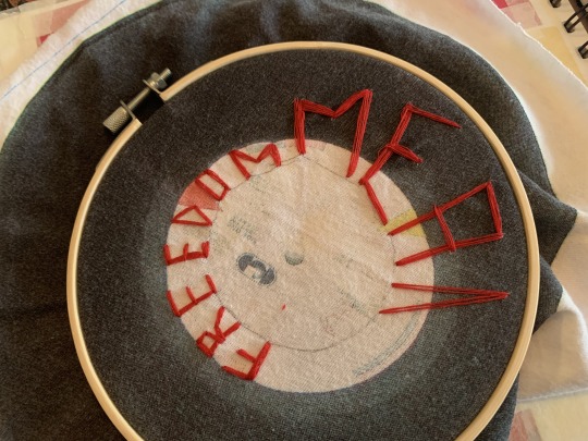
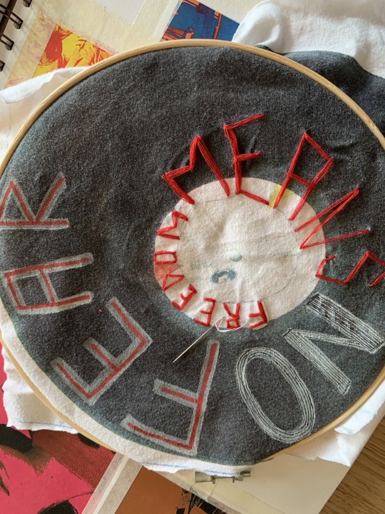
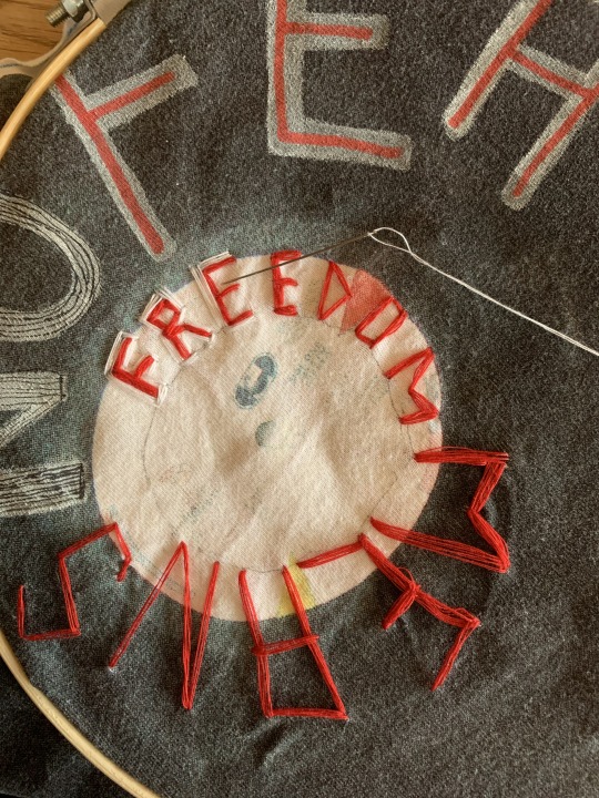
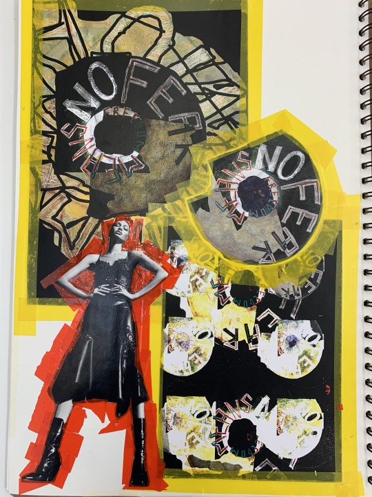
‘FREEDOM MEANS NO FEAR’ hand embroidered textile piece. Process.
REFLECTION/ANALYSIS: with protest and politics being a dominating theme in my project, I wanted to produce my own protest-inspired print. Hand-made signs and DIY t-shirt slogans are recognisable staples of protest that I wanted to include somehow in my work, as personally I find them more impactful and personal that a printed off sign or poster. With my technical and practical skills in textile making and fashion design less refined and sophisticated than my photoshop and image manipulation skills, including hand-rendered or hand-embroidered work into my project was a small struggle. To overcome my own mediocre sewing skills, I’ve utilised the scanners on campus to upload my embroidered textile sample onto photoshop, where I can manipulate and refine both the design and the overall layout.
Making a print out of just one object was difficult, but I am overall pleased with the results and find that the outcome is appropriate for my project. The combination of digital and handmade appeals to my own personal design aesthetics, and I also think it references well to the research I’ve done into the punk counterculture. The distortion and bold colour choices are reminiscent of some of the clothing items I’ve seen of the 1970s and 1990s, and the resulting aesthetic looks as if it would fit in with genres of punk and grunge. The faded, aged and bleached appearance of the last image is my favourite: dark, worn, frayed and inverted. Whilst the text is less legible I think it has the most impact visually of all of the productions, while my ‘multiple’ print has a sense of commerciality and a passing similarity to newsprint. Overall, I am pleased with the direction that this piece took, and the way it has shaped my future productions.


0 notes
Photo
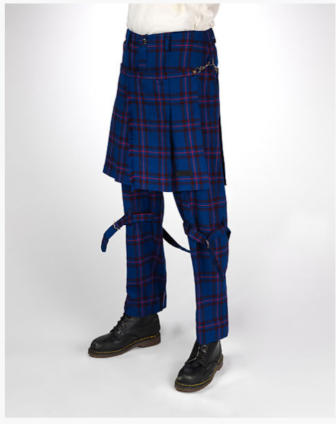
VIVIENNE WESTWOOD: DESIGN ELEMENTS FOR INSPIRATION.
~kilts/skirts
~tartan or plaid
~combined items, layering (skirt and trousers)
~hand-rendered text
~faded/colour bleached prints
~zippers
~placement of accessories/decals for shock value
~hardware embellishments
~British references (colours, kilts, tailoring)
7 notes
·
View notes