Last Seen Blogs

duocmyphamhomi
Dược mỹ phẩm HOMI
minteehell
-minT • Comms Open!-

kuripro2021
栗芝プロジェクト 2021
deimcs
praise to the nightsinger

adarshkrme
Untitled
Text

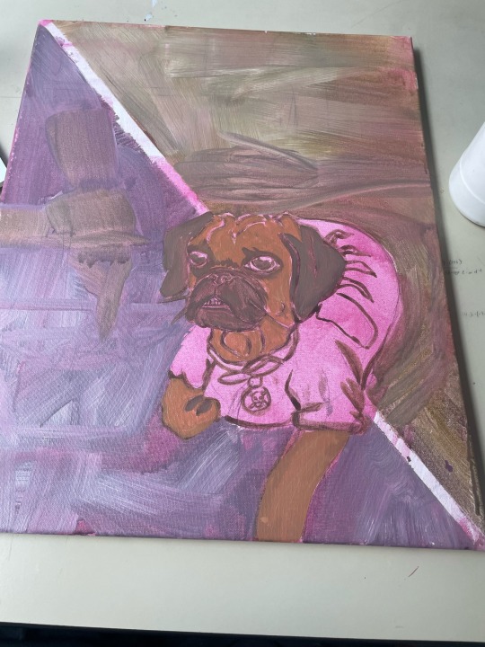
Old man Joey, 2022 Acrylic on canvas. 11in by 14in
Basil, 2022 Acrylic on canvas. 9in by 12in
Children at play, 2022 Acrylic on canvas. 24in by 30in

Loyal Guard, 2022 Acrylic on canvas. 36in by 12in
Family portrait, 2022 Acrylic on canvas. 48in by 32in

Project Statement
19 notes
·
View notes
Text
Through out the entire semester I have been enamored with your work. Everything is all so beautiful and I really enjoyed seeing a bit of your process on making one of your pieces here. Amazing work, i don’t know if this is your usual painting method but it’s so amazing and I would love to seem more of your work.
This is a video of my process when I using airbrush. I continued with the background texture from the third painting. It gives the painting some of a bounded feel.
5 notes
·
View notes
Text
youtube
I’ve been looking a lot more into Alice Neel this past week because I really like her color use and want to take inspiration from her when finalizing these pieces. This was a rather old interview with her dating back to 1978 but honestly taking a deep look into this more classic type of painting was great for me. In the beginning on the video we see a bit of her lining out a painting and I found that super interesting because it’s similar to the technique I’ve been doing for this series. I’ve always heard of Alice neel but this was much more of a deep dive into her work and her as an artist.
3 notes
·
View notes
Text
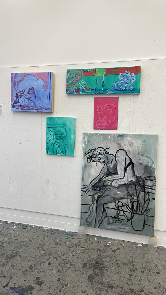
This was how I displayed my works for the final critique. I planned to work on adding in some more color making use of color theory to make the pieces “vibrate” a bit. I was most happy with the top right painting color wise and want to pull that effect into the rest of the pieces.
1 note
·
View note
Text
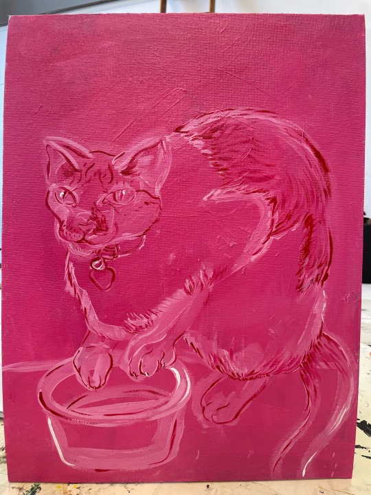
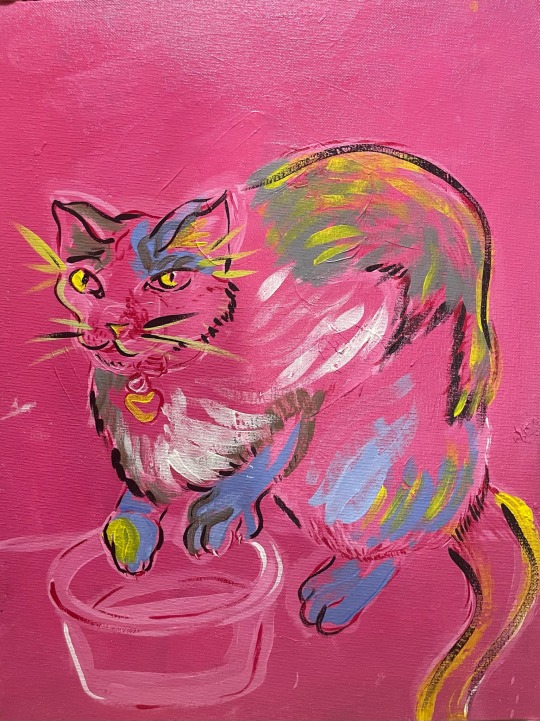
This is my fourth painting. This is of my cat Basil, she’s a 10 year old cat. I painted a deep fuchsia color as the base color and painted her in shades of lighter pink, red, and white. I caught a picture of her standing over the food bowl and gripping it with her claws. Just the way she was hunched over it and gripping the bowl so tightly was really visually interesting to me. She looked so big because she is already a chubby cat at around 15 lbs (cats are meant to weigh roughly 10lbs) she was 17lbs last I checked but we’ve put her on a diet recently.
Her being such a chunky girl has become a big part of her personality. She will always wait by her food bowl or run to you if she even thinks you’re grabbing her snacks. So I just thought this painting got across that idea of her just sitting and waiting for more food. She’s a really calm girl and doesn’t cause too much trouble so I made sure to catch a picture of her where her face is calm but her claws are out because she was in the middle of meowing as loudly as she could so I could feed her…again.
1 note
·
View note
Text

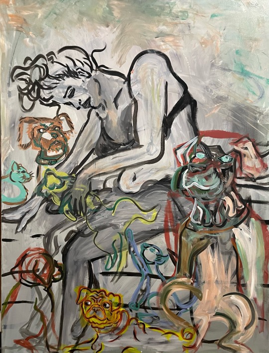
I might completely redo this painting, but this will be my 5th piece. I plan to layer on each pet on top of this. I have been working wet into wet for this series but I like the sort of symbolism of them coming after one another. I’ve included my oldest pet Basil. She is my 10 year old cat that my dad found as a baby in the warehouse he worked at. She will be part of the base layer because she has been in my life so long and so long before anyone else it’s sort of suiting. I plan to add color with each pet I add, for example one would be painted in with shades of blue and then another with shades of red and so on. Each layer I will add to the overall image with that pets color, to sort of represent all that they add to my life. I like the dreariness of this initial layer but I plan to transform that feeling. I am going to take an image of every step along the way because that’s going to be just as important as the final piece. This painting will in theory go through 8 more stages before it is complete because I have 8 more pets to add.
1 note
·
View note
Text
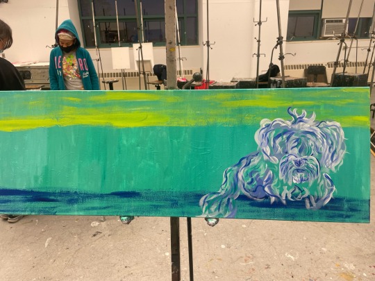
Yesterday I worked on my 4th painting in class. I was painting my dog, Frisky, under the bed. I thought this canvas shape/size lent itself really well to that composition. I started by defining the floor line with a dark blue and the bottom of the bed frame in a neon-ish yellow green with the base color being a teal-ish green color (the color I got from mixing the two with some white). Then I went in layering the sketch lines for frisky figure. I went basic and blocked out the shapes for the first layer and little by little added in the layers of all her curly fur. Her hair was a little overgrown in my reference photo because I had missed her groomer appointment but I think that fluffy look was more suitable for her portrait. Frisky is a really loyal dog who follows me literally everywhere I go all day and I think her being all fluffy gives her that soft cuddly look. When she’s extra fluffy she looks sweet and soft like a teddy bear.
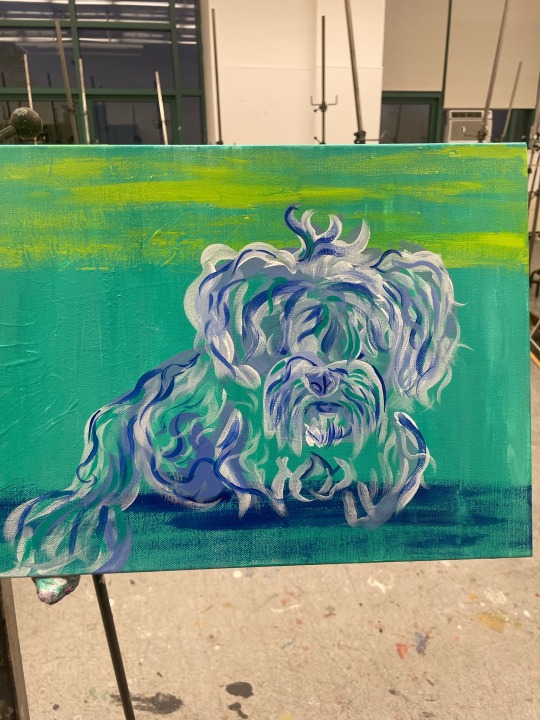
Here a little bit of an up close. I painted in the suggestion of her features like her eyes or her mouth/lips but then layered her fur over those. Because I’m not going too deep into the refining part the layer of these details still peak out through everything like it does in real life.
At this point the I wanted to add details to give the viewer more of an idea of where frisky is supposed to be. So I thought to add in feet, one resting on the floor and the other resting on the bed post, making is so you can just barely see past the toes. The shoes from the day thrown down next to the feet and the blanket spilling off the bed. I wanted the bits of the human (myself) to feel exhausted while frisky is more calm and comforting/comfortable.
The Professor suggested in adding a color to combat the tone I was using such as a rusty peach color or something like that. So I did, using this peach to add in details to the inanimate parts of the painting ( the blanket, the shoes, and the bed post).
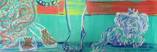
This was my work in the end. I’m really happy with how it came out, it has a certain charm to it. This is really different from work I usually make but I think that’s a good thing. I’ve been stuck on my one kind of style I haven’t allowed myself to branch out and I think this is really good for me going forward. Each time I’ve been doing these kinds of paintings I’ve gotten better. This is my 4th piece but technically only my second that I will be using for my final 5. Expect to see quite a few posts these next two weeks. I want to get painting 1 and 2 done and 5 at least conceptualized.
1 note
·
View note
Text
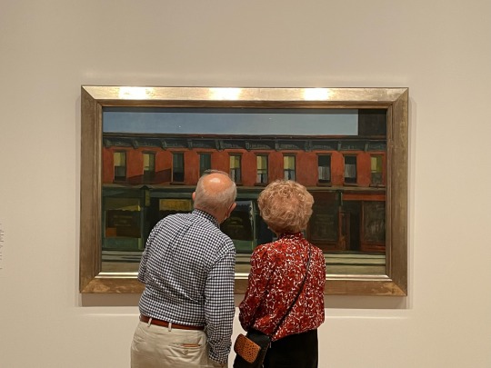
That last picture you took looks like an artwork itself. Absolutely gorgeous image. I like how you commented on the fact that there were many older people there today and was able to catch such a intimate moment between this couple. Absolutely gorgeous image. Very impactful and thought provoking. This would be an amazing painting, even if it wasn’t for your series for this class.
Today I went to Whitney Gallery. I mainly visited the fifth floor where is Edward Hopper's exhibition. Edward attempts to add silence and emotion to mundane scenes, such as a gas station, a motel, or a street, etc. Actually, when I look at his painting, two words fill my brain, loneliness and romance. The characters in his paintings all present a sense of alienation and romance. These figures with unreadable expressions and car-free streets all form a strong style.
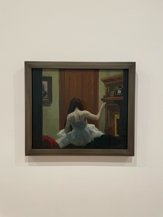

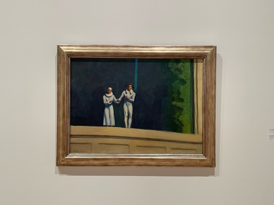
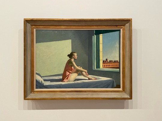
I highly recommend everyone to go see his exhibition. By the way, it's interesting that most of the people visiting today are old people. I think romance is when you are old, you can still hold hands with your lover and walk around the museum, and enjoy the artworks together.
3 notes
·
View notes
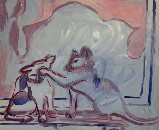
Text

This is my 3rd painting, I decided to go forward with the brushwork look and tried to have fun with perception. I caught a picture of my cats that I felt was better exhibits their personalities and relationship with one another. They were standing in front of the tv and you could kind of see the bed frame and the light shining behind it. I tried to exaggerate the light shining from behind the bed frame by putting in some soft pink bursting out from behind the rough outline of the bed post. I didn’t define the bed frame too much because I felt like that gave the look of a reflection better, especially since the black screen of the tv gets rid of so many details.
I used mostly blue on Chloe and more red on Cootie because I feel it contextualized their mood a bit more. The red on cootie is because she’s getting annoyed and frustrated with Chloe who’s more in a playful mood, probably not realizing in the moment she was getting Cootie mad. Chloe’s outline is more fluid with few defining thin lines while Cootie is much more stiff with a red outline through. You can almost feel her cringing away from Chloe’s paw.
1 note
·
View note
Text
https://www.scientificamerican.com/article/why-we-need-to-take-pet-loss-seriously/#:~:text=Cats%2C%20dogs%2C%20horses%20and%20other,weeks%20after%20our%20pet%20dies
Here are two articles that I read this week to inform my series. I’ve been fixated on the idea of highlighting the role that pets play in our lives (or at least in my own). I feel as though pets and animals as a whole are completely disregarded and given little to no respect most of the time.
In the top article, the writer is focusing on a few artists who base their works on roadkill. The unifying factor for all these works is that they are meant to highlight the disregard humans tend to have for animals. While these works focused on roadkill which is encompasses animals such as pigeons or raccoons usually but unfortunately in the highway I take to school I often see cats as roadkill also. In my experience I will see cats just as often as I see raccoons on the side of the road. I have also seen a dog once, it was a large bully breed but looked young. Poor thing… I will never forget seeing that dog.
The bottom article is about the loss of pets and how it is often overlooked by our society. We are often forced to grieve in silence, even being embarrassed of being so sad about losing a pet. The article explains that the length of time spent mourning a pet often is equal to that of mourning a human. While this article is about how animals and their deaths are treated and refused proper respect in life, I feel like this extends itself to how they are viewed in art. They aren’t viewed as important enough to be the main subject of a respectable piece of work because “it’s just a dog” but it’s not JUST a dog. It’s a loved one. A family member. A living breathing being who deserves to be loved and remembered.
2 notes
·
View notes
Text

This was the list of notes from todays critique of my first 2 paintings.
1 note
·
View note
Text

This is or was the sketch of my 2nd painting. I’m thinking to refine parts of it a bit but I agree with the feedback I got in class that it feels like finished piece already. I feel like it captured the subjects, Cootie and Chloe, well. They’re always two peas in a pod and this was a moment when I was walking past them cleaning each other and they both stopped to look at me when I tried to capture a picture. It was a nice soft moment and I think the looseness of the brushwork captures that more than fully rendering and layering would.
3 notes
·
View notes
Text
This was the beginning of me starting my painting process. I mixed a base color for his face, body and ears so it can have a unified base. I decided to avoid some detail lines like the rolls and folds of his face or his whiskers.

I was inspired by Jordan Casteels method of painting one part one by one giving, usually I’ll focus on big areas or even the whole canvas at once. I think this method was really really successful I really like the layers and level of detail I was able to get in his mouth/nose area a lot. Even at the end of the painting it’s my favorite part, I feel like it centers your view both literally as it is nearly centered and figuratively. Something about all the white hairs and highlights really felt successful.

I like how the details in the face ended up but I feel like he looks a tad bit fluffier than he really is which i don’t LOVE. I won’t say it’s a fail or a win it just sorta is. Visually it’s appealing and interesting but I feel its just a tad to fluffy looking.
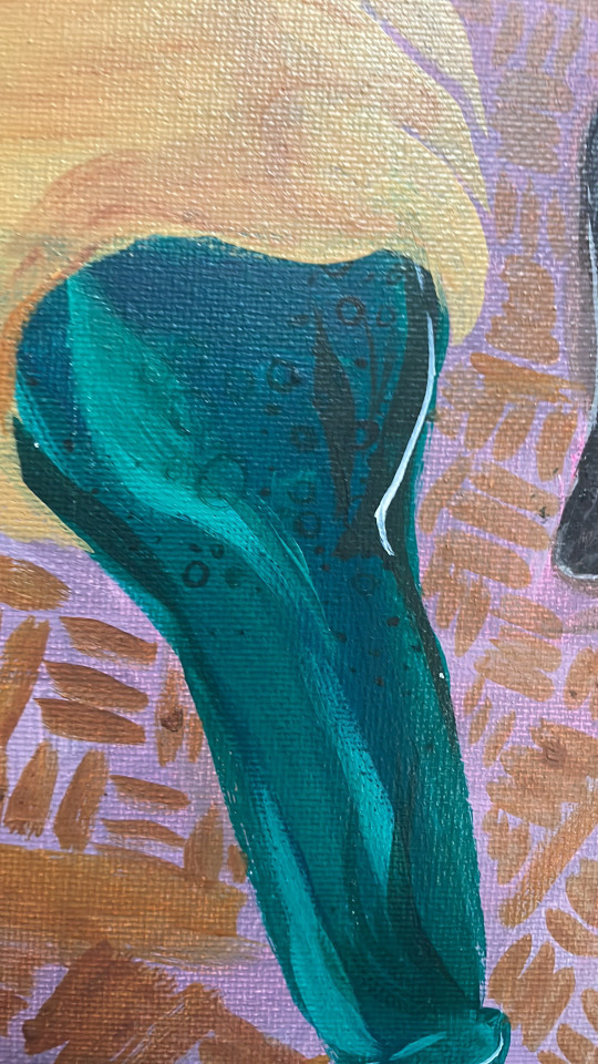
Super small details that I don’t know if anyone noticed was the bubbles in the bottle. I wanted it to look like the beer was bubbly and fizzy as it was pouring out. This was a bit of a fail because while a pretty up close detail didn’t achieve what I wanted it to. I might go back in a try to double down on that effect when I’m refining this piece.
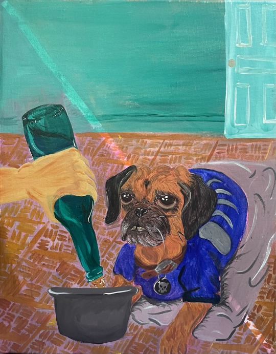
I didn’t get anymore in between pictures of beginning to end, I thought I took more pictures but I guess at a certain point I was just really in the zone. But this was the end result as of today. I do have things I plan to edit and change but I’m happy with it so far. I might do a few tweaks on the floor but for the most part I really like that effect of a like loose outline of these old wooden tiles at my boyfriends old house. I was painting it from memory and the way it came out kind of blurry and loosely outlined is really nice.

When I got home today I decided to take a picture of Joey with his portrait and decided to post it for you guys.
2 notes
·
View notes
Text
This is such a thought provoking piece. It reminds me of the artist Vik Muniz, he had a series of works in which he chose subjects, who would pick out valuable items from the trash, to “paint” portraits of out of the trash they would sort through. Look up his wasteland portraits if you haven’t heard of him, they’re honesty amazing. You’re work is much more abstract than his but it instantly made me think of his work. I am so fixated on the hat in this piece, it leaves me with so many questions. Like was the hat already paint splattered or did you do that on purpose? Is this a pack of cigarettes that you found or was it yours? Is this a portrait of some sort? It’s just amazing and it leads to a great repertoire between the work and the viewer.
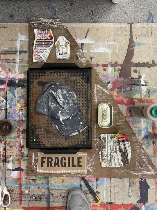
In class work #3:
support: found triangular wood.
materials: wood glue, cigarette pack, lottery scratcher, coffee can, hat, rusted bbq grate, sardine can, broken piece of ceramic, cardboard, chalk, screw, pushpins.
I like this piece as a visual poem. I explored composition and relationship with the objects. I also like the word fragile in contrast to so many hardened, weathered, textures and materials on the collage.
4 notes
·
View notes
Text
I watched a YouTube video about Jordan Casteel and I’m going to type in my responses/notes here.
*(4:19) Jordan mentions how her paintings are to give people (her subjects) a platform and a voice that they may have not had before. This connects to what I’m trying to do with my series; While my dogs are not people they represent something that I want to bring attention to. Just having pets and holding onto them through their whole life is important to me, Giving them a good home even when they’re “bad”. Countless amounts of pets are abandoned daily; Cats, dogs, Bunnies, and every other type of pet you can think of. The idea of your pets being family and important beings worth care/patience is important to me. So painting them as my subjects is my way of telling you (the viewer) these are some of my family members that mean a lot to me. They’re not little furry jesters that exist to keep me amused, they each are their own beings and should be viewed as so. —— I couldn’t find the words to describe this idea earlier when I was presenting my proposal and listening to how Jordan described her subjects and why she chose them kinda clicked something in my head.
*(12:30) “I wanted to paint the people I felt were universally unseen…” - Jordan Casteel — I really like this quote, the way she continues to explain her subjects is standing out to me. I know she’s painting humans and I’m painting pets but the profound love and respect she’s holding for her subjects reflects the feeling I’m trying to get across but with dogs. I feel like for a lot of people it’s hard to fathom dogs or pets in general as these super important beings. I take a lot of personal time learning about the history of pets and the role pets play in our lives and for me it’s like yeah of course they’re important but I’m constantly realizing that’s just MY view not the worlds view. I’m realizing that’s what I want my series to be about, the more I hear Jordan talk about her reasoning behind her subjects I’m better understanding why I gravitated towards my subject choice so much. (Around this point I decided I wanted to also incorporate research into the history of pets, pets treatment in society, and stuff like that because I feel like that is informing my decision and thought process so much.)
*(28:10) Jordan begins talking about the “push and pull” of the different effects created by how thinly or thickly packed on the paint is in certain areas compared to others. This is something I tend to enjoy to make use of as well almost like treating acrylic /oil painting as you would a watercolor painting in that the base color is meant to shine through and be worked up from rather than completely hidden. I love to start with some kind of color usually something not too crazy bright but just something to get rid of that intimidation of this stark white canvas.
*(29:14) They then begin talking about the way that Jordan paints her subjects tends to bring them forward and bring the relationship/moment that they’re sharing forward.
*(30:05) Jordan starts talking about how the point of her making her paintings (specifically referring to early in her career) is to eventually get them out into the work and out of her possession. This isn’t exactly related to my project or not but I just never really thought about this fact. As an aspiring artist the goal IS to get your work out into the world but I have never really connected those dots like I wanted to become successful and obviously make my way into the world, into galleries and so on; But I never quite allowed myself to separate from my painting especially not my favorites. I guess I never really really thought about the fact that the goal is to give your paintings…away? I get attached to my works and I don’t want other people to have them because they feel like they’re personal. Idk this little moment made me self reflect a lot about myself as an artist and how I approach my work. Again this notes wasn’t about the project so much as it was about me as an artist overall.
*(44:00) This note isn’t so much about the content of what’s being said at this point more so of my amazement with just how beautiful Jordan’s exhibit is. Absolutely stunning, these huge canvases with such amazing life size (or close to life size paintings) is just breathtaking. I could only imagine seeing this in person.
*(50:23) Silly note but Jordan starts talking about what she listens to when she paints (crime podcasts or audio books) and she explains that it’s because music can be TOO emotionally driven and that she doesn’t like to have to think during painting. I 100% agree I always need something (not to say I never use music) whether it be Netflix, podcasts, or in todays case this “Artist Talk” video on YouTube.
Overall I really enjoyed watching this video I feel like it informed a lot of the things I want my series to be and to represent. There are a few things I want to research more into primarily I want to research more into the history of pets whether it be pets relationships/treatment that I find interesting or I wanna bring attention to or the history of pet portraits. I want this series to be a bit more informed because I’m beginning to realize more why I wanted to make this so much and I want to share that information with you guys (as well as use it to inform my ideas when doing this series).
youtube
1 note
·
View note
Text
Wow this artist has amazing work! I thought it was digital until I read it was gouache and color pencil, that’s amazing. I see the inspiration in your work for sure (from what you’ve brought to class so far). I love their use of color, I see that your work is rather colorful too and I think looking at works like this is a great way to inform your own color use.
One of my favorite Artists - part 2
• Hanna Lee Joshi
https://hannaleejoshi.com
This is a Canadian-Korean artist that I really like. She specializes in bright gradient tones and explores the construction of the female body. I find her poses and exaggerated proportions of the female body worthy of my study. The beauty of the female body is unrestricted, and each soft pose in Hanna Lee Joshi's paintings represents a realistic woman who breaks through existing societal limitations of what a woman can be.

I'm a little shy...but that's ok
Gouache and colour pencil on paper, 2020
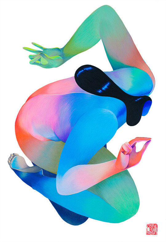
Pursuit of Prosperity
Gouache and colour pencil on paper, 2021
5 notes
·
View notes
Text
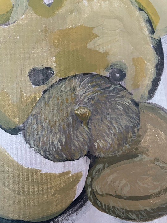

Today I decided I wanted to work on my final pieces with a larger canvas so in class I just practiced painting some texture by painting a couple of teddy bears. I didn’t finish them but I was able to practice some of the skills I’m gonna be using in this project. It felt like stretching before doing a workout in that I was getting my hand used to doing that kind of technique. I also plan to incorporate a bunch of teddy bears into one of my paintings so I was practicing painting teddy bears too.
I want my next painting to portray movement also, so I’m gonna do some research on that tonight.
1 note
·
View note