
Last Seen Blogs


Video
0 notes
Link
0 notes


Text
Evaluation
My final major I think was overall a success, I learnt many new techniques and skills throughout my journey to my final piece. I enjoyed the project and really tried to embrace learning new things and experimenting more with ideas. I was able to use the studio and rent cameras and equipment to help my images become more professional and put together, then develop these through photoshop and finally putting it all together in indesign, then finally creating a physical magazine.
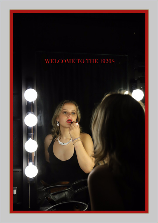
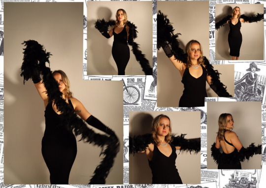
I enjoyed the theme I chose “identity and freedom in fashion throughout the eras” as it really allowed me to do deep research in to different eras of fashion and create a modern twist on them. You can see the development of the eras from the beginning to the end of my magazine, I showed this through my editing and different camera styles, angles and lighting.
My editing skills have really developed, from just using procreate to actually using photoshop and being able to navigate and create great images from it. I still need to improve with some things because I am still quite slow but that’s something that will come over time.
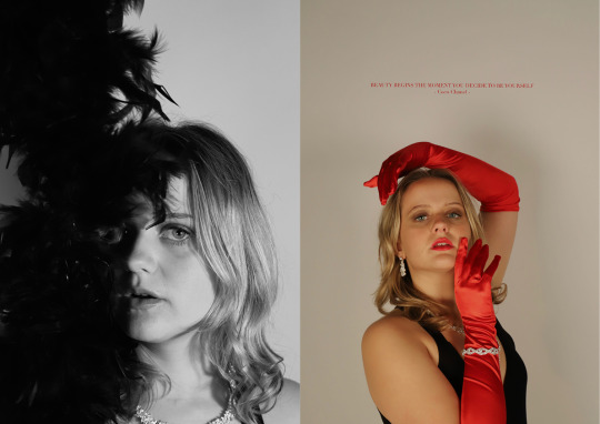
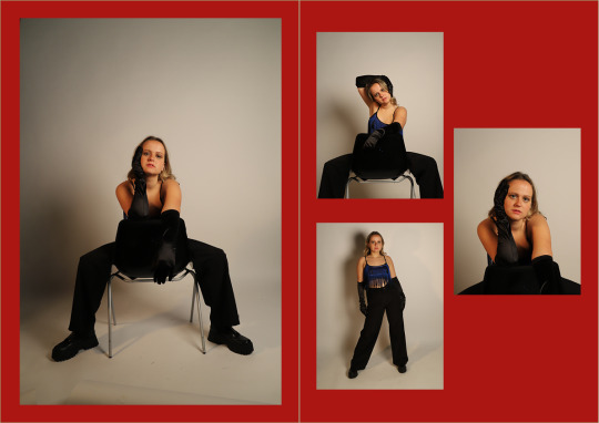
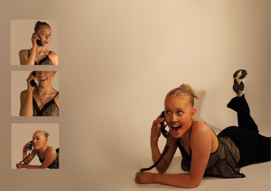
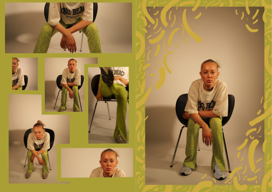
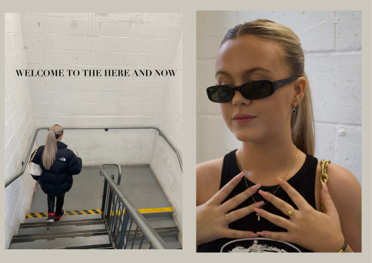
I am super happy I rented out the studio for a couple of days to take the images because it really helps develop the look of my images and really show off the fashioning able to use different backdrops and lighting. I played around with props and makeup as well, which helped relate images to there eras, for example I used a retro phone for the 90s shoot. I also did a location shoot for the now images, creating this more instagramable look which is relatable to the current time period, for example using car parks in photoshoots is very relevant to what people do now, which can create influence on others when they are looking through my magazine. For the final magazine I wanted to be able to create an element of being influential to others when it comes to fashion because trends always do a massive circle and come back, like in my 90s look I used flares and bright colours, where some of the clothes are also from charity shops and this is really big right now.
In this project I also enjoyed playing around with collaging and layouts, I did this within indesign creating double page spreads and really focusing on space so each page is different, either having one image on the double spread with 3 tiny images, having images cross over the spine, or something being really filled up. This is something I also would like to develop on in the future and play around with more because I think you can create some really interesting concepts with it. I also really liked exploring colour, as I don’t usually go so bright. I normally go for my blacks and white - even with my images, which I still included in the 1920s section. But then I decided colour can actually be used in simple ways, just like changing the colour of a background but it can really bring the final image to something completely different.
Overall, I stuck to my original plan and did do fashion throughout the eras and mainly focusing on the use of photography, I am also glad I decided to only pick 3 eras to focus on, I was going to do 4 at one point which was the 1980s but it starting getting out of hand and I didn’t have enough time, but in the end I didn’t need it anyway. If I did have another chance in the future I would definitely add it.
0 notes

Video
0 notes
Link
This is my final magazine put together in flip snack, I love this turned out and really demonstrates how it would look in the real form. I am super happy with the final outcome.
0 notes
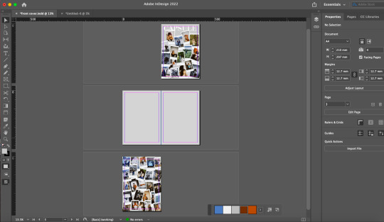
Photo


This is my front and back cover, I am super happy with it and I am so glad I went down the simpler route. I decided to do this because it looks like a pile of images in capsule. The images consist of all behind the scenes images and the images I didn't necessarily use. I think this is completely different from what is in the inside but I like how you don’t know what's going to be in the inside just like when you first find a time capsule. I also went for the capsule because I capturing the key parts of fashion through the eras.
0 notes
Photo
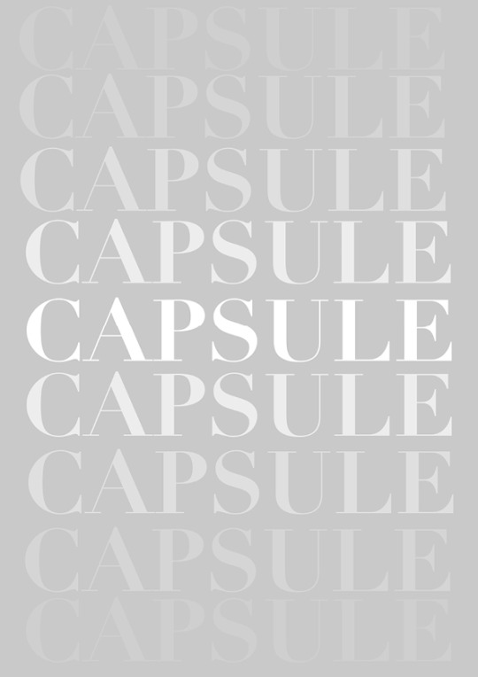
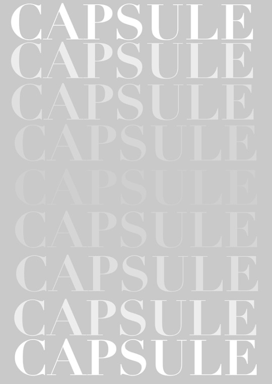
I decided to use this as my inside covers, because it looks like the word is fading in and out. I has a simplicity to it which I like because my magazine inside can be a bit bold sometimes so this creates a Nice balance.
0 notes


Photo


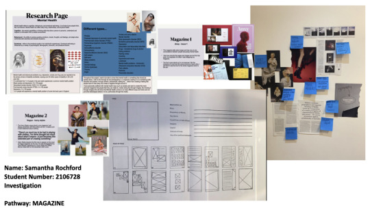
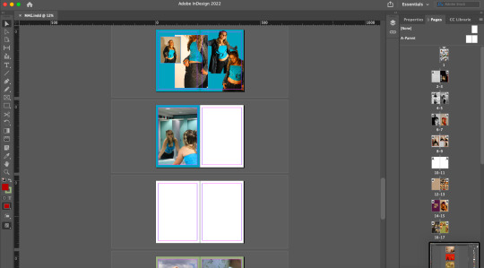
Here you can see some of my planning for indesin and me starting to plan where everything is going to go and what order it should go in.
0 notes