
Last Seen Blogs
eremika-forever12
Eremika Lover

genderlessdude92
KIKI/LYNN(•ω•)

ieynaa7
saiph

mcb00ty
666
amazingpetenclosures
Amazing Pet Enclosures

Text
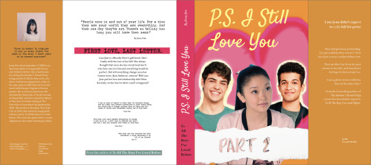
Creative: Proof 1
First Draft!
Second Draft!
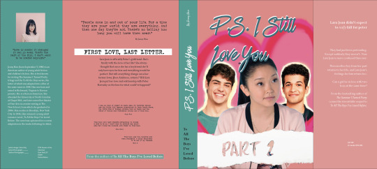
Firstly, on my InDesign document the colours are more saturated but when I posted it here the colours seem to look duller.
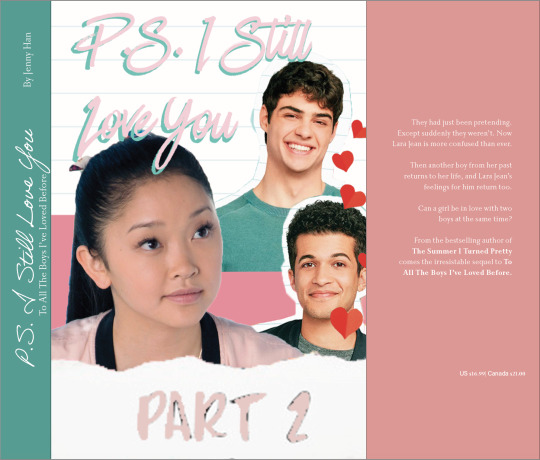
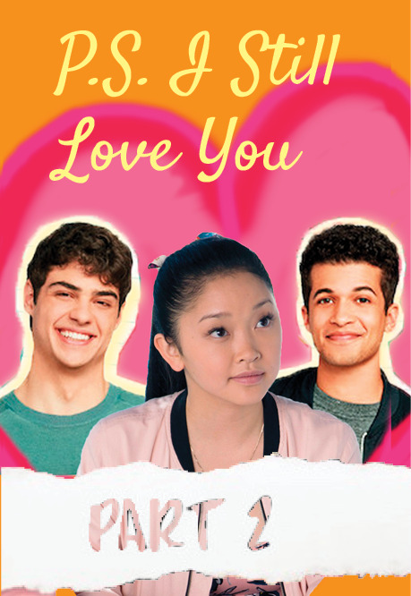
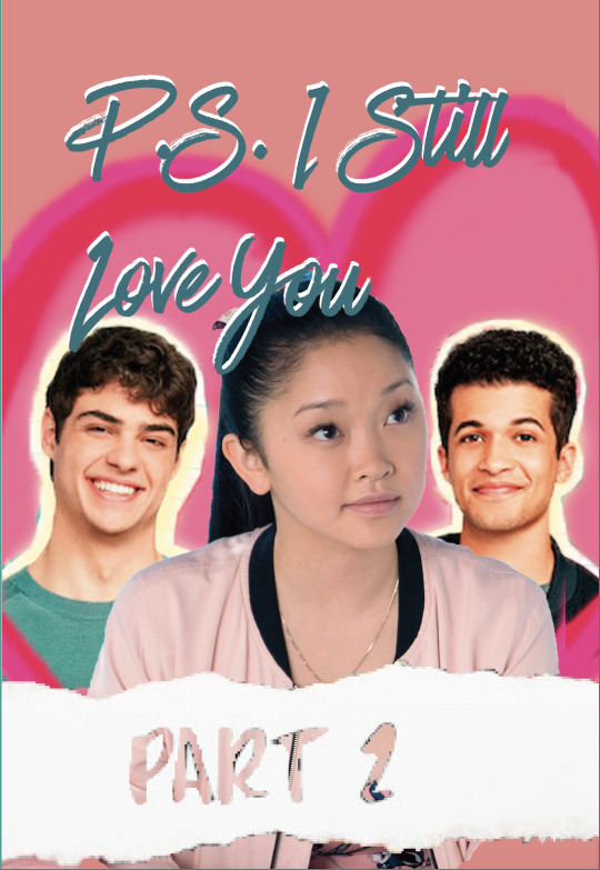
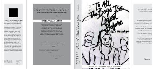
So for my cover I wanted to design it in such a way that’s playful and follows a warm or pinky colour scheme since the book is based on a teen romance. I like both my covers and can't seem to decide which looks better however typeface wise I wanted to stick with “Have Heart One” for my title instead of my other ones as I just know that this really works and is a good fit for the book and the book’s cover! :)
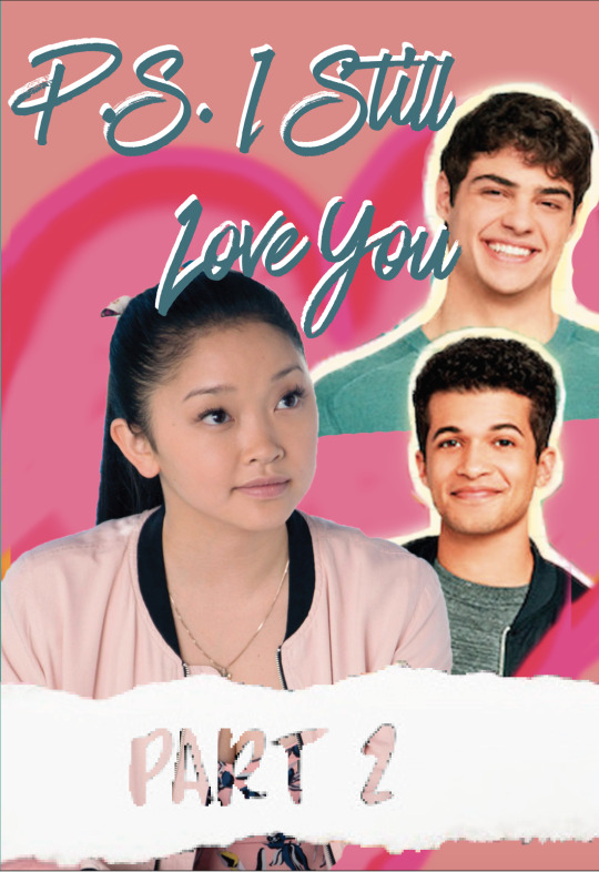
I repositioned and cropped the characters to experiment a little more with cropping and found that my 3rd cover also works as the way they are positioned it looks like she is thinking about her lovers.
0 notes
Text
Project 2: Planning
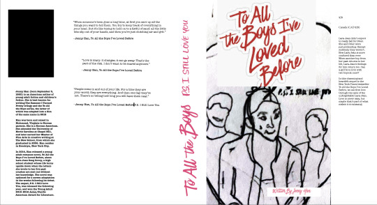
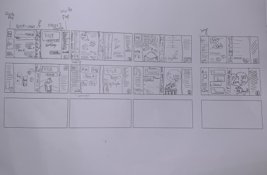
FIRST ROUGH DRAFT ;-
For this I tried playing around with different typefaces for the title, subtitle and the body text. It was a little challenging for me to find the perfect section to place my text. I reworked it and created my second draft!
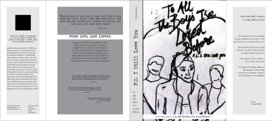
SECOND ROUGH DRAFT
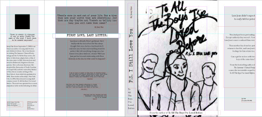
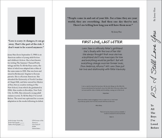
This is my reworked draft. I spent more time figuring out how to perfect the structure of my dust jacket. My chosen typefaces are as follows:
> For my Quotes & Titles typeface: JohnDoe, Regular (anchor typeface)
> For my body text, secondary typeface: Priori Serif OT
I tried to make a “hand drawn-like” typeface work for my title but unfortunately it didn’t however it is similar to the one used in the actual book. Hence I thought JohnDoe would be a good fit as the whole story started with Lara Jean writing letters. The typeface really gives that “typewriter effect”
I also experimented with the typeface “Adobe Handwriting - Ernie, Frank, and Tiffany.”
MORE ZOOMED VERISON OF THE BACK COVER, BELOW.
I’m a little confused as to which works better but I’ll experiment more with these two and decided which functions better.
In conclusion, I’m satisfied with the whole layout of the dust jacket however I’m still not sure about my decision for my title’s typeface as I want to have a handwritten effect or a type writers effect. However, my second draft’s layout worked the best as there's a lot of breathing space throughout the dust jacket that avoiding overcrowding therefore making it more legible and easy to read. As for my sketch that I've plunked onto my main front cover, I'm going to design it in photoshop properly and make it neat and professional !
1 note
·
View note
Text
PROJECT 2: DISCOVERY
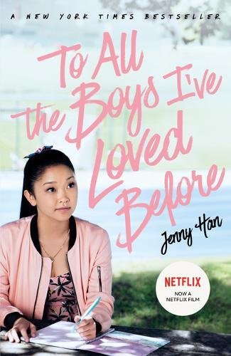
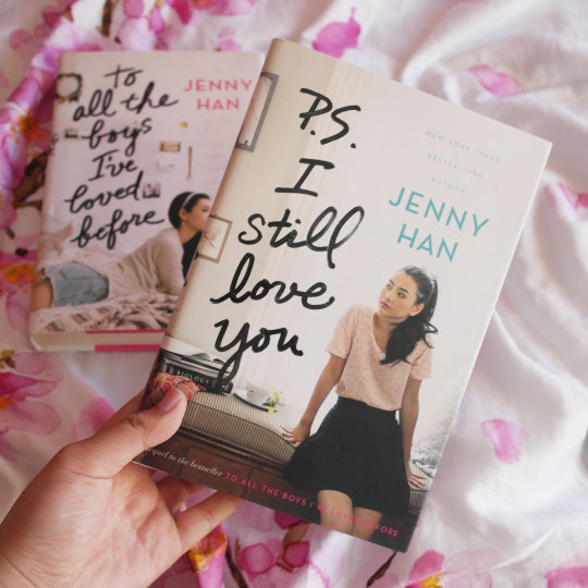
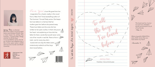
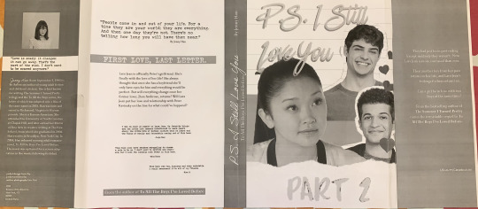
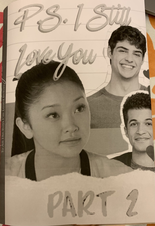
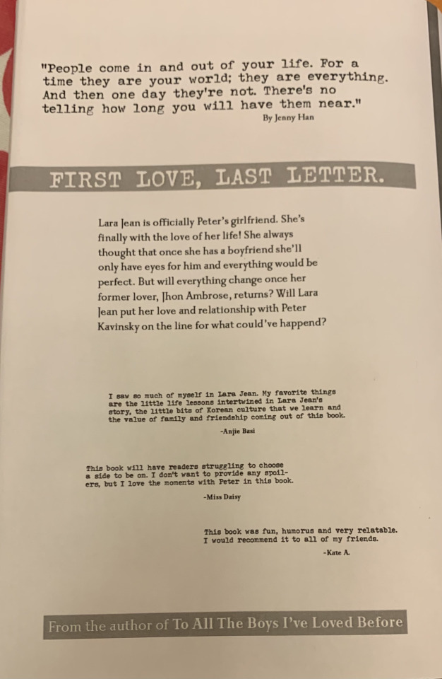
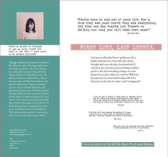
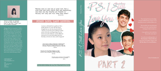
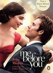
I chose Jenny Han’s famous “to all the boys I've loved before” as our redesign of a dust jacket book.
What is missing from the samples?
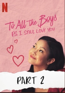
The covers are missing the very element of the term “love.” Like when you look at the book cover you just see the main character — Lara Jean but you don’t see the main love interest — Peter Kavinsky despite the title saying “P.S. I Still Love You” , it doesn’t demonstrate who her love is directed to, on the cover.
Keywords to recall storyline:
Trust
Innocence
True Love
Tough Choices
Heartbreak
Lies / Truth
Characters in the story:
Lara Jean
Half Korean and half American high schooler, Lara Jean is someone who you might consider as an invisible person, at her hight school. One thing to know and remember about her is that she likes writing love letters when she has a crush, but has always kept it a secret. Thats what the first part of the series was all about until her letters got sent out by her little sister and about 4 guys got the letter and her life (in her head) was over. P.S. I Still Love You is second part of series where she gets with her high school crush and her school’s heartthrob, Peter Kavinsky. Since Peter is the type who’s way out of her league she develops trust issues with him when he starts to become friendly with Lara’s ex-best friend who also happens to be his ex-girlfriend and from there their trust and love gets put to the test.
Peter Kavinsky
High school heat throb, jock, party, every girl’s dream boy basically. While being the school’s most handsome and popular guy Peter was sweet, considerate, and passionate. However at the beginning he used Lara Jean to get back his ex-girlfriend, Jen. While they were both okay with this, on a school trip they both end up falling for each other without knowing it. Well she did but he didn’t. Peter is someone who did make a lot of mistakes but always felt remorse and sorry about his actions which made the audience fall for him even more. He wasn’t a jerk but he could be at times, unintentionally.
Josh
Lara Jean’s sister’s boyfriend (in the first book) was one of Lara jean’s former loves or another of one of Lara Jean’s love letter recipients. Josh was one of the guys who were innocent, smart, loyal, kind-hearted and compassionate. However, being Margot’s (Lara Jean’s older sister) boyfriend it was hard for both Lara Jean and Josh. This was because when the letters got sent out, he got is and had no idea what to do but to confront Lara Jean. This caused a lot of tension for everyone. But Josh stayed the sweet guy he is and let her decided whether she wanted to be with Peter or him.
Lucas
Another one of Lara Jean’s lovers who later on came out as gay and told Lara Jean all about it. Lucas is someone who’s just adorable, sweet, intelligent (nerdy)and a loyal friend. It was when Lara Jean had encountered Lucas’s letter had been sent out to him and he came up and told her that she realized all of them were out!
Jhon Ambrose McClaren
He wasn’t much of an important character at first , however he became important in the second part of the series. Being Lara Jean’s second most important and hardcore crush John was a very talented, kind hearted, generous, sweet, loyal, and simplistic individual. Lara Jean felt more relatable with him as with Peter she was exposed to more extroverted activities like partying and socializing. However, with John, while volunteering at an old age home, she became closer to him as they had a lot more intimate moments with one another as he liked the same things as her like reading, enjoying the simple things, planning, organizing and all those things. He always handled himself maturely with utmost grace and patience
My main focus is the second book, To All The Boys I’ve Loved Before P.S. I Still Love You.
Moments before, during or after climax :
Before the climax
Lara Jean Covey’s high school sets up a volunteer program; while her now boyfriend, Peter Kavinsky, goes to volunteer with his friends she decides to go to Belleview Retirement Home instead. And that’s when she meets the books second love interest John Ambrose McClaren
During the climax
She starts reminiscing with John all the good times they had together as kids. She starts getting close with him while Peter is hanging around with Jen, his ex. As she starts having family issues similar to his and needs a shoulder to cry on. While Peter deals with that Lara Jean has no clue and starts to doubt him and their relationship. She gets jealous and starts to think he’s lying to her
Lara Jean gets to know John Ambrose had feelings for her since the beginning but never had it in him to tell her. He confesses his love to her but even though she feels the same she doesn’t believe that he’s the one for her
After the climax
Towards the end where John confesses his love to Lara Jean but she realizes he isn’t the one for her, they’re at a dance that’s being held at the retirement home. She leaves him out snow and goes to drive to Peter’s place but she finds herself at the entrance of Bellview where Peter is waiting for her and then walks up to her and confesses that she is the love of his life and tells her that he remembers that she hates driving in snow. The get back with each other and now know that no matter the struggle they will get through it, together.
The vernacular at the time of the story: what was popular in the culture at the time (signs, typography, trends..)
The book demonstrates that this was taken in a very modern time, 21 century to be exact. It’s a modern day, cliche, high school romcom, kinda love story.
At the time being cool, athletic, pretty, rich and all that was the popular thing. Kids who were from middle class families, not “pretty enough” and popular were picked on and bullied by what we call nowadays “the plastics” or the mean girls.
The typography used for the the film and the book’s poster is Have Heart. It is a brush scrip with two hand-made fonts and some washes.
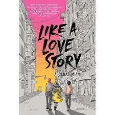
Unrelated Book Covers
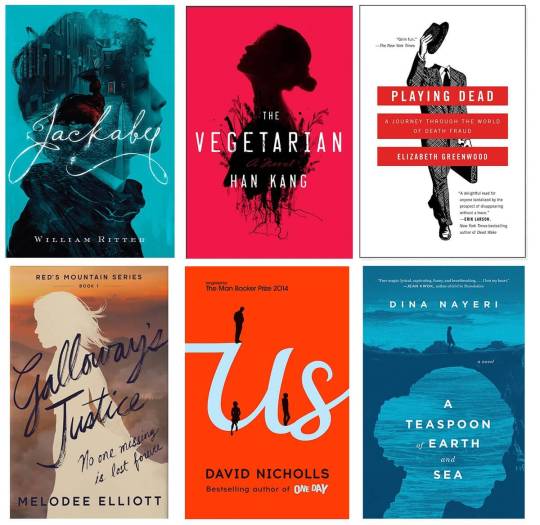
the above images are my inspirations for the dust jacket for my book! The first group of images attracted me as they’re straightforward, make good use of beautiful, natural typography that are structured and have a sense of hierarchy promoting legibility and readability. The use of silhouettes and feel of hand drawn sketches is what mainly attracted me to them. These and and the last to images of book covers really inspired me.
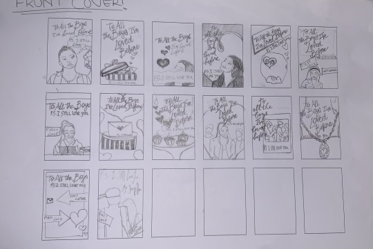
Since my book is basically a teenage romance novel I would like to include 3 of the main characters, Lara Jean, John Ambrose McClaren and Peter Kavinsky, on my dust jacket in any way possible. On Jenny Han’s cover its mostly Lara Jean whose portrayed on all 3 covers of the series. I would like to change it up and include all of them in ways like whether its a creative artsy sketch or in the forms of silhouette with the use of a red and white colour scheme.
THESE ARE MY SKETCHES
0 notes
Text
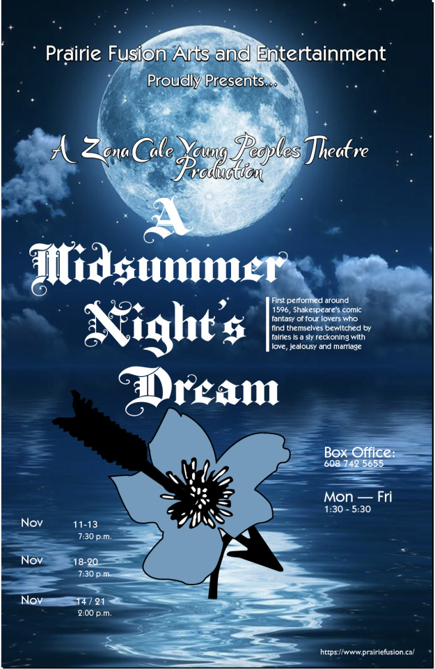
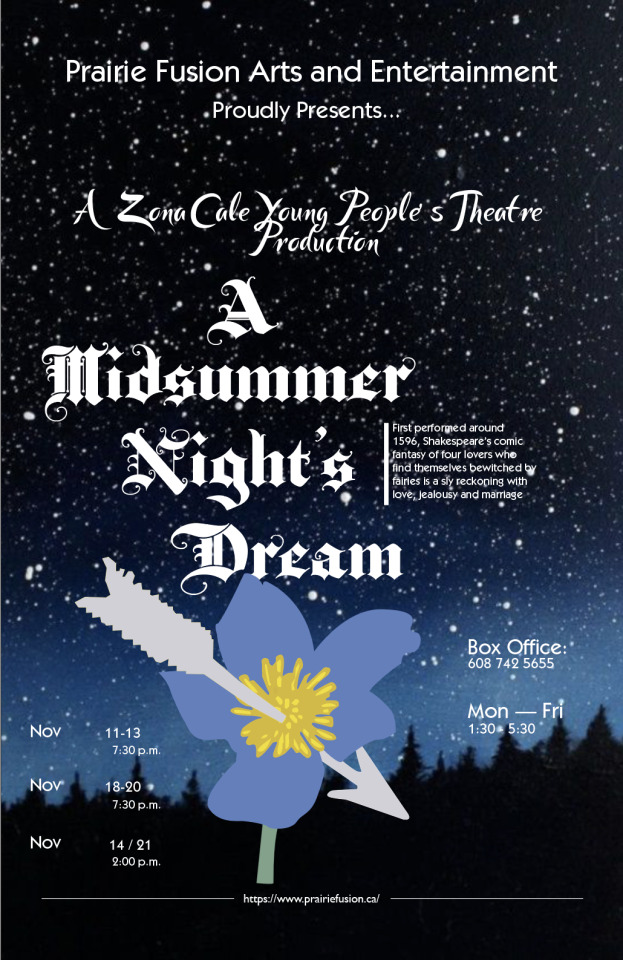
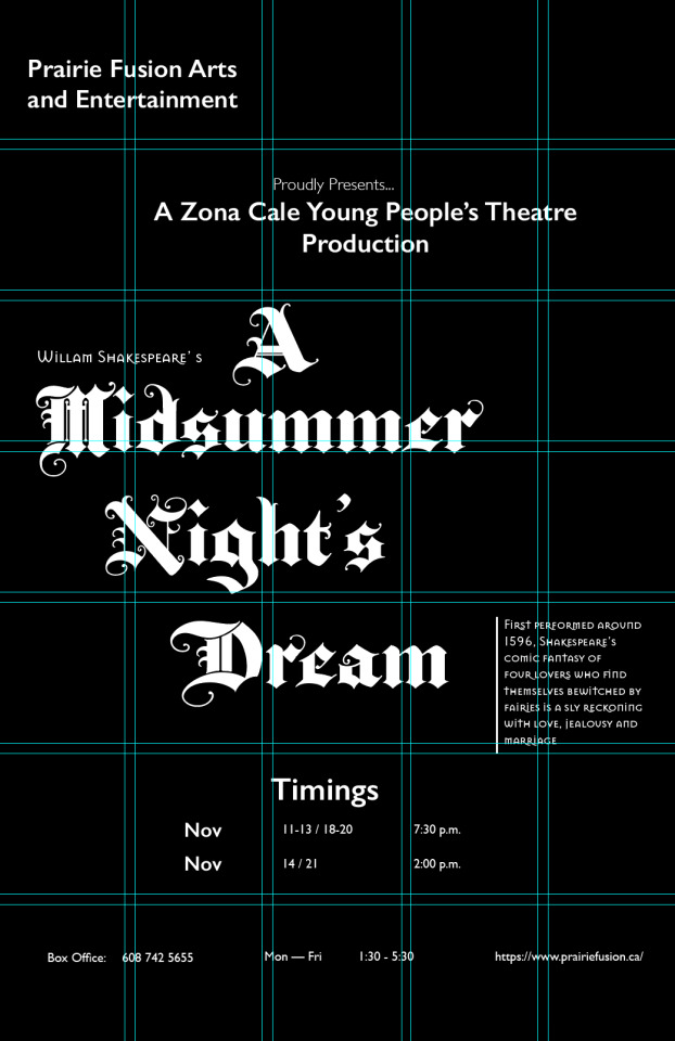
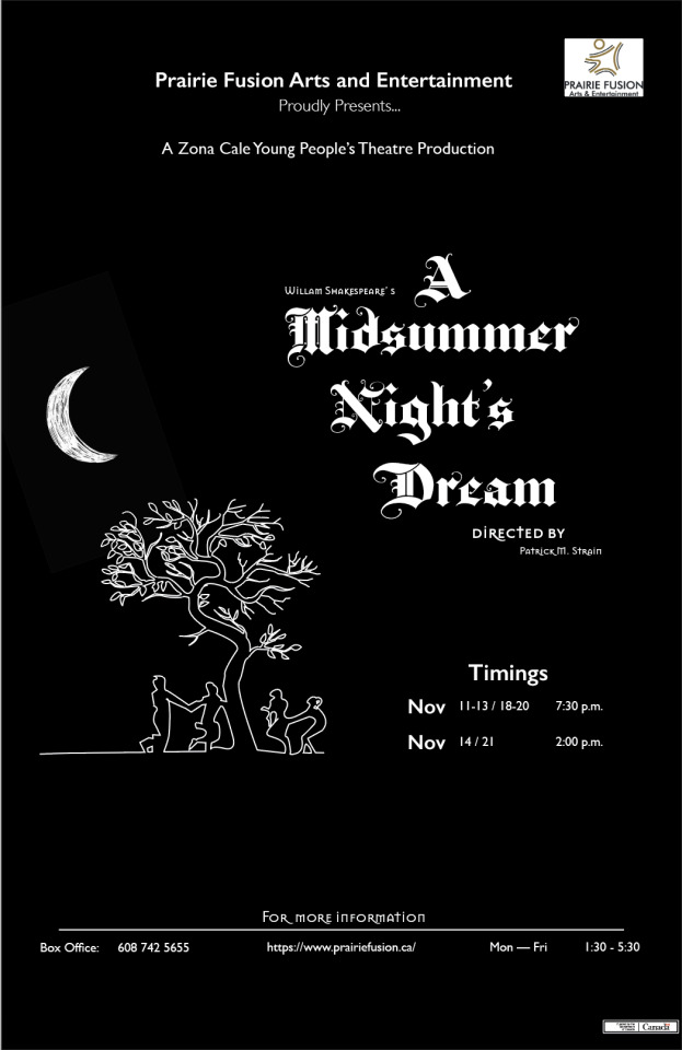
Project 1 Application: Proof 3 Final
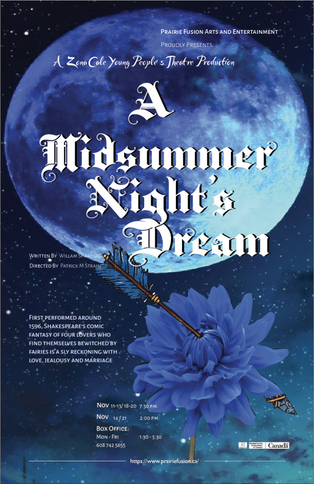
After endless tweaking, reworking and editing I have finally finished my poster design for Shakespeare play, A Midsummer Night’s Dream! This project taught me a lot of things. Firstly, I really gained knowledge on type crimes and used it to help me design this properly! Secondly, in the beginning I had no idea how this was going to turn out but after a few sketches and thumbnails, now I am happy with the results. From my view its looks good but it probably needs a little more finessing and tweaking here and there 😂. Moreover, I chose a flower and a moon, as my background, for my illustration for this poster, because the moon represents both time moving forward, and how things change over time, while the flower symbolizes a woman's fertility. In addition, I thought that having a blue theme for this poster would go very well!
1 note
·
View note
Text
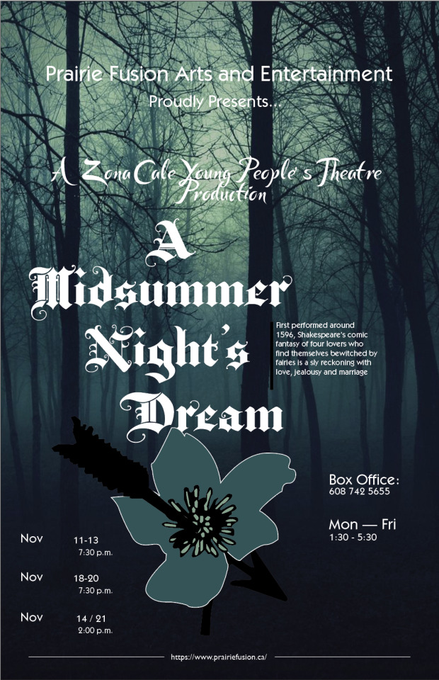
Project 1 Creative: Proof 2
IN THE WILD !
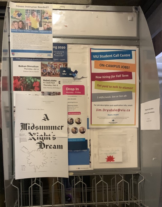
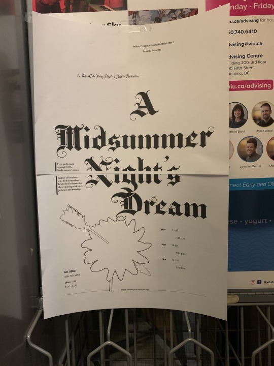
I posted a black and white version of my design next to other flyers and posters and I feel even though its black and white & fades out a bit due to its simplicity, it still stands out because of the title’s dramatic text size and typeface. However, if I had put up my coloured design it would been more attractive and captivating for the audience. The blue in the background of my poster for the play would definitely draw in the audience as it’s easy on the eyes and due to good use of hierarchy, structure and organization its easily readable from a distance!
1 note
·
View note
Text
continuation of.. Creative: proof -1
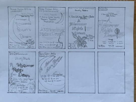
rough thumbnails of the poster design before going digital :)
0 notes
Text
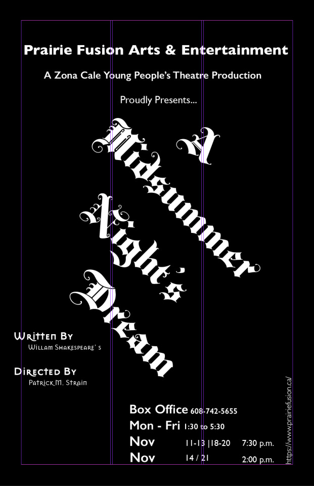
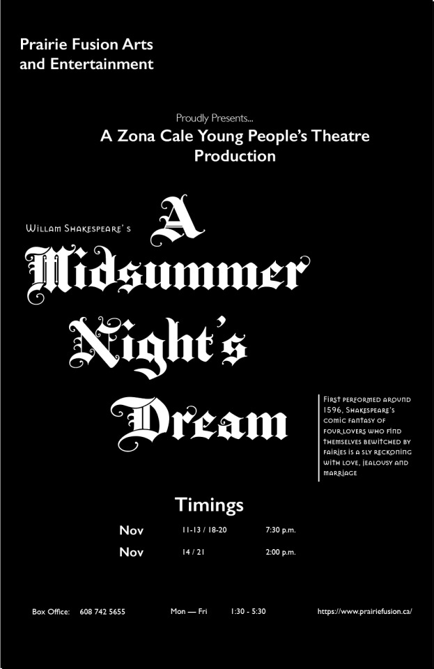
Creative: Proof 1
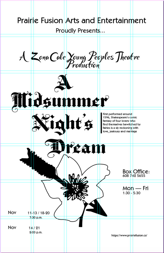
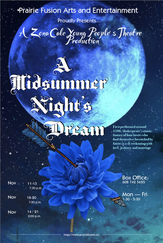
I decided to change the typeface of “A Zona Cale Young People's Theatre Production” and the rest of the small text as I felt that it didn't bring my design together but instead made it feel like something was not right or something was missing. Hence, I’ve not fully decided whether to stick with my last design with the night sky or my first design with the moon reflecting off the ripples of the water! For now I decided to leave the flower animated and not make it realistic with textures just to get a rough idea of the design of my poster.
0 notes
Text
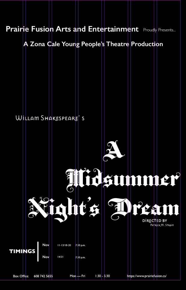
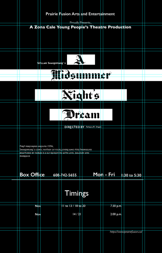
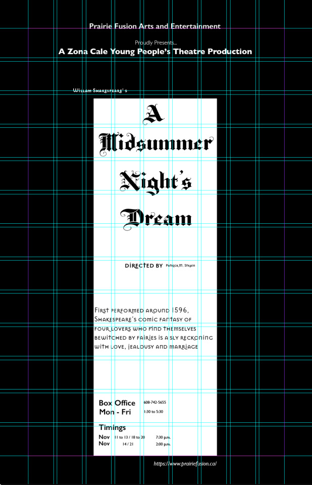
Project 1 Planning: Grids
As seen, in the screenshots below, I chose to stick to my three original choices of typefaces Gill sans, BaroqueTextJF, Mason Sans OT. I also wanted to retain the black background for my poster as it gives it a more dramatic look.
1) 3 column grid
For my first design I wanted to push my limits and just play around with all the elements of my poster, by rotating the title to a different angle than a straight 90 degree angle, positioning the link vertically on the side of the poster to show more variety and contrast in design.
2) 5 column grid
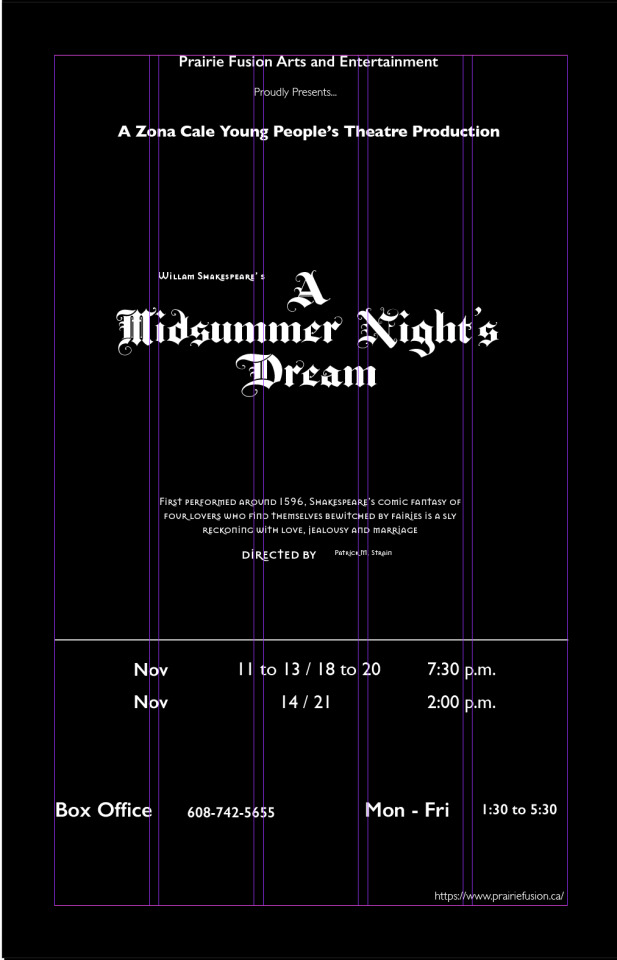
For this I I flipped it and made it more structured and designed. Moreover, I placed everything in such a way that there’s a lot of breathing space for the reader, hence, there’s a sense of neatness, organization and hierarchy. Thirdly, I added in some additional text for the poster so that there’s some information on what the play is basically about.
In this design there’s a larger sense of contrast and breathing space. The content here is laid out more towards the bottom of the poster rather than the centre. This makes it more interesting to look at.
3) 5x7 Modular Grid
In these last two designs I decided that it would be better to incorporate the little synopsis of the play to give our viewers some information as what it is all about.
4. 8x10 Modular Grid
This was a bit challenging however, it gave me the opportunity to explore my own creativity skills! Hence, after experimenting with a variety of designs, placements, alignments and grids I came to the conclusion that I would use a 5x7 grid for my poster document.
Hence, I chose this as my Final grid and design for this play’s poster! I felt this was the more dominant design as it clean, clear and straightforward. This poster easily draws the viewer in by the bold title and then to the synopsis of the play and the timing and so on. Therefore, there's a sense of hierarchy and structure. It’s readable and legible. Even though BaroqueTextJF may be a dramatic typeface, its easy to read while being interesting enough to draw in the audience. Moreover, the design incorporates an even amount of white space / breathing space which avoids overcrowding .
0 notes
Text
Discovery Phase: Type Choice
> I chose Baroque Text JF for the title of the play, “A midsummer night’s dream,” as its a blackletter style font with extravagant flourishes and forms. This typeface is both beautiful and commanding hence, is a good choice for the title of play in order to attract the audience as it’s readable at a distance.
> Baroque Text JF - this font choice’s purpose would be to immediately draw in the audience
> I chose Gill Sans for the sub headings and other less dominant set of information as it has an efficient, clean cut look that makes it easier to read due to its legibility and readability. These two fonts are a good contrast since Gill sans is less decorative and bolder than Baroque which creates a sense of hierarchy to the poster design
> Mason Sans OT was my third font choice for information like who wrote the play, whose the director, where to find more information
0 notes
Text
Good Type Redo
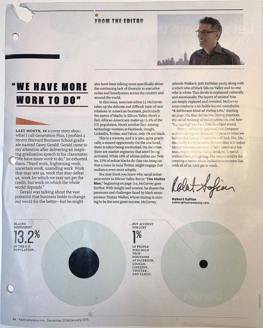
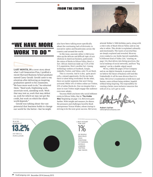
>Some characteristics identified in the original sample was that the layout makes sure there are no orphans and rivers, good use of size, leading and good choice of font.The clear cut edges of the font choice gives the text and clean looks which makes it more legible and readable.
- While recreating this sample I faced a few challenges with kerning and finding the closest match to the body text. Another time consuming thing was resizing the font and trying to match it to the designer’s layout.
•However, the designer increased the font size in the first column on the left, which is kind of noticeable when compared to the rest of the body text. I didn't quite agree with the designer’s on that.
• Even though the designer had made use of a variety of font choices which in the end, came together and was balanced out with careful finessing of the block of texts by carefully editing the kerning, tracking and leading
1 note
·
View note
Text
TYPE IN THE WILD
Example of Good Typography
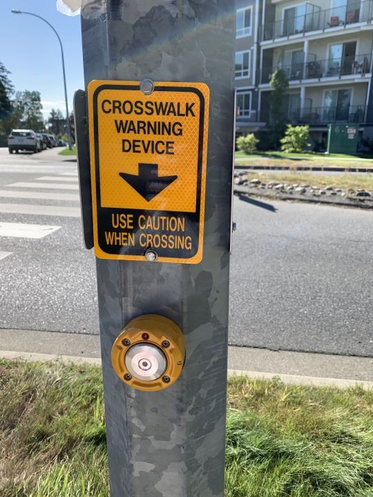
- In the above image the designer has successfully conveyed the apporiate information due to the sign’s contrast of colors with the background and the lettering, and well chosen typeface that makes the sign readable and legible. The use of constant kerning, colors that complement the look and feel of the sign indicating a “crosswalk warning device” and actually making use of the phrase “less is more” so that it is straight to the point and less confusing and crowded, makes the signage readable. Due to its use of bright orange-yellow and the bold arrow, giving direction, it’ll immediately alert all pedestrians indicating what to do before crossing.
Example of Poor Typography
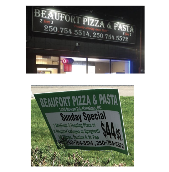
- The second image at the bottom depicts a signage that doesn’t clearly portray what the concept of the business is. This is because the colors the designer has used colors doesn’t mirror or complement the look and feel of the business. As you can see in the second image the designer hasn’t incorporated the same typeface, color scheme or the same overall design of the sign in the first image. Moreover, the sign’s readability is poor not only because it is a small sign, put up near the sidewalk, but also due to its small font size, too much information and use of similar colours for the background and the lettering.
CHANGES
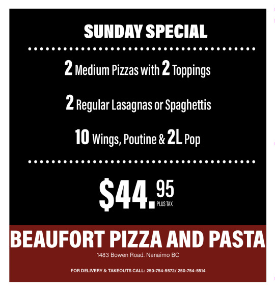
- The color scheme now, is such that it mirror’s or complements the look and feel of their place business
- Secondly, it’s not as cluttered or crowded as it has now been organized with a sense of hierarchy.
- Moreover, the dark background really brings out the body of text which increases the sign’s readabilty. This is because a sign’s contrast directly impacts its readabilty and retention.
0 notes