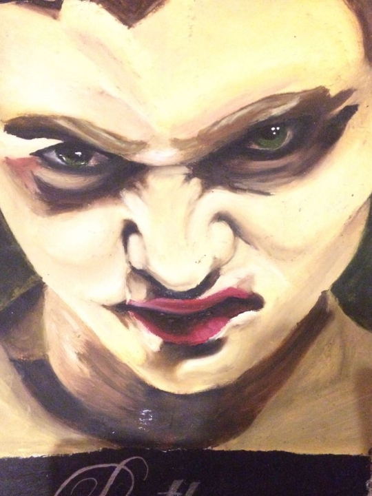
#(black and highlights are all acrylic everything else is watercolours)
Photo
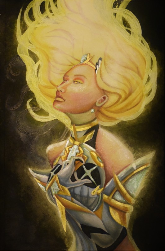
Oh to be a weapon of mass destruction and yet still so full of angst
(pose ref is untitled (Model: Tori Tracy, MUA & Hair: Mikala Vandenbroucke, Photo & post: Julia Kuzmenko), can be seen here)
#mythra#xenoblade chronicles 2#xc2#xenoblade#aegis#acrylic painting#watercolour painting#(black and highlights are all acrylic everything else is watercolours)#A4#traditional art#portrait#currently this would cost a mere $35 to commission wink wink nudge nudge#although I should increase that bc this took. a long time#drag it onto a new tab to zoooom and see all the glitter pieces individually
50 notes
·
View notes
Note
I've been hesitant to ask anything here but, I've been struggling when it comes to drawing and coloring. I'm not sure how to get better. I've asked for tips many times and well just practice is all I get. Heh. I'm really trying. I'd just like some way of helping myself. Is there a way too?
Hmm. Okay, this is going to be a LOOOOOOONG POST.
I don’t know how much advise I can offer but I will tell you what helps me, and how I colour. I’ll break it down into sections. XD
Drawing
I very much recommend live drawing. Particularly for anatomy. Live drawing helps you learn the basic structures of the human body. How the skin folds, how joints bend and move, how to gain perspective. It trains your brain and makes you able to draw a lot better, a lot faster and more accurately.
With anatomical drawing: Do break it down into shapes and lines. Shapes and lines are your friends in drawing.
Like, the shape of the basic human ribcage can be described like a shape of an egg. Artists like Leonardo De Vinci broke down the anatomical forms of the human body into basic shapes.
Lines helps you gain movement into the body. They, along with shapes, are you basic frame for anatomical drawing.
Don’t be afraid of failure or mistakes. If a drawing failures or has mistakes, then it’s something you’ve learnt. You can then apply what you know now from your to a new drawing.
Drawing Style
Drawing style does very from person to person. But looking at comic artists styles can be a great source of inspiration. And maybe mix styles up.
I’d say my style is like a combination of Naruto and Deadman Wonderland.
With time, drawing style does develop and it does. Like, mine has changes so much within a year.
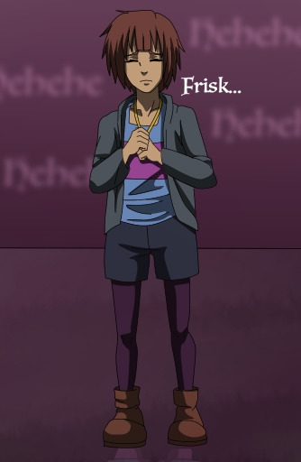
This one was made on the 5th of January 2016.
And then there’s this one:
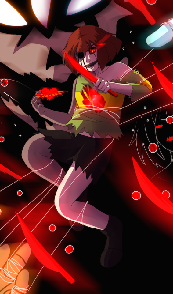
This was made on the 6th of January 2017.
They may be subtle changes, but anatomically speaking, it’s a lot better than last year.
Colouring
Let’s use a visual example to explain this:
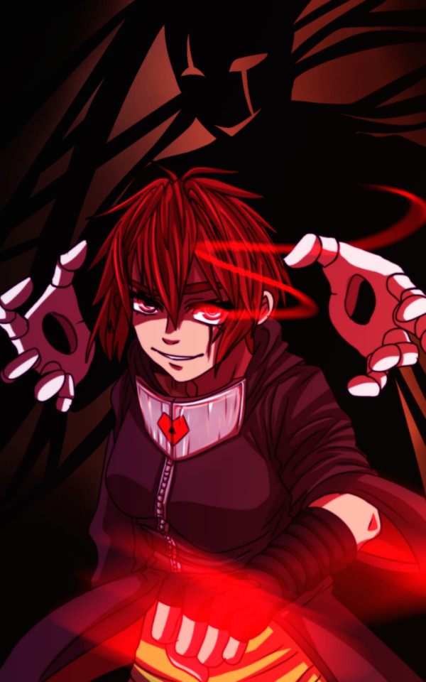
Colouring is really dependent on the style of the artist. For any tips with digital colouring, always have separate layers from your base colour and your shading.
As you can see, I love layers. I am very thankful for them. And use a lot of them.
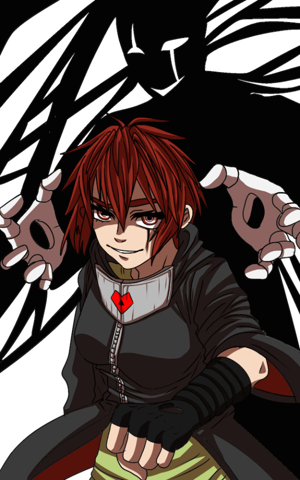
So I always start with a layer for base colours:

Shading
For my shading style, I prefer to use cell shading, so sharp lines and blocked colours to represent tone. However, instead of using a black colour as my shading, I think about what colours would be suitable for the setting and lighting of a scene. So, say the lighting or scene was more pigment with reds and oranges, then I’d want the same colours for my shading (and highlighting).

The darkest red in the top right side is my shading colour, whilst the two on the two of the left (the lighter coloured reds) are more to be used for highlighting.
When setting my layers, I set them to “Multiply”, and turn the opacity to about 50-70%. Up to you.

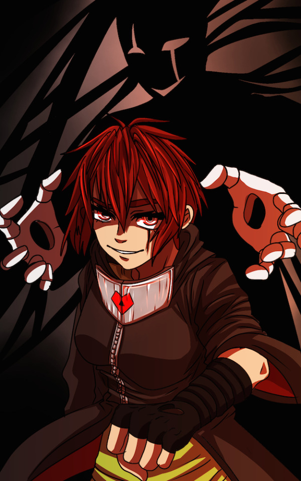
I usually make two layers of shading, one for the main and primary shading:
And another for secondary:

And one other layer for highlights. For highlighting, I set the layers settings to “add” or “add (glow)”. Some programs may call it something else, like Sai calls it “luminosity”.


It may not seem much, but it definitely brightens up the eyes and the shine of the metal neck (brace?).
It just gives your character more dimension and lil’ touch of realism. Whether you decide to have soft or cell shading is up to you.
Once you’ve feel happy with it, you can always add any extra effects.
So, usually to brighten up the colours and the character, I use similar colours on a separate layer, and set that layers setting to “overlay”. Again, set that to around 50-60%. But it’s up to you.

And for effects like the magic, I use the “add (glow)” layer setting again. For colour, I use the most vibrant red on my colour pallet. So the one on the top left.


Now, something that my lovely friend Cross taught me. When I know I’ve finished everything, but want to give it a bit more “oomph”, then I make a duplicate of the completed drawing, use a “gaussain blur” and set the opacity to about 60-80%. Once that’s done, I go to edit and use a “colour balance” effect.


Giving me this result. It just gives the drawing more charisma and “badassery”.
How you shade and colour is entirely up to you. It is a practice thing, but it doesn’t hurt to experiment with other techniques.
I’m not very skilled when it comes to soft shading, with the exception of some architectural backgrounds (sometimes). But I can definitely see the appeal.
Say @kiacii for example, rather than cell shading, she uses soft shading that almost has a sharp edge. She uses SAI and the ’shade’ setting of her layer. And her drawing and colouring style is stunning. With just subtle changes in colour and layer settings, it really makes her work come to life. Which is one of the reasons I hold her so highly.
Brushes:
Brush type is really up to you and which you feel most comfortable with. Or experiment.
Traditional work:
I really can’t do traditional comics. So instead I save the comics for digital, and use traditional mediums like oil paints, acrylics, watercolours, inks etc. for traditional life painting.
One of my artist studies on Melanie Rothman’s paintings.
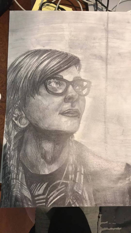
Pencil portrait of my friend from school.
It seriously takes practice and patience. But you can do it :D I hope this helps xDD
180 notes
·
View notes
Last Seen Blogs

perpetualproductions
Perpetual Productions
bbcdumb
stuck in johnlock hell

bbu-fan-blog
I danced so hard, I broke my spleen!
creepychippy
The Demon, that is Selectively Mute
hiddles-and-other-drugs
This is my Wonderland.