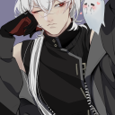
#Been rotating this one in the bg while I tried to figure out depth and shading and how to use the blendy tool
Text
It could be entirely unintentional and just a silly gag on the part of the showrunners. There are limitations on 3d models available to them and they've reused assets for jokes before, even alluding to how some characters share VAs.
However, the potential for the little grey mannequin robot being a reminder to both the audience and Lunar to think back to the first time we saw them brings us back to the episode where Moon and Lunar met the Creator. An episode Eclipse was completely absent for. An episode where, in direct contrast to the reasons Eclipse gave for the daily diagnostic, Lunar is confirmed to be perfectly integrated into Moon's systems by the very man who MADE them.
Even likened to how Sun and Moon were once together, implying a stability with the physical body. It's why the kill-code is reset when Lunar takes over, like how it would when Sun was near Moon. We've had the clues that Eclipse is lying by omission yet again, like he did about July 16th to Sun, and it likely has everything to do with this "big picture" he feels Lunar isn't getting.
He has control protocols, he has physical force, he has intimidation and manipulation. What Eclipse might not have is stability for himself. He might be studying Lunar for issues like how he's had them when taking over before. It might all wrap around to self-interest and trying to take what makes Lunar sturdy to apply it before threats close in on all sides.
It's just a fascinating bit of reestablishing connections to previous revelations through use of a shared model, voice and distinct line. FeeBot could be a different one from what the Creator used before, but the effect was the same for me when watching and on rewatch when paired with the conversation episode.
#Octa Talk#the sun and moon show theory#the sun and moon show#the eclipse and lunar show#eclipse (SAMS)#the Creator (SAMS)#lunar (SAMS)#Been rotating this one in the bg while I tried to figure out depth and shading and how to use the blendy tool#Happy to have a morning where i can shoo it out from the porch
15 notes
·
View notes
Text
forgot to do the monthly summary thing three months in a row lol
Summary of October:
Downloaded Leechblock. It helped somewhat. Managed to get all of my non-sketch fills done (14) for Huxloween even while dealing with bad life stuff. Posted bust-up FE fanart semi-regularly on my other Twitter account (~2-4 hours of work). Trying to get commissions on dA and Reddit (no bites yet).
Plan from August :/ :
All monthly/weekly goals for the year ✗
Proko: ribcage ✗
Review all Proko notes ✗
DAB Lesson 7 ✗
Ky/lux reunion piece (mechanical studies) ✓
one vehicle from life a week (20min) ✗
November plan:
All monthly/weekly goals for the year
Proko: ribcage
Review all Proko notes
DAB Lesson 7
One FE fanart every 4 days
Draw N7 Day piece before N7 Day
notes and improvements from finished stuff (Oct):
make notes on figure proportions relating to head ✗ but have been looking it up, USE AT LEAST ONE PHOTO REFERENCE PER PIECE ✗, do some studies (at least one session) on head/neck connection and tilt ✗ I forgot this was a thing but have been tryng to pay attention to it with figure drawing
apples - background details too clean/without width and thickness (like decals), proportions and position in space kinda screwy, background figures distractingly bad
eldritch hux: cigarette got flattened out, hat doesn't fit properly on his head, highlights on belt buckle VERY bad, fucked up face, I do like the composition though
haunted locations: composition got kinda sidelined when I was trying to fit everything I'd drawn in, speeder looks kinda wonky because the perspective was very difficult, inconsistent use of spot blacks, do like the colours though
bonfire: hands unreferenced and thus screwed up, fucked up faces (nose tip always looks wrong), clothing thickness/folds abysmal
demons: values too indistinct (needs more contrast), hux's arm looks too short, really bad hands, bits got cut off and I didn't resize the canvas, shading looks awful, scroll is flat even though I tried to make it not so
manuela: face w/ open mouth looks kinda unfocussed, otherwise pretty ok
valter: armour lost its form, otherwise pretty ok for what it is
vampires: very messy & confusing colours, anatomy fucked up (ribcage is flat and too long), bad hands that don't look like they're interacting with the chair properly, props for trying this much detail in perspective though
ghosts: luke doesn't look like he's standing on the floor (looks rotated upwards a little), room feels bare and undetailed, could have used more embellishment on the items, nice composition with leading lines and contrast though
curse: hands look awful because I don't know how to render shiny materials, shading on face kinda weirdly simplified, shading on body and clothing folds makes no sense, lost dynamism of sketch due to having to apply correct anatomy
scrying: extremely messy lineart, values somewhat unclear, bad use of linework to express texture (like in the gas tank), sense of scale a bit smaller than I intended (should have made bg people smaller), I do like the concept and details though
knoll and lyon: proportions ABSOLUTELY FUCKED (lyon's legs are like twice the length they should be), very stiff poses, vacant expressions, too many gaps in lineart (rebelle's fault though), clothing folds all completely wrong, colour too messy
orochimaru: vacant expression, scales on snake look awful and flatten it out, weird pose, you can see where I gave up on drawing the flowers, face is flat, nose tip doesn't extend enough
ritual: kylo's back looks like it's bulging, overall very messy, foreground vine merges with hux in the midground, statue hands suck, figures too simplified compared to background, overall scene easy to understand though
trick/treat: faces look gormless, kylo's chest has no depth to it, hands look squishy, kylo's pose hard to read, the knife is hard to place in space (looks like it's occupying the same space as hux's arm), nice details and lineart though
ACTIONABLES: try to find photo reference for expressions, do Proko ribcage lesson, draw and detail with linework everyday objects
0 notes
Last Seen Blogs

ravendoesmusicstuff
Raven
twoandahalfstudios
Two and a Half Studios
achievement-stunter
Untitled

emptiness-statue
Sepya

cottoncandyruby
happy cotton candy day!