#Mike Leuenberger
Text
In-Class Exploration
Today in class quite a few designers were mentions who seemed to hold relevance to the current assignment. So i have decided to delve a little deeper into their individual works to see if any inspiration is sparked.
Mike McQuade
Massimo Morandi
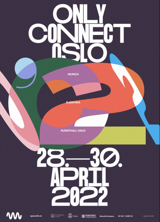


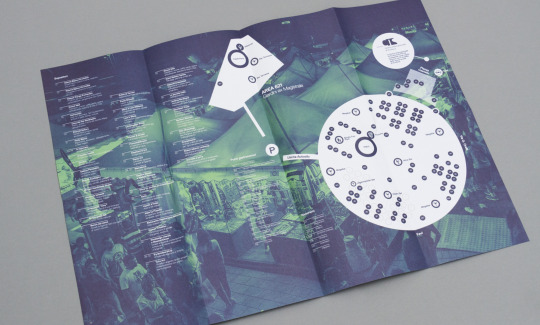
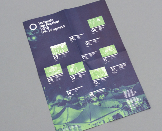
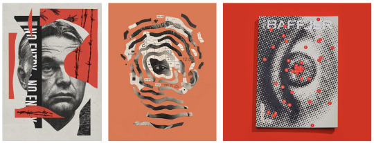
Fabian Leuenberger


0 notes
Text
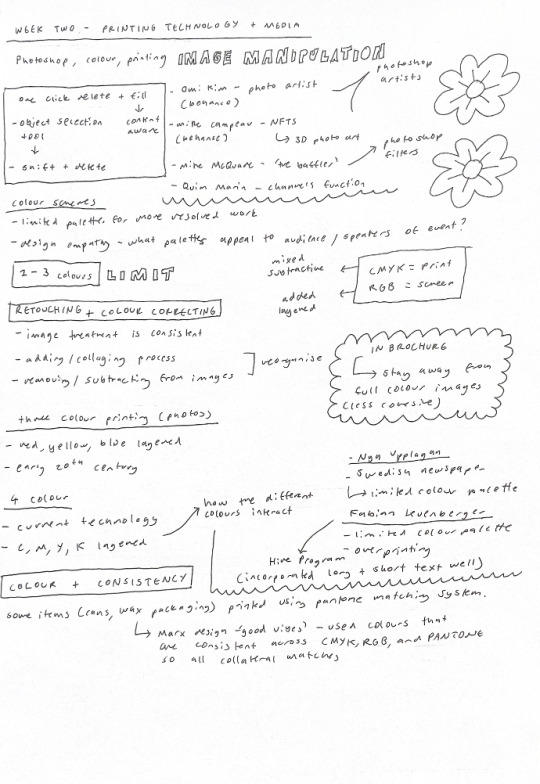
Week Two - Photoshop + Printing Technology
The focus of this week’s class was Photoshop, and exploring some of the tools and possibilities of the software. I think this was one of the most useful tutorials I have attended so far in my time at AUT. The tools covered were ones that I have a bit of experience using, but are so vital to so many processes in photoshop. The instruction and tutorial was very clear, and I really appreciated how Paul explained the why of each tool or instruction he gave. The lecture on colour and printing also taught me some useful practical knowledge about working on projects for print and the colour modes to work in. I was completely unaware that colours in different modes could come out so differently and therefore make projects that utilise a range of collateral quite difficult in terms of consistency.
Learning how to properly use the range of selection tools for a range of different images is something that will be so beneficial in the future. These tools are the core components of photoshop so this knowledge is very important. As well as this, exporting B+W photos as .tiff and changing the colour in InDesign is something I wasn’t aware of, but it definitely will be useful to keep a professional and efficient workflow across programs. Being shown what processes are destructive and how to work in a different way to keep the original is also something that is very useful and will improve my efficiency as I work.
Class Notes
Photoshop Tutorial Notes

Inspiration
At the beginning of the lecture, we were shown a range of artists and designers who use photoshop in their work. This was interesting as it showcased a range of different ways to use the application, and a range of different outcomes that could be achieved. Below I have attached some images of the artists’ work we were shown.

Omi Kim - https://www.behance.net/gallery/104999289/One-Night

Omi Kim - https://www.behance.net/gallery/123082787/New-Past
Omi Kim - https://www.behance.net/gallery/123082787/New-Past
Omi Kim uses a range of different images in her works, collated and collaged into one cohesive image. The way each image is treated to fit into the whole image is very clever and creates a very effective and realistic final product. I also like the grain filters and fade effects used to give more depth and tone to the work.
Mike Campau - https://www.behance.net/gallery/136072691/Costacos-Collection-QB-SuperBowl-NFT-drop
Mike Campau uses the 3D features of photoshop to create NFTs. The images are very effective and have so much depth due to the shadows and highlights of the 3D objects. This is an area of photoshop that I have never looked at but it could be something I experiment with in the future.

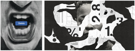
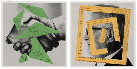
Mike McQuade - Twitter
These works by Mike McQuade showcase some different aspects of Photoshop. The top image is created with a collage style effect, selecting and masking different objects. The bottom image uses the filters menu with the halftone filter used in this image. This puts the image into a series of large and small dots to create tone.

Quim Marin - https://www.behance.net/gallery/14450621/Gravat-poster
Marin’s work experiments with colours and channels to create the glitched, overlayed look of this photo. I really like the effect created by this function, and I especially like the colour palette as it is very high contrast.
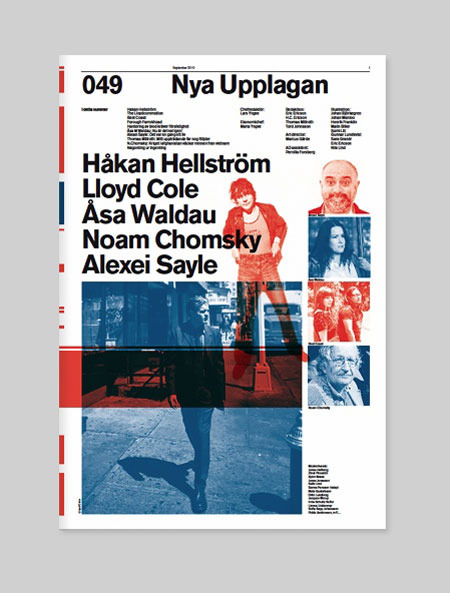
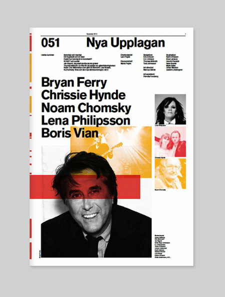
Nya Upplagan - https://www.designer-daily.com/nya-upplagan-11287
These images are from the Swedish magazine Nya Upplagen. The use of colour in these is very interesting as it uses overlaid colours and overlaps to create more tonal range. The clear grid typographic layout work very effectively, and the black and white colour palette allows the colour blocks to stand out.


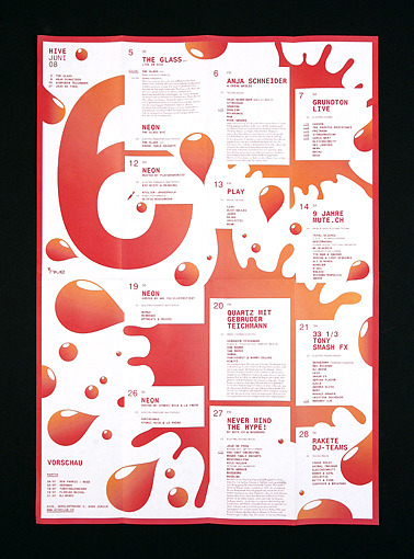
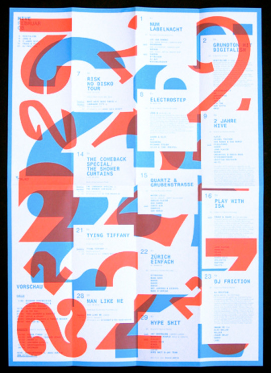
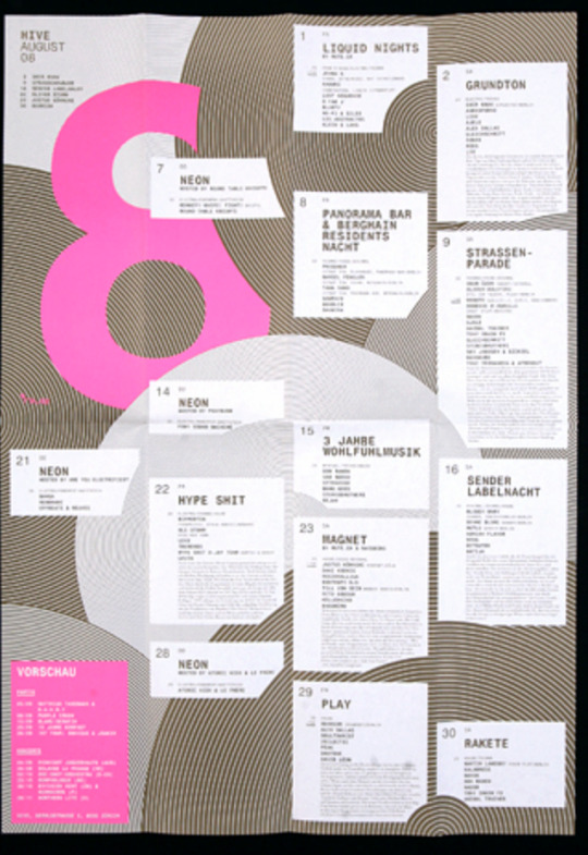
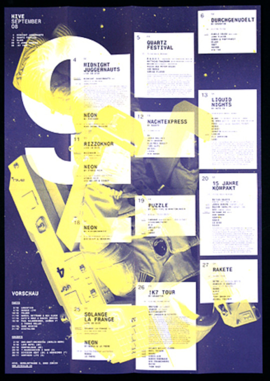
Fabian Leuenberger - http://www.fabianleuenberger.com/index.php?ID=66&C=2
These foldout brochures deal with varying lengths of text very well, which is an obstacle I will have to deal with in my own brochure project. These brochures use very simple colour palettes to create a refined and resolved piece of work. I particularly like the top image, because the overlapping colours used in the numbers is very interesting as a background. The boxes and separation of information is also very clear and easy to follow.
0 notes
Photo

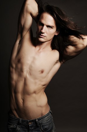
Mike Leuenberger (Model).
#mike leuenberger#male model#biba models#long hair#long haired man#long haired men#man long hair#men long hair#male long hair#long haired guy#long haired guys#laidswesen
68 notes
·
View notes
Photo

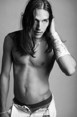
Mike Leuenberger (Model)
#mike leuenberger#model#hot!#long hair#long haired men#long haired man#man long hair#men long hair#male long hair#man with long hair#men with long hair#guy with long hair#guys with long hair
71 notes
·
View notes
Last Seen Blogs
snotboxllama
Chronologically Frozen

decade-cultural
Untitled

tenaciousheartnacho
Untitled

graffitiporn-org
GraffitiPorn.org
thismademethinkofyou
This made me think of you.