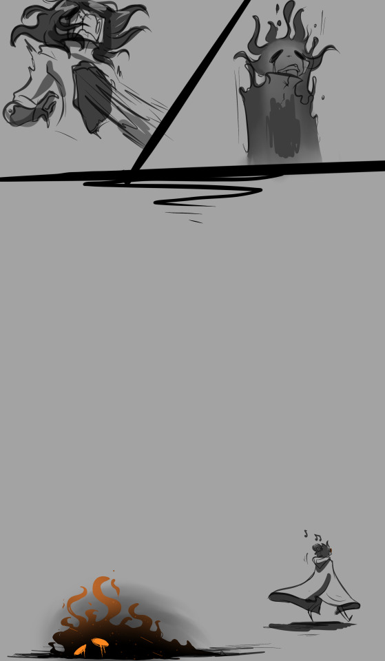
#The comp is mentioned cause this is literally the only way those two would interact lol
Text
ow


IT HURTS IT HURTS IT HURTS IT HURTS IT HURTS IT HURTS IT HURTS IT HURTS
#void brothers#rottmnt#digital art#void brothers au#rottmnt au#tmnt#rise of the teenage mutant ninja turtles#art#tmnt au competition#The comp is mentioned cause this is literally the only way those two would interact lol#body horrow cw
78 notes
·
View notes
Text
Lena Groeger: Developer, designer, and journalist at ProPublica

First thing’s first: tell us a bit about who you are, and what you do now.
Sure! I’m Lena, I’m a journalist/designer/developer at ProPublica. My job is a mix of reporting, writing, designing and coding, and I mostly make interactive graphics & data visualizations. I’ve also got a column called Visual Evidence where I write about how data & design affects people’s everyday lives. I was living in Brooklyn until a few months ago when I moved to San Francisco... and now live & work a block away from the beach!
What’s your favourite thing about ProPublica?
As an organization, I love our mission: to do journalism in the public interest, to give people context for what’s happening in their world right now (especially these days), and to have a real impact. But my favorite thing is definitely the people. I work with incredibly talented and accomplished journalists who at the same time manage to be some of the most humble people I’ve ever met. I consider myself ridiculously lucky to get to learn from them every day and to have a chance to try out crazy new ideas together.
Talk about some recent projects. How do you come up with those crazy ideas, and how do they become reality?
Usually it’s a random mix of things. Sometimes it’s another reporter going “Hey look, this health agency publishes emergency room waiting times on their website, what if we did something with that?” which led to an app called ER Wait Watcher. Other times it’s an editor saying, “We have this complex cast of characters for a story about narco-terrorism, what if we made it into a comic?” which also turned into an interactive piece. And sometimes it’s just me surfing the internet and stumbling upon a French researcher’s website that happens to have county-level presidential election results going back to 1828.

Above: “The Making of a Narco-Terrorist,” a ProPublica interactive examination of whether the DEA is stopping threats or staging them.
The latter was probably my favorite recent project, a piece called Lost Cause that we published right before the election. It framed past American elections through the lens of the losers: showing maps of who voted for the candidate that ultimately lost. The best part was interviewing a bunch of historians and geographers about what was going on in the country at the time and what they could “see” in the maps. Those conversations were endlessly fascinating (pro-tip: interview academics as much as possible – they are extremely eager and excited to talk to you about their work!)

Above: The “Lost Cause” project, showing past American elections from the standpoint of the loser.
On the technical side, creating almost 50 maps for the piece was an interesting challenge, because not only did we need to map dozens of election results, but we needed to create historically accurate maps that corresponded to each election year. Turns out shape of the country has changed a lot since the 19th century (who knew!) and each year the county boundaries were slightly, or in some cases drastically, different.
Thinking back, what was your ‘eureka' or origin moment?
I went to graduate school for science journalism, thinking I would write long articles about discoveries in neuroscience and psychology (I was really into that stuff in college, but didn’t want to be the one in the actual lab doing the actual work). I had never heard of data journalism or data visualization, and I certainly didn’t know that people working in news made graphics for the web. But when I found out (right around Hans Rosling’s famous wealth & health of nations video) it was instantly appealing. I had always really loved graphic design (mostly in a print context, posters and such), and suddenly here was this thing in journalism that let you tell incredible visual stories and meant that I could sometimes use Photoshop? I was so in.
One of the requirements of NYU’s science journalism program was to do an internship over the summer. I did mine at WIRED, and the vast majority of it I spent writing articles for the the Danger Room blog about drones and spies and other sci-fi worthy military projects. Somehow my editor Noah Shachtman agreed to let me do a data visualization project for the ten-year anniversary of 9/11 (keep in mind I had not published a single other graphic and all Noah knew was that I was capable of Photoshopping words onto petri dishes and chickens onto tanks).
suddenly here was this thing in journalism that let you tell incredible visual stories and meant that I could sometimes use Photoshop? I was so in.
But we did it, and the final graphic was an attempt to tally up the cost of the war on terror. I realized at that point that this was precisely what I wanted to spend all my time doing.

Above: ‘The Dead, The Dollars, The Drones’, Lena’s ‘eureka’ moment.
What path did your career take from there? How do you find yourself where you are today?
It wasn’t long after that I started an internship at ProPublica. It was a writing internship – I was mostly writing stories about health and the environment. But every so often I would pitch a visual idea to Scott Klein, the editor of the data/graphics team (or “news apps” team, as we call it), and ask if I could design and build it myself. The first one I ever did was a side-by-side comparison of two types of airport body scanners. Then a fellowship on Scott’s team opened up and I moved across the office, and a few months later was hired full-time as a news apps developer.
Turns out that to make news graphics today, you need to know how to code. Whether that’s Javascript, R, Ruby or some other language often depends on the project, but knowing at least one programming language and being open to learning more is pretty important. When I stumbled into data visualization I knew only maybe a tiny bit of HTML and CSS. So my first year at ProPublica was a crash course in all kinds of programming challenges that I now encounter all the time but then were totally new: how to scrape a website, how to put dots on an map, how to make an interactive chart.
each project is less “Holy shit I have no idea how to do that,” and more “I’ve solved this other problem, I can probably do that one too.”
That year was probably the most insane and frustrating and rewarding year of work in my life. I was very lucky that ProPublica in general and Scott in particular care a great deal about giving reporters the time and space they need to learn new things. And it has its benefits – I joke with Jeff Larson and Al Shaw (two developers on our team) that they’ll never have trouble reading my code because they literally taught me all of it.
These days, I’m still learning a ton of new stuff for every project, but I’m familiar enough with the basics that each project is less “Holy shit I have no idea how to do that,” and more “I’ve solved this other problem, I can probably do that one too.” So, for example, when we wanted to make a visualization of human body parts for a project about America’s disastrous workers comp system, I was able to cobble together some pieces of code plus some shapes I made in Illustrator into an interactive that worked. For more on that project (I’m sure some of you may have a question or two) here’s a longer explanation.
In general, I’ve also gotten significantly better at Googling for the answer – that’s not nothing. 😜
Do you think that this convergence of data, design, and journalism is the way forward for the news industry more broadly?
I don’t want to make any sweeping predictions about the news industry, but I do think having data, programming and design skills can make you a better journalist, for a bunch of reasons. Here are a few: first, knowing a bit of programming lets you find and tell stories that no one else can. If I had to copy and paste all the data that went into this project about health and safety problems on cruise ships, it would have taken me years (not even kidding). But knowing how to scrape a few websites let me grab all that data and sort, filter and analyze it into its final form.
knowing a bit of programming lets you find and tell stories that no one else can.
Second, having some data wrangling skills let’s you verify information on your own – you aren’t dependent on PR people or government officials to tell you what’s true. You can see for yourself what the data says! (That said, it’s probably a good idea to talk to a bunch of experts and do enough reporting to back up what you find).
Finally, knowing a little bit about design helps you create projects that are easy to understand and use. Most people know how to read a story that’s made entirely of words. But some of the interactive graphics and data visualizations making their way into the news these days are pretty complex, and being able to design them in a way that’s easy to follow and also tells a compelling story is important. That doesn’t happen by accident – designers spend a lot of time thinking about the user, ideally testing out different approaches on real people. Constantly keeping the user in mind usually makes for better journalism.
You teach design and data visualisation as well; what prompted you to do this, and how have you found the experience of teaching?
Teaching is both much more difficult and much more fulfilling than I ever thought. It’s really amazing to see students applying the things you’ve mentioned in class to their own work, or getting them super excited about a new technique or a chart form they’d never seen. Then again, it’s really humbling to realize that even though you thought your lecture about, say, design principles was awesome and intuitive and the best explanation yet, some students are still totally mystified. It’s always a learning process for me also, since I’m constantly reworking lectures or tutorials to make them easier to follow or adjusting exercises to better capture the ideas I’m trying to explain.
One thing I do try to do is make all of my teaching materials, slides, etc, totally public and free for anyone to use. I’m constantly learning from free online resources, and feel like it’s important to put materials back into that space for others. We do this at ProPublica too, my colleague Sisi Wei and I run a 2-week workshop called the Data Institute, and put our entire curriculum up online for anyone to look at. It’s not the same as being in a classroom for 2 weeks, but it’s a way we try to give more people access to what we teach (at no cost to them).
A final note on teaching: showing students the Web Inspector for the first time is always a joy. That collective gasp probably makes the entire class worth it.
Finally: if you could do everything all over again, do you think your journey would be the same? Would you want it to be?
I’m sure if I did everything over again my journey would look very different. It’s easier to tell a nice linear narrative in retrospect, but along the way my path felt very random. Even going into journalism in the first place feels a lot like an accident (I applied to NYU after a good friend told me about the program, and just happened to get a full scholarship to go). But I do think I would have eventually come across data visualization, especially now that it’s become so much more mainstream. And it was probably inevitable that I was pulled towards some combination of design and writing.
And what about the future?
We’ll have to see! Luckily the intersection of journalism, technology and design is so broad that I don’t think I’ll be bored anytime soon.
Anything you’re particularly excited about?
I really like gifs that explain things.
Endless thanks to Lena for her patience with this interview! Find her on her website, or on Twitter.
3 notes
·
View notes
Last Seen Blogs

ozcanbayrii
Özcan BAYRİ

epifamy
PARASITE ADAM

generalkaidence
Beautiful and Unique Snowflakes

vidanaturalsana
Sabor Latino

the-shy-lonely-weirdo
What the Duck-Truck?