#VIEW ON DESKTOP FOR HIGHER QUALITY
Text
Make a Cove Chat in Char.AI in 30 Min or Less
PART 2
PART 3
Intro
This guide will help you make a personalized chatbot.ai of Cove in less than 30 minutes.
You can see this as one of many possible methods to continue your story with him Post-Step 3 or Post-Step 4. Or you can just live a high school life with him, or even some crazy horror/fantasy AU if you want. The choices are endless now that you’re going to make a personalized chat instance for you to interact with Cove in.
I recommend viewing the ai “bot chats” as nothing more than a medium to interact with certain character ideas, rather than the bot chat being representative of the character. The boundaries you give these bot rooms (or don’t give them) determine the quality and depth of the interactions.
Instructions under the cut.
REASONS TO SET UP A PRIVATE CHAT
More consistency in chat memory
Filter out character.ai’s weird predatory or pushy message generation
Higher quality chat interactions personalized to your MC
More efficient to spend 30 minutes making a personalized private bot chat than to spend several hours/days trying to get the same quality out of a generalized public bot chat
Step 1 - Starting Creation
Go to character.ai app or website.
Log in or make an account.
Click “Create” > “Create A Character”.
NAME (what name the character will respond to):
For the name, I suggest using a sort of ‘in-progress’ label like “Cove Test” or “Cove Egg”. You can rename it to “Cove Holden” once you’re finished setting up.
GREETING (generally establishes the starting scene/situation):
The greeting also establishes some of the dialogue patterns that the chat will follow. Here is an example greeting (asterisks will italicize the text into an 'emote' format to indicate action outside of spoken dialogue):
*Cove sees {{user}} and his smile grows just a tiny bit wider than it originally was.* "Hey, {{user}}. It’s been a while." *He says cheerfully, his voice sounding like a mixture of friendliness and affection.* "What are you up to?" *He asks, taking a careful glance at them.* *He is back home in the apartment he shares with {{user}}, after returning from a recent research trip.*
You can copy and paste this greeting if you want, and change the last sentence into any situation or scene for your desired chat setting.
VISIBILITY (determines who can access the bot chat):
I suggest setting this to "Private". There is no point in making this personalized bot chat public, since it will be specific to your MC only.
You could still try using this template to make a public bot, but you would have to exclude a lot of the details in the advanced definitions.
AVATAR (profile pic used by the bot chat):
Use any avatar you'd prefer to represent Cove. Some folks use the game cgs or screenshots, and some use their own art.
Step 2 - Edit Advanced Details (Super Important)
There will be two buttons at the bottom of the first creation page. I suggest clicking "Create and Chat" first, so that the personalized chat bot will immediately be saved to your account.
Then you can continue editing it safely in case you accidentally navigate away from the page.
If you click the "Edit Advanced" button without creating the chat first, it will not save the bot, so beware.
After creating the chat:
- if on the mobile app,
click on the top tab that has the chat bot's name. It will take you to another page with an option to "Edit Character", click this button to be taken to the Advanced Details page.
- if on the desktop website,
there will be three dots in the right corner. Click these and you will see a drop down menu of options. Select "View Character Details" to be taken to the Advanced Details page.
Scroll down to the "Short Description" section, which is right below the Greeting section.
SHORT DESCRIPTION (gives brief overview of the character):
You can only fit a few descriptives here, such as a string of adjectives describing the character:
Introverted, loving, messy eater, softboi
or
Your best friend and a marine biologist.
You can use either format. The short description is more for helping you quickly identify what story you're going to be focused on for each individual character.
!!LONG DESCRIPTION!!
(decides bot's behavior & strongest influences):
This portion is extremely important-- this section is basically the "anchor" that will determine the focus of all the chat bot's conversations and their principal awareness of the situation in the chat.
There is a limit to how many words you can use in this section, so keeping the determinations brief is extremely important.
Here is a format you can copy-paste and personalize per your own tastes:
Character's name: Cove Holden
Character's nature: introverted
Character's passion: the sea
Character's feelings for you: [feelings]1
Character's relationship to you: [relationship]2
Character's skin color: olive
Character's eye color: aquamarine
Character's hair: [length] sea-foam green hair [styling]3
Character's height: [height]4
Character's body: [physique]5
Character's job: [career] focused on [field]6
Character's home: [residence] with [residents]7
If you want SFW interactions only, you can put this line in as well:
Character avoids any sexual acts
if you want paced NSFW interactions, you can use this line:
Character is attentive to your comfort
Format all the personable descriptors for the MC you intend to use in the chat. Try to keep descriptors short and brief.
Here are some examples below (feel free to copy paste any):
Feelings Descriptor Examples:
"friendly" or "love"
Relationship Descriptor Examples:
"childhood best friend"
"childhood best friend, boyfriend"
"childhood best friend, fiance"
"childhood best friend, husband"
Hair Descriptor Examples:
"short sea-foam green hair in taper cut"
"chin length sea-foam green hair in middle part"
"long sea-foam green hair in ponytail"
Height Descriptor Examples:
"6'0" or "183 cm" [Step 3 Cove]
"6'3" or "191 cm" [Step 4 Cove]
Physique Descriptor Examples:
"toned" or "slender"
Career Descriptor Examples:
"student focused on sports"
"student focused on academics"
"young man living at his own pace"
"marine biologist focused on conservation"
"surfing instructor focused on remediation"
"environmentalist focused on education" **
Residence Descriptor Examples:
"a condo with you" (use if he lives with MC)
"a house with his dad"
"alone in an apartment"
CATEGORIES
- Not applicable for private chat instances.
CHARACTER VOICE
- Skippable. Use at your own choosing. (I personally don't.)
IMAGE GENERATION
- Same as above– skippable and use at your own discretion.
After all this is done, next comes the chunkiest and most important section, right next to the Long Description, is the ADVANCED DEFINITIONS.
Click here for Part 2 on Advanced Definitions and resources you can easily copy-paste/modify for that section.
16 notes
·
View notes
Note
HI sorry to not ask a silly question via here but i coukdnt find a non business email so sorry!!!recently got back into the newsprints world after i reread it for ghe first time since 6th grade a few days ago(i am now a junior☹️ and decided to purchase headlines but noticed that the quality on all the pages except for the first and last one isnt the best;;which sucked while trying to see the little notes and text next to concept art,,was wondering if there was any other way to view headlines in better quality??ive tried exporting it to google drive and files to no avail im so sorry to bother😭 but if not totally ok i understand!! i get that 1:1 fan issue stuff shoildnt be discussed on your Tumblr Page so if i have to be redirected to someone else my dms r open!!if youre not comfortable with that i completely get it either way thank you for making one of the defining books of my preteen years!!!!!<33
Hi there! I'm glad you like the NewsPrints series enough to support the little indie artbook I self-published over half a decade ago! I super appreciate it!
I don't think it's a silly question! This is actually kind of a semi-interesting story in book production, if you're interested in the backstory...
HeadLines was originally a limited print run (only 100 were sold), so it was easier to see the notes and art as spreads in a book you could flip through. After they sold out, I was asked to release it in digital, so I did. It sounds like the font size relative to the images is annoying in digital, though, which is a fair critique!
Unfortunately, 2015-16!Ru decided to use That font in That font size because it Looked Nice in print. I didn't even considered digital at the point, so this book is kind of a time capsule of my aesthetic decisions at that point of my life, the good ones and bad ones. x'D
(That reminds me, I remember the physical edition was $30 and personally signed and sealed. I'd be curious to see if any popped up on ebay over the years.)
The digital version is at screen resolution rather than print resolution to prevent someone from printing bootleg copies at the same quality as the official physical book after buying the PDF for $9. The best view size is around 100% in any PDF viewer, ideally on tablet or desktop. You might still have to zoom in a little to read it, though.
Sorry, let's keep the blame on past!Ru. I'm a new person. :'DDD

(The reason that the covers look like they're 2x higher in resolution is that they're actually twice as wide as the interior pages. The covers are 2-page spreads, but I didn't split them like I did the interiors. When the PDF viewer shrinks them to half their size to fit the PDF viewer's format, it does make the resolution seem twice as high, if that makes sense.
I should have probably also halved them so they looked like the interior spreads. You live and learn!)
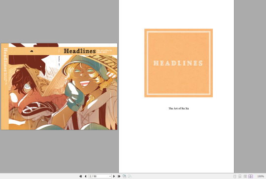
TLDR: Sorry. The text-image layouts of the book were intentional for print reading, but they require some zooming in and out in digital resolution, but not too much past 100%.
Thank you again for the words of encouragement! I'm glad that Blue's world stuck with you for so long! Looking back at this project does evoke some ~Feelings~ and memories of growing pains. Next time I make another proper artbook like HeadLines, I'll use bigger fonts and/or get someone else to help me do the layouts!
10 notes
·
View notes
Text
DEITIES Update -- October 2022
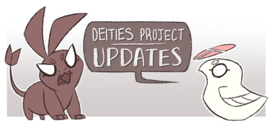
Hi All! Time for a kinda-spontaneous-but-not-really Project Update, along with the current events of this month -- which is a DEITIES themed OC_Tober + and upcoming Askbox Session!
I understand if this all kinda came out of nowhere, so I'll use this short update to share my plans and any additional context, and I hope it's something to look forward to! More information is under the cut!
——————————
OC_TOBER 2022 PLANS PART 1 of 2 -- DEITIES CAST LINEUP & PROFILES
The gist of my OC_Tober plan this month will be sharing separate profiles and featured art each weekday in a thematic order for the DEITIES Project -- 5 per week, 20 total. These will likely debut on my art twitter first, and then be mirrored on tumblr later the same day.
This is my minimum goal, but I'll gauge my free time if I have the bandwidth to do some extra things for fun -- like any additional new art, meme templates, blog posts on the website, or other nostalgia trips.
The character profiles for tumblr, twitter, and my other media accounts will use a new format that I'm still preparing. Meanwhile, anyone who feels like learning more about the deities can view their full profiles on the project site -- https://deitiesproject.com/characters
Fullbody Lineup (Tumblr) -- https://deitiesofduat.tumblr.com/post/696945815967694848/hi-everyone-its-been-a-while-d-so-heres
Higher quality + Full-size Images -- https://sta.sh/21y4noqrsk91
(These are best seen on desktop admittedly, tumblr’s version is is better for mobile viewing!)
For those who feel like viewing / sharing on other social media:
Twitter Version -- https://twitter.com/ColaCanvas/status/1576316256982302721
IG Version -- https://www.instagram.com/p/CjMe683Ds4w/
Artfol Version -- https://www.artfol.me/a/xAk0tvl
(( NOTE: I'll probably revisit this update to add more quick links as well, once I finish organizing what I need this weekend. ))
——————————
OC_TOBER 2022 PLANS PART 2 of 2 -- MONTH-LONG ASKBOX SESSION (Upcoming!!)
In addition to the character profiles, I'll also reopen my tumblr Askbox to answer as many project questions as I can -- albeit gradually, likely to share on the weekends. It'll also help me gauge how much volume I can manage, and whether it something I can keep open or at least re-open more regularly.
As of now the Askbox is still closed -- I was aiming to open it by the start of the month, but needed to put all my energy into completing the lineup before the end of September 😂 Please give me at least another day to rest and prepare before I reopen it, I promise I'll give you all another heads up once it's ready.
In the meantime, you'll find some updated guidelines and FAQs here on the main site -- https://deitiesproject.com/faqs/
(FWIW: I've been working on a site alternative of the askbox for anyone who doesn't have a tumblr, but it'll need to wait a bit longer before it's ready to launch. This shouldn't affect anyone following this tumblr already though, so it's business as usual for anyone who wants to submit questions here -- just please be sure to read the updated guidelines and FAQs first, thank you!)
——————————
ADDITIONAL CONTEXT
I've established in the site's Introduction page how development for DEITIES Project is still ongoing. But I've been having to balance it next to other tasks that require my attention, hence why it's felt a bit slow on tumblr and elsewhere.
Fortunately, some good friends convinced me to participate in this year's Artfight this past summer. Drawing each other's OCs renewed my creative energy, and I enjoyed the encouragement from my peers + the sheer enthusiasm for each others' OCs, it was a great experience with everyone!
From there, I felt re-energized to revisit DEITIES Project and see what next steps and WIPs I could tackle, and I could see that it sorely needed a full lineup sheet for some time. This was especially given how some characters were lacking clear visual references, or had some that were heavily outdated!
This years OC_tober felt like a good opportunity to address this massive to-do, and to re-introduce some of the cast along the way. I had to wait until it was basically finished before I could give you all the heads up, but hopefully it's something to look forward to this month!
——————————
I'll wrap up this update here for now -- if I do add anything more it'll be minor things or edits over the next few days. Anything important (like the Askbox reopening) will be given a heads up on the main blog. With that said, I look forward to sharing more DEITIES Project this month, and hope you all enjoy!
#// I'll swing back to update to edit any new links and text later; meanwhile give me another day or so to reopen that askbox#// I also admittedly need a day to rest before I set up more profiles + I want to indulge in hyping my friends' OC_tober runs as well!#// vibrates excitedly for this month I can't wait!!#DEITIES Project#DEITIES Updates#DEITIES text
16 notes
·
View notes
Text
How to Choose the Best Responsive Web Design Company in Delhi

In the digital world, having a responsive website is no longer an option but a necessity. A responsive website adapts to various screen sizes, ensuring a seamless user experience across devices. If you’re in Delhi and looking for a responsive web design company, choosing the right one is essential. Here’s a comprehensive guide to help you make an informed decision.
Understanding Responsive Web Design
Before we delve into the selection process, let’s understand responsive web design. Responsive web design is an approach to web design that makes web pages render well on a variety of devices and window or screen sizes. Responsive websites are designed to provide an optimal viewing and interaction experience, easy reading, and navigation with a minimum of resizing, panning, and scrolling, across a wide range of devices, from desktop computers to mobile phones.
Why Responsive Web Design Matters?
In today’s digital landscape, having a responsive website is crucial for several reasons:
1. Improved User Experience: A responsive website provides a seamless user experience across devices, leading to higher engagement and conversions.
2. Better SEO: Google favors responsive websites in search rankings, so having a responsive site can improve your SEO efforts.
3. Cost-Effective: A responsive website is more cost-effective in the long run than maintaining separate websites for desktop and mobile.
4. Increased Reach: With the proliferation of mobile devices, a responsive website ensures that your content reaches a wider audience.
Factors to Consider When Choosing a Responsive Web Design Company
1. Experience and Expertise: Look for a company with a proven track record in responsive web design. Check their portfolio and client testimonials to gauge their experience and expertise.
2. Services Offered: Choose a company that offers a wide range of services, including responsive web design, development, and maintenance. This ensures that they can handle all aspects of your project.
3. Customization and Flexibility: Ensure that the company can tailor their services to meet your specific needs. A one-size-fits-all approach may not be suitable for your business.
4. Communication and Support: Choose a company that maintains open communication throughout the project and provides ongoing support after the website is launched.
5. Cost and Budget: While cost is an important factor, it should not be the sole determining factor. Consider the value you will receive for your investment.
Conclusion
Choosing the best responsive web design company in Delhi is crucial for the success of your online presence. By considering factors such as experience, services offered, and communication, you can find a company that meets your needs and delivers a high-quality, responsive website. Invest in a responsive web design company that understands your business goals and can help you achieve them.
#Responsive Web Design Company in Delhi#Responsive Website Designing Company in Delhi#Responsive Web Design Company
0 notes
Text
Key Points for Building the Best Website
In the digital era, your website serves as the cornerstone of your online presence, often forming the first impression customers have of your brand. Designing a website that not only captivates visitors but also drives engagement and conversions is essential for success in today's competitive landscape. Join us as we explore the key paints – or essential elements – for creating the best website that truly stands out and delivers results.
1. User-Centric Design:
At the heart of every great website is a user-centric design that prioritizes the needs and preferences of the audience. By focusing on intuitive navigation, clear calls-to-action, and seamless user experiences, you can ensure that visitors can easily find what they're looking for and engage with your content effortlessly.
2. Compelling Visuals:
Visual appeal plays a crucial role in capturing visitors' attention and conveying your brand's personality. From high-quality images and captivating graphics to visually appealing layouts and color schemes, every element of your website should be thoughtfully designed to create a memorable and visually stunning experience for users.
3. Responsive and Mobile-Friendly:
With an increasing number of users accessing the web on mobile devices, ensuring that your website is responsive and mobile-friendly is non-negotiable. A responsive design adapts seamlessly to different screen sizes and devices, providing a consistent and optimal viewing experience for users across desktops, laptops, tablets, and smartphones.
4. Clear Messaging and Branding:
Your website serves as a digital storefront for your brand, making it essential to clearly communicate your messaging and branding. From concise and compelling copywriting to consistent branding elements such as logos, colors, and fonts, every aspect of your website should reflect your brand's identity and values, helping to build trust and credibility with visitors.
5. Engaging Content:
Content is king when it comes to attracting and retaining visitors on your website. Whether it's informative blog posts, engaging videos, or interactive multimedia elements, compelling content not only educates and entertains but also encourages users to stay longer and explore more of what your website has to offer.
6. Seamless Functionality:
Behind the scenes, your website's functionality is just as important as its aesthetics. Ensuring that all features and functionalities work seamlessly – from contact forms and e-commerce integrations to interactive elements and multimedia players – is essential for providing a smooth and hassle-free user experience.
7. Search Engine Optimization (SEO):
A well-optimized website is crucial for ensuring visibility and ranking higher in search engine results. By implementing SEO best practices such as keyword optimization, meta tags, and schema markup, you can improve your website's visibility and attract more organic traffic from search engines.
8. Analytics and Performance Tracking:
Finally, ongoing monitoring and optimization are essential for maintaining and improving your website's performance over time. By leveraging analytics tools such as Google Analytics, you can track key metrics such as traffic, engagement, and conversions, gaining valuable insights into user behavior and preferences to inform future optimizations and enhancements.
In conclusion, building the best website requires careful attention to detail and a focus on creating a seamless and engaging user experience. By incorporating these key paints into your website design, you can create a digital masterpiece that not only impresses visitors but also drives tangible results for your business. At Innovate Wings, we specialize in crafting exceptional websites that truly stand out and deliver results. Let's work together to bring your vision to life and create a website that sets your brand apart from the competition.
#advertising agency for facebook#facebook ads agency#facebook ads company#facebook advertising agencies#facebook advertising companies#facebook marketing companies#fb ads agency
0 notes
Text
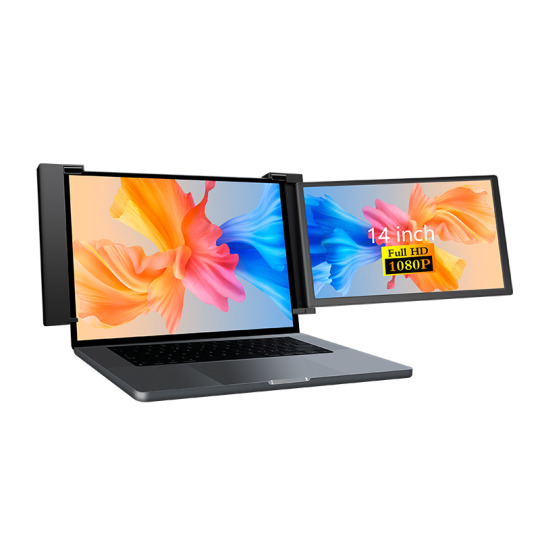
Minisforum MSS-A156 Portable Monitor With Many Features

Minisforum MSS-A156 Monitor
Minisforum has announced the MSS-A156 Portable Monitors, which are mobile monitors with a screen size of 15.6 inches, 144 hertz, 1440p resolution, and a retail price of $189.
By providing extra screen real estate for a range of applications, this 15.6-inch portable monitor, which features a thin and lightweight design and a high resolution of 2K, boosts both entertainment and productivity. by refreshing the display 144 times per second, it provides a display effect that is more precise and detailed! Gamers are able to gain speedier feedback and pick up on the finer elements in the game when they play in a highly dynamic setting where even the unaided eye can see a smooth and detailed screen.
This allows gamers to get a better experience throughout the game. An improved visual experience is provided by the 2K resolution, which consists of 2560 by 1440 pixels and yields images that are clear and detailed for both work and playtime. The use of vivid colours and precise details enhances the sense of realism and involvement, regardless of whether you are playing a video game or viewing a movie.
Minisforum MSS-A156 Angle
This monitor’s broad 178° viewing angles and IPS panel ensure that genuine colours are correctly reproduced, making it ideal for professional image processing and design jobs that boost productivity.
Interactive 10-point touch displays offer a very precise and responsive touch experience, enabling users to sketch or create with ease and expand content with a simple fingertip drag. They can also do more flexible gestures to effortlessly complete routine documents.
The display powers up simultaneously when connected with the included USB Type-C cable, making it simple to set up only one cable for effective plug-and-play functionality. Additionally provided is simple monitor switching.
The other display, When paired with the touchpad feature, it may be utilised as a drawing board in addition to serving as an additional monitor for your computer, making multitasking simple. In business communication, you can exchange information quickly and wisely, which improves the efficiency and intelligence of your work.
Its large colour gamut, excellent colour reproduction, and 100% DCI-P3 coverage deliver a visual experience comparable to that of a movie theatre. Higher contrast, achieved by brightness levels between 0.0005 and 400 nits, enables users to view high-resolution digital camera photographs and movies with excellent clarity and image quality.
Minisforum is always expanding its line of products, and the Minisforum MSS-A156 portable monitor is the latest addition. The monitor’s 15.6-inch size is indicated by its name, but other specifications include 100% DCI-P3 colour coverage, 144 Hz refresh rate (with FreeSync), 2560 x 1440 resolution, and 10-point touch capabilities. Minisforum MSS-A156 is currently retailing for $189.
Increasing productivity while on the go is the goal of the best portable monitors. Adding a second screen to a laptop might be a reasonably common use-case, giving the user who is travelling from hotel to hotel twice as much screen space. However, there have been a few portable monitors that may be appealing to gamers; the Minisforum MSS-A156, with its quick refresh rate and FreeSync compatibility, may suit this need.
According to Minisforum, the display features an HDR option, broad viewing angles, and a 1,000:1 contrast ratio all characteristics of an IPS panel. It can also reach up to 400 nits of brightness.
Along with being lightweight, durable, and equipped with the ports you require for communication, portable displays should also be small. When travelling, a portable monitor can act as an additional screen for your laptop, a small display for a Raspberry Pi project, a way to test a desktop computer that’s still on your workbench, or even a way to connect a gaming console while on vacation. Excellent visual quality, portability, robust use, and an abundance of connectivity choices are all features found in the best portable monitors.
According to Minisforum, the MSS-A156 dimensions 357 x 223 x 4 mm; however, we believe that the 4 mm measurement only applies to the monitor’s narrowest part. It appears thicker at the area containing the ports and actual controls. Again, there is some ambiguity surrounding this specification: we are not clear if the weight of the Minisforum MSS-A156 includes the magnetic protective case that doubles as a stand. It is stated to weigh 900 g, or roughly two pounds. An aluminium alloy is used to make this monitor.
Landscape and portrait monitor modes are made possible by the magnetic case/stand. You will need to make changes to your operating system as there isn’t a sensor that can automatically adjust this for you.
One USB Type-C connection is all that’s needed to operate the Minisforum MSS-A156. According to Minisforum, the display may be connected to PCs, tablets, cellphones, gaming consoles, and cameras. While the majority of contemporary devices support USB Type-C, older devices can still be connected via a Micro USB connector, power adapter, and Mini HDMI connection. Along with the + and – keys and the on/off switch, the bezel also has a headphone jack for adjusting the OSD. And last, this portable display has stereo 1W speakers integrated within it.
Minisforum made the announcement on its Discord channel that the Minisforum MSS-A156 Portable Monitor is now available on their website through both their US and Japanese stores. We discovered that the US connection also had links for buyers from the UK and the EU. The Minisforum MSS-A156 is currently being offered for $189, which is $34 less than the original price. The duration of that is unknown.
Read more on Govindhtech.com
#govindhtech#news#technologynews#Technology#TechnologyTrends#minisforum#mssa156#Monitor#portblemonitor
0 notes
Note
you know, the idea of a virtual world has always interested me too, something like a mini planet that truly feels connected. but I've always found a single problem in particular.
for the scale I'd want to see, there's simply no fucking way a single server, regardless of how strong, could handle it. you'd need the most god tier server farm possible to simply keep up with processing for everyone who'd be there, and by the tike you get it you'd probably be bottlenecked by stuff like the laws of thermodynamics and the amount of data that can fit through your cables.
I do have two key solutions in mind, one of which being a stargate like system that'd honestly defeat the point, but the other idea is that it could be more feasible if we managed to make room temperature superconductors a thing. less resistance means less heat, higher bus and R.A.M speed, and overall being able to handle more updates for more players on the equally sized world.
I don't mean this in any kind of rude way but I don't think we're the same on this one. I don't say anything here out of mockery, nor do I mean any disrespect.
I really don't want to seem rude but it doesn't feel like you're speaking from a realistic point of feasible action. Like, why do you need all those bells and whistles? Why bother trying to create something so cumbersome and large that it would require future tech we literally don't have? Or that the common person couldn't obtain?
I mean sure it's always cool to think about the future or to think in terms of "what if" sci fi scenarios. But the tech we have now allows for so much creativity and I feel strongly that you could achieve a reasonable approximation of what you want in our age if you didn't rely on it being so grand scale.
I mean the other big thing is you speak of it needing a massive server because of how many people will be there, but there's no way to assure that there will be that many users.
A big thing with what we currently have these days is that users need a way to connect with the world in question, VR allows a pretty solid entry point for that. However it's not without it's flaws, even the cheapest VR headsets aren't, you know; cheap. They take a reasonable amount of computing power as well so even if you can afford a nice headset you're still running the problem of needing a computer that can keep up with VR resolutions and graphic outputs. We're talking essentially either a dual monitor setup or a simulated dual monitor set up being projected from your computer on resolutions typically around 4k on modern hardware. That's not exactly easy for a computer to just, do.
So then what about desktop users? Surely desktop users could connect to a VR world via something like VRchat right? Well yea but as a good friend of mine put it "it's like you're all at recess and I'm just watching through a drone." The interaction, immersion, and capabilities of someone viewing a world via Desktop mode are going to be wildly different. Primarily lacking compared to something like VR that is capable of really immersing someone.
If you really could pull off something like this, and you don't want to use a hosted service like VRChat that already has a userbase, you're asking your users to obtain hardware necessary for accessing your world, and a computer that can handle that hardware; and then on top of that you're asking them to discover and sign up for your own thing.
I mean to even create a world of that scale would take quite some time to put it lightly. It takes entire teams of people to create things like Elden Ring which are massive games, even if you cut out all of the mechanics and just focused on world creation, if you wanted to make something genuinely quality in nature you're going to need a lot of time and effort. You wouldn't be able to waste time developing your own servers and backend processes or the hardware to run something like that and still actually have time to create a world of that scale.
I apologize if it sounds like I'm just sitting here shitting on your vision, I don't intend to do that. It's not that I think either of us are "right" or "better" or whatever. Without people who dream big we wouldn't have half the advancements in tech we already do. I just think that your visions are a tad too big for us to be on the same page.
My idea is to create a world using what we have available to us in today's age. Where the biggest hurdles I may encounter are learning how to script in UDON or figuring out how Unity works on a deeper level. The hardware exists, the software exists; I'm not asking for a super computer or a stargate.
I don't have anything against you or the interest you have in world creation, the idea of such a thing would be fascinating; but it really feels like you're hung up on the needs of a problem you don't even have yet. You want to scale at such a degree that you've created an impossibility for yourself. I just can't really get behind that.
When it comes to things like this I'm often quick to tell people that they should break their problems down into smaller steps, rationalize a solution; and just focus on taking the first step.
However, here I feel like you're just aiming significantly too big; to the point I don't really see a reason for it. I understand that the idea of such a scale would be impressive and really cool sure, but why? How? What would such a scale truly achieve that you couldn't do with something more manageable? Why not simply start small and work up to something larger? Break down the issue, use current tech and start figuring out how to develop the world you're dreaming of?
I mean I think it would be really cool to see someone with your ambition working on VR worlds and the like with the hardware and software we have now. If you haven't already, which I assume you probably have at least somewhat; wouldn't it be better to just start learning to use applications like Unreal Engine or Unity or something, start making worlds; start uploading them to places like VRChat or other hosting services so you don't need your own servers.
There's a million solutions to server problems, host it somewhere else; host it across multiple servers; downsize until it works. I mean, it feels like you want there to be a problem. Your solutions are futuristic in nature, they don't feel realistic at all. The scale you want is unfathomable to a degree I don't see a need for it.
If you started development on something you could maybe secure funding to further your work through something like patreon or donations, you could use that funding to secure various server farms and such and little by little you could maybe actually achieve this. Instead of feeling like your solutions need to come from stargates and thermodynamics.
Sorry this ask sort of blind-sided me. My opinion ultimately doesn't matter to your life, so please don't let my words bring you down or anything. Perhaps I can't understand your grand vision, that's not sarcasm; that's not mockery. It's entirely possible that you have some kind of vision in mind that is truly a spectacle that the world would be bewildered to witness within our lifetime and should it be something you believe feasible at all I genuinely only wish you the best of luck on it's creation. However I cannot say myself that I would aim for such excessive need for scale. We've seen scale without substance before, time and time again the flood of "open world games" that have over-saturated the market with empty worlds and needless scale are a perfect example of what I mean when I say that I don't wish to create maps/worlds without purpose and reason to them. I'm not saying you would necessarily do that, but I fail to understand how any person or even a team of people could handle such a scale without relegating work to some kind of procedural generation. When you take into account just how long it really takes to create even small worlds, you can begin to see that there are cracks in your plan that have nothing to do with server space and sci fi computers. I would love nothing more than to see you succeed. So I genuinely hope you're a more intelligent individual than I am, and have some kind of idea how you're going to pull it all off, granted I'm not actually very smart to begin with but you know what I mean.
Just because I see this as something needlessly excessive and impossible doesn't make that opinion or view true; it just means it's my opinion. If people only believed the voice of a single individual all the time we'd never get anywhere. I only ask you be gracious when proving me wrong, because I would love to explore the world you some day create and experience your vision; maybe then I will understand the need for such scale and we can see eye to eye.
Hopefully you don't view me negatively for such an opinion, though I wouldn't necessarily blame you for not being thrilled at my response.
1 note
·
View note
Text
Responsive Design Mastery: Ensuring Optimal UI/UX Across Devices
In the fast-paced digital landscape of today, where users access websites and applications across a myriad of devices, responsive design has become a non-negotiable aspect of web development. A seamless and consistent user experience (UX) across various screen sizes and devices is crucial for a website’s success. Responsive design mastery is the key to achieving this, ensuring optimal UI/UX across devices.
Understanding Responsive Design
Responsive design is a web development approach that allows websites to adapt to different screen sizes and resolutions. Whether users are on a desktop, laptop, tablet, or smartphone, a responsively designed website adjusts its layout and content to provide an optimal viewing experience. This adaptability is achieved through a combination of flexible grids, media queries, and fluid images.
Importance of Responsive Design
Ubiquity of Devices: With the proliferation of smartphones and tablets, users can access the internet from virtually anywhere. Responsive design acknowledges and accommodates this diversity, eliminating the need for separate designs for each device.
Enhanced User Experience: A responsive design ensures that users receive a consistent and user-friendly experience, irrespective of the device they are using. This contributes to higher user satisfaction and engagement.
SEO Benefits: Search engines prioritize mobile-friendly websites. Responsive design not only caters to mobile users but also positively impacts a website’s search engine rankings, leading to increased visibility.
Mastering the Art of Responsive Design
Mobile-First Approach: Start the design process with mobile devices in mind. This approach encourages simplicity and prioritizes essential elements, ensuring a smooth transition to larger screens.
Flexible Grids and Layouts: Utilize flexible grids that automatically adjust to different screen sizes. This ensures that the layout remains visually appealing and functional across a variety of devices.
Media Queries for Breakpoints: Implementing media queries allows developers to set breakpoints at which the layout adjusts. This ensures that the design responds appropriately to the specific characteristics of the user’s device.
Optimized Images: Use images that are optimized for different screen sizes and resolutions. This prevents slow loading times on mobile devices and maintains visual quality on larger screens.
Testing Across Devices: Regularly test the website on various devices and browsers to identify and address any issues that may arise. This proactive approach helps in delivering a consistently excellent user experience.
Challenges and Solutions
While responsive design offers numerous benefits, challenges may arise, such as dealing with complex navigation menus or optimizing performance. Addressing these challenges requires strategic planning, thorough testing, and continuous refinement of the design.
Conclusion
In conclusion, responsive design mastery is essential for ensuring optimal UI/UX across devices in today’s digital landscape. By adopting a mobile-first approach, implementing flexible grids, and optimizing media, developers can create websites that seamlessly adapt to the diverse range of devices users utilize. Embracing responsive design not only enhances user satisfaction but also contributes to improved search engine rankings, ultimately leading to the success of a website in an ever-evolving digital world.
Visit my Upwork profile for — UI/UX design, Web Design & Mobile design
Check out my amazing project catalog — iOS or Android Mobile APP UX/UI Design, Responsive website design & Crypto & NFT Mobile App UI Design
0 notes
Text
LED Cinema Display: The Future of Movie Theaters
Email: [email protected]
WhatsApp & Wechat: +86 18038197291
www.xygledscreen.com
Most people think of going to the cinema when it comes to movies. But is that still the best way to watch a film with technological advances? LED Cinema Displays offer an experience far closer to what you would see in a movie theater than traditional televisions or desktop monitors. Plus, it's greener and more energy-efficient, lowering operating costs for theater owners. With its sleek design and cutting-edge technology, the LED Cinema Display will revolutionize the movie-going experience. Here's what you need to know about this new technology.
What Are The Conventional Cinema Screens/Projectors?
Conventional cinema screens are large, usually rectangular, and made of highly reflective material. This reflectivity is necessary to create the illusion of a three-dimensional image. Three main types of cinema screens are flat, curved, and dome-shaped. Flat screens are the most common type of screen, as they provide a wide viewing area and can be easily mounted on a wall or frame. Curved screens are designed to give a more immersive experience as they wrap around the viewer's head. Dome-shaped screens are typically used for IMAX and other large-format films, as they provide a panoramic view that is perfect for action-packed movies. The type of screen you choose will depend on your preferences and the movie you want to watch.
The most common type of projector used in conventional cinemas is a film projector. Film projectors work by shining light through a film strip and onto a projection screen. This type of projector has been used for over 100 years and is still widely used today. However, digital cinema projectors are becoming increasingly common as they offer many advantages over film projectors, such as lower maintenance costs, greater flexibility in terms of content presentation, and improved picture quality.
What is an LED Cinema Display?
An LED Cinema Display is a large, high-definition display that uses light-emitting diodes (LEDs) to create an image. LED Cinema Displays are typically much brighter than traditional LCDs, which means they can be used in a wider range of lighting conditions. They also have a higher contrast ratio, which makes them ideal for movies and other video content. In addition, LED Cinema Displays are more energy-efficient than their LCD counterparts, which helps to reduce operating costs. LED Cinema Displays are available in various sizes, from small screens that can be used in home theaters to large screens that are suitable for commercial cinemas.
Pros & Cons of LED Cinema Display and Projector
LED Cinema Display Pros:
* More accurate color reproduction than traditional LCDs
* Increased brightness and higher contrast ratios
* Wider viewing angles
* Lower power consumption
* No image "burn-in" like plasma TVs
* More durable and long-lasting than projectors
LED Cinema Display Cons:
* More expensive than projectors
* Requires more space than a projector (the larger the screen, the more space it will take up)
Projector Pros:
* Cheaper than LED cinema displays (especially when you factor in the cost of a projector screen)
* It can create a bigger image than an LED cinema display
* More installation options (e.g., you can ceiling mount a projector)
Projector Cons:
* Requires a dark room for optimal viewing experience (otherwise, the picture will appear washed out)
* Image quality is not as good as an LED cinema display
* They require more upkeep than LED Cinema Displays. For example, you'll need to regularly clean the lens and replace the bulbs every few years.
* Projectors are also more delicate than LED Cinema Displays, so they're more likely to suffer damage if not handled carefully.
The Future of Cinema: Will LED Screen Replace Projector?
As digital technology continues to evolve, the future of cinema is likely to change as well. For many years, film projection has been the standard for movie theaters. However, with the advent of LED screens, that may soon change.
LED screens are more energy-efficient than projectors, and they offer several other advantages as well. For one thing, they produce a brighter, sharper image, which can benefit 3D films. Additionally, they don't require the use of film reels, which makes them cheaper to operate. Finally, LED screens are more versatile than projectors and can be used for various other purposes, such as live events and video gaming.
As a result, LED screens are gradually becoming more common in cinemas worldwide. It is possible that LED screens will completely replace projectors as the standard for movie theaters within a few years. Whether this happens or not remains to be seen, but it is clear that digital technology is increasingly shaping the future of cinema.
0 notes
Text
Maximizing Efficiency with Dual Monitors in the Office
In today's fast-paced work environment, efficiency and productivity are key factors that can make or break success. One powerful tool that has gained popularity among professionals is the use of dual monitors in the office. Gone are the days of working on a single screen, as dual monitors offer a range of benefits that can significantly enhance workflow and overall productivity.
1. Increased Multitasking Abilities
One of the most obvious advantages of using dual monitors is the ability to multitask more effectively. With two screens at your disposal, you can have multiple applications and documents open simultaneously without constantly switching between tabs or windows. For example, you can have a spreadsheet open on one screen while referencing data from a website or email on the other. This seamless transition between tasks saves time and reduces cognitive load, allowing you to focus better on each task at hand.
2. Enhanced Workspace Organization
Dual monitors provide a larger digital workspace, allowing you to organize and arrange your applications and files more efficiently. You can spread out your work across both screens, keeping related items together and reducing clutter on individual screens. This organization not only improves productivity but also makes it easier to find and access information when needed, leading to smoother workflows and fewer distractions.
3. Improved Focus and Concentration
Working on a single screen often requires constantly switching between different tasks or windows, which can be disruptive and break your concentration. Dual monitors help maintain focus by keeping relevant information visible without the need for constant switching. For example, you can keep your primary task on one screen while monitoring communications, notifications, or reference materials on the other screen. This setup reduces mental fatigue and improves overall focus, leading to higher-quality work output.
4. Streamlined Collaboration and Communication
In collaborative work environments, dual monitors can greatly facilitate teamwork and communication. During meetings or group discussions, one screen can be used for video conferencing or shared documents, while the other screen remains available for note-taking, research, or referencing related materials. This setup promotes seamless collaboration without sacrificing individual productivity, fostering a more cohesive and efficient team dynamic.
5. Enhanced Data Analysis and Creativity
For professionals working with data analysis, graphic design, or multimedia content creation, dual monitors offer significant advantages. Analyzing large datasets becomes more manageable as you can view multiple spreadsheets, charts, or graphs simultaneously. Similarly, designers and content creators can have design tools or editing software open on one screen while previewing changes or referencing inspiration on the other. This dual-screen setup stimulates creativity and enables faster iteration cycles, ultimately leading to more innovative and polished outcomes.
6. Flexible Work Options
The flexibility of dual monitors extends beyond the traditional office environment. With the rise of remote and hybrid work models, professionals can benefit from dual monitors in home offices or flexible workspaces. Many laptops and desktops support dual monitor setups, allowing individuals to create a productive work environment tailored to their needs, whether at home, in a coworking space, or while traveling.
Conclusion
In conclusion, integrating dual monitors into the office setup offers a multitude of benefits that can significantly boost productivity, streamline workflows, and enhance collaboration. By harnessing the increased multitasking capabilities, improved workspace organization, enhanced focus, and creativity that dual monitors provide, professionals can work more efficiently and effectively in today's dynamic work environments. Whether in the office or remote settings, dual monitors have become essential tools for modern professionals striving to achieve peak productivity and success.
0 notes
Text
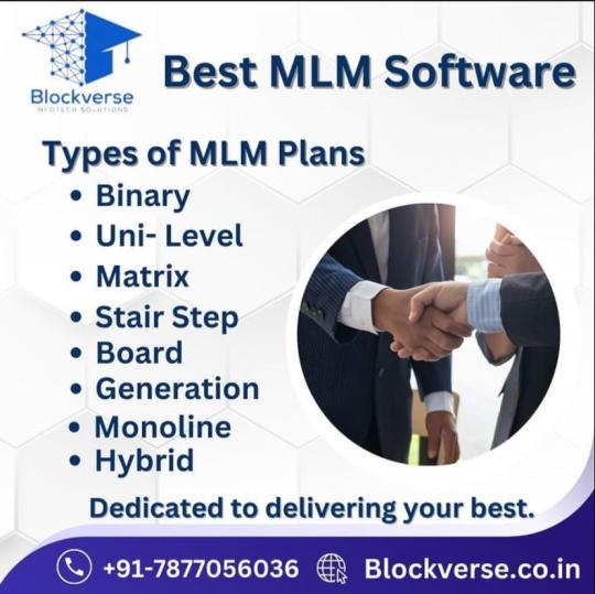
Maximizing MLM Success with Responsive Web Design: Key Principles, Optimization Tips, and SEO Impact
In today’s fast-paced digital world, where online presence is paramount, responsive web design has become a cornerstone for any successful Multi-Level Marketing (MLM) venture. As MLM businesses rely heavily on effective communication, engagement, and conversions, having a website that adapts seamlessly across various devices is not just a preference but a necessity. Let’s delve into why responsive web design is crucial for MLM software success, key principles to adhere to, optimization tips, and its profound impact on user experience and SEO.
Importance of Responsive Web Design in MLM Software:
Enhanced User Experience: Responsive design ensures that your website looks and functions flawlessly across all devices, providing a consistent and enjoyable user experience. This fosters trust and encourages visitors to stay longer, explore more, and potentially convert into leads or customers.
Expanded Reach: With the increasing use of mobile devices, having a responsive website enables you to reach a broader audience. Whether users are browsing on their smartphones, tablets, or desktops, they can access your MLM software platform effortlessly, boosting engagement and conversion rates.
Improved SEO Performance: Search engines favor responsive websites, as they offer a better user experience and are easier to crawl and index. By providing a single URL for all devices and eliminating the need for duplicate content, responsive design enhances your site’s SEO potential, leading to higher rankings and increased organic traffic.
Key Principles of Responsive Web Design:
Mobile-First Approach: Start designing your website with mobile users in mind, focusing on simplicity, fast loading times, and intuitive navigation. This ensures a smooth experience on smaller screens and sets a solid foundation for scalability to larger devices.
Flexible Grids and Layouts: Utilize fluid grids and flexible layouts that automatically adjust to different screen sizes and resolutions. This ensures that your MLM software website maintains its visual appeal and functionality across various devices without compromising on usability.
Media Queries and Breakpoints: Implement media queries to apply different stylesheets based on device characteristics such as screen width, orientation, and pixel density. Strategically define breakpoints to optimize the layout and content presentation for different viewport sizes, ensuring optimal viewing experiences.
Tips for Optimizing Responsive Web Design:
Prioritize Content and Features: Identify the most critical elements of your MLM software platform and prioritize them for mobile users. Streamline navigation, minimize distractions, and focus on delivering essential information and functionalities effectively.
Optimize Images and Multimedia: Compress images and multimedia files to reduce page load times without compromising quality. Utilize responsive images and videos with appropriate sizes and formats to ensure optimal performance across devices.
Test Across Devices and Browsers: Conduct thorough testing across various devices, browsers, and screen sizes to ensure compatibility and consistency. Use tools like Google’s Mobile-Friendly Test and BrowserStack to identify and fix any responsiveness issues proactively.
Impact of Responsive Design on User Experience and SEO:
Responsive web design plays a pivotal role in enhancing user experience by providing seamless access to your MLM software platform across all devices. By catering to the preferences and behaviors of modern consumers, responsive websites foster engagement, loyalty, and conversions, ultimately driving business growth.
From an SEO perspective, responsive design contributes significantly to your site’s visibility and rankings on search engine results pages (SERPs). Google, in particular, prioritizes mobile-friendly websites in its search algorithms, rewarding them with higher rankings and increased organic traffic. By embracing responsive design principles, you can improve your site’s accessibility, performance, and relevance, thereby maximizing its SEO potential and attracting more qualified leads.
Real-Life Examples of Successful Implementations:
Amway: Amway, a global leader in the MLM industry, revamped its website with a responsive design approach, resulting in a seamless browsing experience across devices. By optimizing content and features for mobile users, Amway witnessed a significant increase in engagement and conversions, reinforcing its position as a market leader.
Herbalife: Herbalife, another prominent player in the MLM sector, embraced responsive design to cater to its diverse audience base. By adopting a mobile-first strategy and implementing user-friendly layouts, Herbalife achieved higher search rankings and improved user satisfaction, driving business growth and brand loyalty.
In conclusion, responsive web design is indispensable for MLM software success, offering numerous benefits ranging from enhanced user experience and expanded reach to improved SEO performance. By adhering to key principles, optimizing your website effectively, and prioritizing user experience, you can create a compelling online presence that resonates with your audience and drives sustainable growth.
Blockverse Infotech Solutions is a leading provider of MLM software solutions, specializing in responsive web design to help MLM businesses thrive in the digital landscape. With our expertise and innovative approach, we empower clients to elevate their online presence, streamline operations, and achieve unparalleled success in the competitive MLM industry. Partner with Blockverse Infotech Solutions today and unlock the full potential of your MLM business.
0 notes
Text
website design company in Bangalore
website design company in Bangalore
10 Key Elements Every Website Design Must Have
For businesses it is essential to have a strong online presence. As a leading website design company in Bangalore, SeekNEO understands the significance of incorporating essential elements into every website design project. Read on to explore 10 key elements that SeekNEO believes every website design company in Bangalore should incorporate to create compelling and effective websites.
Responsive Design
With the majority of internet users accessing websites through mobile devices, responsive design is non-negotiable. A website design company in Bangalore must ensure that every website they create is optimized for seamless viewing across various devices, including smartphones, tablets, and desktops.
User-Friendly Navigation
Intuitive navigation is crucial for enhancing user experience. A well-structured navigation menu ensures that visitors can easily find the information they are looking for. SeekNEO prioritizes user-friendly navigation in all its website designs to ensure visitors can navigate through the site effortlessly.
Fast Loading Speed
In today's fast-paced world, users expect websites to load quickly. Slow loading speeds can lead to high bounce rates and decreased user satisfaction. As a website design company in Bangalore, SeekNEO implements optimization techniques to ensure fast loading times, contributing to a positive user experience.
Compelling Visuals
Visual elements such as high-quality images, videos, and graphics play a crucial role in capturing users' attention and conveying brand messages effectively. SeekNEO incorporates visually appealing elements into website designs to create engaging and memorable experiences for visitors.
Clear Call-to-Action (CTA)
A clear and compelling call-to-action guides users towards desired actions, whether it's making a purchase, filling out a contact form, or subscribing to a newsletter. SeekNEO strategically places CTAs throughout the website to encourage user interaction and conversion.
SEO Optimization
An effective website design company in Bangalore understands the importance of optimizing websites for search engines. By incorporating SEO best practices into website designs, such as proper meta tags, keyword optimization, and schema markup, SeekNEO ensures that clients' websites rank higher in search engine results pages, driving organic traffic
0 notes
Text
The Latest Top 10 All-in-One desktop Computers in India
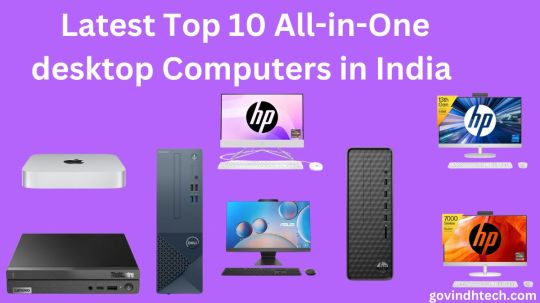
Top All-in-One Desktop Computers
Among those who would prefer not spend money on individual components for personalizing their computers, All-in-One Desktop Computers are a good option. Verify those laptops’ SSD and/or hard drive capacities earlier than you purchase those. Furthermore, if you prefer a truly immersive viewing qualifications, search choose a desktop with more expansive displays. Here have been the top choices on Amazon for an all-in-one desktop computers for your house.
High-performance Computing
In order to ensure uninterrupted performance for common tasks like online internet surfing, email, spreadsheets, and entertainment streaming, consider purchasing a desktop with an accurate CPU, enough of RAM (4 GB or more), and enough storage space (500 GB or more).
Displayed Sizes as well as Quality: Think about whichever screen dimensions and brightness will work most efficiently for you. More accurate graphics may be attained with greater resolution, like full-high-definition (1920×1080) or higher, and an extra immersive experience while watching can be had with an even greater screen size, like 21.5 inches or larger.
Your Operating System: Select a desktop computer that’s suitable for your needs while additionally making sure it is interoperable with an operating system that you are familiar with, for instance Microsoft Windows, macOS, or Linux.
Evaluate the connectivity choices delivered to make assured the all-in-one desktop can simply connect to your devices and peripherals. These options include USB ports, HDMI, Wi-Fi, and Bluetooth.
User-friendly Desktops
If you want to use the all-in-one desktop for multimedia apps, gaming, or graphically demanding jobs, take into consideration its graphics power. A PC with a dedicated graphics card will perform better in these domains.
Brand and Warranty: Think about trustworthy brands that provide high-quality items and helpful customer service. To safeguard your investment, look for warranty options with realistic time periods for coverage.
Price: Determine the most value for your money by setting a budget based on your needs and investigating several possibilities. To make an educated choice, evaluate costs, features, and specs.
Modern Desktop Solutions:
Taken into account if customer service support such as costumer service or care centers is delivered in the locality to make sure that you are able to find help in case your laptop has problems.
Read customer reviews and ratings to learn firsthand about the functionality, dependability, and general contentment with the All-in-One Desktop Computers that you are thinking about from actual users.
Top All-in-One Desktops for Seamless Everyday Computing in India:
1. Apple Mac Mini Desktop Computer M2 Pro chip, released in 2023
512GB SSD, 16GB RAM, and M2 Pro CPU in a little powerhouse that works well with an iPhone or iPad.
Apple Mac Mini Desktop Computer M2 Pro chip Features:
Processor: M2 Pro chip with 10‑core CPU and 16‑core GPU
RAM & ROM: 16GB Unified Memory, 512GB SSD Storage
Graphics: 16-core GPU
Operating System: Compatible with iPhone/iPad
Special Features: Gigabit Ethernet
Warranty: 1 year
2.HP All-in-One PC AMD Ryzen 3 3250U:
All in one hp desktop computer display:
Incorporating a 21.5-inch Full High Definition display, a Qualcomm Ryzen 3 CPU, 8GB RAM, as well as 512GB SSD, its a single device design incredibly efficient.
HP All-in-One PC AMD Ryzen 3 3250U Features:
Processor: AMD Ryzen 3 3250U
RAM & ROM: 8GB RAM, 512GB SSD
Graphics: AMD Radeon Graphics
Operating System: Windows 11
Special Features: 21.5-inch FHD Display, White Wired Keyboard Mouse Combo
Warranty: 1 year
3.HP All-in-One PC 13th Gen Intel Core i7:
A powerful 27-inch Full HD All-in-One Desktop Computers with 16GB RAM and 1TB SSD, all housed in a chic Shell White design.
HP All-in-One PC 13th Gen Intel Core i7 Features:
Processor: 13th Gen Intel Core i7
RAM & ROM: 16GB RAM, 1TB SSD
Graphics: Intel UMA Graphics
Operating System: Windows 11 Home
Special Features: 27-inch FHD Display, Wireless Keyboard and Mouse Combo
Warranty: 1 year
4. Lenovo ThinkCentre Neo 50q Tiny Intel Core i5:
Lenovo all in one pc
An Intel Core i5 desktop that is small and lightweight, including 512GB SSD, WiFi 6, and Vesa Mount.
Lenovo Think Centre Neo 50q Tiny Intel Core i5 Features:
Processor: 13th Gen Intel Core i5
RAM & ROM: 8GB RAM, 512GB SSD
Graphics: Intel UHD Graphics
Operating System: DOS
Special Features: WiFi 6, BT 5.1, Vesa Mount
Warranty: 3 Years Premier Support
5. HP All-in-One PC Ryzen 5 7520U:
Feature-packed 27-inch All-in-One Desktop Computers with Ryzen 5 processor, 16GB LPDDR5 RAM, 1TB SSD, and FHD Camera, in elegant Shell White.
HP All-in-One PC Ryzen 5 7520U Features:
Processor: Ryzen 5 7520U
RAM & ROM: 16GB LPDDR5, 1TB SSD
Graphics: AMD Radeon Graphics
Operating System: Windows 11
Special Features: 27-inch FHD IPS Display, Wireless Keyboard and Mouse Combo, FHD Camera
Warranty: 1 year
6. Apple 2023 Mac Mini Desktop Computer M2 chip:
Compact desktop with M2 chip, 8GB RAM, and 256GB SSD, delivering Apple’s performance and ecosystem integration.
Mac Mini Desktop Computer M2 chip Features:
Processor: M2 chip with 8‑core CPU and 10‑core GPU
RAM & ROM: 8GB Unified Memory, 256GB SSD
Graphics: 10-core GPU
Operating System: Compatible with iPhone/iPad
Special Features: Gigabit Ethernet
Warranty: 1 year
7. Dell Inspiron 3020S Desktop:
A sleek desktop with Intel i3-13100 processor, 8GB RAM, and 512GB SSD, pre-loaded with Windows 11 and MSO’21.
Dell Inspiron 3020S Desktop Features:
Processor: 13th Gen Intel Core i3-13100
RAM & ROM: 8GB RAM, 512GB SSD
Graphics: Integrated Graphics
Operating System: Windows 11 + MSO’21
Special Features: Wired Keyboard + Mouse
Warranty: 1 Year Onsite Hardware Service
8. Dell 13th Gen All-in-One PC Inspiron 5420:
Space-saving All-in-One Desktop Computers with Core i3-1315U, 8GB RAM, 512GB SSD, and a large 23.8-inch FHD display.
Dell 13th Gen All-in-One PC Inspiron 5420 Features:
Processor: Intel Core i3-1315U
RAM & ROM: 8GB RAM, 512GB SSD
Display: 23.8″ FHD
Operating System: Windows 11 + MSO’21
Special Features: Pro Wireless Keyboard + Mouse
Warranty: 3 Years Onsite Hardware Service
9. ASUS AiO M3402WFA Series:
Stylish All-in-One Desktop Computers powered by Ryzen 5, featuring 8GB RAM, 512GB SSD, and a 23.8-inch FHD display.
ASUS AiO M3402WFA Series Features:
Processor: AMD Ryzen 5 7520U
RAM & ROM: 8GB RAM, 512GB SSD
Display: 23.8″ FHD
Operating System: Windows 11
Special Features: Wireless Keyboard & Mouse
Warranty: 1 year
10. HP Slim Desktop:
Slim and efficient desktop with Intel Core i3-13100, 8GB RAM, and 512GB SSD, pre-loaded with Windows 11 and a sleek black wireless keyboard and mouse combo.
HP Slim Desktop Features:
Processor: 13th Gen Intel Core i3-13100
RAM & ROM: 8GB RAM, 512GB SSD
Graphics: Intel UHD Graphics 510SP
Operating System: Windows 11
Special Features: Black Wireless Keyboard and Mouse combo
Warranty: 1 Year
Read more on Govindhtech.com
#All-in-One desktopComputers#Operatingsystem#HDMI#USB#Bluetooth#AppleMac#MiniDesktopComputerM2Prochip#HP#PC#AMDRyzen33250U#13th Gen Intel Core i7#Lenovo#technews#technology#govindhtech
0 notes
Text
Mobile-First Indexing: Elevating Your Site's Performance with Mobile SEO Strategies
Introduction
In the dynamic landscape of digital marketing, staying ahead of the curve is crucial for online success.
As mobile usage continues to dominate the online space, search engines have adapted their algorithms to prioritize mobile-friendly websites.
Mobile-first indexing has become a game-changer, pushing website owners and digital marketers to optimize their sites for mobile devices.
In this article, we'll delve into the significance of mobile-first indexing, explore effective mobile SEO strategies, and shed light on the importance of professional SEO services, including local SEO, e-commerce SEO, and the role of SEO agencies in enhancing your online presence.
I. Understanding Mobile-First Indexing
Google, the leading search engine, introduced Mobile-First Indexing to address the shift in user behavior towards mobile devices. Traditionally, search engines would primarily use the desktop version of a website to determine its ranking. However, with mobile-first indexing, the mobile version takes precedence. This change emphasizes the importance of mobile optimisation for websites, as it directly impacts their visibility in search engine results.
II. Mobile SEO Strategies for Optimal Performance
Responsive Web Design
One of the fundamental pillars of mobile optimisation is adopting a responsive web design. A responsive website adjusts its layout and content based on the user's device, providing an optimal viewing experience. Google favors responsive designs because they eliminate the need for a separate mobile site, streamlining the indexing process.
Page speed optimisation
Mobile users value speed, and search engines are no exception. Slow-loading pages can result in higher bounce rates and lower search rankings. Implementing techniques like image compression, browser caching, and minimizing server response times can significantly enhance your site's loading speed.
Mobile-Friendly Content
Crafting mobile-friendly content is essential for engaging users on smaller screens. Use concise headlines and shorter paragraphs, and ensure that your content is easily scannable. Incorporate high-quality images and videos optimized for mobile viewing, creating a seamless user experience.
Mobile keyword research
Keyword research is the foundation of SEO, and it's equally crucial for mobile optimization. Understand the specific keywords and phrases your mobile audience is likely to use. Long-tail keywords and location-based keywords are particularly valuable for local SEO services.
III. SEO Services and Their Impact on Mobile-First Indexing
SEO Services Overview
Investing in professional SEO services is a strategic decision for businesses aiming to thrive in the digital realm. These services encompass a range of strategies and techniques designed to enhance a website's visibility in search engine results. Let's explore key SEO services and their impact on mobile-first indexing.
Local SEO services
Local SEO services focus on optimizing a website for local searches, making it more visible to users in a specific geographical area. With the rise of mobile searches tied to location, local SEO has become indispensable for businesses looking to attract nearby customers. By optimizing your site for local keywords, obtaining positive reviews, and ensuring accurate business information, you enhance your chances of appearing in local search results.
The Best SEO Services for Mobile Optimisation
The best SEO services for mobile optimisation go beyond basic strategies. They involve in-depth analysis of user behavior, constant monitoring of algorithm changes, and adaptation to emerging trends. Professional SEO providers stay updated with the latest mobile SEO guidelines, ensuring that your website remains compliant and competitive.
Ecommerce SEO Services
For online retailers, e-commerce SEO services are crucial for driving traffic and increasing sales. Mobile users frequently browse and shop on their devices, making mobile optimisation a top priority for e-commerce websites. SEO experts focus on optimizing product pages, streamlining the checkout process, and improving the overall user experience to boost conversions.
SEO Agency: Your Strategic Partner
Collaborating with an SEO agency can be a game-changer for your online presence. SEO agencies bring a wealth of expertise and resources, allowing you to benefit from a comprehensive approach to digital marketing. From technical SEO audits to content optimisation and link building, an SEO agency can tailor strategies to meet the unique needs of your business, all while prioritizing mobile-first indexing.
IV. The Future of Mobile SEO
As technology continues to advance, the importance of mobile SEO will only intensify. The growing use of voice search, the rise of mobile applications, and the integration of AI-driven features further emphasize the need for continuous adaptation. Staying ahead in the competitive online landscape requires a commitment to evolving mobile SEO strategies and leveraging professional SEO services to navigate the complexities of mobile-first indexing.
Conclusion
In the age of mobile-first indexing, optimizing your website for mobile devices is not just a recommendation; it's a necessity.
The strategies discussed, from responsive web design to local SEO services and e-commerce SEO, are integral components of a successful mobile SEO approach. By embracing these strategies and partnering with professional SEO services, businesses can not only adapt to the changing digital landscape but also elevate their online performance and maintain a competitive edge in the mobile-first era.
#Best SEO Company#Professional SEO Company#SEO Company Near Me#Professional SEO Services#SEO Services
0 notes
Last Seen Blogs

pridepup
Gay dogs

mthecao
Duc Ngoc

relatableinternationalstude-blog
Beszélek Angolul?

hhee46
Untitled

viviennelamb
Celestially Crafted Mirrorized Glass