#click on them to cycle through their limited dialogue options again and again
Text
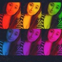
It’s funny how my attachment to characters in video games is on a whole different level to my attachment to characters in other media, because of that element of me personally seeking them out and befriending them and dragging them around with me, even in games where I didn’t really care about my player avatar. Anyway do yall have like, that one video game character you care about to absolutely insane levels, even years later, because you got invested in “winning” your relationship with them? I do and most of you probably know it’s Kreia
#there are many characters I care about a lot but it really hits different when you can load up the game and go walk up to them and#click on them to cycle through their limited dialogue options again and again#I say this but I absolutely do not do this with Kreia because I am too insane about her to even replay that game#but I think in just about every game I’ve played I will latch onto one character extremely hard
16 notes
·
View notes
Text
UX Design in Push Notification: A Complete Guide 2021
Push Notification in UX
A push notification is a test message provided by web browsers or mobile devices that appears on a desktop. It's a short message from a mobile app that appears on your screen. Users who don't use the app or who use their devices to get them are sent them by app publishers. It offers a variety of information, including sports, weather, coupons, special events, and flash discounts.
Notification through push The user experience resembles SMS and cellphone alerts, but it only reaches people who have downloaded specific apps. Push notification is available on every mobile platform. Apple's iOS, Google's Android, Amazon's Fire OS, Microsoft's Windows, and BlackBerry's services are all available.
If the user is not currently using an app, a notification is displayed on their lock screen to keep them engaged.
Various Categories of Push Notification Design
Push notification design and app UX improvements are influenced by the notification's function. It depends on whether the notice is active or not, how it is created, and so on. When creating notifications, it's important to keep a variety of categories in mind.
Let us check categories of Push Notification:
User-Generated Notifications
These notifications, such as WhatsApp or Facebook Messenger messages, or alerts from connected apps, are triggered by an action taken by another person.
It also refers to social media actions such as likes, shares, and other people's conclusions that appear as alerts.
Context-Generated Notifications
These notifications are generated by an app depending on your schedule or location, such as the Google Calendar app, which comes with a notice of an upcoming appointment. When you go close to a restaurant you enjoy, it may display notifications offering you a discount or other incentives.
System-Generated Notifications
It sends you notification UX when there are updates in the app itself. If the app needs to be updated, it will notify you and ask you to update it. It aids in the enhancement of the app's functionality. They deliver critical notifications if you input the wrong password.
Well-Designed Push Notification UX Framework
User experience is disrupted by push notifications and in-app communications. When a person is consistently doing anything on their smartphone, an in-app notice shows. Several factors must be considered to ensure that the UX design of notifications is consistent with the rest of the app experience.
It depends on whether your notifications are from a high, medium, or low attention level. Users are constantly eager to get high-priority notifications including warnings, confirmations, and error messages.
It sends these as soon as they are required. Information that requires less attention, such as affirmative messages and status statements, is sent at a more opportune moment. A user may believe that apps that provide them worthless information are interfering with their compatibility.
During user testing, the UI UX designer takes note of all communications that provide value to the UX.
The next step is to categorize the notifications according to the required level and associates. It is significant because, while designing notifications is not difficult, it must be done with care.
We understand that color coding and iconography must be thought out and integrated into a design system. Color-coding notifications to indicate the type of content notification is preferable. Designers must examine every element and establish themselves correctly on all backdrops when going through this process.
Limit Of Push Notifications For Good UX
The number of push notifications you can send is determined by the type of app your users are using and the content you're giving. It's a balancing act to send folks a sufficient number of notifications. UX Designers demand intentional UX and only convey signals with a clear goal in mind.
There is a need to create a daily notification limit if the app offers notifications to inform users about new products or cashback. When you send spam messages, the user will uninstall the program since it irritates them. It is not required to set a restriction, however sending 5 or fewer push notifications every day is better for the user.
Landing Page Success
We recognize that first impressions matter because if a user doesn't like what they see right away, they won't check into a company further. Businesses invest time, money, and energy into making landing pages that are as enticing as possible.
A well-designed landing page attracts visitors and allows users to communicate with them. It aids in the optimization of the website's performance as well as the identification of your target audience.
A landing page is usually created for a marketing or advertising campaign since visitors arrive after clicking on a link in an email, or adverts on Google, or another comparable website.
We create landing pages with a specific emphasis or objective in mind, often known as a call to action (or CTA). Its focus makes landing pages the greatest option for increasing marketing campaign conversion rates and obtaining a lead or sale. Users are sent to the appropriate page or the best area of the app when they open the push notice.
Users are dissatisfied when a notice redirects them to the app's home screen, which makes it difficult for them to access the numerous features. Push notifications are an important aspect of landing pages since they help companies target their customers more effectively.
Best Practices For Push Notification UX
There is a need to adhere to specific best practices that will assist consumers to understand the significance of notifications while also improving the user experience. These fundamental best practices must be considered while designing, sending a push notification, and integrating into a design system.
According to the app, alerts should be analyzed using the three attention levels. It symbolizes the organization of various types of notifications into three levels: high, medium, and low. The maximum character lengths for notification in all languages must be provided when establishing a style guide for the notice system.
It is better to pay particular consideration to adaptability to provide various content types and text lengths. It is better to create a steady color scheme for the three attention levels and iconography. UX designers always create easy-to-read notifications that yield information.
It's crucial to think about what to transmit on mobile and when to send it. You can add them to a notification list so that the user can simply find them when they want to see them. They also used an icon badge in UI designs to represent it and analyzed it with a system to provide a do not show again choice.
On mobile, we can use high-level notifications, recognize the sound, and receive feedback. For readability, it's preferable to give a proper variation on notifications or between the frameworks on which they occur.
Why us?
Our designers are experienced in building push notification UX at Creative Rats, a leading UI UX design business. We know that notifications provide an experience that aids users in achieving their objectives. Our professionals can easily manage, expand UX, and increase engagement.
During the product design life cycle, we, as designers, address the many forms and test them extensively.
Our process to design notifications is:
We prioritize early design and categorize notifications into three levels: high, medium, and low. Our UX designer prefers to use the best color code, choose icons, and manage placements. They are also classified as a pop-up, banner, dialogue, constant or non-constant, and many other things. It assists us in incorporating it into the design process.
We look at when and how notifications are used to assist us to achieve high usability and consistency in product messages. Our team understands that reviewing external messaging at the proper time helps designers improve a product's performance and user experience.
0 notes
Last Seen Blogs

rock-n-roll-curly-blonde
I Have Better Things To Do On A Saturday Night

padeqibawaka
Untitled
smashleyy69
Forever Ashley
nohu56
nohu56

topolek
Topolek