#doing those lazy anime comic redraws is fun
Text


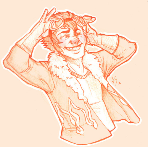
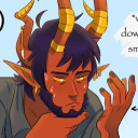
Guess who continued watching the cycling anime? Just that this time I drew diakko...
One of my friends has written a cycling au fic for them: read on ao3
#diakko#little witch academia#lwa#diana cavendish#akko kagari#cycling au#yowamushi pedal#comic#art#friend writing#doing those lazy anime comic redraws is fun
200 notes
·
View notes
Text
I got a question about how I handle lettering for those webcomics, so I’ll put an answer under a jump.
0::BUYER BEWARE
I should start by saying-- I really don’t know what I’m doing at a “pro level.” I think pro dudes use Illustrator and I don’t know how to use that program.
This is just my “just getting by, good-enough, I guess” way of doing things.
Also: I just work in Photoshop-- I don’t know what I’d do in Gimp, say, so this may only be useful to folks using Photoshop... Sorry!
Here’s Salgood Sam showing an analogous technique (he does things slightly different) on Youtube, though.
1:: SETUP
So I have a “Comic Page” template that I keep as a Read-Only file-- it has a layer so I can see where the page bleeds are, some pre-set grids in case I need a grid, etc. It takes about 5 minutes to set something like that up, and I think it comes in handy.
The top-most layer is a “TEXT” folder where I try to keep all my work, just to stay organized. (It’s really easy to get lost in all your layers in Photoshop). I keep some baseline lettering and invisible in my template locked-- so if I need Photoshop to “remember” what my “normal lettering” looks like, I just click off of that, and that saves me having to look things up.

So, when I need to letter a page, I start by typing everything out in that text folder.
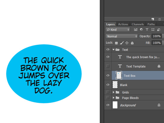
2:: TEXT LAYOUT
Photoshop has a text tool. I usually draw a little box and THEN type, instead of clicking the text tool because when you draw a little box, you can shape the words faster.
This is the aggravating part-- say your script is “The quick brown fox sumersaulted the lazy dog.”
You have to shape it so it’s
THE QUICK
BROWN FOX
SUMERSAULTED
THE LAZY
DOG.
And the only way I know to get that shape right is just by doing it. But it’s also valuable to do because you sit there sometimes and realize “Oh, I should just say JUMP instead of SUMERSAULTED, it’ll look better.” (It’s why I’m always a little astonished when comic writers don’t do their own lettering-- it’s **not fun** but it’s the part where you can fine-tune the words the reader sees. A writer should be interested in that!).
But it’s aggravating because you just... can very easily end up tweaking and tweaking and tweaking and tweaking...
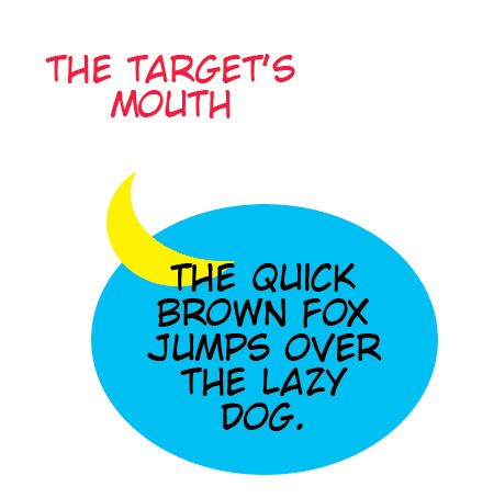
3:: THE BALLOON STAGE
Once the words are in there, I go and click that layer Text Box. That’s UNDER the words. So then I switch to blue or green, and under my words, I use the circle tool in Photoshop and I draw out a balloon.
(A thing that helps me at this part: it’s rare that I pick the exact right top-left corner to start my circle, but usually I’ll find a decent bottom-right spot. So then I just hit control-z and redraw the circle now that I know the bottom-right spot to begin at.)
Because I’m drawing it, I can use the wand tool to grab the circle and resize it different ways-- either just with a straight transform to get the shape just so, or by warping it.
I’m trying to get the words to fit in the balloon, and to have enough space around the words so that the balloons don’t feel cramped. Nate Piekos has a lot of tips that I’d recommend taking a look at to see some good do’s and don’t(s). (And his website Blambot has some excellent fonts available for hobbyists-- I’ve used Anime Ace before anyways).
(I believe 90% of the whole shebang though is choosing the right font for the job.)(OH; for finding the right font size, when I made my template, I just (a) copy pasted some pro comic pages into my template, and (b) then typed out some of their dialogue so I could put it side by side to the pro page). (The mistake I made being ... I think pro American comic pages letter too small, compared to manga, say... I think that was a mistake on my part, but...).
Anyways, so then I have my art, and above my art I have the balloon layer, and above the balloon layer, I have my words.
(Sometimes you want something besides a circle though-- then you just get in there and draw the shape you want with a pencil tool or the lasso. Shouting doesn’t “look” like talking, as an example-- but sometimes those sorts of graphics are corny; depends on the story.)
(I’d always use pencil and not the brush because brush leaves these lame half-grey pixels that are impossible to cleanup and could mess you up later). Here’s an article that calls anti-aliasing the “secret menace of coloring” and I guess that’s how I learned it, anyways.
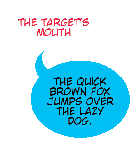
4:: Connecting Balloons and Making those Pointy-Bits
Then, you just have to draw the balloon pointing at whoever’s talking, or connect up balloons.
Usually, I just use a quick and dirty Polygonal Lasso-- I lasso something that points the right way, fill it with some more blue, and there you go-- I blue myself.
But sometimes you want some curves in there-- there, you probably should know how to use Adobe’s curve tool. And I think I have learned how to use it a couple times over the years but I always forget, so instead I do something extra cheap and lazy...
I go into a new layer, and draw a circle in a different color... and then I use the circular select tool to select a portion of the circle so that when I hit delete, it leaves a cool pointy-bit. (Balloon tail? Whatever you call it).
So here’s an image that kinda shows what I do:

And then I hit delete and...
(I’m lying about one bit-- I just do everything in black because I’m too lazy to switch colors like this, and I’ve done this a zillion times. The color bit is how I *should* do it, but).
Here’s the thing-- one you get one good curvy bit on a page, you can just duplicate that layer and rotate it around, to use it other places. Especially after you learn how to use Edit-Transform-Warp. The warp tool lets you take something like that and really distort into all kinds of different shapes-- sometimes you can take just a normal straight pointer, and just go right to warp tool, and get enough of a curve to be happy.
(I just do whatever feels like it’ll go the fastest in the moment because I really don’t enjoy lettering, so I want it to be over as quickly as possible).
Anyways, once I get the shapes the way I want, I color the yellow bit blue, and then smush that layer down into the word balloon layer. So I hopefully end up with something that feels like it has a good shape to it.
5:: The Bit Where it Turns Into a “Real Word Balloon”
Then I do something that I do so often that I just made into an "Action.” (Photoshop Actions are insanely useful). And this is the Action I use more than any other action.
I use the wand tool to grab that blue balloon. And then I hit the action.
My action says :
1) Whatever is selected? Fill it black.
(Weird Note I Barely Understand: For comic book black, I sometimes use C: 60, M: 60, Y: 40, K: 100-- Photoshop’s black is actually not all that black, according to comic colorists, if I remember right. But I don’t remember if I have my Action setup that way. But I should and you may want to, too).
2) Then, it says “Select-- Modify--Contract”. What that means is the selection is shrunk. Not the image-- the selection. So if you select the blue balloon, it’ll shrink how much of the blue balloon you’ve selected. So I usually say... you know, contract maybe 4 -6 pixels (some number that “feels right”).
3) And then my action says, okay, now whatever you’ve selected-- that shrunken bit? Fill it white.
So you have this all black shape (because it filled black at first), and then it shrinks, and then it fills it white. I have it set so that happens everytime I hit like command-F2 or something...

It’s not the “prettiest” balloon-- a pro balloon has a little nicer liner to it and a pro balloon tail is usually, like, longer and got a much more interesting curve to it. But I don’t think it’s so bad that people will notice, is the thing (or at least I hope not). And if that’s the case, I’d rather spend my time focusing on the words in the balloons than the balloons.
6 :: Philosophy
But I think there’s also something else to keep in mind, which is this--
Comics are a language. They’re a language built out of cartoons, panel shapes, panel layouts, color, lettering, et cetera.
In a perfect world, all those elements are working in concert. In a perfect world, all of the decisions around those elements are being equally driven and decided by the story (or whatever thought/emotion is being communicated). As an easy example where lettering is concerned, Howard Chaykin’s American Flagg and its lettering by Ken Bruzenak:

But because of the “industrial” assembly-line conditions most North American comic books get made under, you can tell that the writers, artists and letterers are often not working in any kind of harmony. So a lot of the language just doesn’t get spoken.
You can put the words outside of panels, above panels, panels with nothing but words, words in negative space, words on top of silhouettes, *thought balloons*, etc. Check out this double-page spread from Jim Steranko’s Outland adaptation:
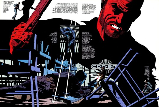
The lettering is part of the page, and helps to communicate the mood of the page from how it looks, not just what it says.
So I would say that it sometimes adds to the fun to come up with an overall strategy of how you want to handle the lettering, before you get rolling, instead of just trying to squeeze words in there after the fact-- to try to think about the page more as a “designer”, and lettering as one of the key design elements.
If you can! If you have the time!
Anyways, that’s how I do things. Probably incorrectly! But it’s just how I’ve always done it.
Hope that helps. Thanks and good luck.
8 notes
·
View notes
Text
Art Growth Compilation

I really enjoy doing posts about improvement in art.
It makes me feel better about my work, especially with how busy I am these days.
I wanted to compile all the comparisons I’ve made over the years and kinda discuss the posts, for myself or others.
I thought it’d be funny to start with comparing how I first drew on a tablet, using dodge and burn tools, to how I do now which is using layers and actually painting. It’s funny to look back on that, you know?
I linked the post I made, compiling all the month to month memes from 2003-2017 that I try and do yearly. And everything else is under a cut ;w;’‘/

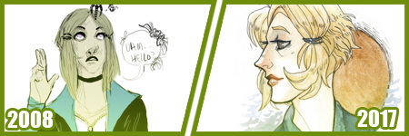
Most artists have done a drawing of themselves and a few Pokemon, or their team. I did that in 2010, and was dissatisfied with my work...
I took a crack again in 2013 after I’d learned to draw more animals and not be so Edgy(tm) I really liked the results. I still didn’t use references though, because I was lazy. I just didn’t want to. I still was on that boat feeling like I was CHEATING. I wasn’t being CREATIVE if I looked at references.
Artists get stuck on using reference and it’s AWFUL. USE THEM. USE TWENTY. LEARN!! It’s so HELPFUL, I wish I had started sooner.
In 2014 though -

I tried again.
I had gotten better at anatomy, but most of all, I started to work off references more. I started to really focus on not stylizing so much, but to work on actually making things look like things. I started to work on caring about COMPARISON sizes. Composition!!
While Pokemon reference sizes are -wiggle hands- and while my team changed up, I was satisfied that I could draw Arbok ACTUALLY like a cobra now, Meowth is easy given it’s just a noseless cat so to speak, Haunter is literally a triangle cloud - I was satisfied having drawn that team.
My secondary team in the new games? I was excited to draw them. It was fresh and new and FUN and it turned out PRECIOUS.
I learned better how to proportion things in an image for layout, and just... making characters feel COHESIVE in the same space.
It was a nice thing to keep visiting. I have a sketch in the works for an update even hopefully.
These pieces are kind of interesting to me too, because they’re towards the end of my era of THIN lineart?
My lineart has gone from this, and THIS, to this.
Literally I use to not believe in line weight, I can still do thin work of course, but I’m not a fan of trying to FORCE it like I use to? Even the second link, I went from the SMALLEST brush in Sai, to using a marker brush that had barely ANY give, to a custom brush on Sai that acts like a Paint Chat brush I use to use with friends online!
That’s what I mean about style too, like you may reserve yourself about things - like not coloring black in and outlining with white, or certain ways you do things. But the growth and changing and figuring FUN ways to color that black etc is where the fun of art comes in, to me??
Learn. EXPERIMENT. PUSH!
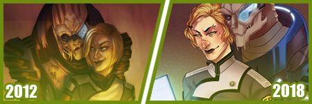
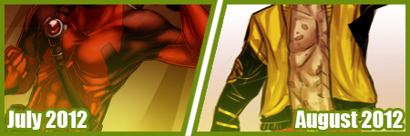
A few months ago, I did my first redraw. Of this piece from 2012.
Six years difference.
This was interesting for a number of reasons. There’s aspects I like more in the old one, but not many. I really like the pose a bit better, but I like the casual closeness that I did in the new one because that’s more my Shepard.
But technically speaking, it’s worlds better because I took time. I paid attention to details. I did fun things instead of rushing. I took time with my coloring and didn’t SMEAR it around. I had a friend who use to complain I drew so fast and they felt so SLOW, but I love what that taught me. I started taking more time on my art, and enjoying it more since I caught more mistakes and vastly improved. By leaps and bounds.
It’s amazing what a difference six years makes in not only style, which is often a FOCUS of these things? My style has come awkwardly and naturally to me over the years of critically picking certain things apart? but I really love where it’s gotten.
I have things I want to get back to, but I love... where it is, and CAN be?
But it’s wild to me how much change happens in technical handling? It’s a hand in hand thing, you can’t focus on one or the other only, or the other suffers.
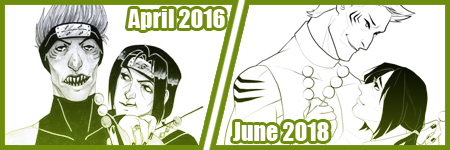
Honestly this has been my favorite improvement to notice though?
Kisame was a character I felt I should be able to draw EASILY? Not so much. Itachi? ALSO EASY. Not so much??
Kisame has weird eyes to grasp how to draw? Thus focusing on them kept making them wonky to me!! On top of that, he’s everything I’ve been use to drawing for AGES because he has a muscular body, with a smaller waist? ... that was something I was use to drawing? I still was awkward getting back into the swing of that... Drawing HIS HAIR though? NOT SO EASY....
But like, Itachi should have been easy, but I have a thing about him appearing too feminine as he gets drawn because his eyelashes, and I’ve really found a nice... medium at this point?
But even still like my face styles and eye styles are finally to a comfortable point for me? I have stopped focusing on some weird things with Itachi’s hair and just... DO IT? But even still like...
The improvement here is literally just if I don’t know how to do something, or I’m not satisfied with how I do it? I just keep at it.
It’s a theme of this post honestly... repetition, persistence.
Keep drawing it. Keep trying to figure out what it is that’s catching you off about how you do it. Don’t like how you do eyes or how they fit on the face? Look at facial structures and references and figure it out. Draw them separate and figure out how to apply them to what you are.
Remember there’s a skull in there. I draw the holes in the skull like the eye sockets, and the nose area to help my proportions for SURE.
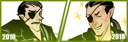
I’ve also gotten to a nice marriage in my lineart? The piece before the recent one, those lines feel HARDER or HEAVIER? The newest piece seems...softer? Like I’m lighter handed again?
I really like critiquing my own growth on what is good or working better for me? Older pieces it looks like I’m putting lineweight for SAKE of it versus where it goes now?
INTERESTING.
Like this lineup -

My style shifts so RAPIDLY, it still is noticeably MY style to people, but parts shift so VIOLENTLY because I’m constantly picking at what I don’t LIKE.
It’s funny too in the case of Kisame and Itachi because consistently I’m drawing the SAME character over and over - can make you REALIZE how you’re doing something wrong?
Like, here’s a difference of eight years, and it’s all the brush I use now, and it REALLY shows how my style has changed - in the aspect of one point of reference?
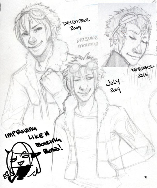
I have a childhood favorite character too, of Daisuke, and I use to be bad at drawing boys, and I use to be SUPER bad at drawing fluffy hair?
It was something I specifically started to learn to do? And I started to draw Daisuke every few months or years for a while. Especially when I started to first REALIZE I didn’t like my style that much?
But the middle one was July 2009, top left is less than 6 months later, and the last one is about a year later. DRASTIC DIFFERENCE. But next -
This one was in 2012, when I started to do more with teeth, or first dipping my toes into anatomy. I started to focus more on HANDS too, I was super bad at them. Overall I started to focus more on making my art have...ages? Like a boy versus a man. Facial features being DIFFERENT.
I can look at this boring little bust and see that he comes off more of a teenage boy to me now. I need to work more on figuring how to draw asian features especially the eyes. Sometimes I hit the mark, other times I don’t.
but between this and 2012? Not too much has changed. I do hair fluffier now, and I angle the eyes better. The teeth not being outlined doesn’t give that weird effect where I might give him TOO MANY TEETH....
People do that and it’s easy but whoof.
So there’s still learning and adapting to do in QUICK drawings, you know? but I can still see there’s good things. That took me like 5 minutes to draw? Not bad honestly.

In it’s own bracket is original characters though too?? But also divergent of STYLE shifts because like...
OKAY. Nightmare Syndicate’s story.. started for me in 7th or 8th grade, that was when I was...14? 15? I’ve been fleshing it out for like 13 years, that’s wild haha!! I love my kids and all.
But okay so SIALI. She’s still fairly similar but I restructured her face for SURE. She’s gotten less edgy, she’s.... a teenage girl.

FELIX?? CHRIST. He’s been such a long journey!! More on that later?
Rot and even Cor?? Rot and Cor are a shorter span of development, but Rot started in Highschool so almost 10 years ago, and Cor has been fairly solid - but even just DRAWING him over three years? Go look at how much he changes.. I’m not married to concepts easily. haha!
People act like making a character you’re STUCK with it. Like Oh boy, I better make this character good, from the get go!!
I only worry about that with small potatoes like my Pillar(Gods) designs I just made for the comic?? Even still, small things will change with them I’m sure.
But not only has Felix and Siali changed, but they’ve GROWN with my style and DEFINED it even. I’ve had to adjust my style to support Felix’s look honestly a LOT. Bend my rules. Break my anatomy stickler attitude - and honestly, that’s the thing.
You have to learn the rules and anatomy BEFORE you can break them. A style built upon broken anatomy will fail you down the road if you just excuse everything with style.
Learn to draw the hands. Learn to draw the feet. Figure out the face. Bones exist. You can break the FUCK out of it once you learn how to do it, you know? Like I’ve seen so many styles I LOVE who are cartoony and BROKEN AS FUCK, but there’s still some STRUCTURE to it. Most of those people can still structure a face just fine, and the reason exaggeration works so well is because there’s like unwritten rules for what works and doesn’t based on that?
Idk.
Felix has a very elongated torso, he’s like 7′ or 8′ tall so I mean?? He’s... broken anatomy, but he’s... lanky - but his muscle is LITHE and stretched. It makes contextual sense. That’s the important part.
But even designs, it’s important to understand designs YOU make, or like... to understand they’ll CHANGE and that’s growth within your art too?
Like okay, example. Felix has a millipede inspired monster form. But with designing that? I still have to know how millipedes and SNAKES work because there's bones and vertebrae in there??

But there’s also the difference of like... CONCEPT, versus execution. You can design a fucking badass character, but understanding your own concept is SOMETHING.
I had no idea how this would play out, until I was mapping out his ‘midsection’ spikes? and man. MY STYLE WAS MADE FOR THIS CHALLENGE NOW. Which is so interesting how smooth my style has always been? Felix has defined ANGLES in it, and it’s hilarious tbh?
But even too, I’ve had to work with Felix’s monster form FACE, to break the rules to make it WORK the way I need it too?
On the anatomy subject too, like when I first got into Marvel comics 6 years ago or so? I had no idea how to do muscle structures?? I was so BAD at it.
I can look at this left image and CRINGE so badly at how NONE of those are muscles?? THOSE ARE THINGS I PERCEIVE AS MUSCLES. Like...
A course I took taught me to draw what I see, not what I know. That’s the whole point of that post that goes around about drawing a shrimp. Look it up. It’s hilarious and cute.
But it’s like, asking an artist to draw a bike, you can tell who uses reference and who WINGS it. It’s funny, but like it’s what you know versus what you see.
I started to study anatomy like crazy and was seeing improvements days at a time. The right image was done like... a month later? already I can see the muscles under the pectorals? those look normal now. the abs aren’t dough lumps under the skin in a perfect 6 pack, they’re the actual plane shapes.
I was trying to find a good reference for myself of learning to make men ‘thicker’ too in terms of the waist etc since the left is really...thin.... but...

A bit better, but even still, comparing these two - they’re 2 months apart? and I can see understanding more about arms and how they connect to the body, where the planes ACTUALLY lay for the chest and obliques and such?
I can see improvements from July 2012 up there, to - WHOOPS. I FORGOT TO CHANGE THE YEAR LMAO... TO FEBRUARY 2013...omg
I mean, I could go on and on about improvements I see, when I go through my art though? Gosh.
Like I’m seeing so SO many bad hands and feet in my old stuff, and just CRINGING because tricks I learned for myself by now?
I give so many pointers and streams and screenshares on discord still to help people with art and it cracks me up?? Like...
I dunno. I’m pretty mediocre tbh, but god damn.
21 notes
·
View notes
Last Seen Blogs

jackzarts
Roll for drawing
vipin-ji-elanthoor
frustrated loser

tammy-nyu
La vida es un sueño el despertar nos mata

qamer
Untitled