#dontjudgeabookbyitscoverdevelopment
Photo

Book Cover development
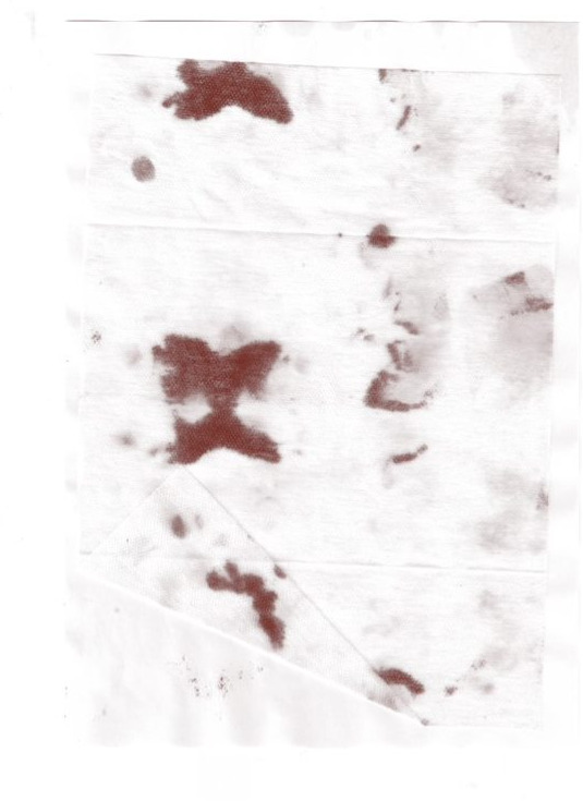
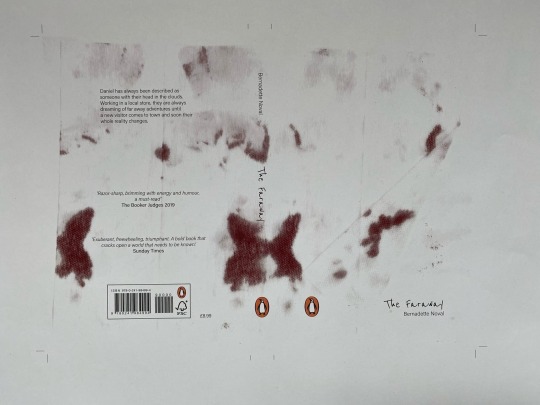
Another piece that was created during the workshop very casually was done when I used tissues to clean my cutting mat of blue ink. Having finished wiping the surface, I unfolded the cloth and I liked the ink stains that had formed on the cloth. Later I scanned them and changed the colour to look like blood in photoshop. Another unplanned thing that happened, but I kept it, was a crease that appeared when I put the fabric in the scanner and didn't check if it was flat. This later allowed me to use it as a design element. I placed the title of the book where the edge of the wipe was supposed to be, to give the cover a mystery and secrecy. I also used a handwritten font to give the impression that someone wanted to hide the note after wiping away the blood.
#viscom#viscomyear1#dontjudgeabookbyitscover#dontjudgeabookbyitscoverproject#dontjudgeabookbyitscoverdevelopment
2 notes
·
View notes
Photo
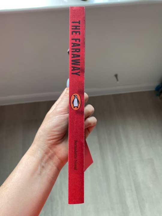
Cover development
I further developed the layout of this cover, worked out the spine better and made the title of the book more prominent, rearranged the text boxes on the back to make it easier to read.
#viscom#viscomyear1#dontjudgeabookbyitscover#dontjudgeabookbyitscoverproject#dontjudgeabookbyitscoverdevelopment
0 notes
Photo


First prints
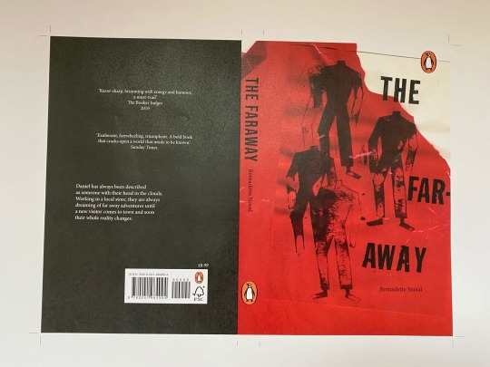
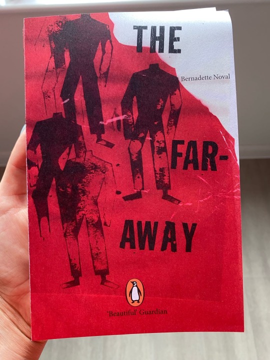
For the cover of this book, I used the work I created at our workshop. I drew a headless body on cardboard and cut it out to make these ink stamps. I then glued on red transparent foil and scanned it.
I wasn't happy with how the first back cover turned out because the dark red text wasn't readable at all, so I changed it to white, but it still looked unfinished and the margins were too wide.
#viscom#visomyear1#dontjudgeabookbyitscoverproject#dontjudgeabookbyitscover#dontjudgeabookbyitscoverdevelopment
0 notes
Last Seen Blogs

crazypassionandlove
Tear my heart out!

vegaselvisfan
VEGAS ELVIS FAN
softlouve
love, always.

kaylaashiloo-blog
kaylashilo