#i focussed on making the colour palette more unified
Text
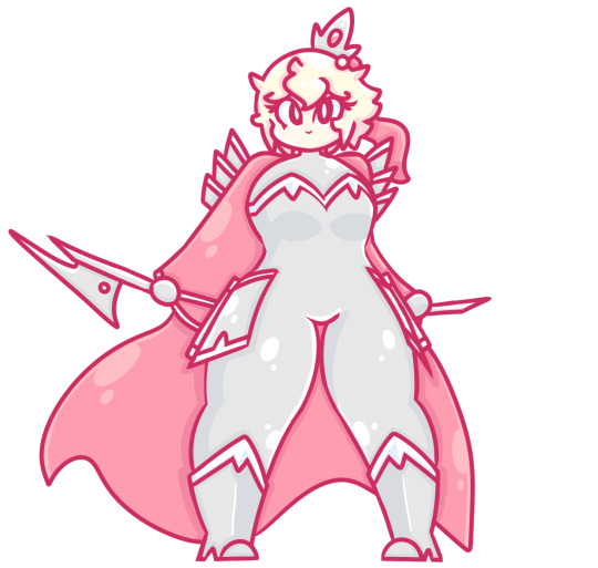
Euphetre redesign!
#Fun fact: this is like the 7th time i've redesigned Euphetre#This time around#i focussed on making the colour palette more unified#by making the black parts slightly more silver#and by making the crown the same type of silver#there is more colour contrast with the hair#art#oc#sylvysprit#sylvyspritart#euphetre
14 notes
·
View notes
Text
Blog Post #5B Refined Rationales
1. Project title
Tod Creek Craft Cider: The Barkley Series

2. The Challenge
I redesigned an existing bottle of cider from Tod Creek Craft Cider in a package design class. $1 of each bottle sold is donated to an effort to clean the Barkley reef just off the coast of Vancouver Island. The original design was lacking interesting visuals that would compel a potential consumer to pick it up and examine the bottle. The cider was being sold in a liquor store so it needed to be visually appealing given the fact that most products sold in a liquor store have a very illustrative or interesting design.
Tod Creek Craft Cider’s brand positioning is: “Premium cider with a west coast bite. Tod Creek Craft Cider is a small batch cider made of BC apples, crafted right here on Vancouver Island.” The goal was to create new labels with an elevated design and to expand the cider into a series.
3. The Approach
I wanted to lean into the idea of the cider being made locally on Vancouver Island. To make the one cider into a series, I updated the design of the existing flavour, apple and blackberry, and I chose fruit pairings native to the island to create two more flavours: apricot and cherry and fig and pear.
Instead of drawing the reef itself, I focussed on an octopus holding the fruit that’s in the cider. In the thumbs, I was playing around with ocean themes and ways to combine them with the fruit pairings. Initially, I found that there was a disconnect happening because I, essentially, have two competing illustrative elements: the ocean and the fruit. I solved the problem by making the two elements interact with one another. The octopus will unify the series, and create diversification by posing in a different position for each flavour, holding different fruits.
4. What I did
I drew the octopi in Procreate and made their tentacles long enough so that they wrap around the bottle to encourage consumers to pick it up and turn it to read the description on the back that describes the reef clean up and fundraising process.
I kept the barcode from the original design because the shape of it is a great element on the back of the label, and I assigned a specific colour to each flavour while maintaining a cohesive colour palette throughout the series.
The final design was able to capture the playfulness that I wanted it to have, along with interesting illustrations that helped to communicate the tone that this cider needed to convey.
___________________________________
1. Project title
The Fermented Moose
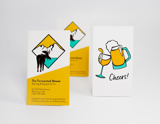
2. The Challenge
I designed a brand identity for a UBrew that opened in 2020 in my hometown, Whitecourt, Alberta. The client needed a logo along with its variations, a business card, a punch card, and a social distancing marker. She wanted to base the logo off of a painting she had made that shows a moose walking away into the mountains with the northern lights above. The tone she wanted to create was a fun and educational experience and she wanted the brand to feel contemporary. Going through the process of learning to brew beer, wine or cider should be enjoyable. The client wanted to incorporate turquoise into the design and wanted the logo to be illustrated but not too cartoonish.
3. The Approach
With this design, I was able to illustrate a few moose and a fun graphic for the back of the business card. The client asked for turquoise to be present in the logo and I paired it with a bright yellow to add the feeling she wanted of joy and excitement. I adapted her painting into a logo by simplifying the image. I chose to focus on the mountains and the moose only.
4. What I did
I illustrated the moose and the mountains in Procreate. I chose to separate the two elements with a tilted square framing the landscape and the moose walking towards it to create movement and depth in the logo. I used a sans serif and the brand colours, yellow and turquoise, to make the identity feel modern. I designed two business cards. One had a graphic one the back of a beer and wine glass clinking and the other had six tiny moose heads that acted like a punch card.
___________________________________
1. Project title
Portal magazine

2. The Challenge
I am currently the graphic designer for Portal, the literary magazine for Vancouver Island University. I designed the 2019 and 2020 issues and the 2021 issue, Portal’s 30th anniversary issue.
I work with the Portal team, the Creative Writing and Journalism third and fourth-year students. All VIU students are encouraged to submit their fiction, non-fiction, poetry, scripts, photography, paintings or illustrations. The student magazine department then decide which pieces will make it into the issue, and I design the magazines’ layout, posters for their fundraising events, ads for ad swaps with other literary magazines, programs and tickets.
3. The Approach
Since Portal works with graphic design students, the turnover is very high in that position as students graduate. Throughout the last three years at Portal, I've been working on ways to make their brand identity more cohesive. I've designed two logos for their yearly Portent competition and a reading series, Portfolio, that incorporate elements from their umbrella brand, Portal. I've also focused on keeping each new issue consistent with the last, using similar colours, typefaces and photo treatments. I've done the same with promotional material so that Portal can cement their identity in the readers' minds.
4. What I did
Using InDesign to design the cover and interior of Portal, I worked on ways to display the art in different ways. To make each layout interesting, I used feather gradients, colour overlays, images placed in object shapes with a mixture of full bleed, half bleed and no bleed compositions. This would also help to establish the tone of each piece.
I also used colour to differentiate the genres. For example, non fiction is orange. This means that each non fiction peace has orange drop caps, text breaks, pull quotes, title, and page markers.
1 note
·
View note
Last Seen Blogs

mbhhm
𝙈𝙊𝙃𝘼𝙈𝙈𝙀𝘿
whumpcollector
Flesh, Blood, and Broken Bone

raybanvietnamv3
Ray-Ban Việt Nam

fabiolapercolla
Untitled
molinnasims
Molinna Sims