#i live and breath for character analysis AND I get a bonus on architecture this time too
Text
Miguel O'Hara: What's his deal
Ok so ever since the theatre realease of Across the Spiderverse back on May 31st (yes in France we get our new releases on Wednesday, this is why the early videos on YT had French subtitles btw in case you were wondering), I have been deep in it. Like. DEEP. The main offender for that being Miguel O'Hara, who immediately started living rent free in my head and he is clearly not leaving any time soon. Anyway, this is completely out of topic for my blog but I do what I want so let me rant about the aforementioned Depressed and Overworked DILF because we love men with problems in this house.
WATCH OUT FOR THE SPOILERS (and unhinged ramblings that totally sidetrack).
Ever since the release of ATSV, a lot of videos have been available on YT to dissect everything, and of course I have been having an intense focus on character analysis, because that movie is absolutely brilliant at establishing character arcs and presenting new Spiderverse characters in one of the most efficient, thrilling and engaging way I've ever had the pleasure to witness. We've been blessed with Gwen's heartwrenching character arc (and she deserves none of the hate she's been receiving, but don't get me started on that), Hobie more like Homie in the span of 5 minutes on screen... And Miguel, who blesses us with his ego, anger issues and massive trauma while also dropping bits of a gentler side - but only bits of it. And I have been extremely normal about Miguel, since he absolutely doesn't tick all of the boxes of the Tickle My Fancy list.
I have been ranting about him in many YT comment sections for more than 2 months now (hi Purple Kisseokjin and Schnee lol), but with the digital release of the movie, I finally remembered I have a Tumblr blog where I can yell about Miguel all I want, so here we are now. Now where do I start...
First Part: Miguel's character design
I've overall been highly impressed by the various art styles given to the Spiderverse cast, and how it reflects who they are and where they come from. Miguel in particular hits many soft spots for me for a good reason: his association with architecture and industrial designs, which are topics I'm interested in (especially architecture). As such, I will begin this study by analysing both the character and environmental designs for Miguel and Nueva York, and how the depiction of Nueva York 2099 reflects the state of the narration as well as how Miles and Miguel feel and think - following the same logic as what we get to see with the use of watercolours on Earth-65B, during Gwen's sequences, to express emotional states. A mandatory tangent will be made in regard to Miguel's themes as well, because they fall in line with my arguments for the character and background designs.
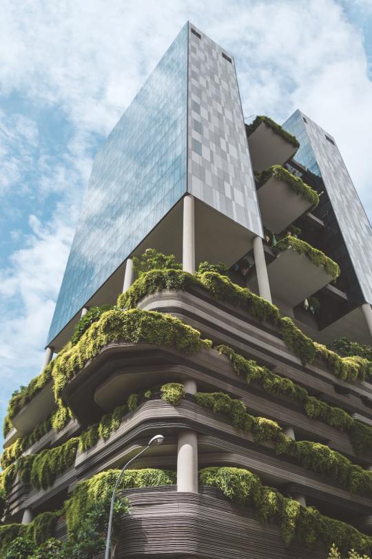
There are some main points to take into account when it comes to anything related to Miguel's design: straight lines everywhere, light rough sketch lines, gouache tones. Where do we find these elements? In architecture design. Older ones made in a traditional way usually have gouache for the colours (although ink and watercolour are also present), and the light sketch lines and straight lines are present to study the perspective, as shown in the example below:

Feels familiar? Well, will you look at that:

One of the reasons why I am giggling everytime he appears on screen is because of these delightful sketch lines. Looook, it has the same style as architecture concept art! Even better, from the mouth of one of the character designers, Kris Anka: NO CURVES!
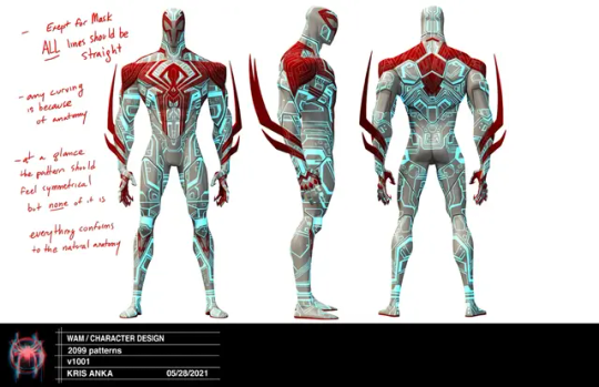
Even his face has sharp angles (he truly has the most powerful cheekbone game), look at the sketch lines:

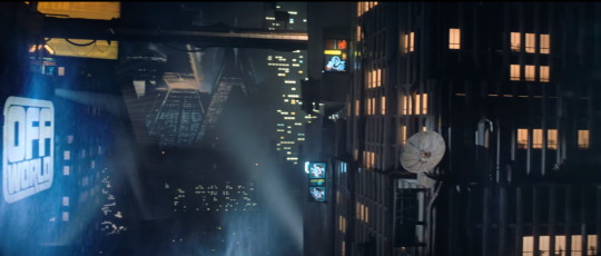
And you know what else has a lot of straight lines and sharp angles? Nueva York.
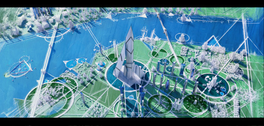
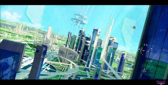
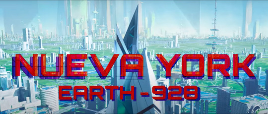
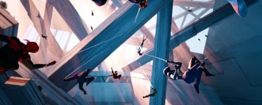
Look at this. Look at this. It's even in the title card when Miles arrives at the Spider Society.
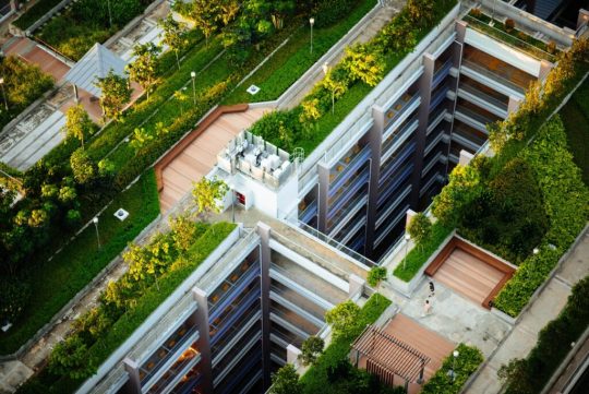
Allow me to make a slight detour to explain what we are looking at while looking at the architecture of Nueva York 2099. What we are seeing here is a blend of brutalism and eco-brutalism. Brutalism is characterised by its materials, steel and concrete, as well as its intent: in a post-WW2 world, architecture is seen with more pragmatism and values function first. Eco-brutalism is a branch deriving from Brutalism, and aiming to reintegrate nature in the concrete jungle in order to create an harmony - albeit a fully man-made one.
The concept artists took (eco-)brutalism and ran away with it for a massive Solarpunk vibe, which makes the whole setting very interesting considering that in the comics, Nueva York is also very much a futuristic dystopia. Yet, using (eco-)brutalism to have us experience the place for the first time along with Miles is a great way to give a sense of awe by way of what we envision as the future to be now:
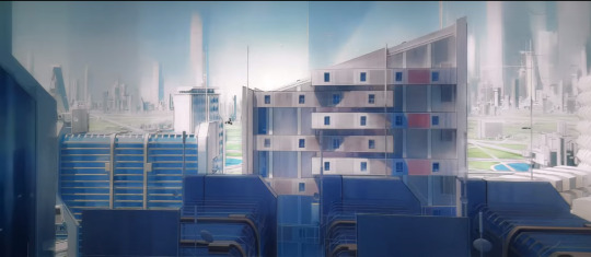
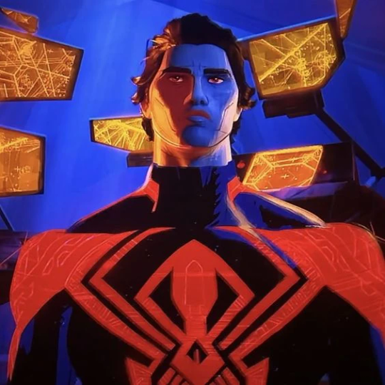
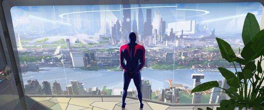
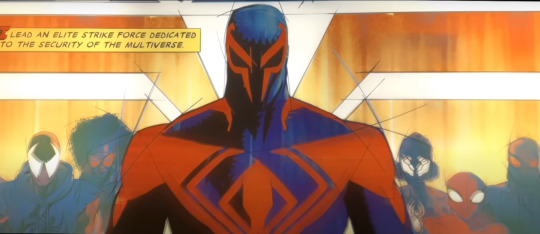
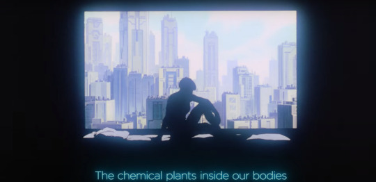
The interesting bit about it is how (eco-)brutalism and the adjacent solarpunk aesthetic are associated with a rather hopeful future, one where humanity manages to harmonise its modern way of life with a new development of nature. It feels like a haven mixing the relaxing greens of nature with the sharp lines of brutalism architecture, and that's how Nueva York feels on first sight. Similarly, Miguel O'Hara's first appearance leaves quite the memorable impression: tall, with broad shoulders and everything about him being sharp (it's even exagerated in the comics part), even his web.
(Fun fact time: ball pens have initially been designed for architecture and industrial drawings, they are fantastic tools to draw neat lines and create a nice variety of shading as well based on how you push on the pen and how you hatch/cross-hatch to modulate the intensity of the shading. You know who and what could be drawn solely with a couple of ball pens? Check the answer below.)

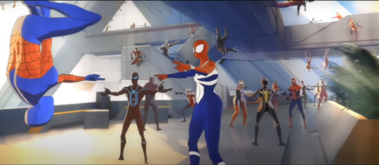
He also shines at the Guggenheim by showing how competent he is, with a certain benevolence on top of it: he initially rejects Jessica Drew's suggestion of adding Gwen to the lineup (yes Miguel, you don't want her because she's buddy buddy with Miles), yet saves her from being shot by her own father and ends up getting her on board as she finds herself with nowhere to go. It certainly leaves a similarly good first impression as the bright and harmonious first sight we get of Nueva York.
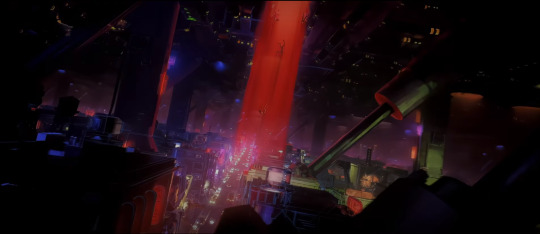
However, the environmental and character designs both give us a deeper look into Nueva York and Miguel, and it's certainly not as pristine as it seems. Just as Miles is about to discover the truth of the Spider Society, he enters a darker lab and Hobie keeps warning him, until they reach the area where Miguel is pretty much playing Big Brother by watching them through some of his screens:

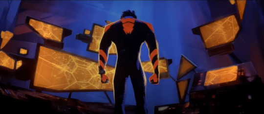


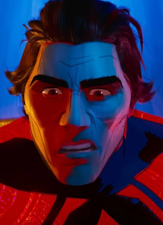
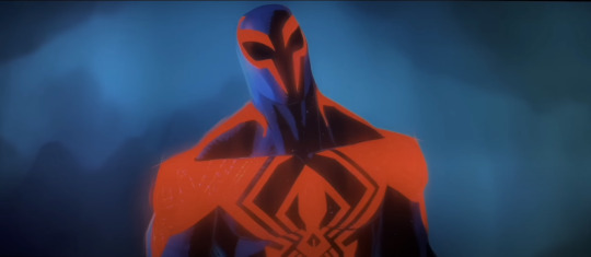
I'd argue that the darker space is a callback to the comics, in which Miguel becomes sensitive to light after his genetic mutation, But it is the very opposite of what we've been shown when introduced to the Spider Society: soft whites and greens are traded for deep blues and the stark orange of multiple screens as well as the tone on Miguel's own costume - the bright orange light of the screens is even reflected on him. This is not a pleasant place, and everytime we see it (the Go Home Machine area has a similar style, albeit more organic in the creepiest way, as displayed above on the 4th screenshot), we witness Miguel having outbursts of anger as well. There is also something that feels disconnected from humanity in the sense that it's colder and more methodical in the design, either with all the sharp angles and stark contrasts, or the alien design of the Go Home Machine.
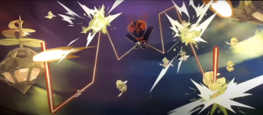
It's an impression that can also be found once we discover the underbelly of Nueva York, while Miles is being chased:
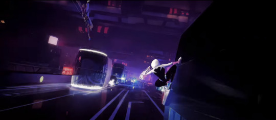
Here, we also have dark tones with stark neon lights that create the impression of a colder, less caring place, that points to the dystopic nature of the place. The impression is created with great efficiency not only by intense contrasts, but also by using the classic codes for a dystopic society: the solarpunk tones can be found in other stories such as the video game Mirror's Edge (classic case of solarpunk hiding a dystopia), and of course the darker cyberpunk aspects are a staple of the Dystopic Futuristic Society, that goes as far back as the first Bladerunner movie at least, and that can also be found in movies, series and games such as the Ghost in the Shell movies/series and the Cyberpunk TTRPG/video game (which pretty much gave its name to the genre) - I'd even argue we could go further back in time for the references with classics such as Aldous Huxley's Brave New World. It matches with the atmosphere of the Spiderman 2099 as well, which is set exactly in that type of darker, cyberpunk dystopia.

I argue that there's something coldly methodical in Miguel's design and, by extension, Nueva York 2099's design as well. And it is delightfully balanced through an initial positive introduction of both, before being broken down for a darker turn later on during the movie, as it matches Miles' own amazement-turned-disappointment throughout the sequences in Nueva York when his initial desire to belong somewhere is brutally turned on its head by the very persons who could have given him that sense of belonging he was seeking.
Interestingly, even the soundscape for Miguel, "Spiderman 2099" and "Lab 2099", expresses the underlying coldness of Nueva York 2099 and Miguel's own scientific, methodical approach to problems. As explained by Youtuber Azcona in his Miguel O'Hara Suite playlist:
"I'd argue that it has the same tonal resonance that the Prowler theme in the first movie had, though is less villainous and dreadful as that theme. Miguel's theme is a five note synth line that sounds akin to an alarm or siren. It's blaringly loud, but is also used for more calm dialogue scenes in an effective way. The words that come to mind when describing the musical soundscape of Miguel O'Hara is "methodical", because no matter how loud or abrasive his theme gets it has an underlying feeling of coldness and efficiency. This is further shown through a repetitive synth ostinato that plods and chugs during a lot of his scenes/scenes involving the multiverse at large. It's reminiscent of Blade Runner in tone and it's mechanical nature, and I think it suits someone as jaded and distant as Miguel. Not only is his theme alarming and efficient, but also efficient in it's cold, electronic soundscape and melodies."
And this very methodical, cold tone is itself used during the infamous Train Chase and Miguel's on-screen mental breakdown... But more on that in the next part!
#across the spiderverse#atsv#miguel o'hara#atsv miguel#atsv spoilers#character analysis#spiderman 2099#not twisted wonderland#THE HOLD MIGUEL HAS ON ME IS SO REAL#He truly lives rent free in my head since May 31st#we love Depressed and Overworked DILFs in this house#and now you have to deal with my latest insane ramblings#I hadn't gone that far since Hell's Paradise lmao that was 4 years ago#but man does it feel GOOD#i live and breath for character analysis AND I get a bonus on architecture this time too
30 notes
·
View notes
Text
TerraMythos' 2020 Reading Challenge - Book 22 of 26
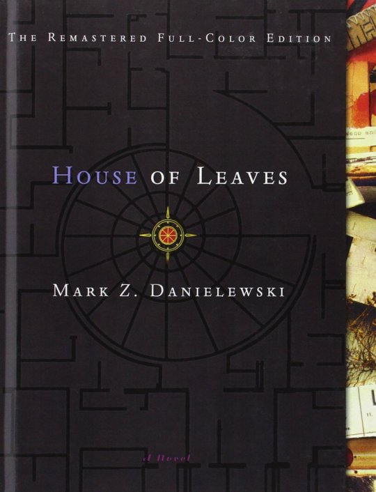
Title: House of Leaves (2000)
Author: Mark Z. Danielewski
Genre/Tags: Horror, Fiction, Metafiction, Weird, First-Person, Third-Person, Unreliable Narrator
Rating: 6/10
Date Began: 7/28/2020
Date Finished: 8/09/2020
House of Leaves follows two narrative threads. One is the story of Johnny Truant, a burnout in his mid-twenties who finds a giant manuscript written by a deceased, blind hermit named Zampanò. The second is said manuscript -- The Navidson Record -- a pseudo-academic analysis of a found-footage horror film that doesn’t seem to exist. In it, Pulitzer Prize-winning photojournalist Will Navidson moves into a suburban home in Virginia with his partner Karen and their two children. Navidson soon makes the uncomfortable discovery that his new house is bigger on the inside than it is on the outside. Over time he discovers more oddities -- a closet that wasn’t there before, and eventually a door that leads into an impossibly vast, dark series of rooms and hallways.
While Johnny grows more obsessed with the work, his life begins to take a turn for the worse, as told in the footnotes of The Navidson Record. At the same time, the mysteries of the impossible, sinister house on Ash Tree Lane continue to deepen.
To get a better idea try this: focus on these words, and whatever you do don’t let your eyes wander past the perimeter of this page. Now imagine just beyond your peripheral vision, maybe behind you, maybe to the side of you, maybe even in front of you, but right where you can’t see it, something is quietly closing in on you, so quiet in fact you can only hear it as silence. Find those pockets without sound. That’s where it is. Right at this moment. But don’t look. Keep your eyes here. Now take a deep breath. Go ahead and take an even deeper one. Only this time as you start to exhale try to imagine how fast it will happen, how hard it’s gonna hit you, how many times it will stab your jugular with its teeth or are they nails? don’t worry, that particular detail doesn’t matter, because before you have time to even process that you should be moving, you should be running, you should at the very least be flinging up your arms--you sure as hell should be getting rid of this book-- you won’t have time to even scream.
Don’t look.
I didn’t.
Of course I looked.
Some story spoilers under the cut.
Whoo boy do I feel torn on this one. House of Leaves contains some really intriguing ideas, and when it’s done right, it’s some of the best stuff out there. Unfortunately, there are also several questionable choices and narrative decisions that, for me, tarnish the overall experience. It’s certainly an interesting read, even if the whole is ultimately less than the sum of its parts.
First of all, I can see why people don’t like this book, or give up on it early (for me this was attempt number three). Despite an interesting concept and framing device, the first third or so of the book is pretty boring. Johnny is just not an interesting character. He does a lot of drugs and has a lot of (pretty unpleasant) sex and... that’s pretty much it, at least at the beginning. There’s occasional horror sections that are more interesting, where Johnny’s convinced he’s being hunted by something, but they’re few and far between. Meanwhile, the story in The Navidson Record seems content to focus on the relationship issues between two affluent suburbanites rather than the much more interesting, physically impossible house they live in. The early “exploration” sections are a little bit better, but overall I feel the opening act neglects the interesting premise.
However, unlike many, I love the gimmick. The academic presentation of the Navidson story is replete with extensive (fake) footnotes,and there’s tons of self-indulgent rambling in both stories. I personally find it hilarious; it’s an intentionally dense parody of modern academic writing. Readers will note early that the typographical format is nonstandard, with the multiple concurrent stories denoted by different typefaces, certain words in color, footnotes within footnotes, etc. House of Leaves eventually goes off the chain with this concept, gracing us with pages that look like (minor spoilers) this or this. This leads into the best part of this book, namely...
Its visual presentation! House of Leaves excels in conveying story and feeling through formatting decisions. The first picture I linked is one of many like it in a chapter about labyrinths. And reading it feels like navigating a labyrinth! It features a key “story”, but also daunting, multi-page lists of irrelevant names, buildings, architectural terms, etc. There are footnotes that don’t exist, then footnote citations that don’t seem to exist until one finds them later in the chapter. All this while physically turning the book or even grabbing a mirror to read certain passages. In short, it feels like navigating the twists, turns, and dead ends of a labyrinth. And that’s just one example -- other chapters utilize placement of the text to show where a character is in relation to others, what kind of things are happening around them, and so on. One chapter near the end features a square of text that gets progressively smaller as one turns the pages, which mirrors the claustrophobic feel of the narrative events. This is the coolest shit to me; I adore when a work utilizes its format to convey certain story elements. I usually see this in poetry and video games, but this is the first time I’ve seen it done so well in long-form fiction. City of Saints and Madmen and Shriek: An Afterword by Jeff VanderMeer, both of which I reviewed earlier this year, do something similar, and are clearly inspired by House of Leaves in more ways than one.
And yes, the story does get a little better, though it never wows me. The central horror story is not overtly scary, but eeriness suffices, and I have a soft spot for architectural horror. Even Johnny and the Navidsons become more interesting characters over time. For example, I find Karen pretty annoying and generic for most of the book, but her development in later chapters makes her much more interesting. While I question the practical need for Johnny’s frame story, it does become more engaging as he descends into paranoia and madness.
So why the relatively low rating? Well... as I alluded to earlier, there’s some questionable stuff in House of Leaves that leaves (...hah?) a bad taste in my mouth. The first is a heavy focus on sexual violence against women. I did some extensive thinking on this throughout my read, but I just cannot find a valid reason for it. The subject feels thrown in for pure shock value, and especially from a male author, it seems tacky and voyeuristic. If it came up once or twice I’d probably be able to stomach this more easily, but it’s persistent throughout the story, and doesn’t contribute anything to the plot or horror (not that that would really make it better). I’m not saying books can’t have that content, but it’s just not explored in any meaningful way, and it feels cheap and shitty to throw it in something that traumatizing just to shock the audience. It’s like a bad jump scare but worse on every level. There’s even a part near the end written in code, which I took the time to decode, only to discover it’s yet another example of this. Like, really, dude?
Second, this book’s portrayal of mental illness is not great. (major spoilers for Johnny’s arc.) One of the main things about Johnny’s story is he’s an unreliable narrator. From the outset, Johnny has occasional passages that can either be interpreted as genuine horror, or delusional breaks from reality. Reality vs unreality is a core theme throughout both stories. Is The Navidson Record real despite all evidence to the contrary? Is it real as in “is the film an actual thing” or “the events of the film are an actual thing”? and so on and so forth. Johnny’s sections mirror this; he’ll describe certain events, then later state they didn’t happen, contradict himself, or even describe a traumatic event through a made-up story. Eventually, the reader figures out parts of Johnny’s actual backstory, namely that when he was a small child, his mother was institutionalized for violent schizophrenia. Perhaps you can see where this is going...
Schizophrenia-as-horror is ridiculously overdone. But it also demonizes mental illness, and schizophrenia in particular, in a way that is actively harmful. Don’t misunderstand me, horror can be a great way to explore mental illness, but when it’s done wrong? Woof. Unfortunately House of Leaves doesn’t do it justice. While it avoids some cliches, it equates the horror elements of Johnny’s story to the emergence of his latent schizophrenia. This isn’t outwardly stated, and there are multiple interpretations of most of the story, but in lieu of solid and provable horror, it’s the most reasonable and consistent explanation. There’s also an emphasis on violent outbursts related to schizophrenia, which just isn’t an accurate portrayal of the condition.
To Danielewski’s credit, it’s not entirely black and white. We do see how Johnny’s descent into paranoia negatively affects his life and interpersonal relationships. There’s a bonus section where we see all the letters Johnny’s mother wrote him while in the mental hospital, and we can see her love and compassion for him in parallel to the mental illness. But the experimental typographical style returns here to depict just how “scary” schizophrenia is, and that comes off as tacky to me. I think this is probably an example of a piece of media not aging well (after all, this book just turned 20), and there’s been a definite move away from this kind of thing in horror, but that doesn’t change the impression it leaves. For a book as supposedly original/groundbreaking as this, defaulting to standard bad horror tropes is disappointing. And using “it was schizophrenia all along” to explain the horror elements in Johnny’s story feels like a cop-out. I wish there was more mystery here, or alternate interpretations that actually make sense.
Overall The Navidson Record part of the story feels more satisfying. I actually like that there isn’t a direct explanation for everything that happens. It feels like a more genuine horror story, regardless of whether you interpret it as a work of fiction within the story or not. There’s evidence for both. Part of me wishes the book had ended when this story ends (it doesn’t), or that the framing device with Johnny was absent, or something along those lines. Oh well-- this is the story we got, for better or worse.
I don’t regret reading House of Leaves, and it’s certainly impressive for a debut novel. If you’re looking for a horror-flavored work of metafiction, it’s a valid place to start. I think the experimental style is a genuine treat to read, and perhaps the negative aspects won’t hit you as hard as they did to me. But I can definitely see why this book is controversial.
7 notes
·
View notes
Last Seen Blogs

rebelcthulhu
…And Some People Are White Guys In 1985

stacey-sweetcheeks
Stacey
🍑SweetCheeks🍑

handmadecolorfuldeer
Hamdmade Colorful Deer

vxl-stxrt
Sleepy Brat

ehghtyseven
my talent? sleep