#i started doing the black shading because i didn't want to actually render and pretty much ended up taking the same amount of time lmao
Text

urrrr art of a fic i've been planning but don't have time to write raaah
#ethubs#my art#hermitblr#hermitshipping#bdoubleo100#ethoslab#i started doing the black shading because i didn't want to actually render and pretty much ended up taking the same amount of time lmao#the fic is a gouverment conspiracy inspired by YCAO#but realistic#AU#cw gun
815 notes
·
View notes
Text
Art Feedback Session - Spookydoesstuff


"Our task was to make a mock intro to a show using our own original stories, either ones we had in the past or ones we made in class. I used Adobe Animate, which isn't very traditional for art to begin with.
I wanted something dramatic and more anime-esqe (inspirations being Persona 5's 2D animation, as well as the Cowboy Beebop intro.
The render itself didn't turn out as high quality as I had hoped, but that's on me for not figuring out how to render in a higher quality. With my time crunch (I had put off working on this until I had 1 1/2 days left, on top of a project for another class.)
I feel this could have been better? But I'm satisfied with it. I just wished someone had said something, even just asking about my characters (I dont generally ask here, at least about these specific ocs, just because I've had them so long and I want to give out more of their story through context and art. But in that class no one had seen them before and I would have loved explaining their story better than just 'alien cats')"
-- Spookydoesstuff

So! Let's start with the good. The color contrast is lovely, the bright red against the monochrome is a classic high tension color combo that really sells the adversarial stress of the scene. The characters themselves each have their own unique silhouettes, which means if you just filled each of the characters in with pure black and then showed me their reference sheets I could easily identify which character is which. The line work here is very crisp and clear, which for animation lends very well to streamlining and simplifying things. Your style itself applies very nicely to an animation style, again, thanks to its general simplicity will make the whole animation process much easier than a more detailed or complex style or design.
When thinking of areas of improvement, the first thing that is brought to my attention is expression. With the four-eyed cat in the second image, at a glance it's hard to see he's furrowing his brow a bit and his current expression comes across more as a neutral expression than a concerned, worried, or frustrated expression. I would recommend here adding a bit of emphasis on the expression with the eyelids or eyebrows so that it goes into the general shape of the eye instead of just above it or add a stylized eyebrow so it is more visible against the dark fur. Due to the thin line art, the line that marks where he's furrowing his brow is hard to spot.
Your art would also benefit from expression through body language! Cats, in particular, are incredibly expressive through body language. The ears in particular here are showing no emotion- Cats when anxious, scared, or angry will pin their ears back. Perhaps a bit more emphasis on bristling fur too- in the nape of the neck and the tail. Fluffing of tails is not just fear, but also aggression when raised high or thrashing. When curved it's fear. The nervous cat in the second picture might want to be keeping her head a little lower, as nervous cats will duck down, especially if submissive. Of course, since these are not standard cats, you are welcome to take these cat behaviors and alter them to your alien culture's standards! Go wild!
Also, look into playing with the line of action a little more. Even with characters that are standing still, exaggerating some curves in their body will add a hearty dose of personality. Plus, look into the 'law' of stretch and squish- I use the term law here loosely, it's more of a guideline.
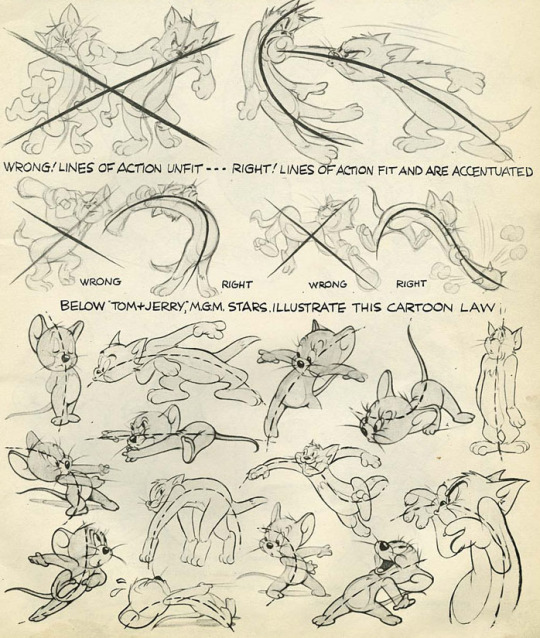
(Here are some image scans from a book called Cartoon Animation by Preston Blair, and there's a lovely tutorial on expressions from the comic Lackadaisy here!)
Next I'd like to mention the shading. There is a bit of an inconsistency between the way you shaded each character. Although lighting direction was ignored for style here, the particular techniques used for each piece should remain the same throughout each frame of an animation, each panel of a comic, or between related images in general. In the second photo, the highlights on the four-eyed cat almost looked like fur patterning, so maybe refining that highlight by making it a little darker would make it more obvious it was a highlight and not a change in fur color?
I think if you were given a little more time you would have managed with the shading, but still something of note to keep in mind for the future~
Finally I would like to address the environment... or the lack of it. The bright red background is lovely, especially in this grey scale-pop style of colors. My only issue is that it feels like they're floating in some red void- you have the darker red to denote the ground, but it doesn't feel very consistent with where the characters are placed and there's no shapes in the background to denote any kind of environment- no tree silhouettes, no building silhouettes, or any other objects that could denote where the characters are.

Above is an example from Persona 5 which kind of shows what I'm talking about. Looking at some perspective tutorials will actually show you a way you can manipulate the floor or gradients to help add some solidity to the ground. With this style I wouldn't even say you would need to add nearly as much detail to them as Persona 5's art- just some dark shapes and perhaps a gradient of sorts to give a sense of location to the scene would help.
Overall, wonderful job! My first impression was 'Oh hey this looks like something from Persona 5!' so you really got that feel you were looking for. You also immediately get a sense of relationship here- from an outsider's perspective with zero previous information on who these characters are or how they are related. You can clearly tell the four eyed cat is protecting the female cat in the back, and there's a sense of either accusation from the one-eyed cat or threat, and that the other two almost seem to be distressed as if they were once close to this character.
Keep up the good work, don't feel discouraged with the lack of feedback from your class. I really feel with a bit of practice in terms of expression and body language you can really make some great waves with your art! You have a great foundation.
In terms of art program recommendations, my wife and I both use Clip Studio Paint. You need the EX version for feature length animations unfortunately, but the PRO version is much cheaper and lets you do some very short animations however it is a very powerful illustration and comic tool as well. Krita is a totally free program that will let you animate as well and has a pretty robust illustration feature itself, but I'm not sure if it has anything specific for comic making.
A big thank you to Spookydoesstuff for being our first review and for being so pleasant to speak to! Please check out more of their art and their blog by clicking here to go to their tumblr!
7 notes
·
View notes
Last Seen Blogs

bandaidsfortheheart
band-aids for the heart

kelygaiborv
KelyGaiborV
tisalovestory
Playing love


uttariyaofficial
Uttariya