#in case they werent legible
Note
Sorry to bring up the writing post and if you want to ignore this you can, but to the comments about artists not getting told this etc etc... like artists dont get told this stuff because most of them work on it in their own? Like the grammar one is what gets me the most. If you're drawing people, you learn to draw each individual part before the whole. So why would you not treat writing the same way? Learn to "draw" the sentence structure and the verb tense consistency etc. before "drawing" 1/2
2/3 a whole fic. And also like??? "Writers can break rules if they want just like artists" YES but like? You need to learn the rules first in order to break them? I'm a music person so I relate most to music but you should learn proper music theory before saying "fuck this, I'm doing what I want". Finally, STRUCTURE IS DIFFERENT THAN WRITING STYLE. (This is specifically at the person who said that not everyone needs to use paragraph breaks because that'd be boring). Anyways you're great
3/3 and people just kind of suck in general and tend to get really defensive when they werent even being attacked. You're a random writer who feels as though people who are literally PUBLISHING WORK should take pride in it and constantly try to grow (which isnt a hefty request). Okay sorry again ignore this if you dont want to talk about it anymore I just had thoughts and no where to put them because I dont post on my blog anymore lol
first of all, thank you, i really really really appreciate this. the post wasn’t intended to attack anyone, and especially not over frivolous things, but people definitely blew it out of proportion. like with the grammar thing for example; i don’t care whether or not people want to write in all lower-case, i’ve done it myself a few times! but it’s exactly like you said, there’s a reason language and grammar rules exist lmao, it’s to make sure that what we write is legible and comprehensive and that we can effectively communicate with one another. so i don’t think me advising people to put a comma before a closing quotation is THAT big of a deal.
also, you’re 100% right about structure being different from writing style. everyone has a different writing style and people definitely misinterpreted what i said and thought that i was bagging on people with a certain style like........no. just no, lol. that’s what pisses me off about this whole thing: people made it into SUCH a big deal, and are now calling me a bitch/cunt/asshole and claiming that i’m racist/ableist/ageist without actually coming to talk to me and hear my side of the story. AND they’re saying that i sounded bitchy and rude, but it’s like. okay, that’s your opinion, that’s how you’re reading my words. tone gets lost over the internet, so you really should just come to me and ask what my intentions were instead of assuming that i have a superiority complex. unfortunately i’m just gonna have to roll with it at this point, but i really appreciate you thinking critically about this and understanding my perspective! and thank you for not jumping down my throat xo
2 notes
·
View notes
Text
Years ago I was really into the theory that Kurt Cobain was murdered. I mean, it really had nothing on my Gillovny and Johnny Depp posts. The amount of time and energy I actually put into researching that shit and writing about it was insane. But anyway. When I first started researching it it seemed plausible he was murdered. The evidence that was put forth was interesting and seemed damning. Lack of legible fingerprints, heroin level, ect. All seemed to point to foul play. Then I started doing my own damn research and asking questions. Instead of relying on other people to tell me what everything meant. To someone who doesnt know any better no fingerprints on a gun says someone either wiped them off or the shooter had gloves. Kurt was found without gloves and a dead man cant wipe off his own weapon (!!). But fingerprints (at least legible ones) are actually difficult to come by. Surface material, temperature, skin oil, gun oil (in this case), ect play a role in how legible any prints will be. Which explained why there werent any on the shotgun. Also, police had to pry it from his hands so...smudge. My point? The people/person that you may rely on for information might just be as ignorant on the topic as you are so do your own research. Dont let someone tell you what something means. Be aware of any inclination towards confirmation bias. Everyone does it to some extent.
1 note
·
View note
Text
Week 04 Review - Word-marks; What’s in a word?
This week we moved onto looking onto word marks and their role in branding. A word mark includes the company name/person's name where typography is the centre piece.
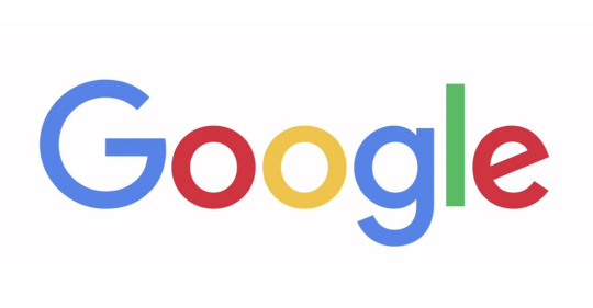
A word mark is about keeping it simple, it can be very effective if used correctly, in some instances a monogram or visual mark isn't needed for a company as the word mark is enough. Some examples of famous wordmarks are;
Calvin Klien

Google
ELLE
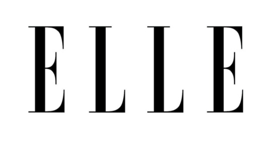
“When we’re born, letters and fonts are just shapes, but as we grow we begin to associate the shapes to words, and the design and style of those words to specific objects and organisations,” states Ian Paget, a graphic designer and founder of Logo Geek. This is very true, companies can style letterforms and work with colour, shape and spacing in order to make their word mark more recognisable with their brand.
When creating my wordmark, I need to find the right typeface, one that both describes me and matches my branding. I need to think of the message I want to convey first before diving in, I want my brand to be minilmalistc, but also fun, friendly and invtiing. Therefore I will stick to a san-serif font and avoid creating a wordmark that is all caps as this portrays a more serious tone which I'm not looking for. I need to pick a typeface that will be legible in different sizes so I will need to consider the weight, case and any noticeable features such as added curves or shapes.
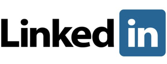
I've already decided on a blue and yellow colour scheme for my monogram, I may use these colours in my word mark however to make it stand out I could increase the darkness so that it doesn’t blend into the background. Some designers add visual interest to a word mark but working with shapes, for example LinkedIn surrounds the "in" within a blue box, this is to promote the feeling of having connections in your industry.
A word mark needs to be clean and uncomplicated, I need to consider whether my word mark will stand on its own, or placed beside my monogram or visual mark.
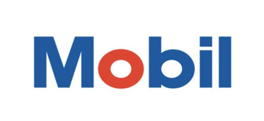
To make a wordmark more memorable, you can change the colour, arrangements of letters or add a unique lettering style. For example Tom Geismar designed the wordmark for the company Mobil Oil, he stated that he made the O red because oil companies such as mobil found that they were being zoned out as they werent graceful looking. The red O was to reinforce the design concept to use circular designs and to create an attravtive look. In addition to the visual appearance, highlighting the letter actually helped people pronounce the name correctly, Mo-bil.

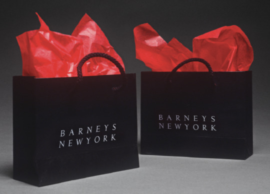
We also covered the importance of Kerning. Kerning is the process of adjusting the spacing between characters in a typeface in order to make a visually appealing results.
An example of this is when designer Steff Geissbuhler created the Barneys New York logo. Theres a larger amount of spacing between the letters in "Barneys" and it's missing an apostrophy, this was strategically done by Steff in order for the two lines to form a single block, and also for the N and Y to align vertically to stand for New York. This is a great example of how visual elements may not be necessary for the company, the word mark portrays the brands and evokes its elegance.

0 notes
Last Seen Blogs

plutotimeslot
Pluto's Timeslot: Offical Tumblr

polypd
THE ONE PIECE IS REAL

mpprod
MP Productions'channel tumblr

angelinaaa016
angelina