#thats what i like about firealpaca most is its a very simple easy to use program
Text
once again debating trying out another program
#the bin#hated krita. just doesnt work for me. firealpaca is genuinely great but i think i need something with a bit more to it#not even for the stuff i post. i havent posted any of the art im struggling to make in firealpaca bc im just unhappy with it#maybe i just need to lean the program better but i honestly dont wanna put in effort to learn a program that doesnt have a lot of features#thats what i like about firealpaca most is its a very simple easy to use program#well idk what one to try out. i think ill maybe give a free trial if some less expensive ones a go and see how i like it#firealpaca is dear to me weirdly. idk. i just remember making really shitty art and animations with it when i was 11 on my touch screen#laptop and it feels happy that im making so much better stuff with it now. i wanna learn to animate properly but im not good at it#i havent been drawing much lately bc my room is a mess but im gonna clean it today so hopefully that mostly fixes it#once my sister moves out i should be back to normal. i miss drawing all the time :/#sorry im rambling here again. nobody cares abt this lol. but ig nobody sees these usually anyway so it doesnt matter
0 notes
Note
Do you have a tutorial or guide or anything on how you do colors because all of your pieces have such nice colors and lighting Seriously, the use of colors in your art isn’t something I’ve seen very often; I was wondering how you choose them & how you get those effects with the software? Thanks so much is advance if you choose to answer this :)
Thank you ;;;_;;;!! I do, but I think it needs a revamp.
I’m going on a very long ramble.

(Heads up! I’m not professionally trained, I have just watched and read a lot of tutorials and deviated from there with my own thing. Unless it has something to do with color blending modes, there is a good chance that I am using a silly fake term for many of these concepts. Also, I use Krita, but everything here should also be done possible on Photoshop, Medibang, GIMP, and I believe Clip Studio Paint. Autodesk Sketchbook and MyPaint don’t have filters like color balance, sharpening, etc. and I don’t know of an easy way of changing the saturation of a painting on SAI and FireAlpaca easily since I’ve never used SAI, I’ve only used FireAlpaca once in a blue moon, and searching for either doesn’t give a “one click” option that doesn’t require undos... but everything about color choices/lighting/color filters/blending-modes-that-aren’t-saturation should stay the same.)
There’s as many ways for things to be beautiful as there are birds in the world. But that’s too many birds, so its good to have a process that you try to follow. This is kind of an ideal setup, but I think this is how streamlined I wished I paint. (I usually bop between consolidating colors and adding detail, continuously, for all eternity until i give up and smash that post button blindfolded. I’ll explain what this means.)
So color wise, I try aim for two things: good value blocks and balance (cohesion), and interesting hue variation (jitter).
------
Setting the Ringabel painting with the saturation at 0%/setting the colors on grayscale, then simplified:


These blocks of different colors both provide structure to the painting, and also add to the composition. The thing I want people to notice most - Ringabel’s beautiful, luscious hair that he lovingly tends to every morning (and his face I guess) - is the area with the most contrast. There are logical-ish subdivisions between each part of the painting and I want to preserve these chunks of logical blocks throughout the painting process, or swap them out for Even Better Blocks.
Even then, I want there to be visual interest and a balance of values around the entire piece, which is why I added lighter glitter around areas that aren’t interesting enough to have real detail. No one is going to stare at that area too hard, but without it, this dynamic painting feels too empty.
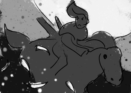
Also, if I were to do the painting from the ground up again from this thumbnail, I’d also include gradients, to aid in carrying the eye to the focus having a better base to build on.
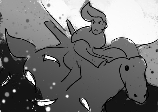
This also makes it easier to play with the lighting before getting to the meat of the work!

----
If we take Ringabel to max saturation, you can still see a bit of the value blocks, but there’s just a lot of colors slapped around everywhere:

I like this effect because it squeezes the maximum amount of visible interest out of a block of color as possible while still keeping the cohesion. And it’s not too hard to do - when you shade your painting, use two different colors instead of just one. When you add lighting, use two different colors. When you have a blob of color, slap some random color on that blob using a softlight blending mode.
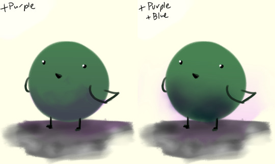
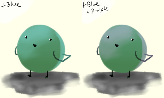
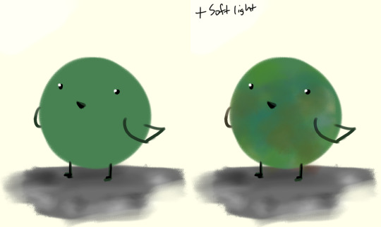
If there’s a concentration of color around an area and there’s an unbalance, add that color on the other side of the painting, to balance.
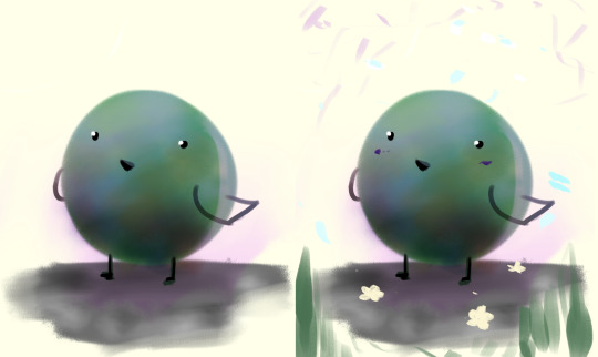
I like to call this jitter.
----
Let’s talk about cheating really quick:
“I kinda want mess up the colors but in a way thats kinda consistent”
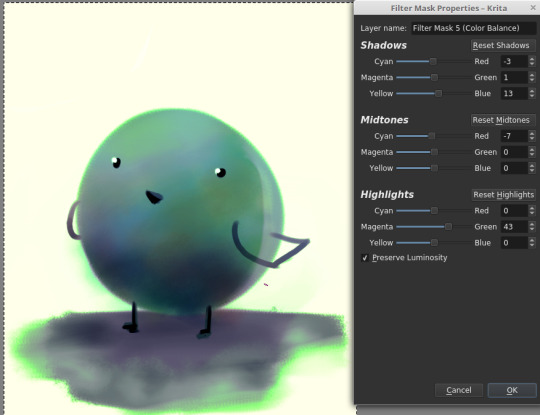
“This is too bright.“
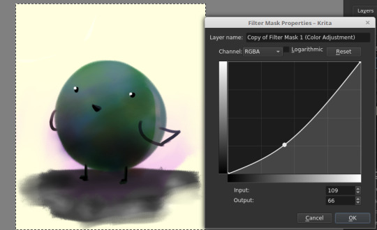
“This is too dark.“

“There’s not enough contrast!! >:(“
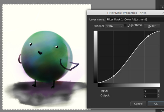
“Too much !!!! Contrast!!!!“

“THIS IMAGE WAS SUPPOSED TO BE PURPLE“
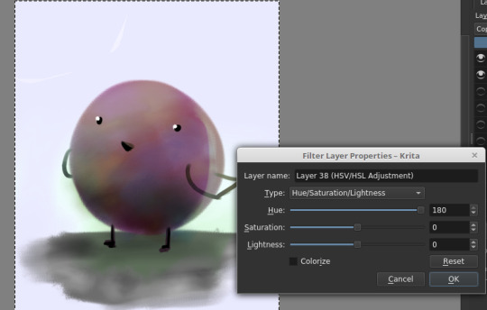
There is magic in the filter list. Jump in and have fun! (And fix your stuff.)
----
And.... that’s the philosophy.
Keep big chunks to stay organized
But have randomness to be fabulous
No shame in fixing mistakes.
----
So from that, actual painting process for Ringabel on a Horse (clop clop). Here’s the thumbnail, which I drew before I knew how horses worked:
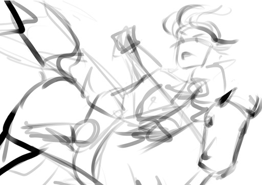
Then we choose hues. This will change over the course of the painting; I ended up with Green, then Red, then Yellow, then blue?
Then, allocate the colors in this way -
Dominant Lighting, Secondary Shading
Secondary Lighting, Dominant Shading
Rim light, another light source
Random random pops of color. because why not.
And pop them in this order:
Base/lineart
Initial color
Random colors (literally any color on the wheel) - Softlight/overlay - introduce jitter
Area Light 1 - (1) - Softlight/overlay - cohesive light
General shading - (2) - Multiply - cohesive shading
Detail shading - (1) - Multiply - jittery shading
Rim light - (3) - jitter - Softlight/overlay/COLOR DODGE - cohesive, out of left field light
Area light 2 - (1) -Softlight/overlay/COLOR DODGE - cohesive light
Detail - ;;_;; - FIX YOUR MISTAKES, C L E A N
Consolidate - (All 4) again to fix colors from the detail portion
GLITTER - (All 4) - jitter, glitter
Filtering - :D
The idea for 4-9 is that we have a balance of detail (jitter) and cohesion that we need to upkeep, and we need to strike a balance between adding cohesion and removing detail, and vice versa. Usually, I repeat those steps over and over and over and over, trying to get it just right. I tried to keep it simple here for the sake of the tutorial and my own sanity.
And now we do the thing.


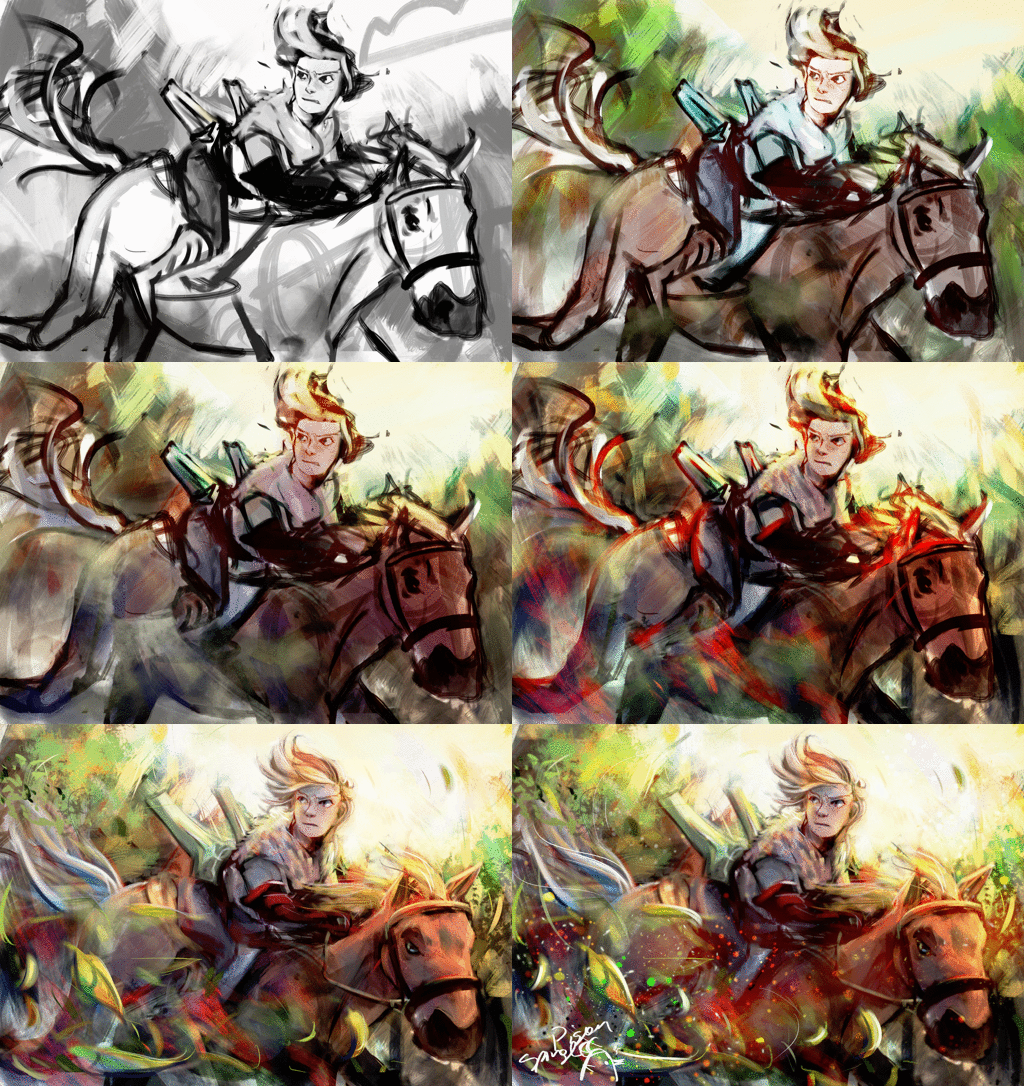
Thanks for sticking around, and have a fantastic day!
#tutorial#art tutorial#digital painting tutorial#painting tutorial#sorry this took so long#thank you for the request#and have a good night!#hotvivitea
19 notes
·
View notes