#their designs drive me nuts. they're like legendary pokemon
Text

Finally got to see these freaks in action! And... they were bullying an old man. Which was very cool, because Ketheric is the worst dad ever. Then they left to let ME bully that old man, which was even cooler. Great first impression. (NO SPOILERS PLEASE I AM VERY SLOW)
#bg3#ketheric thorm#orin the red#enver gortash#bg3 spoilers#their designs drive me nuts. they're like legendary pokemon#can I catch them and teach them both hyper beam#honestly. writing Orin's line made me pretty sure she and Typhus would get along on one of his cheat days
814 notes
·
View notes
Note
What do you think of the legendary birds? Both the regular and Galarian forms

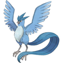
I'm not a huge fan of the OG trio. They're not terrible or anything, but they're kind of boring. Especially old Moltres over here, which is basically the very first thing you think of when you hear "fire-type bird". Some of its earlier sprites make it look like the wings were completely made of flames, which would've been slightly more interesting, but not by much.
It's also weird because you'd think it would more of a phoenix, but instead our phoenix Pokemon is... Ho-Oh? Okay.
Also, it looks like one of those screaming rubber chicken dolls on fire. Just wanted to toss that out there.

Zapdos is slightly less literal than Moltres, but not by much, mostly just by being very yellow and spiky instead of literally having lightning come off of it. The legs look a bit weird--not sure why they're a different color--but otherwise it's serviceable, if not slightly predictable.
Anyone else notice that the eeveelutions mimic the trio, with a bland fire version, a spiky yellow electric version, and a blue diamond ice version? Weird. Anyway.
Articuno's probably my favorite of the bunch, just on the virtue of not overtly representing its type. One could argue that's a bad thing--this could easily pass as a water-type if you didn't know better--but it's certainly more interesting than the others, at least. The tail looks really cool, but it's kind of a shame the rest of the body is pretty normal save for the head crest. Feels like they could've worked the flowy aspect into more of the design.
Side note, one nice thing about the OG trio is that they at least all have different body shapes, so they at least don't blend together too much.
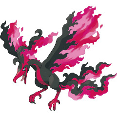
Right off the bat, I'll say that I much prefer the Galarian versions, on the virtue of not being bland as wheat toast. Overall they're more interesting conceptually and are majorly improved in terms of colors and overall design.
However, there's something weird about them that I can't put my finger on. I think part of it is the fact that the game calls them "imposter" birds, as if they're just separate 'mons that convergently evolved to look the same... except they're listed as regional variants in the dex. Which one is it, Gamefreak? You can't have it both ways!
The typing is also weird. It's like... for some reason they insisted on keeping them all flying-types, despite that being the least important type, then dropping the type they had previously. Then, because they dropped the main type, they really push to try to explain why they're named the way they are and look the way they do. Why bother saying "oh, it just has an aura that blazes like fire!" when you could just make it dark/fire and move on? It's a minor thing, but it drives me nuts.
Anyway, design-wise, this is a massive improvement over regular Moltres. The darker base color is super striking and adds some much-needed contrast, the flames are more interesting with additions like the two tails, and little things like the head feathers help make the flames look more purposeful.
Only complaint is that it's very odd that the beak and the face markings blur together with no dividing line. Also, the underbelly stripe really isn't needed; the stomach could've been black and nothing would've been lost. Also feel like the eye shape could've been more triangular, but that's not a huge deal.

Galarian Articuno is a bit weird because it adds a... supervillain theme? It's not bad, it's just odd because it's the only one out of the six that has a theme beyond its basic typing. Honestly, I would've guessed this was the dark-type and G. Moltres was a ghost-type if you gave me these out of context.
Design-wise, it doesn't improve as much as the others, but the wing shapes are very cool, and the black accents work better than the original white ones (though I do wish the wings had the same, instead of more white).
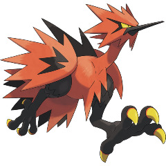
And I absolutely love G. Zapdos; all they had to do was make it a flightless bird, and suddenly it's way, way cooler, with a better design to boot that helps it stand out from the others. There's something natural about a fast-running bird and electricity. Little tweaks, such as the orange color and the shape of the black markings, really improve upon the original without needing to change much.
The only issue here is the body's a little messed up. The non-functional wings still need to be up on the shoulders, not on the back, and the neck doesn't connect to the body correctly, which is the only thing holding it back from being perfect.
Well, that and its typing. Fighting/flying when it clearly needed to be ground/electric, or even our first fighting/electric, just hurts.
Anyway, tl;dr is that the originals are boring and the new ones are major improvements across the board save for some lore issues and typing.
68 notes
·
View notes
Last Seen Blogs

dragon-mating-zone
Just A Really Cute Dragon Girl

yearnriddenfreak
whatever you love is your fate

film-operation-portugal
[[[@%STREAMING%@]]],,,Opération Portugal StREamINg vf(2020) Fil

midwesterngentleman-blog
Midwestern Gentleman

idolsicon
icons