#tom even raced for newman’s team for a few years in the 80s and they would test cars together
Note
just remembered paul newman had framed photos of tom cruise in his office along with his children…what if i feel to my knees…
they’re so………


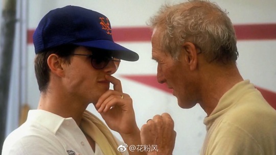
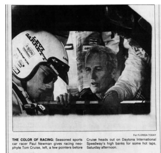

#paul got tom into racing and stunt driving too#tom even raced for newman’s team for a few years in the 80s and they would test cars together
202 notes
·
View notes
Text
A look at the Superman logo over the years
The Superman logo is one of the most iconic superhero logos out there.
It was the first one to appear on t-shirts, setting the trend of featuring superhero logos on t-shirts, bags, and more.
This is a tribute to the success of the designers of the Superman symbol, Jerry Sigel, and Joe Shuster.
They wanted the Superman logo to resemble a cross between a police badge and a diamond. The first element was meant to be a symbol of the hero’s desire to protect, while the second was a symbol of his invincibility.
These two aspects came together with the famous S letter to create a bright and recognizable sign that has remained fundamentally recognizable despite a number of stylistic changes over the years. Let’s take a look at the Superman logo and break down its history and why it has worked, as well as hat changes it has gone through.
The Basics of the Superman Logo
Shape
The shape of the Superman logo, while best known as a diamond, has been changed several times over the course of its history. When Superman first appeared in 1938, the logo was yellow and shield-shaped with a red letter S in the middle.
It varied from that point forward for the next several editions. It was in 1940 that it was converted to a clear diamond shape the first time. This diamond shaped shield with an S featured in its center has remained the basic shape and look of the Superman logo ever since.
Color
Superman has almost always had a red and yellow logo since his creation. In his first few comic appearances, the logo would switch back and forth between being yellow on red and red on yellow. When the logo was first changed to its diamond shape, this was changed briefly, as well, and the red S sat on a black diamond that was outlined in yellow.
It then returned to its familiar color scheme. There have been a few other times when the colors were changed around. In 1948, the logo switched to a black S on a white background for the run of a single series. In 1966, it was swapped to red on black for a single series.
It underwent a quick but very large change when Superman gained electronic powers, become white on blue. Even with all these swaps and variations, the Superman logo always returned to its original, classic color scheme.
Superman logo font
Superman’s iconic S is not a font, but instead a custom design. The style of the letter will vary a bit depending on who the artist is. Sometimes you’ll see the S take on a more rounded shape so that it resembles a figure-8 or an infinity symbol.
Other times it looks more like an angular slash of three lines. A lot of this depends on the overall style and tone of the comic, as well as the preference and abilities of the artist drawing it. The overall shape will always be the same, however: a clear, stylized letter S.
The History of the Superman Logo
The Beginning: Action Comics 1, 1938
Superman was first featured in Action Comics 1. This heralded the beginning of the Golden Age of comic books and was the birth of the most recognizable superhero to appear on both large and small screens.
The path from the beginning of Superman and his logo to their modern widespread recognition was not an easy one. There were a lot of problems, both small and large.
The original shield design underwent several variations during the first three years of Superman comics. It settled on a consistent design in Action Comics #7.
The real break for the Superman character and the Superman emblem came in 1941, just three years after the character’s first release. Paramount became interested in producing a set of animated short films to show in theaters before new movies.
Max and Dave Fleischer were hired to produce these films and offered with a (for the time) generous budget of $50,000. They made 17 short films under the name of Fleischer Studios and Famous Studios.
These movies ran between eight and nine minutes. They did not have a single supervillain-the now-familiar Lex Luthor had only appeared a year before in 1940, but was not screened—but instead featured a number of different threats to Metropolis: giant robots, mad scientists, volcanoes, earthquakes, gangsters, a giant gorilla, and a giant lizard (which was not Godzilla, but instead preceded the King of Monsters by a full 10 years).
These were the first steps to the nearly universal recognition of the Superman logo and character.
It was in these first short films that the look of the Superman emblem started to become cemented, as well as the attitude of the character and the real power of the Superman mythos. He became widely known, a representative of the ideals of “truth, justice, and the American way.”
After the success of these animated short films, it was decided that the character deserved a more ambitious production. In 1948, a four-hour film series called “Superman” was made. It consisted of 15 episodes, each about 15 to 20 minutes long, each with a cliffhanger ending.
This series was hugely popular and gave rise to another movie, called “Atom Man vs. Superman,” which was released in 1950. While the acting and visual effects were a long way from perfect, these features were the first real, live-action adaptations of Superman or of any comic book, really. That cemented their place if Superman, comic book, film, and cultural history forever.
A Long Road to 1978
Alexander Salkind, his son, and partner Pierre Spengler purchased the right to a full-length adaptation of the Superman comics in November of 1974. They planned on making two films right away and releasing them within a small span of time in order to save on overall production costs.
This led them to rush in making many choices about the films, including the choices of a stage direction, screenwriter, and lead actor. The original screenwriter, science fiction writer Alfred Bester, was considered too much of an unknown, so they hired Mario Puzo instead. Guy Hamilton was hired as stage director.
The Salkinds were only interested in hiring celebrities. These actors were often unsuitable for the material due to their star statuses. Many famous actors were considered for the role of Superman, including some you can’t imagine in the role, from Al Pacino to Dustin Hoffman to Muhammad Ali.
The whole process was slow and tedious. Puzo came up with two scenarios written on 500 pages. Robert Benton, David Newman, and his wife Leslie Newman had to decide that they had to reduce this by any means available.
The scenario was reduced to 400 pages by July 1976. The tone was comedic, similar to the Batman of the 60s. this made it less than suitable to the 1970s because superheroes had come to be expected to be serious and naturalistic.
Pre-production started in Rome and ended right after the commencement. Marlon Brando, who had been selected as the star, found out that he could go on trial there for actions he’d done while shooting “Last Tango in Paris”.
The team then moved to England, only to learn that Hamilton couldn’t stay home for more than 30 days due to tax evasion issues. Either the actor or the stage director had to leave. The choice was obvious.
In January 1977, the producers hired Richard Donner to produce both films, finally setting the film on the right path.
Donner refused to use the current version of the script and hired Tom Mankiewicz to rewrite it. The writers refused to recognize his work, however, so he is just mentioned in the credits as a “creative consultant”. Puzo, Benton, and Newman were displayed as stage directors.
It was at this point that they decided to find an unknown actor for the leading role, but the process was too slow.
However, in the February of 1977, Christopher Reeve took the role. Shooting began on March 24, 1977. The plan was that filming would only take seven or eight months, but instead, it ended up taking 19.
Donner had no set time frame or budget, resulting in him shooting too much material. In the end, Warner Brothers had to spend an addition $20 million and move the release date out to the winter of 1978.
By October of 1978, the second film was 80% complete, but the studio decided to suspend shooting it and instead focus on finishing the first movie.
At long last, Superman premiered in December 1978, one of a trio of powerful blockbusters. The other two were Star Wars and Close Encounters of the Third Kind. It was rare for a film to succeed like this in the 1970s, but Superman was one of the few that pulled it off.
The film fits the history of the Man of Steel into the standard three acts. Each of these acts belonged to a separate genre. The first act was half an hour, featuring an old-fashioned space opera.
The second act was an hour, harkening back to American cinema of the 1950s with its cozy atmosphere and endless Kansas farm fields. The last act is meant to evoke urban comics, which bury heroism and idealism in the gray street dust.
The film’s only major weakness was the character of Luthor, who was far too annoying. It would appear that there is nothing easier than to return and finish the job.
However, Salkind fired Donner immediately following the film’s triumphant release.
13 Years of Silence
Sonner was replaced by Richard Lester, who reshot everything he possibly could. There were only radical changes in three moments only: in the beginning, the middle and, the end of the movie.
After Donner and Tom Mankiewicz left the franchise, Superman belonged entirely to the Salkinds as producers, the Newmans as screenwriters, and Lester, the film director.
Unfortunately, the movie they made, Superman 3, was a complete disaster. The scale and serious perception of the material had been erased. All the wit and liveliness of the dialogue had been eradicated.
Following this, the Salkinds sold the rights to Cannon Films. Cannon Films did not prioritize Superman 4 at all, reducing the budget to $15 million. Superman 4 was going to be much more interesting, featuring Superman participating in the nuclear race. Nuclear Man was planned to be an intriguing villain.
But it was not to be. The special effects were so bad that they have earned mockery for decades.
In the early 1990s, two versions of Superman 5 were written by Ilya Salkind, Cary Bates, and Mark Jones. These scenarios covered the death and resurrection of Superman. Christopher Reeve would return to his role as Superman.
However, the project was canceled after Warner Brothers bought the rights and referred them to Jon Peters. After many delays, the Return of Superman was released in June of 2006. It saw some critical and audience success but it simply did not make the money that had been expected.
Man of Steel
During work on The Dark Knight Returns, Goyer thought about restarting the story of Superman and shared this idea with Christopher Nolan. After a while, Warner Brothers announced that it would be making Man of Steel, directed by Zack Snyder.
This was a whole new adaptation of Superman, completely rethinking the hero. It was also a very commercially successful reboot, earning about $128 million on its first weekend.
Batman v Superman: Dawn of Justice
Man of Steel was only the beginning. Warner Brothers began the task of producing a DC competitor to the widely celebrated and successful Marvel Cinematic Universe. The first entry was Batman v Superman: Dawn of Justice. This movie continued the previous one, adding in a larger scale that included space combat and a larger number of characters.
Ending thoughts on the Superman logo
Throughout every iteration of Superman, his logo has remained one of the most key points. It is the number one way to recognize the hero and any media associated with him.
If you enjoyed reading this article about the Superman Logo, you should read these as well:
The Pepsi Logo: The old, the new, its meaning and history
Iron Man Logo Designs: The Official And Rejected Versions
The post A look at the Superman logo over the years appeared first on Design your way.
from Web Development & Designing https://www.designyourway.net/blog/graphic-design/superman-logo/
0 notes
Last Seen Blogs

bluesradio62-blog
Durham Happenings

thelingodingo
The Lingo Dingo

vikazhvakin
shimakaze

stabmeinthe-thyroid-blog
Sad and Gay

avalkyriessinfuldream
A Valkyrie’s Sinful Dreams