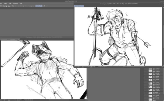
#well this is easier than exporting all the images and lowering the resolution on them manually (using screenshots i sent felt)
Text
guys felt gave me a new disorder


first impression
heart count charm necklace / heart earrings...
'what if branzy won a duel once'
it looked like a gave clown huge boobs in the prev pic so i doubled down. honkers / misc
#well this is easier than exporting all the images and lowering the resolution on them manually (using screenshots i sent felt)#branzypierce#mcytshipping#lifesteal smp#3rd pic brnzy came out really nice i need to draw his hair like that more#i . made all of these last night#ghostart#they got to me with the gambling webweave okay#clownzy
576 notes
·
View notes
Text
Notes from Holiday SDL Videos
History of Frame rates
Phi Phenomenon by Max Wertheimer in 1912
The human brain can perceive 10-12 individual images per second brain turn them into motion
Thomas Edison the magic number is 46 times per second, It won’t flickers because of our persistence in vision
flash each frame 3 times, a total of 48 frames per second - 16 fps
The frame rate for film and music, established in 1929 as 24 fps
2 seconds= 12FPS
3 seconds = 8FPS
4 seconds = 6 FPS
Band width - Fritz Schroter (1930) and Richard Ballard (1932)
To avoid flickering, each frame would be interlaced, broken down into alternating fields. An upper and lower field, seen on screen one after the other in a comb-like pattern, to eliminate intermodulation - distortion caused by hum, generated in electrical current. The refresh was set to that of the AC power.
60 Hertz = 60 fields per second = 30 fps
VHF= (30- 300MHZ) UHF= (300-3,000 MHZ)
Georges Valensi in 1938 broke images down into luminance and chrominance, so they could embed a colour signal as a subcarrier in the tv signal.
Had to reduce the frame rate by 0.1% so colour and audio would never fully match up
60 fields per second to 59.94% fields per second for an effective 29.97 full frames per second
only in countries that use the NTSC standard
PAL and SECAM - 50 fields/sec for 25 frames per second.
24 fps x 99.9% = 23.976fps/ 29.97 = 4/5 = 3:2 pull down
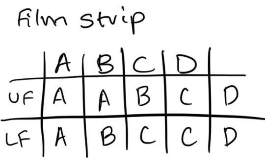
3,2,3,2 = Partial frame cause Telecine Judders
24 fps x 104% audio raised by 0.679 semitones
Filmmakers have tried to push the temporal resolution or frame rate higher
4k standard include a 120 fps option
Framerate is the engine behind the cinematic lie
How to create a GIF in Photoshop
Select, select & mask
Smooth
Feather
Contrast
Layer mask
Invert = Command/control I
Command & comma = hide
Export - save as web (legacy)
GIF
Max colours
Loop forever
Interlaced and Progressive Frame rates
24p, 30p, 60p, 60i
P = progressive
I = interlaced
Progressive = 24 images played back 24 times within one second. Film = 24fps Video = 60i fps
The more frames added makes it seem smoother but also makes it easier for our brains to process. 24 fps forces our brains to pay attention to take in the image than it would otherwise
Persistence of motion - more frames for a smoother playback
Combing - gives away interlaced effect
Keep them consistent from beginning to end for best results
interlaced footage is only good for tv, should be deinterlaced for youtube
Type in Motion
All about storytelling
Elastic screen size - make sure our typography is legible and readable.
Design for the middle - Large enough to show up on different screen sizes. Heavier weights show up even better at screen sizes. sufficient contrast between type and background.
Design for mobile.
When choosing a style for your type, make sure it is true to your content and keep your audience in mind.
Choosing a style sets a tone
Style, size, weight and width
The larger the size, the more visible it will be, and the impact it will have.
With a heavier weight, they read more clearly on screen
Size + weight packs a punch
recommend using heavier weights to ensure higher visibility and legibility for type in motion.
Adding a bit of movement makes it more interesting.
Contrast between foreground and background
Strong distinction is best
Highly saturated colours, like back and red don't play well together unless the type is large.
Colour that is too light doesn't provide enough contrast
Lowercase feels friendlier than caps
Asit animates, type creates a mood, sets the tone and has more impact than static type.
Type transparency
Remain or dwell on the screen long enough the eyes can take in the letter forms and translate them into words.
Dwell time can also make a mood, by being fast or slow
Special effects can cause distraction from tour message
when is the best time to use special effects? - the story you are telling, the mood, and how much time you have.
Sometimes less is more, depending on the story, more is more.
0 notes
Photo

Printing your comic, Part II:
The printing process
Hello there, and welcome guys to part II of this article. On last week’s post we’ve talked about some printing vocabulary and some basic terms, and now we’re going to discuss some settings and common problems you want to check before you send your comic to the printing shop!
Page count:
Most comic creators plan for some time on their pages, set specific compositions to be shown in spread pages and even take the extra step of leaving a shocking plot twist to be revealed right after the flipping of a page. And because of that, here’s another relevant thing to consider if you plan on printing: page count. Take a look at a comic book close to you, and changes are it is a saddle stitch, as we’ve previously discussed. Because of that, each page actually corresponds to half the paper sheet in which it was printed, and the paper sheet is folded in the middle and attached to the spine by the staples. Considerer also that there’s a front and a back side of this sheet, which means each one sheet corresponds to four pages. Because of that, you want to make sure your final page count inside your book is a multiple of four. For example, if your comic has 35 pages, you’ll just need to add an empty (or not) page at the end of it and make it 36 pages long. If your comic is 37 pages, you’ll have to stretch it to 40, so might as well use those compulsory extra pages for some extra material, sketches and character bios!
Resolution settings:
Another very relevant thing to keep in mind is image resolution. Many artists create comic strips for the internet, both desktop and mobile, and sometimes the resolution for tis medias is lower than what you need for printing. Remember that the standard US comic size is way bigger than your cell phone screen, and this final file format should be measured in inches or centimeters, not in pixels. I’d in fact recommend creating pages with about 150% of the final format size just to be sure. Another important measurement of image quality is the DPI rage, which stands for “dots per inch”. This is the amount of dots that will be effectively printed per inch of paper in your final comic. You’ll need at least 300 DPI to ensure a good printing quality, though some print shops will recommend 450 DPI.
File format:
Now that you know your digital file size and proper resolution, let’s see what kind of digital format you should send to your printer. Remember we’ve talked about how any sort of printing process is actually a translation from light color to pigment color, so there will be a change in what you see on your screen to what you get on your printed comic, but we want to make the best of both. So here are some of the ost commonly known output format for images:
JPEG (or JPG): saving your files in this format keeps the file size quite small due to its efficient compression, but also because of that, you lose image quality. What this format does is it groups similar pixels together to save space, which may generate color bands in areas of your paintings. This conversion is also permanent, so the previous data from these compressed area is lost once you save the file.
PNG: The most commonly known advantage is the possibility of saving transparent backgrounds, which can be very handy. PNG files also go through compression, but without any quality loss, which means you can open and edit it as many times as you want without effectively losing data.
PDF: Most printers will suggest you to send your files in this format, and for a good reason. A PDF image is identical to its source in any way, and it’s the ideal file format for printing graphic design material, photographs and also your comic. Also, PDF allows you to save your entire comic within one single file, with all of the pages already in their proper place, and you can even add the printing marks we’ve previously talked about if necessary. Most painting and art softwares can export files in this format, but you can even use online conversion tools for this.
It’s also a good idea to add a note about vector images. Unlike the file formats above, which are all what we call raster graphics, a vector graphic image can have different file formats - and very different properties. To put it simply, a vector image is composed by a series of mathematical equations, it is a collection of points, lines and curves that can be put into numbers like geographical coordinates. But don’t worry: you don’t have to deal with any of the math to get acquainted with vector images!
Through the use of graphic tools, producing vector images can feel very familiar and intuitive. The most notorious quality of vectorized images is that they’re very reliable and can be expanded (or reduced) without any data loss. That’s a great solution for logos, so if you can get your own comic brand in vector image, this can come in hand when producing banners and other bigger products. Also, many people will use vector softwares and tools to create speech bubbles and lettering for their comics. That can make it easier to edit those elements later on, and it also makes it easier to control and create a standard visual identity for your comic. Since most of us will not effectively draw our comics in vector based software, this means speech bubbles and lettering will come as a later stage of the comic production.
So let’s just take a final look at these formats: JPEG, PNG the native PSD (Adobe) are raster graphic images. They are composed of pixels and cannot be enlarged beyond their original format without losing data. These are probably the output format of most of you artwork, so be sure to always produce your comic pages at large sizes and 300 DPI. Vector graphic images include the formats: SGV and EPS, along with the native AI (Adobe). Vector images are composed by curves and occupy less space. PDF is a bit of a wild card here: it can be both raster and vector, and it’s your exporting setup that will define this. PDF is great to maintain all of the data and image quality, and in my opinion is your best friend for printing purposes.
Printing process:
Now we know the proper terms and how to communicate with the print shop staff, and we also know what kind of file we need to export and send in order to get things properly printed. But what kind of printing process are we going to use? Let’s talk about the differences, advantages and disadvantages of the two main printing methods offered by print shops: offset and digital printing.
First of all, those two types of printing process are created in different machines, which different technologies, and as a consequence the color representation that comes out of them differs. Remember, any printing process is already a translation from the data on your computer screen, the language of light, to the language of pigment, so you’ll have to deal with slight changes during this transformation process.
The offset machine is generally a bigger, bulky engine with typically four sections, one for each printing color: cyan, magent, yellow and black. In order to print something, there’s a metal plate to apply each corresponding ink color to its place in the paper sheet, counting four metal plates per image. That means your image will be split into four colors and them those four images will be applied one on top of the other until the final figure is built. It’s a pretty fascinating process, and if your print shop allows you to take a look at the machines, it will be easier for you to understand what’s going on there.
Digital printing will also use four colors, but they’ll be applied using electrostatic rollers, which is another very fascinating thing to watch. This printing process uses toner instead of ink, and the peculiar thing about it that it’s not a liquid, but a very thin powder, which will adhere to the paper sheet according to the data on the programming of those electrostatic rollers. In this process, each color will take its turn as it is laid on paper, but there’s no need for creating the metal plates previously.
So now that you understand how both those machines work, there are some considerations regarding what process to use to print your comic. The most relevant for us comic creators one is the cost and benefit concerning the total amount of copies. As you can see, setting up an offset machine takes way more time, and it also consumes more time and needs more manutention. However, once the setup is made and the process starts, it’s way more efficient, and therefore the unit is cheaper in the long run. Digital printing takes way less time of preparation, and it is cheaper because of that at a smaller number of units. Digital printers will also have a faster turnaround time.
So, in a nutshell:
Offset printing: Good for 2.000+ units, takes more time to produce. The total investment will be big, but the unit cost will be lower, so it’s good for big press. (Tip: some printing shops will actually keep or allow you to keep the metal plates from your current run, so that if you choose to print again in the future, this stage is already executed. Ask your print shop about that!)
Digital printing: Good for anything from 1 to 2.000 copies, a short run print. As you get closer to the 2.000 copies mark, be sure to check out that limbo and see which process is better suited for your specific needs. Digital printing offers fast turnaround time and the initial cost is cheaper, though the unit will be more expensive.
That’s it for today’s article, guys! This time we’ve covered everything process-related that I saw as convenient to comic makers. If you still have any questions about the printing process itself, please let me know!
Next week, we’ll talk about the most common problems along the way, how to avoid some of them, and how to fix others after they've been identified!
You might also like to read: How to print your comic Part I and How to print your comic part III
If you don’t want to miss this, go ahead and subscribe to our newsletter!
If you enjoy this content and comic, please considerer supporting us at Patreon!
#howtowritecomics#how to write stories#how to make comics#how to print comics#making comics#creating comics#printing comics
2 notes
·
View notes
Text
Task 1 - Mini Teach
For task 1, we are asked to design a lesson that uses Art & Design in some way to teach the class skill or some knowledge. Moreover, the lesson session should last for about 10 minutes - not longer and not less. Furthermore, we also had the options whether we are going to stand up in front of the class or create a lesson in a creative way.
To start the project off, I started searching online of what I could teach and these are my mind maps below. However, they seem to be a really boring subject to listen to for about 10 minutes so I decided to scrap that idea.
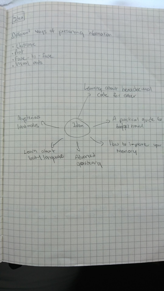
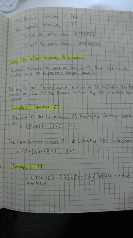
I came to a conclusion to go with teaching the class hexadecimal colours after searching for something to teach that relates to art & design. However, I knew that teaching how hexadecimal colour works alone would not be enough for people to understand; if most people don’t understand the basic of colour theory first. I have decided to talk briefly about the colour theory and how it links to the hex colour codes at the beginning part of the video lesson.
After I have made my mind up that I’d go with hexadecimal colour code idea, I then begin researching from various websites as to how hex code works and how you will be able to guess colours that way. Of course, this was my first time learning about hex colour codes as well so when the deadline comes - I should be really knowledgeable about this subject.
After that, I have also researched briefly about colour theory. However, I am not going to be mentioning terms that are complicated or scientific which we do not need to know about. Just the basic knowledge of colour theory and how colour works.
Once the research is completed, it is now time for me to decide whether to stand in front of the class with a powerpoint slideshow or make a video presentation and to be honest, video presentation sounds good to me. This is because nobody would really like to listen to a boring powerpoint slideshow for a whole 10 minutes. A better way to educate people is through the uses of images, moving images, and animation. This should be enough to grab their attention for the whole 10 minutes and I do plan on doing a voice over instead of just captions as that could overwhelm the audience.
Before I begin, I’d need to write a script as to what I am going to be teaching in the video, and I also need to make sure to pace myself really well as not to go over the mark of 10 minutes. However, the time I limit myself on the video was actually 7 to 8 minutes as I wanted to leave a few minutes for the class to have a go at a mini quiz of guessing the hex colour code.
I recorded my voice using a microphone and I recorded it to only one sentence each as reading the whole script in one go would mean that there is a high chance that I’d mess it up and have to start over again, which is why I decided to record one sentence at a time and put it together in Adobe Premiere Pro. Furthermore, since English is not my first language, I tried to pronounce words as best as I can so that the audience can understand me easily.
After I have recorded the script, I then put all the voice recorded in Premiere Pro where I put them all together, and it came to almost about 8 minutes which is quite good in my opinion. The next step I did was exported the audio file and imported it into Adobe Audition where I equalize and change the volume to a standard volume. The reason why I have to equalize the sound was that the original record was really bad, and I mean some parts were really quiet and some parts are really loud. By equalizing the sound, it will give off a steady and consistence sound which is good for the viewers to listen to.
Once the scripted audio was equalized, it is time for me to export it into an MP4 file and imported the file into Adobe After Effect. I have made some of the assets in Adobe Illustrator and Photoshop which I then imported it to After Effect; however, most of them were made in After Effect itself.
I then started to animate some of the elements that match the script to make some of the areas easy to understand, rather than having the viewers only listen to myself - I thought it would be a good idea to have them see what was going on and how it work as well. Most importantly, I have also used quite a few stock footages that I have found on the internet that are free to use. Not to mention, photos that are being used in the video are from a website called ‘Unsplash’, which is a website that you can use images for free at a high resolution too.
In addition to explaining the basic colour theory and how hex colour code works, I have also made a section where I test out my ideas and using what I have learnt to try to guess the colour using the hex code. I have included that in the video to show that it was possible to guess the colour - although not accurate, as these codes are meant for the computer to process, but it is just a fun way of figuring out the colours.
I did much research into the best way into guessing the hex colour code, but none that I found were as useful or was quite difficult to comprehend and would take some time. This would be a 10 minutes lesson to the class so I want them to learn it in just the amount of 8 minutes, which they would try to take the test on themselves and see whether they have learned anything from the lesson. I realised that this was going to be difficult but I tried as best as I can to use images and animation to make it easy for them to understand.
I came up with an idea to create a number chart which displays 16 numbers from number 0 to 15. Obviously, I have already converted the letter symbol from A - F to 10 - 15 which makes it easier for the viewers to understand. The way it works is rather simple, I did mention in the video that to break the hex colour code in the simplest way, the viewers only need to focus on the first symbol of each red, green and blue colours - which then use the chart to see how much intensity the colour is.
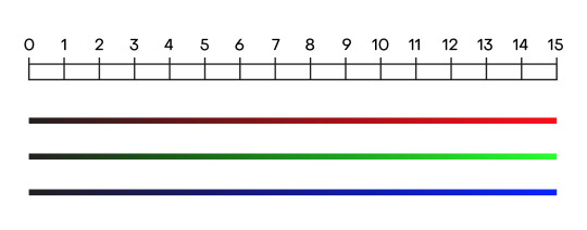
I did also mention that RGB colours started out with darkness or black, which means that the lower the intensity is, for example, number 0 - 4, would actually be a dark colour. The lower the number is, it does not mean that you will get a darker shade of that colour, but would rather get a black colour or nothing the lower the number is. It is a complicated subject to understand but once the viewers understand this point - the rest is easy.
Script:
Hey, welcome to a video presentation of the basic colour theory and hex colours explained. It is a good idea to understand how hex colours works as a lot of the time, you’d be working with them in Adobe software and I know it can be a little bit confusing as you’ll see letters, numbers, and pound or number sign but I’ll do my best to explain it as much as I can.
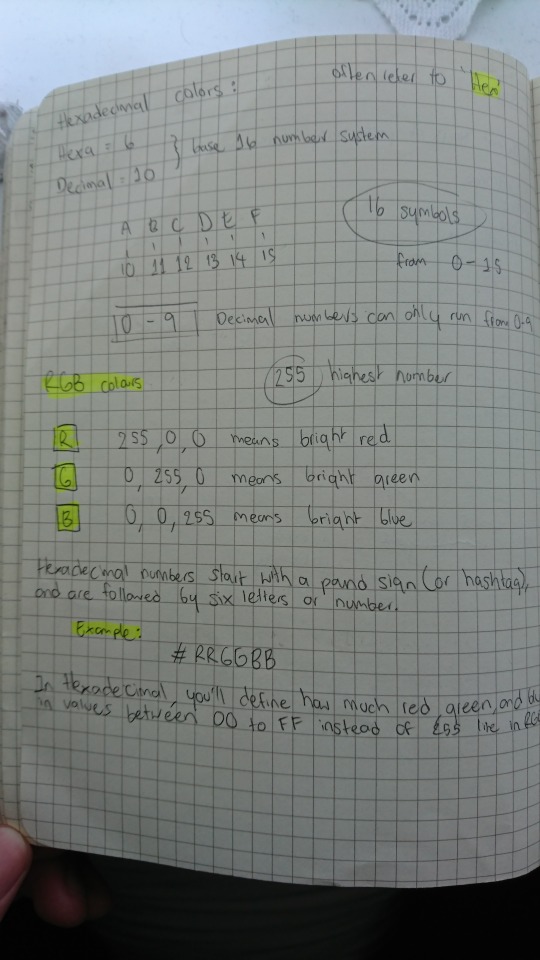
So what is hexadecimal code?
Well, if you’ve ever worked with colours on your computer, then chances are you’ve seen the hexadecimal codes before. It started off with a pound or number sign which follows by random numbers and letters that make up a colour.
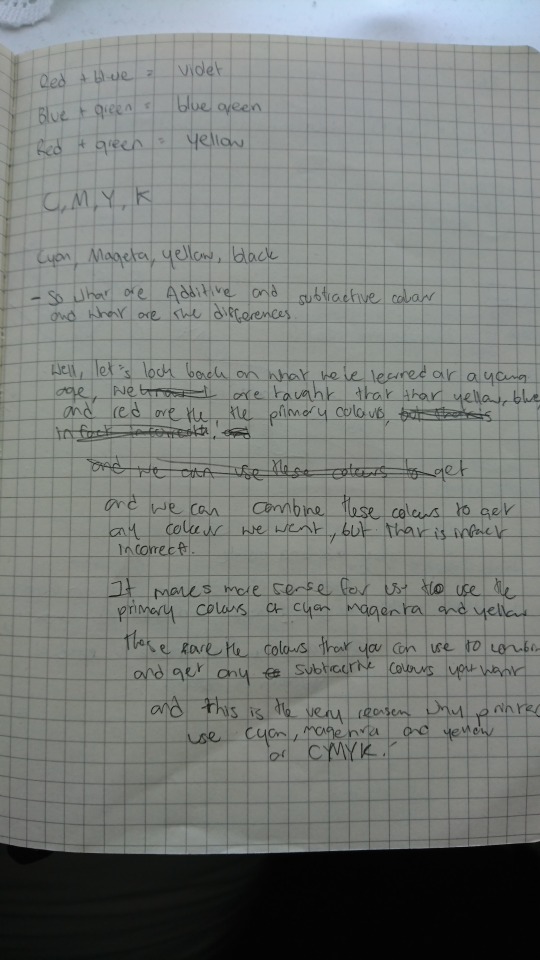
However, before I begin explaining what hex colours is, let’s touch briefly on the basic colour theory and understand the differences between additive and subtractive colours.
Light or white light is a combination of all colours, and to get a better answer to this. Let’s take a look at this apple. It creates colours by subtracting or absorbing certain wavelengths of colour while reflecting other wavelengths back to the viewers. This is called subtractive colours.
If an object reflects all the white light back to the viewers, it will appear white. However, if the object adsorbs or subtracts all light illuminating it, no light is reflected back to the viewers and it will appear black. It is the subtractive process that allows everyday objects around us to show colours. Now, subtractive or CMY colours requires to be illuminated by white light to be visible and seen in original colour.
As for the additive or RGB colours, it starts with darkness or black and gradually add light to get different results of colours, and this is the perfect inversion of the subtractive primaries we have just talked about and this is because, for subtractive, we are taking away light whereas additive, we are adding light into it.
A computer screen blends varying intensities of red, green, and blue light each of its tiny pixels. These pixels are so small and tightly packed that our human eyes are fooled into the perception that there are many different colours when there are only three.
Before we get into the hexadecimal codes, let’s test my ideas of breaking down hex codes and making an inform guesses on the colours.
What we have here is a hex colour code test and what you do is make a well-informed guess base on the hex code given above to figure out the colour.
[Test]
From what I can see from the hex code, I can see that there is no red, a lot of green and a little bit of blue. Now I know for a fact that it isn’t going to be a bright green because it’s not at its highest intensity so my answer would be this colour here. That’s correct.
As for this one, I can see that there is a bit of red, a lot of green and very little blue. Now, can it be a very bright green or a lime green colour? From what I can see from the hex code, I know that there are quite a bit of red in there and red mix with green gives a yellow colour. However, since the red colour is kind of at the medium point of intensity, my guess would be for this lime green colour. And that’s correct.
And for the final one, I can see a medium amount of red, no green, and medium amount of blue. And I know that if you mix red with blue, you’d get magenta. However, because the intensity for both of the colours is at their medium point, my guess for the colour would be a darker shade of magenta. And that’s correct.
That was a quick demonstration of me trying out the test, and by the end of the video, you’d be able to make a well-informed guess as to which colour it is. So how does this work?
It’s simple to understand the RGB colour system because it’s done in the decimal system, meaning numbers are just like what you’ve learned your entire life. Zero is the lowest and 255 is the highest.
To get the colour of red, the set value needs to be at 255, 0, 0. This value will equal to a bright red colour. If the value is set to 0, 255, 0 – you’d get a bright green colour. And lastly, 0, 0, 255 will get you a bright blue colour.
The standard numeral system uses ten symbols from 0 – 9 and that’s what you’re familiar with. All of the numbers in our system are composed of 0 – 9 and any number we have are going to include these 10 numbers, including the number 0.
However, in the hex numbering system, it uses the numbers from 0 – 9 and an additional 6 letters symbols from A – F which represent the number 10 – 15
Now, why do we use letters instead of numbers? Well, when they get to 10, they want to be able to keep the single digits and there are no single digits after 9 so they would have to use letters as a representation for the number 10 – 15.
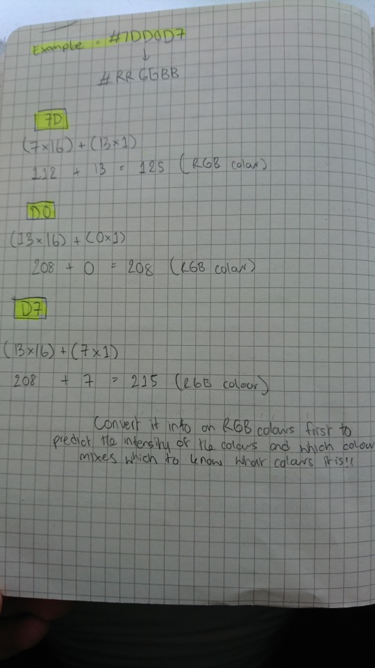
So now that we know a bit about how hex codes work, let’s break it down even more. Hex numbers start with a pound sign or hashtag and are followed by six letters or numbers. The first two digits will mean red and tell the computer how much red to add, the next two digits will mean green and how much it should add, and finally, the last two digits will mean blue and how much it should add into creating one complete colour.
In hexadecimal, you’ll define how much red, green, and blue in values between 00 to FF instead of 255 like in RGB. But to be honest, they work exactly the same way. In RGB colour, the value 0 is the lowest and the value 255 is the highest – and this means how much intensity the colour is. The same thing can be said for hexadecimal colours. The lowest intensity equal to 00 while the highest intensity equal to FF.
There is a way to convert hexadecimal numbers to an RGB value. For example, let’s take 7D in hexadecimal number and convert it to an RGB value. To do this, you’d need to take number 7 and times it by 16. And we know that the letter D equals to 13. Take the number 13 and times it by 1. Basically, you just take that number and do nothing to it. Once multiplied, add the number up to get the RGB values.
So, before we end this video and onto the quiz, I just wanted to show my thought process and explain a little bit of how you can guess the colour using hex code. Let’s start basic. So we know that the first 2 digits are red, the next 2 digits are green and the final 2 digits are blue. Now you can do the math and convert the hex code into RGB values and guess it that way if you think that’s easier. However, I think that is just way too long. Let’s keep it simple and only focus on the first digits for the red, green and blue. C equals 12 so we know that it is way past the medium intensity. 3 is a very small number for the green so let’s not worry about that and around medium intensity for blue colour.
Now we know that if you mix red and blue together, you’d get magenta and there are two shades of magenta here. It can get complicated, but just think simple. We have a high intensity for both red and blue so the obvious choice would be a vivid magenta as there is no green colour in there.
Now it isn’t necessary for us to read hex code as they are meant for a computer to process the code to generate the correct colour. However, it is great to be able to understand how it works and that there is a way of breaking down the code and make well-informed guesses.
Mini quiz:
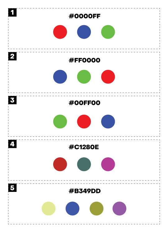
After the video is finished, I then presented them with a mini quiz of five questions to see how much they learn from this lesson. I obviously didn’t want people in the class to feel intimidated by this broad subject, so I started the quiz with 3 simple questions that were mentioned in the video. For example question number one, the question to guess the colour is #0000FF. I did mention that 00 is the lowest intensity while FF is the highest intensity, and the viewers also know that there are six symbols in hex colour code that is divided into a group of 2 to make 6 - with each group representing red, green and blue. FF is the highest intensity and we know that the final 2 digits represent blue colour so the obvious answer would be a blue colour. It is pretty straightforward and this is just to get them started and not feel intimidated by the question.
However, question four is a little bit harder as there are more options and the question wouldn’t be as obvious as the other three. However, it is still pretty simple. Now before I explain the answer, I do feel for the class if they couldn’t get these last two questions as I have printed out a mini quiz for the class, and the colours that they are supposed to be guessing is RGB colours. However, because I have to print these out, I’d need to select the CMYK colours, plus my home printer was being annoying so the colours came out a little faded. I wouldn’t be surprised if they got the answer wrong as the colours are not even correct in the first place. I initially wanted them to try it on the computer screen, but I didn’t know where else they could to take this quiz except for Kahoot. However, I personally don’t like Kahoot and would rather avoid it as it’s annoying so I decided to print it out instead. To compensate for the incorrect colours on the sheet, I tried to make the answer obvious by having colours completely opposite one another to make the choices seem obvious to the viewers.
For question number four, the question is #C1280E and the answer is actually pretty obvious. If the class can remember what I have mentioned that the first 2 digits are red, the middle is green and the last 2 is blue - they should be able to understand this question easily. For example, C equal to number 12 for red. 2 is a very small number for green and there is no blue so the obvious answer would be the red colour.
As for the final question, the question is #B349DD and this is a hard question to test if people have learned anything from this lesson. B equal to number 11 for the red colour, 4 for the green, and D equal 13 for the blue colour. Obviously, the colour red and blue are very high in intensity and if you mix these two colours together - you’d get the colour of magenta which would be the correct answer.
Reflection:
I believe I achieved what I had set out to do at the beginning and managed to make a good quality video presentation. I successfully created the mini quiz as well and I really wanted people to have a go at it - whether they get it right or wrong doesn’t matter as these codes were meant for the computer to process it anyway, but it is a nice way of learning how the code works.
The mini quiz I gave to the class was also well received with 3 to 4 people who actually got all 5 questions correct, while all managed to get at least 3 questions correct. I totally understand it as this type of subject takes time to understand and practice with, but for a 7 minutes lesson - I believe they did extremely well learning it.
As for my presentation, I went a little over 11 minutes but overall, it was a good result. The video I’ve prepared is 8 minutes long and I was planning to have the class do the quiz for about 2 minutes. However, some people took longer than the other but it is no problem as I still think that it was successful.
Final video presentation:
youtube
1 note
·
View note
Text
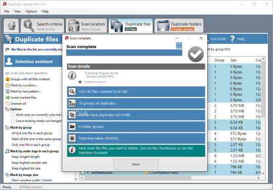
Duplicate Photo Remover Free

Find and remove duplicate files
Duplicate Cleaner by DigitalVolcano Software is the leading program for finding and removing duplicate files on your Windows PC. Documents, pictures, music and more - this app will find it all. This free version has a subset of features found in it's big brother, Duplicate Cleaner Pro. Duplicate Photo Remover free download - Duplicate File Finder, Duplicate File Remover, Duplicate Email Remover, and many more programs. Joe rogan podcast spotify. Using AI techniques normally reserved for the cloud, Duplicate & Similar Photo Cleaner views your photos as you do, making it easier to find duplicates, across multiple file formats and sizes. It also finds similar photos that may have been edited, or are part of a photo sequence. Using AI techniques normally reserved for the cloud, Duplicate & Similar Photo Cleaner views your photos as you do, making it easier to find duplicates, across multiple file formats and sizes. It also finds similar photos that may have been edited, or are part of a photo sequence.
AllDup is a freeware tool for searching and removing file duplicates on your Windows computer. The fast search algorithm find duplicates of any file type, e.g., text, pictures, music or movies.
AllDup Awards
What AllDup can do for you?
AllDup helps you to find, view and remove files that have duplicate content, regardless of name!
Remove duplicate files - Easily and Anywhere!
Find duplicate pictures
Find and hardlink duplicate files!
Find duplicate MP3 files with different ID3 Tags!
No more file clones or file duplicates!
Clear your computer, music or photo collection from duplicate files!
Finding out whether a file has hard links!
It can be especially useful if you have large Music, Pictures, Downloads or Documents folders!
Find and delete hard links
AllDup is a powerful tool to search for file duplicates on your computer!
Find, remove, delete, copy or move duplicate files!
Find and delete duplicate files!
Find and remove duplicate files!
Find similar pictures
Remove duplicate photos and images!
Find files with similar names
Free up used hard disk space on your PC!
Find and remove duplicate files of ANY type!
Find similar music files
Remove duplicate files - as you want!
Find and remove duplicate files from your computer, notebook, network drives, flash drives, memory drives!
Find duplicate photos
Delete duplicate music files!
Remove duplicate files faster and safer than with any other duplicate file finder!
AllDup Features
Search for similar pictures
Search for duplicates of digital photo files
Ignore the meta data of FLAC files
Ignore the ID3 tags of MP3 files
Detailed log file about all actions
Ignore the EXIF data of JPEG and CR2 files
Search for duplicates of executable and any other files
Fast search algorithm
Entire folders or individual files can be excluded from the search by masks or size conditions
Search through an unlimited number of files and folders
The built-in file viewer allows you to preview many different file formats and analyze the content of the file before deciding what to do with it
The unnecessary duplicates can be deleted permanently or copied/moved to a folder of your choice
Search is performed in multiple specified folders, drives, media storages, CD/DVDs..
For your safety all files that have to be deleted can be moved to the Recycle Bin or a separate backup folder
List non-duplicate files
Find duplicate pictures
Save and restore the search result to continue working later
Create shortcuts or hard links to the last original file
Search for hard links
Find duplicate files with a combination of the following criteria: file content, file name, file extension, file dates or file attributes!
Find similar files
Search for duplicates of music and video files
Many flexible commands helps you to select unnecessary duplicates automatically
Search inside archives with the following files extensions: 7Z, ARJ, CAB, CB7, CBR, CBT, CBZ, EPUB, GZ, ISO, LZH, LHA, NRG, RAR, TAR, ZIP
Export the search result to a text file, CSV file or an Excel file
Search for files with similar names
Find video & music files with the same or almost same audio length
Convenient search result list
No doubt you have numerous images on your computer? The trouble with having lots of pictures is that you tend to collect duplicates along the way. Here are top five best duplicate photo finder listed to get rid of duplicate and similar photos. It would be a wise thing to manage space efficiently.
Finding similarly pictures and duplicate photos can become an overwhelming project. This is where duplicate photo finders come in. Remember that you should always backup all files before doing any deletion, which is a good practice to take regularly, for example to a DVD or an external hard drive. All software in this article is sorted from best to worst.
Top 7 Best Duplicate Photo Finder Softwares
Below we enlist the best duplicate photo finders and removers to eliminate junk, give the hard disk breathing space, and speed up the PC.
Duplicate Photo Remover free. download full Version
1. Duplicate Photo Finder: –
Duplicate Photo Finder looks for similarities in different images and easily finds duplicates and photos of the same pixels, rotated photos, flipped photos, resized photos, and edited images. It supports all popular image formats, including RAW, HEIC, JPG, PNG, TIFF, GIF, and much more, which means it won't miss a single duplicate on your computer.C
Duplicate files of all types can be a problem, especially if you're running low on disk space. By using Duplicate Image Finder, you can find and remove them easily.
2. Anti-Twin: -
Anti-Twin can use either byte-to-byte or pixel-to-pixel comparison to check for image similarity. Otherwise, you can activate name comparison, content comparison, or both. By default, Anti-Twin marks itself as a low priority process, but this can be changed by going to “Control” and unchecking the option. To select files for deletion in the result list, click the box left to the filename, and the symbol will change to a red X.
Anti-Twin is an excellent application to e.g., find and delete duplicate MP3 files in a download folder or find similar images. Apart from that, Anti-Twin helps you clean up employees' chaotic file repositories in company networks, e.g., by searching for unnecessary file copies and redundant data back-ups. Get It From Here
3. VisiPics 1.31: –
If you get too many pictures on your hard drive, downloaded, or photographed, you may have many duplicates from several different sources. In that case, you need a quick and easy to use program that finds and deletes all your duplicates.
The application allows you to search for duplicate images using three different filters; Strict, Basic and Loose.
All detected duplicates are shown side by side with pertinent information such as file name, type, and size being displayed. It's auto-select mode let you choose if you want to keep the higher resolution picture, space-saving file type, smaller file size or all of the above. If you are insecure over what you really want to delete you can manually select the images you don't want to keep and delete them yourself.
VisiPics also allows you to search using the'Auto-Select' feature which will mark images with smaller, uncompressed, lower resolution copies as duplicate images.
4. Similar Image Search: -
Similar Image Search is a free software that lets you find duplicate images on your PC. It is a standalone JAR file and requires Java installed on your PC to run. It can search for duplicate image files in any selected folder. First, add the folder then click Library Search and then click Reverse Image Search from the sub menu. It will show you the list of duplicate images in the selected folder and you can easily delete them.
It's designed for photographers to sift through a memory card dump, searching for photos in batches for ease of sorting.
Requires: Java 7 Get It From Here
5. Awesome Duplicate Photo Finder: -
This program is very easy to use. You can do all you need with duplicate photos in just a couple of mouse clicks. Awesome Duplicate Photo Finder is able to compare resized pictures or even pictures with corrected colors (black and white photos etc.). It supports all major image types: JPG, BMP, GIF, PNG.
To start playing just drag some folders from the Windows Explorer into the program's window and click 'Start' button, and have fun!
Requires: Windows 10 Get It From Here
Temperature monitor in game. Generally, the GPU temperature is capped at around 95 Celsius (203 Fahrenheit), while the optimal temperature when gaming should be lower than 85 Celsius (185 Fahrenheit) even when they are heavily loaded. Monitor CPU & GPU in game.
6. Duplicate Photos Fixer Pro: -
Duplicate Photos Fixer Pro is a well-designed photo cleaner utility that helps you quickly find duplicate photos present on your computer. You can easily de-clutter your digital gallery and save a valuable amount of disk space. It offers a limited trial period, which makes it hard to decide whether you want to purchase the product or not.
7. Duplicate Photo Cleaner: -
Duplicate Photo Cleaner is another very fantastic tool for the users who are looking out to get the best duplicate photo finder and remover tool for their computer.
It supports all popular image formats including RAW and PSD, and has a scanning engine optimized for processing image files. In addition to that, Duplicate Photos Cleaner has a handy Preview feature that lets you preview the duplicates before you take any action so that you don't delete any photos by accident.
Duplicate Image Remover Free
Conclusion
So, these were some of our favorite Duplicate Photos Finder tools. Some of them have excellent features on the table, such as giving users the scope to not only delete duplicate photos but also similar image files. However, they all are best in their own way!
Microsoft Duplicate Cleaner Free
So download and try any of them to get rid of unwanted duplicates, similar-looking photos, look-alike selfie images and more.
0 notes
Text
Tips on how to Make Quotes for Instagram: 11 Apps to Attempt This Yr
New Post has been published on https://tiptopreview.com/how-to-make-quotes-for-instagram-11-apps-to-try-this-year/
Tips on how to Make Quotes for Instagram: 11 Apps to Attempt This Yr

Once you come throughout a lovely sight — be it a seaside, a mountain, or your pet’s face — generally, it evokes you to assume larger about what sure sights and experiences imply.
For these moments, you would possibly contemplate posting a photograph on Instagram with an equally inspiring quote because the caption. However you would take it even additional — and save characters — by posting the photograph with the quote.

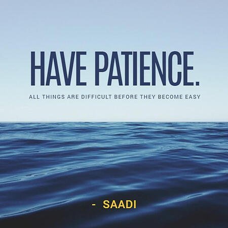
You’ve got seemingly seen quotes on Instagram posts earlier than, however it’s possible you’ll by no means have created one to your model’s account. Here is a current Instagram quote we shared right here at HubSpot:
Posting quote photographs on Instagram can diversify your content material on the platform and humanize your model somewhat, too. Everybody might use a motivational quote throughout a busy Monday morning or a gradual Tuesday afternoon, so check out an Instagram quote to your subsequent submit with the assistance of those free apps.
Instagram Textual content Apps to Make Inspiring Quotes
Featured Useful resource: 9 Instagram Quote Templates
HubSpot created a set of 9 Instagram quote templates for posts and tales – along with 13 extra free Instagram posts for enterprise. Download the collection of templates immediately to make Instagram quotes proper in Google Slides without spending a dime.
1. Canva
iOS, Android, Mac, or Web App

Canva’s many options prolong past text-based footage and, for that matter, social media. However the cellular app and its beautiful pre-made templates make it good for Instagram quotes.
Utilizing the Canva’s social media submit setting, you may draft banners, flyers, playing cards, and posts of all styles and sizes utilizing one among thousands and thousands of pro-level photographs to your quote background. In fact, be at liberty to snap a photograph on the go, as properly. One you choose your picture, you may select from greater than 100 fonts, alter the scale and shade, and publish.
2. Pablo by Buffer
Web App or Chrome Extension
Pablo is an easy app that means that you can make quotes for Instagram (in addition to Fb, Twitter, and Pinterest). You will have the choice of selecting amongst 600,000 photographs or importing one among your individual; including header, physique, and caption textual content; importing logos or graphics; and customizing with a filter.
The choices are restricted, however the interface is extraordinarily streamlined, making it an excellent alternative for inexperienced persons. As well as, you may share on to the social platform of your selecting or use Buffer to schedule the submit for a later date.
three. Stencil
Web App, Chrome Extension, Firefox Add-On, Safari Extension, or WordPress

Relying on the plan you select, Stencil means that you can create quote photographs with their 140+ widespread presets, greater than 5 million high-resolution photographs (all royalty-free), and greater than 1275 templates. Even higher, Stencil has partnered with Google Fonts and among the high icon suppliers to customise your designs even additional.
It additionally helps you identify in the event you’re inside Fb’s really useful textual content limits and whether or not any of your content material may be lower off by widespread social media platforms.
To make sharing simple, you may ship your photographs straight to Instagram, utilizing their in-app social sharing choices, or via their native Buffer integration.
four. VanillaPen
Android or iOS
Image Source
VanillaPen manufacturers itself as a “powerful tool that will transform your regular posts into creative posters within seconds.” It consists of greater than 200 templates (with presets to make the design course of simpler), 86 fonts, and 360 ornamental parts. You may even have the power to carry out primary design capabilities corresponding to resizing, rotating, and extra. From there, you may export and share to the social media platform of your alternative.
5. Fotor
Web App, Mac, Windows, Android, or iOS
Fotor is a wonderful device that provides a variety of templates, fonts, photographs, and stickers to rival any of the apps on this listing. Nevertheless, what makes it stand out is its photograph modifying and retouching capabilities, making its function set just like that of Adobe Photoshop’s however easier. From background removers to blur results, Fotor will help you create beautiful graphics for Instagram.
6. Snappa
Web App
Image Source
With Snappa, you may have entry to greater than 6000 templates and 5 million photographs and graphics to make use of to your designs. It additionally has primary photograph modifying capabilities corresponding to background removing, brightness/lightness adjustment, and blurring performance. You may as well repurpose your designs into the best picture dimensions for a number of social platforms with out manually resizing and redesigning for each. The one draw back is that you just solely get three downloads per thirty days on Snappa’s free plan, however there are premium plans obtainable.
7. QuotesCover
Web App
What’s attention-grabbing about QuotesCover is that it integrates with a big database of quotes in order that you do not have to produce the textual content for the picture you create. Merely search the database, discover a quote, and cargo it into the QuotesCover editor. From there, it would generate an automated design, which you’ll edit with their background choices, textual content formatting device, stickers, and different design property. In idea, you may go from zero concepts to full-fledged skilled design in only a couple clicks.
eight. PicMonkey
Web App, iPhone, Android

Image Source
PicMonkey is one other a kind of instruments that may do all of it: photograph modifying (together with background removals), graphics, and templates created with the most effective practices for every social platform in thoughts. You’ll draw from their library of thousands and thousands of inventory photographs, movies, and animations. The large draw back to this device is that you’re going to want a subscription to obtain or share the pictures you create. Nevertheless, the plus is that the subscription comes with 1GB of cloud storage (or limitless storage in the event you select one of many premium plans). This lets you edit on the go, save to the cloud, and entry designs on different units.
9. Phrase Swag
iOS

Image Source
Phrase Swag helps you create textual content photographs which can be as edgy because the app’s title sounds. The app makes use of a particular typing engine to create recent quote designs primarily based on the background image you are working with.
Simply choose (or shoot) your image, kind your quote into the app’s plain textual content editor, choose one among +80 kinds, and shuffle via the varied decisions that seem. Phrase Swag has actually hundreds of quote and picture choices to select from via a helpful integration from Pixabay, a free picture gallery.
Understand that the free model locations a watermark on the picture.
10. Quotes Creator
iOS or Android
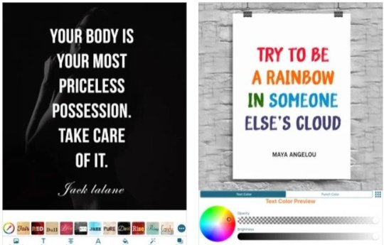
Image Source
Quotes Creator has a neat function that means quotes to make use of — together with their attributions — to take the work out of making an inspirational submit for you. We additionally like how subtly clear the watermark is to make it as distraction-free as attainable. That is one other easy-to-use app that creates quotes for Instagram in only a few easy steps — with a straightforward faucet to add to the platform.
Quotes Creator’s inventory background choices are somewhat tacky, so we advocate discovering your individual and importing them or utilizing their library of photographs.
11. Quote Maker
iOS
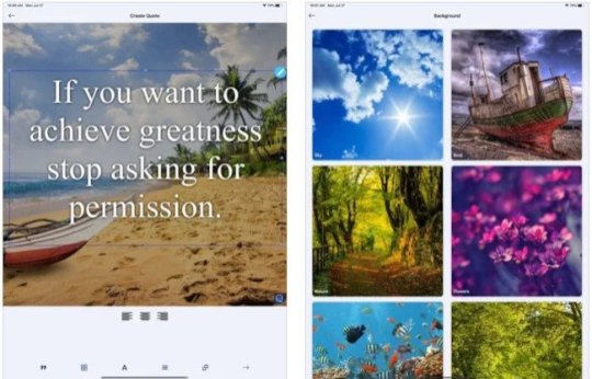
Image Source
Quote Maker is one other free app that requires a Professional model to unlock extra background and elegance choices, however you may all the time add your individual background in the event you really feel too restricted. You’ll be able to add neat decals to your model’s title or a stamp-like impact to an organization motto or mission assertion.
We advocate exploring the app, however one other warning — it may be glitchy in case your design and modifying actions get extra complicated. It is best for easy photographs, just like the one above.
Utilizing an Instagram Publish Template for Quotes
The apps above assist make quotes for Instagram rapidly utilizing templates as a substitute of ranging from scratch. Once you’re creating content material at scale, this will help you scale back the period of time spent on design and extra time specializing in the duties that matter to you.
Editor’s observe: This submit was initially printed in April 2021 and has been up to date for comprehensiveness.
Source link
0 notes
Text
Image Optimization in Advanced Web Development
Web-quality imagery is always a balancing act between using the smallest possible file size while providing good image quality. Embedding a photo straight off your DSLR may look nice, but it will slow your website’s load to a crawl, while an over-compressed image may improve the speed of your site yet discredit the design and overall aesthetic.
For the two types of image assets we predominantly deal with – photos and icons/illustrations – we perform a mixture of image quality checks and compression techniques that work well in most case scenarios.
File Types and When to Use Them
There are three image file types we use when building websites: .jpg .png and .svg.
JPGs are best used for photos such as landscapes, scenery or people. For imagery in content, such as a blog article image, we aim for 20-70kb. Larger background photos can get up to 500kb, but 200kb is a good average.
JPGs are lossy (they recompress and degrade the image quality each time you export), and they don’t manage gradients very well. If you have a gradient in an image, sometimes you can separate the image into two cuts so that you can render the gradient in a separate background using CSS gradients instead.
PNGs are best for assets such as logos and icons because they support transparency and because logo and icons often use a more limited color palette – since PNGs achieve compression through a reduction in the number of colors.
A PNG can be lossy, but we typically use lossless, meaning every pixel is saved exactly without degrading the color palette, resulting in a higher-quality image.
SVGs have the best quality of all and are used for vector art due to their scalability. We often use them with logos, however, SVGs do create more work for the browser to render and can create sluggishness as the page loads, so the quality of your image should always be balanced against its complexity.
As an example of when we use PNGs and SVGs, compare the logos for Silver Screen Insider and Bozeman Websites. For the former, we used an SVG. For Bozeman Websites, because of the complexity introduced with CSS animation when a user scrolls down, we chose to use PNGs instead so as not to compromise browser performance.
Sometimes the best solution is a combination of both: for the logo on JTech’s website, the “JT” component is a PNG, but the “Celebrating 20 Years” is an SVG in order for it to retain its quality in all viewport sizes.
Optimization Techniques
In order to get the best possible results, it is important to optimize your images. To do so, we utilize three programs: ImageOptim (for JPGs and PNGs), ImageAlpha (for PNGs) and Scour (for SVGs).
Optimizing JPGs
ImageOptim reduces the file size of JPGs and PNGs. For large images, such as the ones we use for background panels, we cap dimensions at 1600x1200px. For content photos such as an image inserted in a blog article, we cap dimensions between 200-800px wide.
After resizing to its final resolution, the image is output in Photoshop using the best quality available. Each time we compress the image it loses some fidelity, so we prefer to rely solely on ImageOptim for compression rather than having Photoshop do a pass. Photoshop is noticeably less efficient: its “save for web” at quality 65 produces an image of equal file size but poorer fidelity than ImageOptim’s quality 85.
Retina JPGs
When targeting retina or other high-density displays, we’ve found it works best to save a single JPG at twice the resolution, but use higher compression, around 50-60 in ImageOptim, which can produce a high-quality image that looks good on both retina and standard, lower-density displays. This technique allows us to use a single asset for retina and standard displays rather than cutting and loading multiple versions and without quadrupling the size of our images.
Optimizing PNGs
For PNGs, we output from Photoshop using PNG 24 in their “save for web” option, then run it through ImageOptim. If it detects that the image is using fewer than 256 colors, ImageOptim will losslessly convert the image to a PNG 8, a simpler file format that can produce very light-weight files.
With ImageOptim, our final output of an image without too many complexities (minimal color, simple shapes, and resolution less than 200x200px) can range in size from 15kb down to under 1kb.
Optimizing Larger PNGs
For more complex images, if we can’t produce a file between 15kb and 50kb with ImageOptim, we use ImageAlpha. ImageAlpha is used to process PNGs from a PNG 24 (millions of colors) to a PNG 8 (256 colors maximum), changing the image from lossless to lossy, ultimately aiming for the one with the smallest number of colors.
Lossiness in this format primarily means strategic refinement of the color palette, eliminating the least-noticeable colors to produce an image that still looks great while reducing its complexity.
After exporting from ImageAlpha, we run it through ImageOptim so it can be optimized further.
Optimizing SVGs
When it comes to SVGs, we reduce as much complexity as possible before we export the image from Illustrator. An often tedious process due to their size, we first try to reduce the number of layers to a minimum while still accurately displaying the artwork. It is then saved as an SVG in Illustrator and optimized with a program called Scour.
We use this automator script to make it a bit easier to use in macOS, allowing you to right-click an SVG file in the Finder and optimize the SVG through the Services menu. We often use font files for vector graphics that are single-color with a program called Glyphs.
Conclusion
Properly optimizing imagery is just another way we can improve the performance of our websites, prevent browser bloat, reduce server and bandwidth resource usage, hasten page load time, keep the development infrastructure clean and provide a much more desirable experience for the end-user.
We hope this exploration of our experience with JPG, PNG and SVG file types, image compression and quality tools are a resource for you as we continually refine our own process to produce websites of high caliber.
from Web Designing https://1stwebdesigner.com/image-optimization-advanced-web-development/
0 notes
Text
Image Optimization in Advanced Web Development
Web-quality imagery is always a balancing act between using the smallest possible file size while providing good image quality. Embedding a photo straight off your DSLR may look nice, but it will slow your website’s load to a crawl, while an over-compressed image may improve the speed of your site yet discredit the design and overall aesthetic.
For the two types of image assets we predominantly deal with – photos and icons/illustrations – we perform a mixture of image quality checks and compression techniques that work well in most case scenarios.
File Types and When to Use Them
There are three image file types we use when building websites: .jpg .png and .svg.
JPGs are best used for photos such as landscapes, scenery or people. For imagery in content, such as a blog article image, we aim for 20-70kb. Larger background photos can get up to 500kb, but 200kb is a good average.
JPGs are lossy (they recompress and degrade the image quality each time you export), and they don’t manage gradients very well. If you have a gradient in an image, sometimes you can separate the image into two cuts so that you can render the gradient in a separate background using CSS gradients instead.
PNGs are best for assets such as logos and icons because they support transparency and because logo and icons often use a more limited color palette – since PNGs achieve compression through a reduction in the number of colors.
A PNG can be lossy, but we typically use lossless, meaning every pixel is saved exactly without degrading the color palette, resulting in a higher-quality image.
SVGs have the best quality of all and are used for vector art due to their scalability. We often use them with logos, however, SVGs do create more work for the browser to render and can create sluggishness as the page loads, so the quality of your image should always be balanced against its complexity.
As an example of when we use PNGs and SVGs, compare the logos for Silver Screen Insider and Bozeman Websites. For the former, we used an SVG. For Bozeman Websites, because of the complexity introduced with CSS animation when a user scrolls down, we chose to use PNGs instead so as not to compromise browser performance.
Sometimes the best solution is a combination of both: for the logo on JTech’s website, the “JT” component is a PNG, but the “Celebrating 20 Years” is an SVG in order for it to retain its quality in all viewport sizes.
Optimization Techniques
In order to get the best possible results, it is important to optimize your images. To do so, we utilize three programs: ImageOptim (for JPGs and PNGs), ImageAlpha (for PNGs) and Scour (for SVGs).
Optimizing JPGs
ImageOptim reduces the file size of JPGs and PNGs. For large images, such as the ones we use for background panels, we cap dimensions at 1600x1200px. For content photos such as an image inserted in a blog article, we cap dimensions between 200-800px wide.
After resizing to its final resolution, the image is output in Photoshop using the best quality available. Each time we compress the image it loses some fidelity, so we prefer to rely solely on ImageOptim for compression rather than having Photoshop do a pass. Photoshop is noticeably less efficient: its “save for web” at quality 65 produces an image of equal file size but poorer fidelity than ImageOptim’s quality 85.
Retina JPGs
When targeting retina or other high-density displays, we’ve found it works best to save a single JPG at twice the resolution, but use higher compression, around 50-60 in ImageOptim, which can produce a high-quality image that looks good on both retina and standard, lower-density displays. This technique allows us to use a single asset for retina and standard displays rather than cutting and loading multiple versions and without quadrupling the size of our images.
Optimizing PNGs
For PNGs, we output from Photoshop using PNG 24 in their “save for web” option, then run it through ImageOptim. If it detects that the image is using fewer than 256 colors, ImageOptim will losslessly convert the image to a PNG 8, a simpler file format that can produce very light-weight files.
With ImageOptim, our final output of an image without too many complexities (minimal color, simple shapes, and resolution less than 200x200px) can range in size from 15kb down to under 1kb.
Optimizing Larger PNGs
For more complex images, if we can’t produce a file between 15kb and 50kb with ImageOptim, we use ImageAlpha. ImageAlpha is used to process PNGs from a PNG 24 (millions of colors) to a PNG 8 (256 colors maximum), changing the image from lossless to lossy, ultimately aiming for the one with the smallest number of colors.
Lossiness in this format primarily means strategic refinement of the color palette, eliminating the least-noticeable colors to produce an image that still looks great while reducing its complexity.
After exporting from ImageAlpha, we run it through ImageOptim so it can be optimized further.
Optimizing SVGs
When it comes to SVGs, we reduce as much complexity as possible before we export the image from Illustrator. An often tedious process due to their size, we first try to reduce the number of layers to a minimum while still accurately displaying the artwork. It is then saved as an SVG in Illustrator and optimized with a program called Scour.
We use this automator script to make it a bit easier to use in macOS, allowing you to right-click an SVG file in the Finder and optimize the SVG through the Services menu. We often use font files for vector graphics that are single-color with a program called Glyphs.
Conclusion
Properly optimizing imagery is just another way we can improve the performance of our websites, prevent browser bloat, reduce server and bandwidth resource usage, hasten page load time, keep the development infrastructure clean and provide a much more desirable experience for the end-user.
We hope this exploration of our experience with JPG, PNG and SVG file types, image compression and quality tools are a resource for you as we continually refine our own process to produce websites of high caliber.
from Web Designing Tips https://1stwebdesigner.com/image-optimization-advanced-web-development/
0 notes
Text
Helping Vox report on the future of U.S. health care
Growing uncertainty around the future of health care in the US has insurance providers scrambling. A number of them have decided to stop offering their products on the health insurance exchanges (HIX) — marketplaces where Obamacare compliant insurance plans are sold.
More and more providers are joining the ones who have already exited, leaving many who depend on these exchanges with little or no choice in insurance options.
Vox’s Sarah Kliff and Sarah Frostenson have been tracking and reporting on the evolving insurance coverage landscape. But at the pace things are changing, there is a need for a solution that would make it easy for reporters to keep abreast with these rapid changes.
With this challenge in mind, the Storytelling Studio collaborated with Vox to create an internal tool for managing HIX data and generating coverage maps from it.
Prioritize aggressively to define the product
Building a tool to manage a complex dataset such as health care coverage comes with the risk of “scope-creep” — attempting to build too much into one tool.
To avoid losing sight of the main objectives, we came together to first list all the things the tool should and could do. We then aggressively prioritized, cut and refined items in the list to come up with a compact set of features to include in the first version of tool.
The tool was to be built as a dashboard that can act as a place for reporters to look up current coverage status, as well as generate maps at both the national and state levels. Another feature that made the cut was generating maps simulating providers leaving a county or state.
Once the list of features was finalized, we had to figure out the best way to build it.
A tech spec in progress... http://pic.twitter.com/tedKMSMPyp
— Kavya Sukumar (@kavyaSukumar) April 12, 2017
This would have been an easy candidate for a simple CRUD dashboard with Rails or Django. But like most newsrooms, we lean toward building static sites whenever possible. Building something outside the Studio’s general workflow and infrastructure often end up being maintenance overheads.
In addition to the data management and mapping features, the dashboard also needed to have a robust authentication system because it allows users to change data permanently.
After evaluating a lot of different approaches, we decided to build it like our other apps — a static page built with Middleman and hosted on Chorus, Vox Media’s media stack. For dynamic data we used Kinto, an open source JSON storage service from Mozilla.
We used our existing servers, workflow and tools. This approach also came with an added advantage of being able to plug into Chorus authentication.
The tool had enough moving parts to warrant two developers. While I focused on the data management aspect of the dashboard, Casey Miller built mapping and image generation.
Simplify the data management
One of the reasons we built this tool is because there is no one place where HIX data can be reliably scraped. The data is often hand curated from various sources. This tool does not remove the need for curation. It merely makes it easier by giving the users an interface to update and view the data.
But we still needed a base data source to begin with, which came from the Robert Wood Johnson Foundation (RWJF). RWJF sent us an Excel file detailing the current coverage status by county.
With a combination of rake tasks and shell scripts, the data was parsed and uploaded to our Kinto instance.
On the client, a common data adapter script fetched data asynchronously from Kinto and made it available to both the maps and the data management page via callbacks.
Export dataset as static maps
Once I set up the backend, Casey began working on the map generation UI for the tool. The tool needed to be able to create both maps of the United States and individual states. It also needed the ability to display either the most up-to-date provider count data or provider count data based on a hypothetical scenario that could then be exported as an image for use in stories. While the user would set the hypothetical provider info in the app’s provider view, the map view needed some sort of UI to allow the user to create these different subsets of maps.
Since this is a relatively simple tool with only a few options, Casey decided to place the UI elements in a sidebar to the right of the map. This also happens to coincidentally follow the same format that we set up for creating projects in Autotune, Vox Media’s open-source centralized suite of tools for creating charts, graphs and other story elements.
When finished filling out the information in the sidebar, the user can hit “Submit” to update the map on the left. Once the user is happy with the map they’ve generated, they can click “Save image” to download a png of the map to their local machine.
The save image functionality relies on a version of pancakejs, “A mini-library for easily flattening SVG and Canvas elements into images on the fly,” that was ever so slightly tweaked to allow for the saving of retina images (rather than the lower resolution images it was exporting by default).
Refactor and optimize
At nearly 5MB, HIX data is a heavy payload to download in its entirety on each reload of the dashboard. We needed a way to manipulate data locally and share it between mapping page and the data editing page.
There was a definitely a case to be made for caching data locally across sessions.
LocalStorage was quickly ruled out as an option. With multiple versions of the data we needed to store, and with future plans for extending the tool to handle historical data, we would easily exceed the 10MB cap on localStorage.
We decided to use IndexedDB instead. IndexedDB has some set up overhead but, in the end, it turned out to be exactly what we needed.
Data fetch from Kinto is asynchronous. Unlike localStorage APIs, indexedDB APIs are also largely asynchronous.
It was only a matter of time before the code descended into async hell. At one point, there were seven levels of nesting of functions with eight different potential places for callback. Code readability hit rock bottom. Debugging got harder and harder. Something had to give.
Before adding Promises
All callbacks were replaced with JavaScript Promises. Code started looking much better and less error-prone.
After adding Promises
Release the tool
The tool is now available to Vox reporters.
Since we started developing the tool, Alabama has already seen some changes in coverage. Depending on how the story and data evolves, we may add more features, such as comparing historical data and combining it with other datasets.
Keep an eye out for health care coverage maps as the insurance coverage changes in reaction to the market and policies. And if you want to keep up with the latest twists and turns of the health care debate, sign up for VoxCare — Vox’s afternoon briefing on the health care news that matters the most.
from Vox Media Storytelling Blog - Front Page http://ift.tt/2roBCLM
via IFTTT
0 notes
Text
The Keyword + Year Content/Rankings Hack - Whiteboard Friday
Posted by randfish
What's the secret to earning site traffic from competitive keywords with decent search volume? The answer could be as easy as 1, 2, 3 — or more precisely, 2, 0, 1, 7. In today's Whiteboard Friday, Rand lets you in on a relatively straightforward tactic that can help you compete in a tough space using very fresh content.
Click on the whiteboard image above to open a high-resolution version in a new tab!
Video Transcription
Howdy, Moz fans, and welcome to another edition of Whiteboard Friday. This week we're going to chat about what is sometimes known as the keyword-plus-year hack. This is the idea that you take a keyword that has some existing search volume, and you add on a date, either a month or a month and a year, and you are able to outrank many of the other players because it's a much less competitive space. I'll show you what I'm talking about. It helps to have an example.
Keyword trend graph
So let's say there are a good number of people every year who search for the best web designs. They want to get design inspiration, or they just want to see what's out there. They're looking for the design gallery, so they search for best web designs. Many times, though, those folks will get results from the last 5 to 10 years, and they'll see those in there and they'll go, "You know, I want something more modern, more updated," and so they will revise their query to "best web designs 2016." In fact, many people even start with these queries. So they want to see the top Android games of January 2017. They want to see the best summer dishes 2017 for planning on cooking something.
They're looking for something that is trendy. Maybe they're looking around fashion, or you see this a lot in searches around hairstyle or anything that is grading products or services. Who are the best real estate agents in Seattle? No, no, not the 2012 edition of "Seattle Met Magazine." I want 2017. Who are the best real estate agents in Seattle 2017? So they'll add this year on there. What's great is, because this year or month only happens as it happens, those searches only happen as we get to that time period, the keyword research will not expose it to you. So if, for example, let's make this 2017, so "best web designs 2017."
We're filming this Whiteboard Friday in January. There have only just started to be a few searches for best web designs 2017. There have only just started to be a few any keyword searches that include the word 2017, because 2017 has just started. Therefore, your competitors are not seeing those in their keyword research list. They're not targeting them. There's not a ton of content out there yet, and so it's easier. Even though the volume tends to be lower than the usual keyword — sometimes it's higher, but usually lower — you will find it is vastly easier to rank for, and it's also the case — this is sort of beautiful — if you're using this tactic, even though it's higher in volume to have "best web designs" versus "best web designs 2017," the one without the year, it is often the case that Google will bias to show more recent content, especially if there are lots of searches that get revised to include the temporal number or date.
That is awesome because it means that you can win twice. You can rank for this one, which, of course, the search volume for it will die off at the end of the year, but you might be able to rank for this one as well. If you keep that updated, and change it up, and add to it, retire the old one, move the old one over to an old URL, put the new one up at the new URL, or keep the same URL if you're trying to build on top of the link authority that you've built to that URL, you can have some awesome ranking and traffic power.
The process
How do you do this?
1. Conduct keyword research using:
NON-date keywords – You want to conduct the keyword research without using the date. I'm going to start with non-date keywords. So if I'm in Keyword Explorer, or if I'm doing my keyword research in AdWords, or wherever I am, I would search for "best web design," get a big list of my target keywords.
Last year + keywords – Then I would go look at last year numbers. For example, I would search for "2016 best web design" or "best web design 2016" or anything from my keyword export or list that includes years.
2–3 years ago + keywords – I would go two and three years ago, so that I could get a sense for the volume that includes the year. I would also be looking for month at this time.
2. Use Google Trends and/or SimilarWeb/Jumpshot Trends to ID seasonality
Then I'd use Google Trends, or if you're not a fan of Google Trends — they can be a little squirrely with some data — SimilarWeb and Jumpshot also have keyword trend data, at least at the head of the demand curve, that can be good, and try and identify some of that seasonality. If you see that there's a high season that includes a particular month, that's often an indication that month plus year could be there, and then you can go and look in here. I could add "May 2016 best web design" to see if there was actually search volume for just the May keyword.
3. Use Google SERPs to determine if the month/year tactic is popular or underserved in your niche
Then I'm going to use Google SERPs. I'm going to check the keyword difficulty of those SERPs, and I'd probably look to see how many different outlets are producing monthly or annual content. For annual content, it's really going to be very January- and February-centric. That's when it all gets produced. Then, if it is underserved, that means there's more opportunity there, but, even still, it's almost always a lower difficulty, easier to get in there.
4. Target and create that timely content
So, to do that, you're going to be using:
Recent data. If I were creating a page to target "best web design 2017," I would want to use designs that have come out in the last month only or maybe just at the very end of 2016.
Employ emerging trends and language. So maybe it's PWAs, maybe it is language around clean design, whatever the trends in the field are right now.
Serve the recency of the searcher's intent by giving them the ability or showing right up front that my data and my information is very recent and that I'm helping them with what's going now, not just historically.
5. Publish as early in the period as possible
You want to publish this content as early as you can in the period without doing it earlier. So what I don't want to do is have my launch be in December 2016. December is a very quiet period anyway. It's tough to get traction and attention, it's tough to build links, but it also can be the case that you won't hit the search algorithms as recency systems. Google has these algorithms called the QDF, query deserves freshness, and so if they see that you're producing that content a month or two months before it's actually the right date, there's going to be skepticism, both from users who might stumble upon it or find it, but also from engines. So you want to publish early in the period, but not any earlier than that.
With this tactic, yeah, you can hack your way to some pretty awesome traffic. I look forward to hearing from all of you who've done this, who are trying it, and hear your experiences. We'll see you again next week for another edition of Whiteboard Friday. Take care.
Video transcription by Speechpad.com
p.s. For some great examples of this in action, check out KeywordKeg's list of 2017 phrases.
Sign up for The Moz Top 10, a semimonthly mailer updating you on the top ten hottest pieces of SEO news, tips, and rad links uncovered by the Moz team. Think of it as your exclusive digest of stuff you don't have time to hunt down but want to read!
from The Moz Blog http://ift.tt/2kOO7gz
from Blogger AdWords
0 notes
Text
The Keyword + Year Content/Rankings Hack - Whiteboard Friday
Posted by randfish
What's the secret to earning site traffic from competitive keywords with decent search volume? The answer could be as easy as 1, 2, 3 — or more precisely, 2, 0, 1, 7. In today's Whiteboard Friday, Rand lets you in on a relatively straightforward tactic that can help you compete in a tough space using very fresh content.
Click on the whiteboard image above to open a high-resolution version in a new tab!
Video Transcription
Howdy, Moz fans, and welcome to another edition of Whiteboard Friday. This week we're going to chat about what is sometimes known as the keyword-plus-year hack. This is the idea that you take a keyword that has some existing search volume, and you add on a date, either a month or a month and a year, and you are able to outrank many of the other players because it's a much less competitive space. I'll show you what I'm talking about. It helps to have an example.
Keyword trend graph
So let's say there are a good number of people every year who search for the best web designs. They want to get design inspiration, or they just want to see what's out there. They're looking for the design gallery, so they search for best web designs. Many times, though, those folks will get results from the last 5 to 10 years, and they'll see those in there and they'll go, "You know, I want something more modern, more updated," and so they will revise their query to "best web designs 2016." In fact, many people even start with these queries. So they want to see the top Android games of January 2017. They want to see the best summer dishes 2017 for planning on cooking something.
They're looking for something that is trendy. Maybe they're looking around fashion, or you see this a lot in searches around hairstyle or anything that is grading products or services. Who are the best real estate agents in Seattle? No, no, not the 2012 edition of "Seattle Met Magazine." I want 2017. Who are the best real estate agents in Seattle 2017? So they'll add this year on there. What's great is, because this year or month only happens as it happens, those searches only happen as we get to that time period, the keyword research will not expose it to you. So if, for example, let's make this 2017, so "best web designs 2017."
We're filming this Whiteboard Friday in January. There have only just started to be a few searches for best web designs 2017. There have only just started to be a few any keyword searches that include the word 2017, because 2017 has just started. Therefore, your competitors are not seeing those in their keyword research list. They're not targeting them. There's not a ton of content out there yet, and so it's easier. Even though the volume tends to be lower than the usual keyword — sometimes it's higher, but usually lower — you will find it is vastly easier to rank for, and it's also the case — this is sort of beautiful — if you're using this tactic, even though it's higher in volume to have "best web designs" versus "best web designs 2017," the one without the year, it is often the case that Google will bias to show more recent content, especially if there are lots of searches that get revised to include the temporal number or date.
That is awesome because it means that you can win twice. You can rank for this one, which, of course, the search volume for it will die off at the end of the year, but you might be able to rank for this one as well. If you keep that updated, and change it up, and add to it, retire the old one, move the old one over to an old URL, put the new one up at the new URL, or keep the same URL if you're trying to build on top of the link authority that you've built to that URL, you can have some awesome ranking and traffic power.
The process
How do you do this?
1. Conduct keyword research using:
NON-date keywords – You want to conduct the keyword research without using the date. I'm going to start with non-date keywords. So if I'm in Keyword Explorer, or if I'm doing my keyword research in AdWords, or wherever I am, I would search for "best web design," get a big list of my target keywords.
Last year + keywords – Then I would go look at last year numbers. For example, I would search for "2016 best web design" or "best web design 2016" or anything from my keyword export or list that includes years.
2–3 years ago + keywords – I would go two and three years ago, so that I could get a sense for the volume that includes the year. I would also be looking for month at this time.
2. Use Google Trends and/or SimilarWeb/Jumpshot Trends to ID seasonality
Then I'd use Google Trends, or if you're not a fan of Google Trends — they can be a little squirrely with some data — SimilarWeb and Jumpshot also have keyword trend data, at least at the head of the demand curve, that can be good, and try and identify some of that seasonality. If you see that there's a high season that includes a particular month, that's often an indication that month plus year could be there, and then you can go and look in here. I could add "May 2016 best web design" to see if there was actually search volume for just the May keyword.
3. Use Google SERPs to determine if the month/year tactic is popular or underserved in your niche
Then I'm going to use Google SERPs. I'm going to check the keyword difficulty of those SERPs, and I'd probably look to see how many different outlets are producing monthly or annual content. For annual content, it's really going to be very January- and February-centric. That's when it all gets produced. Then, if it is underserved, that means there's more opportunity there, but, even still, it's almost always a lower difficulty, easier to get in there.
4. Target and create that timely content
So, to do that, you're going to be using:
Recent data. If I were creating a page to target "best web design 2017," I would want to use designs that have come out in the last month only or maybe just at the very end of 2016.
Employ emerging trends and language. So maybe it's PWAs, maybe it is language around clean design, whatever the trends in the field are right now.
Serve the recency of the searcher's intent by giving them the ability or showing right up front that my data and my information is very recent and that I'm helping them with what's going now, not just historically.
5. Publish as early in the period as possible
You want to publish this content as early as you can in the period without doing it earlier. So what I don't want to do is have my launch be in December 2016. December is a very quiet period anyway. It's tough to get traction and attention, it's tough to build links, but it also can be the case that you won't hit the search algorithms as recency systems. Google has these algorithms called the QDF, query deserves freshness, and so if they see that you're producing that content a month or two months before it's actually the right date, there's going to be skepticism, both from users who might stumble upon it or find it, but also from engines. So you want to publish early in the period, but not any earlier than that.
With this tactic, yeah, you can hack your way to some pretty awesome traffic. I look forward to hearing from all of you who've done this, who are trying it, and hear your experiences. We'll see you again next week for another edition of Whiteboard Friday. Take care.
Video transcription by Speechpad.com
Sign up for The Moz Top 10, a semimonthly mailer updating you on the top ten hottest pieces of SEO news, tips, and rad links uncovered by the Moz team. Think of it as your exclusive digest of stuff you don't have time to hunt down but want to read!
from Blogger http://ift.tt/2ly05ep
via IFTTT
0 notes
Text
The Keyword + Year Content/Rankings Hack - Whiteboard Friday
Posted by randfish
What's the secret to earning site traffic from competitive keywords with decent search volume? The answer could be as easy as 1, 2, 3 — or more precisely, 2, 0, 1, 7. In today's Whiteboard Friday, Rand lets you in on a relatively straightforward tactic that can help you compete in a tough space using very fresh content.
Click on the whiteboard image above to open a high-resolution version in a new tab!
Video Transcription
Howdy, Moz fans, and welcome to another edition of Whiteboard Friday. This week we're going to chat about what is sometimes known as the keyword-plus-year hack. This is the idea that you take a keyword that has some existing search volume, and you add on a date, either a month or a month and a year, and you are able to outrank many of the other players because it's a much less competitive space. I'll show you what I'm talking about. It helps to have an example.
Keyword trend graph
So let's say there are a good number of people every year who search for the best web designs. They want to get design inspiration, or they just want to see what's out there. They're looking for the design gallery, so they search for best web designs. Many times, though, those folks will get results from the last 5 to 10 years, and they'll see those in there and they'll go, "You know, I want something more modern, more updated," and so they will revise their query to "best web designs 2016." In fact, many people even start with these queries. So they want to see the top Android games of January 2017. They want to see the best summer dishes 2017 for planning on cooking something.
They're looking for something that is trendy. Maybe they're looking around fashion, or you see this a lot in searches around hairstyle or anything that is grading products or services. Who are the best real estate agents in Seattle? No, no, not the 2012 edition of "Seattle Met Magazine." I want 2017. Who are the best real estate agents in Seattle 2017? So they'll add this year on there. What's great is, because this year or month only happens as it happens, those searches only happen as we get to that time period, the keyword research will not expose it to you. So if, for example, let's make this 2017, so "best web designs 2017."
We're filming this Whiteboard Friday in January. There have only just started to be a few searches for best web designs 2017. There have only just started to be a few any keyword searches that include the word 2017, because 2017 has just started. Therefore, your competitors are not seeing those in their keyword research list. They're not targeting them. There's not a ton of content out there yet, and so it's easier. Even though the volume tends to be lower than the usual keyword — sometimes it's higher, but usually lower — you will find it is vastly easier to rank for, and it's also the case — this is sort of beautiful — if you're using this tactic, even though it's higher in volume to have "best web designs" versus "best web designs 2017," the one without the year, it is often the case that Google will bias to show more recent content, especially if there are lots of searches that get revised to include the temporal number or date.
That is awesome because it means that you can win twice. You can rank for this one, which, of course, the search volume for it will die off at the end of the year, but you might be able to rank for this one as well. If you keep that updated, and change it up, and add to it, retire the old one, move the old one over to an old URL, put the new one up at the new URL, or keep the same URL if you're trying to build on top of the link authority that you've built to that URL, you can have some awesome ranking and traffic power.
The process
How do you do this?
1. Conduct keyword research using:
NON-date keywords – You want to conduct the keyword research without using the date. I'm going to start with non-date keywords. So if I'm in Keyword Explorer, or if I'm doing my keyword research in AdWords, or wherever I am, I would search for "best web design," get a big list of my target keywords.
Last year + keywords – Then I would go look at last year numbers. For example, I would search for "2016 best web design" or "best web design 2016" or anything from my keyword export or list that includes years.
2–3 years ago + keywords – I would go two and three years ago, so that I could get a sense for the volume that includes the year. I would also be looking for month at this time.
2. Use Google Trends and/or SimilarWeb/Jumpshot Trends to ID seasonality
Then I'd use Google Trends, or if you're not a fan of Google Trends — they can be a little squirrely with some data — SimilarWeb and Jumpshot also have keyword trend data, at least at the head of the demand curve, that can be good, and try and identify some of that seasonality. If you see that there's a high season that includes a particular month, that's often an indication that month plus year could be there, and then you can go and look in here. I could add "May 2016 best web design" to see if there was actually search volume for just the May keyword.
3. Use Google SERPs to determine if the month/year tactic is popular or underserved in your niche
Then I'm going to use Google SERPs. I'm going to check the keyword difficulty of those SERPs, and I'd probably look to see how many different outlets are producing monthly or annual content. For annual content, it's really going to be very January- and February-centric. That's when it all gets produced. Then, if it is underserved, that means there's more opportunity there, but, even still, it's almost always a lower difficulty, easier to get in there.
4. Target and create that timely content
So, to do that, you're going to be using:
Recent data. If I were creating a page to target "best web design 2017," I would want to use designs that have come out in the last month only or maybe just at the very end of 2016.
Employ emerging trends and language. So maybe it's PWAs, maybe it is language around clean design, whatever the trends in the field are right now.
Serve the recency of the searcher's intent by giving them the ability or showing right up front that my data and my information is very recent and that I'm helping them with what's going now, not just historically.
5. Publish as early in the period as possible
You want to publish this content as early as you can in the period without doing it earlier. So what I don't want to do is have my launch be in December 2016. December is a very quiet period anyway. It's tough to get traction and attention, it's tough to build links, but it also can be the case that you won't hit the search algorithms as recency systems. Google has these algorithms called the QDF, query deserves freshness, and so if they see that you're producing that content a month or two months before it's actually the right date, there's going to be skepticism, both from users who might stumble upon it or find it, but also from engines. So you want to publish early in the period, but not any earlier than that.
With this tactic, yeah, you can hack your way to some pretty awesome traffic. I look forward to hearing from all of you who've done this, who are trying it, and hear your experiences. We'll see you again next week for another edition of Whiteboard Friday. Take care.
Video transcription by Speechpad.com
Sign up for The Moz Top 10, a semimonthly mailer updating you on the top ten hottest pieces of SEO news, tips, and rad links uncovered by the Moz team. Think of it as your exclusive digest of stuff you don't have time to hunt down but want to read!
from Blogger http://ift.tt/2kbnBMp
via SW Unlimited
0 notes
Text
The Keyword + Year Content/Rankings Hack - Whiteboard Friday
Posted by randfish
What's the secret to earning site traffic from competitive keywords with decent search volume? The answer could be as easy as 1, 2, 3 — or more precisely, 2, 0, 1, 7. In today's Whiteboard Friday, Rand lets you in on a relatively straightforward tactic that can help you compete in a tough space using very fresh content.
Click on the whiteboard image above to open a high-resolution version in a new tab!
Video Transcription
Howdy, Moz fans, and welcome to another edition of Whiteboard Friday. This week we're going to chat about what is sometimes known as the keyword-plus-year hack. This is the idea that you take a keyword that has some existing search volume, and you add on a date, either a month or a month and a year, and you are able to outrank many of the other players because it's a much less competitive space. I'll show you what I'm talking about. It helps to have an example.
Keyword trend graph
So let's say there are a good number of people every year who search for the best web designs. They want to get design inspiration, or they just want to see what's out there. They're looking for the design gallery, so they search for best web designs. Many times, though, those folks will get results from the last 5 to 10 years, and they'll see those in there and they'll go, "You know, I want something more modern, more updated," and so they will revise their query to "best web designs 2016." In fact, many people even start with these queries. So they want to see the top Android games of January 2017. They want to see the best summer dishes 2017 for planning on cooking something.
They're looking for something that is trendy. Maybe they're looking around fashion, or you see this a lot in searches around hairstyle or anything that is grading products or services. Who are the best real estate agents in Seattle? No, no, not the 2012 edition of "Seattle Met Magazine." I want 2017. Who are the best real estate agents in Seattle 2017? So they'll add this year on there. What's great is, because this year or month only happens as it happens, those searches only happen as we get to that time period, the keyword research will not expose it to you. So if, for example, let's make this 2017, so "best web designs 2017."
We're filming this Whiteboard Friday in January. There have only just started to be a few searches for best web designs 2017. There have only just started to be a few any keyword searches that include the word 2017, because 2017 has just started. Therefore, your competitors are not seeing those in their keyword research list. They're not targeting them. There's not a ton of content out there yet, and so it's easier. Even though the volume tends to be lower than the usual keyword — sometimes it's higher, but usually lower — you will find it is vastly easier to rank for, and it's also the case — this is sort of beautiful — if you're using this tactic, even though it's higher in volume to have "best web designs" versus "best web designs 2017," the one without the year, it is often the case that Google will bias to show more recent content, especially if there are lots of searches that get revised to include the temporal number or date.
That is awesome because it means that you can win twice. You can rank for this one, which, of course, the search volume for it will die off at the end of the year, but you might be able to rank for this one as well. If you keep that updated, and change it up, and add to it, retire the old one, move the old one over to an old URL, put the new one up at the new URL, or keep the same URL if you're trying to build on top of the link authority that you've built to that URL, you can have some awesome ranking and traffic power.
The process
How do you do this?
1. Conduct keyword research using:
NON-date keywords – You want to conduct the keyword research without using the date. I'm going to start with non-date keywords. So if I'm in Keyword Explorer, or if I'm doing my keyword research in AdWords, or wherever I am, I would search for "best web design," get a big list of my target keywords.
Last year + keywords – Then I would go look at last year numbers. For example, I would search for "2016 best web design" or "best web design 2016" or anything from my keyword export or list that includes years.
2–3 years ago + keywords – I would go two and three years ago, so that I could get a sense for the volume that includes the year. I would also be looking for month at this time.
2. Use Google Trends and/or SimilarWeb/Jumpshot Trends to ID seasonality
Then I'd use Google Trends, or if you're not a fan of Google Trends — they can be a little squirrely with some data — SimilarWeb and Jumpshot also have keyword trend data, at least at the head of the demand curve, that can be good, and try and identify some of that seasonality. If you see that there's a high season that includes a particular month, that's often an indication that month plus year could be there, and then you can go and look in here. I could add "May 2016 best web design" to see if there was actually search volume for just the May keyword.
3. Use Google SERPs to determine if the month/year tactic is popular or underserved in your niche
Then I'm going to use Google SERPs. I'm going to check the keyword difficulty of those SERPs, and I'd probably look to see how many different outlets are producing monthly or annual content. For annual content, it's really going to be very January- and February-centric. That's when it all gets produced. Then, if it is underserved, that means there's more opportunity there, but, even still, it's almost always a lower difficulty, easier to get in there.
4. Target and create that timely content
So, to do that, you're going to be using:
Recent data. If I were creating a page to target "best web design 2017," I would want to use designs that have come out in the last month only or maybe just at the very end of 2016.
Employ emerging trends and language. So maybe it's PWAs, maybe it is language around clean design, whatever the trends in the field are right now.
Serve the recency of the searcher's intent by giving them the ability or showing right up front that my data and my information is very recent and that I'm helping them with what's going now, not just historically.
5. Publish as early in the period as possible
You want to publish this content as early as you can in the period without doing it earlier. So what I don't want to do is have my launch be in December 2016. December is a very quiet period anyway. It's tough to get traction and attention, it's tough to build links, but it also can be the case that you won't hit the search algorithms as recency systems. Google has these algorithms called the QDF, query deserves freshness, and so if they see that you're producing that content a month or two months before it's actually the right date, there's going to be skepticism, both from users who might stumble upon it or find it, but also from engines. So you want to publish early in the period, but not any earlier than that.
With this tactic, yeah, you can hack your way to some pretty awesome traffic. I look forward to hearing from all of you who've done this, who are trying it, and hear your experiences. We'll see you again next week for another edition of Whiteboard Friday. Take care.
Video transcription by Speechpad.com
Sign up for The Moz Top 10, a semimonthly mailer updating you on the top ten hottest pieces of SEO news, tips, and rad links uncovered by the Moz team. Think of it as your exclusive digest of stuff you don't have time to hunt down but want to read!
from DIYS http://ift.tt/2kOJZNo
0 notes
Last Seen Blogs

sviridovskate
Sviridovskate

aiyanakopa
aiyanakopa

phlanthropyarchive-blog
comme des enfants

n7india
Untitled

woorixx
♪