unitoons
IFY Documentation
Documenting my Uni stuff
11 posts
Don't wanna be here? Send us removal request.
Last Seen Blogs
skellizo
Niko :)

studyourwebdesignzine-blog
Keyword Tools
massaglove-blog
массажист

acserviceinsouthdelhi-blog
Ac service in South Delhi
sagamonique
Cartão XBOX Brasil
Text
Module 5: Launch
For this module I have not been given a specific brief or theme to work towards and instead have been tasked to create and work to a brief of my own choice.
I decided that I would task myself to create a full set of animations that could be used by a game character.
Pre Project Preperations:
During my time before the start of the module, I made some preparations in order to optimize the time that I had.
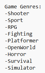
I began by creating a small list of game genres that I could possibly theme my animation set around. I decided to theme the animation set for a fighting game as it is a game genre that I have a lot of experience in which will give me knowledge of possible research material.

I created a list of animations that I can aim to create. These include basic cycles for when the character is idle or walking and the attacks that are regularly seen in fighting games. I plan to tick each part of this list off as I work through the animations.
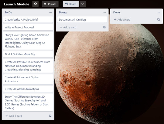
I have also started a board on Trello in order to keep myself organized through out this module.
Now that I had a clear idea of what I would be doing for this project, I was ready for the first week of the project.
Week 1:
Starting week 1, my goal was to create a draft project proposal and make a week by week schedule on what I wanted to have done by the end of each week.
Street Fighter V animation study:
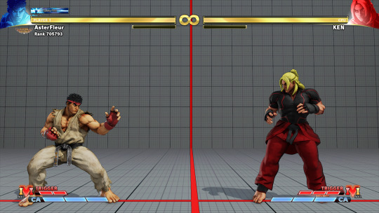
I captured some footage of Street Fighter V to break down into a study. In this footage, I went through all of Ryu's basic animations (Movement, Crouching/Jumping and Normal Attacks both in the air and on the ground). I didn't capture any footage of his special moves such as his fireball or dragon punch because I only intend to include attacks similar to that if I have some extra time when I'm finished the other animations.

The footage I captured was one long recording of his animations so I decided to use Openshot Video Editor to break it down into chunks that I could organize to make it easier to study.
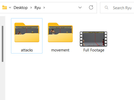
After breaking each animation into it's own video file, I organized a folder to store them in.

This would also allow me to name each of the clips as seen above for easier access.
Week 2:

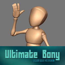
Although I had a lot of problems with the Ultimate Bony rig in my last project, I decided to use it again so I could recycle some of the poses I used in that project such as the fighter's stance.

I wanted to start this week by blocking out some of the simple poses and animations such as the crouching pose and the transition between the standing and crouching poses.
From here I decided to move back to some more research.

I used the game "Absolver" to gather reference for possible attacks my character could use since the attacks in this game are based on many different forms of martial arts so I would be able to find real world reference on each of them.
I put together a board of attacks in the game that I could use for my character and created a document with each of the names of the attacks so I could find further reference on them later.

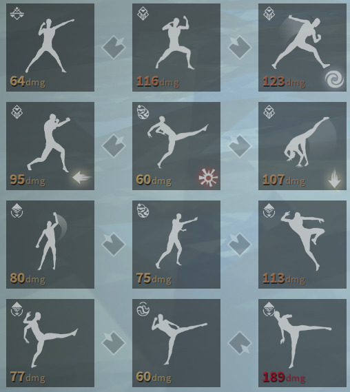
Out of these attacks, I will use six of them for my character's Light, Medium and Heavy standing punches and kicks.
Week 3:
I started this week by beginning to animate my character's walk and jump animations
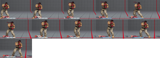
I used this sprite sheet I made from my capture of Ryu's walk cycle as my reference.

I brought it into Photoshop an broke down where the frames to determine where the keyframes and the loops are.

I also spent time looking at martial arts images and videos to gain inspiration and reference on my animations.
Week 4:
I intend to use this week to focus on animation.
I started by creating "Base positions" for standing, crouching and jumping. These will be the positions that each animation will start and end in to ensure they loop seamlessly.

From here I can move onto some basic movement animations.


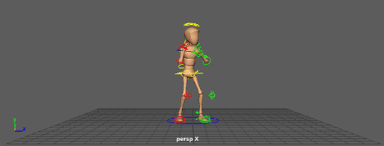
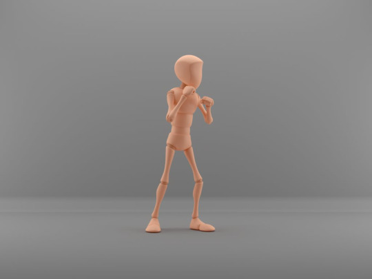
I started by creating my Idle Stance, Forward walk and Backward walk animations. During this process, I ran into a few errors such as having to reverse the face normals because parts of the model appeared black as seen below.

In addition to this, sometimes the model would move in an odd way between keyframes or move as if there were keyframes when there weren't until I restarted the program which would make everything move correctly. This wasn't a perfect solution to the problem and lead to multiple restarts of Maya however I was unable to find a better fix.
Week 5:
This is another week I intend to dedicate to animating and to conduct a peer review with others on my course using Mural.


I used Onedrive folders as a way to keep all my animations organized and used small file names to make them easily identifiable such as "Cr.MK" being crouching medium kick.
Week 6:
This week is the first week back from Easter Break. During Easter break, I was unable to do any work due to unforeseen circumstances. Because of this, I might need to make a few cuts to my animation list.
Week 7/8/9
I decided to group these weeks together because they all shared the primary focus of Animating and Rendering.

To render my project, I created a studio-like set up with area lights above and on either side of the model with a backdrop which I extruded and beveled to create a ground for the light to reflect on. I then set up a virtual camera and imported the model with the animations in to ensure the camera would stay constant.
This is what the renders would look like with the set up and render settings I had chosen.
These renders would take around 30 minutes to complete and around 1 hour 30 minutes for the longer ones. Due to this, I only rendered out a select few of the animations I had created. I originally wanted to have them all rendered out but as I didn't have much time left to compile the animations into a showreel for the exhibition, I was forced to be quite selective with them.
To end these weeks, I used "ezgif.com" to compile each of the rendered images into gifs and then convert them to mp4 files.
As you can see, the quality slightly drops after the conversion but I was unable to find an ulterior method in time.
To edit the mp4 files into a showcase video, I planed to use a software called "Openshot Video Editor" however, the frames would constantly drop and would come out choppy upon exporting the project. Due to this being extremely close to the exhibition and not having access to software such as "Adobe After Effects" I had to find a different video editing software and stumbled upon "canva.com" an online software for editing. This allowed me to create my showreel and put it on a USB drive that I bought.
youtube
This is how my showreel turned out. I would have liked a few more of the animations to be on here as I did put a lot of work into each of them and it would have been nice to show them at the exhibition but I was reaching the end of the time limit and had to cut it there.
Final Week
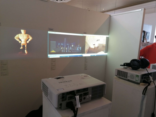
This is the week of the exhibition and we used a set up of projectors and sorted three groups "3D animation" "2D animation" and "3D modeling". The members of these groups would splice each of their showcases together into one video for each projector to be played on a loop.

From here I can focus on writing up my report for the project.
0 notes
Text
Module 4: Industry.
During this module, my goal is to create three pieces including: An attack animation in MAYA, A texture study and outcome in Adobe Substance Painter and a storyboard that relates to the title "Rendezvous". I have also been tasked to create a group study on storyboarding and composition.
Week 1:
During the first week, I intend to start and finish my attack animation and start on my "Rendezvous" storyboard.
For my animation, I will be using the "Ultimate Bony" rig as it is a fairly simple and effective model.
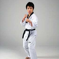

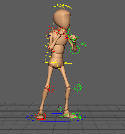
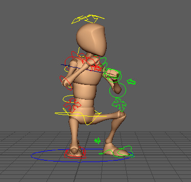
Using this Taekwondo kick stance reference image, I posed my model.

I then used this step by step guide on a basic side kick to pose out my key frames.

This is a collection of the six key frames I posed. I decided to differ from the original reference as they start with the kicking leg in the back and end with it in the front. As I wanted my animation to be repeatable, I had the kicking leg return to the back.

This is the rendered outcome of this animation. If I had more time to improve this animation, I would include more anticipation on the kick in the beginning. I would do this by dropping the model's pelvis before bouncing up to exaggerate the kick more.
During my peer review, I had someone point out the snapping of the leg back leg near the end of the animation, this was due to some problems I was having with MAYA and the rig making strange movements that were quite unexplainable as if their was a keyframe where there wasn't one. I intend to use a different rig in my next animation project to avoid problems like this one in the future.
Week 2:
I dedicated this week to my storyboard project.
Page 1:
Page 2:
Page 3:

Page 4:
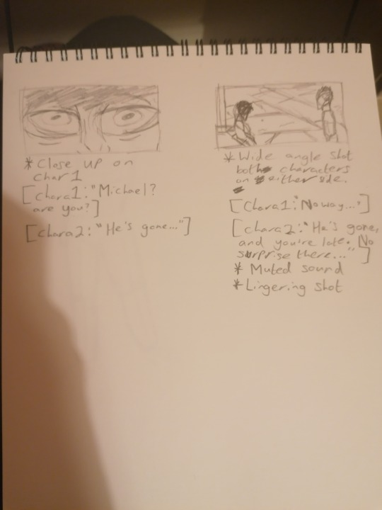
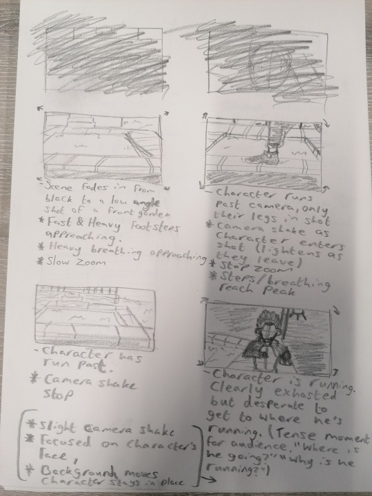
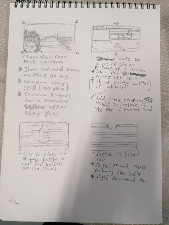
Using my sketchpad, I started creating a rough draft storyboard and intended to make it digital and a lot more presentable. The story depicts two brothers who have an ill father who has become sicker and one of the brothers is running to see him before he dies. After he arrives, it is revealed the brother is too late and their father is already dead.
As I stated before, I intended to create a digital and more refined version of this storyboard however, I didn't want to spend much more time on it as I still needed to work on an Adobe Substance Painter Texture (which at the time I was completely inexperienced with) and group presentation. I would also need to spend some time documenting this work into an individual presentation.
Week 3:
During Week 3, I spent time on my texture, the group presentation and my own individual presentation.

I started by gathering texture study material of slightly rusted and corroded metals in order to create a similar texture in Substance painter.

Using fill layers to decide on colours and other textures to add detail, I created a similar texture to what I studied. I also used a layer to add height imperfections to the texture giving it a more natural feeling.

This is a render of my texture. I believe that it went quite well however it was pointed out that the rust is quite difficult to notice and should be more prominent. Given time I would have experimented with this but as the deadline was approaching, I was unable to.
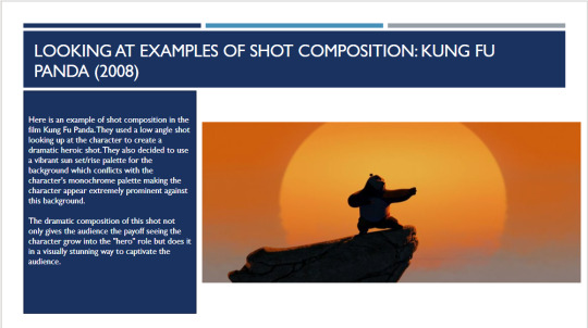
As for the group presentation, I created slides analyzing the shot composition of films such as The Incredibles and Kung Fu Panda which can be seen here:

To stay organized, our group created a Trello board.

Week 4:
During week 4 I conducted a peer review and worked on my individual presentation. This was also the week I would be presenting and the week of the deadline.
0 notes
Text
Module 3: Apply
During this module, I will create an individual creative response to a thematic challenge. The theme I was given for this project was "The Climate Crisis".
Week 1:
During the first week of this project I focused on gathering resources and inspiration using Pinterest and Art Station.
I created this small board of art relating to Climate Change and used it to decide on what I was going to attempt to create as my response. I decided to create an infographic combined with moving image to portray how we can combat Climate Change through recycling.
I decided to create this second Pinterest board that focused on infographics so I could come back to it for inspiration and reference later down the line in order to minimize the chance that I don't have enough material. Using this, I was then ready to begin planning my Project Proposal document.
As I'm not particularly strong at writing, I used a guide provided by my University to ensure the structure is understandable and I include everything I needed to.

In my proposal, I wrote about how I wanted to use aspects of this animated infographic on "How to make an animated infographic". I planned to use the way that they animate quite simple icons and write text around those icons explaining it in further detail.
I also identified that the target audience I will be aiming for will be members of the general public who are interested in learning how they can make a difference and what positive effects it will have.

To reflect this audience, I decided that the best way to target such a large audience would be to create a response that could be viewed by many different types of people. This is why I chose to arrange my infographic as an advertisement that could be shown at a bus shelter.
Week2:
During week 2, I focused on how I was going to create my response. Looking at other infographics and recycling leaflets, I decided on my foundations. The recycling process I would be focusing on was Collection, Sorting, Melting, Flaking and next applications. As this was a loop, I thought about organizing my piece in the way that would allow the animation to loop similar to how the recycling process is a loop.
Due to personal problems and lack of motivation, I wasn't able to spend much time working during this week.
Week3:
During week 3 I focused on creating my infographic.
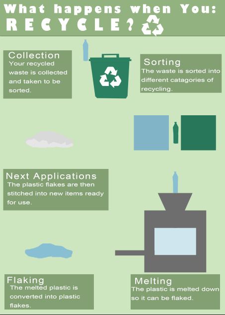
This is how the infographic turned out during my plan. I wanted to spend more time refining the icons and experimenting with the layout. However, I was running short on time and needed to started writing my report for this project.
This is how the animation of the infographic turned out. For what it is I believe I created a unique campaign for this project. I also think the animation and icons are slightly too simplistic. Given more time for this project, I would have liked to refine this response more.
0 notes
Text
Module 2: Technique
Prompt: Create a presentation about yourself, artists who inspire you and show yourself studying and using their process.
Week 1:
As this week was all about myself, I decided to break down who I am and where I want to be as an individual and the same for who I am and want to be in the industry.
My first idea for focusing on myself as an individual was to not only talk about my creative hobbies and interests such as drawing, animation, character design, etc. But to also talk about other things I enjoy doing in my free time such as playing chess or listening to music. I felt like this would add a deeper understanding of who I am and what I enjoy. I also decided to talk about my identity, Name, Age, Gender, Beliefs and more. Talking about myself was slightly difficult for me as I've never really enjoyed thinking or talking about myself due to a lot of self-doubt I have had in the past.
Talking about myself from a career standpoint was a lot easier for me as it was less to do with who I am and more to do with what I want to achieve. I talked about how I wanted to get into the animation industry and was studying at Falmouth University to allow me to take that first step into that field.
I ended the week by going over what I had written and making sure it was accurate.
Week 2:
This week was focused on researching artists and breaking how they work. I had quite a few issues near the beginning of this week, so I was a little behind on my research. I originally wanted to study at least five different artists however I was only able to do three.
I started my research with Ethan Becker. He has always been my primary inspiration for making art, so I looked at his work and interviews with him in order to understand his process and style. I also reached out to him on Instagram to see if I could ask him my own questions directly but similar to all of the artists I reached out to, my message was never seen.


These were some of the works I decided to look at first. I picked these because they show off a combination of shapes, lines, colour and lighting.
I then decided to invest some time into studying the work of TB Choi
I decided to study TB Choi's work because I personally really enjoy their use of such defined shapes as it makes it extremely clear what she is attempting to convey.
After this study I was searching Artstation for another artist and I found someone called Jie Chen.
I decided to look at their work because I was very interested in the rougher and scratchy lines I saw in their work. I think I most likely found this interesting because I normally see very refined and smooth linework in the industry so seeing a character artist with a style that goes against this while still being able to work made me want to look in further detail at their work.
During this week I also attempted to contact kuvshinov_ilya, radsechrist and danaterrace on Instagram but my messages were never seen.
Week 3:
During this week I focused on creating a response to the art I studied in the second week. I wanted to start by getting reference images of friends to base these responses on however due to travel complications I was unable to make it to the campus. This made it difficult to work on some parts of my project.
I started working by taking this art piece from Ethan Becker's Tumblr page.

I used this image specifically because of the absence of colour and the visible construction lines. This allowed me to easily see the shapes he had used.
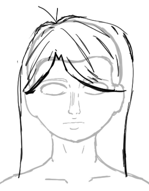
From here I attempted to break the head and neck into segments where I could identify simple shapes.
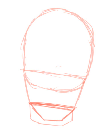
From here I was able to draw guidelines where the eyes, nose and mouth should be.

I then attempted to recreate the lines and shapes I saw making up the character's face.

I then finished it by adding the hair, more facial details and a more transparent layer to distinguish the different parts of the sketch. I was also able to shape the chin and jaw to make it less box like.
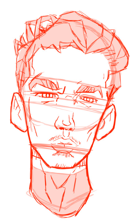
After I managed to complete this practice, I decided that I would continue to create a portrait piece using this same method.
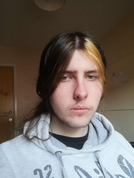
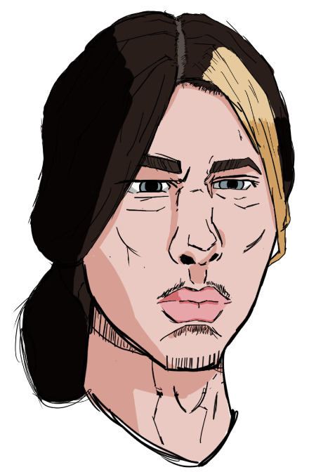
This is the reference image I took of myself and used. I didn't plan to use myself as reference but due to the previously mentioned travel issues it was the only option I had.

This is the portrait image that I made using the same method as my practice image. From here I also decided to look back on Ethan Becker's method of colouring and attempt to apply that to this sketch.
I found an interview with him back in 2016 where he states that he applies the local colour and then adds shadows and highlights using multiply and overlay layers respectively. I decided to attempt this method.
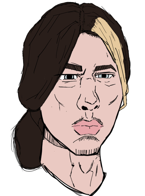
After changing the line colour to black, I placed my local colours.
I then put down my shadows. As the light was coming through my window it was quite front on, I attempted to imitate where I saw the shadows on my reference image.
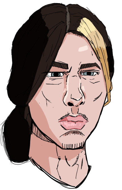
I then added overlay layers to create my highlights. I wanted to make more responses however was starting to run out of time and was only able to create this piece.
Week4:
This is the week of my deadline, so I intend to use it to tweak parts of my presentation and create this blog post to go along side it to provide a more in depth run down of my process and to expand on certain idea and research that I couldn't fit into a short presentation.
I believe I worked quite effectively given the difficulties that I experienced such as not being able to attend classes.
If I were given more time for this module, I would have likely decided to attempt a higher quantity of research and multiple responses.
0 notes
Text
Project #4: Text And Image.
Prompt: Create a skateboard graphic.
I started this project by searching Pinterest for inspiration that I can use to design my own skateboard graphic.


These designs were my main source of inspiration because I believe the grunge style they are made in would fit the primary audience of skaters.
I enjoy the way the text was incorporated on the first design being bold and in front of the image.
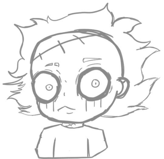
As this project was set in October, I wanted to make my design quite creepy while still following a cartoony grunge look.
I decided to create my own characters to put on my decks and so decided to go back to pinterest to look at how other people create grunge style characters.

These pieces by Instagram artist eazybridget stood out to me as they were extremely close to what I was aiming for.
I decided to attempt to create a character portrait as I didn't think I would need a full body piece of art for my deck graphic.
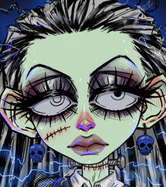
I did a sketch of how I planned my character to turn out and I believe it went quite well.

Following this, I decided to make a second character. I believed that both of these characters fit what I was trying to create so I decided to colour them and see how they looked afterwards.
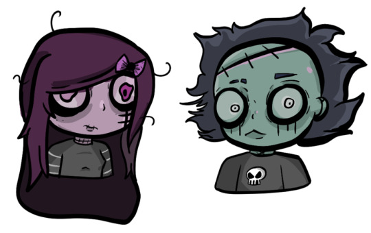
This is how they turned out after I coloured them and added details. I believe they would fit well into both the grunge and halloween themes I was aiming for.

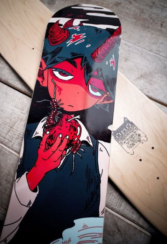
I used this photoshop document to put my design onto the board and see how it would look as a finalized product.
By going into the layer file, I was able to edit the deck design and have the changes appear on the Skateboard Mockup. I used the ruler to mark where the centre was both horizontally and vertically, this would allow me to align my text and images accordingly.

I started by moving my characters into the document and playing with the brightness/contrast until it looked good on the mockup.

To add my text, I went to the website "1001 Fonts" to find a font that would work with the creepy theme I'm going for and I chose "Serrem". I decided for my text to say "Creepy Kidz" and coloured it white with a slight red tint.
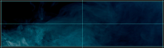
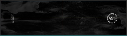
I decided to go to the internet and find a smoke texture that I could use as an added texture on top of the layers. I also decided to play with the hue and change it to blue as if it was under moonlight. I thought this would add to the creepy effect.

I changed the layer type for the smoke to "Colour dodge" which left me with this effect which I thought looked quite nice.

This is the finalized version of my skateboard graphic.
0 notes
Text
Project #3: Draw
Prompt: Create a storyboard for an existing or original idea.
I began this project by looking at storyboard artists.

My research started by looking into Lou Romano. I found myself quite interested in their style of colour scripting and use of basic shapes. I also found it impressive how they create such a clear image of the characters and atmosphere using these basic shapes.
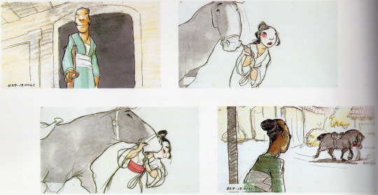
My artist research then took me to study Chris Sanders style of storyboarding which shows quite a large difference to Lou Romano's style as it uses more refined shapes and softer lines but still staying clear.

I decided to do further research into Lou Romano's style and create a piece of art of a character following his way of colour scripting. To create this, I used the Poly lasso tool in Photoshop to select shapes similar to what I saw on my reference image. I then used the eye dropper/colour picker tool to select the colours on my reference and fill the shapes using them. I made new layers for almost every shape so when I added the shadows and highlights, I could just lock the transparency of the layer and not have to worry about it bleeding onto a separate one.
youtube
I decided that I was going to create a storyboard for the Valorant Duality Cinematic using Lou Romano's colour scripting style.
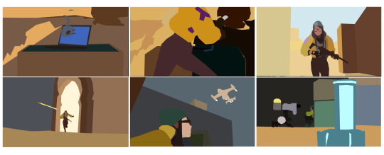
This is how my first six panels turned out. I originally wanted to create a storyboard for the whole cinematic however due to my limited time, I don't think that will be possible.
0 notes
Text
Cardboard Sea Creature Project.
Project Brief: Separate into collaborative groups and create a wearable costume that depicts a sea creature out of cardboard.
To begin this project, we visited the Maritime Museum to conduct primary research in form of taking photos and creating sketches. Due to me misreading my timetable as it was my first day, I missed the briefing and only barely made it to the museum. Due to me not understanding why I was there and not having anything to make notes or sketches in, I had very limited photos and no sketches.
This image was the only one I took at the museum, so I was quite lacking in research
When the project began, I was put into a group of four to begin discussing what type of costume we could make and how we would put it together.

To put create the head, we decided to create a harness that goes over the head and around the forehead of the person wearing the costume. This way we could use that was a base and simply add onto it.
For the body we used the same concept, but the harness would go around the body and over the shoulders of the wearer.
To shorten the workload of each person in the group, we decided to have each person design one piece of the body. Head, Body, Arms, Legs. I was assigned to create the body piece.
We decided to attempt to create a sea person who was a noble knight named Sir. Scuffed.

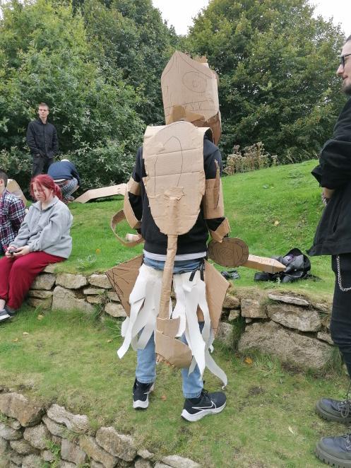
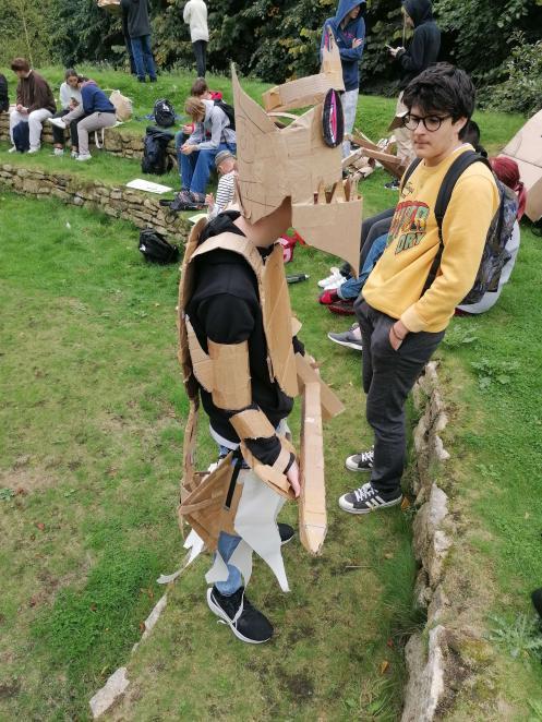
This is how the costume looked while worn. The body part that I created was quite simple in comparison to the other pieces because this was the first time I had used cardboard for art and craft and this type of medium was well out of my comfort zone. Given more experience, I would have been able to create something that was a lot more substantial for the rest of my group.
0 notes
Text
Project #2: Eden Project Moving Image. (pt.3) (Outcome/Conclusion.)

This is the redraw of my character. I lowered the opacity of layer with my image so I could easily work on drawing my character in a position that didn't look out of place.

Here I added colour and shadows/highlights to my character as well as a shadow on the ground to make it look more natural. An issue I did encounter during this process is not being able to figure out where the light from the sun was coming from due to the clouds.
youtube
This is how my moving image project looked after adding my parallax effect.
Project Conclusion:
I believe I made a creative outcome for this project that falls well within the topic of the provided prompt and worked well in the short amount of time provided.
I wanted to create a collection of these parallax screens however, I was limited with the amount of time I had and was only able to finalize one of them.
0 notes
Text
Project #2: Eden Project Moving Image. (pt.2) (Idea Generation.)


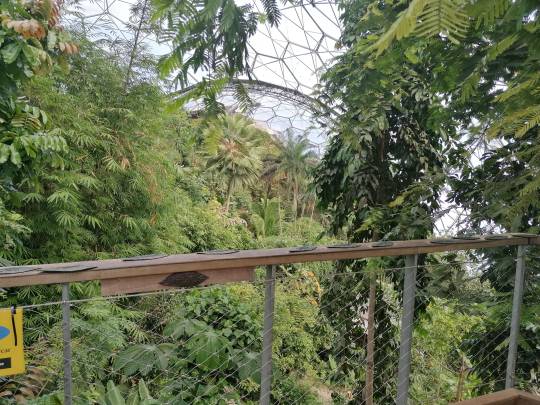
During my time at The Eden Project, I took multiple pictures like these where I had space to insert the character I had yet to design. I had also taken a timelapse of the waterfall in the rainforest dome in case I was unable to follow through with this idea.
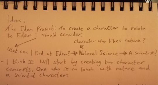
I started planning my character by thinking of how I was going to relate to The Eden Project. My first thought was to break down what Eden was and concluded that I should be looking into a character related to natural science. Following this, I broke it down further into two ideas, the first was a scientist who was studying The Eden Project and the second was a character who was in touch with nature.

This is a sketch of my scientist character, I decided to go with the recognizable style of a scientist with the white lab coat, shirt, tied up hair and glasses. After making this sketch I took a look at my images and decided that the character would most likely not work with the pictures I collected.
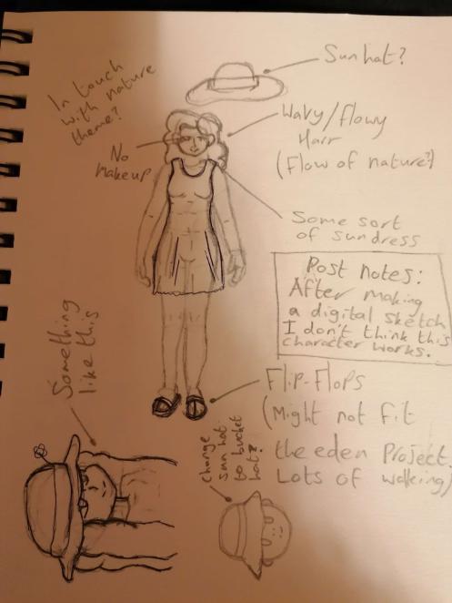
This is the character sketch and concept for my second character idea. My idea was to create a natural, nature loving character. I decided to take this idea further as it felt more fitting than the scientist character.

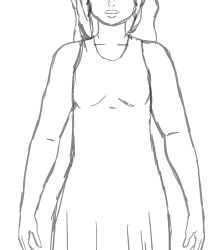
I decided to use my graphics tablet and digitally sketch this character. I started with this basic body shape and continued to draw the character's features and clothing.
This is how the digital sketch of this character went. After doing this, I decided that this idea wasn't really working for me either, so I decided to go back a step and think of a new character concept.

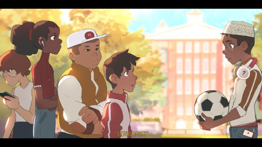
After going back to researching, I changed my thinking and instead of creating a character that would directly relate to The Eden Project, I could also create a character based on the main group I saw at The Eden Project. As I saw many students other than the ones from my course there, I decided to create a student character.
I originally found it quite hard to design a character who is a student because of the wide variety of styles that can be found across students. Due to this, I decided to go to Pinterest and look for trendy clothing and hairstyles that I could use for my character.

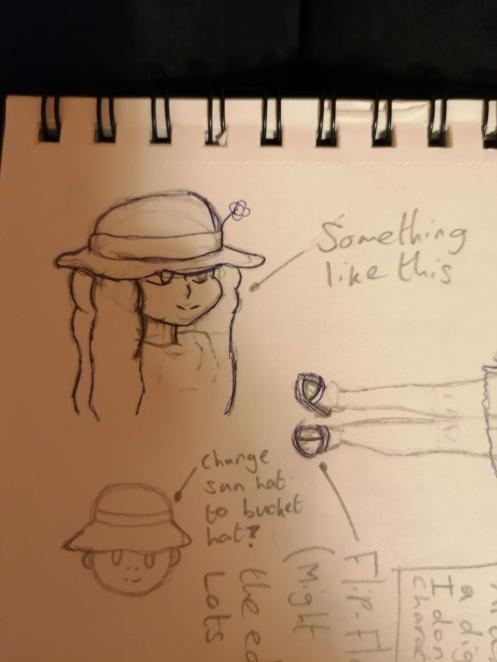
Due to running low on time, I decided to use the body that I had drawn for my other character for this one as well. While researching, I found two hairstyles that fit the kind of character I was going for and decided to compare them side by side. I chose the second option as I believed it to be easier to draw.
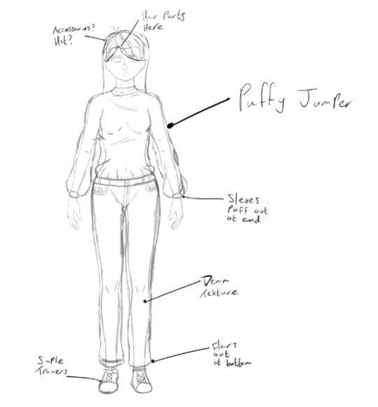
As for clothing, I decided to use quite a puffy jumper tucked into Jeans that flair out at the bottom as this design was quite easy to draw and still fit the trendy clothing I wanted to replicate on Pinterest.
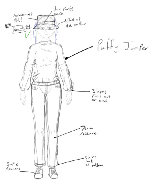
I decided to give them a bucket hat with a patch depicting a sapling on it. I did this because I recalled a lot of students that I have personally seen having hand sewn patches on their clothing.
It was now time to redraw this character in one of my images of The Eden Project. I decided to use one of the ones that overlooked the domes and the rest of Eden as I believed it was the most visually pleasing of my images.
0 notes
Text
Project #2: Eden Project Moving Image. (pt.1) (Research)
Prompt: Create moving image content based around a trip to the Eden Project.
(I had to break up this project into different pieces due to Tumblr not properly posting it in full)
I started this project by thinking about what type of moving image content I wanted to create. My first idea was to create a timelapse of a plant or waterfall as that seemed like quite a simple task. My second idea was to create an illustrated animation of the growth of a plant. I enjoyed this second idea however, it seemed quite unrealistic to achieve in a weeks' time, so I had to scrap that idea quite quickly. My third idea was to create a parallax effect using photos I take at the Eden Project. I decided to focus on my third idea and create a parallax gif/video for this project.
Following my decision for what I was going to do for my moving image, I decided to study the creation of parallax scenes and learn how to create one.
Using an image provided by my lecturer, I used the animation timeline window in Photoshop to create this parallax effect by selecting the leaf and cutting it onto a new layer. I then used the content aware fill to fill in the background behind the leaf and transformed it across the timeline.
Now that I knew how to make my parallax effect, I wanted to research how other artists used parallax scenes in marketing. I decided to focus on game trailers as I remembered them being used quite frequently in them.
youtube
I decided to start by looking at this Destiny 2 trailer as I found that it used a lot of parallax scenes to show off different items and characters.
youtube
I also looked at this trailer for the game Dead by Daylight announcing a Resident Evil crossover. I mainly focused on the end of the trailer that features a parallax scene of one of the characters in the background with the title as the foreground.
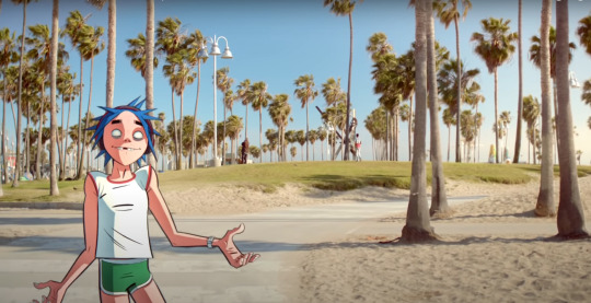
During my time researching, I found myself listening to a lot of Gorillaz and found it interesting how Jamie Hewlett often combines drawn characters with the real world. This is most clearly seen in their Humility music video. After looking into this, I decided that I would create a character who has relation to The Eden Project and combine the mixture of fiction and reality of Gorillaz and the parallax motions I saw in the trailers I had studied.
Now that I had figured out what I wanted to do for my project, it was time to visit The Eden Project.
0 notes
Text
Project #1: Future Cities.
Prompt: Create a character who has a relation to the theme of "Future Cites".
I started this project by looking for reference on Pinterest. After looking at how other people interpret "Future cites" I decided to create a character based on a technologically advanced cyberpunk future.
(Pinterest boards I created for this project)
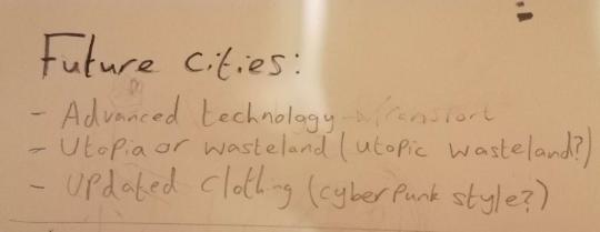
(These are my first notes on the type of city I was going to base my character on.)
After deciding on the type of city I would be theming my character on, I decided to look for more reference on how this city would look. I decided to look at the architecture and character designs in games such as Mirror's Edge Catalyst, Cyberpunk2077 and Watchdogs Legion. I chose these games because they are all set in a similar theme to what I am attempting to create within this project. When I had done what I believed to be enough research, I decided to create the first ever draft of my character.

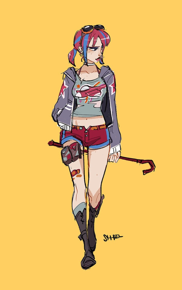
This is a paper sketch of the character. I decided to make him a cyber-criminal who steals data from large server buildings around the city for a bigger organization. I wanted to make his name technology based and after some thought I decided on the name "Terra". I feel like the hair I chose is slightly cliche, but I believe it also fits the theme, so I decided to keep it. I also decided to give him a mask to hide his face since he is a criminal. From here I wanted to do more research into outfits since the one here is extremely bland and not fitting for the theme, so I wanted to go back to study different character's outfits.
Following this sketch, I went back and to my research to look further into the character's clothing.

(My first notes about who my character was going to be.)
I used the design for Icarus from Mirror's Edge Catalyst to influence my design quite heavily. I liked the look of the red lines on the black clothing and wanted to see if that would work with blue instead as that was Terra's main colour. I also wanted to adopt some sort of handwear such as gloves because as Terra is a thief, he would wear gloves as to not leave fingerprints. I also looked further into Pinterest with tags relating to cyber punk style clothing and gained an understanding of what I needed in order to create a good outfit for my future cites character.

During my research, I saw a lot of streetwear which influenced my outfit ideas. I narrowed my upper body choices to two options. The first option was a black overcoat and the second was a Black shirt with blue highlights.
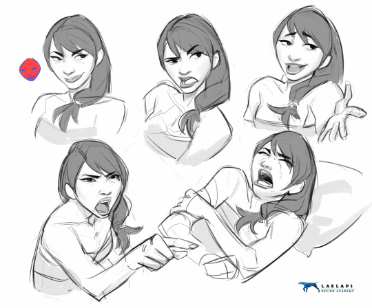
This is a new sketch I did for Terra's new outfit. I decided to give him a messenger bag and a pouch on his leg so he can store things without anything getting in his way if he needs to run from something. I believe these small details don't break away from the cyberpunk/streetwear style that I am attempting to replicate. From here I think it would be best to draw some emotion portraits to show how he would look in each of his emotions.
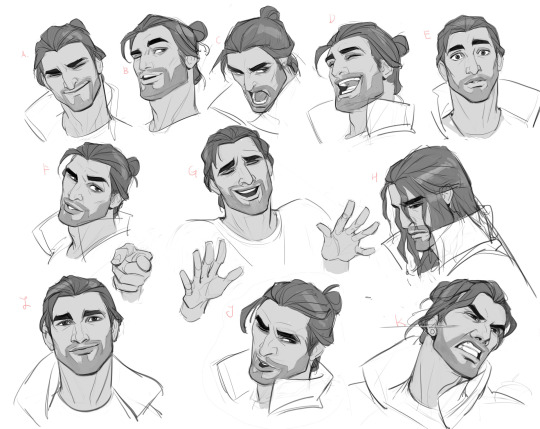
These show how Terra would look when showing a few of the basic emotions such as "Neutral" "Happy/Smug" "Angry/Shouting" and I also included a portrait of how he would look with his mask over his face. Due to these being portraits and not full body, I was able to go into further detail into his face adding aspects such as wrinkles and how his face would morph to match his expression. From this point, I will colour these portraits and the full body sketch and move onto thinking about whether I plan to give him any sort of gadgets or gear.
This is what it looks like after colouring. I believe it still looks quite bland however I believe this is due to not having access to the colours I want to use due to not having a fine line pen to show where one piece of clothing ends and where the next piece starts. I think if I were able to use black rather than grey, the clothing would look more dynamic and fitting for techwear.
Next I decided to think about what sort of equipment to give Terra. I started by thinking of what could assist him in what he does and thought of some sort of vehicle or something to assist in escape and something that could help him with his thievery.
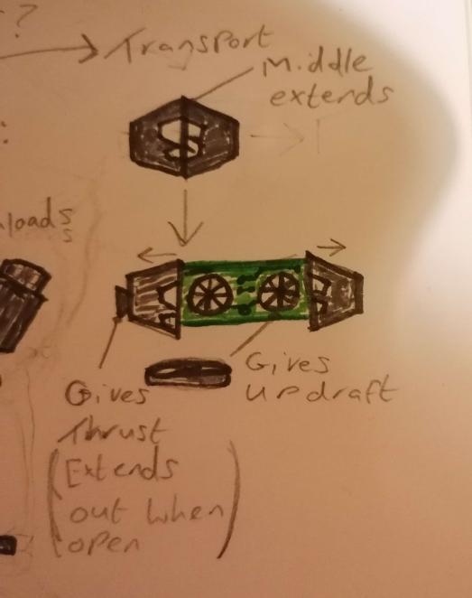
For his transport device I designed a collapsible hoverboard. I decided on this because I believed it fit the theme of future cities and almost fits the crafty nature of a thief who always has a trick to escape.
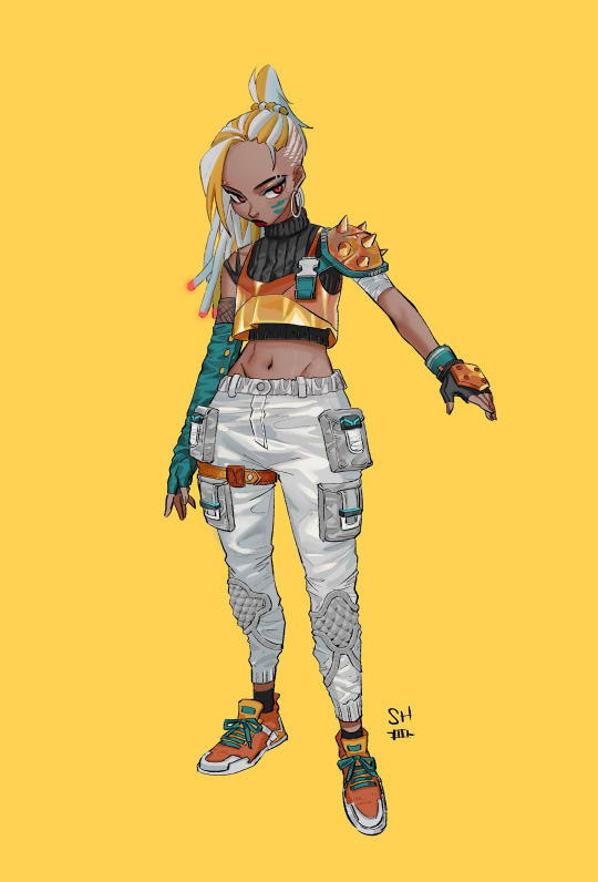
For his equipment to assist him in stealing things like data, I created a separate character named "Byte". My original design for Byte was a small computer chip with spiderlike legs that could move around and download data from pieces of hardware. While I liked this idea, I felt like this design felt a little too common in Sci-fi content. After realizing this, I thought about a way to make Byte a more unique design. While thinking about this, I decided that I wanted Byte to look quite friendly and be quite a goofy sidekick like character to Terra.
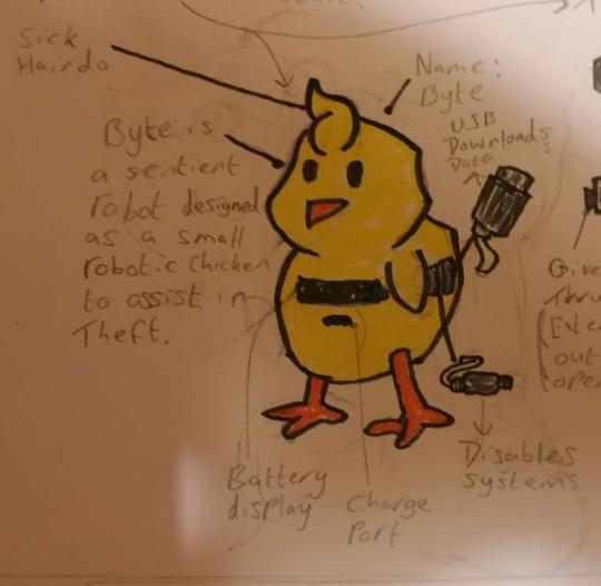
This is the design I chose for Byte. He's a sentient robot designed as a small chicken and is able to use his USB to download data and use a second cable to plug in and disable systems such as cameras and other types of security. He does have a downside however, as his battery is limited, he will need to be charged every so often. As I wanted Byte to be recognizable, I decided to give him a small tuft of hair which is of course made of metal and is just a part of him.
(Byte is very loyal to Terra and will assist him in his thievery by his own free will.)
In conclusion to this project:
I believe this project went quite well because in my eyes, I have created quite a unique character duo who fit within my theme of Future cities, but I also went quite deep into thinking of what equipment my character would have and how it would all work.
As this was my classes' first project, we were told that we should avoid doing it digitally. As this is my primary medium, I struggled quite a bit when using colour on my drawings due to not having full access to a large range of colours.
I do however believe it is important to be able to work both physically and digitally and did quite enjoy this time working in a more practical way.
1 note
·
View note