Last Seen Blogs


joanneegan64
Untitled

heartandsoulgirl
Father, I won't LOSE!
lehoodcollector
LeHoodcollector

nessies-ark
Nessie's Ark
Text
Reflective Statement - Draft
Research skills:
I would say that most of my research went into finding content for my design posters. I wanted to extend my research into finding an expression of aroha that I was familiar with and also associated with. I began to think of my hometown, Otara and how locals express their love for the town through art and music. I definitely could improve my research more by being open in what areas I research – whether that be content, design styles, typography history, and using different forms of research to expand potential ideas.
Creative Process:
When it came to designing exploration posters, I would use the techniques I had learnt in class and just start creating posters. Then, I’d get ideas and further expand or refine my designs. Just getting started on creating content was a head start, even if what I had created was bad, I would try and find what I liked about my posters and try and to develop them into new posters. I would say that I struggle managing my time with my work and trying to construct my posters as a set of 2. There were times where I would focus too much on one poster than expanding my explorations. When it came to creating the diptych, I would struggle with connecting the second poster to the first. I would refer to the conventions we learnt in class and find a convention I wanted to go off. I would also take some of visual strategies I used in my first poster and create something off that for my second poster.
Decision making:
The exploration designs I created prior to my final had great visual strategies but it was quite generic content. I had to focus on creating depth so people could feel connected to the posters. Trying to create that depth in my designs was a struggle, but I would start forming mind maps to help dive into more specific ideas. But even then, when it came to generating designs I would get stuck again.
Overall progression
I have learnt a lot compared to when I first started this course. I am not familiar with using Adobe software, but I have gained a basic understanding of InDesign skills. I would definitely need to look at tutorials in my own time to get more confident in using this software, and it would help me a lot more with bringing out my ideas visually. I have found that mind mapping is a very useful tool in generating ideas. I’ve found that I am strong in using various visual strategies in my work so gaining more knowledge around InDesign would definitely bring me a plethora of visual strategies to use.
2 notes
·
View notes


Text
WK 7 SDL - Adding Motion: Research
things to consider:
what kind of motion are they using?
How does it add meaning or depth?
Why do you think it works? Or doesn’t?
instagram
Numbers are being flipped, and rotated and the weight of each number changes from thick to thin. Even the background sort of slides into a different colour.
I think it works well in this motion design as it describes what 2020 was like for people all around the world. The designer of this piece even writes in his caption "2020 has been a bizarre and challenging year full of twists and turns, ups and downs" to which many of us can agree.
instagram
The motions used are a mix of rotating and a resemblance of the rubber animation preset.
I like that this is a literal take on the word cramped. It's quite a simple animation but it's very effective. It kind of reminds me of the bouncing DVD logo - you keep watching to see if the word fits exactly right.
instagram
there is a mix of screen roll, layering, and possibly some sort of bounce?
I feel like the soft bouncing of the word sleep replicates deep breathing when someone is asleep.
the text runs across the entire page/screen and zooms in and out in the shape of a sphere.
this is another literal take on the word sphere. Distortion of text into a sphere shape has a very 3D effect - as if a sphere was bulging out of the screen.
0 notes
Text

Formative exploration
decided to change background colour to green as I felt the negative space made the green look dull and black? I also like it emphasises the embossed text.
0 notes
Text
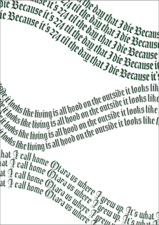
This is the diptych spread I want to go through with for the formative.
This design poster is an expression of my connection to place, and that is my hometown, Otara.
I've chosen to use the typeface Sepian to resemble a typeface used on an iconic mural in Otara dedicated to local rapper, Face Killah.
I wanted to use the colour green to represent its street signs, to which the street names are well known among locals. I initially started with the colours yellow and black, to resemble the colours on Face Killah's mural. However, with Face Killah being in the Killer Beez gang, I didn't want these colours show that was what Otara represented.
The texts used are taken from Otara's local music artists like Sid Diamond, Face Killah and music group STNDRD. I also used my own writing to emphasise my personal connection to Otara. In the first poster, I've warped the texts into circles, representing O for Otara.
Further refinement
just as I was typing this up, I've thought of taking inspiration from the design of foods that most of us grew up eating in Otara - Starz drink, Big Ben pie
think of different colours that could better fit this composition?
remember that the O in Otara needs a macron !!
consider creating a composition that conveys the lyrics from the music I've chosen?
0 notes
Text
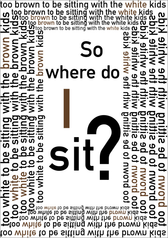
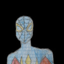
Formative Exploration
In this exploration, I'm trying to convey my own struggle in navigating where I belong.
having the word 'white' be brown is like a visual pun. Represents how I perceive myself - brown on the outside, white on the inside
I am not either, I don't know where I sit.
This design looks a bit awkward though? with the text in the middle, it seems a bit bland
0 notes
Text
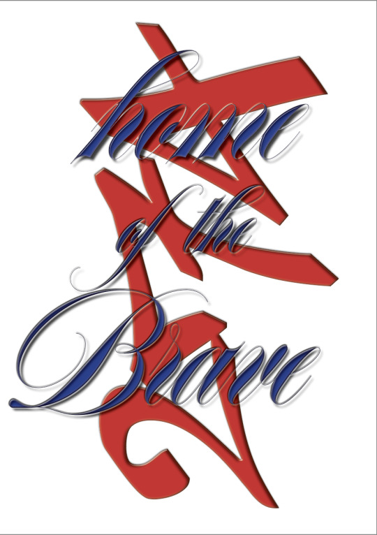
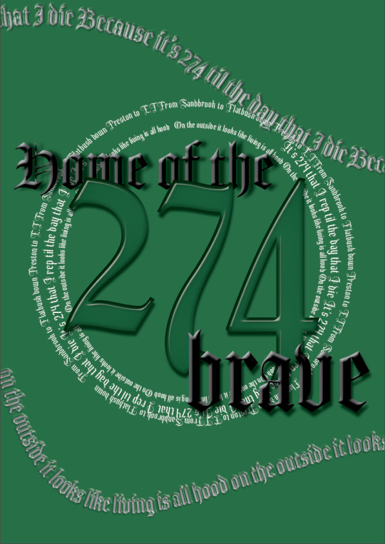
Formative exploration - connection to place
274 - Home of the Brave
Colours that resemble Otara's rugby league club - The Otara Scorpions.
Graffiti like typeface which symbolises the tagging culture in the city.
cursive typeface derived from the Face Killah mural that's displayed on Othello Road, Dawson.
0 notes
Text

Formative exploration - identity
Again, following Caroline's feedback - although, I had the visual strategies, I needed to be more specific to my connection to identity. I wanted to explore what it meant to be a Tongan living in New Zealand. Living in NZ all my life, I've never felt like the islanders I was living next door to. I don't speak Tongan fluently nor I know a lot about my culture.
extending the proud into 'plastic' and 'fraud' - words that I would unfortunately think are better to describe how Tongan I am?
I was struggling with expanding this exploration, however I would like to come back to refining this.
0 notes
Text


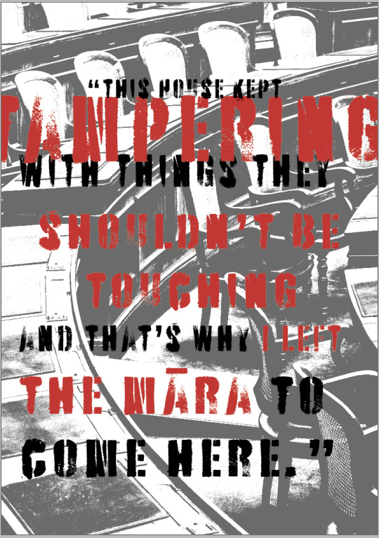
Formative Exploration - political statement
following Caroline's feedback, I wanted to to try breaking apart the text and trying to bring more depth into this design.
I've kept the analogue resembling typeface and the red colouring to represent a sense of frustration.
I wanted the tampering to overlay words "Te Tiriti o Waitangi" and "Whenua" - ACT party wanting to challenge the rights of Maori in the treaty of Waitangi, and even hoping to one day remove the treaty altogether.
Further refinement: I feel like I'm not diving deep enough into what Hana Clarke was trying to say, and I'm finding it difficult to conceptually convey this in my work.
0 notes
Text
Introduction - draft version 2
My name is Ofelia Taulisi and I am a Tongan communication design student who enjoys watching films, taking photos of my friends and family, and filming video stills. I grew up in Otara and was raised around art and diverse cultures. Going to the shops as a little kid, there was always art around me, whether it was a mural, sculpture, or even graffiti tags. I enjoy art because it’s very expressive – a way of storytelling and communicating. I enjoy seeing other perspectives on art and the expression of an artist’s creativity. Some of my favourite creatives I draw inspiration from include photographer and creative, Geoffery Matautia (commonly known as Southsides) and Architect Rewi Thompson. I studied art and sculpture in high school and made the decision to study literacy-based subjects in hopes of studying law in university – to which I realised I made the wrong decision for myself. After high school, I worked as a lifeguard. There, I undertook a role in managing and organising events in our centre to reach our community. I also carried out a project to design posters for a campaign that offered free feminine hygiene products for the community and staff. This project was a pivotal moment that pushed me to take art and design seriously. Through design, I want to reflect the stories of my community, showcasing the pivotal experiences that connect people back to their whenua. I also hope to utilise design as a tool to help me navigate my own sense of identity and bring me to a culture that I have little knowledge of – my own.
0 notes
Text

Rationale - Draft
This poster is inspired by Te Pati Maori MP Hana Rahwiti Maipi-Clarke’s maiden speech in Parliament. I wanted to incorporate conventions of a protest placard to express feelings of anger and frustration. I’ve used this type face (Battery Park) to resemble an analogue type. The red highlights certain words in this statement which emphasises Clarke's anger and frustration towards the government, and its policies regarding Te Tiriti o Waitangi and tangata whenua [people of the land].
I overlapped some text over each other - creating a sort of visual pun - to highlight key words like ‘tampering.’
I created a halftone using an image of a government house. This resembles the place Clarke had to leave the māra [garden] for – parliament.
0 notes

Text

WK 4 SDL: Exploration - Political Statement
What's worked really well here is the use of the placard convention. Considering this is a political statement, the placard inspiration is very suitable for this design. In the right image, I created a halftone using an image of a government house. This represents the place where this statement comes from - Te Pati Maori MP, Hana Rawhiti Maipi-Clarke's maiden speech in Parliament.
I think the typeface used resembles an analog typeface so it ties with a bit of a personal expression. The red highlights certain words in this statement which emphasises Clarke's anger and frustration towards the government, and its policies regarding the Treaty of Waitangi and their actions towards Maori.
0 notes
Text
Helvetica Film Review
Helvetica is everywhere!! It's seen on our local posters, on company logos and mottos. We don't notice how much Helvetica is used in today's world - well at least I didn't before watching this documentary. The social and psychological ways in which Helvetica informs all our lives are very interesting.
The typeface was designed in Switzerland and is named after its Latin origin of the country - Helvetia.
After watching this documentary, I think I would've been interested to see more of the technical details of the Helvetica typeface.
0 notes


Text
DESN512 WK3 Content Research - political statement
“I was perfectly fine growing my kūmara and learning maramataka, but this House kept tampering with things they shouldn’t be touching, and that’s why I left the māra [garden] to come here.” Hana-Rawhiti Maipi-Clarke
Hana-Rawhiti Maipi-Clarke’s maiden speech in Parliament
Doyle, T. (2023/12/12). Te Pāti Māori MP Hana-Rawhiti Maipi-Clarke delivers powerful maiden speech, says new Government 'attacked my whole world'. Newshub. https://www.newshub.co.nz/home/politics/2023/12/te-p-ti-m-ori-mp-hana-rawhiti-maipi-clarke-delivers-powerful-maiden-speech-says-new-government-attacked-my-whole-world.html
0 notes