
Last Seen Blogs
sydney-marlis
kick’n my heels or crying in the club

lovefromlucy
love from lucy

143aina
Aina☆
verfuchst-art
aw piss

sngjng
×××
Text
I want to go on a spiel about character design and my friends are losers who don’t validate me with heart reactions in discord.
While I’m not the biggest Zato fan I do think his character design is a solid good one. And I want to talk about why I think it is good. You don’t usually get a character design static for 25 years without it being good in some capacity.
When discussing character its important to acknowledge what its made for. In the case of fighting games, subtlety is usually thrown out the window in favor of making the character design essentially a pitch for the game or that character’s story. While also emphasizing the important aspects of a characters movement to allow for readability. Zato is interesting in that he isn't the main pitch for the space he occupies in Guilty Gear, as a puppet character, he isnt the main selling point of the design or the main aspect of movement, Eddie is.
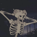
Zato has a really simple design as a result of all of that, especially by guilty gear standards. The core elements of his design are a black bodysuit that exposes the biceps with a black and red belt around tied around his head. The primary color scheme of Zato is black with red highlights, which ties him visually to his shadow monster Eddie. Which can in turn be read as a visual tie to the “shadowy nature” of his work within the assassins guild if you want to go that direction.
Starting off, the cut out of the biceps helps from a design standpoint by acting as a color break and to show off his build. Zato used to be more androgynous and that helped to excentuate that fact, and now that he is jacked it helps to imply strength and capability even without Eddie. From a gameplay perspective it also emphasizes Zato's arms as a point of interest, as his hand movements are the thing that directs Eddies' movements. So having the biceps stand out is important in that way to keep the design from being a monotone block and to improve readability in gameplay.
There are also little bits in his design, like his belt and his shoes that help the design as well. The belt he wears properly is a necessary detail because it provides a break in the shape language of the character. That keeps his torso/lower body design from being boring as a plain black bodysuit. How boring that can be for his design I think is shown well in his original design from GG1. Then, his shoes having a red tassel (or more red in their design from Xrd) helps as another point of interest that can draw the eye but not as strongly as other aspects of the design since they are accent colors here. The shoes Zato wears have red on them in most incarnation, which helps to draw attention to the floor where Eddie is when not active.
The main point of interest in Zato’s design itself is the belt he wears around his head. First, people look at faces first as a general rule, and Zato’s hair and blindfold help to draw attention even more. I think the fact Zato wears a belt and not a normal blindfold adds an extra degree of intention behind the design that a regular blindfold doesn't. While a blindfold usually symbolizes blindness of some kind. The fact he wears a belt, and the fact it’s buckled on top of that, shows a more concrete purpose in it. By using a belt instead of a blindfold, I think it’s shows that he has a greater intention and process behind why he is blinded than just ignorance that a blindfold is normally symbolic of. The intention idea I have also ties into his story of sacrificing his eyes to be able to use Eddie. The belt also acts as another color break from his skin tone that evens out the color of the design which is primarily black on bottom but has more of his skin tone in his torso and head. The red around the blindfold acts as another visual tie to Eddie who is usually shown to have a red outline to him, I also think it could be seen to imply blood as another call back to losing his eyes.
The final major component of Zato's design is his hair, which is a bright blonde that acts as a major contrast to the rest of his design. I think his hair plays an important role in tying him visually to Milia Rage, the most important character in his lore. Especially since in earlier games their outfits were more diametrically opposed with hers favoring white and blue more. I think the similarity in hair is a way of providing a visual link between them, with their opposing color schemes reflecting their Love/hate relationship.
Anyway, I'm not a huge Zato fan, he’s alright in my books. However, on my way home from work I just felt a need to talk about character design and he came to mind. Some of it is probably a stretch but it made some degree of sense to me even in those. The belt over the eyes thing really just felt like me repeating “a belt implies intention more than a blindfold” in slightly different ways and I didn’t structure this super well, but it is what it is and I don’t care that much.

3 notes
·
View notes