
binomialpascal
Math Teacher Resource Community
57 posts
Don't wanna be here? Send us removal request.
Last Seen Blogs


Link
This is a Jamboard Activity I drafted for my math seminar students to explore the Four Color Theorem through Kempe’s (incomplete) approach offered in 1879. Essentially, it gets students thinking about the maximum degree of a vertex in a planar graph.You are welcome to copy and edit with love (a la Desmos) or share another resource, if you have something you like better!
0 notes
Link
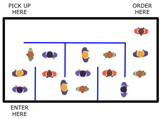
Created a Desmos Activity with the help of my colleagues to get students thinking about physically distanced floor plans at restaurants.
Prerequisite skill: Distance Formula
Make for a nice 2020-themed follow up to practicing distance computations.
0 notes
Video
youtube
Steven Strogatz is great at communicating how cool and useful math and mathematical thinking can be.
0 notes
Video
youtube
“You think it’s about triangles, but really it’s about circles.”
This overview of the fundamentals of trigonometry is thoughtful and on-point, albeit lengthy. Great for adjusting your big-picture perspective!
2 notes
·
View notes
Text
How Data Can Say Whatever You Want It To
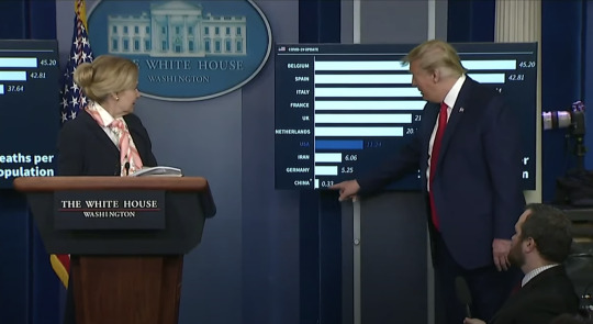
You may have seen this picture from the Coronavirus Task Force Briefing on April 18, 2020. Here Dr Birx provides a chart showing deaths per capita to show how well the United States is handling the COVID-19 pandemic. One could also look at the following screenshot from https://ncov2019.live/ and think the very opposite: that the United States has an overwhelming lead in cases and deaths. So which of these two charts is telling the truth?
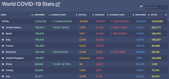
While the first frames the United States as performing “above average” and the second shows a colossal failure, neither of them are wrong. That’s just it, truth can be spun to tell the story you’re looking for if you know how to present the data. The spread of coronavirus information highlights the importance of data literacy in supporting our ability to think critically and come to appropriate conclusions. It also is hugely important that we consider the context of the data. Data literacy and context are armor that protect us from being manipulated.
If your mission is to present to the public a message about moderate success, the per capita approach is a great way to go. But is this per capita approach misleading? You might think, “Of course not! We want to know what percent of people get infected or die. Raw numbers are going to be proportionately larger for larger countries.” Well, you’re right! There’s just one thing…
The loser in this per capita graph, Belgium, has only 11.4 million people living there. This is tiny compared to the United States with 328 million inhabitants. In fact, it’s even less than the 19.4 million living in New York State. You might be wondering where the state of New York would place on this list! See how Belgium got 45.20 deaths per 100,000? New York has 95.69.
Okay, so what about the winner? Are you saying that China only has 0.33 deaths per 100,000? President Trump draws attention to this saying that they must be cheating. Shouldn’t we expect China to be at the top of the per capita graph?!
Here’s the thing. China has a whopping 1,393,000,000 people living there, but the vast majority (about 80%) of their cases were in the province of Hubei where Wuhan is located. Hubei only has 58.5 million inhabitants, and that’s a drop in the bucket for such a large country. Isolating that city, their deaths per 100,000 would fall somewhere between 5.5 and 28.9.
We don’t know for sure if China’s numbers are accurate. But really, we don’t know if anyone’s numbers are accurate. It’s just as unfair to put that entire large country in the per capita graph as it is to only be examining our own cases by looking at total counts. Using the per capita graph to call China out for cheating is as unfair as it is manipulative.
Why these ten countries? Belgium did poorly but has a good reputation; we can throw them under the bus. Many of these other countries have had headlines in the last month, so they’d be good to include. We can’t pick any countries with deaths per capita anywhere near China’s 0.33 though. We need to make sure China is at the very bottom with a shockingly tiny bar to draw attention to the absurdity of this data. You know what country would have drawn attention the absurdity of this data? India. Their deaths per hundred thousand are only 0.04. But that would make the whole graph look absurd, not just China.
Data scientists have a huge responsibility when relaying information to the public. Bias can be difficult to avoid when presenting data. But the Coronavirus Task Force were unabashed in making their agenda clear: they are clearly wanting to (1) make the case that the United States is handling this successfully and (2) single out China for dishonesty in their reporting of COVID-19 cases and deaths.
We can’t just take data at face value. Data literacy is hugely important. Understanding the context data comes from and the choices made in how it’s presented can help us recognize how we might be seeing only one side of the story. Data can be manipulated to say whatever you want it to.
0 notes
Link
A great episode on the origins and power of probability and statistics.
0 notes
Link
Another great TED-Ed video that outlines the history (and impossibility to exact) of pi along with modern day uses.
0 notes
Link
An eight-minute video of the history and essence of calculus from Professor Dave Explains.
0 notes
Link
0 notes
Link
This video is AWESOME!
0 notes
Link
Wow. Carol Dweck is so inspiring, imperative and research-based. I waited too long to start sharing this gem with students!
0 notes
Link
Welch Labs is making some truly amazing content. They show the big picture in a clear accessible way, with quality graphics and humor to boot.
I’m so impressed by how they motivate the historical necessity of various kinds of number in here. I highly recommend!
0 notes
Link
Connecting the area of a circle to the circumference of a circle.
0 notes
Link
Connecting the volume of a cylinder and cone to the volume of a sphere. A neat visualization!
0 notes