framing-visualculture
Framing Visual Culture
Exploring aesthetics, design, media, & art to think about culture and society.
Podcast hosted by Yi Jing Fly.
Buy me a coffee
6 posts
Don't wanna be here? Send us removal request.
Last Seen Blogs
ladureena
I draw for beauty's sake :}

foeverx
FOREVERELEGANT
perambulationsofaben
wanderings of the absent mind

piaragency
PR Агентство
stbreeze
St. Breeze
Video
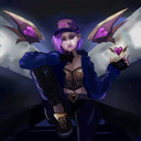
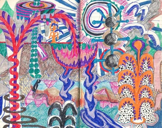
Garden by Meiting Song
Hello everyone, welcome to Framing Visual Culture. I am Yi Jing Fly. Today’s guest is Meiting Song, a graphic design and motion graphics artist based in New York and Beijing. Her works exude the fun and exciting energy of early 2000s Asian pop culture and embraces girlishness in their character designs and color palettes. She is currently finishing her final semester at School of Visual Arts (SVA) in NYC.
Meiting talks about how she developed a simple aesthetic for her digital designs through the process of silkscreen printing, finding the relationship between colors blocks. She also shares her influences looking back on the nostalgia of 90s and y2k aesthetic shared between her Asian friends, where the common language of communication is English but the visual language of shared pop cultural knowledge transcends words. Meiting ponders why no one aspires to design the branding of feminine hygiene products, and hopes to one day work on such a project herself, where she gets to design a fun and lovable brand image for such a ubiquitous and important product.
I saw that one of your illustration has been translated to a t-shirt design on Animal Crossing?
Haha, yes. In the beginning I tried to make a pixel art design in Adobe Illustrator, but there is some difficulty as the squared corners become rounded in the game drawing tool. It’s hard to come up with original designs as I have to do a lot of drafts, so what I do more now is to turn clothes already available in stores or others’ designs into digital versions in the game. There are also many accounts (like Nook Street Market) dedicated to making designer fashion and luxury items into Animal Crossing outfits. It also feels great when I can wear a luxury brand I really really like without spending any real money!
What is the situation like for young artists and art students now in NYC with Covid-19? Do you feel less affected since most of your works are digital?
For students in the digital art department it’s pretty much the same, we are used to working remotely on our laptops. But I’m taking a risograph course this semester and I can’t access the studios to work on my prints.
The grad show is also affected, as we usually have a huge event at SVA where we get to present our works to industry experts and network with them. I would say our career prospects are definitely jeopardized.
I especially love the animation series and gifs you’ve been working on lately. They remind me of Chinese paper-cut animation enlivened with simple Internet aesthetic. Can you tell us more about how you developed this aesthetic over time?


When I first started out doing graphic design in college I was making a lot of minimal and clichéd designs. We were all inspired by Apple’s aesthetic, but the minimal things I made in the beginning were more unfinished, and I realized I can’t keep doing that.
For the whole of last year I took silkscreen printing classes, and that was where I really challenged myself to think about the relationship between color blocks and each layer I’m making; eventually I learnt the skill of simplifying a very complicated thing. A lot of people like to make complex prints with silkscreen, but that’s not meaningful for me personally. At the time I also looked at a lot of art involving color blocks, and Taiwanese graphic designer Wang Zhihong’s works especially inspired me.
There are strong elements of 90s and Y2K Asian pop-culture in your works, are they from your own nostalgic references?
When I was little I didn’t pay particular attention to the pop-culture I was consuming. It was actually after growing up and meeting many Asian people from other parts of Asia that I noticed these things more. In fact, my inspiration comes more from other people’s sense of nostalgia. For me I watched a lot of Card Captor Sakura, Crayon Shin-Chan, Doraemon, and Hannah Montana. Hannah Montana was actually my fashion icon as a kid. Now I am searching for the songs that were super popular in my childhood, like Jay Chou’s songs, and trying to recall the streets and scenes where I heard them. It brings me a lot of joy doing that.
Another interesting thing I found is that, with my Asian friends, even though we communicate in English, we actually know the celebrity or show we’re talking about, we just don’t know the name in the other language. Communicating this shared cultural experience in English and reaching that moment of connection beyond language is really great!
Fashion and art are very interrelated. Oftentimes we find artists expressing themselves in both their art and fashion, and the aesthetics of both are usually aligned. What kind of clothes are you into right now, and how do they reflect or inspire your creative process?
Right now I’m really into the clothes by designer Rui Zhou (a recent Parsons MFA graduate). I especially like the sinuous lines in her garments, the flow of the curves, as I like round edges. The pearl/ bead element that holds the delicate knitwear together is my favorite part, it almost looks like an exclamation mark! I probably wouldn’t wear the whole look directly over my body, but it’d nice to just wear a piece of the ensemble as an accessory. There are also a lot of singers and celebrities in America that are wearing her clothes in their MVs or photoshoots. I find it interesting that what is indie or non-mainstream is the mainstream in New York.
Ruizhou SS19
I do think that she is one of the designers creating entirely original designs and pushing the boundaries of fashion. You recently did a collab with clothing brand Unif and photographer Monimogi, can you tell us the concept behind that collab?
It began with Moni following me on Instagram, and she liked the Sunrise Mart zine that I made and wanted to collab on something similar for Unif. Sunrise Mart had more of a Shōwa era advertorial aesthetic, with the nostalgic design elements stemming from that time, but for the Unif zine I wanted to make something with a Y2K aesthetic.
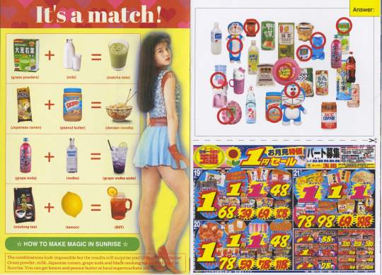
A page from Sunrise Mart
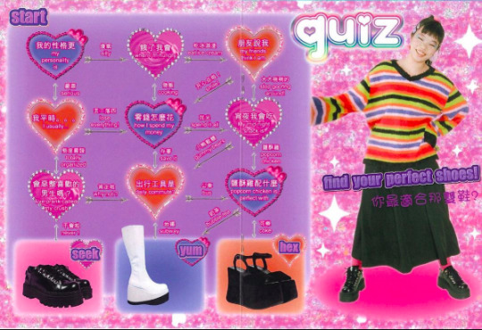
A page from Unif zine
I wanted to make something very “Tai” (corny Taiwanese subcultural style), hence the blings and saturated colors, and the use of Traditional Chinese chracters. They are quite characteristic of early 2000s teenage girls magazines as well. In those magazines you will often find horoscope readings or personality quizzes, and I incorporated that into the Unif zine, by making a quiz for “finding your perfect shoes.” I previously made a quiz for finding out what type of drink you are in Sunrise Mart and my friends told me it was pretty accurate lol.
I also made a series of stickers to go with the zine, adding many elements that I have designed on my own. I also slid in a picture of a glass dildo with a heart shape on the top, and I thought no one would find out since its quite inconspicuous, but Unif side found out immediately and exposed me. But they kept it anyway because they thought it was funny. They’re pretty chill about things.
It took quite a while to make this, from the photoshoot in February to layout design of the zine in March. The Covid-19 situation was worsening at this time, and I had to focus my mind on making this really cute and fun zine when in reality I was being super anxious.
#framing visual culture#meiting song#mad.lizzard#artist interview#chinese culture#asian#graphic design#graphic art#motion graphics#unif#fashion#nostalgic#y2k#showa#90s
4 notes
·
View notes
Text

I’ve always thought about those teenager accessories, and feminine hygiene products, why does no one want to do branding for them? All the students in art school aspire to design for museums or luxury brands, but no one aspires to work with sanitary pad brands.
The pads or tampons that I find in CVS are rather plain, and don’t entice me to purchase them. The quality aren’t that great either. The feminine product packaging and marketing visuals in Japan are much cuter. In China I have seen the use of anime or cartoon characters on these packagings as well.
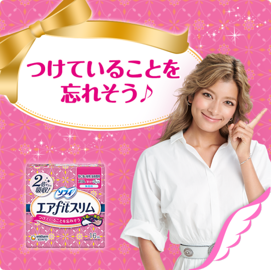
Most people consider feminine products to be something embarrassing. No one will go around the school showing off their pads. I would love to take on the branding of feminine products in the future, especially for newer things like menstrual cups.
In the design of today’s podcast episode cover, I’ve put in the image of a menstrual cup as the “Holy Cup” card sign, inspired by Card Captor Sakura and nostalgic, girlish elements. I’ll be making an animation with this series of graphics as well.
Finally, any recommendation for books, magazines, artists, or music?
Music: Sogumm
Artists: Ancco, Nicole Shinn, Tim Lahan
Thank you!
#framing visual culture#menstrual cup#feminine products#pads#art#graphic design#asian#artist interview#meiting song#mad.lizzard
0 notes
Photo
“At the end of the day making art is about having an attitude, and sometimes I have that attitude.”
Mike Chang is a Taiwanese American artist and art educator based in Singapore. Working across a variety of mediums such as drawing, painting, sculpture, and collage, his works seek to explore a curiosity towards conventions of seeing. Encountering his works is a way of understanding his sense of nuanced humor. Today, Mike and I will take a deep dive into his art, discussing the formal qualities of his works, his process, and his journey of developing a visual language.
Listen to Mike Chang’s full interview here.
#framing visual culture#mikechang#artist#interview#artist interview#water color#art#drawing#sketching#podcast
0 notes
Text
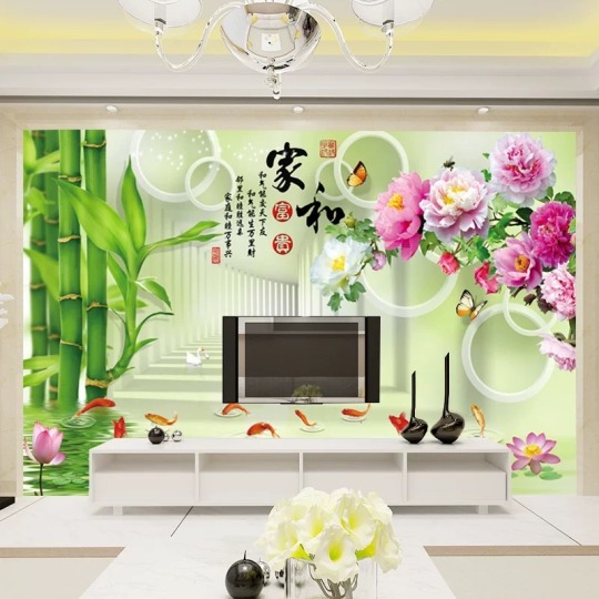
What’s with digital wallpapers in Chinese homes?
This article was originally published on medium.
In China, copying is not at all bad. There is a term “Fu Zhi Pin,” referring to copies of things made with such craft and exactitude that it is worthy of study in a museum. Fast forward to 21st Century and contemporary Chinese domestic space. Copying, or maybe copy pasting, is celebrated, but in a different way. The trend of plastering wallpapers of digitally rendered nature and blog space backgrounds onto walls and floors of Chinese home is an intriguing one. How did the copying of Western architecture in residential communes and homes lead to saturated, digital wallpaper and Karaoke style lighting design to be the preferred taste of the older generation? The answer lies in breaking down the aesthetic of “China Too Cool.”
Knock-offs, counterfeits, unoriginal. These are the words that usually come to mind when we think about things “Made in China.” As China has risen to become the largest export economy in the world, exporting over 2 trillion US dollars worth of goods in 2017, it has become no exaggeration to say that in almost every region of the world, everyone must own or at least have encountered something manufactured in China. In today’s episode, we’re going to consider goods and cultural productions made in China, and question the stereotype of unoriginal counterfeit goods. To do so, we’ll first look at what’s China’s fascination with copying, and then examine architecture and interior design choices to understand the phenomena of tacky, repurposed aesthetic taste that I call “China Too Cool.” The term “Too Cool” is the phonetic English translation of a subcultural style “土酷” (Tuku), which in Chinese means “tacky cool.” The emphasis should be on the English term “Too” and not the Chinese “Tu” as in tacky. It should be considered in its double meaning of both outdated and cool, cooler, coolest — too cool. This style is marked by an attitude of poking ironic fun at but also embracing the stylistic elements of dated popular taste.
To get a visual image of Too Cool, think of the Microsoft rainbow word art on a full background of digitally rendered nature, printed on a glossy, plastic laminated cheap notebook. For visual references, I suggest going to the Instagram page of @butterfly.minmin, a 3D graphic artist who is the living embodiment of the saturated visual overkill of Too Cool.
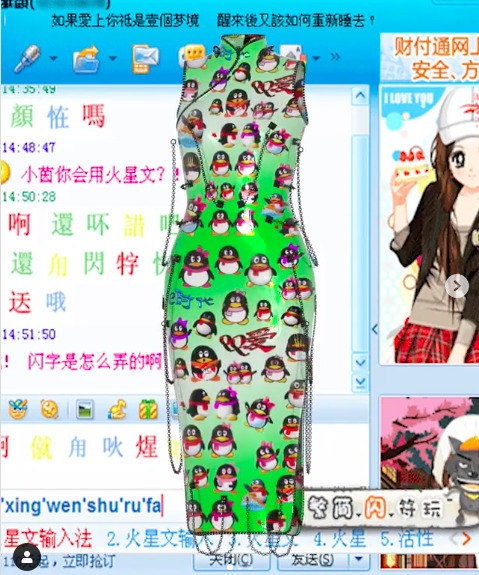
This dress is set against a digital backdrop of QQ chat, China’s online messenger popular in the early 2000s. It is now regaining popularity with Gen Z users, to set themselves apart from their parents and grandparents who are using WeChat.
There is a long-standing tradition of imitation art within China that boasts of its own classification system. The highest form of simulacrum bears the essence of the original — the qi, or in English, the “life force” — to the extent that the image evokes and becomes a “real” substitute of the original. In this case, art imitates and reproduces life, capturing not a perfect copy of the appearance but its essence. We can see this in traditional Chinese ink painting, where the mountains and lakes do not look realistic, but they exude the spirit of the sublime beauty of nature.
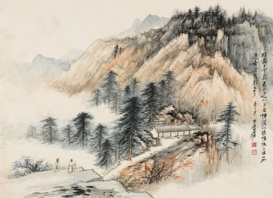
A Chinese ink painting by the late artist Zhang Daqian. He topped art sales in 2011, surpassing Picasso.
The act of perfecting copying is also highly regarded by the Chinese as “testament to cultural and technological achievements.” Journalist and Columbia University professor Alexander Stille points to two Chinese terms, “fangzhipin” and “fuzhipin”, to explain the Chinese attitude toward the copy: “Fangzhipin is closer to what we would call a reproduction — a knockoff you would buy in a museum store — whereas fuzhipin is a very high quality copy, something worthy of study or putting in a museum.” These instances of copying are for the sake of understanding the beauty of form and structure, of technology and craftsmanship, and of artistic achievements. For the Chinese, to perfectly reproduce something shows thorough understanding and extraordinary craftsmanship. Value is perceived in the skill of making, not necessarily in having a new idea.
In the book Original copies: architectural mimicry in contemporary China, author Bianca Bosker examined the intriguing phenomena of “simulacrascapes.” These are themed residential communities in China that replicate archaic European and American towns. For instance, you will have “Little Paris” residencies that feature a miniature Eiffel tower in the middle of its park, or a replicated Venetian neighborhood complete with a canal running through it.

A replica of Venice in Dalian, a modern port city in the North-Eastern part of China
While both the Western and Chinese intellectual elite sigh at the “backward” mass scale replication projects, quick to dismiss them as “kitsch”, “fake”, “unimaginative and cliché”, Bosker provides a more nuanced reading of the phenomenon, explaining the conditions for their existence and viewing them as “monuments to the ‘New China’.” These mass scale residential simulacrascape developments, aimed at the expanding middle class, owe their success to their visibility as “coveted status symbols.” Much like the conspicuous logos of branded goods, these themed residencies featuring the trademark forms of Western cultural achievement are meant to signal wealth and luxury. Beneath the surface of “West worship” actually rests a mindset of Chinese superiority, the conviction that all the good things of the world can be found in China, and tailored to Chinese taste to resemble Chinese peoples’ conception of the foreign — the historical tourist spots showcasing the celebrated moments of Western culture.
Let us now examine the interior choices made by home buyers: by looking at the domestic space, we get a glimpse into the popular taste and preferences of individuals. A little search on Zhihu.com, China’s Quora/ Reddit, brought me to revealing explanations of popular contemporary Chinese interior design choices. What the term “European-style” translates to in China is literally: chandeliers, Greek columns, pompous gilded Rococo motifs and gaudy Baroque furnishing.
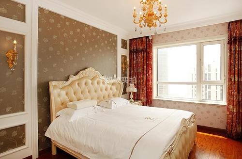
Notice the chandelier, Rococo bed frame, and wallpaper, and heavy curtains.
Italian philosopher Umberto Eco once explained that such “eclectic frenzy” and “compulsive imitation” “prevail where wealth has no history.” This aesthetic had seen an earlier manifestation in America, in the seemingly “artificial regions” of post-urban California and Florida and it is happening now for the Chinese nouveau riches, especially after the disruption in historical, cultural, and aesthetic richness as a result of the Cultural Revolution. The Rococo motifs and Greek columns, once elements of high culture and luxury are today considered archaic and kitschy for their irrelevance and impracticality to contemporary urban living. This is especially so after the new standard of design elevating functionality over appearance set by the Bauhaus school and Modernist architecture.
A more interesting development of this interior appropriation is how these “European style” copies evolve into mutations with Chinese characteristics. What is kept of the “European style”, in other words, the elaborately ornamental Rococo and Baroque, is the essence of sensory overload, but the manifestations are more in keeping with “current” trends.
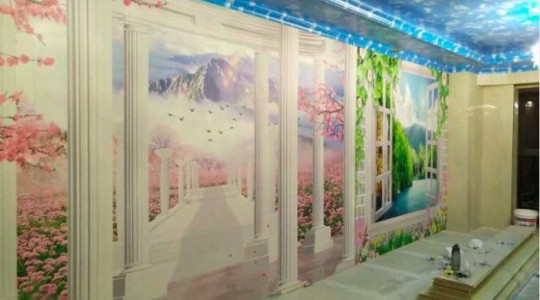
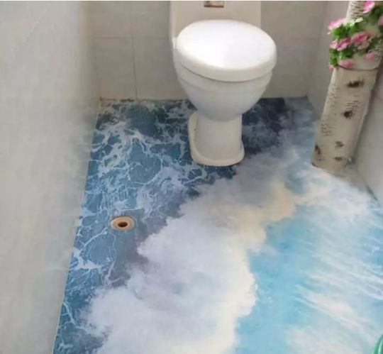
State of the art 3D renderings extending your living room to a fantasy world of nature.
One image from Chinese Quora Zhihu.com shows the design on a sliding closet door (top left). It features bright, saturated colors of blue skies and soaring birds, a high-definition landscape rendering of detailed grass, gradient-infused lotus plants in the foreground, a flat pictorial space, and an unmistakable uplifting mood. It is all too much. It’s too artificial, too uplifting, too bright, too much, “Too Cool.”
This was a photo in a series uploaded by a millennial netizen expressing her disbelief at her parents’ interior design choices for their new house on the outskirts of the main city. She is not alone in her lamentation; threads voicing outcry over outlandish new wedding home designs gifted by their loving parents are ubiquitous on the Chinese Internet, gaining popularity and resonance with every “Like”. Among those are bed frames with a Microsoft logo that acts as a lamp, a virus-molecule-like structured lighting fixture, a bedroom with crowded magenta rose wallpaper and magenta bed sheets, big digitally rendered aurora flowers, and a kitchen floor fully covered with a stock image of retreating seawater and sandy beach.
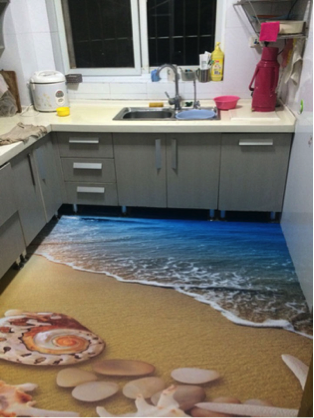
Imagine cooking in this kitchen. You can almost pick the salt from the sea water.
These acts of personalizing your living room wallpaper or lighting fixtures are popular with older people from small cities in China. That, combined with their love for nature and saturated colors result in a home of digital pretense of nature.
In order to understand “mom and dad’s” unwavering belief in the aesthetic choices of these interiors, we have to put things into context and perspective. Whatever is “fashionable”, “trendy”, or “cool”, “has always to be differentiated from the mainstream.” So we have to ask: in comparison to what are these design choices cool and trendy? If we think about the older, simple countryside homes with wooden furniture and undecorated walls before the rapid urbanization and digitization of China, then all the examples I have presented exhibit an extraordinary sense and creativity in being different. They are most likely not going to be defined as refined and classic, but in terms of “coolness”, in terms of novelty, these interior designs might stand a chance, even if only within the circle of “mom and dad” or small-town folk.
Globalization and localization aren’t just buzzwords for the marketing director, they can be felt when you enter the doors of these Chinese Too Cool interiors. From replicating western architectural clusters to recapturing the essence of newfound wealth and self-expression, Chinese designs take on a life of its own. To only see the designs as tacky knockoffs would be a missed opportunity to embark on a nuanced cultural reading of Chinese thinking.
This article is an excerpt based on my essay “China Too Cool: Vernacular Innovations and Aesthetic Discontinuity of China.” In my essay, I propose Too Cool as a lens of understanding the generational and economic differences in modern China set forth by the country’s rapid urbanization. I talk about cultural productions made during the cultural revolution and right after during the economic reform of Open Door policy, cultural appropriations of Bollywood and poor copies of Japanese anime, as well as bizarre Taobao aesthetics. The overarching theme and mood is a relatable one of displacement and using creativity to regenerate meaning and identity. If this interests you, you can get a free pdf version of my essay here.
#china#chinatoocool#contemporary china#chinese homes#interior#design#architecture#mimicry#copies#aesthetics#rococo#digital nature
1 note
·
View note
Photo


1 note
·
View note
Quote
Visual culture is a term that refers to the tangible, or visible, expressions by a people, a state or a civilization, and collectively describes the characteristics of that body as a whole... The term is most useful for what specific aspects of the visual culture of a people reveal about the people themselves.
Art in Antiquity, Brown University
4 notes
·
View notes