
Last Seen Blogs

blobloblobsstuff
Untitled
sicherosaga
these bitches gay!

likepinpl-blog
Likepin.pl


younuhknowclay
CLAY NAH RAmP
Text
تلخيص لكتاب بناء العلامة التجارية
"خطوات علمية تطبيقية"
اسم الكاتب: د.خالد بن سليمان الراجحي
إصدار: 2022م
تلخيص: جنان التيتون
ينقل لنا الكاتب والدكتور خالد الراجحي في هذا الكتاب سوء الفهم الذي قد يحدث بخصوص العلامة التجارية في مفهومها الفكري والعملي الشامل والعميق وبين الجانب الفني في صنعها ويبين الاختلاف بينهما في بناء العلامة التجارية بسلسلة من الخطوات العلمية والعملية التطبيقية.
يُساهم الكتاب في تقنين خطوات بِناء العَلامة التجارية بإضافة عملية وعلمية لتكون مبنيةً ببناءٍ صحيح بأُسسٍ علمية تساعد على إدارتها بشكل احترافي حتى مع مرور الزمن واختلاف الأسواق والأذواق.
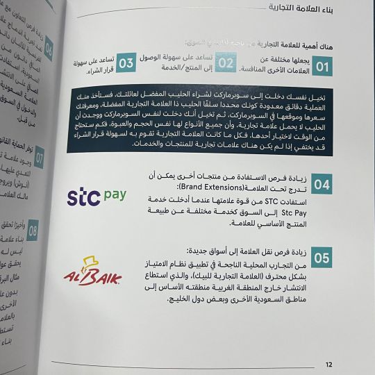
يتحدث الدكتور خالد في بداية الكتاب عن تعريفات العلامة التجارية بمختلفها ويذكر نقاط التشابه والاختلاف فيها، مبينًا أهميتها من ناحية أدائها في السوق في ثمان نقاط ثم يستهل في طرح الخطوات العملية المترابطة والمنطقية لبناء علامة تجارية قوية على شكل تسعة فصول ابتداءً بالدستورالذي يمثل العمل الفكري لبناء العلامة ويبدأ عندما يفكر صاحب المشروع بفكرته حتى طرح استراتيجية تسويقية للعلامة التجارية وصولًا إلى قياس قيمة العلامة التجارية وإدارة العلامة الذي يعتمد على المعرفة والخبرة ويحافظ على الوضع القائم للعلامة وتطويرها ونجاحها في المستقبل، ويضيف بأن ذكر هذه الخطوات بتتابع لا يعني أنها أنها متتابعة بالضرورة، أي لا يجب أن ننتظر انتهاء الخطوة تمامًا للبدء بما بعدها بل قد يكون من الضروري الانتقال بين الخطوات ذهابًا ورجوعًا لتحسين جودة النتيجة المُراد الوصول إليها.
يختم الكاتب بأربعة فصول وجدتها كثيرة الفائدة تحتوي على نصائح متفرقة هامة لبناء علامة قوية ومميزة كالاستثمار في العلامة بتعقل والتركيز على بناء العلامة بإبداع، ويضيف بعض الحالات في العلامة التجارية التي تثري القارئ وتساعد على فهم عملية بناء العلامة بشكل أفضل.
ويُذَكِر أنه ولو ظَهَر الكتاب كعملٍ مقنن بخطواتٍ علمية مدروسة إلا أن بناء العلامة لا يخلو من الإبداع والاجتهادات الشَخصية التي قَد تكون وليدة اللحظة التي قد تعتمد على ردات الفعل أكثر من الفعل، ولكن ترك الأمور لذلك فقط سيكون كفيلًا بجعل العلامة هشة كقاربٍ صغير تتقاذفه الأمواج وقد يجعلها معرضة للفشل إذا لم يتدارك ملاكها الوضع ويحولون التعامل معها إلى الأسلوب العلمي والعملي المنطقي الذي يكفل لها الاستمرار والتطور والنمو. كتاب ثري يحمل الكتاب الرسومات التوضيحية والكثير من العلامات التجارية وتحليلها، مفيد بشكل كبير لمن يرغب بالبدء في بناء علامة تجارية ومرجع لمن يريد تطوير علامته التجارية وضمان استمراريتها.
@uob-funoon


4 notes
·
View notes
Text
Final FA327 project using silkscreen printing, pop art "Andy Warhol's style"!
@patriciabarakat @uob-funoon
#silkscreen#silkscreenprinting#serigraphy#printing#popart#andywarhol#FA327#colorseparationandprintingtechniques#printmaking#graphicdesign#art#universityofbahrain#girl with a pearl earring
8 notes
·
View notes
Text
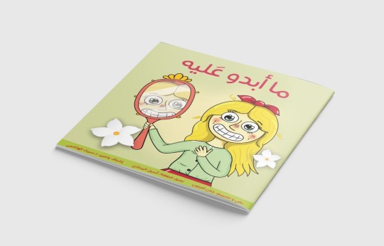
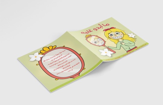
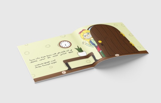

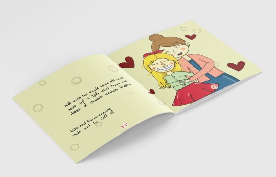
نبذة القصة:
بَسمة فتاةٌ لطيفةٌ وحَساسة، يزيدها تألقًا أسنانها الكبيرة التي تزيد ابتسامتها إشراقًا وأرجلها الطويلة المقوسة.. تتعرض بسمة للتنمر خلال مرحلتها الدراسية الجديدة مما يجعلها تبحث عن طرقٍ لتغيير مظهرها فتصل لطريقةٍ تثير قلق والدتها، فما هي هذه الطريقة؟ وهل ستنجح في ذلك؟
تحت إشراف د.سماء الهاشمي
@uob-funoon
13 notes
·
View notes
Text
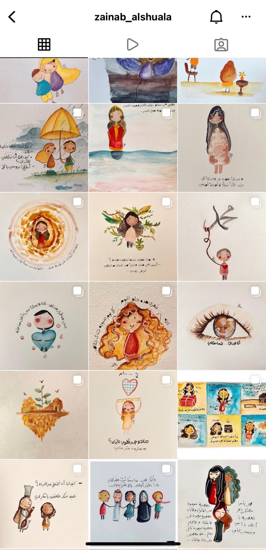
Interview4:
With Medical student and artist Zainab Alshuala.
Q1: Can you give a brief about yourself and your start in art/design?
Q2: What made you want to join the art/design field?
Q3: Your favorite artists/designers?
Q4: What inspires and motivates you the most?
Q5: As an artist/designer do you believe that you are getting the appreciation and support you deserve?
Q6: You are a really great artist, what would your advice be to a new person joining the art field?
Q7: Last but not least, how is doing your art, studying to be a dentist and managing your small business? Do you find it hard?
1. I am Zainab I Love simplicity. I mostly express myself with words drawings sometimes I find myself stuck so I get myself out. I like meditation feelings and colors especially white.
2. I see it as a free space for everyone. You can express yourself easily in transparency and peace.
3.To be honest I don’t really know well About The history of art and artists.
But I really enjoy seeing paintings and art. Every artist Has his own touch that makes him special.
4.Emotions or my biggest motivation and I always appreciate my feelings whatever it was sadness or happiness. I also love language and its vocabulary And that’s why I always look into the words and their meanings to get a drawing out of them.
5.Thank God, Even if the support was simple I appreciate whoever support me because in reality he loves what I create and that’s what’s important.
6.My advice to artists is to look deeply for themselves in art and its meaning to make theirselves seen.
Honestly my major combines between science and art and that would made me get into it.
1 note
·
View note
Text
Interview3:
With artist and architect @/Qreeeb on Instagram
Q1: Can you give a brief about yourself and your start in art/design?
a person who likes every type of art, from drawing and painting, music, calligraphy, photography and so on. I started drawing when i was at primary school until now.
Q2: What made you want to join the art/design field and also be an architect?
since I was young, I started to exploring types of art, when i was in school i was attracted to the art subjects and from that time I started with drawing, after that i was curious about the other types like music so i started to learn guitar and piano but I didn’t take it seriously. I moved to calligraphy but it wasn’t that easy for me as well. And at the end I decided to try digital art and i found it the most creative field for me.
On other hand i was really interested in buildings and their forms, and who can it be combined with art. So when i was in high school I wasn’t interested in any major other than architecture.
Q3: Your favorite artists/designers?
In fact i never studied art theoretically or read about any famous artists, i wasn’t searching about a specific type or a someone to follow his way of doing art, but I was searching about what I like and what i can be the best at it.
Q4: What inspires and motivates you the most?
Recently the most thing that give me motivation is the artworks of the other artists, specially the way that each one of them has his own way to draw what he/she likes.
Q5: As an artist/designer do you believe that you are getting the appreciation and support you deserve?
I can’t really say that I received the needed support in any time, especially in school there was a luck of supporters were most of my art teachers were just teaching as the basics and doesn’t focusing on who is talented or not.
Q6: You are a really great artist, what would your advice be to a new person joining the art field?
Follow what you like, be your self and have your on way of doing art, try and try and when you had stragglers try to find the way to solve them but never lose your motivation to be a unique artist.
Q7: Last but not least, how is doing your art for yourself and doing your job as an architect? Is it hard?
For me doing art is my best way to escape from life problems, it lets me to focus a lot in it and forget anything else. And on the other hand doing architecture is a type of doing art for me cause i am still designing and creating a unique buildings that have something that represents me.
3 notes
·
View notes
Text
Interview2:
With incredible artist Khatoon Ali.
Her words were inspiring and full of passion. It was a really fruitful interview!
Wishing Khatoon all the best⚡️
16 notes
·
View notes
Text
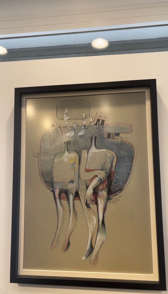
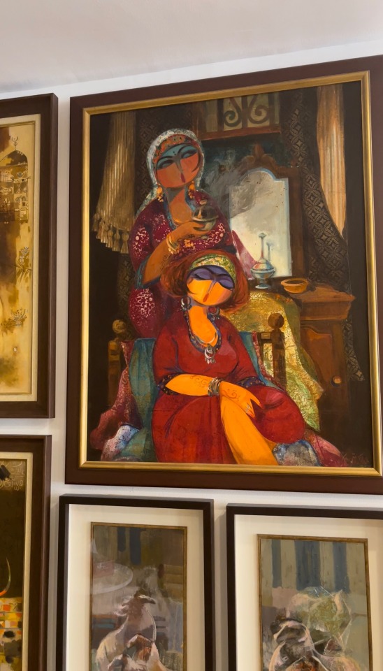
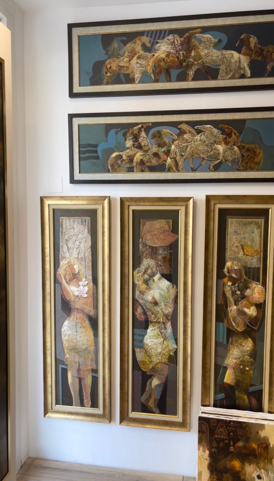
My visit to Baghdad Art Center.
The place was really small and it had so many paintings from the Iraqi style. They were so many paintings on the floor which we couldn’t see clearly.
I saw so many unique paintings. They belonged to a variety of artists. Two of them are Sattar Luqman and Amer Alobaidi. Their style is really unique and different, you have to concentrate and analyze from close to fully understand which is interesting!
The paintings hanging on the walls there were framed perfectly with big and shiny frames. They looked beautifully fancy! And I believed they deserved to be framed as such, because they are really amazing artworks.
The style shows some stories from the Iraqi traditions and life style, there was a lot of nature paintings and horses. There were also paintings that showed love and affection, it made my heart warm. The strokes and colors were chosen based on knowledge and also from the heart of the artists which made it beautifully done..
16 notes
·
View notes
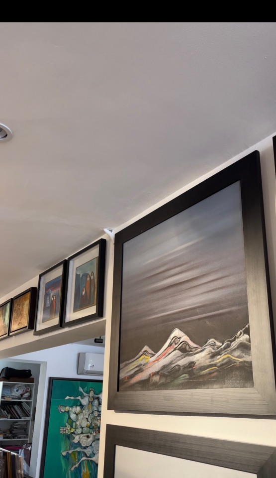
Text
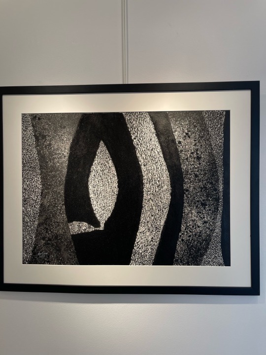
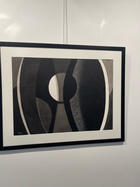
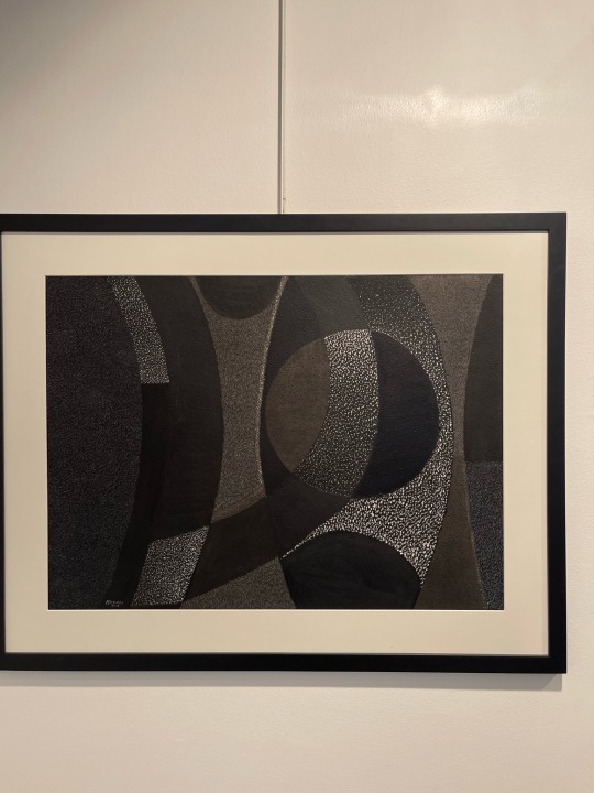
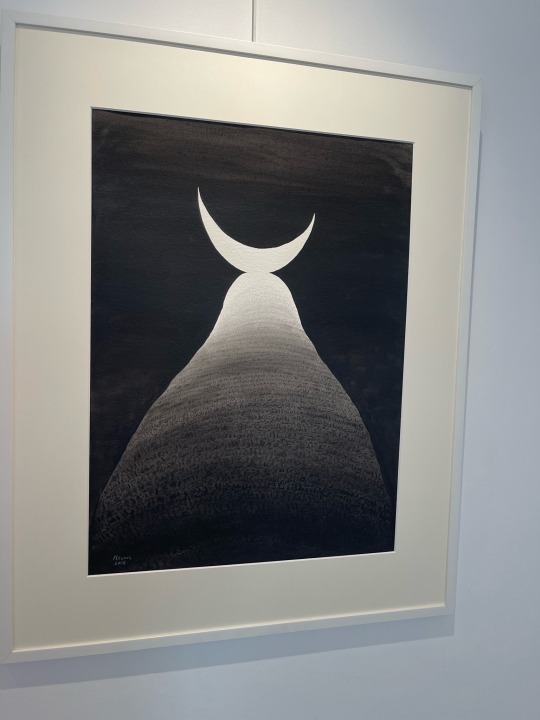
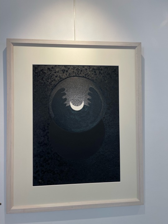
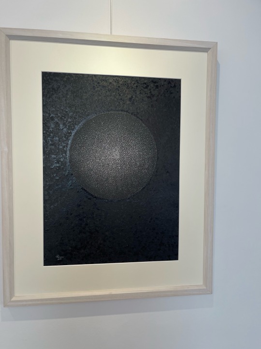
Part 2: A visit to Albareh
Resmi’s work was more dark and Minimalist. It was not my style because I prefer colors. But his work and use of principles is very clear and incredible!
Most of his work looks like graphic designs because of how are principles and elements of design are clearly shown. I believe that contrast was the most clear. He mostly uses black, grey and white in his paintings.
Shapes and lines were used in repetition, some even could be patterns. There were many paintings including a moon that were beautifully done using watercolors on paper or mixed media.
I really enjoyed the visit. It added a lot to my knowledge and artistic vision. Observing and looking at art is always a good time!
43 notes
·
View notes
Text
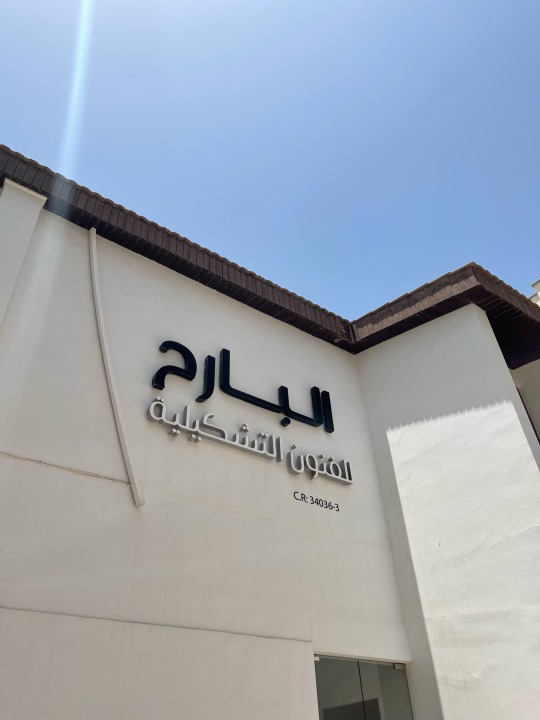
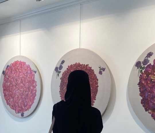
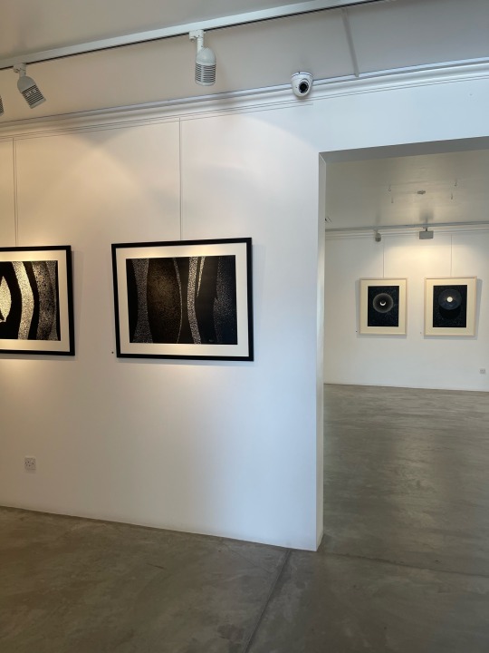
Part 1: A visit to Albareh
I visited Albareh art gallery for exhibitions and events. There was artworks of the two talented artists: Resmi Alkafaji and Nazar Yahya
The place was really spacious and calm. It had a great relaxing atmosphere that makes you really enjoy and appreciate art.
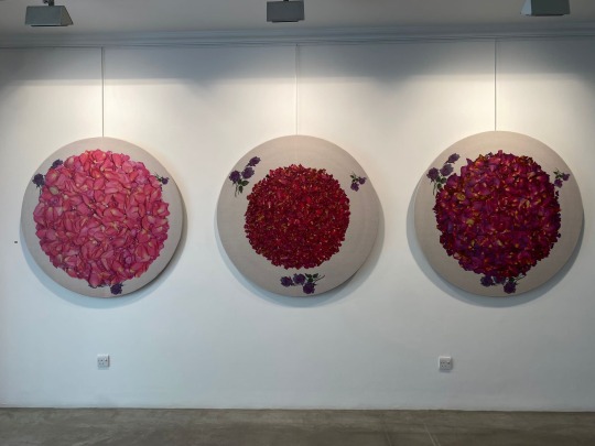
In Nazar’s works there were flowery and pinkish artworks, then there was dark and mysterious ones which was really interesting!
But all of them were rich but so easy on the eyes. What I liked the most was the collection of three large round paintings of petals made with mixed media on rice paper on canvas, called: Energy1,2,3. I am a flowers lover so these paintings had me the moment I laid my eyes on them! I also like his prints work, it was also a collection called Flower of Chemistry. It was like a chain. First a bare face then slowly getting covered by petals, it was mesmerizing!
His other mysterious works were: The knowledge triptych1,2,3, The witness triptych1/3, Wildlife1/3 and straight path. In the last two he included Arabic words and Qura’an which was really beautiful and unique.
14 notes
·
View notes
Text
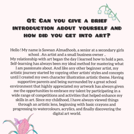
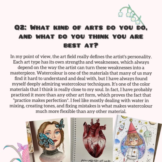
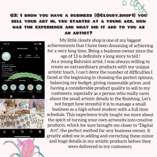
Interview1:
With the young and inspiring artist and business owner:
Sawsan Almadhoob, a senior student.
Sawsan is really inspiring and talented beyond her years, she speaks passionately about art like it’s her lifeline.
I really enjoy doing this interview and I’m really proud of all the young artists out there that are following their dreams and trying their best!
19 notes
·
View notes
Text

Advertisement criticizing:
A meal deal at Pizza Hut advertisement:
Principles of graphic design:
It is balanced. There’s contrast using different colors and textures.
The advertisement presents a deal on the meal shown. It look delicious and appealing which makes the advertisement a good one since it did its job! The colors and brightness reflecting on the food and drink also makes it look yummy.
The font is cool and suitable, the colors of it is also good and goes well with the ad. A little note is that I think the coke looks a little too unrealistic and out of place it could’ve been edited better.
13 notes
·
View notes
Text
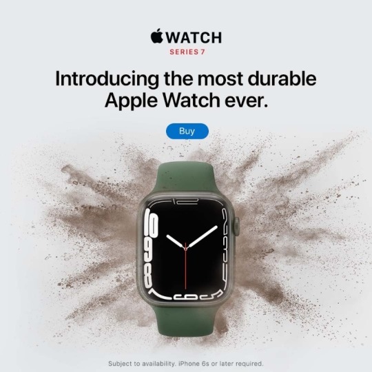
Advertisements criticizing:
Introducing a new Apple Watch advertisement:
Principles of design:
It looks balanced and has some contrast using different colors also in the numbers font in the sizes and thickness. They added emphasis using the strokes behind the watch creating different texture and the empty space in the background.
Apple’s designs are mostly Minimalist. Their minimalism makes them unique. It is easy on the eyes and straight to the point which is better for most people.
Even though the advertisement’s design is good, I think they could’ve chose better colors and fonts. But then they have there own style.
17 notes
·
View notes
Text
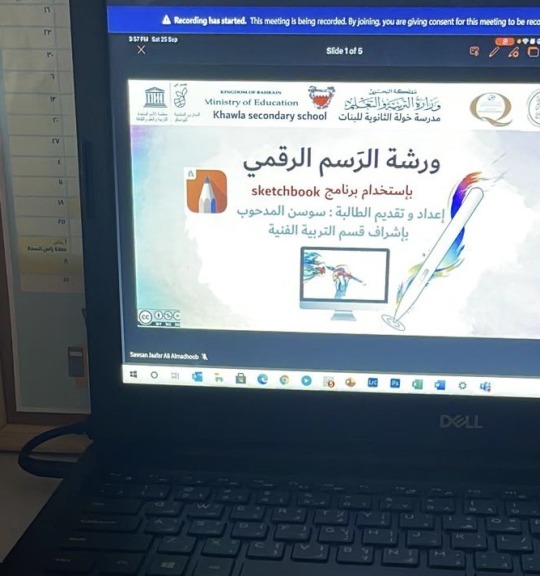
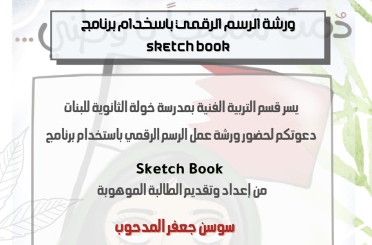
Workshop:
“Digital art workshop” basics and using sketchbook..
Done by: student Sawsan Almadhoob
What was most interesting about this workshop that it was done by a 16 year old student with a talent that blew me away!
The workshop was fun and really helpful for anyone who is starting in digital art, it included basics and how to use the sketchbook program on your pc/ipad/laptop.
She started with the basics, all of the instructions were clear and well organized.
She gave tips about deciding what to draw, choosing the right colors, choosing brushes and getting a neat beautiful artwork!
Then she gave tips about “sketchbook” and how to use it in a way that helps you in your projects and artworks. She explained all the tools and their job.
Then she started drawing a simple thing with us, the participants, everyone was paying good attention because it was really fun and engaging. Then everyone shared their tries and it was absolutely amazing how everyone came up with wonderful artworks just from learning in this workshop for less than an hour!
I really enjoyed the workshop and it was really useful to my knowledge and skills in digital art!
16 notes
·
View notes
Text
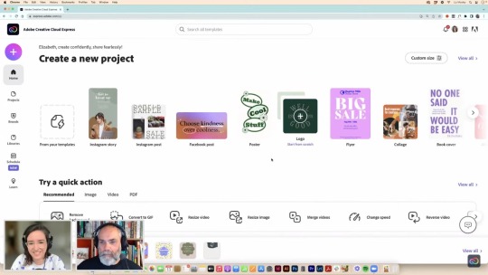
Workshop:
“How to create a branded profile picture”
Creative field: Graphic Design
I joined a short and helpful workshop that was held on May 13th.
It was about how to create a branded profile picture, using your personal picture or a client’s. It started with an introduction done by Liz Mosley and Tony Harmer. Liz started explaining a bit on how to use the Adobe Creative Cloud which was new to me because I’ve been using other Adobe programs but never the Creative Cloud which was really helpful.
Starting by selecting logos, colors and fonts of your choice and that you find suitable.
You can choose the kind of post.
You can upload pictures and choose different kinds of templates which was really cool and interesting. You can add shapes, letters and there’s many variations of backgrounds that you can choose from, solid, pictures and gradient backgrounds ready to use. In addition, there’s also frames that you could use to give more touches to your branded profile picture.
Everything was really clear and the instructions were really useful.
18 notes
·
View notes
Text
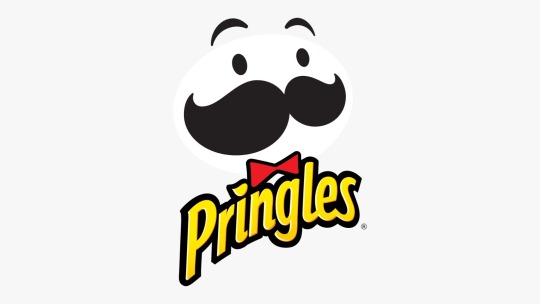
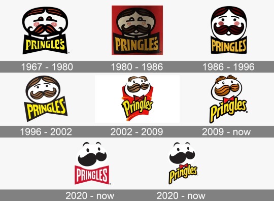
Logo criticizing:

PRINGLES
Elements of design I see:
Lines, curved and straight. Shapes, shapes were used to create the logo as a whole. Colors, yellow, brown, red and white. Typography, name of the company. And small spaces.
Principles of design I see:
Variety, adding something interesting and some contrast. Contrast: using different shapes and colors. Emphasis, the mustache looks bigger than usual mustaches so it draws attention.
Getting deep into the logo:
The logo had many stories of where it came. It features the head of a fictional character. It is essentially a stylized cartoon caricature of Julius Pringles, A beer of the marketing legend. Anyhow, the redesigned the logo to make the logo look like an emoji. It became more modern and up to date because they wanted to target young generations. It became more simple and the hairstyle got changed. I think the color used are interesting and good for a chips logo! The man looks somewhat funny and cute. The mustache is big it draws attention. There is some gradients in the hair and mustache. The font is suitable and I like how the dot on the “i” looks like chips. The font used is similar to Bodega Sans Medium. The letters are close to each other and the last three letters or connected.
@uob-funoon
13 notes
·
View notes
Text
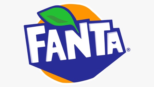
Logo criticizing1:
FANTA
Elements of design I see:
Lines, creating division and hierarchy within the logo. Shapes, there is somewhat of a geometric shape in the back and an organic one (leaf). Colors, orange, blue, white and green. Typography, the name of the company (Fanta). Space, the logo has a few small spaces in some areas simplifying the logo a little bit.
Principles of design I see:
Contrast, there’s color contrast, using cold (blue) and warm colors (orange). Emphasis, I can see that color and lines were used to create a direction or a focal point towards the name (Fanta) which draws attention to it.
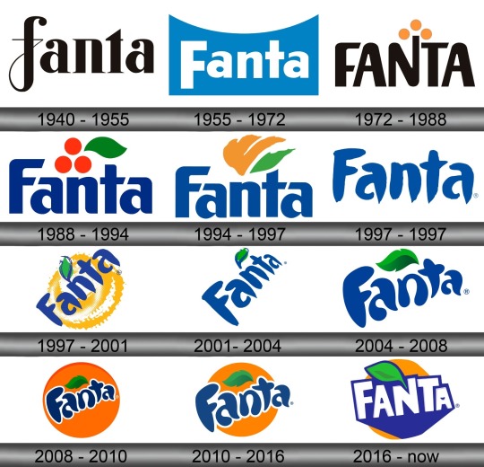
Getting deep into the logo:
After a trip down the changes of the Fanta logo. The newest logo is pointy and edgy. But in my opinion it looks a bit uncomfortable to the eyes, visuals could be better. The font is unique and letters are uneven. It makes sense for the main color to be orange, which is a mix of red and yellow, it represents excitement and enthusiasm. It also is energetic as it is a summery drink!
15 notes
·
View notes