
joaquinpacio
Joaquin Jude Pacio
Photographer and Videographer | JP Films | [email protected] | Philippines
11 posts
Don't wanna be here? Send us removal request.
Last Seen Blogs

astridjazmin33
Mi life is HTTYD💗

snug-the-joiner
Snug

spriteveon
. . . to the skies !
r-pemutt
ur nasty lil brother
spriteveon
. . . to the skies !
Text
Photoshop Journeys: Logo Design Process
For the 5th week of our session, we have learned the Fundamentals of Design and applying them in the Logo Design Process. We see it everywhere, a logo is an image that symbolizes your business, from the colorful application icons in your phone and computer, to the clothes that we wear. The process of making logos is quite a challenge. One must know the basics of design in order to create a logo that is visually appealing to the eyes, and should be in line with what the business is all about.
For our activity, we have been assigned to create a concept logo for “Mindscope”. An application focused on relaxation, with this description, we got to work in creating the logo. Together with my partner Zach, we settled to create a mood board to collect our thoughts on what the logo will look like. Below are following images we have gathered

We struck a common interest in the lotus logo as this represents tranquility and rebirth in eastern cultures. We also settled in having cool colors with a gradient effect. Thus I began sketching my own variation of how Mindscope will look like for me

Above you can see a sketch I came up with for the logo. I decided to go for a pictorial style of logo since this is for an application, majority of applications have eye catching pictorial logos. Keeping the lotus look, this seemed fine to me. All was left was to head to Photoshop to create a vector logo and below is the final result
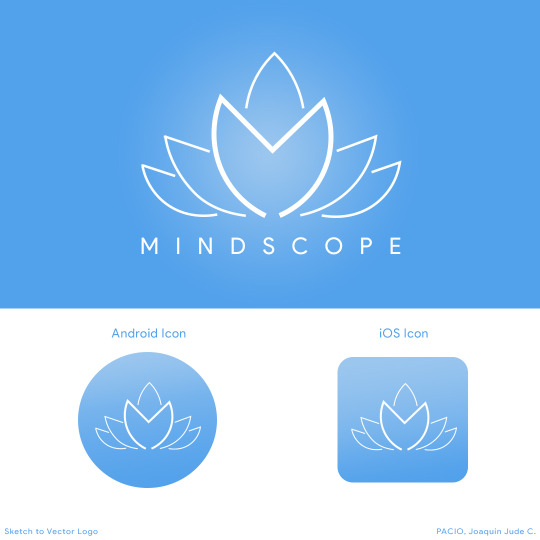
From sketch to a vector logo, with a couple of additions in color, here is my final logo rendition for the app Mindscope. I also decided to show what it would look like as app icons on an Android and iOS device. The logo is a lotus with the center petals being thicker and having an “M” outline as two petals intersect. As I look back to designing this logo, I can see how the fundamentals of design such as lines and color, as seen in my final output are able to help process the imagery of the lotus logo in relation to the application’s description.
0 notes
Text
The Photoshop Journey (pt.1)
For this blog I will be talking about my Adobe Photoshop journeys. I personally already have a background in using Photoshop but mostly for editing photos. I rarely use it for any graphic design purposes, as I am mostly intimidated in doing such work. After a while, I had to learn graphic design too. The good thing about Adobe Photoshop is that it offers a lot of versatility in whatever design one wishes to create. After going through the basics of how photoshop works, we each had tasks to complete using a few techniques to achieve the task and these are enumerated below.
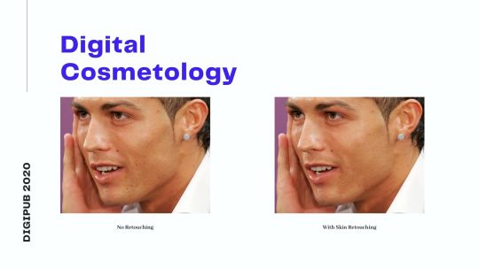
1.) Digital Cosmetology - https://www.youtube.com/watch?v=DmgyRK6H5wk One of the things I love about photoshop is removing certain elements in an image. In the context of photo editing, when a certain subject wishes their facial extemities removed, it can easily be removed using the healing, or clone tool. Though personally, having too much corrections in the face can seem too unrealistic.
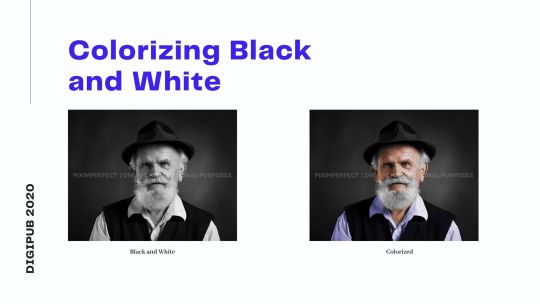
2.) Colorizing a Black and White Photo - https://youtu.be/k5Y8YcKnRm0 What was very surprising in learning Photoshop was the power to colorize black and white images. The process was complicated personally, despite the fact Im into photography. This made me realize that I still had a lot to learn regarding the fundamentals in my photography and color. One key takeaway from this activity is having references when colorizing images, it can be pretty messy if you do not have any references on your designs.
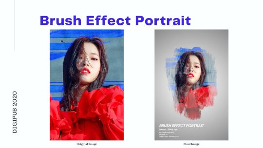
3.) Brush Effect Portrait - https://youtu.be/vFolUHalStc I may be artistic, but I am more experienced in digital art than traditional. Luckily Photoshop can help me in the brush tool. Applying certain brushes can help give off that painting look with proper image manipulation.
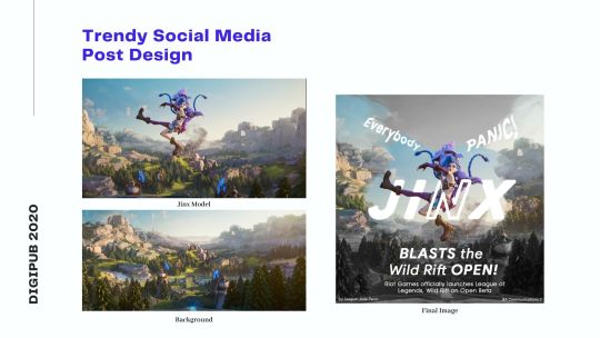
4.) Trendy Social Media Design - https://youtu.be/FEzO2-Iw8vE Upon opening this tutorial, I got surprised because I actually follow some guides made by this channel. For me, this seemed as the culmination of all the tutorials I have learned from the previous activities. At first I really did not have any inspiration, however, on that exact same day, October 28 was the official open beta release of League Of Legends: Wild Rift, a mobile game of which I personally have a passion in playing for on my computer with friends. I mixed the elements of brush effect, and played with a little bit of typography at the end. This just goes to show sometimes inspirations come in the most unexpected places.
There will definitely be more things to watch out for during the Photoshop journey so stay tuned for the next post!
0 notes
Text
Digital Collage
After learning key fundamentals in design, we finally have the opportunity to create digital outputs! For this activity, we were assigned to create a digital collage from certain photos given to us. At first I really had no idea what to do, but after all the lessons on color, and with my previous experiences self-learning Photoshop, I created this image:
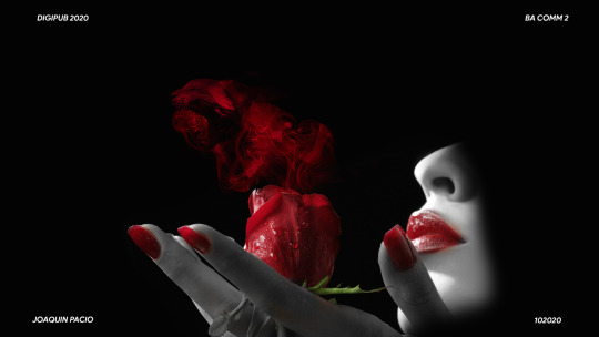
For this exercise I combined around 3 images, one of which I downloaded which is the smoke emitting from the rose, to give it a feel that a certain scent is emitting from the rose, which can be seen by the subtle appearance of a cat. Removing the colors excluding Red was also intentional here given that Red is a symbol of love, passion and with the symbolism of cats as feminine in nature, this photo aims to give off vibes of passion and love as you would when you smell roses.
Personally, I am still new to creating digital outputs from scratch. Normally, being a photographer I just capture the moment and edit the colors. But I wish to learn more digital art styles as I can so I can diversify myself depending on the project I will be working on in the future. For sure I will give my all in improving my works after this assignment.
0 notes
Text
Color Wheels
A while back, we talked about color psychology and color theory and how these affect our process when creating designs, photos, films, etc. As we begin to create our own digital outputs in Digital Publishing, to make things simpler, let’s take a look into the Color Wheels, an illustration made to show the relationship between colors. For this activity, we were to create the color wheels in Photoshop. Colors can be divided into two categories:
1.) Red, Green, Blue - RGB
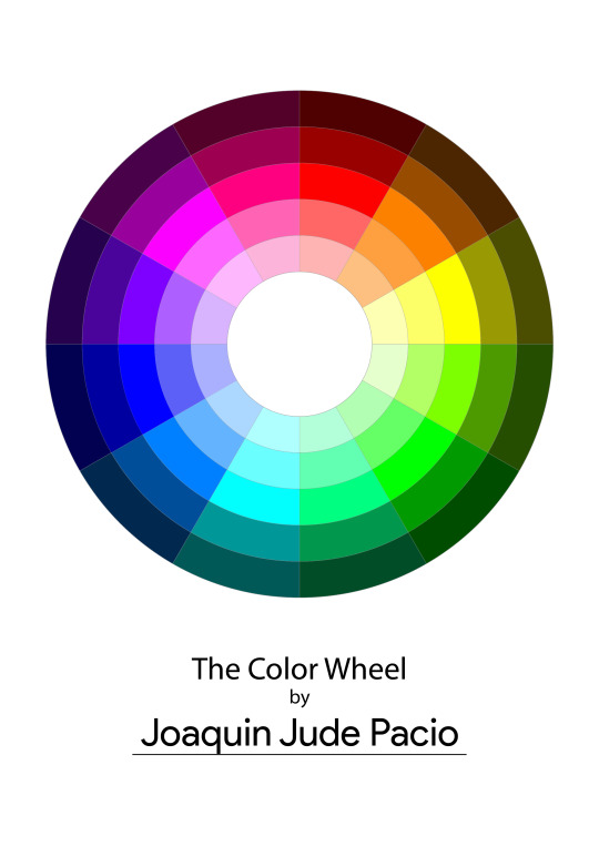
The RGB Color wheel is an additive color model in which the colors Red, Green, and Blue are added together to create an array of colors. This can commonly be seen in outputs for digital displays (Cellphones, Televisions, etc.). To create this color wheel, it must contain the primary colors in this color space which are Red, Green, and Blue. Additionally, mixing the primary colors in this color space creates White.
2.) Cyan, Magenta, Yellow, Black - CMYK

The CMYK Color wheel is a subtractive color model based on the colors used for printing. CMYK refers to the four colors used in printing, Cyan, Magenta, Yellow and Black (Key). As mentioned, it is better to use this color space in your design when printing your outputs.
To wrap up this short post, before we even begin designing in the following weeks of our class, knowing what colors to use from a specific color space, be it RGB or CMYK can affect the output. Should we present our designs on our screens, then RGB is the choice. If we are to print the piece, CMYK is the best option. These small details can greatly affect the way we create our outputs in future works.
0 notes
Text
Image File Types
This week in our Digital Publishing class became quite interesting as we begin to dive into the basics of Photoshop and image manipulation. A key takeaway from this lesson is the topic for today’s blog post. I will be elaborating five image file types I commonly use on my works both in and out of the school as well as providing some examples.
1.) Joint Photographic Experts Group - JPEG

The standard for all image file types. Commonly used in the digital world, .JPEG comes from the committee that created the standard and also other still picture coding standards. Be it taking your next selfie with friends or capturing a sunset on from your phone, to a digital camera, .JPEG is the most convenient form of file format given it’s file size not being too large for one photo. Everybody uses this format, however my personal take is that given it’s small size, it does not give me room to manipulate certain elements in the photo should I wish to change the color, or add other effects. Mostly I export my photos to .JPEG format for posting online whenever I am done editing.
________________________________________________________________
2.) Portable Network Graphics - PNG
This is similar to .JPEG formats, though what makes .PNG’s different is being able to have a transparent and is generally larger and of higher quality. I mostly do this when I do photo manipulations, where I mix multiple photos to create one image. Here is one I made practicing photo manipulation.
________________________________________________________________
3.) Graphics Interchange Format - GIF
We use it often when we send messages to our friends, GIF’s are multiple shots stitched together and rendered in a small size so it can be sent for posting. I personally do not own any gif photo but here is a digital render by tumblr user @flushcrushes. One thing I find satisfying in gifs is that it automatically plays back. When thought carefully in creating the output, it can create interesting results.
________________________________________________________________
4.) Tagged Image File Format
When I edit photos using Adobe Photoshop, a separate file is created from the raw file with all the image adjustments I have added to the raw image. Below is an example of one of my photoshoots, the first photo was edited with Adobe Lightroom for the color adjustments and transferred to Adobe Photoshop, adding light streak overlays. Transferring .TIFF files is easier as this does not require you to export the image when switching apps, saving time and space on your storage.
(1) Color corrections made in Adobe Lightroom
(2) Addition of overlays and effects in Adobe Photoshop
________________________________________________________________
5.) Camera RAW
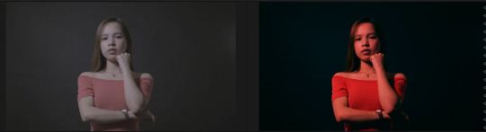
Commonly found in DSLR cameras, the ability to shoot RAW offers a lot of flexibility to photographers as the camera does not immediately process the colors in the image, giving it a flat look. it is only when processing the image in an editing application you can adjust the colors to your liking. Having such feature is helpful for photographers not only for its capability but also having a large file size given that it takes in a lot of raw data from an image from it’s brightness to the colors taken. From the sample above, on the left is the raw image and on the right is the edited image. Originally, the red tint was added during the editing process, the light introduced to the subject was actually a white light.
Knowing the different image file types can help in the conceptualization of a design. As communication students, we should be able to deliver our outputs through which everyone can view and utilize.
0 notes
Text
Color Harmonies
For about 4 years I have explored the creative fields of photography, videography, and even graphic design all without having much formal training, and learning from fellow colleagues and friends who are already working in the creative industry. During this time I realized that to truly create something that attracts the attention of the viewers, I have to start working on my fundamentals. This week in our Digital Publishing class, we have discussed Color Psychology and Harmony and how this affects our daily lives. As creatives, managing color in your work can make or break the creative process.
For this activity, we were tasked to identify the 8 color schemes from photos we have taken. Below are shots which I have taken from a few months ago before and during quarantine and I will do my best to identify the color harmonies within these shots.
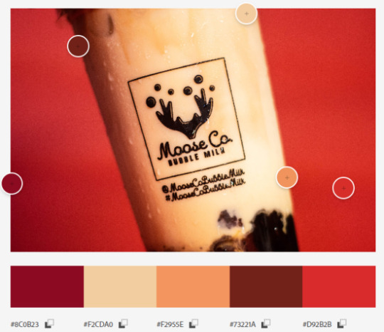
1.) Analogous
The term analogous refers to having analogy, or corresponding to something in particular.
It was awhile back after finishing work for AdZU’s Virtual Orientation Seminar, our project head decided to treat us with Moose Co Bubble Milktea, a popular Milktea brand gaining huge popularity here in Zamboanga which our instructor, sir Ced Zabala owns the establishment! Taking out some leftover cartolinas at home, I tried to do some product photography using the red cartolina as a backdrop. Little did I know I have already created an analogous color combination from the colors of this milktea and it’s backdrop. Indeed satisfying to my eyes and quenched my thirst easily!
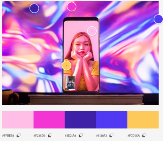
2.) Complementary
any two colors which are directly opposite each other
It has been months since the beginning of quarantine here in our area due to the COVID-19 virus, and I was finding ways to create amidst not having any physical contact. There was this particular trend online where photographers would conduct online photoshoots wherein they would make a video call and the model will pose according to the photographers’ instructions. I decided to test this out with one of my close friends, Desree Macrohon. I placed my phone behind my computer monitor emitting a bright holographic photo which complements the bright vibes from Desree’s room as I took the photo.

3.) Split Complementary
Instead of using a complementary color, two colors placed symetrically around it on the color wheel are used
Rolling the camera roll back to 2019, I had the chance to attend one of the Philippines’ most popular artists, Ben&Ben again during the Zamboanga Hermosa Festival. This time, I was just another member of the audience. Though I had no professional gear with me, I decided to take some shots using my phone. Ever since my first concert shoot with Ben&Ben it seems that their stage lighting always had this split complementary look of bright and cool colors. Recalling my color psychology lesson, the atmosphere the lighting gives us the harmonious and energetic vibes that the band gives off during their live performances.
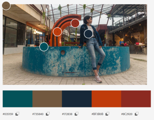
4.) Double Complementary
when two hues (colors) are next to each other on the color wheel and are paired with two adjacent hues on the opposite side.
Going further back, during our Christmas break, a couple of friends and I decided to go out and do an outdoor photoshoot. We really did not know where to go but we told our model KC to wear casual. Without any clue what she would wear, we decided to meet up at Yubenco Tetuan, the long roads and establishments there would offer good choices depending on the attire of our model. Luckily she wore denim giving us a good opportunity to shoot near some restaurants. We chose a location where there would be another cool color so it complements her outfit, we then found this pond in between some restaurants, and with the red structure in the middle of this pond, this color can catch the attention of the viewer, plus the rustic environment just fit perfectly for this shoot.

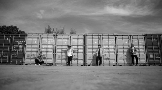
5.) Triad
A triadic color scheme is comprised of three colors evenly spaced on the color wheel
This shot was taken during the music video making for one of Zamboanga’s top rising local bands, Peregrine. After working awhile attending their gigs and taking photos of them, I was offered to take part of their creative team for their music video release for one of their songs, Half-Hearted. Looking back to this shot, it was nice to see the guitars able to stand out amidst this abandoned setting. This shot was originally in black and white, it was only during post-production did I see this triadic harmony occur from the color of the ceiling, the guitars and their outfits as well.

6.) Warm Colors
During the first week of classes for the year 2020, as I was strolling down the walkways of our school, I came across this patch of sunflowers blooming at the side of a school building. Coincidentally, my orgmates were looking for me asking to take photos of them in this sunflower patch. Again having no camera at the time, I took out my phone and took some shots of them. At this point I knew a little about utilizing colors, so I asked to borrow an orange sweater and let Sophia wear it for this shot, thus giving this warm feeling.
7.) Cool
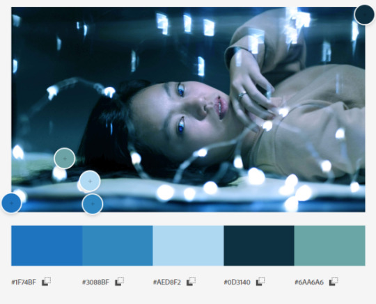
On Sundays, I would head down to one of my photography mentor’s studios and would talk about photography and other parts in the field. I decided to bring along one of my colleagues, he decided to bring his sister along so we would take some photos as well. We took some fairy lights and went for this dreamy concept. Something I find very fond of doing.
8.) Monochrome
Monochromatic color schemes are derived from a single base hue and extended using its shades, tones and tints.
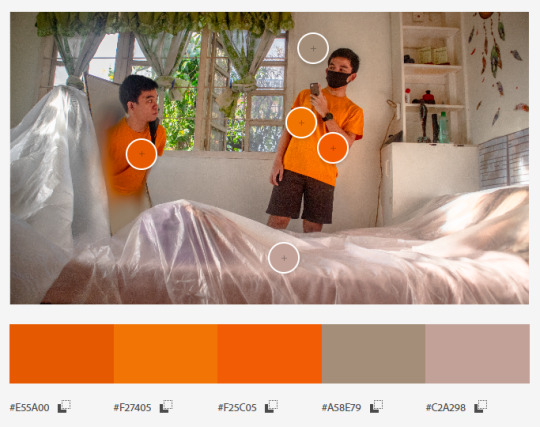
After going through all my shots, the most frequent theme I notice when I shoot is having a monochromatic look. This was a self-portrait shoot I took in one of our bedrooms. During post production I decided to tweak the lightness of my yellow shirt on the left making it a little darker than my one on the right.
0 notes
Text
LOONA’s Color Psychology
Colors serve as the extension of our personality and a way to express ourselves to others. For artists, colors can help connect their work to their audience. These can be either subtle elements or even elements which stand out in their outputs. Regardless of medium, proper use of color is important in all aspects of our lives, physical and digital.
K-Pop, at first, I looked down upon this genre of pop culture. Until I inevitably got obsessed with it, but not for the reasons why many people are into the genre. When the rest pay attention to the artist in their music videos, I pay attention to the camera movements, angles, transitions, lighting, and many more details placed in the production. One particular group stands out for such attention to detail in both performance and aesthetic, Blockberry Creative's "Girl of the Month" (kr: 이달의 소녀), or widely known to the world as "LOONA". Thus, for this activity I decided to go over the color psychology in LOONA’s music videos.
Before debuting as the full group, Loona debuted each of it's members with a solo album beginning October of 2016 until December of 2018, giving them a spotlight to showcase their charms and talents. This project was so ambitious that each member has even been assigned a representative color, animal, and even fruits. For this activity we will be looking into only 10 out of the 12 music videos as per required for our activity, but I will leave a link to all of the members' solo albums below.
*Disclaimer - There are some of these shots in which a member is not primarily showcasing their representative color assignments*
Heejin - “Vivid” - Yellow
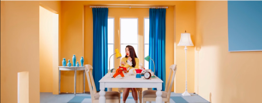
In this particular shot we can see the artist, Heejin with a yellow outfit within a yellow painted room with accents of blue in other areas of the room. This gives off a vibe of optimism, positivity, and freshness. Being the first girl to be officially under Loona, delivering a fresh concept to the scene.

Haseul - “Let Me In” - Grey
We're going to fast forward to the third member Haseul, with her solo music video entitled "Let Me In". This shot is mostly gray and and black colored, giving off the feeling of dullness and bitter cold, and isolation. This music video was actually filmed in Iceland.
Vivi - “Everyday I Love You” - Pink
Winding it back to a 90's themed aesthetic, Vivi's charm can be clearly seen in this shot with accents of bright pink and light blue in this shot are usually common colors used when doing retro concepts. These bright colors help express Vivi's softness, kindess, and love.
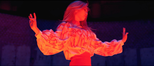
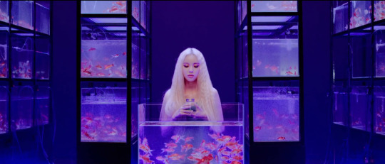
Kim Lip - “Eclipse” - Red
With her representative color being Red, Kim Lip seems to express it with ease as the intense color of red associates to confidence, authority and passion. Similar to pink, red can also express feelings of a more passionate and mature form of romance.
Jinsoul - “Singing in the Rain” - Blue
A music video filled with never ending blue, Jinsoul's serene and cool charms are seen in this shot, delivering calmness and depth. As blue is my personal favorite color, Jinsoul is also actually my bias among the Loona members!
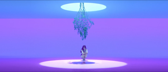
Choerry - “Love, Cherry, Motion” - Purple
Purple can be associated with ambition, mystery, and magic. This shot from Choerry's music video delivers such eccentric feelings, detaching our thoughts from reality with such abundance of purple in her music video. As one of the youngest members of the group, Purple is indeed the perfect representative color given her cheerful and whimsical nature.

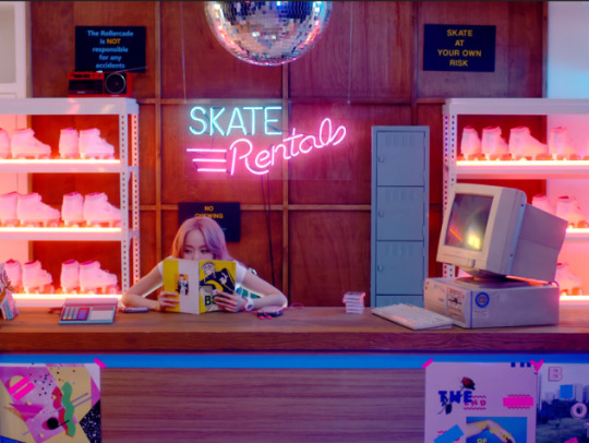
Yves - “new” - Orange
With the color orange having the energy as passionate as red and as bright as yellow, Yves can be seen in this shot dancing with such enthusiasm you just cannot turn away from her.

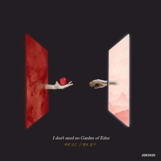
Chuu - “Heart Attack” - Green
While green can mostly be associated with wealth and harmony, it's negative effects give off feelings of envy, greed, and inexperience. Though Chuu wants to gain Yves' attention by offering her a green apple, perhaps it would be better if she tried different methods to gain her attention.
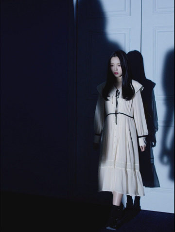
Go Won - “One&Only” - White
Wearing a white dress which represents purity and innocence, Go Won seems to be scared as two dark shadows approach her. As black can be associated to evil and mystery, perhaps she intends to remain pure.

Olivia Hye - “Egoist” - Black
Taking place in an abandoned factory, lay Olivia Hye in a black outfit. As mysterious as the shot looks, the abundance of black gives a feeling of mystery, somewhat evil and perhaps death.
________________________________________________________________
Looking back to these shots, the use of color psychology in the production of these videos helped affect the way we see the girls and their individual charms. Though we may not feel it most of the time, colors can and will make us feel things and help connect one another. As a Communications student, regardless of profession I may take up soon, be it photography, videography, perhaps both, understanding color psychology is essential when creating various outputs so that there is a connection between the audience and me when I showcase my work.
Should you want to view these videos for yourself, you may open this Youtube playlist below:
https://www.youtube.com/watch?v=-FCYE87P5L0&list=PLn1GA3tkejwAufhKKo7DDhPIGf1Xeb0V7
STAN LOONA!
Video Footage taken from Loona’s Official Youtube: https://www.youtube.com/channel/UCOJplhB0wGQWv9OuRmMT-4g
3 notes
·
View notes
Text
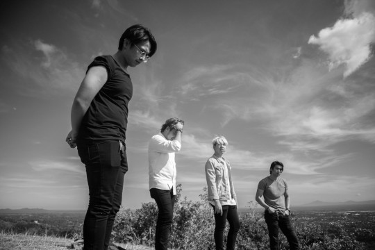
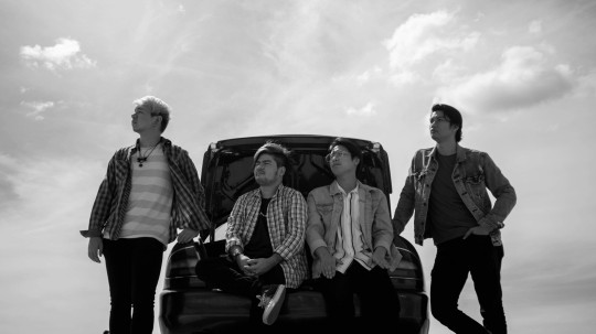
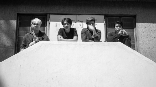
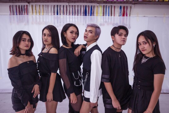
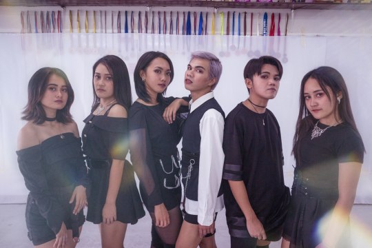
Photoshoot with Peregrine PH
Taken last January 2020
Links to Peregrine PH are below
0 notes
Text
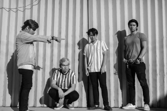
PEREGRINE - HALF HEARTED - Teaser Video 1
Filmed in promotion of Half Hearted Official Music Video
Links to Peregrine are below
0 notes
Text
EVERGLOW - DUN DUN Dance Cover by Universal Cover Group
Produced last February 19, 2020
Full video below
1 note
·
View note
Text
CHUNG HA - GOTTA GO Dance Cover by Jianne Wee
Produced last March 1, 2019
Full Video below
youtube
1 note
·
View note