principlesandpractice-vis4051
ArmaanKhaliqmodule-2
VIS4051 Principles and Practice of Graphic Design
81 posts
Don't wanna be here? Send us removal request.
Last Seen Blogs
you-are-paining-me-aa
I WANT TO SEE YOU ONE LAST TIME. 11.05

msmorgenmuffel
Untitled
so-tired-of-dying
So Tired Of Dying

antonioebangelista
Untitled
reticulating-splines
Imaginary Infrastructure
Text
Reflection
I think through this project I am starting to understand a lot more of what makes a good design. Through all the lectures and the research I am doing at home I feel like this is making my knowledge even better. One thing I 100% want to work on is to start doing more physical experiments as I don't think I achieved this.
2 notes
·
View notes
Text


Here I broke down my research into their own categories so it helps me decide on which one I want to pick. In my opinion I think I would like to research more into bullying or sexual health because these are big problems are still going on in the world. I also think that these need to be heard out more.
0 notes
Text

To help me decide which topic I would like to pick for the brief I jotted down 16 causes that's a problem in the world. I then decided to pick 5 of these and research a bit about them. The reason I created my notes like this is because it helps me break it down and makes it easier for my mind to think.
0 notes
Text

Study Tips...
Work in short bursts.
Set 25 minutes timer to manage your time.
Take breaks and then repeat the step again.
Make time to reflect back on previous work.
0 notes
Text
Lecture Notes 29.11.22
Capture Research using bookmark
Look into Creative Review
Design Week
Find 2 research links by 2pm and think about design and how all the elements work together. in addition to this, think about how the work was constructed and etc.
0 notes
Text
This is my final motion. I typed out the word using a nice bold Helvetica font and then created a black box that would move left and right. I then got this to play by screen recording the screen.
0 notes
Text


Here the task was to create a motion without using any softwares that makes animation.
0 notes
Photo

Final Outcome of 18/19
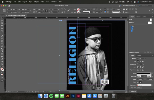
Here is my final outcome of my magazine cover. I was really happy with the outcome and I think it looks really good in my opinion. The reason why I am happy with this is because I think the colours work well together and the type fits in well with the design. I chose the colour Blue as it connotates trust, loyalty, faith and inspiration. This all fits in with my word ‘Religion’.
0 notes
Photo


Origninally I chose the colour red to work with however I felt like the colour just made it look to sinister, which is the defiantly the look I am not going for at all. I also decided to change the font as it reminds me of a horror movie and that's the opposite of my work.
0 notes
Photo
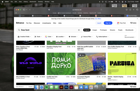
Some research on choosing the font that I want to add to my magazine cover. I looked at a few websites including Behance. I like how Behance has a variety of choices that look different.
0 notes

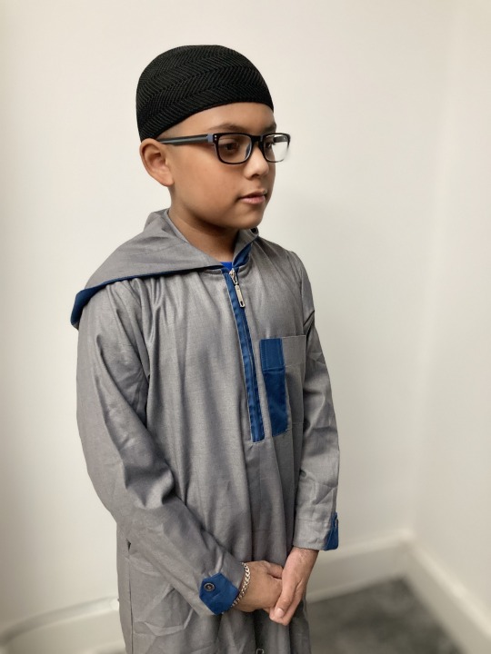
Photo

So after considering we chose to go for this photo as the contrast worked really well and it works well with the eye for the audiance.
0 notes
Photo
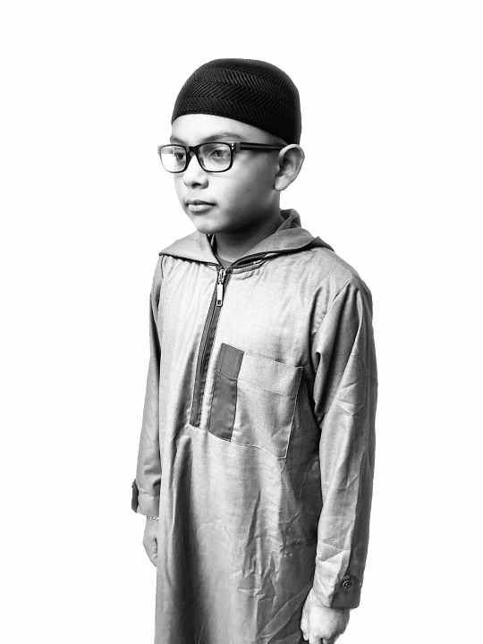


As I couldn't attend the lecture today I was committed to work at home by myself. So here I captured some photos on my Phone that I could use to create my magazine cover. I chose to have my brother to we are a thobe and a mosque hat to represent my religion Islam.
0 notes
Photo
Here is our task for this week to complete and get done.
0 notes
Photo


Final Outcome 15
I wanted to create something funky and just to play around with photoshop. I like the one on the right side as it makes me think retro 80s or 90s look. I also like how the colours are black and white as it creates a sense of sense of emptiness and sadness.
0 notes