sammakesthings
SAM MAKES THINGS
Art, animation, and writing blog of @saminthecan
92 posts
Last active 2 hours ago
Don't wanna be here? Send us removal request.
Last Seen Blogs

superkisa
superkisa
feaicons
Fea
ezelinherseyironi
ezelll

shk-21
summer here kids
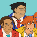
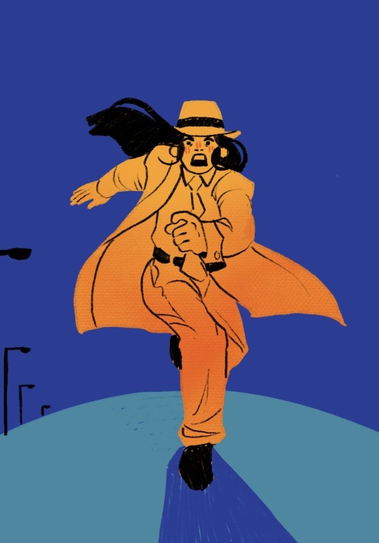
attorneys-against-court-violence
Have you seen my badge?!
Text
I draw too many bust shots lol. Will definitely be doing some full body mercs soon
0 notes
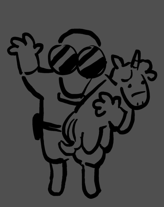
Text

another messy thing from when i was supposed to be working on actual work. I picture Ms Pauling is taking their picture. Their asses did not stop that cart
159 notes
·
View notes
Text

very sloppy study-turned-not-really-a-study-anymore of that one sniper headshot that pops up first whenever you google tf2 sniper
I will not be polishing this i have so much work
180 notes
·
View notes
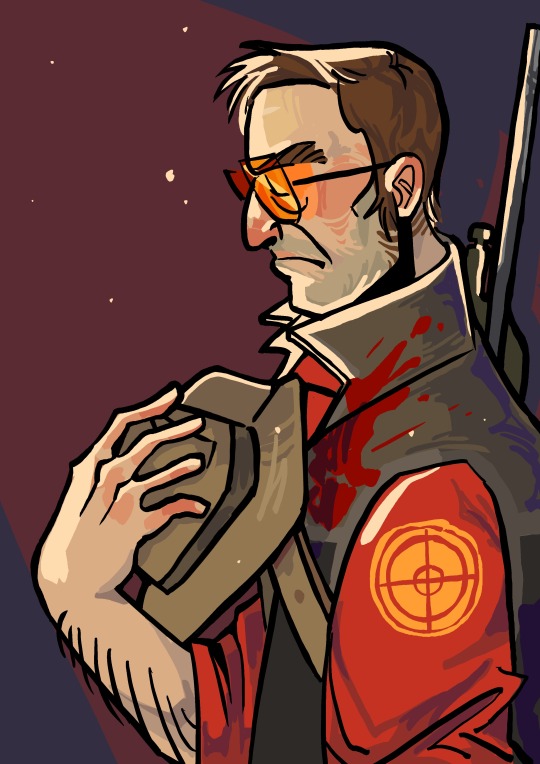
Text

“Now, this won’t hurt one bit.” 🫀
I’m so tired of staring at a screen that I almost didn’t want to come here and post, but my stronger will has triumphed. Alt versions and process work will be dropped later though…
498 notes
·
View notes
Note
catboy demoman 😇😇 please?

LET’S DO ITTTTTT!!
176 notes
·
View notes
Note
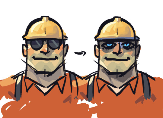
Hi, not a request, just wanted to ask what program you use for your drawing? Your art is wonderful, I really love it. I've been trying to learn how to do the FX like you did in the "Be Polite" piece (the rainbow-y effect on the outline specifically.) If you would be so sweet as to share your process or at the very least a few tips to guide me in the right direction, I would appreciate it so much <3
Of course! I use Procreate for all of my digital art, which if you don’t have already, is totally worth the $13; it’s super versatile, not to mention satisfyingly easy to navigate. If it interests you, I use this Syrup brush for pretty much everything, including the Sniper piece (just crank the stability way down in settings).
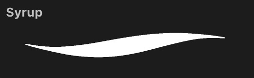
But anyway, the FX! Unfortunately, the effects I used on this particular piece came specifically with Procreate, and as I am not as familiar with other programs, I could not tell you whether they possess the same features or where you could find them.

Halftone will give you that “comic book” look, while Chromatic Aberration produces the rainbow one you asked about; you can adjust each to your liking.
However, I do remember a little trick from when I did not have Procreate that might give you what you’re looking for. I got some lines:
Duplicate this layer a two or three times, then set each of these duplicated layers to Alpha Lock and color them each red, green, and blue, or whatever you’re going for:
Offset each of the layers in a different direction from the original line work. I put blue off to the left, red to the right, and green a little upwards.

If that looks a little whacky, then play with opacity and layer settings (I used 50% opacity and Color Dodge).

And now we have Pyrovision. It kind of does the trick, and hopefully this is helpful knowledge! But who knows maybe you already found this tip
As for my process I will probably create a separate post, if that appeals to you. Thank you very much for the ask, it makes me really happy to see some interest my stuff. Have a nice day! :-)
11 notes
·
View notes
Note
I'm sorry but I need to say I diacoverd ur account 1 day ago and I'm in love with your art your art style ur one of my favorite blogs because WOAH WOWOWOWOW !!!!!!!!!!!!!! (TдT)
Art is so creative and original Annd the colors the blending PERFECT I LOVE IT👏👏👏👏🎉🎉🎉🎉🎉🎉🎉 C: BIG SMILE 1000000/10 MASTERPIECE 💞💞💞💞💞
AWWW thank you!! This absolutely made my day :’-) I love your style too, it makes me so happy! Follow @twizzlerr for more amazing tf2 fanart and especially Texas Toast 💖
4 notes
·
View notes
Text
please give her brown contacts, I’m shaking
368 notes
·
View notes
Text

hallo dummkopfs! A little WIP
And a little Miss Pauling for the wait!

13 notes
·
View notes
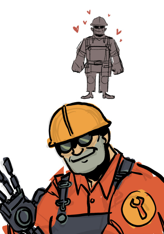
Text

Professionals have standards.
[Alt version / no FX under cut]
994 notes
·
View notes
Text

you’ll never guess which one of them actually has a PhD
#team fortress 2#tf2#tf2 fanart#tf2 medic#tf2 engineer#I don’t really like how medic looks here#but it was my first time drawing him so??#yay
47 notes
·
View notes
Text

another doodle from while i was watching Emesis Blue, this time actually related to Emesis Blue. Idk why he’s sleeping, probably just a long terrifying day
248 notes
·
View notes
Text
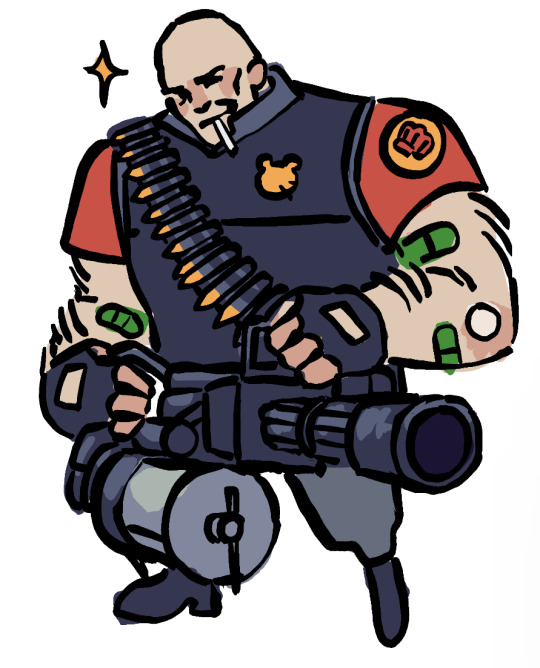
my first team fortress fanart! Watching Emesis Blue rn :-)
#i’m scared#what’s happening#I kind of wasn’t paying attention#I’m not good at multitasking#tf2#team fortress 2#tf2 heavy#art#tf2 fanart#that’s a medical lollipop btw#not a cigarette
46 notes
·
View notes
Text

the next book… the next book…
986 notes
·
View notes
Text

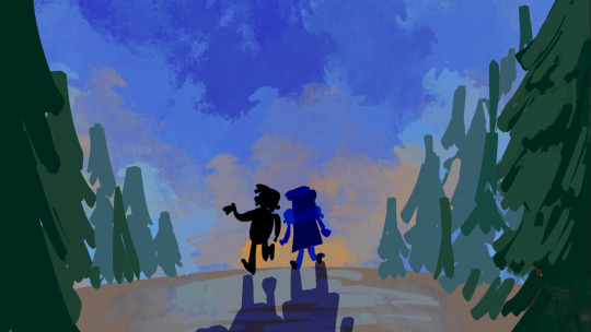
Concept sketchies for a school short film just in case my vision for it never sees the sun
8 notes
·
View notes
Text
Reblog if people are literally ALWAYS allowed to make fanart/headcanons of your characters and tag you!
4K notes
·
View notes