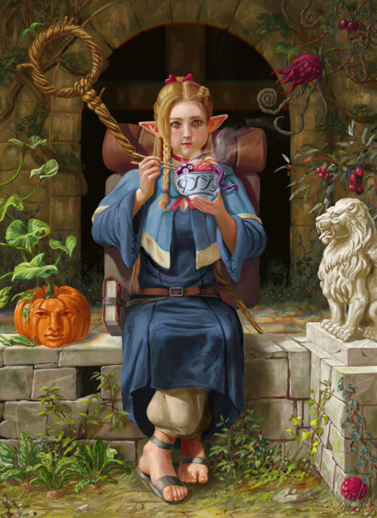
#best archival quality prints
Text

Art has the power to captivate and inspire, making it a desirable investment for both collectors and art enthusiasts. When considering art purchases, one aspect that often goes unnoticed is the quality of the print itself. However, the actual value of archival quality prints lies not only in their aesthetic appeal but also in their scientific background. And this article will delve into the fascinating world of these prints and explore the scientific principles and techniques that contribute to their longevity and preservation.
#Dick herman#Dick herman photographs#decorations photographs#photographs#photography#photoart#archival quality prints#Archival quality prints dick herman#Archival prints#best archival quality prints#nyc archival quality prints#usa#nyc
0 notes
Text
Chiho Saito’s 1999 Revolutionary Girl Utena Original Illustration Collection
IT’S HERE. IT’S DONE. IT’S FINISHED. NOW…IT’S YOURS. Happy Holidays, my friends.
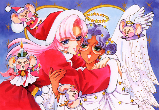
Vanna here! I have posted some already about this project, and the responses I got, public and otherwise, have been absolutely incredible. Y’all have been reblogging and hyping this before it even finished…I haven’t felt so encouraged about an Utena project since the musicals! (Yes, streams soon, I promise.) You can read the other post to get more details, and catch my post here with more details about the process if you’re interested. The long and short of it?
This is the first artbook I ever scanned. I did it in 2001. In Photoshop, using multiple scans per page that took hours to process. But it was 2001. A half megabyte file that was 1250px wide was considered extremely hardcore and impressive. That’s just always been the business I’m in when it comes to Utena art, you know?
It’s now the latest artbook I’ve scanned, and so much of the process, and effort involved, is unchanged. What has changed, is the result. Welcome to your new desktop background. Your new phone background. Your new poster print.
What I’ve done here is attempt to create definitive digitized images of Chiho Saito’s work as offered by this book--I have removed the print moiré of the original scans, and used my literal decades of experience to try and tease out as much information from them as possible. Without being physically in front of the original artwork (which is a thing I’ve had the great fortune to get to do) this is The Most Chiho Saito you are ever going to get. I’ve tried my best to make sure there is a way to get it that works for everyone:
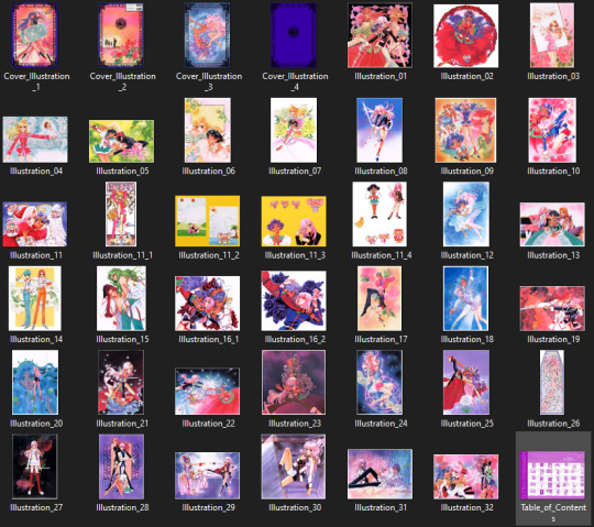
Do you just wanna scope 'em out? Look at some disaster gays? Grab your favorite one or two? This is the path for you! Check out the ‘compressed’ (not very) 10k ‘web friendly’ (not really) copy at the Bibliothèque, the media archiving wing of the Something Eternal forums at Empty Movement*. All the following links are also available from here.
Do you want these copies? All of them? Don't just grab them individually, friend. This batch is 375MB and can be downloaded as a zip of the individual files here on our Google Drive.
Do you like digital archiving? Are you looking for a copy that preserves the archival quality of the effort but sits nice and comfy in a single file? This is for you. A minimally compressed 10k, 513MB version worked into a PDF is now up, shiny and chrome, on the Internet Archive.
Do you like the idea of the minimal compression, but want the individual files in a zip? Yep I did that too, here's the drive link.
Are you looking to print these in a larger size? This is probably the only reason on Earth you’d ever want them, and yet a bunch of you are going to go straight for these. Here are the zero-compression JPG full size copies, most of them are 15k across, like simply a ridiculous size. Pick your fave and download it from our Google Drive!
I am genuinely really proud of this work.** I was able to tease out so much new detail from these…her incredible layering techniques, the faintest brush of her highlights, and the full range of her delicate hand at whites and blacks… details commonly lost in digitization. I sincerely hope you find something here that you’re looking for, as an artist looking for inspiration, as a weeb looking for a desktop, as an archiver excited to see incredible 90s manga artwork saved forever in the digital realm. I feel like I have already said so much about them, and could keep going, but you know what? This work speaks for itself. Enjoy, use, explore, and definitely tell us what you think!
We love y’all. ~ Vanna & Yasha
* AHEM ASTERISK AHEM
You might be wondering what any of that is. Something Eternal? Biblewhatawhat??? EmptyMovement.com? You might even have done a double take at the word ‘forum.’ And you should!!!
I have a confession. This artbook was my ‘side project’ as I worked on this, *the main project.* For a couple years I’ve been banging around with a new domain, and originally I had other plans for it, but Elon Musk ruined my Twitter and Discord is well along on its way to enshittification, and well….we joke on the Discord a lot about ‘reject modernity, embrace forums’ and you know what? We’re right. So Yasha and I are putting our money where our mouths are once again, and doing something insane. We are launching, in 2023, a website forum. Obviously, this is not the official ‘launch’ per se, but I cannot announce the artbook without directing you to the forum, since it sits on the attached very cool gallery system. Oops! Told on myself. Another post more focused on the forum will be forthcoming, but if you are just that motivated to get in right away, you absolutely can! (This will help stagger new arrivals anyway, which is good for us!) If you would rather wait for the ‘official’ launch, by all means that’s coming, including a lengthy screed about how and why we’re doing this. In either case, remember: this is a couple weebs trying to make internet magic happen, we are not website developers by trade. Give us grace as we iron things out and grow into this cool new website thingie…hopefully along with some of you! :D
If you do join up, naturally, there is a thread about this project!
** If you like this kind of content, consider helping us pay for it! We do have a Patreon! If you’re wanting to use these in some public-facing distributive way, all we ask is for credit back to Empty Movement (ohtori.nu or emptymovement.com, either will work.)
I would like to say ‘don’t just slap these files on RedBubble to get easy money’ but I know that saying this won’t effectively prevent it. Y’all that do that suck, but you’re not worth letting it rain on the rest of this parade. :)
#revolutionary girl utena#utena#rgu#sku#empty movement#chiho saito#90s manga#digital archives#manga aesthetic#shoujo kakumei utena#utena art
2K notes
·
View notes
Text
Well-Meaning Interventions
Here are some frequently encountered DIY repairs that, while well-meaning, are, alas, misguided interventions that exacerbate damage and some alternative approaches that better promote ongoing usability.
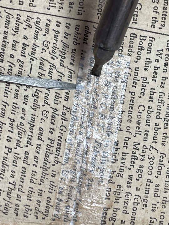
While scotch tape is great for wrapping presents and many other tasks, when used on book pages and documents it typically creates problems. The adhesives in clear, pressure-sensitive adhesive tape tend to degrade and discolor over time, resulting in significant damage to the paper. A clear example of degraded tape damage is this 1862 letter from Confederate soldier M.A. Harvey to his wife, “My Dear Eva”.
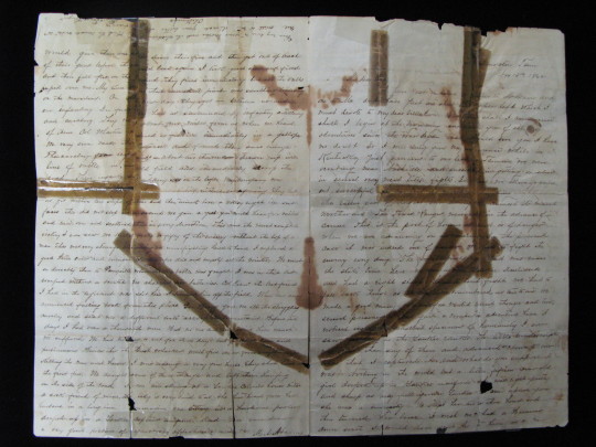
While this letter would have been relatively straightforward to mend with kozo paper and paste, the tape caused permanent damage, and days of work were required to stabilize the letter so that it could be mended appropriately.
When the boards of a beloved volume become detached, simply applying duct tape to reattach them might seem like a swell solution.
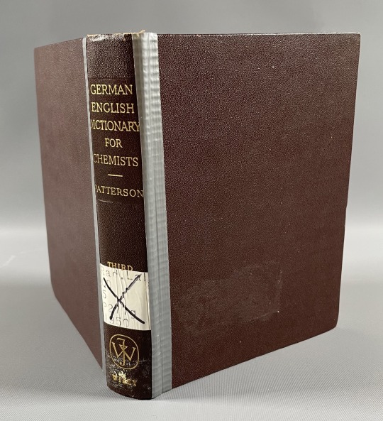
Though duct tape can temporarily reattach book covers, it tends to create significant damage and shorten the book’s lifespan. Similarly, where the spine of a book has become loose or detached, at first glance it might seem that adhering a loose spine covering directly to its text block would be a simple fix.
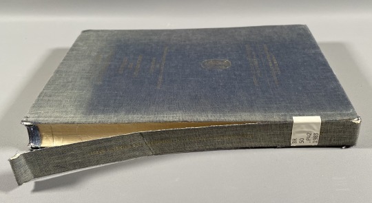
However, the spines of most modern books are not actually glued to the spine of the text by functional design. Adhering the spine covering directly alters the book’s mechanical structure and impedes its functioning, resulting in stress points that create further damage as the book is used.
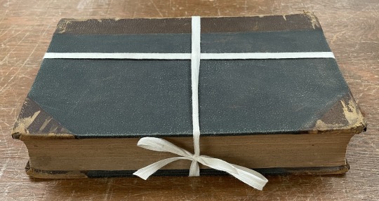
In order to retain loose book covers or spines, consider tying the book with cotton twill tape, positioning the knot along the head, tail, or fore-edge of the book.
Even better, alkaline book boxes from a preservation supply vendor offer protection from further damage or loss while helping to moderate acidic degradation processes. The repair of books that one wishes to remain functional over time is best left to trained conservators or technicians. For further preservation resources, preservation supply vendors, and information on locating a conservator, see the Hesburgh Libraries Preserving Private Collections guide.
Applying leather dressings such as leather conditioner, neatsfoot oil, or shoe polish to leather books hampers their preservation. While one may enjoy the appearance of polished leather spines in a bookcase, in the short term, leather dressings may darken leather and over time tend to further dry out the skin as well as cause stickiness and/or significant discoloration to the leather, known as leather bloom.
If a leather-bound book is exhibiting signs of leather decay such as red rot (crumbling leather that creates a dusty mess that can transfer to the book pages during use), consider ordering an archival alkaline box for the book or consulting a conservator for further advice on preservation and treatment options.
Using books as a place to “preserve” newspaper clippings, flowers, etc.
Placing newspaper clippings or other items inside the protective pages of a book might seem like an ideal place to keep the item flat and secure. However, most newspapers are printed on poor-quality paper that quickly becomes highly acidic, and over time this acid will migrate into the pages of the book, chemically degrading and visually staining them. A more effective place to store treasured clippings is within alkaline folders that offer both chemical and physical protection.
828 notes
·
View notes
Text
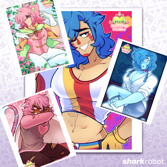

The posters designed for the Norwich Anime & Gaming Convention are now available at Shark Robot for everyone worldwide to purchase! The SFW and NSFW variations are available separately for purchase, and each poster is printed on premium luster photo paper with archival quality inks. They also come in four size options to choose from so you can ensure that you have enough space to admire these bad (and good!) boys:
$9.95 USD - 8" × 10" (20.32cm × 25.4cm)
$12.95 USD - 10" × 13" (25.4cm × 33.02cm)
$13.95 USD - 12" × 16" (30.48cm × 40.64cm)
$14.95 USD - 16" × 20" (40.64cm × 50.8cm)
Additionally, Hatter Jack has returned as a sticker, in case you missed the run for the Patreon Hoodie! Single die-cut sticker are sized 2.95" × 3.09" (7.493cm × 7.8486cm) and retails for $2.95 USD.
Posters
Bachelor of the Month - Prince Blossom's Blossoming (Prince Blossom)
Originally designed as a convention souvenir, our princely mascot Prince Apfel Octavius Blossom The Third basks in the floral delights of his hidden rose garden. Perhaps, is he beckoning you to come closer? You would do well to oblige your lord~ (Looking for the NSFW variant? Purchase it here!)
DachaBo - Rude Awakening (Simoun)
Originally designed as a convention souvenir, this little meow meow doesn't appreciate his beauty sleep getting interrupted. The least you can do is let people know when you're gonna barge into their nap corner, okay!? Not like he wants to see you, a-anyways... (Looking for the NSFW variant? Purchase it here!)
Gallagher Mansion - Elias' Sunday Best (Elias Gallagher)
Originally designed as a convention souvenir, our dearest departed Elias Gallagher is getting ready to put on his Sunday clothes. Oh? It seems like he's noticed you looking... Well, he's certainly not displeased~ (Looking for the NSFW variant? Purchase it here!)
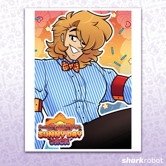
Sunny Day Jack - Wave For The Camera (Jack)
Originally designed as a convention souvenir, your best friend Sunny Day Jack is here to say hi! All eyes on the star of the show, after all. Why don't you wave back? (Looking for the NSFW variant? Purchase it here!)
All purchases of merchandise from our Shark Robot catalogue further supports development of our series! You can view the full catalogue here at our vendor page.
#somethings wrong with sunny day jack#sdj#sunny day jack#dachabo#the groom of gallagher mansion#minors dni
473 notes
·
View notes
Text
There's a project related to my interest in Warhammer that I've wanted to do for quite some time, but I know I'll never get the chance to actually do it. At least, not properly. And it involves... I think "historical preservation" is probably the best word for it?
See, I like to occasionally sift through my collection of old "out of date" rulebooks and army codex books from earlier editions of 40k. The sort of things that have been out of print for many years. Games Workshop hasn't sold these books in 2 or 3 decades, and they've all been supplanted by the current rules. And I do this because I think it's interesting to see how the game - in both crunch and fluff - has changed since 1987.
More beyond the break...
For example: the different ways the galaxy has been depicted in 40k between the different editions. In the first rulebook, when it was still called Rogue Trader, all we got was a small, almost abstract, image on the bottom of the page. The 2nd edition rulebook that came out in October 1993 (specifically, the Codex Imperialis book) had a two page spread, but it was also very abstract with a few notes, but no real detail to speak of. As far as I can tell, the first time we got a map of the galaxy with the segmentum divisions that we're all accustomed to now came from a very unexpected place: the very first Tyranid codex that came out in August 1995.
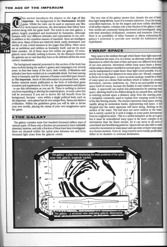
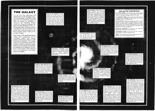
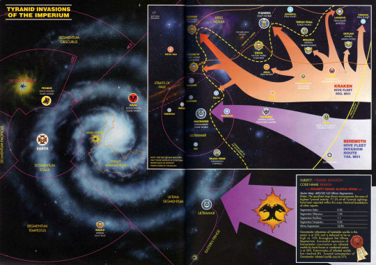
Of course, my copy of the 2nd Edition book is a very poor quality black and white scan. Those segmentum divisions could genuinely be there, and I just can't see it. Not to mention, it's entirely possible that a map with segmentum divisions first premiered in an issue of White Dwarf first, because GW liked to do stuff like that in the old days where you'd see it in the hobby magazine long before it was "officially" released in a rulebook.
There are a lot of glaring omissions from a lot of the other files in my collection: poor scans, missing pages, corrupted files... There's a lot I still don't know, because it's impossible for me to currently confirm that the little I do know is, in fact, accurate. My collection is woefully incomplete. Plus, I don't really have much past 6th edition anyway.
And this, in essence, is my idea: try and complete the collection. Find pristine copies of all the old 40k rulebooks, army codexes, even old copies of White Dwarf, and digitize them all into a huge archive for the sake of historical preservation. Of a sort.
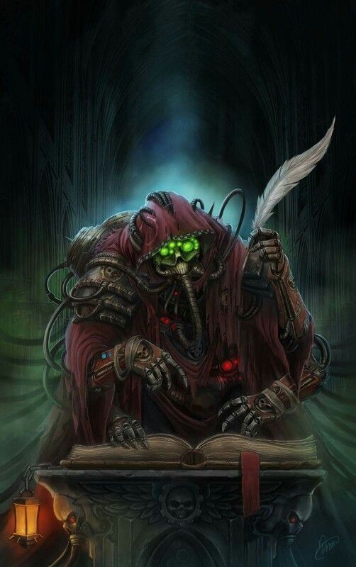
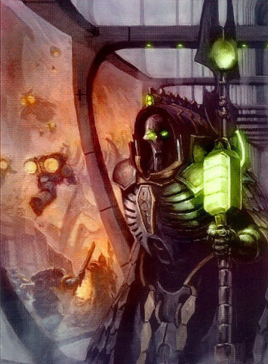
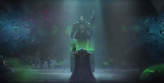
Basically, I want to become a Lexmechanic of the Adeptus Mechanicus, looking for Dark Age of Technology era STC's uncorrupted by the Heresy or the war with the Iron Men. Either that, or I want to become Trazyn with his Infinite Archive on Solemnace.
Unfortunately, there are many problems with this plan. The first being GW's overly litigious nature. They see all this Warhammer shit as "product" first and a hobby for people to enjoy a very, VERY distant second. Doesn't matter that these books (and the magazines) are long since out of print and they don't sell them anymore, effectively making the old editions the tabletop hobby equivalent to video game abandonware... if they got wind that I was attempting a project of this nature, I just know GW would smack me in the face with a cease and desist.
Of course, the other major stumbling block here is the financial issue. And I'm not just talking about buying the books. Obviously, there's the problem of the rarer books that go for upwards of $300 or more on ebay, but there's also a volume problem. Even if you find some good deals, and you're able to find older books for $10 or $15 a pop, there's just SO MANY books, that if I were to attempt this I would be wasting several thousand dollars that I just don't have.
More importantly, there's also the machine I would need to buy in order to do this project in the first place. Because if I was going to do this, I would want to do it right, y'know? I wouldn't want to simply shove the books into my dinky little scanner-printer combo hooked up to my computer. The only way I'd get a clean scan using that method would be to physically destroy these very valuable books, and that's the last thing I'd want to do. No, I would want to do it right, and get a machine like Scribe, the book scanner used by the internet archive:
youtube
Now, obviously, I can't get access to that machine, specifically, because Scribe was custom built by the engineers at the Internet Archive. But other V-cradle book scanners that let you digitize books without destroying them do exist... and they're all REALLY expensive. A good one to produce professional quality scans is, like, $25,000.
And I know what you're thinking: why do I even care about any of this? Even if this project was not entirely out of my reach, it's ultimately pointless, right? Why would I want to preserve all these old, out-of-date, no longer relevant rulebooks for a tabletop wargame that has only existed exactly as long as I have?
Because... let's be honest, this isn't really about Warhammer. The reason I want to do this stems from a much deeper desire to simply Remember. It's amazing and terrifying in equal measure just how easily history can be erased, either deliberately or simply through neglect. All of these things in our lives that are seemingly so important to us can easily vanish from history, like sandcastles when the tide rolls in.
Hell, if you really want to know my feelings about this, just watch Jacob Geller's video on this very subject.
youtube
If I had infinite time and infinite money, and I didn't care about any kind of repercussions from GW's legal team, this project would not be beyond my reach.
But I do not have infinite time or money. And there are more things in my life that I need to be concerned with that are far more important than creating a... stupid archive.
Shame, really.
#warhammer#warhammer 40k#warhammer 40000#wh 40k#Games Workshop#adeptus mechanicus#STC#Trazyn the Infinite#Solemnace#internet archive#Scribe#historical preservation#archival#Youtube
173 notes
·
View notes
Text

Highly forbidden ancient magic specialist is a picky eater…
…but she eventually comes around. She is the best girl.
I made two versions because I find quite charming that Marcille has these two exact reactions every time she is forced to eat a random monster. Can you spot all the monsters in this image?
Posted previously exclusively on my Patreon. There you can find the process of the painting.
Available as a print on my InPrnt shop: https://www.inprnt.com/gallery/ailustrar/marcille-donato/
#dungeon meshi#delicious in dungeon#marcille#marcille donato#marcille dungeon meshi#tragones y mazmorras#fantasy art#fan art
126 notes
·
View notes
Text

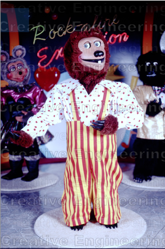

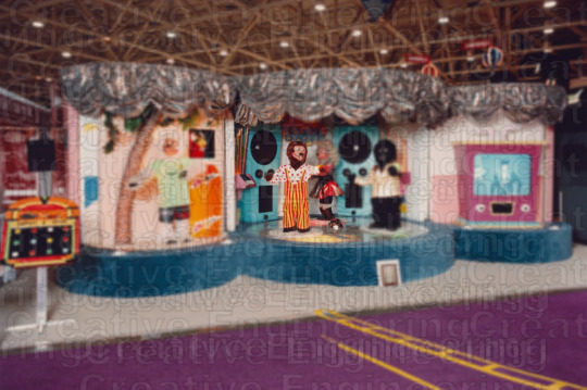
I've been thinking a bit about animatronicswarehouse, Aaron Fetcher, and the ethics of putting rare or lost media behind a paywall. Last month, animatronicwarehouse launched a subscription service in which for $30 a month you can receive rare prints of CEI characters and shows. This is quite similar to Aaron Fetcher's premium video service where for $65 you have access to private videos of Aaron's current projects, old CEI show footage, stories, or just general updates. Aaron's service is pretty notorious for being needlessly complex for subscribers and easy for "thieves" to just screen record.
What really gets me though is the wealth of lost/rare footage sitting there collecting dust. Many of the digitized films from CEI's earliest shows sit behind a paywall. I wouldn't be as frustrated if premium subscribers received videos a month or two earlier than people watching the main channel to make both parties happy, however it seems that many won't be released for quite some time, will only have very short samples posted to lure more people to the premium service, or worst case, not seen at all.
Back to animatronicwarehouse. I'm concerned that this new service will become very similar to Aaron's service, albeit much less bloated. AW already knows Aaron, I mean, they did a good amount of work together to create one of, if not THE best RAE shows. They seem close and I'm worried that he'll start taking cues from Aaron. Yesterday he announced that he's selling posters of rare, high quality images of CEI shows that are presented as a must-have collector's item. Now, I don't really have a problem with this. My and other people's complaints start with the price. Most posters cost $120 with the most expensive costing $195 for a poster of the RAE that looks extremely similar to one that can easily be found on showbizpizza.com. You can also buy a $150 picture of the Hard Luck Bears that can be found online as well.
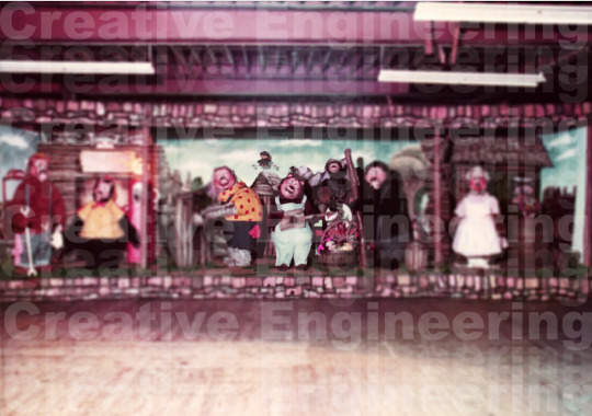
AW's Poster vs Photo posted by Hourly Rock a-fire Explosion (@HourlyRock) on twitter
As an advocate for archiving all forms of media for future generations, I cringe a little every time I see a rare photo with a huge watermark and blur on it or footage cut off and interrupted with a plug for a subscription service. It feels exploitive to make profit off the rarity of something, especially in a fandom where most people weren't alive when these early animatronics were up and running and can only recapture that magic through photos and video. Part of the reason animatronics are still popular is because new generations can look back at them or find current operating ones. I've seen people in YouTube comment sections from countries that never had Showbiz Pizzas or Chuck E. Cheese and yet they can enjoy it because videos and photos allow them to interact and enjoy these things. If we put the past behind a paywall, what will we have to discuss in the future?
#animatronicwarehouse#animatronics#rock afire explosion#showbiz pizza#chuck e cheese#pizza time theatre#aaron fechter#creative engineering#lost media#bad take?#profiteering
113 notes
·
View notes
Text
Resource Post: Supplies, Equipment, and Software
So I've had some people ask about the supplies and equipment I use to make my books! This is not a comprehensive list, nor is it an official tutorial on how to make a book (for that, I recommend starting with Renegade Publishing's resource documents, DAS Bookbinding, or SeaLemon's YouTube tutorials -- all free, no patreon required!), but if you're floundering because you don't know what you need to get, hopefully this will help a little bit ❤️ If I discover more good resources or change up my style, I'll add to this post.
Of note: I'm based in the US, so this list is unfortunately pretty US-centric. Apologies!
SUPPLIES
Disclaimer #1: I have a background in book conservation, so I'm picky to a fault about the supplies I use. To make a long-lasting book, you want to look for "acid-free" or "archival" materials -- BUT, a lot of consumer craft stores have realized those are good buzzwords to slap on products even if they aren't really archival. Your best bet is to buy from stores that supply materials to libraries and archives; those tend to be higher quality and stick to actual archival standards. Talas, Hollander's, University Products, and Colophon Book Arts Supply are good places to start.
That said! If price matters more than longevity, hitting up Michaels or Joann Fabrics is totally fine. This is a hobby. The bookbinding police are not gonna come smash down your door because you didn't use archival-quality craft paper. My big recommendation, though: at least get your glue and paste from Talas. High-quality adhesive makes a huge difference in how well, and how long, a book holds together. Bad adhesives can turn brittle with time, stain your paper/cloth, and make all your hard work fall apart.
So, all that said, here's what I use:
BOARD - Davey Binder's Board, 0.098"
GLUE - Jade 403 PVA
PASTE - Zen Shofu wheat paste (you shouldn't have to buy more than half a pound -- a little goes a long way)
CLOTH - Either Arrestox or Dover bookcloth, which comes in a wide variety of colors and holds up extremely well to whatever you want to do to it
THREAD - 25/3 linen thread, which I run over a small block of beeswax to make it easier to handle and give it better "locking" properties as I sew. For bigger books of ten signatures or more, I sew onto 3/8" linen tapes for extra support.
DECORATIVE PAPER - Hollander's is a treasure trove of decorative papers for endsheets and covers; Talas has some really nice ones, too, but they tend to be pricier (since unfortunately everything at Talas has gotten a lot pricier lately)
PRINTING PAPER - Hammermill Colors paper, 20lb, in cream; 24lb is also a good weight that feels a little more substantial than regular printer paper. (I'll probably switch to 24lb once my 20lb paper runs out.) To get the right grain direction, I buy a ream of 11x17 paper and cut it in half to make standard letter-sized sheets (8.5x11). Here's a quick primer on grain direction and why it's important when making a book!
ENDBANDS - I've never had the patience to sew my own endbands (though I hope to gain that patience someday!), so I just use premade ones like these.
EQUIPMENT
Disclaimer #2: a lot of the stuff on this list is professional-grade (or close to it) with prices to match. You definitely don't have to buy everything right off the bat. It took me fifteen years to accumulate it all, and you can DIY a lot of bookbinding equipment -- a good googling will lead you to all sorts of innovative ways hobby bookbinders set up their shops. The Renegade Publishing resource documents also have a lot of A+ recommendations.
PRINTER - For text, I use a Brother B&W laser printer with auto-duplex (auto-duplex is key when printing a book); for images, both B&W and color, I use a Canon color inkjet printer set to at least 300 DPI. I fully admit having two printers is an absurd setup, but what laser printers can do well, inkjets absolutely suck at, and vice-versa -- and like I said, I'm hella picky. You can get by fine with a single laser printer! Just make sure it's got auto-duplex to save yourself a lot of pain.
GUILLOTINE - I have this model, which goes in and out of stock with some regularity. The trick with this guy is to (a) sandwich your text block between some scrap board so the clamp doesn't leave a dent, and (b) REALLY CRANK DOWN on the clamp as tight as you possibly can to keep the paper from shifting as you cut. This fixes 99% of the skewing problems mentioned in the reviews.
PRESS - I have a little cast-iron press I bought off a coworker for fifty bucks; similarly, you might have luck searching eBay, looking at Affordable Bookbinding Equipment (Jim does incredible work!), searching craft stores for a flower press, or even just using two pieces of wood and a few C-clamps. SeaLemon on YouTube also has a good video on how to DIY a book press.
PRESS BOARDS - For setting the hinges in the press, I use a pair of brass-edged boards like these. It's a good investment if you want to get really nice, crisp hinges, but it's also 100% possible to DIY brass-edged boards if you want. At my very first job, we even set our hinges by taping sewing needles to the book before putting it in the press!
FINISHING PRESS - I have this one, which I use to back my books in combination with these backing irons
BACKING HAMMER - To my chagrin, I've discovered that having an actual backing hammer makes backing a book way, way easier. Some folks have had good luck with a cobbler's hammer or just a regular old hammer from a hardware store, but I splurged on a student hammer from Hollander's, and it works fantastically. (I wouldn't recommend buying the "professional" hammers, though, because seriously, $90 for a hammer?! No.)
BONE FOLDER - I'm actually not a fan of bone folders made from real bone; I like Teflon folders a lot better for scoring and flattening. (Real bone folders tend to burnish the material, an effect I'm rarely going for.)
CUTTING MACHINE - A Silhouette Curio. This is 100% optional, but it's how I do the bulk of my cover designs, including cut-outs, embossing, foiling (with a foil quill attachment), and spine titling. The software and overall quality are way better than Cricut, and its 5mm clearance means you can fit more than just vinyl in there. Sadly, Silhouette has discontinued the Curio, but it's still possible to buy from third-party sellers -- and if you don't care about the 5mm clearance, I've heard good things about the Silhouette Cameo line.
A side note on vinyl, from the obnoxiously picky book conservator: if you're aiming for longevity with your books, using HTV in your book designs may not be the best idea. Not only can the adhesives be questionable, but the plasticizers in vinyl break down in really weird, gross ways once several decades have passed. That's why I tend to stick with cut-outs and foiling instead of HTV. But, again: if you just want to make something pretty, don't worry about it!
SOFTWARE
TYPESETTING - I use Affinity Publisher -- it's similar to Adobe InDesign, but with a flat cost instead of a bullshit subscription model. I am by no means an expert in this, since I've only been designing books for a couple years; pretty much everything I learned, I learned from Aliya Regatti's tutorial, plus or minus a lot of googling and noodling around. I've discovered that it does get cranky if your book is over 250 pages or so, meaning you may have to split longer fics into multiple files. That said, I've been really happy with it, and it goes on sale every now and then if the $70 price tag is too much.
As always, Renegade Publishing has a whole lot of tutorials for other software options, including Microsoft Word, InDesign, LaTeX, and Scribus if you already have access to one of those instead.
IMPOSITION - "Imposition" is when you lay out a book so all the pages are in order once you fold + gather the signatures. Since Affinity Publisher doesn't do this automatically on export, I use Bookbinder 3.0, which is an old but nice little Java program that breaks a single PDF into a series of properly imposed signatures. I usually set it to 6 sheets per signature.
MISCELLANEOUS
IMAGES
The Noun Project is a gigantic repository of basic SVGs and PNGs that are not only great for cutting machines, but for adding flourishes to your title page, chapter headings, and scene dividers. Every single book I've made has used at least one image from here; I pay for the yearly Noun Pro subscription, but it's not necessary to use the site.
Unsplash is perfect for photo elements
Pixabay not only has a great archive of photos, but illustrations and vector images as well
Surprisingly, Wikipedia also has a lot of good Creative Commons photos attached to their articles!
FONTS
1001Fonts is a good starting point for finding free fonts, as is FontSpace and DaFont
If you're willing to pay for fonts (and sometimes it's worth it for a well-designed font that's perfect for your project), Creative Fabrica and Pixel Surplus have some good stuff, including discounted bundles of multiple fonts
251 notes
·
View notes
Text
The posts from 2022 when Maus was banned in government attempts to censor, are going around again.
About how you shouldn't pirate Maus, and instead buy it or get it from the library; because Art Spiegelman is still alive and it steals from artist. Because it's immoral to.
1. Art Spiegelman himself did not say to stop pirating because he's losing money. At most his *publisher* (Penguin Random House) wanted to put down the internet archive's copy of Maus thru forced request - then contributing as part of a lawsuit to shut down archiving efforts and Internet Archive as a whole (dangerous). Because publishers are greedy and realized the book was profitable again. The scans of his book online in GDrive and Online Archive are low quality - the same types that get printed at schools while having 1 or no copies. He did not lose money from this, he got more.
2. When Maus was (and is) banned n censored in specific states + districts in u.s. for inappropriateness (like Tennessee) -- in many places it barred minors from buying, being lent in library, getting Maus and other books. Getting it legally n by the books was not an option for the people most affected. This was why some stores tried to go around this by donating the books for free to them.
3. Maus isn't and wasn't available in many places, even as an option. Even if you want to get it. Even in places where it "can" be bought - it being banned made people buy more of it from fear of censorship, often always in demand in library and store supplies - always sold out in many places or with huge waiting list. It is less bad now, however there still issues exist. And thats assuming you even have a library, or that your library even has it.
4. Piracy doesn't "steal" income from artists. It is a symptom of inaccessibility and/or avoidance. When people want to support someone or something, they buy it after pirating when possible. The banning ended up being good marketing - going on 2022's best sellers list 40 years after it was published, even with inaccessibility. Especially with efforts to raise money by Tennessee comic book store, and even with California book store donating free books at deficit.
5. The actual logical conclusion to not pirate or archive banned stories, is for people without access to it - to not be able to read any version of it at all. Along with other less fortunate banned and censored books that are even harder to access. This does the intended result for censorship. Limiting information, limiting awareness and power of those that need it most.
We've already criticized the logic before.
If gonna cyclically be smug about "people needing critical thinking" and end up being reactionary about censorship and piracy, even years later... well. Am not gonna complete that thought.
#maybe a good chunk of tumblr users shouldn't read serious things if going to conclude this.#text post#o post#piracy#sij#shoah#holocaust
31 notes
·
View notes
Text

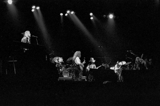
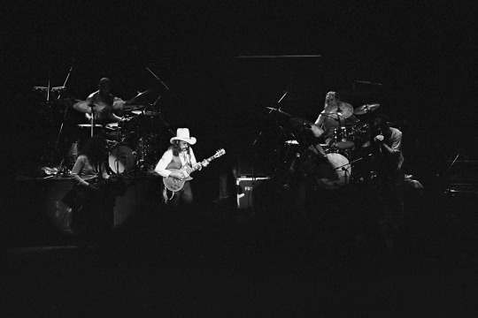
The Allman Brothers Band
Re-posting this with some additional details...
When Gregg Allman (1947-2017) passed nearly seven years ago, I was driven to the negative archive to see if I had any decent shots of the man. I had attended at least two concerts in 1979, as I recall, which would put these images in the Enlightened Rouges time period. I was not thrilled with the quality of the negatives I found, but I was glad to have them nonetheless.
Gregg used his Hammond B-3 with Leslie speaker, of course, but what one sees above is an electric piano with “Hohner” printed thereon. In addition to Gregg, there are three other original members of the band playing during this time period—Dickey Betts, who can be seen playing his Gibson Les Paul, as well as both drummers: Jai Johanny Johanson (Jaimoe) and Butch Trucks.
In the end, one can say that Gregg Allman certainly had an interesting life, with extreme highs and lows. Musically, he had a unique voice and wrote some very memorable songs. The band, which Gregg and his talented brother Duane formed in 1969, was extremely influential and enjoys a firm place in the history of rock and roll. Duane is often to be found on lists of "best guitarists" of course—he was an unusual talent, to be sure.
Three photographs by Richard Koenig.
The close-up of Gregg was taken in Indianapolis at Market Square Arena on May 26th 1979. The other two: the Band from afar, with the second highlighting Dickey, were shot at Alpine Valley, near East Troy, Wisconsin, on August 18th 1979.
21 notes
·
View notes
Text
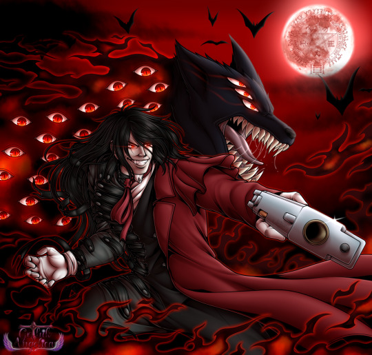
This was done recently. My best vampire, Alucard!
Up until now, Alucard only had one decent fanart, which was one of the prompts for 2021's Goretober on DA. It's still good, if I am to be honest. But it needed more. So I grabbed my stuff, brainstormed and there we go. ^^
I was in a dilemma which form I would give him, the default or Level 1. To end it, I split him in both forms, like he's slowly transforming himself. Added his shadows as well the Hellhound. And of course, not forgetting his famous Casull.
Boy am I satisfied with this piece! I really hope it made Alucard justice.
Print available!
261 notes
·
View notes
Text
The Many Illustrators of
A Tale of Two Cities
1: Hablot Knight Browne (a.k.a. Phiz)
...& a century-and-a-half-long game of telephone...
For the first post in a series on the book's illustrators, how could we start with any but the very first one?
"Although a number of critics have pilloried Hablot Knight Browne ('Phiz') for his supposed ineptitude in the program of illustration for A Tale of Two Cities, the fact that he so astutely realized and graphically elaborated so many significant elements of Dickens's letterpress is evidence that his pictorial series reflects an extremely careful reading of the printed text...The visual accompaniment [that these illustrations provided to the novel's monthly installments] was not mere ornamentation, but an aide-mémoire intended to facilitate the monthly reader's keeping track of a discontinuous narrative over a period of seven months."
from "Charles Dickens's "A Tale of Two Cities" (1859) Illustrated: A Critical Reassessment of Hablot Knight Browne's Accompanying Plates" by Philip V. Allingham from the 2003 volume of the journal Dickens Studies Annual.
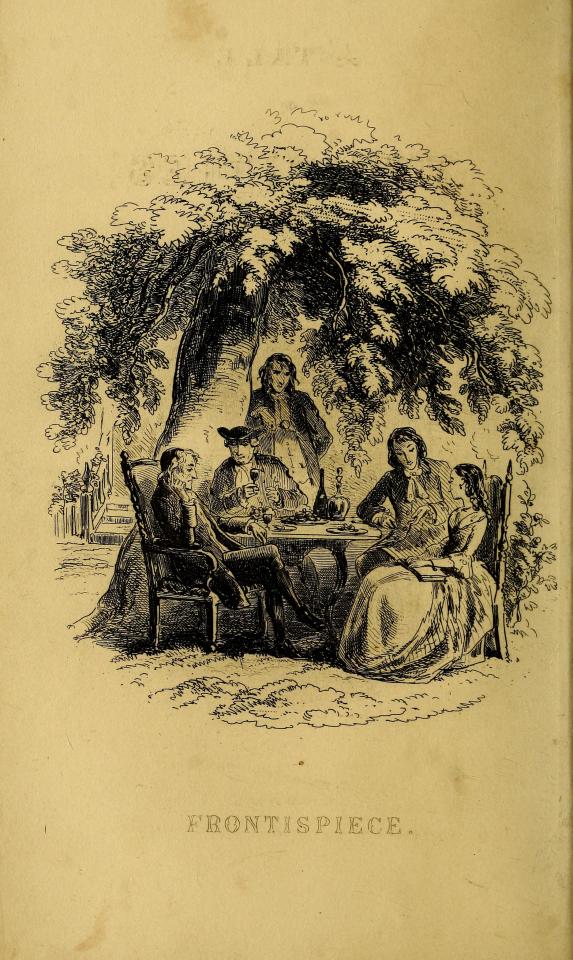
Frontispiece
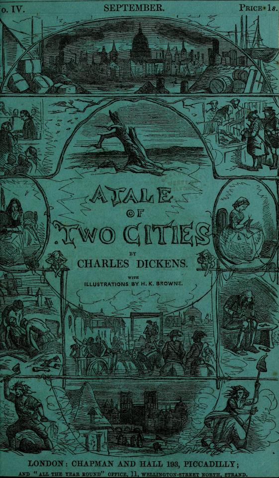
Cover to the Monthly Installments
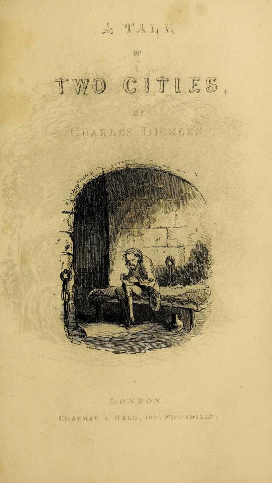
Vignette
For some perspective on the significance of this first set of illustrations - published initially within monthly installments of the novel in 1859 (the text of which was collected from the original weekly installments published in All the Year Round, also in 1859) - that single quote comes from an entire article on these illustrations that is itself 49 pages long.
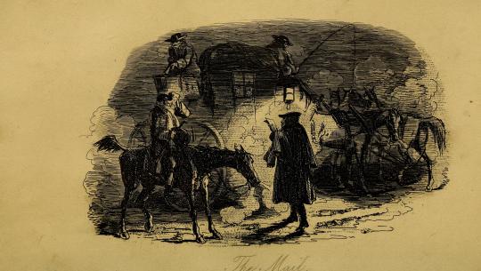
The Mail
As such, suffice it to say that this particular post will not be a thorough examination of the history, context, and impact of these illustrations (though, for those interested, be sure to click on any links you see throughout this post for all sorts of further reading!).
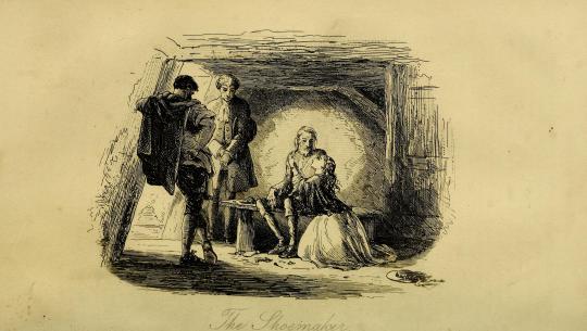
The Shoemaker
Instead, it will simply be a place to observe and appreciate these illustrations for what they are, in their "original" glory.
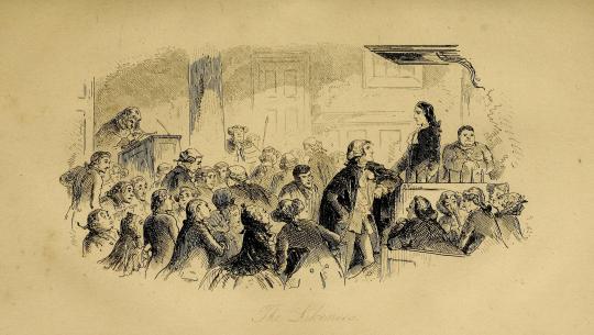
The Likeness
...I mean, just look at these things! (I'm of course gonna break formality after this one because it's my favorite😌)
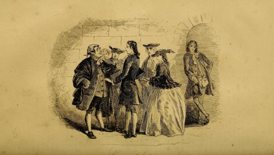
Congratulations
In terms of the odyssey of finding the proper edition of these to post, "original" is the operative word.
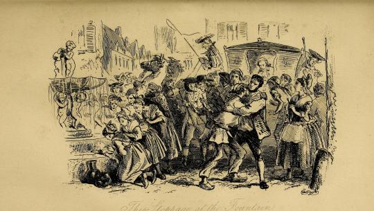
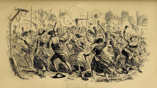
The Stoppage at the Fountain
These are the oldest (except for some or possibly all of McLenan's...more on that many months from now though) and certainly the most iconic of the illustrations of this novel and thus have also had the most mileage, having been passed from edition to edition to edition countless times over the last 164 years.
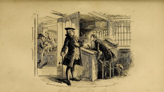
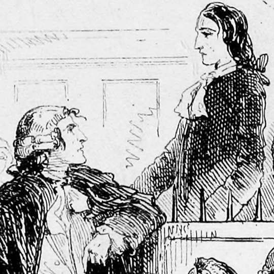
Mr. Stryver at Tellson's Bank
That means - as the gif at the top of this post demonstrates - that these illustrations have slowly been "translated" over time into dozens of distinct images - in ways as innocuous as a change in a shadow and as striking as a change in a character's facial expression.
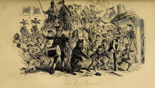
The Spy's Funeral
These translations have happened in all sorts of ways over the development of printing technology - blemishes, xeroxing errors, low-quality or blurry scans, too much ink being used in printing, image compression, sometimes even actual tracing of the original illustrations! - and as interesting as they can be on their own, for someone determined to find the most accurate representation of Phiz's phenomenal work, they can be...phrustrating.
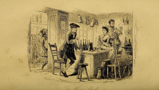
The Wine-shop
In fact, as a sidebar, the illustrations that I used for the Best Character Showdown bracket turned out to themselves be traces and not originals! I am Ashamed and disheartened!
You could even say that I am yet another...
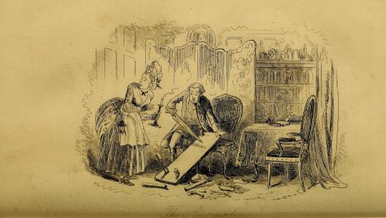
The Accomplices
accomplice in the mistranslation of Phiz's work!
The Sea Rises
Rest assured, though - although they are not from the monthly installments themselves (which as far as my research has gone do not seem to be anywhere on the Internet), these particular scans are sourced directly from an online scan at the Open Library project (contained within the Internet Archive) of the first edition of A Tale of Two Cities, itself also published in 1859.
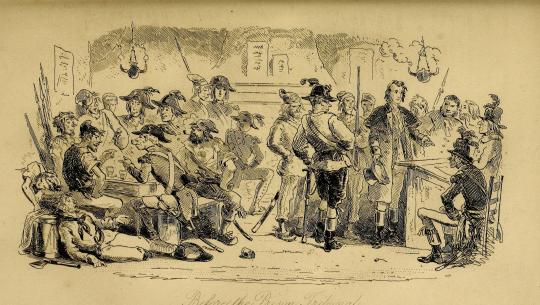
Before the Prison Tribunal
I do wish that they hadn't been cropped the way that they have and that they were available in a (much) higher resolution, but as of now, they're the best representation of Phiz's original work that we netizens have!
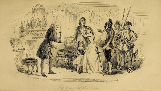
The Knock at the Door
A Tale of Two Cities was the final novel that Phiz illustrated for Dickens - and marked the complicated ending to a twenty-three-year (yes) professional partnership between the author and illustrator - but his work here will mark a beautiful beginning to the long archiving project we will experience together here on this blog.
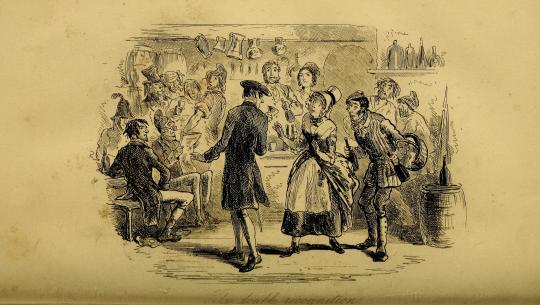
The Double Recognition
Throughout the work of this project, there will be quite a variety of sources being used - from direct scans by me to the two-tone abstractions of PDFs clearly not created for the purpose of storing image information - depending on the needs and availability of each edition.
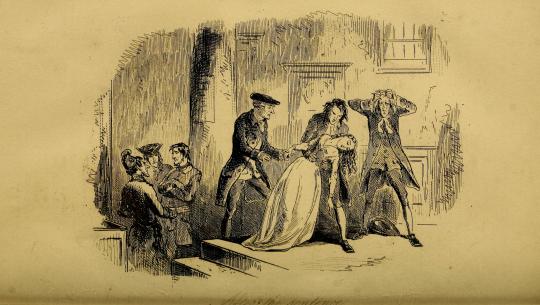
After the Sentence
All of it goes to show the importance of accuracy and attention to detail in archiving art, which is itself an art form to be appreciated.

Hope you've enjoyed!
& the standard endnote for all posts in this series:
This post is intended to act as the start of a forum on the given illustrator, so if anyone has anything to add - requests to see certain drawings in higher definition (since Tumblr compresses images), corrections to factual errors, sources for better-quality versions of the illustrations, further reading, fun facts, any questions, or just general commentary - simply do so on this post, be it in a comment/tags or the replies!💫
#A Tale of Two Cities#AToTC#classic literature#victorian literature#dickens#charles dickens#engraving#illustration#illustrators#Phiz#Hablot Knight Browne#1850s#HOUUGHHHAGHGUHGGHHHHOUHGHHOUHGHHGAHGHSGHGHGH#how long have i been working on this today? has it been eight hours?#well? how did I get here?#again most of them won't even remotely be like this#but it's phiz! i gotta do phiz right!#also for the record: for the first gif I made all eight variations grayscale and modified their contrast#and for the second gif I sepia-toned and modified the contrast of one of the illustrations#all for the sake of readability and reducing flashing!
26 notes
·
View notes
Photo

Jon Koko(Swedish)
Broderies 2020 Archival Print (Best quality Gicleé) on very fine Canson Arches Aquarelle 310 gsm paper. 36 x 36 cm via
285 notes
·
View notes
Text

Hello everyone! Here is a rebloggable post-format of our Criteria section. As always, if you have any questions, feel free to send an ask!
WORK SPECIFICS
FIC:
Word count is ~10,000 minimum.
Use Archive Warnings. Please do not use “Author chose not to use archive warnings”. If none of them apply, select “No archive warnings apply”.
Tag appropriately. If you are having trouble, there will be space for you to discuss your story with others to accumulate tag suggestions.
If you need any further clarification here and your question isn’t covered in the Rules, please feel free to send an Ask or DM one of the mods.
ART:
There are as many forms of artistic expression as there are people in the world. No type of art will be disallowed for this event, but some may be more difficult to complete regarding the style of collaboration and time involved when working on this type of event, so please keep that in mind when applying. We have an incredibly diverse team of moderators who are happy to do their best to help with any questions or concerns involved with creating your work. If the art you’d like to make isn’t featured here, drop an ask and we’ll be happy to establish something with you.
Illustration:
Must be high enough resolution to be displayed on a computer screen. We understand the importance of keeping your print quality images to yourself to prevent theft, but please don’t overly sacrifice digital quality at your author’s expense. Please find a middleground.
Photo Manipulation/Graphic Edit/Moodboard:
Outside of images of the actors, please don’t use images you don’t have permission to use. This is in regards to fanart by other people and personal photography shared online. Pinterest is not a source. Wikimedia Commons is a great source for high quality common license photographs. We will do our best to share other great photo and image sources later.
As above, please maintain a high enough quality that your image can be viewed safely on a computer screen.
Cover Art:
Whether or not you are choosing to do an illustration, edit, or other visual modification to create a cover for the fic, please make sure you go over with your author whether or not use of lowercase or symbols is deliberate and confirm which username or author handle they would like to have credited.
Podfic:
Podfic may be difficult to finagle considering the length of time writers have to finish their works. We suggest getting together with your author and making sure they can work out a plan with you regarding timing, whether that’s limiting their writing time, sending you each chapter as it is completed, or something else.
Video:
At least 30 seconds. Outside of images of the actors and scenes from various media, please don’t use images you don’t have permission to use. This is in regards to fanart by other people, previously edited scenes by other fans, and personal photography shared online.
Playlists:
At least 12 songs. This is the general minimum number of songs on Soundtrack Albums. Please feel free to do more! If you decide to add an album cover, the previous cover art criteria apply.
Ficbinding:
Please make sure you go over with your author whether or not use of lowercase or text symbols is deliberate and confirm which username or author handle they would like to have credited.
We said it at the top but I will add it here as well: if you don't see the type of art you do represented here, please reach out! No form of art is disallowed from this event, and we would be happy to help work out some baseline criteria with you to make sure expectations are fair. Everything here comes from our experience hosting and participating in similar events with these mediums, but we are always happy to learn about something new. (:
FAQs | RULES | SCHEDULE | CRITERIA | MODS
20 notes
·
View notes
Text
October Merchandise at Shark Robot!
With the turn of the season, we've got some more merchandise hitting our Shark Robot Catalogue~🍂 Posters and stickers, ahoy!
Each poster is available in four size options and printed on premium luster photo paper with archival quality inks:
$9.95 USD - 8" × 10" (20.32cm × 25.4cm)
$12.95 USD - 10" × 13" (25.4cm × 33.02cm)
$13.95 USD - 12" × 16" (30.48cm × 40.64cm)
$14.95 USD - 16" × 20" (40.64cm × 50.8cm)
Meanwhile, single die-cut sticker are sized 2.95" × 3.09" (7.493cm × 7.8486cm) and retail for $2.95 USD. The stickers will be on pre-order and ship towards the end of October.
Posters

Something's Wrong With Sunny Day Jack Promo (2023)
Don't Take His Sunshine Away...
The 2023 promo poster for Something's Wrong With Sunny Day Jack has been updated to include the new logo, and is finally available for purchase! There really is something wrong going on here, but your favorite man would never want anything bad for you... right?
Employee of the Month, Every Month
Welcome One, Welcome All, To Popov's Big Top Yoooooogurtopia~!
It's everyone's favorite(?) boss from the very best(?) FroYo place in the whole wide world, Barry! It takes some real team effort to put a smile on every customer's face, and you can count on Barry to pull through! ... To call you in to cover for your coworker's missed shifts, that is. But hey, who could say no to this guy? (Don't actually answer that one.)
Stickers
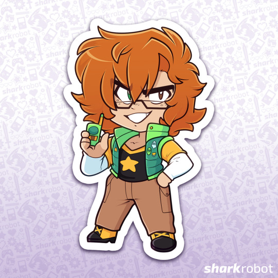
Chibi Taylor
Taylor Potts, President of the Occult History and Sciences Investigation Club (that's the OHSIC, and don't you forget it!), reporting for duty! This determined guy needs to find a ghost pronto, so of course he's sending you to do his dirty work... W-wait, what do you mean that lead was real!?

Chibi Elias
It's the groom of Gallagher Mansion himself! He's waited over 100 years for you to show up, and oh how delighted he is to see you~ Shall we have the wedding ceremony of the century?
---
All purchases of merchandise from our Shark Robot catalogue further supports our studio! You can view the full catalogue here at our vendor page.
#somethings wrong with sunny day jack#sunny day jack#sdj#the groom of gallagher mansion#minors dni#merchandise
335 notes
·
View notes
Text

Shaggy foal sketch | Limited edition fine art print from an original drawing.
My sketches start life as hand-drawn graphite images made on cartridge paper. I often work on these with charcoal, oil pastel or Caran d'Ache to create the look I'm after. The artwork is then scanned and finessed digitally ready for fine art printing. This process often referred to as Giclée printing uses the highest standard of printing methods to give gallery quality results that maintain all the details of the original sketch.
The graphite pencils I use are Faber-Castel, the oil pastels are Sennelier and the china-graph is Caran d’Ache. The inks are pigment based archive quality (100years+). The heavyweight specialist papers I use are of the best professional quality having a wonderful surface designed specifically for fine art drawings and illustrations.
Very limited editions with only ten per size printed.
All artwork is signed and includes a certificate of authenticity.
The A5 are 5.8" x 8.25" (14.8cm x 21cm)
The A4 are 8.25" x 11.7" (21cm x 29.8cm)
The A3 are 11.7" x 16.5" (29.8 cm x 42cm)
The A2 are 16.5" x 23.4" (42 cm x 59.4cm)
Frames not included in price.
Free shipping on artwork to UK destinations.
https://www.seanbriggs.co.uk/product/shaggy-foal/?feed_id=3191&_unique_id=66157c030e522
9 notes
·
View notes
Last Seen Blogs

mclarenp1boy
McLaren P1 ♥_♥
alzen26
آلفراشــــــۃة ⁽✿⁾˻⃗

sammie31470
SHELLO!!!!

repoman51501987
Working Class Anti Hero

clara-teamrocket
C.T.R progress updates