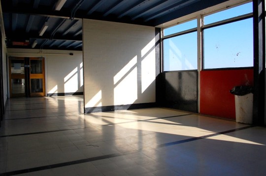
#did you know that these buildings were inspired by le corbusier
Text
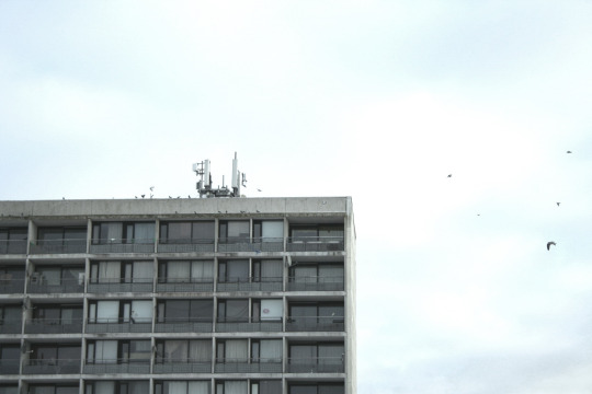
#architecture#architektur#plattenbau#neubaugebiet#large panel system building#wikipedia tells me#concrete#prefabricated#building blocks#block#house#housing#building#beton#haus#wohnhaus#tower block#the good shit#did you know that these buildings were inspired by le corbusier#now you know#denmark#danmark#photography#fotografie#lensblr#photographers on tumblr
5 notes
·
View notes
Text
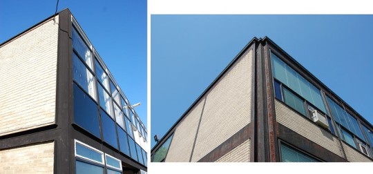
The Brutalism Post Part 3: What is Brutalism? Act 1, Scene 1: The Young Smithsons
What is Brutalism? To put it concisely, Brutalism was a substyle of modernist architecture that originated in Europe during the 1950s and declined by the 1970s, known for its extensive use of reinforced concrete. Because this, of course, is an unsatisfying answer, I am going to instead tell you a story about two young people, sandwiched between two soon-to-be warring generations in architecture, who were simultaneously deeply precocious and unlucky.
It seems that in 20th century architecture there was always a power couple. American mid-century modernism had Charles and Ray Eames. Postmodernism had Robert Venturi and Denise Scott Brown. Brutalism had Alison and Peter Smithson, henceforth referred to simply as the Smithsons.
If you read any of the accounts of the Smithsons’ contemporaries (such as The New Brutalism by critic-historian Reyner Banham) one characteristic of the pair is constantly reiterated: at the time of their rise to fame in British and international architecture circles, the Smithsons were young. In fact, in the early 1950s, both had only recently completed architecture school at Durham University. Alison, who was five years younger, was graduating around the same time as Peter, whose studies were interrupted by the Second World War, during which he served as an engineer in India.

Alison and Peter Smithson. Image via Open.edu
At the time of the Smithsons graduation, they were leaving architecture school at a time when the upheaval the war caused in British society could still be deeply felt. Air raids had destroyed hundreds of thousands of units of housing, cultural sites and had traumatized a generation of Britons. Faced with an end to wartime international trade pacts, Britain’s financial situation was dire, and austerity prevailed in the 1940s despite the expansion of the social safety net. It was an uncertain time to be coming up in the arts, pinned at the same time between a war-torn Europe and the prosperous horizon of the 1950s.
Alison and Peter married in 1949, shortly after graduation, and, like many newly trained architects of the time, went to work for the British government, in the Smithsons’ case, the London City Council. The LCC was, in the wake of the social democratic reforms (such as the National Health Service) and Keynesian economic policies of a strong Labour government, enjoying an expanded range in power. Of particular interest to the Smithsons were the areas of city planning and council housing, two subjects that would become central to their careers.
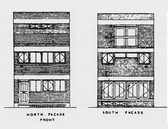
Alison and Peter Smithson, elevations for their Soho House (described as “a house for a society that had nothing”, 1953). Image via socks-studio.
The State of British Architecture
The Smithsons, architecturally, ideologically, and aesthetically, were at the mercy of a rift in modernist architecture, the development of which was significantly disrupted by the war. The war had displaced many of its great masters, including luminaries such as the founders of the Bauhaus: Walter Gropius, Ludwig Mies van der Rohe, and Marcel Breuer. Britain, which was one of the slowest to adopt modernism, did not benefit as much from this diaspora as the US.
At the time of the Smithsons entry into the architectural bureaucracy, the country owed more of its architectural underpinnings to the British architects of the nineteenth century (notably the utopian socialist William Morris), precedent studies of the influences of classical architecture (especially Palladio) under the auspices of historians like Nikolaus Pevsner, as well as a preoccupation with both British and Scandinavian vernacular architecture, in a populist bent underpinned by a turn towards social democracy. This style of architecture was known as the New Humanism.

Alton East Houses by the London County Council Department of Architecture (1953-6), an example of New Humanist architecture. Image taken from The New Brutalism by Reyner Banham.
This was somewhat of a sticky situation, for the young Smithsons who, through their more recent schooling, were, unlike their elders, awed by the buildings and writing of the European modernists. The dramatic ideas for the transformation of cities as laid out by the manifestos of the CIAM (International Congresses for Modern Architecture) organized by Le Corbusier (whose book Towards a New Architecture was hugely influential at the time) and the historian-theorist Sigfried Giedion, offered visions of social transformation that allured many British architects, but especially the impassioned and idealistic Smithsons.
Of particular contribution to the legacy of the development of Brutalism was Le Corbusier, who, by the 1950s was entering the late period of his career which characterized by his use of raw concrete (in his words, béton brut), and sculptural architectural forms. The building du jour for young architects (such as Peter and Alison) was the Unité d’Habitation (1948-54), the sprawling massive housing project in Marseilles, France, that united Le Corbusier’s urban theories of dense, centralized living, his architectural dogma as laid out in Towards a New Architecture, and the embrace of the rawness and coarseness of concrete as a material, accentuated by the impression of the wooden board used to shape it into Corb’s looming, sweeping forms.

The Unité d’habitation by Le Corbusier. Image via Iantomferry (CC BY-SA 4.0)
Little did the Smithsons know that they, mere post-graduates, would have an immensely disruptive impact on the institutions they at this time so deeply admired. For now, the couple was on the eve of their first big break, their ticket out of the nation’s bureaucracy and into the limelight.
The Hunstanton School
An important post-war program, the one that gave the Smithsons their international debut, was the expansion of the British school system in 1944, particularly the establishment of the tripartite school system, which split students older than 11 into grammar schools (high schools) and secondary modern schools (technical schools). This, inevitably, stimulated a swath of school building throughout the country. There were several national competitions for architects wanting to design the new schools, and the Smithsons, eager to get their hands on a first project, gleefully applied.
For their inspiration, the Smithsons turned to Mies van der Rohe, who had recently emigrated to the United States and release to the architectural press, details of his now-famous Crown Hall of the Illinois Institute of Technology (1950). Mies’ use of steel, once relegated to being hidden as an internal structural material, could, thanks to laxness in the fire code in the state of Illinois, be exposed, transforming into an articulated, external structural material.
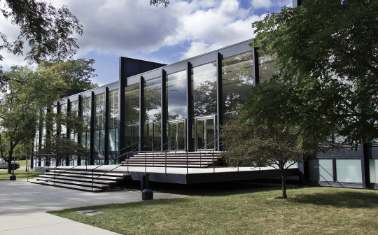
Crown Hall, Illinois Institute of Technology by Mies van der Rohe. Image via Arturo Duarte Jr. (CC BY-SA 3.0)
Of particular importance was the famous “Mies Corner,” consisting of two joined exposed I-beams that elegantly elided inherent problems in how to join together the raw, skeletal framing of steel and the revealing translucence of curtain-wall glass. This building, seen only through photographs by our young architects, opened up within them the possibility of both the modernist expression of a structure’s inherent function, but also as testimony to the aesthetic power of raw building materials as surfaces as well as structure.
The Smithsons, in a rather bold move for such young architects, decided to enter into a particularly contested competition for a new secondary school in Norfolk. They designed a school based on a Miesian steel-framed design of which the structural elements would all be visible. Its plan was crafted to the utmost standards of rationalist economy; its form, unlike the horizontal endlessness of Mies’ IIT, is neatly packaged into separate volumes arranged in a symmetrical way. But what was most important was the use of materials, the rawness of which is captured in the words of Reyner Banham:
“Wherever one stands within the school one sees its actual structural materials exposed, without plaster and frequently without paint. The electrical conduits, pipe-runs, and other services are exposed with equal frankness. This, indeed, is an attempt to make architecture out of the relationships of brute materials, but it is done with the very greatest self-denying restraint.”
Much to the upset and shock of the more conservative and romanticist British architectural establishment, the Smithsons’ design won.
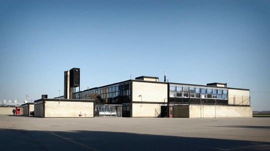
Hunstanton School by Alison and Peter Smithson (1949-54). Photos by Anna Armstrong. (CC BY NC-SA 3.0)
The Hunstanton School, had, as much was possible in those days, gone viral in the architectural press, and very quickly catapulted the Smithsons to international fame as the precocious children of post-war Britain. Soon after, the term the Smithsons would claim as their own, Brutalism, too entered the general architectural consciousness. (By the early 1950s, the term was already escaping from its national borders and being applied to similar projects and work that emphasized raw materials and structural expression.)
The New Brutalism
So what was this New Brutalism?
The Smithsons had, even before the construction of the Hunstanton School had been finished, begun to draft amongst themselves a concept called the New Brutalism. Like many terms in art, “Brutalism” began as a joke that soon became very serious. The term New Brutalism, according to Banham, came from an in-joke amongst the Swedish architects Hans Asplund, Bengt Edman and Lennart Holm in 1950s, about drawings the latter two had drawn for a house. This had spread to England through the Swedes’ English friends, the architects Oliver Cox and Graeme Shankland, who leaked it to the Architectural Association and the Architect’s Department of the London County Council, at which Alison and Peter Smithson were still employed. According to Banham, the term had already acquired a colloquial meaning:
“Whatever Asplund meant by it, the Cox-Shankland connection seem to have used it almost exclusively to mean Modern Architecture of the more pure forms then current, especially the work of Mies van der Rohe. The most obstinate protagonists of that type of architecture at the time in London were Alison and Peter Smithson, designers of the Miesian school at Hunstanton, which is generally taken to be the first Brutalist building.”
(This is supplicated by an anecdote of how the term stuck partially because Peter was called Brutus by his peers because he bore resemblance to Roman busts of the hero, and Brutalism was a joining of “Brutus plus Alison,” which is deeply cute.)
The Smithsons began to explore the art world for corollaries to their raw, material-driven architecture. They found kindred souls in the photographer Nigel Henderson and the sculptor Edouardo Paolozzi, with whom the couple curated an exhibition called “Parallel of Life and Art.” The Smithsons were beginning to find in their work a sort of populism, regarding the untamed, almost anthropological rough textures and assemblies of materials, which the historian Kenneth Frampton jokingly called ‘the peoples’ detailing.’ Frampton described the exhibit, of which few photographs remain, as thus:
“Drawn from news photos and arcane archaeological, anthropological, and zoological sources, many of these images [quoting Banham] ‘offered scenes of violence and distorted or anti-aesthetic views of the human figure, and all had a coarse grainy texture which was clearly regarded by the collaborators as one of their main virtues’. There was something decidedly existential about an exhibition that insisted on viewing the world as a landscape laid waste by war, decay, and disease – beneath whose ashen layers one could still find traces of life, albeing microscopic, pulsating within the ruins…the distant past and the immediate future fused into one. Thus the pavilion patio was furnished not only with an old wheel and a toy aeroplane but also with a television set. In brief, within a decayed and ravaged (i.e. bombed out) urban fabric, the ‘affluence’ of a mobile consumerism was already being envisaged, and moreover welcomed, as the life substance of a new industrial vernacular.”
Alison and Peter Smithson, Nigel Henderson, Eduoardo Paolozzi, Parallels in Life and Art. Image via the Tate Modern, 2011.
A Clash on the Horizon
The Smithsons, it is important to remember, were part of a generation both haunted by war and tantalized by the car and consumer culture of the emerging 1950s. Ideologically they were sandwiched between the twilight years of British socialism and the allure of a consumerist populism informed by fast cars and good living, and this made their work and their ideology rife with contradiction and tension.
The tension between proletarian, primitivist, anthropological elements as expressed in coarse, raw, materials and the allure of the technological utopia dreamed up by modernists a generation earlier, combined with the changing political climate of post-war Britain, resulted in a mix of idealism and post-socialist thought. This hybridized an new school appeal to a better life - made possible by technology, the emerging financial accessibility of consumer culture, the promises of easily replicable, luxurious living promised by modernist architecture - with the old-school, quintessentially British populist consideration for the anthropological complexity of urban, working class life. This is what the Smithsons alluded to when they insisted early on that Brutalism was an “ethic, not an aesthetic.”

Model of the Plan Voisin for Paris by Le Corbusier displayed at the Nouveau Esprit Pavilion (1925) via Wikipedia (CC BY-SA 4.0)
By the time the Smithsons entered the international architectural scene, their modernist forefathers were already beginning to age, becoming more stylistically flexible, nuanced, and less reliant upon the strictness and ideology of their previous dogmas. The younger generation, including the Smithsons, were, in their rose-tinted idealism, beginning to feel like the old masters were abandoning their original ethos, or, in the case of other youngsters such as the Dutch architect Aldo van Eyck, were beginning to question the validity of such concepts as the Plan Voisin, Le Corbusier’s urbanist doctrine of dense housing development surrounded by green space and accessible by the alluring future of car culture.
These youngsters were beginning to get to know each other, meeting amongst themselves at the CIAM – the International Congresses of Modern Architecture – the most important gathering of modernist architects in the world. Modern architecture as a movement was on a generational crash course that would cause an immense rift in architectural thought, practice, and history. But this is a tale for our next installment.
Like many works and ideas of young people, the nascent New Brutalism was ill-formed; still feeling for its niche beyond a mere aesthetic dominated by the honesty of building materials and a populism trying to reconcile consumerist technology and proletarian anthropology. This is where we leave our young Smithsons: riding the wave of success of their first project as a new firm, completely unaware of what is to come: the rift their New Brutalism would tear through the architectural discourse both then and now.
If you like this post, and want to see more like it, consider supporting me on Patreon!
There is a whole new slate of Patreon rewards, including: good house of the month, an exclusive Discord server, monthly livestreams, a reading group, free merch at certain tiers and more!
Not into recurring donations or bonus content? Consider the tip jar! Or, Check out the McMansion Hell Store! Proceeds from the store help protect great buildings from the wrecking ball.
#brutalism#architecture#architectural history#brutalism post#smithsons#alison and peter smithson#british architecture#modern architecture#le corbusier#concrete#brutalist architecture
933 notes
·
View notes
Text
Twenty-two women architects and designers you should know
To mark International Women's Day, we asked 22 of the world's most inspirational women architects and designers to nominate another woman who should be better known for their work.
Each of the prominent architects and designers was asked to select a woman who they think deserves greater recognition.
Several chose to shine a light on historic figures who did not receive full recognition in their lifetimes, with MVRDV co-founder Nathalie de Vries, Bangladeshi architect Marina Tabassum and Neri&Hu co-founder Rossana Hu nominating Jadwiga Grabowska-Hawrylak, Minnette de Silva and Lin Huiyin respectively.
Others took the opportunity to draw attention to a contemporary woman or women-led team that should be better known, with Camille Walala, Tatiana Bilbao, Dorte Mandrup and Eva Franch i Gilabert nominating Unscene Architecture, Taller Comunal, Marie-José Van Hee and V. Mitch McEwen respectively.
Read on for the 22 architects and designers that deserve greater recognition:
Marie-José Van He
Nominated by Dorte Mandrup, Dorte Mandrup Arkitekter
"Marie-José Van Hee is a remarkably talented architect. Working primarily in her native country, Belgium, she is forging a significant mark on contemporary architecture with her attention to space, light and natural materials.
"Through her understated, authentic and poetic work, she continuously influences and inspires architects and designers alike. A timeless simplicity and weightlessness permeate throughout her designs, creating a stillness that seems almost tangible – blurring the line between art and architecture."
Iwona Buczkowska
Nominated by Farshid Moussavi, Farshid Moussavi Architecture
"Polish-born French architect Iwona Buczkowska's brilliant career is distinguished by an architectural approach opposed to any form of standardisation, thus placing the diversity of users and their agency at the core of her work. Her tireless commitment has led to the creation of works of incredible richness and inventiveness, whether for housing projects or public facilities.
"At a time when we need to question our built environment, and in particular, the housing in which we live, her work on diversification, user empowerment and inclusion seems particularly worthy of attention. As her work is under-studied, and because some of her built projects are currently under threat of demolition, I feel it is particularly important to bring to light what her work has to teach us."
Charlotte Perriand
Nominated by Es Devlin, Es Devlin Studio
"Last weekend I went to the South Downs to try to recreate this uplifting portrait of Charlotte Perriand (above) about which her daughter said: 'That photograph of a strong woman, triumphantly embracing nature, is the perfect image of my mother. She announces the contemporary woman, emancipated and free.
"Most of us have sat on the extraordinary and now iconic furniture she made in collaboration with Le Corbusier. Most of us are unaware of her fundamental role in its design. She was a genius in the art of collaboration, especially with powerful male artists. Her practice spanned an astounding range of genres, her work drew deeply on the forms she observed in nature throughout her rich life."
Kenyatta Mclean
Nominated by Harriet Harriss, dean of the Pratt Institute School of Architecture
"I'd like to nominate Kenyatta Mclean, co-founder and co-managing director of Blackspace: the black, interdisciplinary, spatial collective comprised of architects, artists, designers and planners who have asserted both the necessity and the agency of 'Black Urbanism'.
"From my perspective, her ability to co-create spatial narratives that are centred in and driven by racial justice is essential and urgent work applicable both to the US where the practice is situated, and cities worldwide, where structural racism and other forms of discrimination are embedded in the materiality and form of the architectures that surround us.
"Moreover, spatial collectives – from Matrix to Assemble – offer a much-needed antidote to the vagaries of starchitecture and the hierarchies typically found in traditional design practices. Kenyatta Mclean's visionary work reminds us all of the need to use this period of Covid-imposed introspection to re-examine how much more inclusive, equitable and impactful our industry needs to become.
"Blackspace also offers a road map and a benchmark for graduates and young practitioners who are committed to leading the changes we need to make."
Unscene Architecture
Nominated by Camille Walala, Studio Walala
"I would like to nominate Unscene Architecture. A pair of fantastic women that I met the year before the pandemic started. The architecture design duo – founders Manijeh Verghese and Madeleine Kessler – were the co-creators of the British Pavilion for the postponed 2020 Venice Architecture Biennale. Definitely, ones to watch."
Anupama Kundhoo
Nominated by Seetal Solanki
"A rare kind within the world of architecture. Anupama Kundhoo brings people a voice, materials a voice and building a voice that is beyond her own – an egoless practice. Traits that shouldn't be so rare actually, but she's paving the way for so many and hopefully many more to come."
Ndebele women
Nominated by Sumayya Vally, Counterspace
"In this tribe, we evoke women near and far – friends, ancestors and mythical figures – women who write, organise, imagine and build worlds into being. I chose to draw attention to the unrecognised architect genius of the Ndebele women – women who craft ritual objects and build and adorn their own homes. The calling of their names invokes the calling of millions of errant, unrecognised, other architects the world over – past, present and future.
"They are Maria Ntobela Mahlangu, Dinah Mahlangu, Johanna Mkwebani, Martina Maghlangu, Anna Msiza, Sara Mthimunye, Sara and Lisbeth, Pikinini and Sara Skosana, Anna Mahlangu, Letty Ngoma, Sarah Mguni, Martha Mtsweni Ndala, Rossinah and Esther Mahlangu."
Jadwiga Grabowska-Hawrylak
Nominated by Nathalie de Vries, MVRDV
"When working on our Concordia Design project in Wroclaw, Poland, I met Jadwiga Grabowska-Hawrylak, the grande dame of modern Polish architecture. Born in 1920, she brought architecture to the next level in the second half of the 20th century. In 1974, she was the first woman to receive the prestigious Honorary Award from the Association of Polish Architects.
"In a time when female Polish architects were mostly known as 'the wife of…' Jadwiga had a highly successful career, she had a big part in rebuilding postwar Wroclaw, and was also known for her schools and housing. I am really impressed by her work and her amazing personality. When I met her, she was very energetic and still very much involved in architecture. With her passing in 2018, Poland lost a great architect."
Minnette de Silva
Nominated by Marina Tabassum
"The first name that comes to mind is Minnette de Silva (pictured above with Pablo Picasso), an architect ahead of her time. Less celebrated than her contemporary male counterparts. You may have read this article below, but I'm sharing the link again. This tells her story better than I can write."
Marina Willer
Nominated by Margaret Calvert
"I would propose Marina Willer, although she may not fit as she's already well known. Apart from being an exceptional graphic designer and filmmaker, Marina was the first woman to be appointed a Pentagram partner. Brazilian by birth, it was at the Royal College of Art, where I was teaching at the time, that I first became aware of her amazing drive, commitment and talent as a student."
Duygu and Begum Ozturk
Nominated by Nelly Ben Hayoun, Nelly Ben Hayoun Studios
"I nominate Duygu and Begum Ozturk, the two sisters behind the fashion brand Harem London. Born in Istanbul, they started their all-organic fashion brand recently in Dalston, London; merging traditional techniques from Istanbul and London, bringing together their heritage and future.
"I love that they started a business together as sisters and that they are persevering in developing their beautiful collection despite the pandemic and Brexit and all the complexity this created for them. They need to be applauded for their great work."
Lin Huiyin
Nominated by Rossana Hu, Neri&Hu
"Lin Huiyin was the first female architect in modern China. Lin and her partner Liang Sicheng were the pioneers in architectural heritage restoration and documentation in China during the 1930s.
"Although it was the two of them who brought China's ancient architectural treasures to light, Lin's recognition in documenting and restoring China's historic buildings has often been overshadowed by her partner, who is recognised as the 'father of modern Chinese architecture'. In addition to her architectural practice, Lin is also widely acclaimed for her literary creation."
Mary Corse
Nominated by Azusa Murakami, Studio Swine
"I would like to pick Mary Corse. She has been gaining much-deserved recognition in recent years with a solo show at the Whitney but has been arguably one of the most innovative artists to come out of the light and space movement.
"We love her material research, her ability to take industrial elements like the glass microbeads used on motorway reflective road markings and using it to make really delicate and sublime optical paintings is really inspiring."
Yemi Awosile
Nominated by Morag Myerscough
"I have loved Yemi Awosile's work for many years. She is a wonderful person and I have worked with her in the past on the Bernie Grant Centre where she made some textiles for the centre."
Franziska Porges Hosken
Nominated by Jane Hall, Assemble
"Austrian-born, and America-based, designer Franziska Porges Hosken was pioneering in multiple respects. In 1944 she became one of the first women to receive her master's of architecture degree from Harvard's Graduate School of Design and in 1947, together with her husband James Hosken, she founded their successful eponymous furniture business Hosken.
"Despite giving up her design practice to take care of her first child in the late 1950s, Hosken continued to create as a photographer and journalist, publishing numerous books on urbanism including The Language of Cities.
"She was also an activist for women's rights, founding the Women's International Network and publishing reports on Female Genital Mutilation (FGM), a term she is credited with coining, which affected the agenda of major health organisations including the WHO. Continuing to distribute a feminist newsletter well into her eighties, Hosken's legacy demonstrates an extraordinary commitment, undertaken over the course of a lifetime, to connect design with social activism."
Winka Dubbeldam
Nominated by Sonali Rastogi, Morphogenesis
"Winka Dubbeldam is an architect whose contribution I would like to acknowledge. She is the founder of the WBE firm Archi-Tectonics. She had visited our studio about 15 years back whilst working on the redevelopment of the New Delhi railway station. I also enjoyed attending one of her juries in UPenn about ten years ago, and ever since, I have been following her.
"Being in academia myself, what resonates with me is her significant influence on the emerging generation through her involvement in architectural education and design juries worldwide. Her designs are evocative and transformative, and she creates architecture that matters.
"I read somewhere that she maintains a fluid balance between energy and calm, precision and informality, experiment and comfort in her designs, studio, and life, a mantra I have been following all my life."
Eva Albarran
Nominated by Sofia Von Ellrichshausen, Pezo von Ellrichshausen
"I would like to propose Eva Albarran: a Spanish entrepreneur, living both in Paris and Madrid, who operates in the expanded, and diffuse, field of contemporary art and architecture.
"She is a solid character who has managed to solve complex productions for significant artists (such as Christian Boltaski, Felice Varini or Francis Alys). Together with her husband, they direct a refined gallery and the Solo houses program, a project that might well be read as a radical revision of the current human condition in relation to nature."
Dana Al Amiri
Nominated by Pallavi Dean, Roar
"Dana Al Amiri, the co-founder of Watab Studio, is a rising star in the male-dominated Saudi construction industry. I love her minimal pared design philosophy – practicing in a region that is infamous for opulent and OTT statements. She truly represents the next generation of regional architects that are defining Saudi's design identity."
Taller Comunal
Nominated by Tatiana Bilbao
"I would like to make Taller Comunal, which is led by Mariana Ordóñez Grajales and Jesica Amescua Carrera, my recommendation. Because for them, architecture is not a profession, it is a service to facilitate architecture to be produced by the people who inhabit it. That should be the future of our profession."
Anne Tyng
Nominated by Huang Wenjing, Open Architecture
"Anne Tyng immediately came to mind as a female architect that deserves much more recognition. Born in China in 1920 to missionary parents; a classmate of Eileen Pei and IM Pei — these two little details seem to have brought her closer to me, my being Chinese and had worked in the office that IM founded.
"Tyng was one of the first women to study architecture at Harvard Graduate School of Design; the only woman to take the architectural license test in 1949.
"It is unfortunate and unfair that people often seem to be more interested in her anecdotal affair with the iconic master Louis Kahn than her great influence on his early works — the rigour of geometry and order was very much Anne Tyng's interest and contribution. She went on to be an independent architect, theorist and educator. A true pioneering woman in the field."
V. Mitch McEwen
Nominated by Eva Franch i Gilabert
"Mitch is an architect, activist, dancer, rapper, entrepreneur, someone who has taken the lead on many occasions to make space for new ideas.
"We crossed paths several times throughout the last ten years; In 2011, during the Occupy Wall Street Movement, I organised an exhibition and a series of events at Storefront for Art and Architecture hosted by brilliant people; Mitch's workshop "How to Occupy a House in America" was one of them.
"In 2014, Mitch was one of the architects writing letters to the Mayor in the first edition in New York of the global project "Letters to the Mayor" asking Mayor Bill de Blasio: "How can New York City Housing Authority really become the Pride of Our City?" and provided some answers and ideas that still stand.
"Mitch is currently an assistant professor at Princeton University – where I am currently teaching a seminar. Her work is now on display at MoMA in New York as part of Reconstructions: Architecture and Blackness in America."
Mónica Bertolino
Nominated by Sandra Barclay, Barclay & Crousse
"Mónica Bertolino is an architect from Córdoba, Argentina, where she lives and works as part of the Studio Bertolino-Barrado founded in 1981.
"Together with Carlos Barrado they have an excellent production of projects in different scales. In their work you understand immediately the search for good qualities in habitability, their sensibility when they intervene in the landscape, and their concern for research about materiality linked to the local traditions of construction.
"I admire and think she deserves recognition especially in her academic role where she transmits her passion and enthusiasm for architecture in an unconditional way. She is devoted to this mission!
"She participates in workshops and as invited professor in different universities in the world as well as a regular professor in the National University of Cordoba and in the Catholic University of Cordoba."
The post Twenty-two women architects and designers you should know appeared first on Dezeen.
6 notes
·
View notes
Photo

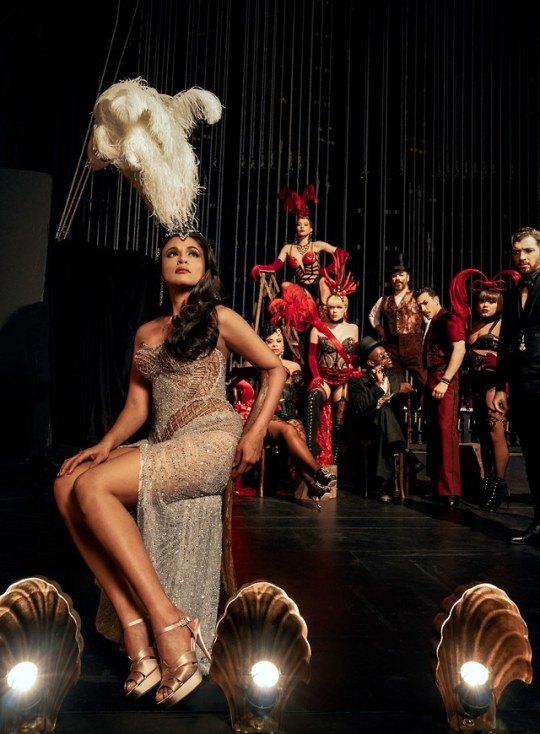
Moulin Rouge for VOGUE!
(These are the HQ Photo Versions!)
Moulin Rouge!’s Broadway cast, photographed at Kings Theatre in Brooklyn.
Sittings Editors: Hamish Bowles, Alexandra Cronan.
Produced by 360pm. Set Design: CJ Dockery at Mary Howard Studio; Costume Designer: Catherine Zuber; Choreographer: Sonya Tayeh
Photographed by Baz Luhrmann, Vogue, July 2019
July 2019 Vogue (Online)
BAZ LUHRMANN WAS BORN to reinvent the movie musical for a new generation—which is exactly what he did in 2001 with Moulin Rouge!, his deliriously romantic mash-up, set in 1890s Paris, of La Bohème, La Traviata, and the Orpheus myth, with a soundtrack that exploded with modern-day pop songs, lavish Technicolor sets and costumes (by his wife, Catherine Martin), and a hyperkinetic cinematic style that drew on MGM musicals, MTV videos, and Bollywood spectaculars. The motto of this blatantly artificial world, served with a knowing wink (which nevertheless swept us up in its very real, very breathless emotions), could be borrowed from William Blake’s The Marriage of Heaven and Hell: “Enough! Or too much.”
In his own way, the brilliant theater director Alex Timbers—whose work includes Bloody Bloody Andrew Jackson, Here Lies Love, and, most recently, Beetlejuice—was born to reinvent Moulin Rouge! for the stage, as another generation of New York audiences will discover when his electrifying, eye-popping, and blissfully over-the-top adaptation of Luhrmann’s masterpiece opens on Broadway, after a smash run in Boston, this month.
“I’ve spent my life taking classics and interpreting them in radical ways,” Luhrmann says, “so how could I not applaud someone taking a work of mine and interpreting it in a radical way? You have to interpret things for the time and place you’re in. In the end, it’s still a tragic opera, but Alex applies himself to it in such a dexterous way that there’s irony and fun and music and emotion.”
Luhrmann grew up in Herons Creek, a tiny, remote Australian town with a total of seven houses in it, where, he says, “if you didn’t have a good imagination and an ability to create worlds in your mind, you were lost.” Fortunately his family, which ran a gas station and a pig farm, also ran the local movie theater and had a black-and-white TV set (which showed exactly one channel), and Luhrmann devoured a steady diet of old movies, including musicals, with which he fell in love. His mother was a ballroom-dance instructor who started giving him lessons early, and his father insisted that Luhrmann and his siblings study painting and music. Before long he was staging little shows, performing magic tricks, making films with his father’s 8-millimeter camera, and acting in school plays.
Apparently it was the ideal upbringing to produce an artist of dazzling originality, one with a singular, idiosyncratic vision and an expansive playing field: film, theater, opera, commercials, music videos, pop songs. After the success of his first two films, Strictly Ballroom and Romeo + Juliet—both of which had healthy doses of movie-musical DNA encoded into their cinematic language—Luhrmann wanted to take on the genre itself. He and his co-writer, Craig Pearce, set their film in Belle Epoque Paris, in and around the legendary Moulin Rouge nightclub, telling a tragic love story straight out of verismo opera with the Orpheus legend—a young poet and musician travels to the underworld in search of his dead love, Eurydice, and is reunited with her only to lose her again, emerging forever changed—as its mythical underpinning.
But Luhrmann also had what he calls a “preposterous conceit” that allowed his Orpheus—a Bohemian poet named Christian, played by Ewan McGregor—to metaphorically enchant the very rocks and stones to follow him because of his voice: “When our poet opens his mouth, ‘The hills are alive with the sound of music’ comes out of it,” he says. “Whether you like The Sound of Music or not, it’s a giant hit that’s got artistic cred—so it’s a funny, concise way of saying ‘The guy has magic.’” Preposterous or not, the conceit turned the love story between McGregor’s Christian and Nicole Kidman’s doomed Satine, a nightclub star and courtesan, into a pop fantasia, giving the music its audience had grown up with—from “Your Song” to “Lady Marmalade”—an operatic grandeur.
Luhrmann had long wanted to bring Moulin Rouge! to the stage but felt that he wasn’t the right person for the job—he worried that he was too close to the material and might be overprotective of it. Enter Alex Timbers, 40, a downtown wunderkind who has brought the cheeky, postmodern spirit of his theater company Les Freres Corbusier to Broadway and shares with Luhrmann a restlessly playful and inventive mise-en-scène. “When I saw Bloody Bloody Andrew Jackson, I could tell that his aesthetic and the way he told a story—very high-energy, very theatrical, ironic but also moving—had a certain kinship with mine,” Luhrmann says. “And after I met him, I knew that he would have his own interpretation but also understand the language of the film.”
The biggest challenge Timbers and his team faced was how to bring the film’s hypercinematic exuberance alive on a stage. “We had to create a visceral and kinetic excitement using an entirely theatrical vocabulary,” Timbers says. “We don’t have any of those virtuosic techniques like close-ups and Steadicam and music video–style editing, but you want the show to be able to leap over the footlights—emotionally, but also as a spectacle. So we use a lot of techniques to do that.”
Do they ever. From the moment you enter the theater, it’s clear that Timbers has realized his mandate to make the show—which he’s been working on for the past six years—“360.” It’s as if you’ve walked into the Moulin Rouge itself, courtesy of the gorgeously overwhelming set (by Derek McLane) that greets you: There are hearts within hearts, chandeliers, the stage flanked by a windmill on one side and an elephant on the other. Then out come the corset-clad boys and girls of the night (who come in all colors, shapes, and sizes) and the fashionable members of the Parisian demimonde in Catherine Zuber’s fabulous costumes. The next thing you know, “Four Bad Ass Chicks from the Moulin Rouge,” as the script identifies them—propelled onstage by Sonya Tayeh’s wildly exuberant choreography—are belting “Hey sista, go sista, soul sista, flow sista,” and we’re off to the races. “I wanted to build this exotic, intoxicating world that felt beautiful and dangerous and gritty and sexy,” Timbers says. “It felt really important for the sets and the costumes to use period elements, and for us to be ruthless about that, but to put them in a form that feels contemporary and surprising.”
The seven-time Tony-winning costume designer Zuber (The King and I, My Fair Lady) has done that and then some, tipping her hat to Catherine Martin’s designs for the film without imitating them. She’s even managed to design Belle Epoque finery that allows the dancers the freedom of movement to execute Tayeh’s propulsive choreography. Zuber is also a master of using costumes to reveal character and situation, as with the ornate gown she designed for Satine after she becomes the Duke’s courtesan and enters his glittering world. Inspired by designs from John Galliano’s 2006 couture collection, it features a bodice that looks like a cage and three rows of lacing down the back. “It’s almost like she’s a prisoner,” Zuber says.
Playing Satine this time around is Karen Olivo (West Side Story, Hamilton), who brings very different qualities to the role than Kidman, both physical (Olivo is a woman of color) and temperamental (desperate, determined, and down-to-earth, as opposed to ethereal). Aaron Tveit (Next to Normal, Catch Me if You Can), meanwhile, sings like a dream and brings the requisite dewy idealism to the naive Christian, but with a hint of something edgier.
The story is very much the same as the film’s: Satine is the star attraction at the Moulin Rouge, owned by the rapacious Harold Zidler (Danny Burstein), who is in financial hot water and in danger of losing the club. Christian and Satine meet and fall head over heels, but she has been promised by Zidler to the villainous Duke (Tam Mutu), who can give her the bejeweled life she’s always dreamed of, forcing her to choose between that and true love. Meanwhile, Christian and his pals Santiago and Toulouse-Lautrec (Ricky Rojas and Sahr Ngaujah) are writing a show, bankrolled by the Duke, that is meant to save the Moulin Rouge from going under. Then, of course, Satine has this persistent cough and . . . well, you know.
The big difference in terms of the storytelling is that book writer John Logan (Red) has fleshed out and deepened the characters and the relationships between them. “We looked at the major characters, asked what their backstories were, and tried to figure out how grounded they could possibly be in psychological realism and yet still be heightened in that way that musical theater demands,” Logan says. “How did Satine get to be this sparkling diamond—and what’s the price she’s paid along the way?”
But the boldest change—and in many ways the heart of the show—is in the new songs, which give Moulin Rouge! fresh emotional resonance (and whip the crowd into a frenzy). Along with the familiar Bowie, Madonna, and Elton John tunes, expect to hear from the likes of Outkast, Sia, Beyoncé, Fun, Adele, and Lorde, to name but a few (there are more than 70 songs in the show). To curate Moulin Rouge!’s dizzying playlist, Timbers, Logan, and music director/genius Justin Levine holed up in a Times Square hotel room with a digital keyboard, dredged up their musical memories, and took note of what worked. Their taste is impeccable, whether using a song for its sheer exuberance, as with a rousing version of Lady Gaga’s “Bad Romance,” or to reveal a character’s inner desires, as Satine does with Katy Perry’s “Firework.”
Logan has been blown away to see how powerfully audiences have connected with the show—and the songs. “I went to a wedding recently, and when the dancing started, I heard half our score being played, which was wild,” he says. “And when you see audience members respond to the songs—‘They’re using thatsong? Oh, my God! No way!’—you can feel how excited they are. It’s an experience I’ve never had before. It’s magic.”
#moulin rouge#aaron tveit#karen olivo#danny burstein#vogue#Baz Lurhmann#moulin rouge broadway#moulin rouge musical#vogue magazine#articles#features#ricky rojas#tam mutu#sahr ngaujah#robyn hurder#jacqueline b arnold#jeigh madjus#holly james
333 notes
·
View notes
Text
Evaluation
Fabrication another possible outcome:
In the revisit of the fabrication project, I explored other disasters which impact the way people live and their accommodation. I began to explore war zones through Google, Pinterest and mainstream media. Most of the time whole cities are wiped out due to bombing, they take very long to clean out and rebuild this causes a high level of homelessness. I wanted to come up with a design of a building that can be achieved without having to clean and rebuild all of the city’s streets and existing buildings. Councils can have this installed in one area with less destruction while cleaning the rest of the city.
Throughout my research, I came across Brutalist architecture which was popular in the1950’s. It is recognised for the use of rough, unfinished materials for the exterior of buildings and consisted of straight lines, unusual shapes, and small windows. Socialist principles influenced the utilitarian, low-cost social housing. After the Second World War Le Corbusier accomplished his Tower Block which he’d been designing since the ’20s. The first two were built in Paris and Marseille and housed around 1600 people.
I learned a lot about how I work best when I am motivated is when it is easier for me to work and enjoy it. Due to lockdown, there was confusion as to which pieces of our work will be marked and how grades will be established. This made me less keen to work as I felt like when I was working hard at one project, I would receive an email stating that it will not be marked or count towards my grade. I found it very hard to enjoy the work I was doing due to the atmosphere. I was didn’t feel creative, I stopped thinking about design and my love for it for a long time which made me question my choices and career. There was a period where I couldn’t do any of the work because I just wasn’t sure if this (architecture) is what I want to do for the rest of my life. This was very frustrating as my career has always been the only thing I’m sure of. As an easily distracted procrastinator, working at home was very challenging. There wasn’t much to inspire me in terms of giving me new ideas or ways of looking at the projects, nor inspire me to continue doing the work. At college, in a classroom, everyone is being creative and bouncing off of each other’s energy. I could ask one question and start a discussion which results in lots of new concepts for me. Whereas at home I don’t have that so my energy slowly faded away. It was also very hard to find a quiet time and place, with a big family and kids playing all the time. This with my lack of motivation made me very uninterested in doing the work. It was very unhealthy for my mental health because my career was always my main drive and I lost that. I felt very confused and anxious for a long time.
I decided that no matter what I want to do with my career I needed to do my best in the course now and whatever comes after that is my choice. I began to only work when my family were asleep. Sometimes that meant waking up at 4 am or sleeping in and staying up all night. Thankfully, this worked out well in terms of getting the work finished. I think I could’ve done much better if I had used my time more wisely and was more motivated.
The most attractive task was drawing the exterior of the building in perspective. It took about 3-4 attempts but once I began to work on the final one it was very enjoyable. It felt like a break from work even though it was time-consuming. I think it is very satisfying because the drawing looks messy and there are lines everywhere until you add pen lines and colour then it all becomes clear within minutes. The most unattractive work I did was making the playdough for primary inspiration. I used flour, cooking oil and food colour. I didn’t like the texture of it when mixing the ingredients. The result was very good though, I couldn’t go to buy play dough at the time but I needed it that day to make sure I don’t forget to do it.
The research went well, there were many examples of social housing in styles and expenses. Most existing structures saved as inspiration but were too luxurious to be a reality for a post-war city.
The thing that went very badly was my attempt to find software that would allow me to produce a realistic-looking design to deliver my idea in a better way. They were all made for advanced architects, although the tutorials show other results which looked like what I wanted, I didn’t know how to achieve them.
My research gave me a lot in understanding the concept of what I was trying to achieve myself. There are many different examples of social housing. Also, it shows me that my idea may be original in what it is trying to achieve. I would like to make it a habit to use books as magazines as research tools, not just the internet.
The limitations in this project made it very unique, I couldn’t experiment with any materials or make models to help me see my design in a new light which would allow me to alter things and point out design flaws.
Self-review
My research was sufficient to help me come up with different designs and concepts. It was varied enough for me to take a piece from each example and implement it into my design. The large amount of it though meant that I couldn’t critically analyse it. This was also mainly due to poor time management, I didn’t want to make lists and times plans as I had in previous projects because there were a lot of changes in what our concentration should be on. I felt like if I made a checklist and didn’t get the chance to complete it I was more discouraged to do the work. The main problem solving I had to do was on my attitude towards finishing the project. I think work is now mediocre because of this, which I don’t particularly like.
The only practical skills used for this project were attempting to draw using different mediums. It was challenging trying to render the design using software that was very new to me but I made many attempts. Unfortunately, none are presentable in my opinion.
I made many attempts to put the drawing in situ but I couldn’t find any suitable images. There were a few places I had in mind where I could’ve taken photographs of my own but I couldn’t go as it seemed unnecessary. When drawing the outline I made the lines as clean and think as possible to make the process easier.
I believe this building fits into the brutalist style of architecture with the bright element. The concrete floors and harsh corners that face the outside contrasted by the round pillars give the building more elements. It doesn’t completely fall into the movement but has elements of it.
Bibliography
https://medium.com/projexity-blog/architecture-meets-social-engagement-in-5-awesome-projects-af283bba616b
https://www.archdaily.com/933053/best-unbuilt-architecture-7-submitted-proposals-exploring-diverse-programs
https://www.re-thinkingthefuture.com/architects-lounge/a455-15-buildings-that-reflect-contemporary-nature-of-social-architecture/
https://www.rasmussen.edu/degrees/design/blog/9-types-of-design-jobs-for-creative-people/
https://targetjobs.co.uk/careers-advice/career-planning/273051-the-top-10-skills-thatll-get-you-a-job-when-you-graduate
https://www.indeed.co.uk/?from=gnav-jobsearch--jasx
https://www.whatuni.com
https://www.ucas.com
https://www.archdaily.com
https://www.dezeen.com/2014/09/15/le-corbusier-unite-d-habitation-cite-radieuse-marseille-brutalist-architecture/
https://en.wikipedia.org/wiki/Brutalist_architecture
0 notes
Text
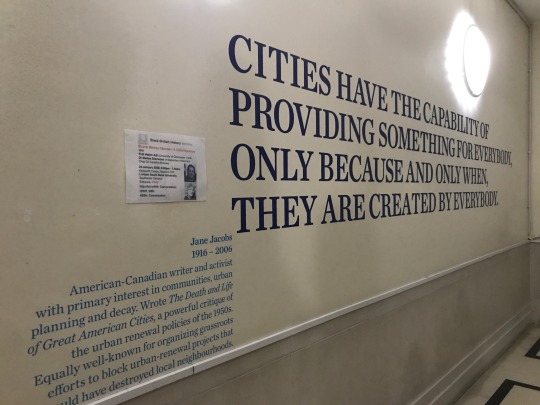
Photo text: "Cities have the capability of providing something for everybody, only because and only when, they are created by everybody."
"- Jane Jacobs 1916-2006, American-Canadian writer and activist with primary interest in communities, urban planning and decay. Wrote The Death and Life of Great American Cities, a powerful critique of the urban renewal policies of the 1950s. Equally well-know for organizing grassroots efforts to block urban renewal projects that would have destroyed local neighborhoods. "
I never got around to reading Jane Jacobs, though I've skimmed enough references to her to appreciate her view of the local community as the interactions (and potential for interactions) amongst neighbors. While Le Corbusier was in favor of making the city into big towering apartment blocks that could provide as much housing as possible with limited shared amenities, it seems like her definition of the community unit was a lot more in line with how real life shakes down.
Friday's class mentioned going into history to find inspiration for the future, in a way anyway, so it strikes me that the present complications about "smart city" echo the old question of how do you build a city for the people? How can we design for inhabitants in a way that uses citizens beyond strings of data or bodies to be stored? Maybe I should do a bit of sparknotes research into Jane Jacobs's theories and how she conceptualized community interactions. We were talking about the circular economy and it reminds me of my own experiences with feeling like being part of a community. For example:
When I was living in New York, I really loved keeping an eye out for furniture in the piles of trash outside homes the night before Trash Day. (Rarely did I ever take anything home, since the threat of bed bugs is omnipresent.) But one night, I saw a perfect frosted glass door lying on the sidewalk amongst pieces of what looked like a dismantled down IKEA wardrobe. It was about 90 inches tall, taller than my apartment ceiling, and the length of my arm.
Greed gripped me and quickly I went home and got one of my roommates to help me carry this huge glass door home. I was worried that taking it would ruin someone else's future wardrobe set, but I also really wanted to use it for projection or puppetry or art or something. I was also worried that since it was such a perfect glass door, I should be paying someone for the honor of taking it from their trash, so I wanted to escape with it quickly.
While we were trying to maneuver the door out of the pile of trash, an older woman had come out from the apartment building and watched us struggle. For some reason, my nervousness about stealing this glass door made me think it belonged to her--and maybe it did, since she noticed me nervously looking at her and went "take it!"
"It's such a nice door! Thank you so much!" I was incoherent with gratitude. I had never seen this woman in my life but I really wanted to be neighbors with her in that moment, share our lives, form a community, repay her for this boon. My roommate and I made off with the door and I never saw this woman again. The door sat in our living room, propped against the wall, unused for another two years.
When it came time to move out, I was trying to freecycle all my stuff and for some reason, I put the door up too. Who'd want a random glass door? But it was perfect and I really, really wanted to hold onto it but there was no way I could throw it back onto the street and not a chance I could take it with me.
It was the first thing to claimed. The person didn't mention why they wanted it, so my roommates and I made up many scenarios, all of them possible and ridiculous.
I got a roommate to haul it downstairs with me, and when the time came a young woman hopped out of a SUV. We struggled getting the door into her car. I managed to ask her why she wanted it. Turns out this door would become a whiteboard for her young students to draw on. What a good reason! Ultimately we managed to balance it precariously over her passenger side seats and it barely fit, but she slammed her trunk and drove away.
And so I said goodbye to the glass door, which is now hopefully living a good third(?) life.
I think this whole process was hilarious but also I love this memory because it's so rare. What if this whole process was ordinary? What if we naturally expected our items to transform, and to change ownership?
There was a great car ad a few years ago when the owner of the car asks a nosy stranger, "who are you?" "I'm the next owner," the stranger replies.
What if we talked about product lifecycles like life stories? Things would be much less disposable, surely, and maybe there would also be stronger community ties. Freecycle was good, I enjoyed the brief moment of intersection I had with this teacher, but what if I could call her up and ask her how it went? How my dear trash door is doing? What if the door could talk back to me?
What if I could call up the lady I had taken this door from, and let her know that I've also paid it forward? What if I could take more trash off the street and know that it's not infested with bed bugs, have guarantees and accountability? I really love it when I see trash that have a small message taped on: I work!
Again, this interest in histories and artifacts could be interesting if the stories were told from the voice of the object. (Would objects have an objective voice?) At the very least, I would be interested in a world where their possessors could talk to each other, trace the intersections of their lives.
0 notes
Text
The 25 Rooms That Influence the Way We Design
The 25 Rooms That Influence the Way We Design
https://ift.tt/38uI6hs

Continue reading the main story
Credit...Video by Scott J. Ross
The 25 Rooms That Influence the Way We Design
Three designers, two journalists and an interiors photographer gathered at The New York Times to make a list of history’s most enduring and significant spaces. Here are the results.
On an October afternoon, our six-person jury — Tom Delavan, the design and interiors director of T Magazine; Gabriel Hendifar, the creative director of the Manhattan-based lighting and design studio Apparatus; the architect Toshiko Mori; the architect and designer Daniel Romualdez; the veteran design journalist Suzanne Slesin; and the interiors photographer Simon Watson — assembled in a featureless conference room at The New York Times to discuss the most influential rooms of all time. By that, we meant “influential” in its truest sense. We wanted the jury to identify the spaces that not only changed the way we live but also changed the way we see, places — whether pleasing, provocative or completely novel for their eras — that not only informed our panelists’ individual practices as designers and documenters but also challenged how we all, as humans, think about beauty, strangeness, originality, décor, proportion, furnishings, art and the multivalent connections therein that define memorable rooms: ones that, above all, offer a new kind of visual lexicon. These are rooms, in other words, that have influenced and inspired interior design throughout the decades, shaping how our mind identifies and assesses a space, any space.
Image

From left: Tom Delavan, Toshiko Mori, Daniel Romualdez, Suzanne Slesin, Gabriel Hendifar and Simon Watson, photographed at The New York Times on Oct. 14, 2019.Credit...Sean Donnola
No one was expecting unanimity; if taste is individual, then discord among this cohort was inevitable. And yet we had asked each of them to nominate their 10 to 15 favorite rooms ahead of time, which the group would whittle to a list of 25. The overlaps were obvious front-runners: Four people chose the soaring, glass-walled sitting area of Pierre Chareau’s Maison de Verre, built in Paris in 1932, while Cy Twombly’s objet-filled 1960s living room in his Roman apartment, Rem Koolhaas’s elevator-cum-office built in 1998 for a disabled client in Bordeaux and Yves Saint Laurent’s art-covered 1970s Parisian salon were also submitted by several panelists. A lively conversation ensued for nearly three hours: What’s more important, the architecture or the design? Are the best spaces dictated by the people who inhabit them? The designers who create them? The period they reflect? Or some magical alchemy of all those things? Should public areas like hotels and restaurants be given as much weight as private, residential ones? And, actually, what is a room?
That last question animated the conversation from beginning to end, as each of our experts made arguments both concrete and philosophical about the human need to gather and connect in enclosed space, sometimes with the intimacy-creating aid of walls and ceilings, but other times not. (We drew the line on gardens — even ones with hedge walls — which everyone decided didn’t qualify.) By the end, we had narrowed upon a mutually satisfying definition of what makes a room and a list of about three dozen worthy examples, the images of which we laid out on a massive conference table, assessing them for final inclusion: Do we have too many museums and, speaking of, is the spiraling rotunda of New York’s Guggenheim more of a room or a building unto itself? Is the living room of the Finnish furniture designer Alvar Aalto a better representation of midcentury Scandinavian Modernism than that of the Danish furniture designer Finn Juhl? Where are all the female-led projects? (“We have to remember that architecture, like many industries, was male-dominated for much of history,” Delavan said. “And the field of interior design — while originally led by women, though now more evenly split between genders — is only a century or so old.”)
Eventually, consensus was reached, though that doesn’t mean the list is necessarily finished or complete: The royal “we” in this story’s headline was, in many cases, applied by our panelists to their own work, the way that they think about design while largely practicing in North America and Europe, which unfortunately means that entire continents such as South America and Africa weren’t under consideration as much as they would have been with another group. There’s a heavy emphasis on contemporary projects, places that everyone had seen with their own eyes. (“Just blame it on the editors,” Romualdez joked, to which Slesin responded, “What’s amazing, if we had to do this tomorrow, is how different it would be.”) So the result that follows — which is ordered chronologically, from oldest to newest — is, at its very least, one history of design in the West on one day from one group of highly opinionated people, all of whom would probably have rather found themselves in any of the rooms below. — KURT SOLLER
This conversation has been edited and condensed. The room summaries are by Nancy Hass.
1. Stonehenge in Wiltshire, England (circa 1600 B.C., architects unknown)
It took Neolithic builders nearly 1,500 years to complete Stonehenge, the outdoor enclosure of nearly 100 enormous upright stones on Salisbury Plain in the south of England. The origin of the structure, which is thought to have been a burial ground or perhaps a place of pilgrimage — the stones are aligned to frame sunrise during summer solstice and sunset during winter solstice — defies logic: The iconic 30-foot-tall three-piece sandstone pillars that stand in the center can be traced to local quarries, but how did a civilization without the wheel transport the inner ring of bluestones, some weighing four tons, from their origin point 200 miles away in Wales? Thought to have been finished around 1600 B.C., over the eons Stonehenge has been attributed to the ancient Celtic high priests called druids and the Arthurian wizard Merlin. But modern historians and archaeologists largely agree that a series of indigenous British tribes worked on the site in stages, over hundreds of years, each culture gaining technological sophistication through the centuries, creating an open-air chamber that stands as an indelible template for enclosure, space and ambitious monumentality.
Tom Delavan: My colleague Kurt and I were discussing what qualifies as a room, and we thought, “Well, a room has walls, or something that could define a wall. But does it need to have a ceiling?”
Simon Watson: For me, a room is a place for people to inhabit together in solidarity, I suppose.
TD: So residential, you’re saying?
SW: Not necessarily. It’s a place where people can gather; it’s what we humans do. I tried to go back as far as I could, and Stonehenge seemed like an obvious choice. I’m not sure if we know much about it, but what we do know is that it was a space where people gathered: Whether they prayed or whether they had conversations about their day, it was a place where people came together. And, for me, that was the definition of a room. It doesn’t have a ceiling. And I don’t think the difference stands in the make of walls, but it creates a space.
Gabriel Hendifar: Or is it just about some spatial organization that communicates intention, whether that intention has a ceiling or not? A room is something that’s been organized to serve some function, whether that is spiritual or shelter, residential or commercial.
SW: And you can go forward in history from Stonehenge to the Pantheon, which is one of the greatest rooms in the world. I’m not suggesting that the Pantheon came from Stonehenge, but rather that the circle is a humanist form we understand. It is the shape that creates a togetherness, in a way. It’s instinctual.
Toshiko Mori: Well, also, Stonehenge has a reference to astronomy. It’s human enclosure, with references to the world outside earth. So, the ceiling in this case is a sky. I think that’s the beauty with it, that it actually exists between ground and sky.
2. The Pantheon in Rome (125 A.D.; architects unknown)
The Roman Pantheon is not only the world’s best-preserved Classical building — it was completed by the emperor Hadrian on the site of an earlier structure of the same name that was probably a sanctuary — but is also likely the first in which the interior, not the exterior, is the focus: It was a precursor to the elaborate decoration of public spaces in later centuries, as well as a model of perfect balance. While its portico, reached by wide steps of Numidian yellow marble, was made in classically Greek style (squared off, with granite columns) once you enter the circular part of the building, you find a shrine to the motifs and mathematical obsessions of the Roman Empire. The rotunda is 142 feet in both diameter and height — a perfect hemisphere — with a 27-foot-wide oculus at the top of the domed ceiling. The dome itself is made of a porous type of limestone, like pumice, mixed with concrete, and has five rings of 28 rectangular coffers. Altered over the eras by successive rulers, including Pope Urban VIII, who in 1626 removed the original bronze girders from the porch roof to make them into cannons, the Pantheon’s architectural and decorative influence cannot be overstated: Thomas Jefferson’s 1826 library at the University of Virginia is one of many obvious homages.
3. The Shokin-tei tea pavilion in Kyoto (circa early 17th century; architects unknown)
The Katsura Imperial Villa near Kyoto, built in the early 17th century, profoundly influenced architects such as Frank Lloyd Wright and Le Corbusier, both of whom spent time in Japan. And with good reason: The 16-acre property, with many outbuildings and exquisite gardens, is a clear expression of how Zen Buddhism’s graceful influence is woven through Japanese culture and design — and is a vivid illustration of why those aesthetic codes still feel utterly contemporary. There are several free-standing tea pavilions on the property, all made to amplify a sense of pureness, reverence and isolation (each celebrates a different season and allows the gardens to be seen from various angles), but Shokin-tei, the tribute to winter, is the one that stands out for its unexpected modernity. With a thatched roof and three sides that face the property’s large pond, it’s notable for the blue-and-white checkered handmade paper that covers a central alcove and sliding doors. The loggia is held up by three oak logs, left natural with their bark intact. Rustic and bold, the teahouse is pleasingly geometric, a hallmark of traditional Japanese architecture.
Kurt Soller: How many of your choices were influenced by having seen these places in real life? Tom made this great point about how, for many people, most of these spaces only exist through pictures.
Suzanne Slesin: That’s why I included the Katsura teahouse, because I’d been there. I went on a tour, and I think we were the only Westerners. It was pouring rain. You’re wearing this translation earpiece, and you go around and the guide was talking, talking, talking in Japanese, and everybody was taking it very seriously, and then the translation was just: “teahouse.” So I just took the picture and I stood there and I thought, “It’s really beautiful, but I’d like to know more about it.”
TM: It’s incredibly influential. A literary reference. So that’s why the Japanese guide would go on and on and on to talk about —
SS: We understood nothing. But to me, this was extraordinary: Of course, Japanese interiors are influential, but this blue and white, I mean, anybody could do that today. And it would be amazing.
TM: The Bauhaus school [in early 20th-century Germany] had seen it. I have to be a little careful about this immediate link because it’s been an argument, a scholarly argument. But it’s very interesting to think about.
4. The parlors of Georgian homes in the United Kingdom (circa 1714-1830; various architects)
There is no perfect room, of course, but the parlor of the typical Georgian home — built throughout London and Edinburgh during the reigns of King George I through King George IV — may come close. The rooms are large, but not in the cavernous, ill-planned way of a McMansion or a billionaire’s high-rise penthouse on Central Park: They are, instead, models of proportion. Usually square, with ceilings around 16 feet high, the parlors’ symmetry was based on the Classical architecture of Rome and Greece, filtered through the lens of the Renaissance but scaled down to accommodate a single family. Unlike the neo-Gothic revival, which began as early as the mid-18th century, or the late Victorian period at the end of that century, both of which prized ornament, there was a spareness to Georgian style, which makes it feel modern today. Windows, placed with mathematical precision, were large and often shuttered — Georgian builders seemed to understand that in the late afternoon, taking tea, one might want to ease gently into the dusk.
SW: The Georgians started this idea of creating very livable proportions in rooms. When you go through them, the scale is huge, with vast windows, but you feel completely comfortable, because the proportions are so perfect. So these big spaces become calm, wonderful places to be in, to live in and socialize with your family or your friends.
KS: Has it influenced how people live now?
Daniel Romualdez: I think they bring the influence.
SW: I think people miss it. I’m looking around me [here in Midtown Manhattan] and I happen to see these vast skyscrapers going up and people living in these enormous spaces. I’ve been in them. You walk in and you think, “How could you live here?” The proportions are wrong. First of all, you need sunglasses all day long.
DR: All that glass!
5. Pierre-François-Henri Labrouste’s reading room at the Sainte-Geneviève Library in Paris (1851)
The Sainte-Geneviève Library, in the Fifth Arrondissement, has roots dating back to the sixth-century manuscript collection of the Abbey of Sainte-Geneviève, though its soaring reading room was built over 13 years, starting in 1838, by the Beaux-Arts architect Pierre-François-Henri Labrouste, who had spent his early career mastering the use of iron in grand railway stations and thus was a virtuoso at evoking grandeur. The nearly 20,000-square-foot, two-story structure is defined by exposed cast-iron arches, suspended over iron columns like parachutes billowing above a giant classical arena. The room, which is now part of Paris’s university system, stands as one of the finest neo-Classical interiors in Europe, influencing the Gothic Revival that swept late 19th-century France as well as the innovative spirit of the architect Louis Sullivan, who at the turn of the 20th century pioneered the use of iron and reinforced concrete in the American skyscraper.
TD: I bet it’s such a nice place to be, between the light and the space.
SW: But it’s also so delicately supported.
TM: Yes, because of the cast-iron work. So it’s a new technology, but within tradition. The motifs of all the cast-iron elements are plants, so it refers to nature, which softens the technological aspect: Otherwise they could have made it look like trusses, but they didn’t. There’s also a visual relationship to the books’ paper, which comes from plants. This influenced the Boston Public Library, the Butler Library at Columbia University, the Doe Library at U.C. Berkeley and others, so this whole idea of a collective reading room is an important example.
6. The Bloomsbury Group’s studio at Charleston in Sussex, England (circa early 20th century)
Inspired by the bright, fluid figuration and sharp abstraction of Post-Impressionists including Gauguin and Matisse, who led the way to High Modernism after World War I, the visual artists of the Bloomsbury Group ran wild at Charleston, the Sussex, England, farmhouse where the married painters Vanessa and Clive Bell and Vanessa’s lover Duncan Grant lived for decades. Virtually every surface in the house, a way station for intellectual bohemians including Vanessa Bell’s sister, the novelist Virginia Woolf, is covered in joyous drawings. In the living room, barely clad classical figures dance across the hearth, and books spill out from shelves. The house, preserved after Grant’s death in 1978, is the embodiment of the revolution that shook the art and design world, its handcrafted ethos driven by the class-driven conflict that took root in England between the wars.
SS: The Bloomsbury rooms combined all the arts together, and this was both unique and very influential. They also represent a coming together of all the arts in a place and time that, although it has passed, is very current in terms of how people engage with design.
KS: And the craft of it all, too, the idea that [the Bloomsbury-adjacent guild known as] the Omega Workshops seems so visually relevant now.
SS: Exactly. I think that’s something people are talking about now. [A few decades ago,] I remember knowing about this and thinking, “Oh, it doesn’t suit my Modernist sensibility. It’s cluttered.” But now I’m looking at it very differently, and I think it’s both charming and bohemian, which is very attractive.
DR: Why did that change?
SS: Well, things happen in life. Some of the things that you like 30 or 40 years ago, you’re less interested in, or you get bored with them. Even well-known designers, like you, Daniel, your style changes. It depends on your clients, but also the way you feel.
DR: Yeah. What persists for you?
SS: I still love Minimalism and Modernism.
DR: Do you think the Modernists’ influence is waning? You know, 30 years ago, when I was in architecture school, that’s all we talked about.
TD: Since I started working at magazines [in the early 2000s], Modernism has basically been watered down. It’s sort of softer; it’s not about an absence of decoration, or anything similarly social or political. It’s just about simplicity.
SW: It’s become more cushy and comfortable.
DR: But don’t you think it’s also, like, a status symbol? A buzzword?
SW: Yes, in every single place in the world.
DR: And you just think, “Oh, I know about Modernism. I’m going to do that even though everything about this room has nothing to do with it.”
7. Jean-Michel Frank’s living room for Marie-Laure de Noailles’s hôtel particulier in Paris (circa 1925)
The Jazz-era Parisian arts patron Marie-Laure de Noailles blithely disregarded convention. She and her husband, Charles, underwrote the Dada-inflected films of Luis Buñuel and Man Ray and bought arms for the anti-Franco forces. Their 16th Arrondissement apartment sparked the career of Jean-Michel Frank, an interior designer who stripped away the early-18th-century moldings from the vast rooms and squared off the giant opening between them. The walls of the apartment (which was returned to its ornate origins by the designer Philippe Starck in 2003 for the Musée Baccarat) were covered in parchment panels hung with paintings by Dalí, Picasso and Miró. And the severe living room furniture that Frank made for the couple continues to inspire contemporary design; created from lush materials including shagreen and mica, the pieces combine geometric discipline with the mark of the artisan’s hand.
8. Pierre Chareau’s salon for Jean Dalsace’s Maison de Verre in Paris (1932)
Bathed in sunlight during the day and lit at night with a phosphorescent lantern glow, the Maison de Verre may well be Paris’s most radical residence. Resembling a box made of glass blocks capped by a single traditional apartment, it was commissioned in the late 1920s by Jean Dalsace, a gynecologist who bought an 18th-century Left Bank hotel, determined to reinvent it as a Modernist mansion. Unable to evict the top-floor tenant, he built around her. The architect, Pierre Chareau, conceived the edifice as a series of interlocking forms, with the doctor’s office on the first floor and two private levels above. Simultaneously labyrinthine and airy, with several sets of stairs and a double-height salon behind the monumental glass wall, it has been compared in impact to Le Corbusier and Pierre Jeanneret’s Villa Savoye (1931) on the outskirts of the city. But unlike that imposing International Style monolith of reinforced concrete, the Maison de Verre possesses a lyrical delicacy owing to the work of the iron artisan Louis Dalbet, who created such touches as perforated mechanical screens to separate spaces and a rolling steel-pipe library ladder with wood inlays. After remaining in the Dalsace family for more than 70 years, the house was bought in 2005 by the history-obsessed American collector Robert M. Rubin, who meticulously restored it.
KS: The Maison de Verre was the most submitted project among our panelists: Four of you chose it —
DR: If I remembered, I would have put it on my list.
GH: Me too.
SS: I mean, it has everything: It has a new structure, it looks to the future, it has furniture that is not just traditional but also modern. Everything about that house — the traffic patterns, the materials, the siding of it, the way it’s used — is really a 20th-century development. And it’s beautiful. I mean, I think it’s beautiful.
DR: It changed the way we designed, you know, these glass-wall houses. The coziness. The multilevel living room.
TD: It’s very comfortable, which isn’t always the case for things that are modern.
9. Finn Juhl’s living room at his home in Charlottenlund, Denmark (1942)
The Danish designer Finn Juhl, along with his countryman Hans Wegner, established the vanguard of Scandinavian furniture design in the 1950s and ’60s with pared-down yet softly contoured pieces made largely of oil-rubbed walnut, maple and teak, and seats and backs covered in nubby upholstery. They were a complete break from the fussy neo-Classical style that preceded them and, because of new manufacturing processes engineered at the same time, were instantly copied. Trained as an architect, Juhl used the ultramodern house he built for his family and lived in for close to 50 years in a suburb north of Copenhagen as a laboratory, tweaking the setting to accommodate new volumes and contours. The house had an open plan — radical for the time — and each ceiling of each room was painted a different color to create different moods. In the living room, where Juhl placed one of his Chieftain chairs and Poet sofas, the beige was intended to evoke the feeling of being under a canvas, especially when sunlight hit it.
SS: I first saw it published in the October 2012 issue of Marie Claire Maison, and I thought, “The art, the furniture, the space, everything is of one mind and very, very simple and modest, but extraordinary.”
TD: The proportions are so nice, even though it’s not grand.
SW: Typical Scandinavian mind-set.
SS: But really, I love the palette and the tile work. The hearth, it’s like a little carpet. I think this has a lot to do with the way people think today.
KS: How so?
SS: Well, I tried to think about the trends — I’m not talking about grandiose houses, like what’s happened to the Hamptons — that can influence the ways people want to live today. One of them is smaller, more modest spaces. But still quality, not cheap in any way.
10. Le Corbusier’s Le Cabanon in Côte d’Azur, France (1952)
Charles-Édouard Jeanneret, the Swiss architect known as Le Corbusier, loved the Mediterranean, with its incomparable light, rough-hewn local architecture and rocky shoreline. In 1952, he built the one-room Le Cabanon for his wife, Yvonne, to use as a summer getaway. Merely 12 feet by 12 feet, it had no real bathroom, just a toilet near the bed, nor a kitchen; the couple took their meals at an adjoining cafe reached by an internal door. With an exterior that resembles a Canadian log cabin and interior plywood walls, it was constructed using Le Corbusier’s so-called Modulor principles — an anthropomorphic scale of proportions based on the movement of the human body — down to the built-in furniture, making it a diorama of the architect’s revolutionary worldview.
SS: I visited this about two years ago, and I could not believe how perfect it was and how it was really the most modern. I mean, it’s one room that allows for sleeping, eating, relaxing and more clever things, too: Guest rooms that pull out of a box, a bathroom mirror that slides open to become a window.
TD: Just that you could live in such a compact —
SS: One of the most important architects of the 20th century conceived of this in the most modest, most beautifully done way, and that was his choice. And one shouldn’t need anything else.
DR: Super functional. Do you know how he lived in it? I mean, was it meant to be a retreat?
SS: I think he spent every summer there.
SW: Yeah, and that’s where he ended up dying [in 1965]. He went to swim and never returned.
11. Nancy Lancaster’s living room at her flat in London (1958)
Among the great paradoxes of the influential style widely known as English Country — a dotty dishevelment characterized by cozy sun-bleached chintzes, antiques from various periods and brightly hued walls — is that it was brought to Britain from the American South in the 1920s, by the Virginia-born socialite Nancy Lancaster, who owned the Mayfair design firm Colefax and Fowler. Inspired by her romanticized memories of plantation houses (including her grandfather’s) that had fallen into disrepair after the Civil War, Lancaster, who lived in England virtually all her adult life, tapped into what her biographer Robert Becker called a corresponding “abstract nostalgia” for a British way of life that had been obliterated by the wars. While she lived largely at Ditchley Park, an estate in Oxfordshire, it was the lacquered egg-yolk yellow living room of her flat above the firm’s Avery Row showroom, completed in 1958 (she died in 1994 at the age of 96) that stood — until just a few years ago, in fact, when the firm moved — as a shrine to her aesthetic, with its barrel ceiling, faux-marble baseboards, braided swags, oversize chandelier and array of comfortable seating. The room has been a lodestar to a generation of American collectors and designers, among them Sister Parish, Mario Buatta and Mark Hampton.
DR: I think you all must think I’m nuts to have chosen the butter-yellow room. I just know that you all would have thought that was weird. But I honestly think design goes in waves, and clients are actually looking at chintz again, which is surprising.
TM: I’m not so sure about Nancy Lancaster. I don’t get it.
DR: I’m going to stand up for her. I just think we are living in a bubble. There’s a lot of stuff being done now that looks like this. Many things I see on Instagram are using similar materials and creating a similar atmosphere.
12. Philip Johnson’s Four Seasons dining room in New York City (1959)
When the Four Seasons restaurant — the epitome of the steel-and-glass International Style, created on the ground floor of the Ludwig Mies van der Rohe-designed Seagram Building — opened in the late ’50s, it was a tourist trap. Not until the late ’70s, when, under new owners, its Grill Room (one of two dining areas connected by a corridor hung with a massive Picasso tapestry) was named the ultimate power lunch spot by Esquire, did Philip Johnson’s extraordinary feat get its due. But it is the Pool Room, now operated as a seafood restaurant called the Pool, that stands as the most vivid reminder of the architect’s commitment to tranquil austerity. Other fancy restaurants of the time were fussily French with cushy banquettes, but Johnson embraced a brash, unadorned rectangularity, with 20-foot ceilings and massive windows shaded only by curtains of rippling, undulating chains. Although the classic midcentury furnishings — not accorded historic status when the building was declared a landmark in 1989 — were auctioned off a few years ago, when the current owners took over, the room’s combination of hushed chicness and uncompromising discipline endures, a testament to the relationship between Mies van der Rohe and Johnson, master and student.
SW: I never ate there [in its original incarnation]. But the pool just struck me as something that functioned very well in the space. Also, it was outrageously chic, it was glistening. It just seemed so refined.
TM: And civilized.
SW: And civilized. Even though half the people in the room were probably crooks.
Everyone laughs.
SW: But it worked, it definitely worked.
13. Cy Twombly’s living room at his apartment in Rome (circa 1966)
The Virginia-born abstractionist Cy Twombly came to Rome in the late 1950s, and soon after, he married the Italian portraitist Tatiana Franchetti, sister of his patron Baron Giorgio Franchetti, with whom he bought an apartment in a 17th-century palazzo on the Via di Monserrato; it had been built for the Borgias. He immediately had the place stripped of generations of old paint to reveal whitewashed walls and pale blue doors with gold moldings; the large rooms and abundant light became a perfect setting for his enormous oil paintings, with their calligraphic graffiti on pale backgrounds, punctuated with phrases from classical allegory or from poets such as Stéphane Mallarmé and John Keats. Particularly in the main sitting room, the artist had an intuitive sense of how best to punctuate the works in his home: He offhandedly mixed them with slightly run-down gilded antiques upholstered in bleached shades, plaster busts that could be found in flea markets throughout the city and bits of silver. The effect is ethereal yet unpretentious, airy, elegant and livable.
DR: To me, Twombly created a whole new atmosphere. Think of all the rooms on Park Avenue today.
TD: It’s a certain “I didn’t try too hard,” which I feel is kind of its own design aesthetic. Even his art, which was super edgy, was not considered great art at that time.
GH: It’s like, “I just happened to be in this palazzo.”
TD: The antiquities were not expensive then. He was buying stuff at the equivalent of a flea market.
SW: I mean, those big busts aren’t antiquity. They’re 19th century. And no offense to Twombly, but they’re a dime a dozen in Rome, and everybody has them. You know?
TD: But to his credit —
SW: To his credit, it all works very well. I’m just trying to break it down. The room itself isn’t outstanding. It’s what’s in it.
DR: To me, it’s all about atmosphere. And you can have a perfect room with no atmosphere, and it doesn’t succeed. So where does the architecture of that room begin and where do the objects and the installation and the installation designer fit in? Which comes first?
TM: Because of those questions, I actually chose extreme examples. Like the Neue Nationalgalerie in Berlin, which was designed as a completely universal space. It’s spectacular: It’s just a ceiling and then there’s continuity of interior and exterior. To me, this was the definition of the conceptual idea of a museum. In a sense, as a space, this is a room that is essentially universal and infinitely transformative. As a concept, it’s amazing.
14. Ludwig Mies van der Rohe’s main exhibition gallery at the Neue Nationalgalerie in Berlin (1968)
As Mies van der Rohe’s last major building (he died a year after it was opened), the massive structure embodies the legendary architect’s preoccupation with open, flexible spaces with minimal enclosure — a radical notion for a museum hall at the time — and complex engineered solutions that seem virtually invisible. With a nearly six-foot-thick steel flat roof painted black (a grid ceiling inside holds lighting) and an architecturally austere presence, it comprises two distinct levels. Visitors climb three flights of stairs to the entrance and the main special exhibition gallery, a hangar-like space supported by cruciform columns on either end, where the art, mostly from the 20th century, is often hung on temporary walls and other innovative structures, revealing the space’s flexible nature. The building is currently undergoing a massive restoration by the British architect David Chipperfield.
15. Stanley Kubrick’s suite in “2001: A Space Odyssey” (1968)
A room does not have to be realized to be seminal: The final, indelible scene of “2001: A Space Odyssey” is set in a huge suite meant to be a luxurious zoo environment for the film’s protagonist, the wayward astronaut Dr. Dave Bowman. Stanley Kubrick, a notorious perfectionist, said it was intended to look as though created by a master race that wanted to observe Bowman in a comfortable setting through the remainder of his life: He ages, dies and is reborn in the room in a few cinematic minutes. Kubrick resisted what might have been an obvious trope of the time — making the room a neon pop palace of blobby plastic furnishings — instead positing what an alien race might consider soothing and elegant to a 20th-century human. The result is a mixture of inaccurate replicas of Louis-era French furniture and neo-Baroque statuary set into alcoves, all gently illuminated by floor tiles lit eerily from below.
DR: Watching that movie, I didn’t remember the plot, because all I did was obsess about this room.
SS: It’s outer space. I mean that’s really a definition, to me, of Modernism, of originality. I mean, it’s terrifying.
GH: It’s sort of atemporal, it’s about the future and the past.
SW: It’s kind of Philippe Starck-y in a way.
TM: I think one can trace nearly everything he’s done to this movie.
16. Donald Judd’s master bedroom at his loft in New York City (1968)
In 1968, Donald Judd, then 40 and fresh off a Whitney Museum retrospective, bought a derelict five-story SoHo factory built in 1870 to use as his home and studio. Although by the late 1970s he was spending much of his time in Marfa, Texas, he lived and worked in New York off and on until his death in 1994, punctuating the loft’s vast rooms with art and objects, creating a template for late 20th-century American Minimalism. After a restoration by the Judd Foundation, run by his son and daughter, the building — which opened to the public in 2013 — remains intact, as pristine as one of the sculptor’s welded metal boxes. Works by Dan Flavin, Claes Oldenburg, Carl Andre, Marcel Duchamp and others remain in the exact positions that Judd placed them. But the top-floor master bedroom best encapsulates the residence’s style: On the wall hangs an early Judd piece in wood, Oldenburg’s “Soft Ceiling Lights at La Coupole” (1964-72) and a John Chamberlain crushed car fragment known as “Mr. Press” (1961). The bed, on a low plinth, is counterpoised with a 19th-century Italian settee, and the angles of a Flavin fluorescent work echo the cast-iron windows overlooking Mercer Street. The neighborhood may no longer be recognizable as the postindustrial wasteland that Judd found in the ’60s, but in the fifth-floor chamber, his vision of SoHo — raw, hand-forged, radical — lives on.
TM: When you talk about someone’s personality driving a space, it’s iconic.
SW: I went there with a friend of mine who is an architect in, I think, 1992, when Judd was still alive. He was still using it then, and what really struck me were these simple elements: the way the floor and the ceiling were the same, and how the objects were placed in this beautiful loft. It seemed so pure, so perfect.
TD: For some reason, I always thought it would be a difficult place to live.
KS: But specific to the person that lived there, right?
TM: Yeah, yeah, yeah.
TD: Yeah, but then his children lived there.
TM: I have to say … I lived in the Maison de Verre, and it’s a horrible place to live.
KS: But should livability be a criteria here?
DR: To keep my business sustained — to have clients come back: yes.
SW: I agree.
DR: I mean, I’m not an artist. I went to architecture school. I ended up decorating, even though I wasn’t trained for that. But the only way my practice will continue is if my clients come back, and most of that is about livability and practicality. You don’t want things falling apart. The last thing you want to get is a phone call about how the air conditioning points at the shower.
17. Yves Saint Laurent’s salon at his apartment in Paris (1970)
The couturier Yves Saint Laurent and Pierre Bergé, his partner in life and business, bought a nine-room, nearly 6,500-square-foot duplex at 55 Rue de Babylone in Paris’s Seventh Arrondissement in 1970 and spent the following decades perfecting it. The designer, who died in 2008 at age 71, layered it with Renaissance bronzes, paintings by Goya and Picasso, the severely modern furniture of Jean-Michel Frank and Eileen Gray and witty anthropomorphic sculptures by Claude and Francois-Xavier Lalanne. His eye for combining old with new — he took elements from the classically minded Rothschild clan and was inspired by the ultra-minimalist Paris hôtel particulier that Frank decorated in the 1920s for the family of the art patron Marie-Laure de Noailles (see above) — remains remarkable, especially in the before-and-after of the double-height salon, its paneled walls the color of burnt sugar. It’s a master class in creating a room that is beautiful from the start yet flexible enough to evolve over the years in tandem with one of the greatest collectors of all time.
KS: Daniel, when discussing Yves Saint Laurent’s apartment, you wanted us to consider it before and after his art was installed, right?
DR: Yes, when I work with clients, I know they’re going to collect art — but they don’t have that art yet — so we need to make the room beautiful for when they first move in. So I show them pictures from the YSL living room when it was empty, more or less, and when it was laden with works by Picasso and others decades later.
GH: What’s interesting to me about this is that it’s wildly chic, but it expresses a certain sort of internal psychology. This room to me is about addiction. It’s about being compelled to collect, to fill space with objects that say something to you about who you are — and about how that affects how we design the spaces we live in, how these spaces communicate something about our psychology.
SW: Or who we think we want to be?
TD: Right.
TM: This relationship of art and life and intimacy — the way the paintings are placed in strange ways, the proportions of the objects — is really interesting to me.
GH: It’s beautifully manic. There’s something about addiction here. I want to get into his head to understand.
18. David Hicks’s living room at his estate in South Oxfordshire, England (1973)
The courtly, charismatic British designer David Hicks grew up amid the chintz and antiques that characterized English interiors of the early 20th century, but at the dawn of the 1960s, he shocked the system with supersaturated clashing shades (red with violet, chartreuse with deep forest), octagonal patterned carpets and a daring mix of 19th-century furniture, Asian objects and Pop abstraction. His taste quickly became synonymous with upper-class cool, and it was he who coined the now-ubiquitous term “tablescape.” In his own red-and-pink living room on his South Oxfordshire estate — which has since become an enduring influence on contemporary designers including Miles Redd, Vicente Wolf and Steven Gambrel — black lacquer accents, layered patterns and oversize objects underscore his lasting aesthetic legacy.
TD: I was always impressed that Hicks could take these 18th-century antiques and bring them to the present.
SS: I don’t think he was afraid of mixing — you know, I wouldn’t talk so much about eclecticism, but that was really it. He was very sure of himself, and I think people may have questioned it, but he just did it. And it was bold.
DR: I mean, when we think about how long his influence has been, it’s been going for like —
SS: This is from the ’70s.
TM: I think his idea of pattern on pattern on pattern is super interesting.
GH: I think that’s the defining character. It’s the graphic nature — even the way he outlines the wall planes. That feels like a very Hicks thing.
19. Paul Rudolph’s living room for Halston’s townhouse in New York City (1974)
If there is one photograph that conveys the essence of the 1970s — at least its louche, glamorous side — it’s the Harry Benson shot of Halston in his 32-foot-tall living room on the Upper East Side. The fashion designer’s stylishly gaunt frame may be burned into the collective memory, but it’s arguably his house — that sharp-edged, almost extraterrestrial abode — that will forever haunt us. Designed in 1966 by Paul Rudolph, who was for years the dean of Yale’s architecture school, and remodeled once Halston bought it in 1974, the 7,500-square-foot townhome was famously a locus for celebrities, including Andy Warhol, Bianca Jagger and Liza Minnelli. Rudolph, widely credited for bringing Brutalism to the United States, eschewed comfort, practicality, even safety in much of his work, opting instead for maximum minimalist drama. Although Gunter Sachs, the Swiss industrialist who was an owner of the house after Halston’s death in 1990, mitigated some of the Rudolphian details, including the ubiquitous gray industrial carpeting, the vertiginous floating staircase to the mezzanine still shocks, especially when imagining the partygoers who must have tried to descend it in stilettos: It has no handrail. That’s just one of the defining details that the designer Tom Ford, who bought the house earlier this year, is likely to leave alone.
DR: In some ways, it’s influenced all these glass-tower apartments. I can’t think of anything more glamorous since then.
SS: It is glamorous. And I think right now we’re in a glitzy period but not a glamorous period. And this was glamorous without being glitzy. It had this “wow” factor for its time, and yet it was pretty tame in a way.
GH: Everything comes up from the floor, with that wall-to-wall carpet drawing you down. I find it very earthy and sensual and grounding in a way.
DR: Your point is fantastic. I was feeling uncomfortable with these super tall rooms.
SS: Also, isn’t it really a portrait of Halston? It’s exactly him. I couldn’t separate that house from him: the way he looks, the way he was, what he represented, the clothing — everything.
20. Ricardo Bofill’s living room at La Fábrica in Sant Just Desvern, Spain (1975)
Architectural postmodernism, which became prominent in the 1980s, combined classical elements with Brutalist materials like cement and iron, often pumping up details to cartoonish proportions. But La Fábrica, a 32,000-square-foot former cement factory outside Barcelona that Ricardo Bofill, now 80, converted into a home and office in 1975, illustrates the style at its most inspiring. With over 30 concrete silos, cavernous machine rooms and nearly 2.5 miles of underground tunnels, this reimagining of a complex that had been built during Spain’s postwar boom was a mammoth undertaking that is, after nearly 50 years, still in process. By keeping many of the original details, including massive if narrow arched windows and exterior metal staircases, Bofill — whose firm Taller de Arquitectura is known for Barcelona Airport’s Terminal 1 — has transformed the space into vast public areas, expansive libraries and cozy bedrooms, some tucked into the formerly abandoned silos. The central living room, with two stories of arches, exposed pipes and oversize billowing white drapes, reflects the inherent dynamism of repurposed spaces.
GH: To me, this represents this idea of reclaiming industrial space and rejiggering it for habitation, putting a human-scale softness inside a space that is not meant to do that. I think this says so much about how we live now — how much of Manhattan and Brooklyn, for instance, are being developed.
SS: The outside of this is the scariest building you’ve ever seen. It’s all turbines.
GH: There’s this tension between the building’s past life, which was really industrial and felt anti-human, and its current use as a backdrop for domestic life.
21. Andrée Putman’s office for the French Minister of Culture at the Palais-Royal in Paris (1984)
Jack Lang, who became France’s Minister of Culture under François Mitterrand during the 1980s, brought with him not merely a stylishly shaggy haircut and custom-made jewel-toned shirts that he wore beneath a well-cut suit but a fierce passion for interior design. Perhaps unsurprisingly, he hired Andrée Putman — then the doyenne of Parisian design, who had conceptualized Morgans Hotel in New York and redone the interior of the Concorde — to reconceive the ministry’s ornate offices in the 17th-century Palais-Royal in the First Arrondissement. She paired the elaborately gilded boiserie walls and outsize chandelier with a pale-hued suite of geometric postmodern furniture, including barrel chairs and a half-moon desk so aesthetically significant that it was kept by at least five successive French presidents. Her fearless mixing of styles and periods — unheard-of at the time — led the way for designers to introduce modern, even minimalist, furnishings into historic structures, weaving a new, more layered narrative
GH: This room speaks specifically to what furniture does, and about how the intervention of nonnative pieces to a historical room completely changes what you see. I just think this is incredibly genius.
22. Vincent Van Duysen’s living room at his house in Antwerp (1993)
Sensual minimalism might seem oxymoronic, but if there is a signature style of our era, that may be its proper sobriquet. In the 1990s, the Belgian designer Vincent Van Duysen, now 57, pioneered such environments — unfashionable at the time — which are both under-decorated and gracefully patinated. They take from early 20th-century Modernism a sense of lofty proportion and a lack of color and embellishment but avoid the coldness of steel and tempered glass. Instead, with raw, textured fabric and wood to bring out the soul in sparingly arrayed and geometrically precise furniture, Van Duysen’s interiors evoke silence and calm. Nowhere is this truer than in his own Antwerp living room, where light illuminates elemental shapes and defiantly plain bleached linens in shades of oatmeal and pure white.
KS: Tom, you had chosen very pale rooms, very white rooms. How come?
TD: I saw Van Duysen’s early apartment when it was published in the early ’90s; it still feels like so much of what’s happening now is based off that sort of linen-and-oak-floor look. It’s not overly polished, but it has a sort of fanciness.
23. Philippe Starck’s lobby for Ian Schrager’s Delano Hotel in Miami Beach (1995)
The Delano, on Collins Avenue in South Beach, was not the first boutique hotel (that title likely belongs to Morgans, also an Ian Schrager brainchild, which debuted in New York City a decade earlier), but it remains simultaneously archetypal and original. Born of a collaboration between Schrager, the Brooklyn-bred impresario of Studio 54, and Starck, the Harley Davidson-riding Parisian designer, the interior renovation of the 1947 hotel, with its historically protected pink stucco facade, was intended to, in Starck’s words, reflect the “deep elegance of a poor people who have a very clean house.” His approach contrasted vividly with the neon-adorned Art Deco hotels that were then being modernized along the strip, and helped give birth to the contemporary Miami aesthetic. The 14-story hotel currently has 194 sparsely furnished, white-on-white rooms above a cathedral-ceilinged lobby corridor with gleaming dark floors and semi-sheer floor-to-ceiling white curtains that billow in the breeze. In niches along the way sit a Salvador Dalí chair and the iconic overscale banquette from which countless guests have started taking selfies.
SS: Starck’s whole philosophy was influential both in other hotel lobbies but also in the way people looked at their bedrooms, their entryways and particularly their bedrooms. I mean, this was one of the first all-white projects, with the whole idea of creating excitement of being in a hotel versus the fear of being in a space that you don’t know, that’s not comfortable. That whole dichotomy of thinking in terms of designing spaces — and in how that changes how people experience their own homes — was very interesting. Visiting the lobby of the Delano was like entering a classical temple.
SW: I remember walking in in the ’90s, and I had the same feeling as you have when walking into a gothic cathedral. It turned everything around.
TD: It was sort of breathtakingly beautiful, but the proportions are also very functional.
24. Rem Koolhaas’s elevator office at Villa Lemoine in Bordeaux (1998)
In the late 1990s, the French publisher Jean-François Lemoine and his wife, Hélène, were in the midst of planning a hyper-modernist family villa overlooking the city of Bordeaux when he was in a car crash that left him partially paralyzed. Undeterred, they hired the Dutch architect Rem Koolhaas, whose firm OMA built them an elaborately engineered house to enable Lemoine unparalleled mobility without sacrificing the couple’s desire to push beyond conventional volumes. Instead of keeping things on a single elevation with openings wide enough for a wheelchair, Koolhaas created three levels partly wedged into the hill, centered around a 10-foot-by-11-foot elevator platform set up as an office for Lemoine. Powered by a hydraulic lift, the platform moves freely between the floors. It can hover between, lending spectacular unobstructed views, or become flush to the kitchen at the base or disappear into the glassed-in center-level living area; at night, it rises to become a corner of the cantilevered top floor expanse that holds the bedrooms, which have porthole-like windows punched through weathered metal cladding. Lemoine died in 2001, and the house remains in the hands of Hélène. Their daughter, Alice, and her husband, Benjamin Paulin, son of the legendary furniture designer Pierre Paulin, have recently transformed the home into a temporary exhibition space showing Pierre Paulin’s furniture.
DR: Would you say the room that’s the most influential in the home is the office that goes up and down?
TM: That whole idea of a room itself. Since the entire study is an elevator, the owner could access his whole home, which makes the person who is disabled become the most empowered person. It’s an ongoing issue: How do you make a disabled person not a secondary citizen within their own environment?
25. Ryue Nishizawa’s Teshima Art Museum in Teshima, Japan (2010)
The Japanese island of Teshima, about an hour and a half south of Okayama in the Seto Inland Sea, is a place with chaste beauty, a population of barely 1,000 and, since 2010, a nonpareil one-artwork museum. Shaped like a flattened droplet of water straining to return to the sea, the Teshima, designed by the Pritzker-winning architect Nishizawa (co-founder of the Tokyo-based firm SANAA) is rendered in pale concrete, with no structural pillars, just curved walls that slope to meet the canopy of ceiling and two elliptical openings that allow in the elements. But as you stand in the vast space in your bare feet (shoes must be removed at the door), it’s the interaction of the structure with the subtle and strange environmental sculpture, “The Matrix” (2010), by the elusive artist Rei Naito, that makes the room seem so otherworldly. Water trickles down from a ribbon dangling from the rim of one of the apertures; at first, you think that this alone is creating the small pools on the floor. But as you look more closely, you realize that water is scooting across the roughly textured surface like a wriggling family of salamanders. The floor itself, it turns out, is the matrix, pocked by the artist with pin holes that allow groundwater to filter upward, animated by unexplained physical forces, creating a perpetually changing canvas.
TD: How high is the ceiling?
TM: About 15 feet. Not so high. It’s very intimate; only limited numbers are allowed in. It’s a very personal experience because you’re not allowed to speak and you’re kind of restricted.
SS: It’s also freezing.
KS: Is this a room to the rest of you? Just to play devil’s advocate.
SS: It is! I think it’s a room.
DR: I think it’s a sculpture.
SS: This is comparable, I think, to the “Space Odyssey” room.
TM: It’s got one oculus. So it seems influenced by the Pantheon.
TD: Going back to our original definition, a room is an enclosed place where people gather for a reason.
KS: This is contained in some way.
SW: Look, here’s what I think we’re learning today: There’s no one definition of a room.
https://ift.tt/2RKumsG
via The New York Times
December 10, 2019 at 02:22PM
0 notes
Text
October 5, 2004 | Barjac
Michael Auping: Titling an exhibition Heaven and Earth, as we have done here, requires a little explanation. Perhaps we should just begin with the very simple question, do you believe in heaven?
Anselm Kiefer: The title Heaven and Earth is a paradox because heaven and earth don’t exist anymore. The earth is round. The cosmos has no up and down. It is moving constantly. We can no longer fix the stars to create an ideal place. This is our dilemma.
MA: And yet we keep trying to find new ways to get to ‘the ideal place’, the place we assume we came from – to find the right direction.
AK: It is natural to search for our beginnings, but not to assume it has one direction. We live in a scientific future that early philosophers and alchemists could not foresee, but they understood very fundamental relationships between heaven and earth, that we have forgotten. In the Sefer Hechaloth, the ancient book that came before the kabbala, there is no worry of directions. It describes stages, metaphors, and symbols that float everywhere. Up and down were the same direction. The Hachaloth is the spiritual journey toward perfect cognition. North, south, east, and west, up and down are not issues. For me, this also relates to time. Past, present, and future are essentially the same direction. It is about finding symbols that move in all directions.
…
MA: You are not a ‘New Age’ spiritualist. I know that for sure, but some people who see your images may wonder just what your position is in regard to religion.
AK: My spirituality is not New Age. It has been with me since I was a child. I know that in the last few decades religion has been made shiny and new. It’s like a business creating a new product. They are selling salvation. I’m not interested in being saved. I’m interested in reconstructing symbols. It’s about connecting with an older knowledge and trying to discover continuities in why we search for heaven.
MA: I can see fragments of continuity in your works between symbols that are ancient and those that take a more modern form, and for me that suggests a kind of hope within your landscapes. But there are also some very dark shadows in your images, literally in terms of color , as well as in metaphor and content. It is as if in the same image we see a liberation of knowledge but the dark weight of history.
…
MA: Christian images are apparent in your work, but in many ways not as apparent as Jewish or Gnostic references.
AK: Later, I discovered that Christian mythology was less complex and less sophisticated than Jewish mythology because the Christians limited their story to make it simple so that they could engage more people and defend their ideas. They had to fight with the Jewish traditions, with the Gnostics. It was a war of the use of knowledge. However, it wasn’t just a defense against outside ideas. It was aggressive. Like politics, they wanted to win. You know, the first church in Rome was not defensive and not aggressive. It was quiet. It was spiritual in the sense of seeking a true discussion about God. It was exploring a new idea about humanity. But then there was ‘iglesias triumphant’, the Triumph of the Church. And then the stones were stacked up and the buildings came, and the construction of the Scholastics, Augustine, and so on. They were very successful in limiting the meaning of the mythology. There were discussions about the Trinity and its meaning. anyone who had ideas that complicated their specific picture was eliminated. This made Christianity very rigid and not very interesting. Whenever knowledge becomes ridgid it stops living.
MA: In 1966, you visited the Monastery at La Tourette. Was this before you made the decision to be an artist?
AK: I began studying law. I didn’t study law to be a lawyer, but for the philosophical aspects of law, constitutional law. I was interested in how people live together with out destroying each other.
I went to La Tourette while I was studying law. It may sound strange to go from the study of law to La Tourette, but it really wasn’t. I had always been interested in law from a spiritual aspect. A constitution is not unlike the idea of a church doctrine. People need a context or a content, something to bind them together. This could be stretched to mythologies. Law, mythology, religion – they are all structures for investigating human character.
…
MA: Why did you go to La Tourette in the first place? I don’t imagine that you went only to see a Le Corbusier building. You stayed there for three weeks.
AK: The Dominicans were there. I liked their teaching. They have an interesting history. I had read that they had many discussions with Le Corbusier about the shape of the building and the materials. It was a point in my life when I wanted to think quietly about the larger questions. Churches are the stages for transmitting knowledge, interpreting knowledge and ideas of transcendence. It’s a history of conflicts and contradictions. A church is an important source of knowledge and power. Le Corbusier knew that. I stayed there for three weeks in a cell. I thought about things. In a place like that you are not simply encouraged to think about God but to think about yourself, Erkenne dich selbst. Of course, you think about your relationship to god.
Also, for me it was an inspiring building in the sense that a very simple material, a modern material, could be used to create a spiritual space. Great religions and great buildings are part of the sediment of time; like pieces of sand. Le Corbusier used the sand to construct a spiritual space. I discovered the spirituality of concrete – using earth to mould a symbol, a symbol of the imaginative and spiritual world. He tried to make heaven on earth – the ancient paradox.
…
MA: Could we go back and talk a little bit more about your education as an artist? You went to the university in Freiburg.
AK: Yes. But first I had a nineteenth-century idea that the artists is a genius – that art comes out of him naturally and he doesn’t need any education. I had always thought this, even as a child. You could say that I had too much admiration for artists. I thought they all came from heaven. Later I found out than an artwork is only partly done by the artist, that the artist is part of a larger state of things – the public, history, memory, personal history – and he must just work to find a way through it all, to remain free but connected at the same time.
…
MA: And later on you went to see Joseph Beuys, although you didn’t officially study with him.
AK: No. I was living in the forrest in Hornbach and had made some canvases. I had heard of Beuys and so I took my canvases to Düsseldorf to show him. He was impressive. I liked him very much. His dialogue was broad and he could be very impressive. He had a world view, not just the view of an artist. I think I appreciated him more because I had studied law.
MA: How so?
AK: Art cannot live on itself. It has to draw on a broader knowledge. I think both of us understood that at the tim ewe knew each other.
MA: Although I never met him, you and Beuys seem very different to me. He was more extroverted and you are more introverted, or at least less public.
AK: We were different, and as a young artist I needed to question that difference. Nevertheless, I learned a lot from him, even though he was not my teacher. I could talk to him about larger issues.
MA: In his interviews and writings, Beuys often evoked the word ‘spiritual’. How do you think he meant that?
AK: That is complicated. We were both in Germany at a certain time – a time when a dialogue about history and spirituality needed to begin. It was difficult to separate the two subjects There was a sense of starting over. To evoke the spiritual not only looking at ourselves but into the history of our nation. It was not just a matter of a critique. It had to be deeper than that. So yes, Beuys was a spiritual man. The artist is naturally spiritual because he is always searching for new beginnings.
…
MA: Here on the grounds of your home in Barjac, France, you are creating a monumental installation of stacked concrete rooms or ‘palaces’ that go up hundreds of feet into the air, asa well as a sprawling series of connected underground tunnels and spaces containing palettes, books, and lead rooms. Are you working your way through the palaces of heaven?
AK: I follow the ancient tradition of going up and going down. The palaces of heaven are still a mystery. The procedures and formulae surrounding this journey will always be debated. I am making my own investigation.
28 notes
·
View notes
Text
CHANDIGARH: A DAY IN THE CITY BEAUTIFUL

Hungry to travel, we planned a trip to Himachal. We had to decide between Chandigarh and Delhi to be our pit stop. But being architecture - geeks we chose Chandigarh, even though it meant loosing more time in travel.
What Chandigarh was all about- Tons of Le Corbusier. Lots of Chole Kulche. Napping on park benches and gardens. Having an entire double decker bus to ourselves. High energy. Great weather.

Chandigarh Railway Station
Arrival Story
We reached Chandigarh railway station at dawn. And boy oh boy, that was a clean railway station! The cleaners were wiping the walls clean like we do at our homes in Diwali. As a result of 24 hours journey in sleeper coach, our bodies felt dirtier than the benches we sat on. After cleaning up in the waiting room, we went to the ISBT in sector 17. We kept our luggage in the cloak room as we had to board the bus to Himachal from there. These were our ways for a cheap trip turning out to be a pocket friendly and thrill- pill.
Trees dot the fabric of Chandigarh- along the roads, in open plazas, everywhere! And mulberry is one such tree that you spot all around. Coming out from the ISBT, we found big mulberry trees loaded with berries as with the onset of summer, they start bearing fruit. While satisfying our taste buds, a few lines from James Riley's poem on the mulberry tree came to my mind:
“Today as I dream with both eyes wide-awake/ I can see the old tree and its limbs as they shake/ And the long purple berries that rained on the ground.”

Mulberry hunting on the roads of Chandigarh
Chandigarh Tourism runs a hop-on, hop-off double-decker tourist bus. It leaves from sector 17 and runs to prominent sites like the Rose garden, Museum and Art gallery, Bougainvillea Garden, Rock Garden and Sukhna Lake for just 50 bucks a person. As there were no other tourists that day, it was like we had our own private bus to scout the beautiful city and enjoy the panoramic views of sparkling parks, eating joints, and majestic hills, at our own pace!

HOHO bus
SUKHNA LAKE
Our first stop was Sukhna lake, a majestic man-made lake with Shivalik ranges forming its backdrop. We took a small stroll and clicked a few pictures. After that, we headed towards the next famous destination of Chandigarh, Nek Chand’s wonderful, whimsical Rock Garden.

Large plaza adjoining the lake
ROCK GARDEN
The whole experience of visiting the Rock Garden was extraordinary, disorientating and deeply impressive. Throughout the garden, Nek Chand has used space in sharply contrasting ways, from almost oppressively narrow, steep-sided lanes and tiny Alice-in-Wonderland doorways to large, confident waterfalls and open terraces. Inspired by Le Corbusier's use of concrete in the city, yet what Nek Chand produced is folk art and labyrinthine paths. It stands in extraordinary contrast to Corbusier's modernist city and its grid pattern roadways. Though being about half a decade old, it still has the same charisma and awesomeness. You are spellbound by the site of hundreds and hundreds of figurines covered with colorful broken crockery, tiles, bangles and what not!

Made entirely of reclaimed, reused and recycled materials
GOVERNMENT MUSEUM AND ART GALLERY
If it is not Monday or outside the hours of 10:00 AM to 4:45 PM, you may visit the Government Museum and Art Gallery in Sector 10. The Government College of Art and the Museums of Architecture & Natural History surround it. It has become a haven for tourists, researchers, students on a school visit and families because you can spend an entire day here. And for us, its campus meant, a nice place to rest. As we were awake since 4 in the morning, we were tired and the benches shaded by the trees proved to be very cozy to take a half an hour nap.
No one else was there the afternoon we visited. We paid admission for ourselves and half-admission for our camera. The curators intended the exhibition to have placid and mesmerizing effects on the eyes of the onlookers. And I must say they were quite successful in doing so. And if one happens to be a lover for art and crafts and architecture, then this place is the ultimate paradise.

Built on Corbusier’s concept of “a Museum of Unlimited Growth”
Corbusier conceived the Capitol Complex as the head of Chandigarh’s sectored body, and the City Centre in Sector 17, two-thirds of the way up the grid of arteries, as the heart. The green space—surprise, surprise—was considered the lung. And as an conclusion to our day, we decided to visit the Capitol Complex.
Unlike other cities such as Mumbai, which are a mixture; Chandigarh is easy to navigate, sector-wise, as the sectors are all in line. In Mumbai, it takes more-and-more-proximate-but-never-definitive directions from five pedestrians to get anywhere.

An easy to navigate layout
CAPITOL COMPLEX
The rickshaw deposited us shy of the gate. In front of the guard booth, an army officer kept vigil. He had arms and a rifle, which were enough to make us feel nervous. As we walked towards him, we did rapid character development and hammed up to look like non-hostile tourists (which we were). An even pace, cautious bob of the head, clearly displayed hands, chattering amongst us. While we didn't expect bullets flying towards us, the thought of how severely dangerous an error would be under the circumstances of upcoming elections affected that kind of dread in us.
Fear not, we passed through unscathed. The officer took our identity cards in his possession and allowed us to go visit the campus of Capitol Complex. We were warned not to wander anywhere near the Assembly building and the High court or any other building other than the Open Hand.
OPEN HAND
No one else was there the time we visited. As soon as you enter the campus, you can see the 28 meters high Open Hand looming over you, heavy and dominating. It's not until you reach the monument that you see, the hollow crowned by the Open Hand. The floor of this consideration, 'considering to think, see, to talk about what's real', was 5 meters deep. It consists of two amphitheaters. Two because Corbusier's philosophy was that ' there are always two sides to a question'.
We descended to the sunken courtyard designed as ' pit of contemplation' where the public affairs would be discussed. It appeared more to us as a place, hidden in view, where cult meetings would take place. We could imagine cult leaders addressing their followers from the podium. Corbusier designed the place so carefully that a person won't need a microphone, but the acoustics of the place will handle it all.
And it was while sitting there, clicking weird pictures that one of us squealed that the Hand is moving! Yes, we didn't know it till then that the Monument is mounted on a ball bearing. It allows it to turn with the wind, not aimlessly, to express what life really is, constantly moving.
The true and simple meaning of the Open Hand is to Give and Receive.
Symbol of Faith in the world of Catastrophe.
You don't need knowledge of symbolism in architecture nor longer than a day in Chandigarh to become familiar with the Open Hand and its authority in enhancing the brand name of the city. Also interpreted as a flying bird, for the citizens of Chandigarh, it is symbolic of freedom, freedom to be who they are and what they can do.

Open Hand, also identified as flying bird
HIGH COURT AND ASSEMBLY BUILDING
Till the time we were sitting there, two surveillance conveyances had already come to check in on us. The barbed-wire-and-jeep-patrolled perimeter was enough to dismay us. So, after spending a significant amount of time in the pit of contemplation, we walked to the High Court, hopeful that no one will catch us. Since the officer had warned us not to wander anywhere near the other buildings, we gratified ourselves by clicking pictures with the architectural marvel, as a proof that affirmative, we had visited the much-celebrated building.
Sculptural architecture with rhythmical brise-soleil and a floating roof
Though Corbusier conceived the entire complex as the head of the new capital, looking behind us, we could not see any of the city. Lush trees and extensive landscape surrounded us, with no building in sight. The only structure visible was the sculptural hill that Le Corbusier had designed for the Assembly Building, at the Southernmost part of the complex that divides the city from the Capitol Complex.
Returning back to the security booth, the army personnel had changed. The camoed officer flicked through our identity cards. On sight of State Maharashtra, he apprised us of his roots there. Like true Indians, meeting in a foreign country, we exchanged greetings. "Aree tumhi pan, mi pan!" There is no greater happiness than meeting a person speaking your language in a state where the language and people, both are alien!
We witnessed something on our way to the main road which you would never expect in an urban area. In the darkness of the night, the landscaped areas along the sides of the road started glimmering of golden speckles of dozens of fireflies. We stood there unable to believe. And then, suddenly it started sparkling all around. What joy such brilliant tiny moments can bring!
We didn't fear, we dare. This is what women do everywhere. It turned out to be a successful girls going. And that was an end to Chandigarh but a perfect beginning to a great travel story.
Read the full article
0 notes
Text
A ‘radical alternative’: how one humankind changed the taste of Los Angeles
In the 1960 s, British architectural pundit Reyner Banham swore his love for the city that his fellow eggheads detested. What Banham wrote about Los Angeles redefined how “the worlds” comprehended it but what would he think of LA today?

Now I know subjective sentiments can vary, the writer Adam Raphael wrote in the Guardian in 1968, but personally I anticipate LA as the noisiest, the smelliest, the most uncomfortable and most uncivilised major city in the United States. In short, a smelling sewer …
Three years later, Raphaels paroles appeared in publication again as an epigraph of Reyner Banhams Los Angeles: The Architecture of Four Ecologies “the worlds largest” exuberantly pro-Los Angeles journal ever written. Ever since publishing, it has shown up on directories of enormous volumes about modern metropolitans even those is drawing up by people who examine Los Angeles anything but a great American city.
Somehow, this work that outlined so much of its initial publicity with offend appraise( In Praise (!) of Los Angeles, sneered the New York Times reviews headline) has retained its relevant through the activities of the decade, such that newly arrived Angelenos still read it to orient themselves. But what can it educate us about the Los Angeles of today?
An architectural historian a decade into his vocation where reference is firstly called, Banham knew full-well that his fellow eggheads detested Los Angeles. How and why he himself came so avidly to appreciate it constitutes the core question of his work on the city, which culminated in this slim volume.
The many who were ready to cast doubt on the importance of the enterprise, he reflected in its last chapter, included a recognise Italian architect and his wife who, on was found that I was writing this work, doubted that any person who is cared for architecture could lower himself to such a project and walked away without a word further.
The project began when Banham produced his shaggy whisker and wonky teeth to Los Angeles and declared that he enjoyed the city with a ardour, in the words of novelist and Bradford-born Los Angeles expat Richard Rayner. Teaching at the University of Southern California, who applied him up in the Greene brothers architecturally worshipped Gamble House in Pasadena, Banham had a privileged basi from which to search. But what “hes been gone” looking for, and the way he wrote about what he saw and seemed, redefined the room the academic world and then the wider world comprehended the city.
Reyner Banham with his shaggy beard and wonky teeth in 1968. Picture: Peter Johns for the Guardian
Not that he swore his love right there on the tarmac at LAX. Banham initially knew the city incomprehensible a reaction shared by many commentators, wrote Nigel Whiteley in the study Reyner Banham: Historian of the Immediate Future.
Banham firstly attempted to publicly explain this cutting-edge metropolis, saturated across its tremendous seat with electronic machines, synthetic chemicals and televisions, in four 1968 BBC radio talks. He told of how he came to controls with LAs embodiment of the experimental: its experimental determine and infrastructure, the combinations of cultures it accommodated, and the experimental lives to which it gave rise.
But even an appreciator like Banham had his qualms with research results. In Los Angeles you tend to go to a particular lieu to do a specific happen, to another to do another thing, and finally a long way back to your dwelling, and youve done 100 miles in the day, he complained in the third largest talk. The intervals and the trust on mechanical transportation leave no chamber for accident even for glad collisions. You project the working day in advance, program your activities, and waive those random meetings with acquaintances and strangers that are traditionally one of the reinforces of metropolitan life.
Nevertheless, to Banham this un-city-like city supported out a predict: The unique value of Los Angeles what arouses, intrigues and sometimes repels me is that it offerings radical alternatives to almost every city notion in unquestioned currency.
In his subsequent landmark book, Banham itemized Los Angeles retirements from conventional urbanism, as well as from all the rules for civilised living as they have been understood by the pundits of modernity, with evident gratify. It seemed to legitimise a model “youve already”, in a 1959 article, recommends to supplant the old-time perception of a single dense core surrounded by a wall.
Civilised living in suburban LA. Image: University of Southern California/ Corbis via Getty Images
Banham foresaw the city as scrambled egg, its shell burst open, its business yolk mixed with its domestic lily-white, and everything spread across the landscape, its evenness vexed simply by occasional specialised sub-centres. A tourist to Los Angeles today might discover the city explained in simply the same route: as a network of nodes, a constellation of city hamlets, an exercise in postmodern polycentrism.
Banham applied another digit in the eye of conservatives who insisted that a city should have just one strong centre with his short assembly A Note on Downtown, which opens with the words, … because that is all downtown Los Angeles deserves.
From its fetishised structures such as the Bradbury Building and Cathedral of Saint Vibiana to its brand new agency towers in their standard livery of dark glass and steel, Banham wrote that everything countenances as an unintegrated scrap in a downtown stage that began to disintegrate long ago out of sheer irrelevance, as far as one can see.
The notebooks contrarianism reflects the contrarianism of Los Angeles itself, which, insofar as it plays the functions of a great city, to its implementation of size, cosmopolitan mode, innovative energy, international influence, distinctive way of life, and corporate identity[ proves that] all the most admired theorists of the present century, from the Futurists and Le Corbusier to Jane Jacobs and Sibyl Moholy-Nagy, have been wrong.
Filled with photographs and sketches, Banhams book on Los Angeles segments its subject up into the four ecologies of its subtitle: the beaches and beach towns of Surfurbia; the Foothills with their ever more elaborated and costly mansions; the utilitarian Plains of Id( the only parts of Los Angeles flat enough and tolerating sufficient to compare with the cities of the Middle West) and the famed, then notorious, freeway plan he dubbed Autopia: a single intelligible situate, a coherent cognitive state in which Angelenos invest the two calmest and most fruitful hours of their daily lives.
The 1893 Bradbury Building in downtown LA was an unintegrated scrap in Banhams gazes. Photo: Michele and Tom Grimm/ Alamy
Between sections on the citys ecologies, Banham examined the buildings found in them. Populist, stylistically promiscuous, tradition-agnostic and often deliberately impermanent, Los Angeles architecture has, of all the citys components, reaped distain the longest. There is no reward for aesthetic dignity here , no sanction for aesthetic misdemeanour; nothing but a immense planetary phlegm, wrote the novelist James M. Cain in 1933.
More than 40 year later, Banham considered a stylistic reward of Tacoburger Aztec to Wavy-line Moderne, from Cape Cod to unsupported Jaoul tombs, from Gourmet Mansardic to Polynesian Gabled and even in extremity Modern Architecture.
He discussed at length the LA building known as the dingbat a two-storey walk-up apartment-block … improved of lumber and stuccoed over, all indistinguishable at the back but inexpensively, elaborately, embellished up-front, decorated with an aspirational appoint such as the Capri or the Starlet.
In characterizing dingbats as the real symptom of Los Angeles city id, trying to be dealt with the unprecedented form of residential concentrations too high to be subsumed within the illusions of homestead living, Banham diagnosed the center and long-lasting friction, then as now, between wanting to grow outward and needing to grow upward.
Banham gleaned out the implications of Los Angeles ostensibly disposable builds not by idolizing them , nor minimizing them, but plainly by investigating them as they were. Robert Venturi, Denise Scott Brown and Steven Izenour would preach the same approaching in their own urban classic, Hearing from Las Vegas, publicized the following year: Withholding opinion may be used as a tool to draw later sentence most sensitive. This is a way of learning from everything.
Still, even appreciators of Los Angeles might take issue with this method when Banhams non-judgmental attitude at the least toward the esthetics of American commercial culture starts to look like advocacy for bad taste.
The self-absorbed and perfected Watts Towers. Image: Hulton Archive/ Getty Images
Non-appreciators of Los Angeles certainly did. The painter and critic Peter Plagens, scribe of an 11,000 -word excoriation in Artforum magazine entitled The Ecology of Evil, moved so far as to description Banhams book hazardous: The hacks who do shopping centre, Hawaiian eateries and savings-and-loans, the dried-up civil servants in the department of highways, and the forces of showbiz fringies will sleep a little easier and drive a little harder now that their enterprises have been authenticated. In a more humane society where Banhams doctrines would be measured against the subdividers rape of the tract and the contribute molecules in kids of my own lungs, the author might be put up against a wall and shot.
Uncowed, Banham followed the book by starring in Reyner Banham Loves Los Angeles, a 1972 television documentary that followed him through the working day in the city that forms nonsense of biography and breach all the rules, and inspired within him a passion that goes beyond appreciation or reason. Stops on the tour included Simon Rodias handmade Watts Towers( a altogether self-absorbed and perfected tombstone) to Los Angeles characteristic fantasy of innocence( prominently tagged on all the maps in his notebook ); the overgrown sections of the age-old Pacific Electric Railways rusting runways that once tied the whole big metropolitan together; the decrepit canals and beachside bodybuilding facilities of Venice; and a Sunset Boulevard drive-in burger joint.
There, Banham requested the painter Ed Ruscha, plainspoken and painstaking observer of American urban banality, what public buildings a tourist should interpret. Ruscha recommended gas station.
Banham pre-empted objections to Los Angeles urban form by claiming the figure problems very little, having already written that Los Angeles has no urban word at all in the commonly accepted feel. Yet whatever it does have, he debated, has rendered a fascinating, and sometimes even efficient, prepared of emergent urban phenomena.
Come the day when the smog doom eventually tumbles, he chronicled over aerial shots of Wilshire Boulevards double sequence of towers and frame-filling neighborhoods of detached mansions, … when trafficking in human beings grinds to a halt and the private vehicle is banned from the street, a lot of craftily placed citizens will be able to switch over to being pedestrians and feel no pain.
Cyclists on Venice Beach … though often of LA is not bike-friendly. Image: Alamy
The end of the car in Los Angeles? Bold terms for the person who is called Wilshire Boulevard one of the few enormous streets in the world where driving are particularly pleased after having, like earlier generations of English intellectuals who school themselves Italian in order to speak Dante in the original, learned to drive in order to speak Los Angeles in the original.
But just as the languages discover on the streets of Los Angeles have proliferated, the language of mobility has changed there, as has much else besides. How legible would Banham, who perished in 1988 , now find it?
The smog that presumed bane of the citys postwar decades which he ever minimise has all but vanished. The day of apparently limitless infinite to pander an infatuation with single-family residences has given method to one of structure cranes budding to satisfy the brand-new demand for high-density vertical living. They sit not only over a downtown arise miraculously from the dead, but the specialised sub-centres sown all over greater Los Angeles.
Though the ban on private cars hasnt come yet , no most recent developments startles any Angeleno who was there in the 1970 s more than the citys new runway transportation system, which started to develop nearly 30 years after the end of the Pacific Electric. It grades as such as a success for financing, planning and implementation( at the least by the globally unimpressive American standard) that the rest of the country now looks to Los Angeles as an example of how to build public transportation and, increasingly, public space in general.
Readers might scoff at Banham calling the Los Angeles freeway network one of “the worlds largest” designs of humanity but he has demonstrated more of an ability to see beyond it than many current spectators of Los Angeles. Even though it is vastly better than any other motorway organisation of my relationship, he wrote, it is inconceivable to Angelenos that it should not be replaced by an even better system nearer to the perfection they are always seeking.
Banham felt downtown Los Angeles only deserved a short assembly devote to it. Photo: Alamy
Banham also saw the rise of the self-driving car, so often mooted these days as an alternative solution to Los Angeles traffic woes. But cars that drive themselves( as distinct from Baede-kar a then-fantastical tone sailing system dreamed up for Banhams TV doc, that bears an eerie similarity to those every American driver uses today) come with problems that Banham also predicted all those years ago. The marginal additions in efficiency through automation, he wrote, might be offset by the mental destitutions caused by destroying the residual apparitions of free decision and driving skill.
Under each outwardly celebratory sheet of Banhams book lies the notion of change as Los Angeles only constant: no matter how excitingly modern the car and the roadway, the working day will come to an end; no matter how comfortably idyllic the disconnected residence, it very must fall out of favor, or into impracticality, sooner or later.
Some of the elements that sucked Banhams attention have, after their own periods of dishonor, diverted fashionable again. Even the humble dingbat has experienced a neighbourhood in the future of the city, becoming the object of critical subject and architectural rival.
Banham also read the future of Los Angeles in other unprepossessing constructs, especially one striking and elegantly simple-minded stucco casket on La Cienega Boulevard. Its designer? A certain Frank Gehry, then almost unknown but now one of the stronger influencers of the constructed context in not only Los Angeles( his current high-profile programme concerns re-making the citys famously dry, concrete-encased flow ), but other metropolis as well. The Toronto-born starchitect became his adopted hometowns architectural emissary just one of the myriad modes in which Los Angeles has influenced the rest of the city nature.
These dates, the rest of the city nature also influences Los Angeles. No longer striving for the purposes of the delusions of total exceptionalism that prevailed in Banhams day, it has, with its towers, learns, ballparks and even bike-share methods, saw paces toward the liveability so is necessary in 21 st-century urbanists. It now even resembles( if faintly) New York, Boston, London, and Paris those exhaustively planned , non-experimental municipalities where, Banham lamented, warring pressure group cannot get out of one anothers hair because they are pressed together in a sacred labyrinth of cultural monuments and real estate values.
In its impressive dictation to incorporate older metropolitan virtues and play by the rules of good urban design, modern Los Angeles ignores the possibility of setting up becoming a similarly sacred labyrinth at its jeopardy. Retaining Banhams Los Angeles: the Architecture of Four Ecologies on its syllabus will hopefully protect against the horrendous fate of losing its rule-breaking experimental urban spirit.
The engineering-trained author viewed Los Angeles as a kind of machine. Though it has come in for a severely needed repair of its interface in recent years , none has yet written a consumers manual more engaged in the city on its own terms as Banham did 45 years ago.
Follow Guardian Cities on Twitter and Facebook to join the discussion
The post A ‘radical alternative’: how one humankind changed the taste of Los Angeles appeared first on apsbicepstraining.com.
from WordPress http://ift.tt/2ngh6vX
via IFTTT
0 notes
Photo
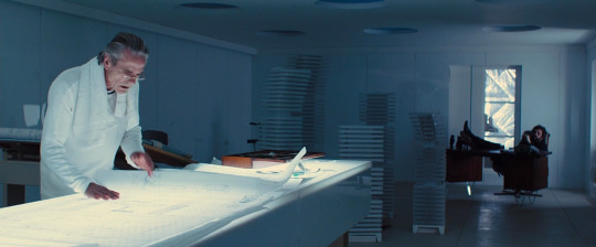

169.
Hight-Rise (2015)
“Prone to fits of mania, narcissism and power failure.” - Laing
The architect, Royal, who lives on the top floor of the housing development he designed (obviously), has a scale model of the development in his office. As living conditions in the building start to deteriorate, you start to anticipate the destruction-of-model-scene - based on the well established trope. And sure enough, we see children pushing the models over. The models aren’t destroyed completely, for we see them again towards the end of the film - there is hope.
I quite enjoyed the dialogue between the physiologist (Tom Hiddleston) and the architect (Jeremy Irons) :
Royal: Ah, Doctor Laing. I hear you play squash.
Laing: Yes, I do. You built all this?
Royal: Dreamt. Conceived. I hardly rolled my sleeves up. Course, the project's
far from finished. There will be five towers in all, encircling the lake. Something like an open hand. The lake is the palm and we stand on the distal phalanx of the index finger. There. I've put all my energies into this tower. I'm its midwife, so to speak.
Laing: Mm. It looks like the unconscious diagram of some kind of psychic event.
Royal: That's good. Can I use that?
Laing: By all means.
Royal: Of course, I'm a modernist by trade but you, a doctor, will understand
one prescribes as required. That folly out there is for my wife. Her chief distraction is the careful cultivation of an intense sort of nostalgia.
Laing: For what?
Royal: Why delve?

Later Royal talks more about his ideals for the building:
Royal: But some of the people who live here, haven't you've seen them? The vanguard of the well-to-do. They've fitted themselves so tightly into their slots that... they no longer have room to escape themselves.
Laing: Slots designed by you.
Royal: I know. I'd conceived this building to be a crucible for change.I must have missed some vital element.
Later after Royal’s idea of what the building would be has been shattered:
Royal: You recall us speaking about my hopes for the building to be a crucible for change?
Laing: Of course.
Royal: Well, all this has made me realize something quite fundamental. It wasn't that I left an element out, it was that I put too many in. And now the building's failure has offered those people the beginnings of a means of escape to a new life.
Laing: Mm.
Royal: Who knows... perhaps it will become a paradigm for future developments. And you, have you settled?
Laing: I believe so.
Royal: Impressions?
Laing: Well, the lights, fire, like neurons in a great brain. The lifts seem like the chambers of a heart. And when I move... I move along its corridors like a cell... in a network of arteries.
High-Rise is the film adaptation of J.G. Ballard’s influential novel. “There were many architectural inspirations for High-Rise – Le Corbusier’s Cité Radieuse in Marseille, the Montparnasse tower in Paris – but the closest model is probably the brutalist Balfron tower in east London, not far from where Ballard puts his cluster of five tower blocks (more or less in present-day Canary Wharf). Its architect, Erno Goldfinger, like Royal, lived in one of the penthouse flats shortly after its completion but moved back home to Hampstead after only a few months. Not only did Goldfinger end up as the sinister Royal in High-Rise, but as an arch Bond villain – his Willow Road neighbour Ian Fleming objected to his modernist house, which was supposedly out of keeping with the street’s Georgian housing.” [source]
#high-rise#architecture#film#architectural model#drama#2010s#character is an architect#destruction of model#extension of character
7 notes
·
View notes
Text
Modernist Architecture-Inspired Sketches
9.11.18
After researching what modernist architecture was, we did some sketches of potential ideas for our 3D gallery/museum. We needed to try and incorporate the modernist architecture principles and characteristics.
I started with the top left design, my second favourite. I decided to draw it in perspective using lines and such, so it ended up quite blocky, although that’s what modernist architecture tends to incorporate, geometric shapes. I tried to keep simplicity in mind throughout this task, and I kind of did, but a lot of them ended up looking quite complex and detailed. The top left design looks like you could slide down the two parts which are branching off.
The next one that I drew was the one on the right—which looks really silly now that I’m looking back on it. I thought it was good at the time, but it doesn’t even look like it could be a building. It looks like a robot actually. Perhaps if it was a bit wider it would look more like a building. Also it looks too futuristic, and not really modernist. Although futurism and modernism do share similarities.
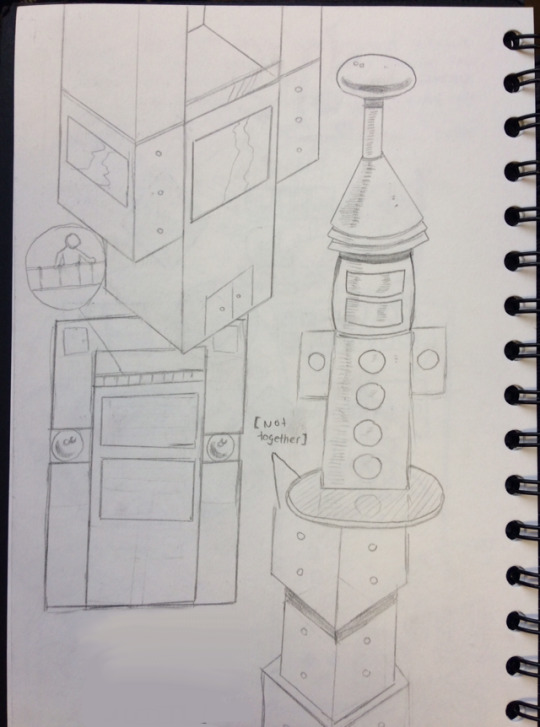
As for the bottom left, I’m not really sure what it is, and I don’t really like it either, but it does have some aspects and principles of modernist architecture. It looks too blocky this time, like an actual rectangle if you showed it as a silhouette. Maybe it would look better in 3D format where you can see all the indents and things that stick out, and the gap at the top where the banister that you can stand over. It looks like I was trying to create a house design instead of a 3D gallery/museum. I did add big windows though, which I noticed are commonly used in modernist architecture.
Finally, my favourite design out of the four—I think that it looks pretty good, with the cubes stacked on top of each other, and the tiny circular windows, it looks much more simple than the others, which is a very important principle in modernist architecture, as I mentioned in my research below. I think that it looks quite ominous and sci-fi, in a good way. Either way, I think that it is the closest to modernist architecture out of all of them. To make more designs like this, I think I’d need to look more closely at certain structures to see what works and what doesn’t.
Update, (14.12.18)
I have done another sketch, which I think is vastly superior to all of the above sketches. I took more time to do this one, whereas the others were rushed. Though I’m not writing them off just yet—I’m sure that my final design in Unreal will take a degree of inspiration from them, maybe the bottom right or top left designs.
Anyway, here in this new design, I used two point perspective, which makes it look a lot better than the others. It’s anatomically (not sure this applies to architecture but I’ll go with it) correct now—or to some degree at least. So It’s kind of geometric, and has drawn inspiration from Bauhaus architecture, as well as some Constructivist architecture, though only in design, since Constructivism prioritizes how it works over aesthetics. I also took inspiration from Zaha Hadid’s work, as well as Le Corbusier too. I think that it looks quite modern, and I think the glass defintiely adds to that. I drew a glass balcony, as well as big glass panels on the sides of the building. The front (and maybe back too? I haven’t decided yet) is shaped like a Lego hand (I don’t know why that was the first analogy that popped into my head) with a door on one of the sides.
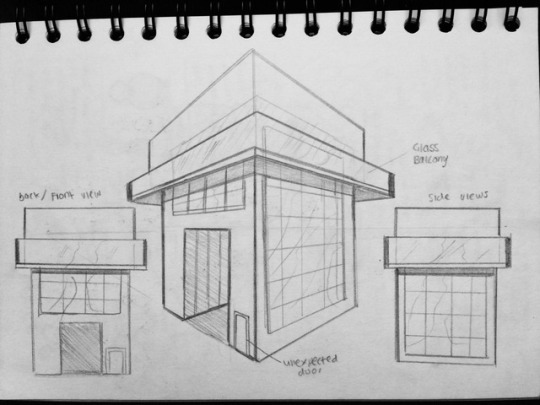
Overall, I’m pleased with this design, and I will most likely base my design in Unreal off of this one, unless I come up with something else, or see some new inspiration.
0 notes
Text
Meet the Designer: Lia Lovisolo, Liadesign
Liadesign is an Italy-based interior design firm that focuses on everything from decor and space planning to kitchen and bathroom renovations. Founder Lia Lovisolo shares her design style, where she finds inspiration, her favorite project, and more.
What is your design style?
My style is linear and clean, not necessarily minimal, but based on simple elements, geometric graphics and pure colors. I always try to play with the unexpected and create a connection between aesthetic and practical purposes.
How did you get started in your career?
I started my career when I was renovating my own house. I had a degree in architecture, but was working in another profession. While taking care of my home, from the construction phase to the more detailed interior design phase, a love for the work and the determination to carry it forward was born.
Where is the most unexpected place you’ve found design inspiration?
I find a lot of inspiration while observing urban landscapes and nature in general, but the most unexpected inspirations derive from the study of small details that are noticed only by observing things closely. Photography often helps me to capture these details.
What trend are you most excited about right now?
The trend that most excites me now is the use of color and geometric shapes in interior decoration. I am fascinated by the unusual color combinations and uncommon patterns, the composition of shapes and colors, the mixture of curved lines and broken lines, and the ability to create harmony through decoration without necessarily having to do demolition and reconstruction.
What was a challenge you encountered during a project and how did you solve it?
The most compelling challenges often concern small houses and the solution of problems, practical or aesthetic, related to small rooms or disadvantageous proportions. One of the most beautiful challenges I recently faced was the creation of a kitchen with a peninsula in a really small and especially narrow room. The clients did not want to eat on a table leaning against the wall. So, I invented an hexagonal sliding peninsula, which had both a worktop and a dining table function (photo here).
What is one of your designer secrets/tricks?
In my opinion the most important secret or trick for a designer is the ability to listen and know how to wait. Knowing how to listen helps with understanding the client’s needs and their psychology. Understanding the customer is essential for carrying out the work in an optimal manner, and saves time and resources. Patience is also important because often the best decisions are those made with no hurry.
What’s one of your favorite all-time projects? What made it stand out?
One of my favorite projects of all time is a Milan apartment where I used a lot of colors to define spaces and create harmony (photo here). What makes it outstanding, above my other projects, is the color range, the relationship between cold and warm shades, and the dialogue between colors and rooms.
If you were a house, what kind of home would you be?
If I were a house, I would certainly be a period villa, full of design and art pieces from the great masters of the 20th Century - something like Villa Necchi Campiglio in Milan or Villa Borsani in Varedo.
What’s your favorite building or space in the world?
I have many: ancient, modern and contemporary architecture. I am particularly fond of the work of Le Corbusier, Villa Savoye.
What’s your favorite room in your home?
The room I love the most in my house is the living room, with a large bright bow window overlooking the garden (photo here).
What’s your favorite part of Houzz?
What I enjoy most about Houzz is that it’s international and cosmopolitan, a place where different attitudes and design cultures meet and mutually enrich each other. It draws on projects from around the world and helps both designers and homeowners to broaden their views.
When you’re not designing, where can you be found?
When I'm not designing, you can find me in my garden, taking care of my plants and flowers and, above all, taking photos of them!
1 note
·
View note
Text
week 2
Task 1
1 James camera
2 Emma’s wristband
3 The Calypso sculpture project. National Aquarium, Baltimore
4 Chinatown Art Brigade. "Resilience of The Chinatown Art Brigade”
5 The work of Mata Aho Collective.
6 Free electron. "Ville Radieuse: 24 hours in the mind of Le Corbusier."
I put James at the top because I feel like the designer and James had the most inactions so they could come up with the best design, I put him about Emma because Emma designer went a tested it on other people rather than testing it on her client, which was good because she engaged with more people but I feel like James design really dug deep to find out what James really wanted and needed
Task 2
The big life fix
When designing a product for a customer it takes a lot of work and time, it also means communicating with people and other designers to come up with the best posable product for your client. To make sure that all this works and it completed in the shortest possible timeframe the design needs to have a strong drive behind them, the inspiration that other give to them by telling them their stories and what they have been through will give them that drive to make the best possible product. For example, James is a 22-year-old male who suffers from a rear skin problem that means his fingers have fused together and he has to be raped in bandages his whole life because the friction of the clothes on his skin would cause his skin to blister and burn. James was a young photographer with a passion for taking photos, but his skin condition meant that it has become a lot harder for James to take photos. When this group of designers heard about James and his stories they knew they need to try and help him. A point of inspiration was James and his goal, the designers were inspired by his story and maturity levels and how he always keeps a positive mindset. James knows he is only going to have a short life and all he wants to do is leave something behind for people to remember him by. Another point of inspiration for the designer was how James story could help motivate other people in a similar situation and show people that with the right drive it's always posable to do what you want. In Emma's case it was something that she developed in her 20s that stopped her from doing what she loved, Emma what a design for a larger design company but she suffered from Parkinson’s which gave her uncountable trimmers (e.g. shaking and twitching). So what they did was design a watch that vibrates to confuse the bran so she can focus on drawing the watch made her able to draw in a straight line again, I believe that the thought of the joy people get with you present them with a working product, for example when Emma wrote her name for the first time in 3 years and the joy and overwhelming thank towards the designer inspires other designers to try and give their clients the same experience.
Task 3
simulates
Both are made up of guidelines, not rules
Both respect mana
Both encourage new relationship
Both believe in equality
Both believe in humility when sharing knowledge
Definites’
Massey believes injustices
kaupapa-Maori is broader with their guidelines
kaupapa-Maori is about being cautious and politically savvy
Task 4
Big life fix
· How did they make sure that the Wi-Fi had far and equal use for everyone?
· Did the pitch their idea in a humble way?
· Where they respect full of the people in the village
· Was there another way that they could have gone about doing it
· Have they taken the coulter of the village away by giving them Wi-Fi?
· Did the make James feel more unordinary by design him this special camera?
· Did they show the family the respect the deserved?
· Was James showing the designs the respected the deserved
Le Corbusier's Ville
· How did the owner of Le Corbusier's Ville Radieuse communicate with the people living there?
· Was there any mana behind the company that created Le Corbusier's Ville Radieuse?
· Did he look into materials deep enough?
· Was he trying to build a utopian or something similar
· Did he active what he wanted in his design
· Was it successful
0 notes
Text
Week 2
Journal task one
Engagement – from most to least engagement.
Most - The big life fix- I believe this episode has the most engagement with its participants, as the designers prioritise the needs of their clients, and put a great deal of thought in to how to solve their clients problems.
Chinatown Art Brigade – a collective of artists creating art and media to advance social justice. They think of the people first, and are a voice for those who are unheard.
The Calypso sculpture project – The project is people focused as it creates empathy due to its statement; plastic being in the sea and endangering sea animals.
Ville Radieuse: 24 hours in the mind of Le Corbusier – I believe that although Le Corbusier had good intentions, he missed out a few important factors – the importance of independence, therefore he did not entirely think through the needs of humans.
Least - The work of Mata Aho Collective.- The artists comment on the complexity of Maori lives through their works. I believe although this project includes engagement, it provides the least engagement in comparison to the other projects, as the purpose of the project just by viewing it is unclear and it needs to be explained and understood in order for the users to feel a connection towards it.
Journal task two
Option A - In the video of Emma, the designer, Haiyan Zhang, gathers information in a variety of ways. Identify at least four of these and reflect on how they used to inform the development process product (e.g. how one way of gathering information leads to another and then another)
Initially met Emma in order to gather an idea of her client, her wants and her needs. Emma then began testing and trialling. She made a variety of initial experiments to try out, and to then test on her client in order to see if any of them led to the possible solution. The outcome of these experiments were unsuccessful, however also successful in the sense that she had tried them out and knew they weren’t even close to the solution, and was therefore able to take a completely different approach.
Then Emma went on to research the projects which were going on around her in order to get a headstart on a possible method to help Emma. When researching she discovered a project where someone made a spoon which counteracted the tremors from Parkinson’s through vibrations. She was inspired by the vibrations and decided to use vibrations as the possible solution in her design.
Emma then made a prototype, not the final product, as she wanted to test it on a group of Parkinsons sufferers and then adapt it in order to make it the best possible product for Emma. The prototype was successful as the Parkinsons sufferers felt a difference when feeling the vibrations from the prototypes, allowing Emma to realise that she was on the right track and that she could continue on the right track.
Journal task 3
Identify key differences and similarities between the Kaupapa Māori resource and Massey's universal principles. This can be written in full sentences or done diagrammatically, or using notes or tables. Whatever format you use, it should convey the differences and similarities clearly.
Differences
· In regards to relationships, the Kaupapa Maori resource looks at relationships in a family-like way, whereas Masseys universe principles looks at relationships in a more business-like way.
· Maori morals are more personal and general human values, eg being a familiar face. These greatly contrast with the business and legal ethics of Massey.
Similarities
· Prioritise relationships and respect
· Both look at the importance of being cautious – the Maori resource looking at the importance of being politically savvy, and Masseys principles looking at the importance of avoiding harm.
Journal task 4
Use Le Corbusier's Ville Radieuse and your work from journal task 2, above. For each, note ethical questions that arise if we use the Kaupapa Māori resource and if we use the Massey universal principles.
Ethical questions
Le corbusier’s Ville Radieuse
Kaupapa Maori resource –
Building and maintenance of relationships – I believe that Le Corbusier did not follow this principle because he did not focus on family; where people prefer to build their own home etc and build relationships as a result.
Massey universal principles –
I believe that Le Corbusier did not follow Massey’s principle – Autonomy, as through his architecture, decision making on the basis of ones own values and beliefs became limited, as people would not be able to express themselves through his architecture as everyone became placed in to the same system.
Emma gathering information
Kaupapa Maori resource –
I believe that Emma follows many of this resource’s principles, in particular Aroha, Mahaki, Mana. However does not follow Aroha to the point where she does not allow her client control. Furthermore she does not follow Kia Tupato, as she takes risks instead of being cautious, an example being when she tests her prototype on volunteers without adhering to the possible risks of the prototypes.
Massey universal principles –
Emma does not follow Masseys avoidance of harm in the physical sense, when testing her prototype on volunteers. Through this testing however she knows that there will be no harm on her client as the volunteers did not receive any harm through the tests, and in fact, the testing was successful as they felt a difference through the vibrations.
0 notes
Text
A ‘radical alternative’: how one husband changed the perception of Los Angeles
In the 1960 s, British architectural reviewer Reyner Banham proclaimed his love for the city that his fellow academics disliked. What Banham wrote about Los Angeles redefined how the world perceived it but what would he think of LA today?
Now I know subjective sentiments can run, the correspondent Adam Raphael wrote in the Guardian in 1968, but personally I anticipate LA as the noisiest, the smelliest, the most unpleasant and most uncivilised major municipality in the United States. In short, a stinking sewer …
Three years later, Raphaels words appeared in reproduce again as an epigraph of Reyner Banhams Los Angeles: The Architecture of Four Ecologies “the worlds largest” exuberantly pro-Los Angeles book further written. Ever since pamphlet, it has shown up on rosters of enormous books about modern cities even those is drawing up by people who examine Los Angeles anything but a great American city.
Somehow, this notebook that described so much better of its initial publicity with startle value( In Praise (!) of Los Angeles, gibed the New York Times refreshes headline) has maintained its relevant through the decades, such that newly arrived Angelenos still read it to orient themselves. But what can it educate us about the Los Angeles of today?
An architectural historian a decade into his vocation when he firstly visited, Banham knew full-well that his fellow academics detested Los Angeles. How and why he himself came so avidly to appreciate it constitutes the core question of his work on the city, which culminated in this slim volume.
The many who were ready to cast doubt on the importance of the enterprise, he reflected in its last chapter, included a discriminated Italian inventor and his wife who, on was found that I was writing this volume, disbelieved that anyone who cared for architecture could lower himself to such a project and keep walking without a word further.
The project began when Banham introduced his shaggy beard and wonky teeth to Los Angeles and was indicated that he cherished the city with a heat, in the words of novelist and Bradford-born Los Angeles expat Richard Rayner. Schooling at the University of Southern California, who made him up in the Greene friends architecturally hero-worship Gamble House in Pasadena, Banham had a privileged basi from which to explore. But what he went looking for, and the behavior he wrote about what he saw and experienced, redefined the behavior the intellectual nature and then the rest of the world perceived the city.
Reyner Banham with his shaggy whisker and wonky teeth in 1968. Photograph: Peter Johns for the Guardian
Not that he affirmed his love right there on the tarmac at LAX. Banham initially located the city incomprehensible a reply shared by many commentators, wrote Nigel Whiteley in such studies Reyner Banham: Historian of the Immediate Future.
Banham firstly attempted to publicly explain this cutting-edge metropolis, saturated across its enormous seat with electronic designs, synthetic chemicals and televisions, in four 1968 BBC radio talks. He told of how he came to grasps with LAs embodiment of the experimental: its experimental chassis and infrastructure, the combinations of cultures it accommodated, and the experimental life-styles to which it gave rise.
But even an appreciator like Banham had his qualms with the result. In Los Angeles you tend to go to a particular target to do a specific circumstance, to another to do another thing, and finally a long way back to your home, and youve done 100 miles in the working day, he grumbled in the third talk. The distances and the trust on mechanical transportation leave no chamber for coincidence even for joyous accidents. You strategy the day in advance, curriculum your activities, and forgo those random encounters with sidekicks and strangers that are traditionally one of the honors of metropoli life.
Nevertheless, to Banham this un-city-like metropoli contained out a predict: The unique appreciate of Los Angeles what arouses, plots and sometimes fights me is the fact that it offers revolutionary alternatives to almost every city conception in unquestioned currency.
In his subsequent landmark book, Banham listed Los Angeles differences from conventional urbanism, as well as from all the rules for civilised living as they have been understood by the scholars of modernity, with obvious gratify. It seemed to legitimise a model “youve already”, in a 1959 section, proposed to supersede the old notion of a single dense core surrounded by a wall.
Civilised living in suburban LA. Image: University of Southern California/ Corbis via Getty Images
Banham foresaw the city as scrambled egg, its shell separated open, its business yolk mixed with its domestic white-hot, and everything spread across the landscape, its evenness agitated exclusively by occasional specialised sub-centres. A visitor to Los Angeles today might hear the city was reported in merely the same method: as a network of nodes, a constellation of city villages, an exercise in postmodern polycentrism.
Banham made another digit in the eye of diehards who insisted that a city should have just one strong centre with his short section A Note on Downtown, which opens with the words, … because that is all downtown Los Angeles deserves.
From its fetishised designs such as the Bradbury Building and Cathedral of Saint Vibiana to its brand new role towers in their standard livery of dark glass and sword, Banham wrote that everything platforms as an unintegrated scrap in a downtown panorama that began to deteriorate long ago out of sheer irrelevance, as far as one can see.
The journals contrarianism manifests the contrarianism of Los Angeles itself, which, insofar as it plays the functions of a great city, in terms of length, cosmopolitan style, innovative energy, international affect, distinctive way of life, and corporate identity[ supports that] all the most admired theoreticians of the present century, from the Futurists and Le Corbusier to Jane Jacobs and Sibyl Moholy-Nagy, ought to have wrong.
Filled with photographs and sketches, Banhams book on Los Angeles subdivides its subject up into the four ecologies of its subtitle: the beaches and beach towns of Surfurbia; the Foothills with their ever more elaborate and costly residences; the utilitarian Plains of Id( the only parts of Los Angeles flat enough and boring sufficient to compare with the cities of the Middle West) and the famed, then infamous, freeway method he dubbed Autopia: a single intelligible home, a coherent cognitive state in which Angelenos invest the two calmest and most fruitful hours of their daily lives.
The 1893 Bradbury Building in downtown LA was an unintegrated scrap in Banhams gazes. Picture: Michele and Tom Grimm/ Alamy
Between sections on the citys ecologies, Banham examined the buildings found in them. Populist, stylistically promiscuous, tradition-agnostic and often intentionally impermanent, Los Angeles architecture has, of all the citys components, reaped distain the longest. There is no reward for aesthetic goodnes here , no penalty for aesthetic violation; nothing but a vast planetary callousnes, wrote the novelist James M. Cain in 1933.
More than 40 year later, Banham ascertained a stylistic bounty of Tacoburger Aztec to Wavy-line Moderne, from Cape Cod to unsupported Jaoul graves, from Gourmet Mansardic to Polynesian Gabled and even in member Modern Architecture.
He discussed at length the LA building known as the dingbat a two-storey walk-up apartment-block … improved of timber and stuccoed over, all same at the back but inexpensively, elaborately, embellished up-front, emblazoned with an aspirational epithet such as the Capri or the Starlet.
In defining dingbats as the true symptom of Los Angeles metropolitan id, trying to cope with the unprecedented appearing of residential concentrations too high to be subsumed within the misconceptions of homestead living, Banham diagnosed the center and prolonged tension, then as now, between wanting to grow outward and needing to grow upward.
Banham attracted out the implications of Los Angeles ostensibly disposable structures not by adoring them , nor denigrating them, but simply by investigating them because they are. Robert Venturi, Denise Scott Brown and Steven Izenour would preach the same approach in their own metropolitan classic, Memorizing from Las Vegas, produced the subsequent year: Withholding opinion may be used as a tool to construct later ruling most sensitive. This is a way of learning from everything.
Still, even appreciators of Los Angeles might take issue with this method when Banhams non-judgmental attitude at the least toward the esthetics of American commercial-grade culture starts to look like advocacy for bad taste.
The self-absorbed and perfected Watts Towers. Photo: Hulton Archive/ Getty Images
Non-appreciators of Los Angeles certainly did. The painter and critic Peter Plagens, writer of an 11,000 -word excoriation in Artforum magazine entitled The Ecology of Evil, became thus far as to name Banhams book hazardous: The hackers who do shopping center, Hawaiian restaurants and savings-and-loans, the dried-up civil servant in the disagreement of roads, and the legions of showbiz fringies will sleep a little easier and wield a lot harder now that their enterprises have been authenticated. In a more humane civilization where Banhams doctrines would be measured against the subdividers abuse of the land and the induce corpuscles in kids of my own lungs, the author might be sat up against a wall and shot.
Uncowed, Banham followed the book by starring in Reyner Banham Loves Los Angeles, a 1972 television documentary that followed him through one day in the town that builds rigmarole of record and terminate all the rules, and inspired within him a passion that goes beyond gumption or intellect. Stops on the tour included Simon Rodias handmade Watts Towers( a altogether self-absorbed and perfected gravestone) to Los Angeles characteristic imagination of innocence( prominently marked on all the maps in his volume ); the overgrown areas of the old Pacific Electric Railways rusting runways that once tied the whole gigantic city together; the decrepit canals and beachside bodybuilding facilities of Venice; and a Sunset Boulevard drive-in burger joint.
There, Banham requested the painter Ed Ruscha, plainspoken and painstaking spectator of American urban cliche, what public buildings a guest should meet. Ruscha recommended gas stations.
Banham pre-empted dissents to Los Angeles urban sort by claiming the model problems very little, had now been written that Los Angeles has no urban kind at all in the commonly accepted feel. Yet whatever it does have, he reasoned, has rendered a fascinating, and sometimes even efficient, prepared of emergent city phenomena.
Come the day when the pollution fate finally condescends, he chronicled over aerial shots of Wilshire Boulevards double sequence of towers and frame-filling vicinities of separated homes, … when the traffic grinds to a halt and the private vehicle is banned from the street, a lot of craftily placed citizens will be able to switch over to being pedestrians and seem no pain.
Cyclists on Venice Beach … though much of LA is not bike-friendly. Photograph: Alamy
The end of the car in Los Angeles? Bold messages for the man who announced Wilshire Boulevard one of the few enormous streets in the world where driving are particularly pleased when you have, like earlier generations of English academics who taught themselves Italian in order to read Dante in the original, learned to drive in order to speak Los Angeles in the original.
But just as its own language heard on the street of Los Angeles have multiplied, its own language of mobility has changed there, as has much else besides. How legible would Banham, who perished in 1988 , now find it?
The smog that expected bane of the citys postwar decades which he always minimise has all but faded. The duration of apparently limitless seat to pander an obsession with single-family dwells has given channel to one of construction cranes sprouting to satisfy the new is asking for high-density vertical living. They digest not only over a downtown grow miraculously from the dead, but the specialised sub-centres sown all over greater Los Angeles.
Though the ban on private cars hasnt come yet , no recent development astounds any Angeleno who was there in the 1970 s more than the citys brand-new runway transportation system, which started to develop almost 30 times after the end of the Pacific Electric. It grades as such as a success of funding, the planning and execution( at least by the globally unimpressive American standard) that the rest of the country now ogles to Los Angeles as an example of how to build public transportation and, increasingly, public cavity in general.
Readers might scoff at Banham calling the Los Angeles freeway network one of the greater handiworks of humankind but he has demonstrated more of an ability to see beyond it than numerous current beholders of Los Angeles. Even though it is vastly better than any other motorway method of my acquaintance, he wrote, it is inconceivable to Angelenos that it should not be replaced by an even better structure nearer to the perfection they are always seeking.
Banham seemed downtown Los Angeles merely deserved a short section devote to it. Picture: Alamy
Banham also foresaw the rise of the self-driving gondola, so often mooted these days as an alternative solution to Los Angeles traffic woes. But cars that drive themselves( as distinct from Baede-kar a then-fantastical articulation navigation arrangement dreamed up for Banhams TV doc, that countenances an eerie resemblance to those every American driver uses today) “re coming with” questions that Banham also prophesied all those years ago. The marginal gains in efficiency through automation, he wrote, might be offset by the mental destitutions caused by destroying the residual misconceptions of free decision and driving skill.
Under each outwardly celebratory sheet of Banhams book lies the notion of change as Los Angeles simply constant: no matter how excitingly modern the car and the roadway, the working day will come to an end; no matter how comfortably idyllic the detached live, it more must fall out of promote, or into impracticality, sooner or later.
Some of these components that reaped Banhams attention have, after their own the times of dishonor, rotated fashionable again. Even the humble dingbat has find a target in the future of the city, growing the subject matter of critical analyse and architectural rival.
Banham also checked the future of Los Angeles in other unprepossessing builds, especially one striking and elegantly simple-minded stucco chest on La Cienega Boulevard. Its designer? A certain Frank Gehry, then nearly unknown but now one of the most powerful influencers of the improved context in not just Los Angeles( his current high-profile job concerns re-making the citys famously dry, concrete-encased river ), but other municipalities as well. The Toronto-born starchitect grew his adopted hometowns architectural emissary only one of the myriad spaces in which Los Angeles has influenced the rest of the urban nature.
These eras, the rest of the city world-wide also influences Los Angeles. No longer striving under the deceptions of total exceptionalism which prevails in Banhams day, it has, with its towers, instructs, parks and even bike-share structures, moved paces toward the liveability so is necessary in 21 st-century urbanists. It now even resembles( if faintly) New York, Boston, London, and Paris those exhaustively schemed , non-experimental cities where, Banham deplored, warring pressure group cannot get out of one anothers hair why i am pressed together in a hallowed labyrinth of culture statues and real estate values.
In its impressive order to incorporate older metropolitan moralities and play by the rules of good urban issues, modern Los Angeles discounts the possibility of becoming a similarly sacred labyrinth at its jeopardy. Hindering Banhams Los Angeles: the Architecture of Four Ecologies on its syllabus will hopefully protect against the horrendous fate of losing its rule-breaking experimental city spirit.
The engineering-trained columnist viewed Los Angeles as a kind of machine. Though it has come in for a severely necessary renovation of its interface in recent years , nothing has already been written a consumers manual more engaged in the city on its own terms as Banham did 45 years ago.
Follow Guardian Cities on Twitter and Facebook to join the discussion
The post A ‘radical alternative’: how one husband changed the perception of Los Angeles appeared first on apsbicepstraining.com.
from WordPress http://ift.tt/2pUKBrb
via IFTTT
0 notes
Last Seen Blogs

gazeteci-kamil
Unbetitelt

mahdihasan8800
Abdullah Al Mahadi

grealishh
Jack Bloody Grealish

drickifocused
Focused On You

dancerunderrated2
Gender Fluid