#im afraid of using the copics my friend got me. what if im good at coloring then im gonna want to buy them again
Text
greatest minds of our generation
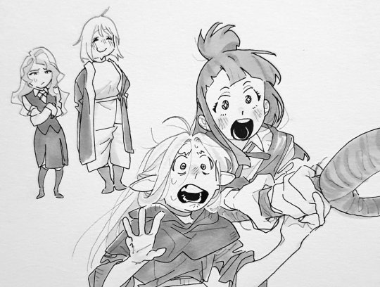
#for my next trick ill draw falin in shiny chariots outfit#maybe. i just thought about that it sounds good tho#im afraid of using the copics my friend got me. what if im good at coloring then im gonna want to buy them again
2K notes
·
View notes
Note
YO! What kind of art materials do you use? Whenever I look at your art I’m always amazed at how friggn PRETTY the colors are! It’s just *chefs kiss* (Also your designs are amazing ok BYE)
YO! thanks for the ask, prepare for yappin'!
short answer: i really only use copic markers (i got the big 72 colour box for christmas a few years ago) and my trusty 4H pencil, with a 6B for the outlines!
longer answer: a few years ago i literally only worked in black and white, because i was terrfied at being bad at colouring. as a result, i was consuming a LOT of colour theory content but never really using it, and getting really good at tones and values. greyscale (for my style at least) forces you to block in shadows, so i learned how they work.
when i finally got my 16 year old rat hands on expensive markers, i had some idea of how colour worked, but not really. it took a lot of trial and error just to figure out how to colour a face. if i can be one of those annoying art people who gives advice, it would be practice effectively. it's about quality, not quantity, and i don't mean the quality of your work - don't be afraid to fuck up. changing my mindset from 'this is starting to look awful, time to set fire to my sketchbook' to 'this is starting to look awful, but now i can try and make something else about this good; at the very least i know what not to do' got me a lot further than just churning out art regularly.
one thing that took a while to shake (and im still not entirely over it) is using colours that look Wrong (tm) to gain a desired lighting effect. artists have to train themselves out of Knowing The Colour Of Things (we've all seen those colour theory videos where red is actually grey or some bullshit) and learn to take a step back when applying colour in their work. traditional art comes with the caveat that once colour is down (unless it's in pencil), it's there for good. no multiply layers to be seen.
the trick is to trust the process. the portrait of porter in the club (my profile picture, at time of writing) looked AWFUL with just flat colours and rim lighting. i get vibrant colours by layering them - especially with faces - until i build a 3D shape with the values. highlights are your best friend in the whole world. one shitty paint pen from ebay changed my entire artstyle because i could start creating depth in my colours without worrying about keeping light areas light.
ok thats all i got
thanks for supporting my page! (kisses you gently on the head)
#art#illustration#sketchbook#sketch#art tips#ask#you do NOT wanna see my colouring from like. this time last year#god it was bad#i was so sure i knew how colours worked but i was wrong
3 notes
·
View notes
Last Seen Blogs

randomchineselady
RCL Foodlogue

glitterbabyboo-blog
LT_overall

sekushigarage
Untitled
randomchineselady
RCL Foodlogue

b00gie95
B00GIE'S WRLD