#piecharts
Text
Your organic benefits in a pie

Organic food is not only great for your health but is farmer and nature-friendly. If you haven’t started your journey of consuming organic goodness, check out why you should.
Shop for a wide range of organic products at the link in our bio.
https://play.google.com/store/apps/details...
0 notes
Text
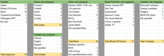
2022 Books: Stats & Pie-charts!
I neglected to post a general photo of (most of) the books I read in 2022 — at least the physical, photographable copies — so here we are! (There’s a link at the bottom of the post to the full year on Goodreads, including digital ones.)
Everything on the top shelf except the last five (a.k.a., not the ones by Diana Wynne Jones or Ally Carter) are books I had the privilege of editing last year! ❤…
View On WordPress
1 note
·
View note
Link
Data Interpretation - Problems On Line Graph | Part-2 | Arithmetic | Vinay | Tone Academy This video deals with • Data Interpretation • Single Data Interpretation • Mixed Data Interpretation • Problems on Line Graphs #Datainterpretation #bargraphs #PieCharts #tablegraphs #linegraphs For any queries/doubts/information - we are just an email away - mail us @ [email protected] Subscribe to : https://bit.ly/2YQOgbs https://www.youtube.com/playlist?list...
0 notes

Text
Best Graph Making Tools

Follow @everythingaboutbiotech for informative and useful stuff ✨
#DataViz#DataVisualization#Graphs#Charts#DataGraphs#GraphDesign#Infographics#DataAnalytics#ChartTypes#BarChart#PieChart#LineGraph#GraphSoftware#ExcelCharts#TableauViz#DataStorytelling#FlowChart#OrgChart#Data#Analytics#Numbers#Statistics#DataScience#BigData#Dashboard
6 notes
·
View notes
Text
wh when did this happen guys

over 10k..... c!crimeboys enjoyers working hard i see
#fokron speaks#wilbur soot#tommyinnit#who knows how much of it is rpf vs dsmp vs au. that would be an interesting piechart
4 notes
·
View notes
Text
the most important thing u need to know about me is that i do love a good spreadsheet
look at her:) she's so pretty and well organized:)
#i always talk abt how much i love here comes the sun and a BIG reason why i love it so much#is bc through writing it i discovered my love for spreadsheets<3#rip to handball fic. that's THEE best spreadsheet i've ever made and now it's abandoned.....#also don't rb... i WILL post a full version of this once i reach 100 responses lololol#there are piecharts. i can't wait
2 notes
·
View notes
Text
How to master data visualization: 8 intriguing best practices
Data visualization plays a crucial role in the analysis and interpretation of data by transforming raw information into meaningful insights. By visually representing complex data sets, charts, graphs, and interactive visualizations make it easier for individuals and organizations to understand information, identify patterns, and make informed decisions.
Importance of Data Visualization
Data visualization is important because it allows us to comprehend and communicate data in a more intuitive and impactful way. It takes advantage of the human brain's visual processing power, enabling us to absorb and process information more efficiently than through text or numbers alone. Visualizing data helps identify trends, outliers, and relationships, leading to a deeper understanding of the underlying patterns within the data.
https://rahularaj.com/10-essential-python-libraries-every-data-scientist-must-know/
Benefits of Effective Visualization for Decision-Making and Insights
- Clarity and Simplification: Visualizations simplify complex data by presenting it in a visually appealing and digestible format. They enable users to quickly grasp the main findings and draw insights from the information at hand.
- Identification of Patterns and Trends: By representing data visually, patterns, trends, and correlations become more apparent. This allows decision-makers to identify opportunities, risks, and potential issues that may have been difficult to detect in raw data.
- Enhanced Communication and Persuasion: Visualizations are an effective means of communicating data-driven insights to various stakeholders. They can help break down complex concepts and findings, making it easier for non-technical audiences to understand and appreciate the significance of the data.
- Interactive Exploration: Interactive visualizations permit users to manipulate and explore data, enabling them to dive deeper into specific data subsets or variables. This interactivity facilitates a more interactive and dynamic analysis experience, encouraging users to ask questions and discover new insights.
- Data-Driven Decision-Making: Effective data visualizations empower decision-makers to base their judgments on sound evidence and insights derived from data. By ensuring data-driven decision-making, organizations can minimize risks, optimize resource allocation, and make informed strategic choices.
In conclusion, data visualization is a powerful tool that enables us to unlock the true potential of data. By transforming complex information into visual representations, data visualization simplifies understanding, enhances decision-making, and uncovers valuable insights that drive innovation and progress.
Choosing the Right Visualization Technique
When presenting data effectively, choosing the right visualization technique is crucial. Different types of visualizations are suitable for specific purposes, allowing you to convey information clearly and facilitate better data understanding. Here are five common visualization techniques and their respective applications:
- Bar charts and column charts: These charts are ideal for displaying comparisons and trends. They use rectangular bars or columns to represent data values, making it easy to compare different categories or variables. Bar charts are preferable when the categories are distinct, whereas column charts are more suitable when the data points have varying heights.
- Line charts and area charts: These visualizations are effective for showing changes over time. Line charts display data as a series of data points connected by lines, revealing trends and patterns. Area charts, on the other hand, fill the space between the lines and the x-axis, making it easier to see the magnitude and distribution of values over time.
- Scatter plots and bubble charts: These types of visualizations are useful for exploring relationships and correlations in data. Scatter plots represent individual data points using dots, plotting them along two axes to showcase correlations between variables. Bubble charts take it a step further by incorporating additional information through varying sizes or colors of bubbles, allowing for visual representation of three dimensions.
- Pie charts and donut charts: These circular visualizations are effective for illustrating proportions and percentages. Pie charts divide a circle into slices, with each slice representing a different category or value. The size of each slice corresponds to the proportion it represents. Donut charts are similar but include a hole in the center, providing space for additional information or emphasizing the central theme.
- Heatmaps and treemaps: Heatmaps are ideal for visualizing complex data patterns. They use color gradients to represent data values and provide a visual summary of a large dataset. Treemaps, on the other hand, use rectangles nested within larger rectangles to display hierarchical data. The size and color of each rectangle represent different variables, making it easy to identify patterns and relationships within the data.
By carefully selecting the appropriate visualization technique based on the nature of your data and the insights you want to convey, you can effectively communicate your data findings to your audience. Remember that clarity, simplicity, and relevance are key when choosing visualizations.
Designing Effective Visuals
When creating visuals, it is crucial to ensure that they effectively convey the intended message and engage the audience. Here are some key strategies to design visuals that are impactful and visually appealing:
- Simplify and Declutter: To emphasize the key message and minimize distractions, simplify the visual elements. Remove any unnecessary clutter and focus on highlighting the essential information. Use concise text, clean lines, and minimalistic design to create a clear and uncluttered visual.
- Choose Appropriate Colors: Colors play a significant role in visuals as they enhance readability and convey meaning. Select colors that align with the message and the overall tone of the content. Use a limited color palette to maintain consistency and avoid overwhelming the viewer. Consider the psychological impact of different colors and their associations when choosing appropriate colors for your visuals.
- Use Proper Scaling: Proper scaling is crucial for accurately representing data values and proportions. Ensure that the size of each visual element, such as bars in a bar chart or icons in an infographic, accurately reflects their respective values. Avoid distorting proportions as it can mislead the audience and impact the understanding of the information presented.
- Incorporate Meaningful Labels: Labels provide context and explanations for the visual elements. Include clear and concise labels that help the audience understand the information being presented. Use labels to identify data points, add captions, or provide additional context. Ensure that the labels are easily readable and positioned appropriately within the visual.
- Utilize White Space: White space refers to the empty or blank areas in a visual. It is essential for creating visual balance and aiding comprehension. Incorporate sufficient white space between different elements to prevent visual clutter and enhance readability. White space also helps guide the viewer's attention to the most important parts of the visual.
By following these strategies, you can design visuals that effectively communicate your message, engage the audience, and improve overall comprehension. Remember to maintain a cohesive visual style throughout your content for a polished and professional look.
Making Data Interactive
To make data more engaging and enhance exploration, adding interactivity is key. By incorporating interactive elements, users can have a more immersive and effective experience while analyzing and interpreting data.
1. Enhancing User Engagement: Adding interactivity to data visualizations, such as charts and graphs, encourages users to actively engage with the information presented. This can be achieved through various methods, including:
- Tooltips: Tooltips provide additional contextual information when users hover over data points or elements. They can be used to display specific values, explanations, or relevant details, allowing users to gain a deeper understanding of the data.
- Filters: Interactive filters enable users to refine the displayed data based on specific criteria. Users can selectively include or exclude certain categories, time periods, or other variables, allowing for a more focused analysis.
- Drill-Down: Implementing drill-down features allows users to explore data at different levels of granularity. By clicking on specific elements, users can dive deeper into the data, revealing more detailed information and uncovering insights that may not be apparent at a high-level view.
2. Improving Data Exploration: Interactive data visualization techniques facilitate effective exploration and analysis. Some strategies to consider include:
- Hover Effects: Incorporating hover effects, such as highlighting or enlarging data points, gives users immediate visual feedback and enables them to quickly identify patterns or outliers.
- Interactive Maps: Maps that allow users to interact with geographical data through zooming, panning, and clicking on specific regions can be highly effective in presenting location-based information.
- Animated Transitions: Smooth animations when transitioning between different data views or visual representations can help users better perceive changes and detect trends.
3. Promoting Data Understanding: Interactive features can contribute to users' comprehension of complex datasets. Examples of how this can be achieved include:
- Comparative Analysis: Interactive elements that facilitate side-by-side comparisons enable users to contrast different datasets or subsets of data. This can be done through interactive sliders, checkboxes, or other controls.
- Linked Visualizations: Creating connections between multiple visualizations allows users to explore relationships and correlations between variables. For example, selecting a data point in one visualization could highlight related data points in other linked visualizations.
- Storytelling: Combining interactive elements with narrative storytelling techniques can guide users through a data-driven story, making the information more understandable, engaging, and memorable.
In conclusion, by adding interactivity to data, such as tooltips, filters, and drill-down features, users can have a more immersive and exploratory experience. Furthermore, engaging users with interactive data visualizations helps improve data understanding, promotes valuable insights, and enhances the overall data analysis process.
Telling a Compelling Story with Data
To effectively communicate information through data visualizations, it is crucial to construct a compelling narrative that engages viewers and conveys a clear message. Here are three key steps to follow:
1. Establishing a Clear Narrative
Begin by defining the problem or topic that your visualization aims to address. Clearly articulate the purpose of the visualization, whether it is to inform, persuade, or entertain. This narrative framework will serve as the foundation for your data story.
For example, if your visualization focuses on the impact of climate change on global temperatures, start by explaining the significance of this issue and why it is important to understand its implications. This context will help viewers grasp the relevance of the data presented.
2. Guiding the Viewer's Attention
Once you have established your narrative, guide the viewer's attention towards the key insights and findings within the data. Use visual cues such as color, size, or position to emphasize the most important elements. By directing attention to these key points, you can ensure that viewers understand the main takeaways of your visualization.
Additionally, provide contextual information to help viewers interpret the data correctly. This could include labeling axes, providing units of measurement, or offering comparisons to familiar benchmarks. These annotations will enhance the viewer's understanding and facilitate meaningful insights.
For instance, if your visualization compares the energy consumption of different countries over time, highlight the countries with the highest and lowest energy usage. Provide explanations or annotations to clarify any fluctuations or patterns observed in the data, allowing viewers to fully comprehend the implications.
3. Incorporating Annotations and Explanations
To further augment the narrative, consider adding textual cues and explanations throughout the visualization. Annotations can provide additional context or clarify complex concepts. Use headlines, subheadings, labels, and captions strategically to provide clear and concise information.
For example, if your visualization illustrates the impact of a marketing campaign on sales, include annotations that describe the campaign objectives, targeted audience, and any external factors that influenced the results. These annotations will help viewers understand the story behind the data and connect it to real-world scenarios.
Remember to keep the text concise and focused, avoiding excessive clutter that may distract from the main narrative. Use a combination of heading levels, paragraphs, and bullet points to structure the content and create visual hierarchy.
By following these steps and incorporating effective annotations, you can transform raw data into a compelling story that engages and informs viewers, allowing them to derive meaningful insights from the visualization.
Ensuring Accessibility and Responsiveness
In order to create an inclusive and user-friendly experience, it is important to prioritize accessibility and responsiveness when designing visualizations. This ensures that all users, including those with disabilities, can effectively engage with the content. Furthermore, optimizing for different devices and screen sizes allows for seamless interaction across various platforms.
Designing Accessible Visualizations:
- Color Contrast: Ensure that there is sufficient contrast between the text and background colors in the visualization to make it easy to read for individuals with visual impairments.
- Alternative Text: Provide descriptive alternative text for images and graphics within the visualization. This allows users with visual impairments to understand the content through screen readers.
- Keyboard Accessibility: Design the visualization in a way that users can navigate and interact with it solely using a keyboard, without requiring a mouse or touch input. This accommodates individuals with motor disabilities who may have difficulty using a traditional pointing device.
- Assistive Technologies: Test the visualization with assistive technologies, such as screen readers and voice recognition software, to ensure compatibility and proper interpretation of the information.
Optimizing for Different Devices and Screen Sizes:
- Responsive Design: Employ responsive design techniques to ensure that the visualization adapts and scales appropriately across different screen sizes, from mobile devices to desktops. This allows users to easily view and interact with the content regardless of the device they are using.
- Flexible Layouts: Use flexible layouts and grids that automatically adjust and reflow based on the available screen space. This ensures that the visualization remains visually appealing and user-friendly on different devices.
- Mobile Optimization: Consider the limitations of mobile devices, such as smaller screens and slower internet connections. Optimize the visualization by minimizing unnecessary elements, optimizing image sizes, and prioritizing essential content for a smoother mobile experience.
- Touch-Friendly Interactions: Implement touch-friendly interactions, such as swipe gestures and pinch-to-zoom, to accommodate users accessing the visualization on touchscreen devices.
By prioritizing accessibility and responsiveness in visualization design, you can ensure that your content is widely accessible and provides an enhanced user experience for all users, regardless of their abilities or the devices they are using. This commitment to inclusivity and usability fosters a positive and inclusive digital environment.
Utilizing Advanced Visualization Techniques
Advanced visualization techniques play a crucial role in effectively presenting complex data and insights. By leveraging these techniques, you can enhance comprehension and make data-driven decisions. Let's delve into some of the prominent methods:
- Network Diagrams and Sankey Diagrams: These visualizations are ideal for presenting connected data and flows. Network diagrams display relationships between entities, such as social networks or organizational structures. On the other hand, Sankey diagrams demonstrate the flow of quantities or values through a system. Both diagrams enable users to identify patterns, bottlenecks, and interactions within complex systems.
- Geographic Maps and Choropleth Maps: When spatial patterns and distributions need to be visualized, geographic maps and choropleth maps are valuable tools. Geographic maps display data on a geographical layout, providing insights into regional variations. Choropleth maps, on the other hand, use color-coding to represent data at a specific geographic level, such as countries or regions. These visualizations help understand spatial relationships, identify trends, and make location-based decisions.
- Tree Diagrams and Sunburst Charts: Visualizing hierarchical relationships is made easier with tree diagrams and sunburst charts. Tree diagrams display hierarchical structures, with parent nodes branching out into child nodes. They are widely used to represent organizational hierarchies or categorize data. Sunburst charts, on the other hand, show hierarchical data in a circular layout. They illustrate the proportion of each category within the hierarchy, helping users understand the distribution of data.
By incorporating these advanced visualization techniques into your data analysis and communication, you can effectively convey complex information, identify patterns, and make data-driven decisions. These visualizations enhance understanding and simplify the interpretation of complex data structures, resulting in more impactful insights.
Testing and Iterating
Testing visuals is crucial for ensuring the usability and effectiveness of designs.
Read the full article
0 notes
Photo

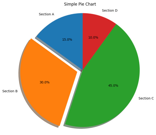
Are you using A DATA STUDIO ACCOUNT for your data analysis and visualization needs? Do you want to learn how to use pie charts effectively? You’re in the right place! In this post, we’ll guide you through each step to create a pie chart in A DATA STUDIO ACCOUNT and share some tips and tricks to make sure your chart is well-designed and easy to understand. Let’s get started! Step 1: Login into Your A DATA STUDIO ACCOUNT The first step is to log in to your A DATA STUDIO ACCOUNT. If you do not have an account already, create one. Step 2: Choose the Data Source You Want Once you are logged in, choose the data source you want to use for your pie chart. You can either select existing data sources or create a new one. Click here for a guide on how to create a new data source. Step 3: Add a New Report and Choose a Data Source After choosing the data source, you can add a new report to your A DATA STUDIO ACCOUNT. To do this, click on the “Create” button. Choose a data source in the “Data Source” option. Step 4: Add a Pie Chart to Your Report To add a pie chart to your report, click on the “Insert” tab and select “Chart” from the drop-down menu. Choose the “Pie Chart” option. Step 5: Customize Your Pie Chart Next, customize the look of the pie chart. You can change the colors, labels, and more. Make sure to choose a design that will make your data more accessible but also eye-catching and visually engaging. Step 6: Analyze Your Data Now, you can start analyzing your data with your pie chart. The chart can help you understand the distribution of data points and can show any patterns or trends. Step 7: Share Your Pie Chart Finally, when your chart is ready, you can share it with your clients, team members, or anyone else who needs to understand your data. You can also embed your chart on a website or blog post. By following these easy steps, you can now successfully create a pie chart in A DATA STUDIO ACCOUNT. Do give us a like and share your feedback on Cratos.ai. You can visit Cratos.ai for all your data visualization needs and stay tuned to our page for more such tutorials. Don’t forget to use #Cratos and #PieChart in your posts.📈🔎🚀📊
0 notes
Photo

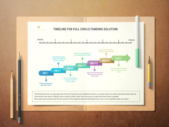
Timeline Chart Infographic Design For Circle Funding Solution Company.
.
Hope you will like it & if you need any kind of design then please Feel free to reach out via DM or by email:
📩 [email protected]
📞+880 1718939127
.
.
.
.
#company #business #creative #seller #dashboard #companyceo #piechart #infographic #infographicdesigns #timeline #chart #marketor #instafood #businesscompany #graphicdesigner #dashboarddesign #like4like #art #beautiful #motion #animation #powerpointdesign #powerpointpresentation #funding #design #email #JimBrown #creativity #businessinfographic #hiring #strategy #designer #needjob #freelancer #motiondesigner #graphicdesigner
#infographic#infographicdesigns#business#company#timeline#piechart#designs#graphicdesigns#fiverr#freelancer#social media marketing#upwork#freelancerdesigner#needjob#logomaker#logodesign#powerpointdesign
0 notes
Photo
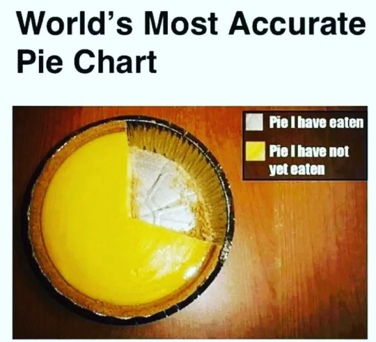
Now, this is MY type of pie chart… #pie #maths #statistics #humour #piechart (at Lancaster, Lancashire) https://www.instagram.com/p/CpgKEJwqRSH/?igshid=NGJjMDIxMWI=
0 notes
Photo
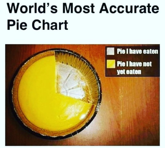
Simplified. 😂 #piechart #iwantpie #smarternotharder #keepitsimple (at Carlsbad, California) https://www.instagram.com/p/CpO0TC3Llks/?igshid=NGJjMDIxMWI=
0 notes
Link
• Data Interpretation • Single Data Interpretation • Mixed Data Interpretation • Problems on Line Graphs #Datainterpretation #bargraphs #PieCharts #tablegraphs #linegraphs For any queries/doubts/information - we are just an email away - mail us @ [email protected] Subscribe to : https://bit.ly/2YQOgbs https://www.youtube.com/playlist?list...
0 notes
Photo

I see your pie chart meme and call. #tompetty #piechart #data (at Toledo, Ohio) https://www.instagram.com/p/CnuDJS-OJqs/?igshid=NGJjMDIxMWI=
1 note
·
View note
Photo

The results are in y’all, I’m not one to toot my own horn, but facts are facts👀just look at the results! #crdnlsn #micislife #volume7 #sexy #piechart #survey #facts #nolies (at Sexy Land) https://www.instagram.com/p/CfKs1NpN1sY/?igshid=NGJjMDIxMWI=
0 notes
Photo

#chole #cholemasala #foodwithatwist #graphicdesign #infographic #piechart #artofcooking #designthinking #ingradients #cooking #relax #funcooking #tastyfood #yummy https://www.instagram.com/p/Ce_JNHBPy7H/?igshid=NGJjMDIxMWI=
#chole#cholemasala#foodwithatwist#graphicdesign#infographic#piechart#artofcooking#designthinking#ingradients#cooking#relax#funcooking#tastyfood#yummy
0 notes
Last Seen Blogs

model-brittany-brooke
Brittany Brooke

mrs-grassi
Mitch's Slave

friendlymotors
MOTTO

dsvrx
🫶🏽

guntoyou
총알받이 가계정 전문