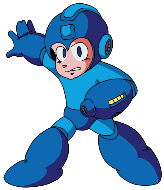
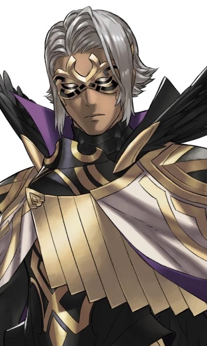
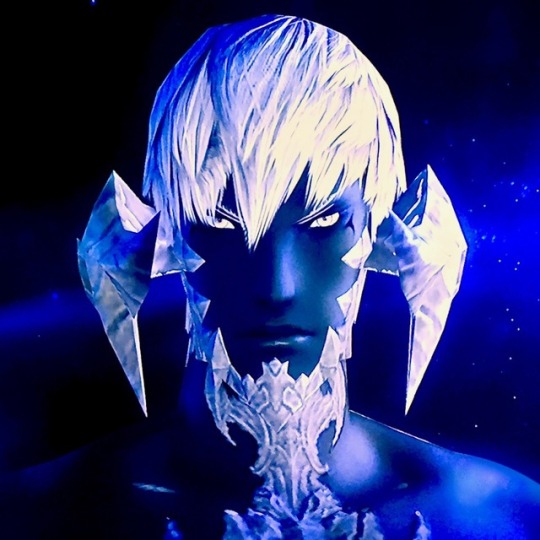
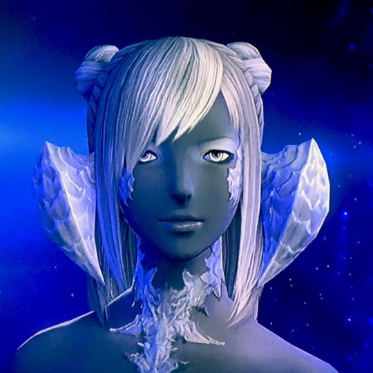
#the colors here are a bit desaturated compared to the game because i liked the concept art vibes more
Text

final rest
#kh#kingdom hearts#ansem#(the cool one)#ansem sod#kh1#fanart#kh1 is SO pretty....#the colors here are a bit desaturated compared to the game because i liked the concept art vibes more#also uh top 10 guys who are SUPER hard to draw#worlds most elaborate coat design#but his blue hghlights are so cute and stylish
1K notes
·
View notes
Note
what do you think about lavvy being the ancestor of hop and leon ;0
Frankly, I’m not into it. I’ve got a few reasons, mainly being that they completely lack visual similarity. They don’t have much in common aside from being brown and Galarian!
Of course you can make an argument for genetics influencing how his descendants would look, but… folks. They were not subtle with character design in this game. One of Hop and Leon’s most distinguishing visual features are their eyes. Very stylized, specific, and the golden color may even be an homage to Leon’s name (named for Dandelions). There’s also their distinctive purple hair… Professor Laventon’s hat and shirt may be similar to their hair, but he overall has a more desaturated, cooler color, compared to Leon’s rich, warm purple hair.
Now. I’d be a hypocrite if I pointed at the fandom and called them weird for declaring them related because they saw a brown Galarian man in a game with ancestors to pre-existing characters and instantly wanted to make a connection, but it’s also become so widespread that it’s reaching fanon levels of lore, where most people seem to have adopted it as true. I’d be a hypocrite since I gave him a sister OC who’s an ancestor to Peony and Rose. But I’m not desperately grasping at straws to try and justify why it would be possible, because I don’t really care if it ends up canon or not (and it won’t!) I’m just here to play in my space.
It does bug me a bit how widespread the headcanon has gotten because… well. I’ve watched the Pokémon fandom forget before which things are and aren’t canon. Namely the whole “Iris is Leon’s cousin” thing, which is a very popular edit from a blog dedicated to PokeMas edits. And the headcanon doesn’t have a lot of basis to it besides “well she’s brown and her hair is kinda purple”. And like… I can’t rag on people for having headcanons, but I do gotta roll up a newspaper and whap people over the head for not double-checking things. It’s a headcanon people can certainly have, I’m not a cop, but I don’t subscribe to this one mainly because Iris is coded to be Native American (see her home village in the anime) wherein Leon and Hop are more likely to be Indian coded.
But these are all just some weird blorbos and this is the internet and it doesn’t super matter and god knows I’ve made a bunch of characters related when they have no relation in canon
#puyon prattles#long post#please don’t take this personally or as an attack#I just have strong opinions about how fandom can be a little weird
2 notes
·
View notes
Text
The artstyle of the Classic Mega Man series, which only began to find its footing just after the third installment, is iconic. I have a major soft spot for Keiji Inafune's artwork for the NES-era Mega Man titles, as well as Ryuji Higurashi's illustrative work for Mega Man 9. I've even spent a good while trying my hand at the style, of which you can check out here!
Though, every artstyle has to start somewhere, and even though the later NES Mega Man titles had some excellent looking artwork, the illustrations for the first couple of games were... interesting. The characters of the original Mega Man and its sequel were drawn in a much more rounded artstyle, looking more chibi like than the anime-esque style it would evolve into, and after the first few Mega Man games, it was quickly improved upon.
When you really take some time to sample Mega Man 1 and 2's artwork, however, you'll find that it's not that bad of an artstyle. Sure, the infamous 'Capcom hand' looked odd from having the middle two fingers fused together, but outside of that, I find that it's an artstyle that doesn't get a lot of representation in Mega Man fanart and is one I've grown to appreciate in these past few weeks.
And from having drawn a near-identical Inafune-styled Mega Man a month ago, yet another challenge for my artstyle replicating smarts arose... could I do it again, but take more after the style of Mega Man 2's artwork?
See for yourself!
I've been playing a whole lot of the first Mega Man Legacy Collection for the past few weeks, and in that time I've beaten all six games (Some even twice or thrice like Mega Man 5), read all of the database entries, and have been sampling the game's enormous backlog of illustrations from Mega Man 1 through 6!
In doing so, I found myself developing a fondness for the artstyle of the first two titles in the series— while I do prefer the artstyle of the later NES games, the humble beginnings of Keiji Inafune's illustrations for Mega Man appealed to me, and it was a style that I definitely wanted to see if I could come close to replicating.
And so, it was shortly decided that I would be drawing Mega Man in the Mega Man 2 artstyle! ... but what pose would I draw him in? I thought it would be neat to have a MM2-styled version of Mega Man from his appearance on Mega Man 10's box art, and the instant I thought of that pose, I got straight to work!

Compared to its modern counterpart, the style of the earlier Mega Man games has some pretty key differences: most glaring are the pupils of the eyes, which are much more wide than the slimmer pupil shapes seen in later titles. The eye shape itself is also a lot more circular, too, and certain aspects of robot master facial features (Such as their mouth or chin) are much larger.
The hands and boots of both Mega Man and robot masters are also greatly simplified, too. The 'feet' section of the boot is much more round, and also lack the 'Z' crease shape you would normally see on non-segmented boots. Instead, the boots (And often other parts of the body, such as the legs or buster) have minor crosshatch shading, though nothing too major.
These were design elements I made sure to account for in my initial sketch, and much like when I last drew Mega Man, the most important part was getting his head to look as 1:1 to the original that I could. You might notice the 'Capcom hand' looks a bit wonky, and this is because I was using my Switch for references and it was tough to draw a good looking one pointed left instead of right— it wasn't a huge deal. I could always fix it when I digitalized it!
After I got the sketch fully lined to my liking, it was time to figure out another crucial aspect to staying true to the look of Mega Man 2's visual style: the colors. The colors I used here were directly picked from Mega Man himself on Mega Man 2's box art, but when I wasn't liking how dark the colors came out, I brightened and desaturated them a slight bit to give it that vintage feel.
The shading was particularly easy, as I referenced the shading from my main reference of Mega Man in 10's main artwork, though I intentionally left some areas unshaded (Such as the buster meter and inner earpiece) seeing as Inafune tended to do the same every now and then.
An extremely small detail that I'm glad I acknowledged was how you can only see Mega Man's right (Or his left) earpiece as opposed to both. In artwork from the first two games, whenever Mega Man is at a 3/4ths angle, only one earpiece is present, whereas both can be seen at the same angle in later games.
I'll be honest, it was actually a whole lot of fun drawing in 2's artstyle, since it's a lot more simplistic compared to the perfection 9 and 10's style demands when replicating it— I may even attempt modern robot masters in the same style to see what they may have looked like in earlier Mega Man titles... or perhaps even draw faux official artwork for the obscure Bond Man!
That said, I hope you've enjoyed my dive into analyzing the artstyle of the earlier Mega Man games, and what my research yielded in perhaps one of my favorite drawings I've done this year!
#Mega Man#Rockman#Mega Man 2#Rockman 2#Star's Art#Deep Dives with Star#Style Replication#Coolness#I still remember drawing this was SUCH a spur of the moment thing.#Like I thought ''I want to draw a MM2 styled Mega Man.'' and then sat down and sketched a MM2 styled Mega Man.#That like NEVER happens.#I don't doubt that I could PROBABLY also attempt a Mega Man in Mega Man 7's artstyle...#... since it's literally just the modern artstyle with lankier limbs and different shading...#... but that can be a potential future project#This originally was going to be a MM1 styled Mega Man#But then I realized that what I'd sketched lined up with MM2's style more. Even if I had drawn a MM1 styled earpiece#It wasn't a tough conversion to say the least!
30 notes
·
View notes
Note
hiiiii~ 🎨 pleaseee? 🥺
SKY YESSSS EVERYTHING FOR YOU! YOU'RE HERE! A REAL QUEEN HAS ARRIVED INTO MY ARMS AAAAAAA I CANNOT WAIT TO WRITE A WHOLE BOOK IN THIS ASK ✨👍❤️❤️❤️❤️ idk i know it's silly but i get so much joy from complimenting you in practicular sjdhsjks you're just the cutest and you deserve all the love AND I'M HERE TO GIVE IT TO YOU AT ALL TIMES!!!! 😌😌😌❤️💕💘💓❤️💕💘 you're really truly the one who carries this site on your shoulders and it makes me so incredibly proud of you because you always work so hard 🥺 YOU MAKE SO MANY PEOPLE HAPPY i couldn't imagine being here without you!! YOU'RE ESSENTIAL, ANGEL. Before i start with showering your gifs in love all i want to say is that YOUR GIFS JUST OPEN MY THIRD EYE AND I HEAR ANGELS SING. DON'T YOU TELL ME LATER AGAIN THAT I'M EXAGGERATING (I'll get to that later on 😤) BECAUSE YOU'RE SIMPLY A GENIUS ✨ your style are one in a million, there's no way i could ever get confused on whether a gif is yours because your gifs are unmistakable!! ONE OF A KIND! you're such a precious baby, always being worried if your gifs are pretty and this makes me want to give you all the love (BUT AT THE SAME TIME LIKE 😤😤🤜👊🤛✊🤛👊✊ HAVE YOU SEEN YOUR OWN GIFS???? LIKE /ONE/ EVEN??????? OH MY GOD) and write essays about your every gifset because every 👏 single 👏 one 👏 of your sets makes me want to write poems NOW MOVING ONNNNN
I'll really have to put this under the cut because oh my god i'm so sorry you might want to get a popcorn on the way because.... yeah
good god i think i need to lie down YOU DROPPED A BOMB AND NEXT SECOND YOU JUST VANISHED LIKE '💆🏻♀️😌💅🏻 uhuh goodnight' AKSNDKSJSKSKKSKSKSKD ARE YOU SANE THIS IS INSANE FKANDKDKDKSJSSK THE WAY THAT I SAW THIS CLIP BEFORE AND THOUGHT oh he looks gooood BUT NOW YOU DECIDED TO JUST UH??? PUT SOME OF YOUR ✨SPICE✨ INTO THIS MEAL AND PUT IT ON A PLATE LOOKING LIKE /THIS/???????????????? bro i need a doctor i'm having literal heart palpitations...... WHERE DO I EVEN START 🙏 (warning: a very stupid and corny word-play ahead) he's beauty he's grace he's mr. golden face WKDHSKSKKS BUT REALLY HIS SKINNNNNNNNNN HISSSS SKIIIIIINNNNNNNNN 😭😭😭😭😭 THE WAY HE'S GLOWING, PLEASE!!!!!!!!! only you can make them look like this, you pull out in their skin colors everything what's the best, just stunning. next, lips.. oh my goodness, lips. beautiful, amazing, just *mwah*, beautiful, kinda desaturated (which i love in your gifs) red shade. next we have CURVES GAME ON POINT, JUST STUNNING, IF I TELL YOU THAT YOU INSPIRE ME SO MUCH AKSJSJSJSJSJKS amazing blend to the background, beautiful contrast. your gifs make me fall in love with him more and more every day 💔 and i can't leave without mentioning SHARPENING SETTINGS AAAAAAA i love itttt
indeed the cutest pie 😭😭😭 i loooove how you sometimes make your gifs so tall, you know, it's so pleasing to look at and makes them so unique and pretty. I LOVE the coloring here, it's so soft and makes everything look so flawless and light?? because gif itself is a bit dark too and his skin, and light hair are just outstanding but the contrast is so soft that everything is just pulled together nicely and looks amazing! and i love how you just pulled a magenta on me and made his mic look THIS GOOD ahhhh it's THE PRETTIEST MIC EVER 😭
this set is just... yummy 🤷♀️ you know???? YOU KNOW i know you know 👏 I'M– so in love with the coral, mustard and soft minty shades of background probably that's why it reminds me just of a good candy 👍👍 to add to that there actually ARE candies on the screen, like 4 of them 👀👀👀👀 again, curves adjustments - *chiefs kiss* i love skin colors and lips, it's something i can't get enough of i just simply want to eat a gif 🤷♀️🤷♀️🤷♀️
now, we have reached the star of the show. I'll bring back something as a friendly reminder :
you cannot just say it's not the best and then have me just staring at it for five next hours ISLSNSJWNSJSJSNKSSJSJ please PLEASE where am i supossed to start FIRST OF ALL WHICH PARALLEL UNIVERSE YOU'RE LIVING IN THAT YOU MANAGED TO MAKE MAGENTAS LOOK SO BEAUTIFUL I JUST CANNOT UNDERSTAND HOW KAJSJSKS i'm really saying this seriously right now but this gifset made me tear up because i notice every single detail and it overwhelmed me to the very ends of my nerve endings KSJSKSK BECAUSE– 😔 skin color, suit color, hair color, lip color, mic color, sharpening, background, lighting, contrast, exposure.... all of it is just so beautifully composed and i don't think anyone could ever make something this amazing, especially looking at raw footage like comparing your gif to video frame it's just.. insane. you have magic hands and big brain that's all i have to say and i think it's truly one of my favorite sets of yours
run episode koo 🥺🥺 first and foremost i wanna notice and highlight how much i love that you just got rid of...... all blue and green KSJDJS LIKE PERIOD QUEEN AS YOU SHOULD ✨✨✨ i was kinda scared to do it on my own gifs and here i have another example of how you're just a genius, not scared of ANYTHING ✊💯💘 and then we can move onto his beautiful, tanned, golden skin and gorgeous red lips. I LOOOVEEEEEE IT SO MUCH I LOVE CURVES HERE AGAIN AAAAAAA I'll literally say it every time because it's the best part of your every set and I'm A COWARD TO MAKE MY GIFS TOO DARK AND DO THE CURVES THE WAY I WANT TO SKDJJSKS so i admire yours 😌✨
this gifset just simply brings me so much joy, it's like drinking a glass of cold water in the middle of the night, it's like feeling a warm gentle touch of sunlight on your skin when the sun is rising, it's like a fresh breeze ✨ again, stunning coloring, i love how you mixed oranges with this pastel blue and beiges you have kinda going there 🙇♀️ on its just so so so pretty AND ALSO OF COURSE /THEM/, THEY ARE JUST SILLY AND BEAUTIFUL, NEXT QUESTION
AJSHSJJSDKABSJDKSKKSS FIRST OF ALL THE ✨BONUS✨ IS LITERALLY ME @ YOU AFTER YOU DROPPED OF THIS GIFSET like you know i like this whole situation we have going on here wink wink how old was he in 2015 lemme do a quick math yeah 18 EIGHTEEN YEARS OLD WAS HE AND HE HAD THE AUDACITY TO LOOK LIKE THIS???? yeah no if i was a stan back then we would have a problem you know 👊✊🤜👊🤛✊👊 me looking like.... just nowhere near /this/ good..... at almost 20th year of my life is crying. i love the use of reds and brown here AND OF COURSE CURVES, MOVING ON
🍯🍯🍯🍯🍯!!!!!! THIS SET LOOKS LIKE A HONEY COMB!!!!! ❤️❤️❤️ i love how vibrant and bright the background is but you still managed to restore his skin into a perfect golden shade AHHHHHH it's so pretty
NEXT ONE IS DEDICATED FOR USER TAEYUNGIE IDK HER BUT SHE'S SURE DAMN LUCKY 🔊🔊🔊🔊 PLEASE i was so happy when you decided to make this set in the end 🥺🥺🥺 i belive i already screamed lots under the set in the tags but AAAAAAAAAAAAAAAAAAAAAAAAHHHHHHHHHHHHHHHHHHHHHHH it's amazing beautiful just gorgeous from head to toe (a gif i mean cuz clearly we cannot see his toes SKSJSJSKSJSK) A M A Z I N G coloring, veey warm very soft he just looks like a carmel with raspberry on top (WHY DO I USE SO MANY FOOD REFERENCES SKJSJSKS I'M NOT HUNGRY I SWEAR) BUT NO, FOR REAL. he just looks so cozy here and i wanna hug him so much 😔😔😔 long story short my mind and stomach perform pirouettes because i'm head over heels for this man. AGAIN THANK YOU SM BABY FOR DEDICATING THIS ONE FOR ME ❤️❤️❤️
we're here, we survived till the 10th and at the same time last gifset of this post, TIME TO POP THE CHAMPAGNE ✨ and scream a little but more because HE'S SO BEAUTIFUL I'M LITERALLY FEELING MYSELF EVAPORATING SJSJKSKSKS the contrast here is darker than usual AND I'M LOVING IT it's bringing all his best features also he just looks like a glazed donut which kinda makes me cry (WAIT I JUST REALIZED I AGAIN DID A GOOD REFERENCE SKJSJS WTF) BUT HIS GLOW 😭 HIS GLOW 😭😭✨ just amazing, it's inappropriate how much i spent staring at this set KSJSJSKSK
when i tell you that writing this one took me like... two hours. but it was totally worth it and purely out of love for your stuff. anyway, i deserve a kiss on the forehead 😌
creators send me 🎨 & I’ll tell you my favorite of your last ten creations and why
2 notes
·
View notes
Photo

[Alright, I am...rewriting this post from scratch because tumblr is a very, very functional website which definitely doesn’t punish you for using it. I hope I have rewritten all the details correctly, apologies if it seems jumpy]
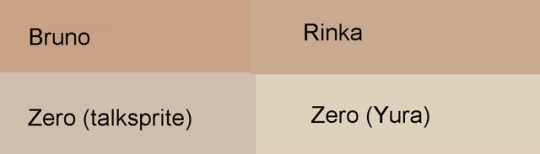
I was looking at FEH Zero the other day and was struck again by just what a...hideous gremlin he is.
Funny thing is, if you eyedropper the skin colors it’s actually not that far off. It’s almost amazing how much worse it looks with a small values tweak.
Thing is, Fates’s talksprites in general are consistently desaturated. It uses pops of bright color here and there--particularly for the royals--but for the most part its colors are relatively muted. This is both an overall design aesthetic choice and, I suspect, a technical limitation. These are talksprites; they’re going to show up on a screen competing for attention with text boxes, backgrounds, cutscene models, and typically at least one other character portrait. All of that needs to fit together visually, and a less saturated color palette is a very effective way to make those complex pieces work together without the screen looking overwhelmingly busy.
Because Zero’s talksprite is, overall, less saturated, you read it as something like a faded photograph. Your brain looks at the context and autocorrects for the washed-out colors. Fates’s watercolor-like textures (look at the ‘splotches’ on Zero’s cloak) even encourage this illusion. Consider how you can see a stop sign in shadow and still know it’s red and not purple, even though if you took a picture and super-zoomed in you would probably be looking at a purple swatch. If you eyedrop the skin tone of Zero’s talksprite and take it out of context, it’s not very dark, and this is where skin tone wank usually goes off the rails.
Yura’s Zero, however, changed his design for a lighter cloak, big gold baubles, and vivid red accessories. Now, Zero’s portrait isn’t a faded photograph. You can see that bright red belt and know how vivid the colors in this picture are supposed to be, and now all you can see is how sallow and sickly that yellowish skin looks.
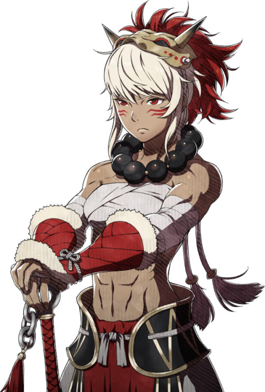
Also for the sake of comparison is Rinka’s talksprite, which does have--if you eyedropper it--noticeably more saturated skin color. This is because of Rinka’s own color palette; she’s dressed in reds and warm yellows. She needs that warmer skin tone or else her design would clash. Zero, by contrast, has a very cool palette--navy blue with purple and gray accents with some pale gold accessories. His cooler, more washed-out skin tone serves to unify his design the same way Rinka’s unifies hers.
I want to draw your attention to that gold, actually, and look at the golds on Kozaki’s Bruno. It’s so much richer than Zero’s! His skin color is very visibly more saturated, and just like Zero he even has purple in his design to compare against--and again, it’s so much more vivid. This is because FEH is a game with a different design aesthetic. Even though it shares Kozaki as an artist, the different usage of color palettes and richer colors serves to try and illustrate a different world.
It’s also, again, a response to the technical platform. On a tiny, dim smartphone screen you need brighter colors that are sure to show up (in fact I suspect this is why Yura lightened up Zero’s clothing so much in the first place--she just didn’t account for how differently it would make the rest of him read). On top of that, FEH doesn’t use prerendered models for cutscenes and only features one portrait on the screen talking at once--you can afford the extra visual real estate taken up by bright, vivid colors. Technical limitations always shape the art design you see and it’s not talked about enough!
(Incidentally, I think the full illustration in the artbook has Zero’s skin color has something like an average between his talksprite and Bruno’s skin color, though I can’t really prove it since I don’t think anyone’s unbound it for a properly color-balanced scan. I do think it’s a bit richer, though. Standalone illustrations like this have a little more freedom when it comes to saturation balance because they don’t have to be used in concert with a bunch of other elements like the talksprites do, text boxes and other portraits and cutscenes and so on.)
#design breakdowns#fire emblem fates#fire emblem heroes#zero#please post this time i'm fucking begging you#i was looking at zero in aether resort like 'man i should build him he's still one of my favs'#and then i looked at his portrait like '...oh right never mind'
36 notes
·
View notes
Photo


Discussion of Au Ra design fun under the cut!
Au Ra are a good time imo, no idea why I don't play them more often.
What I've noticed in practice is that if I do encounter Au Ra in-game, like player characters, they tend to be toned back into more natural colors. In terms of how people have critiqued them, I've heard two main camps. First is that they're essentially the same as Miqo'te: Hyurs with a few animal features pasted on. Here it means horns and tails and a couple of odd scales scattered around. I've also heard people get terribly upset that the Au Ra females weren't closer to their concept art--more Amazonian and dangerous looking as opposed to the cute version we got with extreme sexual dimorphism. Additionally, there have been some laments about how the concepts were more demonic looking as opposed to draconic.
Like I talked about in a past post I don't know for sure, but if I had to guess my suspicion is that the sexual dimorphism came from testing audience reactions for Au Ra, Viera, and possibly Lupins. I think what probably happened was that Au Ra were more popular than other options but that there was a lot of demand for cute bunny people alongside the Au Ra. At that stage I think there wasn't certainty if another race would be added following Au Ra so there were attempts to maximize popularity and stack all the most popular results into Au Ra.
In terms of Au Ra being just Hyurs with extra features, I actually want to point out--female Au Ra faces are significantly softer, have larger eyes, and more narrow/upturned noses overall compared to Hyur counterparts. The male Au Ra are overall more proportional than Elezen and offer a male body type that combines height and lean muscle. Male Au Ra are also the only race so far that for height can match male Roegadyn with some consistency. Male elezen can on a good day, but Au Ra have a better shot.
Overall, while it might be a little unclear in a couple of panels because of lighting, I made a rule for myself that I could not do drow coloring this time. I like how dramatic that approach is, but I've done it a lot. This time needed to try something else to make impact, and Au Ra have insane color options to take advantage of.
I personally find that space where horns connect to the head somewhat awkward, so I picked hairstyles that would help disguise that space. First set of Raens I tried to play into red coloration that would give different impressions of heat while feeling unified with the white scales. The first two Xaela are absolutely desaturated to give the impression of being cast in silver or moonlight.
The second set, both Raen have green skin against variations of gold and white. I did this frankly because green is one of the last colors I'll think to use reflexively while being a very reptilian color. Seemed like a good way to step outside my comfort zone. The bottom two Xaela both use blue in different ways. Part of why I made the female Xaela so dark is because the noses for that face default tend to get odd pixelation that shows up in lighter shades. I wanted to make the male Xaela feel a bit Middle Eastern since the features for that face preset are more angular. Sometimes the upper lip got odd pixelation for that preset, so I tried to pick hues carefully to hide that as much as possible.
For female Au Ra, while height and overall softness is just how it goes I do want to mention that depending on how features are arranged it is COMPLETELY possible to make an edgy or scary looking female Au Ra. Mainly I think having dark eyes contrasted with a very bright liminal ring, small irises, and black eyeshadow to give a sunken impression goes a long way toward removing the cute factor in favor of spooky. If you give the impression that one pupil is larger than the other that can be unsettling too.
7 notes
·
View notes
Photo
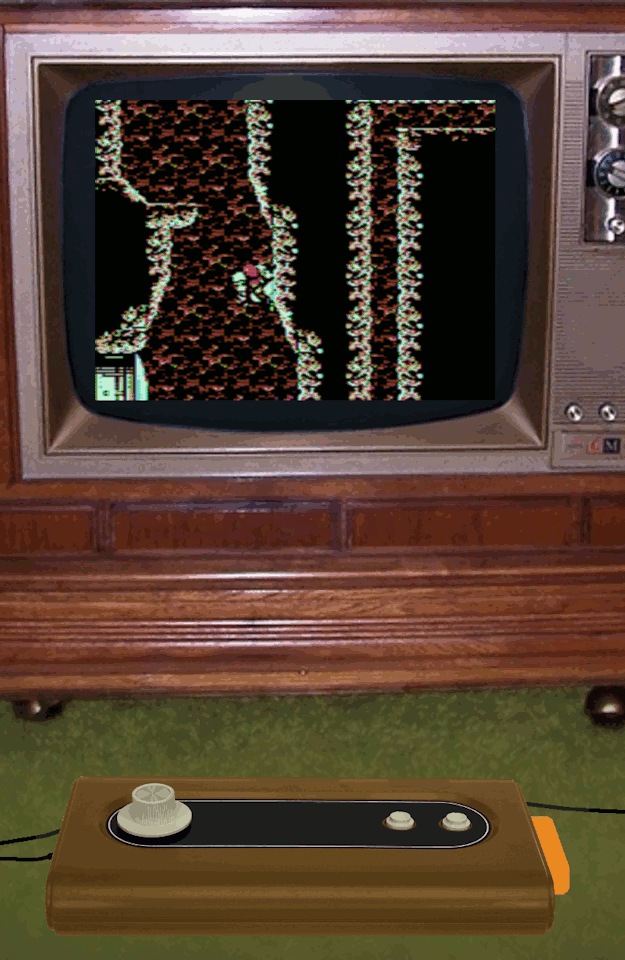
My dream 1977 console/computer
Imagine it's 1976. Current home consoles are Pong clones, but the 2nd gen consoles are just around the corner.
What would your dream 1977 console have been like (or some other year)?
Keep in mind that if it's too expensive compared to the Atari VCS, then it will fail like the Bally Astrocade. Here's mine, which uses the console itself as an arcade style controller:
- - - - -
My dream 1977 console/computer:
Less expensive than the Atari VCS
Arcade-like 360 spinner and two buttons on the console itself
.895Mhz 6502 CPU
2K RAM (BASIC cartridge adds another 2K RAM)
No hardware sprites - all "sprites" are software rendered using custom characters
20x12 character tiles; each tile is 16x16 pixels (32x16 with jitter)
320x192 normal resolution, each scanline has 4 colors (out of 8)
640x192 jittered resolution, 15 composite artifact colors
Total of 19 colors - 6 directly supported colors plus 13 jitter mixed colors
Despite being simpler and less expensive than the Atari VCS, the dream system has vastly superior 15 color backgrounds and software sprites. It also has large "arcade style" controllers suitable for placing on the floor/table/lap.
- - - - - SPINNER CONTROL - - - - -
My dream 1977 console/computer integrates the P1 controller into the console mainboard itself. The corded P2 controller is also very large - the size of a keyboard with numeric keypad. This minimizes costs on the 1P option. Initially there are 3 different packages:
1) "1P" budget option - just the console itself, with the integrated P1 controls (spinner and 2 buttons)
2) "2P" option - the console, and a corded P2 controller (spinner and 2 buttons)
3) "PC" deluxe option - console, and a corded keyboard (keyboard between spinner and 2 buttons), and BASIC cartridge
The "1P" option is less expensive than the Atari VCS, although the "2P" package could be more expensive because of the large P2 controller.
The dream console is a single board computer with P1 controls integrated into the main board. The left side has RF output and power connector; the right side has an edge connector for the cartridge and the P2 controller port.
The spinner control is inspired by driving games and Space Wars - steering on the left, along with thrust/fire action buttons on the right. The controls are ambidextrous simply by flipping the console around 180 degrees. Note that unlike an arcade stick being wrenched around, a spinner controller would not impose brutal bending stresses.
A spinner with two action buttons is suitable for a large variety of games:
Asteroids/Space War
Driving games
Breakout/Pong
Vertical shooters (with fast left/right movement)
First person shooters like Star Trek
Tempest/Gyruss tube shooters
Chess/Checkers/card games where the spinner quickly selects square/item.
Puzzle games like Tetris and Puzzle Bobble where the spinner is great for quick precise left/right aiming
Platformers with fast left/right movement
Still, it is not very good for Pacman, and many games would have to be rethought. Sometimes, it just means a minor adaptation. For example, Missile Command could use the spinner for aiming without range. Each missile uses a proximity fuse to detonate whenever it gets near to a target.
Sometimes, a game must be radically rethought. Gunfight used an 8 way joystick for movement and a 2 way joystick for aiming. The spinner could be used for aiming, but what about movement? Gunfight could be reimagined with a Joust-like fantasy theme. The spinner aims a bow and also turns you around left/right. The action buttons flap and shoot.
This Joust-like fantasy shooter could be the "killer app" for the dream console, offering frenetic gameplay unlike anything else out there.
- - - - - HARDWARE SPECIFICATION - - - - -
For the hardware, I want something that can generate text characters so it can be used as a home computer. To minimize costs, text generation is the ONLY thing the hardware directly does. No sprite hardware is included, and colors are done with composite artifact tricks.
Fundamentally, the graphics are similar to the Apple ][, but with 8 pixels per byte. It uses the Apple ][ idea of half-pixel shifting to boost base colors from 4 to 6. The video chip is extremely simplified, relying upon the CPU to race the beam and do all timing related to hsync, vsync, etc. The CPU is also needed to set SCREEN and FONT pointers each scanline. The CPU is also responsible for DRAM refresh.
During an active scanline, the video chip loads 20 characters and 2 bitmap bytes per character (total of 40 bytes of bitmap, or 256 pixels). This consumes 3/4 of the bus cycles, so the 6502 CPU at half speed. The screen is only active 52% of the time, so the CPU essentially runs at 74% speed. Between scanlines, the CPU updates the SCREEN pointer and the FONT/SHIFT registers. Clever coding can get the CPU to perform other useful work during active scanlines such as drawing sprites rather than just doing DRAM refresh during that time.
Because of how composite artifact color works, all modes have a practical horizontal resolution of only 320 and a horizontal color resolution of only 160. Alternating pixels get smeared into colors, as with the Apple ][ and CoCo.
The two main modes are NORMAL MODE and JITTER MODE:
NORMAL MODE = 320x192 8 colors (4 per line)
JITTER MODE = 640x192 15 colors
NORMAL MODE is 20x12 tiles, where each tile is a 16x16 bitmap (32 bytes). This gives 320x192 resolution, similar to Atari 800 high resolution mode. Composite artifact colors mean that the "color" of each pixel is either green or purple; they mix together to form white. The palette is thus:
BLACK, GREEN, PURPLE, WHITE
This video chip can delay a scanline by half a pixel, like the Apple ][. The shifted palette is:
BLACK, ORANGE, BLUE, WHITE
Additionally, the shift may be jittered every other field. This results in a 1:1 mix palette:
BLACK, yellow, indigo, WHITE
JITTER MODE augments the jitter concept by swapping the font while jittering. This doubles tile size from 32 bytes to 64 bytes, but it means 15 mixed colors are available. It also boosts B&W resolution from 320x192 to an incredible 640x192. The 15 1:1 color mixes are:
BLACK,
orange/2, green/2, blue/2, purple/2
red, yellow, cyan, indigo, grey50%
light orange, light green, light blue, light purple
WHITE
These colors are NOT the same as the 15 Apple ][ LORES colors. The jitter effect shifts the mixed pixels a quarter pixel and also desaturates the colors a bit.
JITTER MODE is very colorful and great resolution, and easy to program. However, it can only cover 12% of the screen with custom RAM tiles (28 out of 240 tiles). This mode is most useful when most of the screen is covered with mostly ROM tiles or repeating tiles, with either a small number of smooth moving sprites or enemies moving in formation.
Both of these modes may be scanline doubled to halve the vertical resolution (from 192 to 96), thus halving the tile memory (16 bytes or 32 bytes per tile). DOUBLE NORMAL MODE has a color resolution of 128x96 with 4/8 colors, similar to the Bally Astrocade. Despite the low resolution, this mode is good for lots of fast action and oodles of software sprites. At 16 bytes per tile, it can cover 47% of the screen with custom RAM tiles (113 tiles out of 240 tiles).
The CPU driven video can do interlacing simply by ending the last scanline halfway through. This opens up various interesting possibilities such as 2:1 mixing (for a 36 color display with 16 colors per scanline).
Despite the extremely simple hardware, the dream console has amazing graphics capabilities. I'd say the capabilities are roughly NES-like, which is seemingly outrageous for a cheap 1977 console. It achieves these capabilities with a combination of tricks:
1) Composite artifact color provides high resolution with 4 colors "for free" (a trick used by the Apple ][ and CoCo)
2) Jitter doubles horizontal resolution/color without doubling bandwidth requirements (a trick the Apple ][ could have used, but this was not historically done)
3) Tile based graphics instead of full bitmaps massively reduces RAM requirements.
- - - - - ATARI VCS COMPARISON - - - - -
So, how does the dream system stack up next to the Atari VCS?
Color - Atari VCS. The Atari VCS had 128 directly supported colors, organized to easily do beautiful gradient/fade effects. The dream system has only 6 directly supported colors. They can be mixed into 15 color in JITTER MODE, but the general "look" is still pretty garish and generally Apple-like.
CPU - Atari VCS. Its CPU is 50% faster. Both require the CPU to race the beam to assist display.
Scrolling - equal. Both the Atari VCS and dream system can easily do smooth vertical scrolling, due to the CPU driven updates each scanline. Neither is very good at smooth horizontal scrolling, but both can use tricks to do it.
Resolution - Dream System. The 320x192 practical resolution is twice the Atari VCS's 160x192.
Sprites - Dream System. Software rendering allows practically unlimited 15 color sprites.
Background - Dream System. The Atari VCS just had very blocky and bland 40 pixel background - only two colors on a scanline. The dream system can do multicolor backgrounds, with a practical resolution of 320 pixels.
Text - Dream System. The Atari VCS pretty much couldn't do text modes. The dream system's 20x12 character screen is adequate for a home computer.
Controls - Dream System. The dream system has an "arcade quality" two button spinner controllers
Computer mode - Dream System. The Atari VCS would eventually get a couple BASIC cartridges, but they just weren't capable. The dream system's "PC" option makes it a usable 1977 class 4K home computer, albeit with only 20 column text.
RAM - Dream system. 2K of RAM is a good 1977 compromise between economy and power, and the cost of RAM would go down.
Cost - Dream system. The dream system cuts corners compared to the Fairchild Channel F, which itself was less expensive than the Atari VCS.
So basically, the dream system would be greatly superior to the Atari VCS in most important respects. The smoother color gradients of the Atari VCS would not be very evident in the early titles, and the faster CPU would not confer any obviously visible benefits.
Historically, the sluggish Fairchild Channel F looked blocky and primitive compared to the Atari VCS. It devoted almost all of its RAM to a full screen frame buffer. Similarly, the more expensive Bally Astrocade devoted almost all of its RAM to an even bigger frame buffer. This made it more expensive than the Atari VCS. In contrast, the dream system conserves RAM usage with custom tiled graphics rather than a full frame buffer.
The Magnavox Odyssey 2 would put up more of a fight against the Atari VCS. Its graphics limitations were a bit weird, being better than the Atari VCS in some ways, but worse in others and being generally less flexible. It actually had pretty nice joysticks. The Odyssey 2 did well, considering Atari's head start and its lack of compelling hardware advantages. Why was that? Oh yeah - K.C. Munchkin came out well before Atari would have Pacman ready...
The Intellivision would try a whole different approach. Mattel would market it as the "intellectual" alternative, with more complex games that usually required reading the manual first to play. Was this a good move? Well, at least they were trying something a bit different. As it was, the Intellivision did have compelling hardware advantages that made it look advanced compared to the Atari VCS. So, it did okay despite some awful design decisions (like those controllers).
This dream system would be doable in 1977, but would have had incredible graphics. Focusing the hardware to be a CPU assisted character generator using jitter, interlacing, and composite color artifact tricks gives it advanced graphics at low cost. Integrating the controller into the mainboard also minimizes cost, while giving the controls an "arcade quality" aura.
I think many early games would use NORMAL MODE with only 4 colors because it's easiest to program, and the relative lack of color wouldn't be a big deal to people with B&W sets. But there would be extreme pressure on developers to switch to JITTER MODE because its colorful graphics would make those cartridges show room darlings. The additional color possibilities of 36 color interlaced modes could also be used to try and get showroom attention.
I'd concentrate on the Joust-like fantasy shooter as a "killer app" launch title. It shows off JITTER MODE's 15 color backgrounds and sprites. It has only 5 smooth motion sprites (2 players, 2 arrows, and one computer arrow). The computer archers are aligned to tiles, but one at a time shoot an arrow at a player. The game is mostly supposed to be a duel between the players, but they can cooperatively shoot at the computer archers instead. The archers don't move around, but they are animated in place.
1 note
·
View note
Text
Journal - How to Create Photorealistic Architectural Renderings Using Unreal Engine 4
Ronen Bekerman is an industry leader in Architectural Visualization who hosts in-depth tutorials on his specialist blog. Architizer is pleased to present a selection of these guides written by some of the world’s best rendering artists.
Keeping on the trail we took in the previous installment of this series, “A Photographic Approach to Architectural Visualization“, we will check how these effects can be transported into the world of real-time, more specifically with Unreal Engine as the champion of game engines making their way into the realm of ArchViz. To present this case, let’s take a trip down memory lane starting at the point that sparked it all for me and for the ArchViz community at large as well.
Here, Lasse Rode of Berlin-based studio xoio takes Unreal Engine for a good spin as he strives for photorealism using a real-time tool. He does this with his great-looking, and mostly white, Berlin Flat scene as seen on the forums. Follow along as Lasse explains getting started with Unreal Engine 4. Enjoy it!
Introduction
My name is Lasse Rode, and I am part of studio xoio. We are a small agency specializing in visualization and illustration works for architecture and product marketing. Usually we work in a kind of “traditional” 3D environment utilizing applications such as 3ds Max and the like. We are constantly checking out new rendering engines and currently making big use of Corona Renderer, V-Ray and Octane. Each engine has its strengths, and we always try to use it like that: each for the best purpose.

Lasse Rode’s modeling techniques enable realistic renderings to be created in a relatively short amount of time; images via Corona Renderer.
Back in August 2014, I stumbled upon some drop dead gorgeous Unreal Engine 4 architectural visualization tests by Frenchman Koola, which immediately reminded me “The Third & The Seventh” by Alex Roman, only this time it was done in REAL-time.
In my eyes there have been several main trends within our industry: The strive for (photo)realism and becoming faster — if not real time. Not having to wait for your rendering to come out of your render farm was always a dream for us — especially when rendering animations!
For a long time, the main downside of the “real-time-thing” was the lack of quality you could achieve compared with pre-rendered still images or animations. So even though it looked very interesting, the application of it in a visualization context seemed hard to imagine. And honestly, the “gamey” look of it made it hard to sell for high-demanding clients from the architecture and brand fields.
This has changed rapidly. The results possible with real-time engines today are very beautiful and convincing!
Why Unreal Engine?
The release of UE4 gained a lot of attention within our industry, and the possibilities seemed to be endless. The PBR (Physically Based Rendering) material system and the easy-to-use importing pipeline for getting your models into the Unreal Engine were the most compelling reasons for us to give it a try — in addition to the quality of output possible! If you have seen the work of Koola (also available as a download in the Unreal Engine Marketplace), which went viral some weeks ago, you are probably as convinced as we are that Unreal Engine 4 is capable of impressive quality.
In the following article, I want to give you an outline of the workflow I used to make the Berlin Flat scene you can download from the Marketplace and share some techniques and tricks I came across during the process. Some of them I found myself, while others are derived from information I found on the web. The Unreal Engine Forums and Documentation are a vast and great resource, as are the starter content that comes with the engine and the assets and scenes you can get from the Marketplace.
The Berlin Flat
I made a series of images of this flat in a historic building in Berlin at the beginning of 2013 using 3ds Max with the Corona Renderer. It’s a flexible way of handling the color-mapping, which really helped to pull off the very whitish mood of the whole set. This actually was also the reason for choosing it when giving UE4 a try.
I noticed UE4 being very successfully used on scenes with gloomy lighting and busy textures. I suspected it to be not that easy to get precise shadows and GI within an ultra-white interior.
And honestly: It is a tricky task!
Above is one of the original renders done with 3ds Max and Corona Renderer. To have a look at the entire set, click here. Below is the UE4 video made with this scene …
youtube
Viewing on mobile? Click here.
The Original Scene
The entire model was done in 3ds Max in a rush, so I actually detailed only the parts that are visible in the final images. Of course, this is an approach that is not possible in a real-time environment. Repurposing the scene for use with Unreal Engine, I had to reduce the scope a bit because furnishing and detailing the complete space would have taken too much time for testing purposes. I decided to export only two rooms: the ones you see on the lower part of the screenshot below.
Exporting the Geometry for Unreal Engine
This is a very easy task IF you keep some things in mind!
It makes sense to split things up a bit. Because the lightmass is calculated with a separate map for every object, it is good to be a bit careful with high values especially on big plain objects like walls and ceiling. Because of this, I only exported the inner faces of the walls that we actually see.
I also added a bit to the top and bottom of the walls to intersect them later with the ceilings. I found this to be a good way to prevent “light leaks” — lighting artifacts that happen when geometry is not closed or not intersecting. This is no problem when having a gloomy scene with lots of busy textures, but because we are going to have an ultra-white space, it is important to get as precise GI as possible, especially in the corners.
The second crucial thing is to create unwrapped UV coordinated for the channel the GI is going to be stored in by Unreal Engine’s lightmass calculation. In 3ds Max, this would be UV-channel 2.
Channel 1 is for use by all the other textures like diffuse, roughness, normal, etc. Unreal Engine counts the channels starting from 0, which can cause some confusion in the beginning — but once you get it, it is fairly simple.
Note: Unwrapping is only important for the light-map channel! For the texture channel, any kind of mapping can work, such as cubic or cylindrical mapping. In most cases, a simple “flatten mapping” in 3ds Max unwrap does the job to create sufficient UV-coordinates!
If you want to put your scene together in UE4 like it has been in your Max-scene, it is good to leave the entire “space” in place when exporting because the object’s coordinates are easier to align. For single objects like chairs and other assets, it is very comfortable to export it only once and install them in your Unreal Engine scene. For this purpose, it is good to move them near the center of your 3ds Max scene because the new object’s pivot in Unreal Engine will be there.
I used high-poly geometry without any LOD (Level of Detail) simplification. This is only recommended in small scenes like this one, but because I’m after a smooth experience and don’t want to have any jagged edges on my furniture, this was logical for me. I have no doubt there’s room for optimization, though!
Make sure your assets are merged into one object and have different material-IDs applied to handle the different materials later in UE4. Then, save your geometry as an FBX file and off you go over to the Unreal Engine editor!
Importing Into Unreal Engine 4
Importing FBX files into Unreal Engine 4 works pretty smooth! I did it in several steps.
I prepared different files that made sense:
The geometry of the room in a separate FBX file
Different file for the assets, each with some objects in them
Just make sure to uncheck the “Combine Meshes” to receive your objects separately and not baked into a single mesh!
Materials
I’m a very straightforward guy and a big fan of simple setups! It’s a philosophical thing, but achieving things with the least effort possible is far superior to using a setup only you understand or you can’t remember when opening a scene half a year later.
So this example of a shader is very simple, consisting of a diffuse map, desaturated and blended with black color. The same map is then color corrected and inverted to put into the roughness channel of the material. Done.
A normal map would have been too much here, but feel free to explore the materials for yourself in the scene!
Here you see the wood material applied to the chairs and the table — a dark dyed wood with a crisp matte reflection revealing the wood structure and texture.
In this image you see two more materials that might be of interest: firstly the curtain, which is backlit by sunlight and is a two-sided material:
You have to set the Shading Model to “Subsurface” and add a constant node with a value smaller than 1 and wire it to the Opacity property of your material to get this effect.
Secondly, the jar in the foreground has a very simple glass material:
It has a fairly dark diffuse color, zero roughness and a high specular value. I also involved a Fresnel-node with a value of 1.5 to control the opacity and refraction. There are a lot more complex ways to generate more realistic glass — but I honestly had some trouble to really get control over that, so this easy glass seems to be good enough.
Note that I checked “Two Sided” and set Translucency Lighting Mode to “TLM Surface” in the Details tab on the left.
One other material I want to show here as well is the floor because this one is the only one to have a normal map applied:
Here you see a material defined by a diffuse color, a roughness texture and a normal map. The diffuse color is a simple very light gray, defined by a 4-value constant.
Roughness looks a bit more complex: On the left, you see the same map three times scaled differently with a TexCoord node. The red channel of each is then multiplied with the others and then wired as an alpha into a Linear interpolation node (Lerp) to blend to values; 0.3 and 0.2 in this example to get a subtle noisy reflection on the floor planks. This is then fine tuned with a “Power” node to get just the right amount of roughness that looks OK.
The normal map again is influenced by a TexCoord and is then flattened a fair amount via a “FlattenNormal” node to get a subtle relief on the material.
Preparing the Assets
Before dropping the assets into your scene, it is always best to apply the materials onto them within the geometry editor. You only have to do it once and can still apply different materials in the main scene if needed. This is a fast process: Here you see it is important to apply different Material-IDs to your objects to put the different materials where they belong!
Building the Scene
This is kind of brief, but: Put the thing together. First you have to drag in the room geometry. The best way is to select all the parts needed and drag and drop them into the empty scene. Afterwards all the furniture and assets have to be placed in the environment.
Here you don’t see the back faces of the outer walls. As I’ve explained above: They are only single-sided for better lightmass calculation.
For this exact purpose it is also good to set the lightmap resolution for your larger objects to a high value, for the walls I set it at 2048, for example.
As mentioned above, light leaks can be an issue. To prevent these, I put black boxes around the whole scene. It looks kind of messy from the outside — though more clean on the inside!
Lighting and Lightmass
The lighting is also a fairly simple setup: I used the “Koola method” — a combination of a sun and planes with spotlights in front of the window to simulate a skylight. It is rather effective and easy to control!
To calculate the global illumination, only a few tweaks are important:
I drastically increased the lighting bounces and the indirect lighting quality. I also decreased the smoothness to 0.6. Details are pronounced better and the shadows don’t wash away so much.
Further to this, I set the direct lighting to a dynamic shadow, which is important to have the light moving later in the animation!
The last step before hitting “Build” is to set the Lighting Quality to “Production”!
This should result in smooth lighting everywhere.
Actually when getting to this point the first time, I was kind of thrilled! This is actually the strongest part of this engine: to thrill you. Being able to move inside my “rendering” in real time was really a delightful moment!
Post Processing
One of the greatest features is the possibility to apply color correction and camera effects just within the editor. This can be done with a Post Process Volume for global settings. I did some tweaks on the saturation, fringing and vignette, the bloom, disabled the auto exposure by setting the min. and max. values to 1 and increased the overall brightness by setting the Exposure Bias to 1.42. I also added a lens flare, which I find really awesome happening in real time!
Setting up the Animation
The ability to move freely inside the scene makes doing animation a very easy and pleasing task because of the instant-feedback nature of the real-time environment. As a frequent user of compositing software, it took not much time for me to adapt to the integrated Matinee tool and set up an animation.
First thing to do is setting up a Matinee Actor.
When opening Matinee, you will see a window with a track section and a curve editor.
Setting up the cameras and animation work is very self-explanatory. Motion is controlled by key frames and curves just like any other animation software. Also the “cutting” work is done just within the Matinee editor.
I created a couple cameras moving slowly through the space: Seeing exactly what you are doing really helps to tweak the timing of cuts and speed of camera movement!
You can see the camera trajectories just in the editor and control the editing on the fly! After getting the rough “cut” done in Matinee, I then exported the complete animation as an AVI and fine-tuned it in Premiere and aligned it to the music.
Conclusion
The entire process starting at exporting from 3ds Max and importing into Unreal Engine 4, working out the shading and lighting to produce the animation and then posting on YouTube took me about one day. This speed is unheard of in ArchViz and reflects very much the key potential that lies in the use of Unreal Engine 4 for visualization works.
Some screenshot details from the animation
The absence of render times in terms of “producing” images really makes the process of creation very flexible and free. The fast feedback of your action is the real revolution!
We are constantly thinking and testing the possibilities of applying this kind of production and workflow into our daily work and our environment as a whole.
There are a lot of possible applications, and we are very eager to explore them!
I hope I gave some insight into my motivation and process and wish a lot of fun with the Berlin flat scene.
Kind regards,
Lasse.
This article was first published on Ronen Bekerman Architectural Visualization Blog in December 2014 and refers to software available at that time. Enjoy this article? Check out the other features in our series on “The Art of Rendering”:
Methanoia Reveals the Story Behind Architecture’s Most Striking Visualizations
When Architectural Visualization Gets It Right: Victor Enrich’s Surreal Art
7 Magical Demonstrations of Hyper-Real Environments
Alex Hogrefe Creates Stunning Architectural Visualizations Using SketchUp and Photoshop
How Technology Will Revolutionize Architectural Representations
The post How to Create Photorealistic Architectural Renderings Using Unreal Engine 4 appeared first on Journal.
from Journal https://architizer.com/blog/practice/details/the-art-of-rendering-real-time-photorealism/
Originally published on ARCHITIZER
RSS Feed: https://architizer.com/blog
#Journal#architect#architecture#architects#architectural#design#designer#designers#building#buildings
0 notes
Text
IDK if anyone’s made a post on this but I can’t get over the connection between Haruka and Kiryu’s colors through the series so here I go,
Something that’s always constant in all the games is Haruka’s general color scheme; she’s always in some combination of red and white, and she’s the best character for this kind of analysis because throughout the games she’s always growing and changing but remains consistent in that red and white theme.
And then we have Kiryu, who has almost always worn gray and burgundy, like a toned-down version of Haruka’s red and white. And I love this so much.
Red means passion, red means pride and power and sometimes even pain. Kiryu’s red is faded and desaturated compared to Haruka’s red, which has always been bright and vibrant. Kiryu’s red is worn out because he’s been through so much even from the beginning. Even in his Hawaiian Dad shirt, the red isn’t nearly as bright as Haruka’s, but it’s brighter than the usual burgundy because this shirt signifies that he’s closer to reaching what he wants in life, what he was probably meant for since the very beginning. It stays faded because he’s still been through so much, he’s still worn out from everything he’s experienced, he’s still at least a little jaded.
Up until Yakuza 5, the red Haruka wore was always downplayed or hidden by the white she’s wearing. Kiryu’s red is covered up too, usually, but where does it show? On his chest!
Color placement is just as important as color choice. Having Kiryu’s red be on his chest signifies his passion, his sense of justice, how caring he is. And come Yakuza 5, where’s Haruka’s red?
You guessed it lads, she’s learning from the best.
Haruka gains some of that pride and passion, and she’s always been determined but she’s never had a set path aside from wherever Kiryu goes. Now, in Y5, she’s following her own dreams and making it big with her own ability. She’s basically independent, leaving the orphanage and Kiryu behind essentially even though she still cares about them more than anything. She’s independent, but still, she’s naive and pure, and what color represents naivety and purity? White, of course.
Haruka’s clothes are almost always overwhelmingly white. She’s young and inexperienced, naive, despite how smart she is for her age. White also signifies protection, and what does Haruka do but protect and care for not only the other children at the orphanage, but even Kiryu at times.
Compare this to Kiryu, who only ever wore white in Y0, and even then it’s still a lighter gray with pinstripes of white in it. He’s still got a vibrant orange by his chest, decorated with chains because it’s the tackiest choice he could find he’s being chained into a situation so far out of his control that it nearly kills him several times over, pulled into a game that would have nothing to do with him otherwise, and all this likely for the first time in his life.
After Y0, Kiryu never wears such overwhelming white. The next time he wears pure white is Y5, and it’s paired with lots of gray and black because he’s a Depressed Dad who just wants to see his children again. No, gray is Kiryu’s color, because he’s still jaded and seen so much already, but he’s not completely black because he still has hope! And even the little bit of white we see in his outfits in Y5 is focused around the chest.
Kiryu’s gray represents his separation from other Yakuza (Bearing in mind Nishiki’s all white with black, because he dressed for the power he wanted and flaunted the fact that he’d do anything to gain it), Kiryu still has a sense of justice and honor even if it’s muted now by everything he’s been through. He’s still just a little naive in the way he believes in the good in people, and in the world as a whole.
Kiryu and Haruka fit together less like puzzle pieces and more like Matryoshka, where the one underneath is smaller, maybe brighter, but they’re almost the same. They resemble each other but you can still see the differences.
but maybe....
it’s not......that deep...........
#I can't get enough of hearing myself type#I also love character analysis#this was a lie it's been several years and I've had enough of hearing myself type
40 notes
·
View notes
Text
A Power Of New Apple iPad Mini Use Cases And Performance Of Its Features
Apple's new £399 iPad mini has almost all the features of the iPhone XS, at half the price. If you have demanding software requirements, then it is a tablet, but what you want is suitable for hands, lab coats or cars. Apple has done the usual farmer work here, and there aren't many other small and powerful tablets on the market. This makes the 2019 iPad mini the editorial choice for small high-end tablets.
iPad Mini Use Case
Who is the iPad mini? From now on, this will color my judgment. I would say that it is not for those who want a "cheap iPad" or a "cheap tablet." Have a better cheap iPad for your kids to play Toca Boca games - the sixth generation 9.7 inch iPad and the cheaper basic use tablet.
However, if you look around, there are a lot of iPad minis doing business. Smaller tablets are suitable for car racks, as point-of-sale systems for receiving restaurant orders, writing prescriptions at the bedside, getting signatures from FedEx packaging, or for augmented reality - the lens market checks its Zillow status. The iPad mini is for those who stand up while holding a tablet, and those who don't want to pay for the iPhone and the service plan for each device.
Design And Pencil
This iPad mini looks a lot like the previous iPad mini version. It measures 8.0 x 5.3 x 0.2 inches (HWD) and weighs 10.5 ounces. It is available in grey, rose gold or silver. The 64GB model is priced at £399 and the 256GB model is priced at £549.
It has a large top and bottom border, a Lightning port, a dual speaker at the bottom and a SIM card slot. There is a physical home button with Apple's simple, accurate Touch ID fingerprint sensor. It can be easily held in one hand. The design worked, but it started to become obsolete.
The screen is a bit different. It is still a 7.9-inch laminated LCD with 2,048 x 1,536 pixels. But this time around the Apple added True Tone, which changed the white point according to the ambient light.
The iPad mini has a maximum brightness of 559 nits, which is significantly brighter than the old iPad, almost identical to the fifth-generation iPad and the 11-inch iPad Pro. Apple adjusts the screen very strictly. In all their cases, blue and red are definitely lit, green is just a desaturated touch, and yellow is slightly red. Compared to Samsung's Galaxy S10 screen in natural mode, the color is similar to the ideal distance, but red is more accurate.
This is the first iPad mini to support the official Apple Pencil or Logitech Crayon. We are talking about the first generation of pencils, although the Lightning port on the back, and the cylindrical body can be rolled - not a better second-generation model with inductive charging and a flat side.
For the iPad mini, the pencil is a bit too long and the ratio is quite. Its pressure and tilt sensitivity are clearly visible in applications like Procreate, and its responsiveness is great for taking notes, but for simple tasks like signing, you should get a cheaper capacitive pen. It's worth mentioning that when I compare the pencil here with the second-generation pencil on the 11-inch iPad Pro, I can definitely see the difference. The iPad Pro's 120Hz refresh rate makes the digital ink look smoother; the pencil on the mini (and the pencil on the sixth generation iPad) has a little delay.
Performance
Like other iPads and iPhones, the new mini runs iOS 12.2; we have iOS 12 comments to learn more. iOS 12.2 has a series of small-scale improvements on the base version 12, but the most important thing is to support Apple's new streaming service. I have been writing this article a few days before the release. Does this mean a complete overhaul of Apple's music and video applications? We will see it soon.
In any case, iOS 12.2 will also appear on all other current iPads, and older iPads will also appear on the iPad mini 2. The biggest difference between this mini and old models is performance. Apple has jumped from the last mini A8 processor to A12, wow. The A8 in the iPhone 6 has already exceeded half of its life. It may be supported by two other generations of operating systems, but third-party developers are no longer targeting it. On the other hand, the A12 is the latest chip with at least four years of service life.
The performance difference between A8 and A12 is very funny. In the Antutu system benchmark, the iPhone 6 scored 80,620 during the test. The iPad mini has 373,092. On the Geek bench multicore, the pure CPU benchmark, the fifth-generation iPad received 4,494. The sixth generation iPad received 5,934. This gets 11,548. (These results are very similar to the iPhone XS Max, and they don't have the 2018 iPad Pro with the enhanced A12X chipset.)
It's not just about the CPU; the image signal processor has been significantly boosted as well and there's a special machine-learning unit, so things like bar code scanning and object identification will go speedily.
Rendering a movie in iMovie also shows the difference in power. Boiling a minute of 1080p footage down to 360p on the iPad mini takes 5.4 seconds; it takes 10.21 seconds on the A9-powered iPad, and it will take even longer on an older mini. And of course, the older mini doesn't support the Pencil, which requires an A10 processor.
The iPad mini primarily uses 802.11ac Wi-Fi to connect to the internet. Speeds are fine, but nothing special; in testing I actually found the signal to be a bit weaker than on the 9.7-inch iPad.
The mini comes with a 12w power adapter, which charges it pretty slowly; I only got to 20 percent in half an hour. You can speed up charging by using a USB-C PD adapter and a USB-C-to-Lightning cable, but they don't come with the tablet.
Camera
The iPad sports an 8-megapixel rear camera and a 7-megapixel front camera. Both record 1080p video at 30 frames per second. Compared with the fifth-generation iPad's 8-megapixel camera, images taken with the main camera are aggressively sharpened, bringing out more details but also more noise. Low-light images are also stippled with noise from a somewhat straining sharpening algorithm, but aren't otherwise much better than shots from the earlier iPad. It's clear that the differences here aren't in the camera, but in the image signal processor.
The front-facing camera of course has a lot more pixels than the previous iPads, but they aren't necessarily better pixels. You get more detail, but it's kind of grainy, noisy detail.
The front-facing camera, meanwhile, is for video calling with devices that have high-resolution screens, and it does a good job at that.
And if you're a real estate agent, sure, houses will look fine in photos taken with this tablet. But you can't think of this camera as the one you should use to take photos at your next birthday party. Use your iPhone instead.
Left to right: iPad Pro (11-inch), iPad, iPad mini, iPhone XS Max
Comparisons And Conclusions
This year's iPad mini and the new iPad Air are basically bigger and smaller versions of each other. Here's how it steps up: The existing iPad (just called iPad) is for all of your basic tablet needs. The iPad mini is for people who specifically need a smaller, lighter tablet. The iPad Air is for if you intend to run apps that will be too slow on the iPad, or if you're crazy about Apple's keyboard case. The 11-inch iPad Pro (or the more expensive 12.9-inch model) is a primary creative machine, especially for people who intend to use the Pencil.
The mini shines when you need a tablet that runs powerful applications, but is still handheld. That could be in many enterprise contexts, such as retail, navigation, logistics, law enforcement, education, or real estate. It's much easier to hold up a mini for AR viewing applications than to hold up a larger iPad.
If you have an existing iPad mini of any generation that's been acting sluggish, it's because the processor is just too old for today's apps. I understand the reluctance to get a new device that looks the same as your old one, but the processor change makes the 2019 iPad mini more than a worthy upgrade. And for anyone who wants an iPad, but finds the £329 model a little unwieldy, you now have an excellent alternative. The iPad mini is a versatile tablet, and our Editors' Choice.
If you are looking for a tablet repair centre in the UK, then visit Tabletrepairer.co.uk offering same day repairs and while you wait tablet repairs.
For more details, visit Tabletrepairer.co.uk
0 notes
Text
ACLOUDYSKYE.
Last week, we talked about QUO.
Rarely do I ever hear music that hits me deep. This hasn’t happened here either, no. This music got to the core of me. On flyoutlet, closing the month of November, I present, acloudyskye.
Compared to previous features and posts, you might notice this one is missing something after acloudyskye’s name in the title. You’re not wrong, but there’s not going to be anything either. After I heard acloudyskye’s music, I was speechless. I had considered a few things to add onto the title but no words could compare with what I had heard.
The comment section of Vanishing Point.
The first song I heard was “Vanishing Point.” The opening felt nice and airy, but the flute that was a bit loud already hinted at something being off. While listening, I checked out acloudyskye’s profile where the bio read, “a story from a broken place.” The first synth that was introduced could easily be linked to the words in the bio, and when it was joined by saws opening up the space of the song, I actually started getting excited for what was coming up. Never had I been so wrong in my expectations, and at the same time been so happy about being wrong.
The cover for “Vanishing Point.”
I have this kind of dystopian world in my head, and whenever I try to make a song I try to imagine the song as a short story taking place in that world in a grand overarching plot hence, “a story from a broken place.”
- acloudyskye.
The drop. It kicks in, and everything is so big and tight that there is no space left for words. The room the saws opened up for just a moment ago? The drop exceeded the amount of room given, and had it been an actual room, it would’ve torn down the walls, and went on forever. The only thing I could do in the moment was to sit and stare in amazement. We’re only talking the first 4 seconds here. A bass goes wild, possibly to give the listener a quick break from what’s just happened, but it does not work out at all, there is still full gas on the song’s quest to be absolutely everywhere. I had to know what inspired this.
A big one was Disasterpeace and the soundtrack he did for the game Hyper Light Drifter. All of his synths have this kind of liveliness to them where they bounce around in the stereo field and disintegrate which contrasts the overall somber mood in the world of Hyper Light Drifter. That contrast definitely drove me to write the song the way I did.
I continued with “When There Were Others,” and while it is not as brutal as “Vanishing Point,” it would definitely have brought the same reaction out of me if I had heard that before “Vanishing Point.” I believe acloudyskye’s ability to make multiple songs that could get such reactions shows the quality of his crafts. “Parting Gift,” keeps acloudyskye’s flow, but it also becomes something on its own. It mixes the previous broken sounds with bass that goes so hard it puts you in a trance. The further back we go in acloudyskye’s music, the calmer the songs became, and then I doubted whether or not it had always been a story from a broken place.
Around Junior year I started getting really stressed out and just wanted to vent which is when my stuff started getting a bit more violent sonically, although I would argue that I’ve been making distorted stuff for a while, it’s just not until now that it’s come from a place that’s sincere.
I tried not to write about lyrics in this post, but I feel that I have to. acloudyskye’s music had my full attention already so the lyrics weren’t easy to miss the first time. As acloudyskye does not usually include lyrics, the times where he does, it turns out great. The lyrics we have seem short and subtle, but they easily leave an impact. In both “Vanishing Point” and “Parting Gift,” there are 6 small lines of lyrics. Just those 6 lines quickly become personal, and leave a big opportunity for interpretation. The lyrics in both of the songs stayed in my head for a while.
[...] a lot of the times I write in a way that makes it easier for me (lots of prolonged vowels and pauses between lines). As for the content in the lyrics, I like keeping things vague because I find that talking about a specific subject distracts from the overall feeling that I'm trying to convey through the track.

The cover for “Parting Gift.”
Throughout, I noticed something about the cover art for his songs. Unlike his first tracks, they used similar color schemes and styles. Most of them look unrealistic, abstract, or made up, and that’s where I realized the cover arts could’ve been connected to this dystopian world acloudyskye mentioned earlier. The image above shows the cover art for “Parting Gift.” Dark colors, sinking ship in the background, unrealistic looking boxes, and a main character in the middle that also appears on some of the other covers. Did we get a look into this world?
I try to make them reflect the song while also fitting them into that whole "short story in a world" thing that I'm going for. As for the use of color I like sticking to the primary colors used for computer displays (rgb) as well as using desaturated/pastel shades of those colors, makes it look kinda bleak which I like a lot.
To conclude, acloudyskye brings music you definitely do not want to miss out on. There are loads of songs already to listen to, and what acloudyskye pulls out of his dystopian world next, we can only wait for in anticipation. I remain speechless.
Listen to acloudyskye’s music here:
soundcloud.com/acloudyskye
Look out for a surprise this coming week.
- flyoutlet
0 notes
Last Seen Blogs

slowlysuperduck
it's lemons then

morerealbeauties
Female Hotties

xxcupcakelover17xx
mess

largando
Untitled

brettseaton
Brett Seaton