cyhung
A Place Where Notes Come to Die
A temporary home for Cheri Hung (@cyhung).
172 posts
Don't wanna be here? Send us removal request.
Last Seen Blogs

slurpii-cup
Hee-Hoi!

lyn1tx
Lyn1tx

energonbunny
energonbunny

tywvin-archive
moved !

minwrathous
minWRATHous
Photo
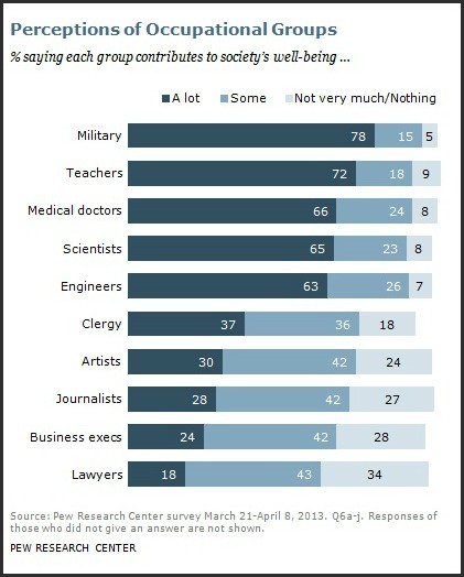
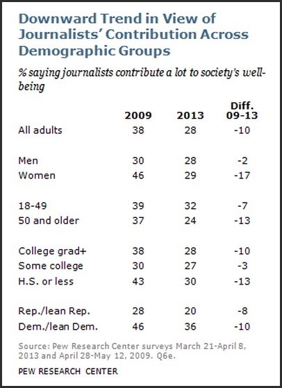
Study says Journalists are Getting Less Respect
via Poynter
27 percent of Americans say journalists contribute little or nothing to society’s well being, according to a study by the Pew Research Center’s Forum on Religion & Public Life.
The percentage of Americans who say journalists contribute a lot to society has shrunk since 2009. The trend is particularly notable among women, 29 percent of whom said journalists contribute a lot. In 2009, 46 percent of women held high opinions of journalists.
Images: Polls conducted by Pew Research Center
96 notes
·
View notes
Photo

Cherry Brandy Mojito, A Refreshing Summer Drink #recipe
View Post
0 notes
Photo
Stately Font Map + D3.js
View Post
0 notes
Text
Two Days of Data Visualization: OpenVisConf 2013
This was one of the best conferences I’ve been to in a while. Two days of insightful talks by people who do data visualization from across the field and disciplines. The speakers included interactive designers from news media, data scientists,…
View Post
0 notes
Text
SASS and LESS Mixins: CSS3 Buttons
There are many reasons to use css pre-processors languages like SASS and LESS. Other than the basics, such as variables and math functions, my top reasons would be for mixins and color functions. Mixins are extremely useful when you need to create…
View Post
0 notes
Text
OpenStates PHP Plugin
This PHP plugin is to fetch, parse and display data from Sunglight’s OpenStates API. I decided to create it after digging into the API for a project on anti-Common Core bills. So that I could quickly spin up more state legislature data projects in the…
View Post
0 notes
Photo
Last month we published a package of stories marking the fortieth anniversary of the Roe v. Wade decision. It had a few moving parts but I’ll just go over some of them briefly here.
How it started
This summer you probably heard the story about the last abortion clinic in Mississippi that was threatened to close due to stricter state laws. Allison Yarrow, who sat across from me at the time, was covering the story and it got us thinking: the line “The Last Abortion Clinic in Mississippi” is attention grabbing, but it doesn’t tell the whole story. That is to say, what you really want to know is how far are people away from their nearest clinic, regardless of state boundaries. One state may have five clinics but if they’re all in the southwest corner of the state and you live in the northeast corner, and your adjoining states have multiple clinics but only at their borders farthest from you, then you’ll have a hard time getting to a clinic, even if you had many in your state. To see where this might be the case and where access to services was compounded by new restrictive provisions (over 150 nationally in the past two years) we made as close to a comprehensive database as possible of every abortion clinic. Our goal was to see what parts of the country were farthest from a clinic. From start to finish, this process took about six months.
We got our address data from a variety of publicly available sources: Planned Parenthood, the National Abortion Federation, anti-abortion websites that keep their own lists and others. We needed to verify that the address information was correct, though, so we called over 750 clinics to confirm. We also asked them up to how many weeks they offer services. The resulting database is the only one of its kind that we know of. The Guttmacher Institute undertook an abortion provider census in 2008 but they didn’t separate clinics from hospitals from private doctors offices, which represent different levels of care that we thought was an important distinction.
What it became
We started this in July and the project evolved. We thought the election might bring the issue of abortion access to the fore but it didn’t and that gave us more time. Allison brought up the fortieth anniversary of Roe v. Wade and that let us think much bigger about the project. Because this was such a personal subject matter, we knew readers’ comments would feature prominently (from both sides of the issue) and we wanted a strong narrative component, too.
To give a human voice to the Geography of Abortion Access map, Allison flew to Wichita, Kansas, one of the areas that stood out both on our map, as a metro area far from a clinic, as well as in recent memory as the site of the 2008 murder of late-term abortion provider George Tiller. To add a broader perspective, Sam Register who runs the Newsweek Archivist tumblr went through the Newsweek archives so people could follow the topic’s coverage from the 70s through the 00s.
What we learned from reader’s stories
Over the course of the week, we shifted the question we were asking from why do you support or oppose legal abortion to a conversation about pro-life and pro-choice labels as a way to get more nuanced opinions and show the complexity of the issue. We asked readers to complete either the phrase “I’m pro-life but…” or “I’m pro-choice but…” We got more responses from our other reader-based projects but we were happy in how thoughtful and honest people were. Read our roundup of interesting responses to those questions as well as our free form “Tell us your story” prompt here.
Under the hood on the map
How to represent this dataset was tricky. We had three main issues: anonymity, unbiased geography, and context.
Anonymity: Although we got our data from publicly available websites that anyone could find and was often information that anti-abortion groups already held, we weren’t comfortable publishing addresses, names, or exact latitudes and longitudes. We took great care to do things like scrub our final database of anything identifiable and we partially randomized each clinic’s location so they weren’t pinpoint-able from our map. On the presentation level, we added the magenta circle big enough to span multiple hexagons (our base geography layer) to let people know that an address was approximate. Even if you backtrack and find our database, you won’t get any information that would let you de-anonymize the data.
Unbiased geography: As I wrote above, we wanted to get away from the arbitrary state and county borders that most all of the research we encountered was based on. We did some initial plots using Census tracts but that presents exactly the same problem [photo]. We ended up making a hexagonal grid using the Repeating Shapes plugin for ArcMap, which lets you make a grid out of your choice of shape and size. The trick to making a hexagonal grid for the web so that the hexagons will be regular (all sides equal) no matter what degree of latitude they fall on is to make the grid in your output projection, Web Mercator EPSG: 3857. You can reproject it to do your analysis in whatever you like, but because it will eventually be displayed in Web Mercator, it will need to be created in that so as not to come out distorted in the browser. If you want a 20,000 meter in diameter hexagonal grid, here’s the one we used: Shapefile, KML, GeoJSON.
And here’s another one that Brian Abelson, current Knight-Mozilla Fellow at the New York Times, made while he was helping out on the project. They are also 20,000 meter hex grids. This one has the state borders preserved in case you want to assign state values to each hexagon: Shapefile, KML, GeoJSON.
Context: Generating our distance map wasn’t enough to tell a story with. We added three other pieces of information that would walk people through the significance of the patterns they were seeing. The first was a map of female population aged 15-44 so that people could see the areas where women lived that were farthest away from clinics and identify significant metro areas (the pink dot density overlay). The second was the different legal restrictions that each area was subject to (areas with highlighted transparency). Again, this was an interesting way to visualize this data because we didn’t highlight every hexagon in Kansas, for example, to show that certain laws were applicable in Kansas. Instead, we highlighted hexagons whose closest clinic was in Kansas. This gave us a very realistic map so that people could see what state laws they would be subject to if their nearest clinic was across state lines. It also visually demonstrates how state laws can affect people that don’t live in that state. And third, we selected our own highlights from going through the data, such as the areas where telemedicine is banned in conjunction with mandatory in-person counseling. The combination of these laws in Arizona, for instance, means some women travel over a hundred miles and spend two days to get a prescription for the abortion bill.
More under the hood
The map itself we built using CartoDB, which allowed us to very flexibly add the different highlighted views of the map without rebaking our tiles each time.The slider that shows clinics that only offer services up to X weeks we did by loading four tile layers on top of each other at once and show/hiding them depending on the slider value. This made the map slightly slower on initial load but it made the transitions between map states super fast — so a trade-off.
For the highlighted states, those restyle and reload all four map layers as well. We used Leaflet.js’s ability to plot vectors to draw the line between the hexagon you’re hovering over and the closest clinic to provide some more descriptive interaction.
The heatmap was created through ArcGIS from census tract data. We filtered for just the number of women of reproductive age, 15 to 44, per tract and then used the Create Random Points function in ArcGIS to create one point for every 210 women. We came up with the 210:1 ratio by looking at a histogram of the data to see what would be an accurate dividing point. For a shameless plug, I used an online tool that I made called www.Histagram.me to generate quick, interactive histograms. Feel free to use it too.
Because the heatmap itself is done with CartoCSS layering techniques and not a statistically calculated heatmap, we made sure to compare side-by-side with a choropleth tracts map of the same data using Jenks-clustered color breaks to make sure that our heatmap told the same story as the choropleth.
A few months ago we spoke with Andrew Hill, Senior Scientist at Vizzuality (who makes CartoDB) on some experimental ways to map the data. The line on hover came out of some of his renderings and you can see in the photos below some of the experimental line styles.
All in all it was a lot of team work, Allison, Abby, Brian, Caitlin, Lizzie, Sam and a number of other people all helped with parts of it over the course of six months. If you have any other questions about it, let me know at [email protected]
-Michael
Before we settled on the Value-by-alpha approach for showing the different state laws, some failures:
We tried outlining the different shapes and showing them in different colors:
We tried coloring the hexagon outline by the different laws that were in effect. Creating a sensical hierarchy proved difficult:
Lines instead of hexagons:
Highlighting Peurto Rico:
A value-by-alpha chart where census tracts are shaded by their percentage of women of reproductive age. Unfortunately, it’s not that intelligible and the heat map overlay is a much cleaner way of showing this relationship:
Before we made the hexagon grid, how the map looks if you use census tracts:
161 notes
·
View notes
Text
Open School Design & Student Learning - A Motion Graphics Video
Feels like ages ago when Quality Counts 2013wrapped! This is my first attempt at creating something in After Effects (not counting my attempt at producing a MFGX tribute to…Gary Oldman). The video is meant to exhibit the relationship between the physical…
View Post
0 notes
Photo
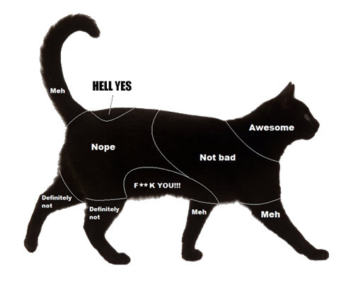
How to pet cats and dogs.
What this chart indicates is that cats are able to state what they want from the petting interaction, which leads to a more honest, deeper pet-and-pet-owner relationship. Dogs just lie there and let the pet-owner do his bidding like a woman of the wharf would a grizzled merchant marine holding a twenty-dollar bill.
43 notes
·
View notes
Photo
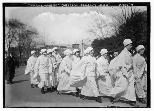
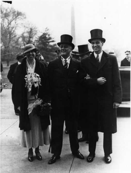
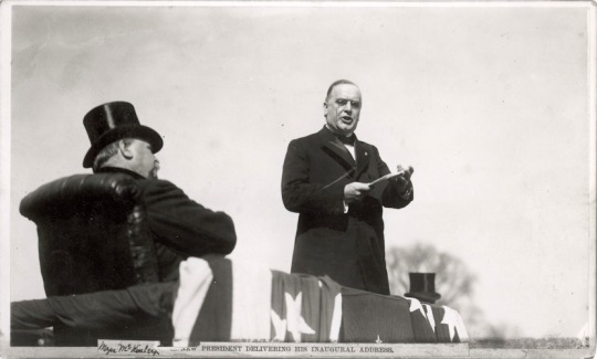
Old-Timey Inaugurations
Top: Suffragists march at Woodrow Wilson’s 1913 inauguration.
Left: Franklin Roosevelt with wife Eleanor and son James at the first of his four inaugurations.
Right: Outgoing president Grover Cleveland watches watches incoming president William McKinley’s 1897 inauguration speech. McKinley was assassinated in 1901.
Images via Talking Points Memo. Read through for more.
20 notes
·
View notes
Photo

Making Gravlax
Generally, Gravlaxis made by covering a piece of filet salmon with equal parts of sugar and salt,…
View Post
shared via WordPress.com
0 notes
Link
Given the name and topic of this blog, I felt it would be fitting to write this inaugural post on how to make one of my favorite dishes using a HTML5 video tool, Popcorn.js. I made two versions using both the javascript library and Popcorn Maker….
0 notes
Text
Adding Ability to Select by Date to TimelineJS
In a recent project, I needed to add a select-by-date controller to a timeline built using TimelineJS. The controller will give user a way to jump the timeline by year.
I found a solution on TimelineJS’ github issues page (issue 295). User ahmadassafsug…
View Post
shared via WordPress.com
0 notes
Photo
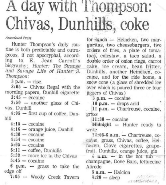
Hunter Thompson’s Daily To-Dos
Not that we recommend it or anything.
Via Buzzfeed. Select to embiggen.
548 notes
·
View notes