
Last Seen Blogs

100daysofteenwolf
100 Days Of Teen Wolf

kawaii-raspy
ʀᴀsᴘʙᴇʀʀʏ ᴍɪʟᴋ

madamemaddy
grelle sutcliff is an icon

dunnsdelihomeinfohub
Dunns Deli Home Info Hub
ruewen
these books ruewened my life.
Text
Post Modernism
History follows a Meta-Narrative
Rational, scientific, thought can solve the world’s problems
If we follow these principles, progress will be inevitable
Proclaims
- The end of uncertainty
- The death of the meta-narrative
- Progress is no longer inevitable
- The revolution is not coming
Differences between Modernism and Post-Modernism
Modernism
We know who we are
We should strive for a coherent, contradiction-free world-view
An artist’s intentions are important
Categories are logical
There are genres with clearly-defined boundaries
Art should have a purpose
Authenticity is important
True knowledge is derived from logic, maths and science
Post-Modernism
We shape who we are
We should embrace the chaos and contradictions in the world
Only the views interpretation matters
Categories are arbitrary
There are no genres, only context
Let’s replace purpose with play
Copies are equally valid
Truth is relative. Sociology and cultural studies reveal more to us than science can.
Postmodern Art
There are no original ideas
Reject western aesthetics - ignore what they think is “good” or “bad”
Reject the distinction between “High Art” and “Pop Culture”
Reject the idea that art needs a purpose
Reject intellectual property and ownership
Reject the idea of the “Author”
Reject genres - refuse to play by their rules
Embrace new technologies
Embrace experimentation and play
Embrace mass production
There are no rules
Reality vs. Hyper-Reality
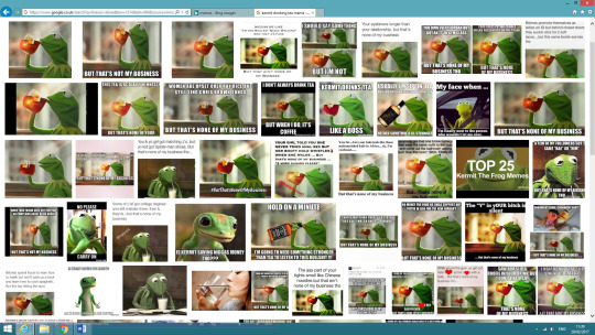
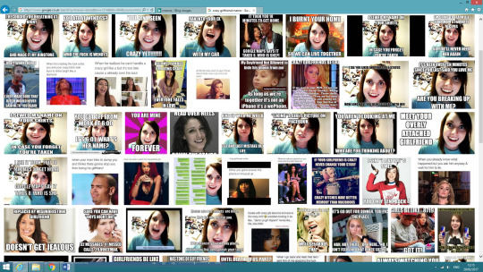
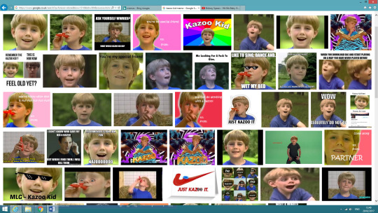
Memes are a very strong representation of postmodern material. As the image gets deeper within the internet and shared across thousands of social media accounts. The person who ‘made’ the meme gets lost and nobody then knows which one is the ‘original’. It becomes everyone’s to edit and share to wherever they want to. Even the ‘traditional’ way the words are written on a meme can be altered to something different.
Diffused via social media (grounded in hyper-reality, not reality)
Don’t conform to traditional ideas of what “good” or “bad” art looks like (a rejection of traditional aesthetics)
Doesn’t try to speak for itself: instead, refers to other ideas in pop culture (referential rather than original)
Diffusion is hyper-fast (A rejection of the durability of ideas)
They belong to no-one (A rejection of intellectual property)
0 notes
Text
Metering
Use the light meter app and shoot 35mm exposures ensuring you get the 4 types of shot requested.
- A portrait in front of a light source
- Painting with light
- A long exposure
- An inside space
Ensure that the settings are noted for all shots in the order they were taken.
AT HOME:
Describe what the following are:
- Spot metering
- Matrix/evaluative metering
- Centre weighted metering
PHOTOGRAPHY DIARY:
- Write an entry in your photography diary:
- What did you do?
- Was it difficult?
- Did it help you?
- What didn’t do well? Why?
0 notes
Text
Lighting Effects
liam
What did you do? Explain and use correct terminology when talking about tools and processes in Ps.
How did you find it? Easy, hard, time consuming?
Do you think you could adapt these techniques to create lighting for your work in future?
What are the benefits of these tools? What other uses for improving images can you think of?
What are the limitations?
Be reflective on the task.
0 notes
Text
Post Colonialism
“Britians history and culture is profoundly internationalist.” - Theresa May, 2017, Brexit speech.
Post-Colonialism
To colonize - to establish, maintain and exploit colonies in other locations.
The colonialist era, 15th - 19th Century.
Justification from colonialism
-> Economic, resources, land. “Primitive Accumulation”
-> Power - Tactical
-> Religion. “Bringing god to the godless”
-> Intellectual - Bringing “civilization to the savages”
-> Racial
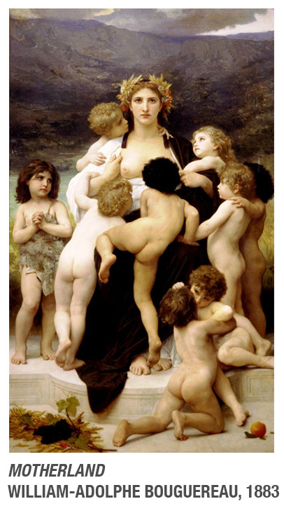
The mother within the painting represents the motherland, which was France. The children are being breastfed by the motherland as a way to show nourishment. What is also visually noticeable is the painting has tried to show different skin tones however white is being implied as the best. As the skin tones shown are not as broad as they could be. The laurel is placed on her head so she is seen as Julius Caesar, this shows power, monarchy, justice.
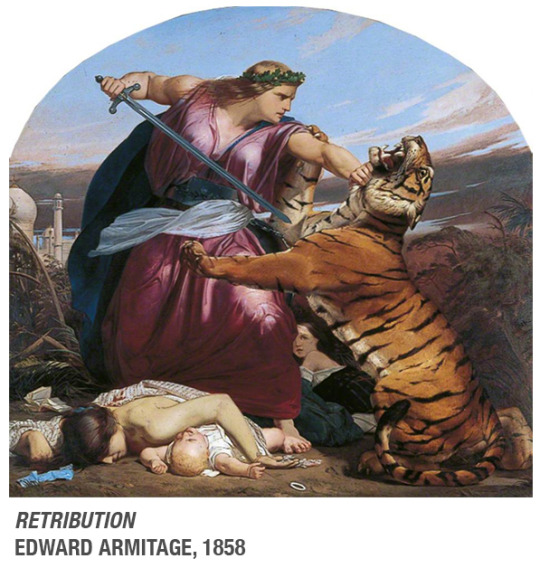
The artwork is called Retribution, this means revenge, which is a powerful word within itself. The location that the painting is set in is India, this is known by the Taj Mahal in the background. The tiger represents the Indian people and the women defeating the tiger is representing Britain. The fearlessness shown in her facial expression and body language shows that she is powerful.
Post Colonialism: Criticizing the attitudes, influence and consequences of colonialism.
Edward Said:
We perceive them either as oil suppliers or terrorists. In the Arab world, stories are happening in the peoples lives. However we don’t get to see the real humanity of the middle east. He blames the media of only showing wars and terrorists. The way we see the Arab world makes it easier for the Western world to attack.
“Othering” - To turn people into a nameless “other”, defined by their “not being like you”.
0 notes
Text
Feminism
Definition: Someone who believes in equality regardless of sex or gender.
-> Sexuality and sexual relations
-> Jobs and employment
-> Positions of power and influence
-> Representation
-> Influence of gender roles
Timeline
1857 - The right to divorce.
1870 - The right to property, a wage, and inheritance (wages before the law changed went to the father until the woman married).
1876 - The right to go to university.
1919 - To have a professional job.
1916 - 1928 (when the law was for all) - The right to vote.
1949 - The right to serve in the military, however in 1992 women were allowed to actually fight.
1967 - The right to abortion, before this it was illegal and therefore a baby would be dangerously aborted by chemicals and objects. As there wasn't an option for it be done by a doctor and nurse.
1975 - Equal pay and maternity rights.
1991 - The recognition of marital rape.
History of Feminism
1795 - Book written by Mary Wollstonecraft, "A vindication of the rights of women."
1895 - The word "Feminist" first used.
First Wave: 1896 - 1940
"The Suffragettes"
Mainly concerned with legal rights, voting, employment rights, legal marriage, parenting and property.
Second Wave: 1945 - 1980
"Patriarchy" - Society run by men.
The dominant ideology is patriarchy.
-> Simone De Beauvdir "The second sex" (1949)
-> Germaine Greer "The Personal
-> Gertrude Stein Is Political"
How does gender shape us?
Gender is a social construct
Men are often not part of the patriarchy. A very little amount actually do.
Third Wave: 1980s - Now
-> Saw second wave as:
- Too rigid
- Too Bourgeois, they ignored lower class, black women, transgender women etc.
"Intersectionality"
Different operations intersect e.g. Being a woman and being of a different race or/and being transgender.
"Sex Positive"
[> More celebratory of female sexuality
Objectification - Turning someone into an object, often for sexual pleasure.
Object - Things to be used and owned.
Subject - Has feelings, thoughts, is complex, has humanity.
"The Male Gaze"
Laura Mulvey, 1975
Visual culture is constructed for male pleasure (heterosexual).
-> The male gaze can be by:
- The male subject in the content
- The creator of the content
- The viewer is encouraged to see the world through the eyes of the male gaze.
In a patriarchal society the male gaze becomes the norm.
The male gaze is oppressive because it excludes non-male intersexual viewers.
- It represents women as objects and thus reinforces the dominant ideology that women are to be used.
0 notes
Text
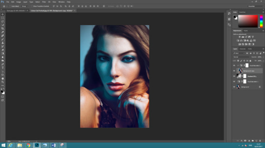
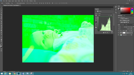
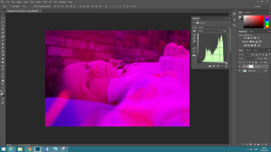
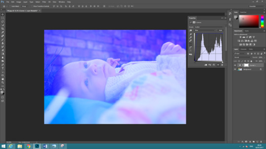
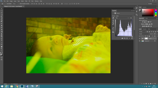
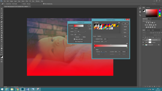
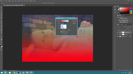
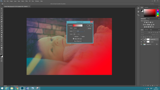
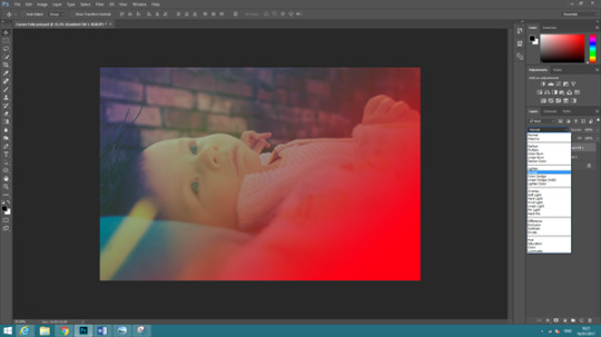
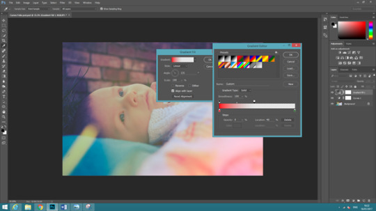
Experimenting with Saturation in a Gel Image
Open the gels image.
Create a new adjustment layer called ‘Hue/Saturation’.
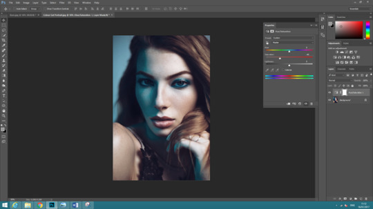
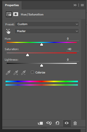
Bring the saturation down to -40.
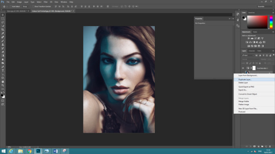
Duplicate the Gels Layer by right clicking onto it and pressing ‘duplicate layer’.
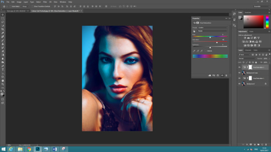
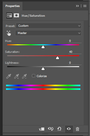
Bring the saturation up to 40.

Clip the two top layers together, do this my holding down ‘Alt’ on the keyboard and clicking between the two layers.
Open a Gradient adjustment layer and just press OK.
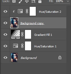
Position the gradient 3rd on the layers.
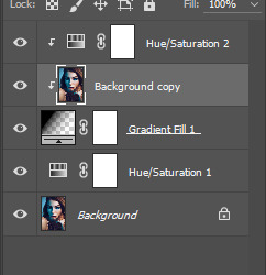
Clip the duplicate image to the new gradient layer.
Experiment and move the angles and styles around exposing different parts to the saturation.

Photographer is unknown, the photo manipulation stages shown were done by myself.
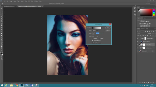
Another edit I made using the same technique:

Photographed by Brooke Cagle, photo manipulation shown in screenshot was done by myself.
0 notes
Text
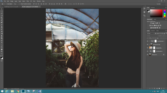
Barn
Open the sky and barn image.
Move the sky image on top of the barn image.
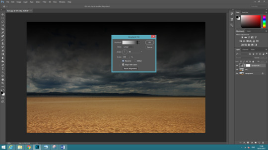
Create a new adjustment layer called Gradient.
Click reverse so the gradient is on the sky.
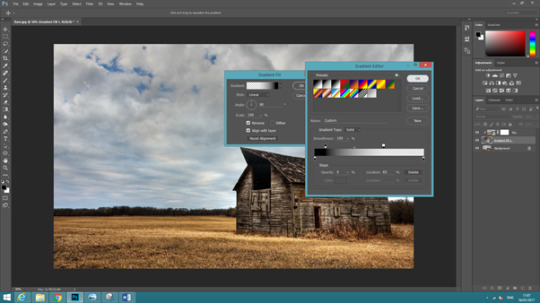
Then move the gradient layer so it’s between the sky and barn layers.
Press Alt and click on sky layer to add a clipping mask onto the gradient.
Move the points so the opacity changes, until the sky and barn has changed.
0 notes
Text
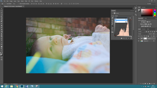
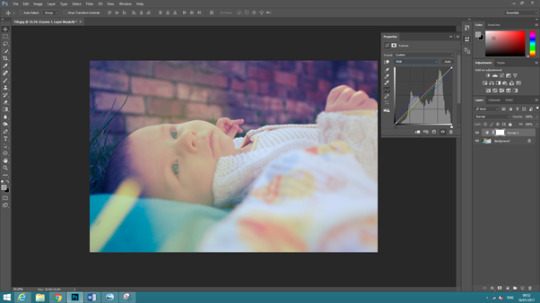
Experimenting with Curve and Gradient Layers
That is how you can experiment with curves on an image.
Open the image in Photoshop.
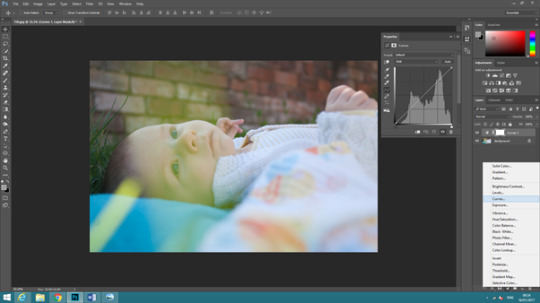
Go to create a new adjustment layer and select curves.
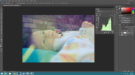
When we move the black line in curves we are moving the contrast and tonal range, this changes everything if it is on RGB (red, green, blue).
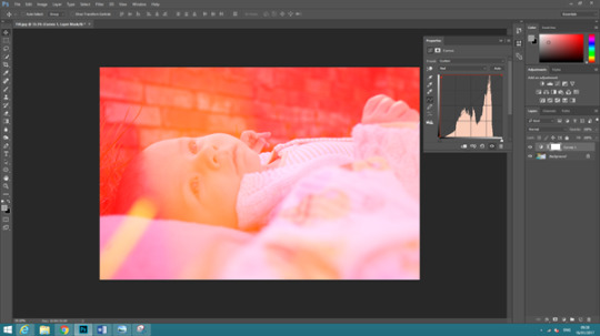
If you go into reds, if you reduce the red in the image then it will boost cyan, or boost reds.
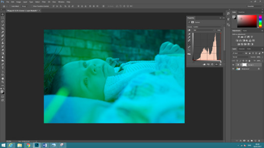
Green can boost either green or yellow, and blue can boost blue or magenta.
In split toning you boost one colour in shadows and the opposite colour in highlights. For example you could boost red in shadows and cyan in highlights.
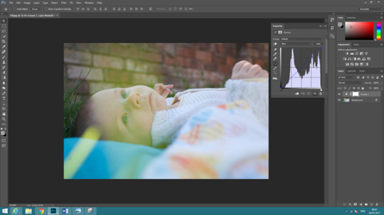
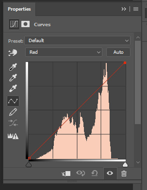
Select the blue channel in curves.
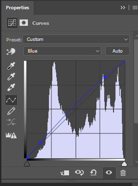
Add two anchor points on the curve. Make a point at the bottom and a point at the top.

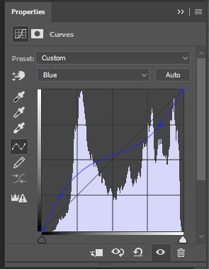
I brought the bottom anchor just above the line it’s near, and the top anchor down the line it’s near.

Next moving onto the green channel.
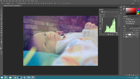
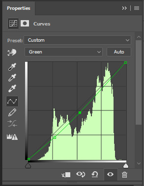
When using one anchor point, you risk boosting the rest. So especially in green you need to create a straight line between the two points, to make sure the green is not being boosted in parts of the image. So, it’s not overpowering.
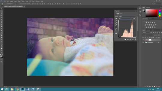
Next onto the red channel.

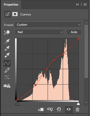
Move the bottom anchor points to boost the cyan in the highlights and boost red in the shadows.
Go back to the RGB curves.
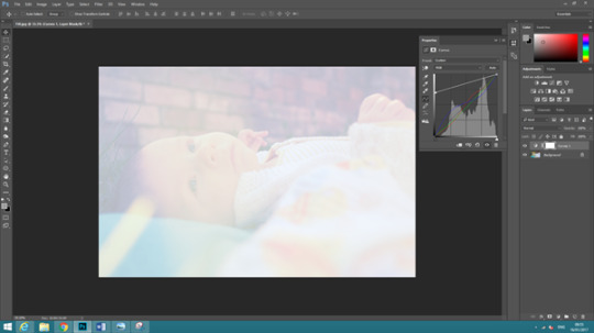
Use this to limit the tonal range in the photography, the complete tonal range goes the blackest black to the whitest white. We can use curves to limit tonal range.
Select the bottom anchor point, and as you move it will change from white to black.

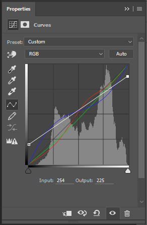
Move the bottom anchor to an output of 50, then move the top anchor to an output of 225.
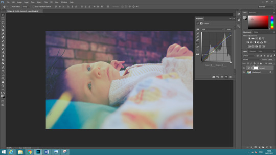
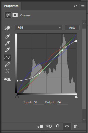
Add anchor points onto the line and move the bottom anchor down to create a highlight and the top anchor down slightly to make the shadows darker.
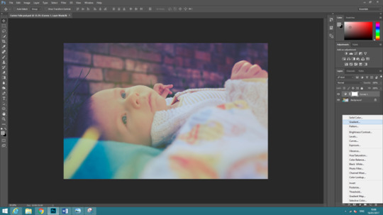
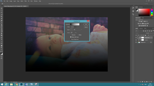
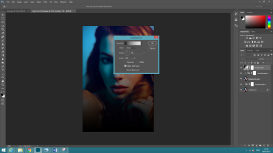
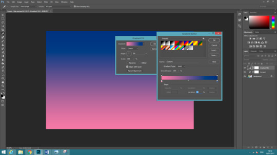
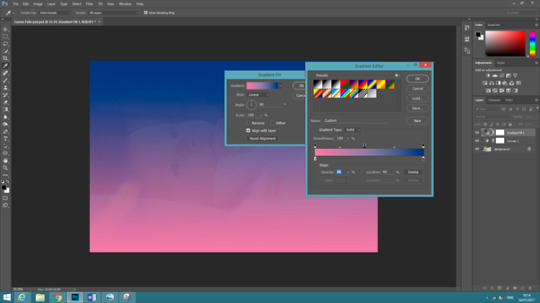
Create a new adjustment layer called gradient.
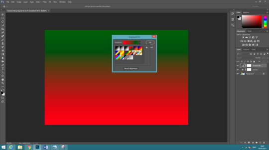
As an example I used the green and red gradient.

When you click on the green point, the colour fill box with appear at the bottom, you can change the colour.
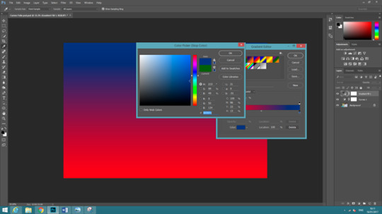
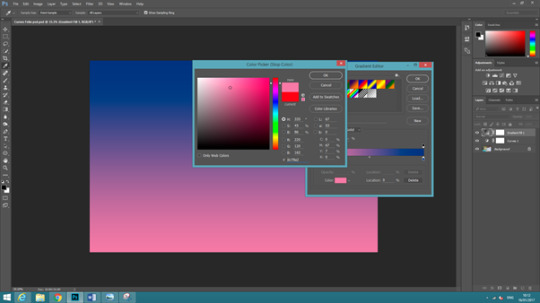
I changed one to blue and one to pink as an example.
Use the bottom stops to adjust how much of each colour is in the gradient. If you move the pink slider you will notice that there is more pink than blue.
The colour mid-point chooses at which point the colours blend.
You can add an opacity stop by clicking above the line, and add another colour by clicking below.
To remove a colour stop, you click and drag down to dispose of it.
A gradient can be very complex, you can place different opacity stops and many different colours.
I went back to the red and green pre-set and reduced the greens opacity to 0%.
The style of the gradient will change how the gradient forms on the image.
You can position the gradient anywhere on the image.
Choose the blend mode called ‘screen’.
The more you move the opacity further to the middle, the less the red will spread across the image.

Image photographed by John Simson, photo manipulation done by myself.
0 notes
Text
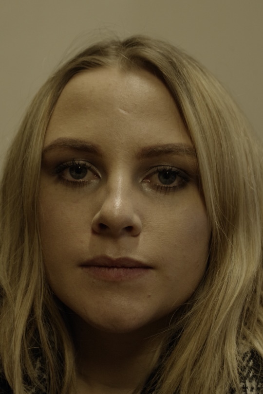
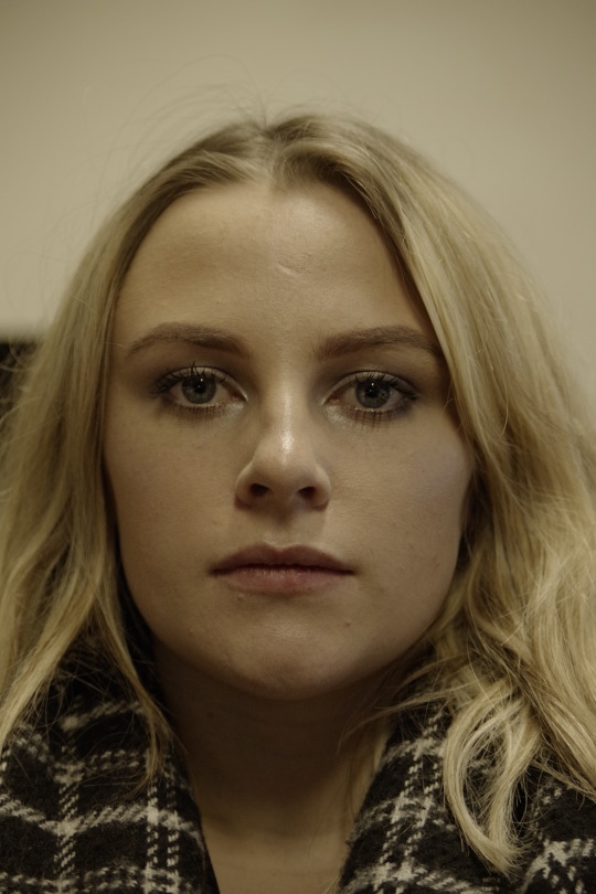
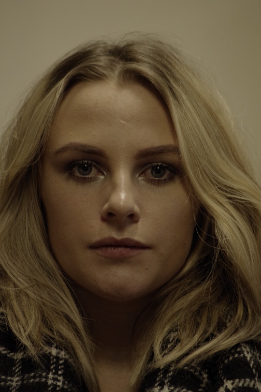
Portraits
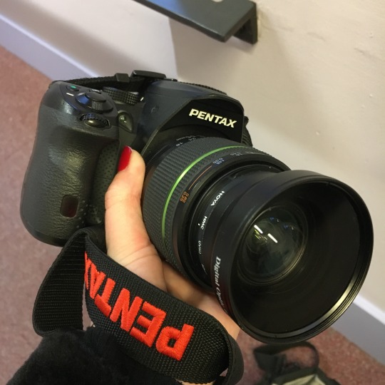
Firstly we will shot with different focal lengths to see the distortion the lens creates in the face.
I used light from the window and artificial lighting when taking the image. The settings I used were shutter speed 1/60, aperture F5.6, and ISO 800.
The image shown below is the 18 to 50mm lens with the macro lens connected.
The idea of using different focal lengths, is to see the background move in the images. By keeping the face and frame the same, it seems like the focal length is the same however i changed it each time, but moved away from the subject.

18mm focal length
35mm focal length
50mm focal length
55mm focal length
70mm focal length (zoom lens)
200mm focal length (zoom lens)
18mm focal length with macro attached
35mm focal length with macro attachment
50mm focal length with macro attachment
Focal lengths using the face.
18mm focal length
35mm focal length
55mm focal length
70mm focal length
200mm focal length
0 notes
Text
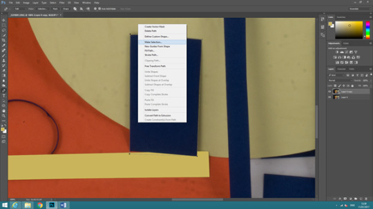
Geometric Shapes Using Paper #Part2
Photoshop Process
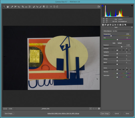
I opened the image within Photoshop and raised the brightness as it was quite dark.
Unlock the layer as this helps all the information transfer onto the duplicate, and then duplicate. This means we will be doing non-destructive editing.
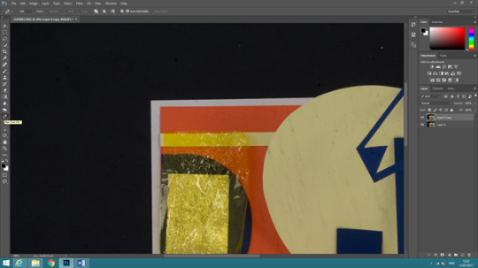
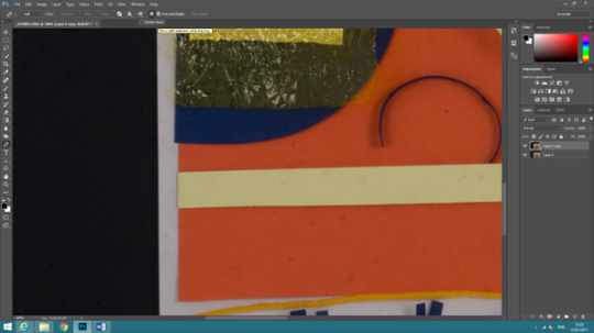
Select the pen tool, then make sure the rubber band is also selected at the top of the screen. This allows you to see the path you want to create.
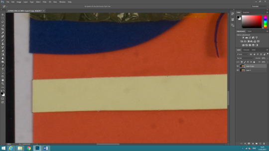
Draw the path around the shape, by clicking points onto the outline and connecting the point back to the start.
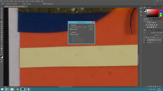
Right click and press ‘make a selection’ on the shape and bring the feather up to 0.5
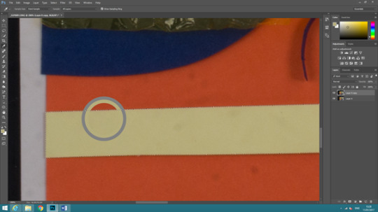
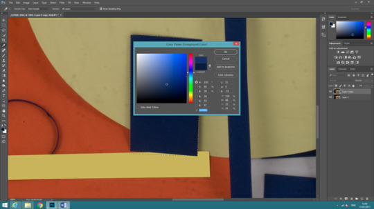
Press ‘I’ on the keyboard and it will bring up the eye tool, this helps select a similar colour.
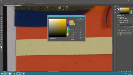
Double click on the colour square on the left hand side of the screen, then raise the colour to make it more vibrant.
Select the paint brush tool (B), and bring down the opacity to 15%. The reason behind this, is to keep the gradient of the shape.
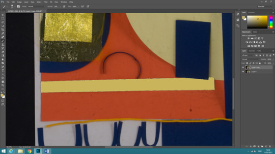
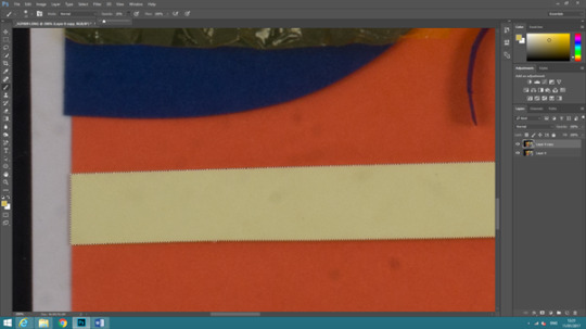
Paint over the shape, and click multiple times so the colour is as you want it. Click less in some areas to create a gradient effect, if needs be.
Just do the same for the other shapes on the page. If the shapes were cut out wrong, then this can always be fixed. Just paint it back in once you have selected the way the outline should have been.
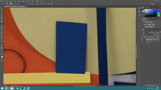
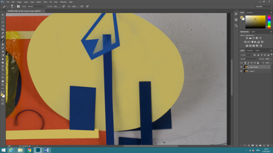
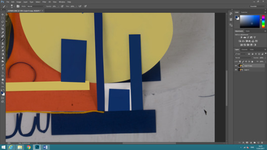

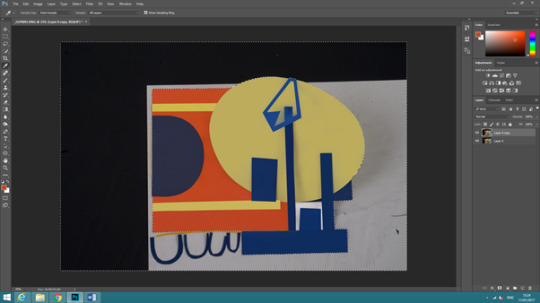
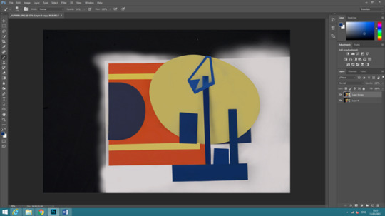
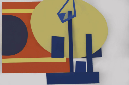

I decided to crop the final piece differently and much closer, to have a different perspective.
0 notes
Text
Applying Marxist Critique to Private School Snapchat
https://www.facebook.com/PrivateSchoolSnapchat
A Marxist would say that the people who are shown in the images are members of the bourgeoisie. The word and meaning of a bourgeoisie comes from a German man in the 1800s named Karl Marx, who made the theory of a social class structure. He identified two different classes with the sociology of capitalism and the theory that there were two types of classes, one he called was ‘Bourgeoisie’ which identified with wealthier people, and ‘Proletariat’ who identified as the working people of the bourgeoisie. The bourgeoisie were the ones who had control “the means of production”, meaning the production of factories, housing, and machinery. The control of the means of production in those times as seen in today’s society gave the bourgeoisie wealth and power, which also allowed them to control the means of coercion, i.e. the media.
The proletariat were said to be the people who worked for the Bourgeoisie, they are the people who actually produced the products their boss needs to make money. They are helping the wealthy become wealthier without knowing or understanding it. If the Bourgeoisie own the factories, housing, land and education, then they’re receiving their money back from the Proletariat that they pay to make them the money they have to be a Bourgeoisie.
A Marxist might also suggest that the images are displays of conspicuous consumption and that they are designed to raise the cultural capital of the photographer. By saying this they would mean that the individuals are taking the photographs and projecting their wealth to the world. They are distracting the consumer with ideas that they could have the wealth too, it’s making the consumer idolise the wealthier person. Making the consumer have thoughts of wanting to become that wealthy and to be able to buy the expensive items that the images are portraying.
By the consumer idolising the wealthy, this makes them forget about the real problems within the world and possibly their personal lives also. As the higher class posting images of their expensive purchases is not going to help people in need. The consumer then helps make the person taking the images a non-financial social asset by them gaining popularity and more followers on social media. This then boosts their social abilities beyond politics and economic means.
Finally, a Marxist might also say that these images help to reinforce the dominant ideology. Meaning if a group of people such as the wealthy believed there to be a barrier between classes, this would then be passed from person to person and would become a normal thing within society. So by the wealthy posting images of their luxury items, it projects a story of separation between the small majority who can afford it, and the rest that can’t, as a mechanism of social control. This then makes the social structure resume to the wealthy controlling what the consumer believes and where they would place themselves in society.
0 notes
Text
Thoughts on Equality and Discussing Karl Marxs’ Theory
I personally think that the world is not a place that we should see as being equal. There are so many different types of discrimination occurring every day. When people think they’re different from the next person, then that is not seen as equal. There are many structured parts in society that stop an equal world with an equal population from happening.
There are many people in the world that stop equal rights from becoming normal. Many of those people are in a position of higher power. Politicians often have an effect on the people who worship or follow in their direction. These people can easily influence their followers to do the same wrongs as them. Follow in their wrong footsteps.
The leaders who are often in power hold a much higher class then their followers, this is where wealth comes into play. Wealth helps the leaders become leaders, it helps them build an empire with the money they were brought up with.
Inequality may never be fixed, if the process of wealth and class still act as an important role in today’s society, to those of that higher class. Once money acts as a higher level of power, then there can’t be any change in to who gets to speak amongst the world.
Celebrities are the one contrast of the higher class helping inequality become no longer, meaning they can voice their opinions on problems such as racism and sexism. However they then are wealthy people in power, but the question is whether or not, we can live with the wealthy that help and hold the same good opinions we hold.
ISM - A set of ideas, an ideology.
A whole set of ideas which affect the way you see the world.
Marxism - Karl Marx
-> German
-> Writing in 1800′s
-> DAS KAPITAL (1867)
Marx blames capitalism - A way of organising society, that focuses on money.
The American Dream
- Low Taxes
- Few rules
- Survival of the fittest
- Everyone is free to run their buisness how they like
“Meritocracy” “Trickle-down wealth”
70% of people earn less than 26K a year 1% own 50% of the wealth
|------------------------------------------------------------------|
Your chances in life are determined by how hard you work.
Marx believes that your life changes are determined by your social skills.
Bourgeoisie
-> The haves
-> Control “the means of production” (factories, housing, land , machinery)
-> Control “the means of coercion
(Media, Law, Politics, Education) Influence the people if they can control these things. Makes people think its normal, which deceases the chances of a strike.
Proletariat
-> The have-not
-> Do the actual producing - work for the bourgeoisie “wage slavery”
Every time they spend their money, its going back to the Bourgeoisie, as they own everything.
<------------------------> A relationship of exploitation and struggle “class warfare”
Capital
-> Financial capital, money, property, land and resources
-> Cultural capital
The bourgeoisie use their power to shape the “dominant ideology”
Ideology “blinds”us, ideas appear as facts “its just a normal”
1. The bourgeoisie use art as a way of communicating their power “conspicuous consumption”
2. Who gets to buy the art? - The Bourgeoisie
3. Who buys the art? The Bourgeoisie
Therefore art which reflects the dominant ideology is favoured.
0 notes
Text
Geometric Shapes Using Paper
In this week’s masterclass we looked at advanced studio lighting set ups. We firstly experimented with a top down lighting setup.
The Equipment and Set Up
-> A black backdrop – The colour black is the best to use as the dark colour means the light will not reflect from the floor into the camera lens.
-> Studio Lights – Usually a soft box will be placed over the lights, however instead I used the card. However there are two lights I used, on either side of the box setup. I have the settings on 4, so they produced a powerful light blast onto the product. The lights are high key lighting, and one of the lights had an umbrella.
-> Card – The card around the product is acting as a soft box, but as I said before, the lights would both normally have a soft box on each. To get an evenly lit photograph, there are four boards to act as reflectors and to condense the light into one area. There is four in a cube shape to make it evenly lit, this is so the light bounces off each surface. If the boards were not there, then light leaks would occur. This would be a problem as we want all the light onto the product.
-> Tripod – This is placed in the centre of the setup to hold the camera in place, but also so the camera is at the correct height to have an overhead view.
-> Camera – To capture the images. It is placed onto the tripod and bent over so it’s angled at a birds eye view.
-> Bean bags – They are used to keep the camera balanced, as the camera is at an angle to be able to capture a birds eye view. The bean bags stop the camera/tripod from tipping forward due to more weight on one side. They’re also there to keep the composition the same throughout, as the camera is securely balanced.
The type of light the set produced was white balance, this is so all 100% of the colours are true. What also helped keep the colours true and well lit, was the high key lighting. The high key lighting meant everything was bright and evenly lit.
There are many other areas in photography which you can use the same setup within. Examples include, clothing photography, ecommerce photography such as food, products etc. The lighting set up would help these images to be produced by bright, even lighting, if a clothing item wasn’t taken with bright lighting then it could be false advertisement for the customer buying the product. Meaning the colours could not be the same, the texture of the product might not have been able to see.
Product photography could also be helped by using this method of lighting, as the bird’s eye view may benefit the angles of the product itself.
Contact Sheet
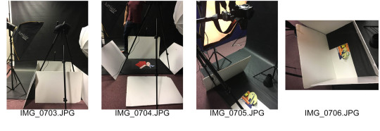
I think the colour scheme of the shapes went well, as they fit well together as a whole. I also think the shot in the studio was correctly lit and positioned, I would have moved the shapes back into their position, if I had a little longer in the studio. As some of the shapes are slightly misplaced, from the journey to the studio.
I would also change the way I positioned the shapes from the start, as I think the design I made will be tricky to edit when in Photoshop.
Carl Kleiner
and the Paperscapes he created for Google

The abstract wallpaper designs were created for Google’s new Android Marshmallow operating system. Carl created them all by hand using materials such as textured and non-textured cards, coloured paper and by using carefully angled lighting. Experimenting with shadow and depth to create a 3D looking image.
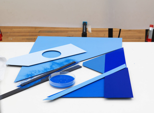
Behind the scenes of one of the productions.
“We wanted to work with surfaces that had a subtle and sophisticated texture, organic to the touch and graphic in composition. After experimenting with different things we came to the conclusion that most materials were too dominant to work in this series,” says Kleiner - Creative Review.

I think the colours in the paperscapes were very well thought out, and they are appealing colours to the eye. The precision of the lines, is what makes his work seem completely made in Photoshop, however it’s not. The shadows definitely bring the pieces together to look 3D.
0 notes