Last Seen Blogs
itissadbutitsmy-artblog
#1 wizard city fan
ghulehvu
❤ Ghuleh ❤
haleyskitten
Haleys Kitten
tamil-movie-updates
Tamilmovieupdates

kokoibean
KokoiBean

Text
social media pages ~
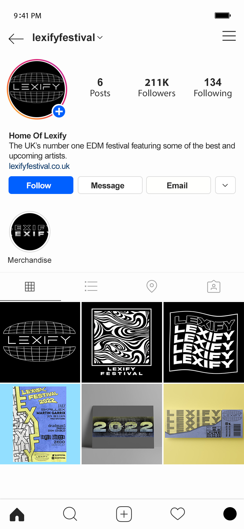
One of the main aspects of running any event at this moment in time is to have an active and respected social media page and team within the company. This is so that any important information that needs to be released to a large part of the community can easily be addressed with a few clicks online.
So with all this in mind I wanted to make dedicated social media pages on both the main growing platforms at the moment to both spread information and the word of the festival to a wide amount of the target audience in which the festival is intended for.
The way I went about doing this was by simply downloading a base Twitter and Instagram account with no information on and then port over my own work so that I looks like an active account trying to reach the public.
This is also a brilliant way to show off a small part of my work I have made during the course of the FMP in one place, in one image.
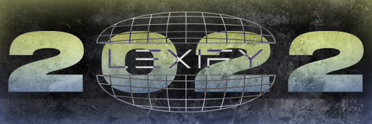
One of the pieces I had to make for this these outcomes was the Twitter header. I really wanted to give it rather grungy look with the texture over the top along with the layer and blend options In combination together gives it that dirty look I was aiming for.
As you can see I also stuck with the color scheme you can see in other outcomes within the header using the gradient tool. and I also used a brush with minimal hardness setting to create a slight inner glow around the edges of the header to match the gradient of the 2022 in the middle.
I ended up liking this outcome so much that I ended up using it as not inly the Twitter header but as a stand alone poster outcome that I have put into a mock-up as part of the branding and advertisement.
0 notes
Text
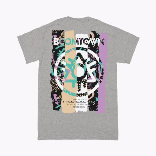
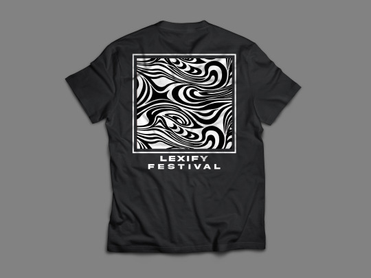
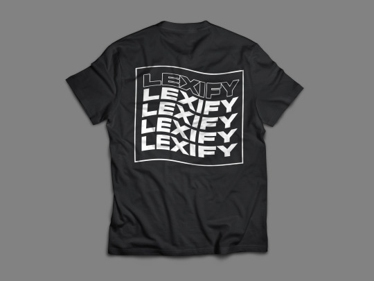
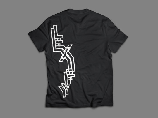
festival merchandise research ~
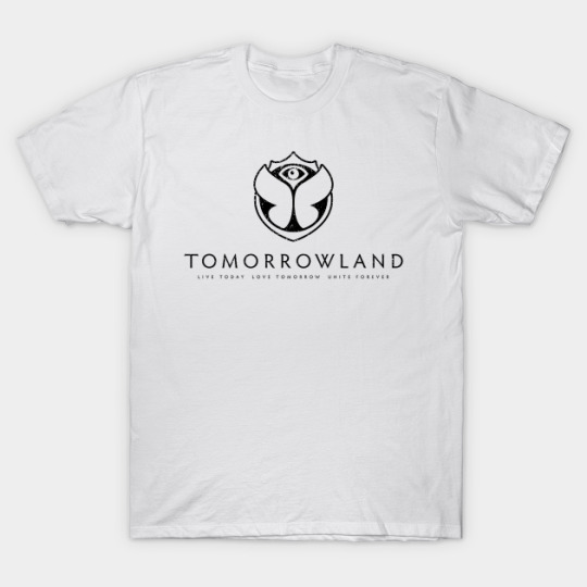
I looked at some other festival merchandise to gather inspiration for my own merchandise outcomes.
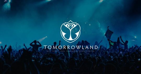
Just like the branding for the brand the merch seems to be a simple logo or graphic followed by the name of the place such as the Tomorrowland shirt shown here. But with some others you can see the shirt at the front has a smaller design usually in either top corners or a located in the middle of the chest, where as on the back of the shirt they have a slightly more interesting design printed over the whole of the back to grasp attention.
Merchandise is both a great item for people coming to the event and also a good way to advertise while making a profit. As long as people are wherein the clothes people will see the eye catching designs and wonder what it is then probably start a conversation about what the clothing is or from or look up the name driving traffic towards future events.
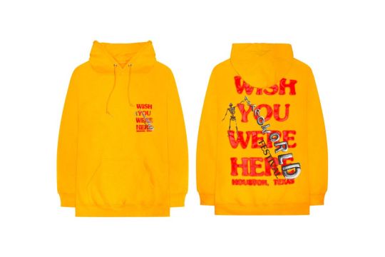
Here with the Travis Scott merch from the ‘Astro World’ events is something exactly what I want to go for. The small graphic at the front and the large graphic at the back.
My LEXIFY merchandise will be printed onto both shirts and also hoodies in both black and white variations.
0 notes
Text
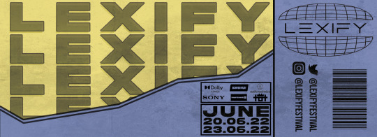
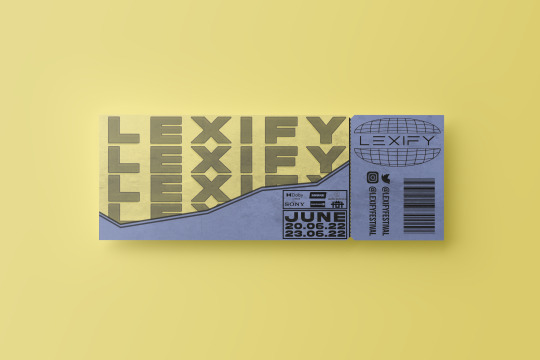
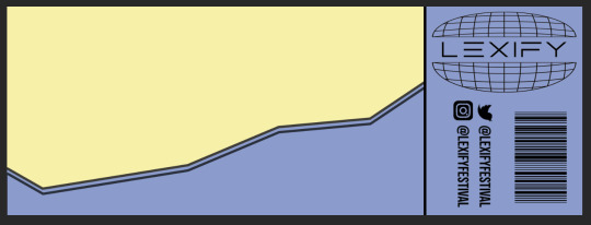
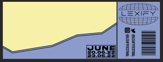
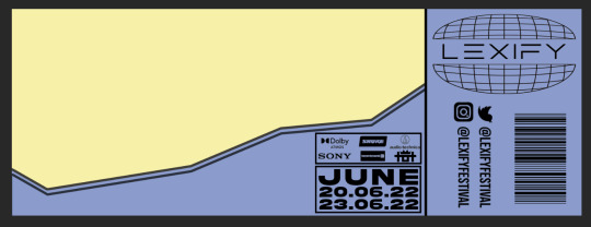
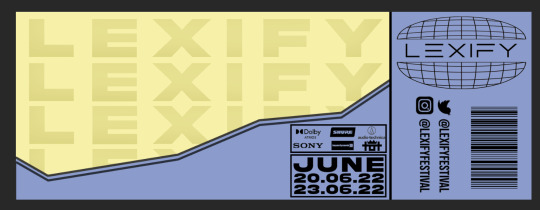
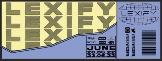
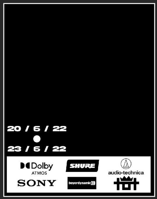
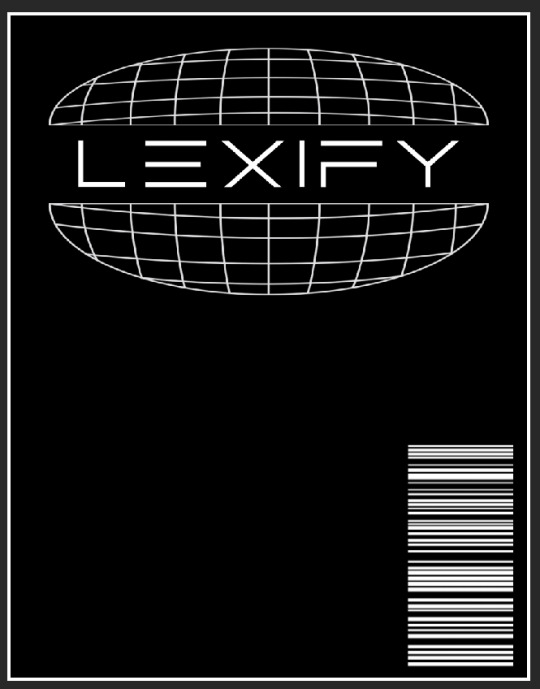
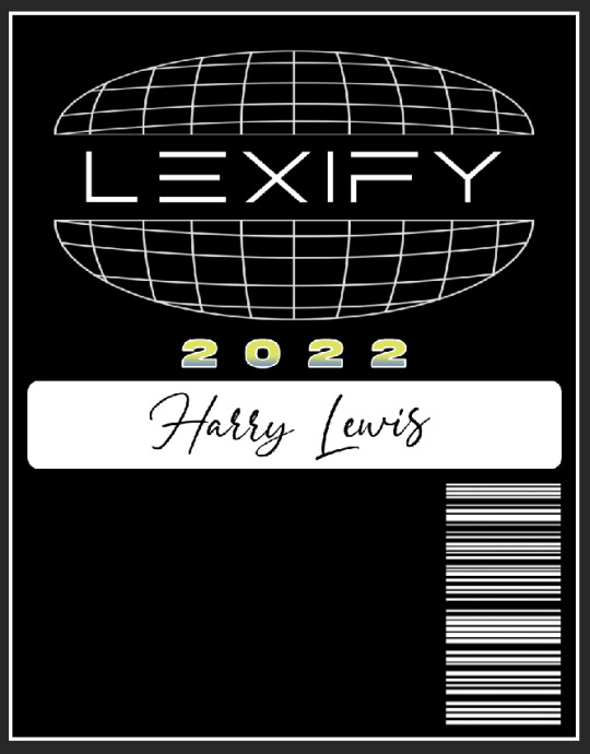
festival ticket outcome ~
Here is the final outcome for my festival ticket which will be handed to all participants to the event to gain access to all parts of the festival.
0 notes
Text
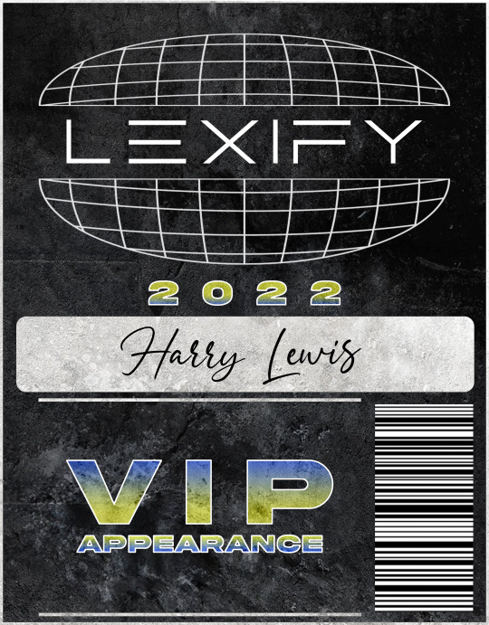
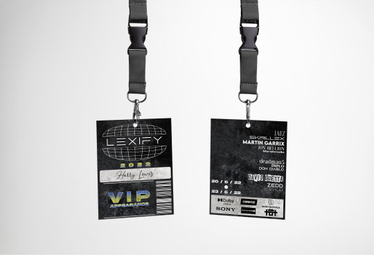
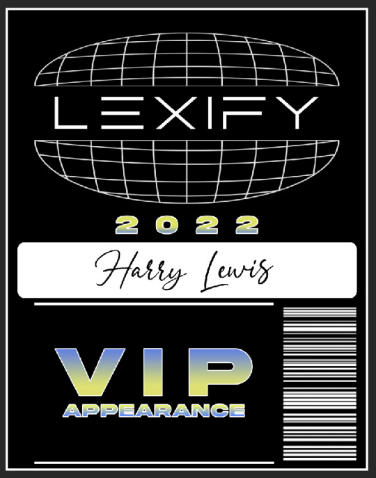
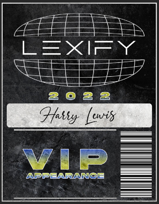
VIP badge final outcome + mockup
Here is the final outcome to my LEXIFY festival VIP badges to be worn during the event.
Displayed as the PNG files (both back and also the front) along side a clean looking mock up which I had sourced from “Graphics Burger”.
0 notes
Text
VIP badge experiments + design process (back)
0 notes
Text
VIP badge experiments + design process (front)
0 notes
Text
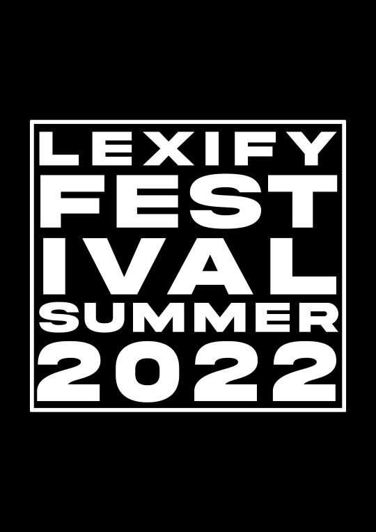
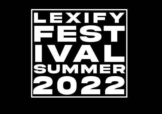
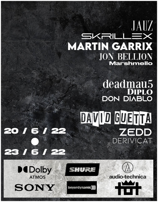
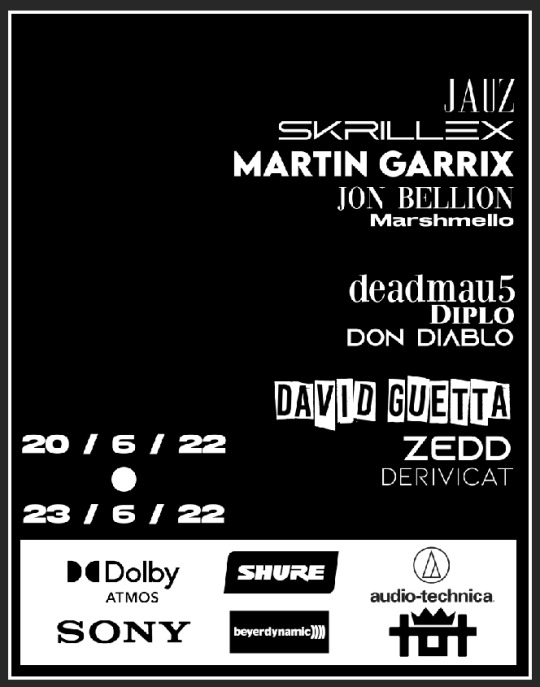
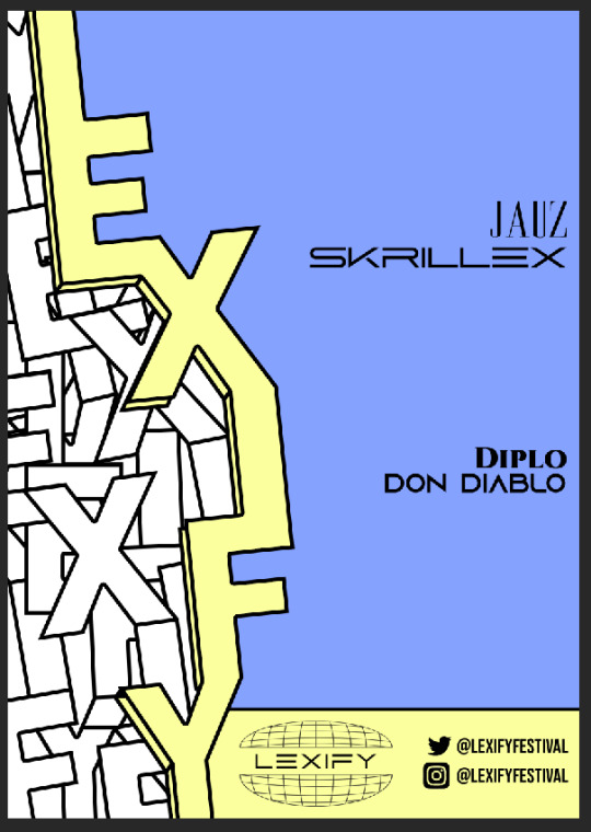
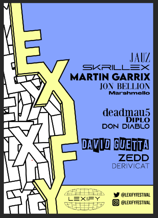
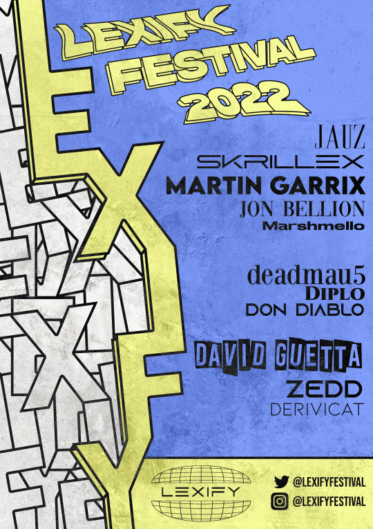
line-up poster final ~
My final outcome for my line-up poster.
I was very happy with how this poster came out in the end everything from the use of multiple type to the scattering graphic dominating the middle of the page. It all comes together in my opinion to create something rather unique.

0 notes
Text
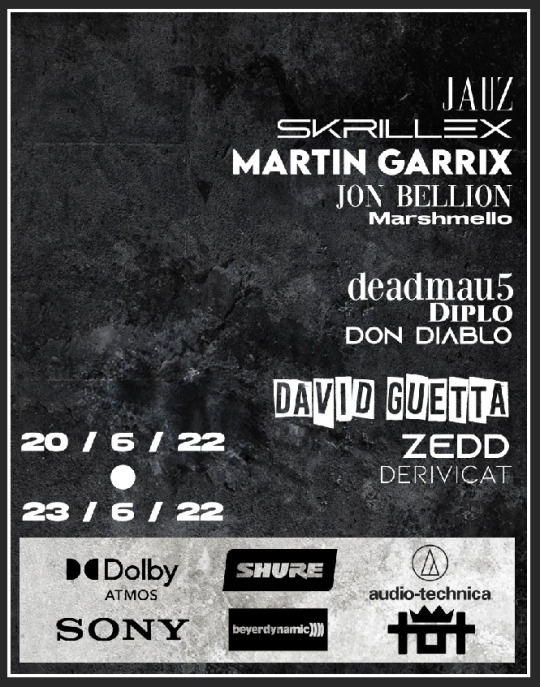
festival line-up poster outcome ~
For my first outcome I wanted to make the first of 3 posters for my festival. So I thought I good start for this would be the line-up and also hit two birds with one stone by also working out who will be performing as the main performances at the festival.
One of the big decisions I made when making this poster and which will then run in the rest of the outcomes is the selected color scheme for the festival. Which I wanted to have two opposite colors to each other to really have that nice contrast between them both. But I also wanted to have them as the pastel tones of the colors as I feel it’s nicer to work with than the brightest and most harsh versions of the color screaming at you.
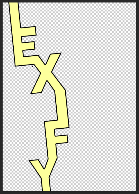
The first thing I had to do in term of making this poster was to create the type scattering down the page. I had got this idea from when I was thinking of ideas for my logo in my sketchbook. Having the letters scatter down the page creates a brilliant effect of dividing the page along with a bold title which is exactly what I did.
The way I did this was by typing out the name of the festival and putting all of the individual letters into there own layer and once done that connect all of the edge together until it all ran smoothly with each other then to add in the final touches which are the color overlay and the stroke to make it stand out amongst the background and other elements of the page.
Next to cover the left hand side of the poster which would not have any of the performing artists one continued the graphic of the scattering letters by simply copying and pasting in the name over and over again until the whole side is filled up with scattering letters.
This effect makes it look like the bold yellow text has split up the page and looks like its peeling over to show a new side to the poster. Something that I haven't really tried before and something in which I really like the look of.
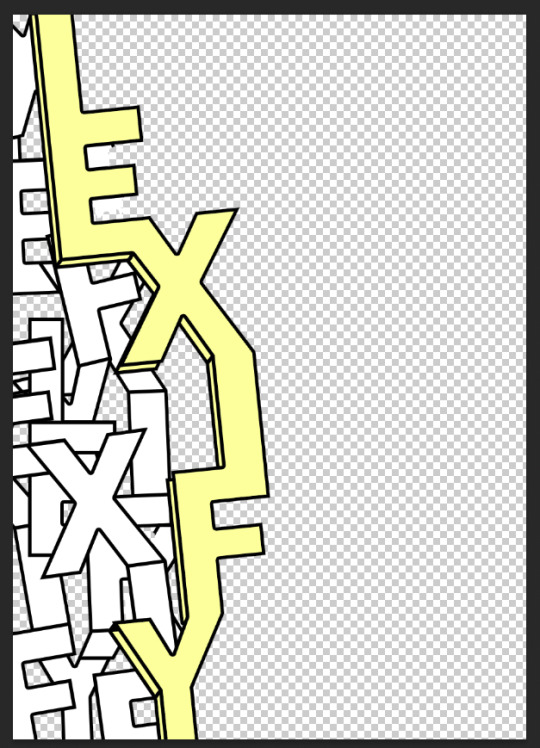
The next thing I did was organise the layout of where I wanted all of the text to be placed on the poster much as the acts the logo and the social media handles.
As I wanted to dedicate alot of space to the artists I decided to locate the minor detains at the bottom in there own box so that its all still easy to see all the information shown but not take away from the main piece of the poster being the acts.
Now it was time more me to find who I wanted to perform at my festival so I looked up some of the greatest EMD artist currently in the charts and also I used some of my own artist I like to listen to that may not be as well known to show variety in the event.
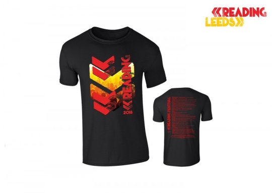
The inspiration to create the text like this in the matter of doing all the names in a different type faces, sizes and spacings is from Leeds and Reading Festival as you can see in those line up posters seen below each name is shown differently to grasp attention to each individual.
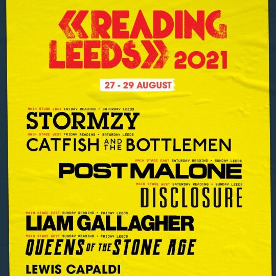
(Example of what I was taking inspiration from).
When I had downloaded all of the fonts and found which artists I wanted it was just a matter of getting them onto the canvas. Once completed that I then shifted my focus over to the head title of this poster which you can see the trial and error until I got a result I was happy with below.
The original plan for this title was to keep things simple and go for a font that looked simplistic and appealing. But once I had that on paper it seemed extremely underwhelming and as if I wasn't doing it justice compared to the rest of the outcome and that it almost looked to basic to the point where it looks like its just blending in with the other text. So I saw the problem and went out to find the solution.
The answer to this problem is showcased right here, by using the same techniques to make the scattering text on the left I typed out ‘LEXIFY FESTIVAL 2022′ then duplicated the layer and moved it to a slight angle below and then adjusted the transform tool till I was happy with the outcome.
At the end I added the grunge layer over the top of my work which will be a feature in all of the outcomes and part of the branding of the EDM grime feel of the festival. I added this in as a separate layer and made the layer options to ‘Difference’
0 notes
Text
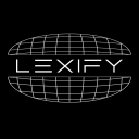
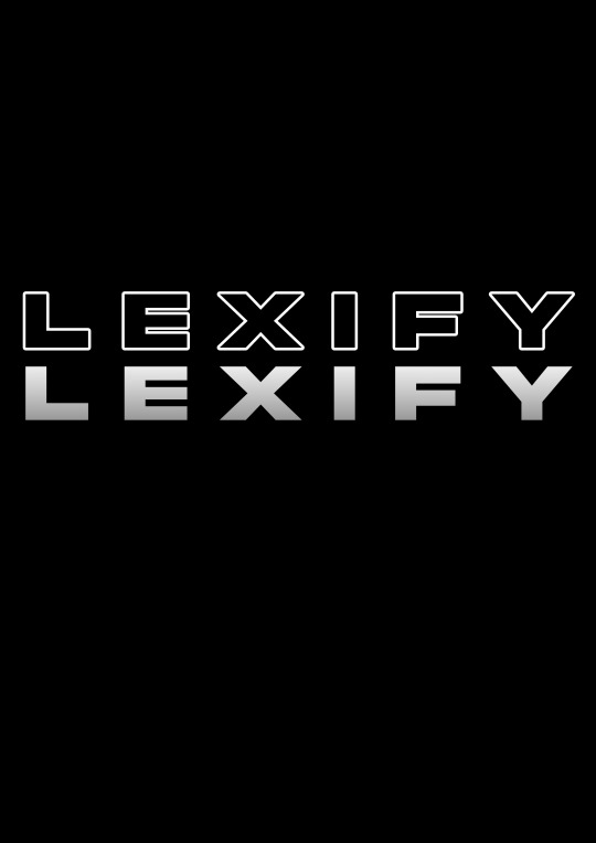
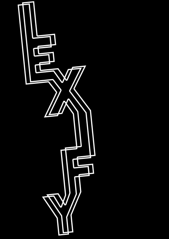
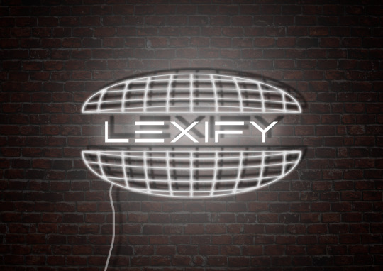
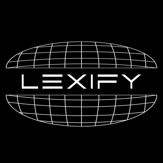
final logo + branding outcomes
Here is the final outcome of my logo for my festival at the end of all of the editing and adjustments to it.

For the final design of my logo I wanted to design some art to show it off on its own as its own piece so I went for a LED sign; something that I am familiar with as I have made many before in and also outside of college. I feel it’s a great way to present a single item or design on a large scale which can be seen as if in the real world.
0 notes
Text
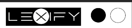
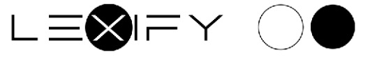
logo + branding digital work experiments (box logo idea) ~
Another Idea that I had then coming up with an initial plan for a logo was to do something simple like a box design such as where I got my inspiration from the ’Supreme’ box logo that they have on some of there products. Simple yet when you see it you can tell straight away what brand it is as it is such a synonymous logo of Supreme.
Unlike the ‘globe’ idea that I had at the start where the text is very much apart of the actual graphic part of the logo; with this the idea was to merge all of the aspects of the work together. Although I have mentioned before that the idea behind these logos are meant to be minimalistic and remain that way when I made the logo with just the box and the text it was far too plain to the point it wasn’t even a viable option to be the logo. So with some minor adjustments and adding on I added in the circle to create additional contrast to the work and then stayed with that thought the color variations.
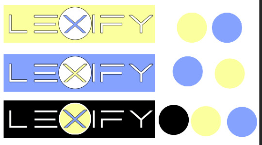
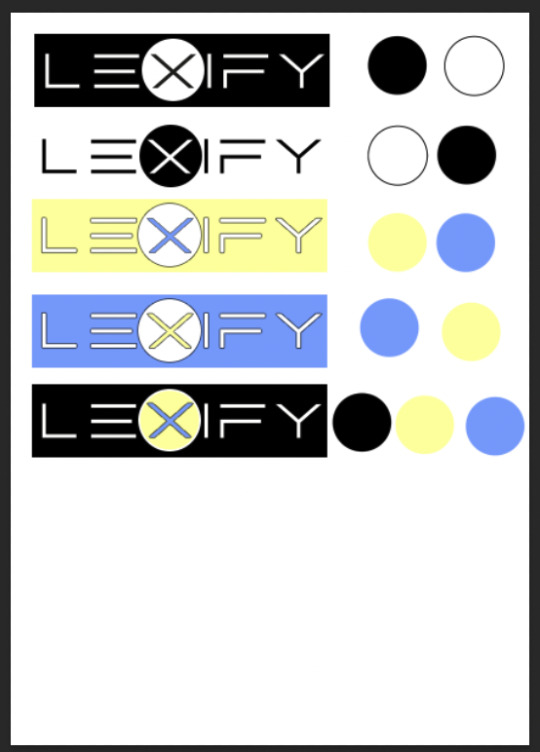
When trying out the color options in Illustrator ran into the problem that when I put the logo onto any outcomes I make the logo will either blend into the design or horribly clash with the work. Which is why I decided no matter what logo I went with it had to be in black and white so that it can be its own piece and not look like its made for just that one outcome.
0 notes
Text
logo + branding text experiments ~
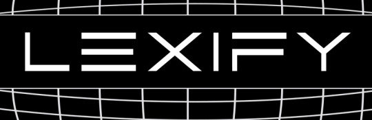
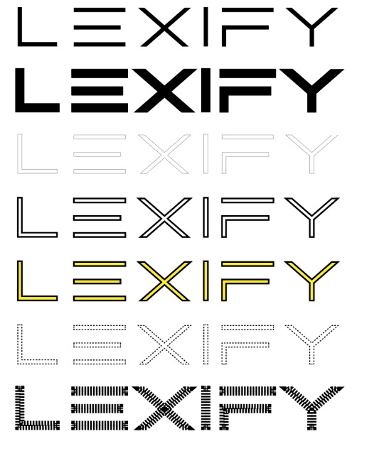
When looking for a font to fit my genre of music and to go along side with my branding I wanted it to be bold and to stand out so you know exactly what it is when you lay eyes on the logo. I went looking for a font on dafont.com and ended up going with a font called Abnes.
After typing out my name of the festival I had found some imperfections in the font that I had chosen such as the lettering not being uniform and all at the same size as each other. Such as the descenders and the ascenders some being thicker than others slightly. Although this is a very small aspect to point out when I found the imperfections it would not sit right with me if they had not been fixed.
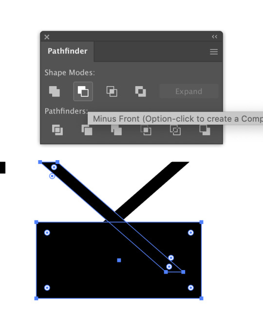
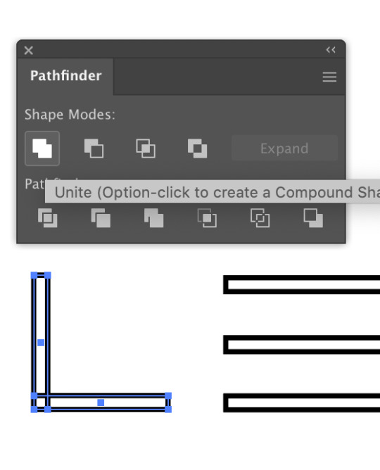
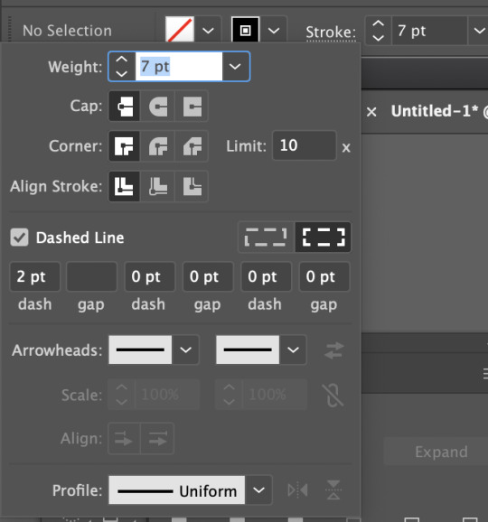
So what I did to fix this was I typed out the name of the festival, ‘Lexify’ and then screen shot the typeface and then ported that screen shot into Illustrator then started to use the line tool in combination with the rectangle tool to start to make the text more consistent. When tracing over the screen shot with the line tool at the top of the letters the line would keep going past the point in which the font would stop to have the flat top and bottom of the text. So to combat this I used the rectangle tool to cover up the points in the lines in both top and the bottom.
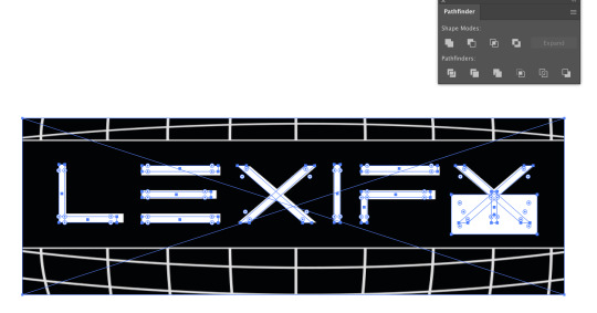
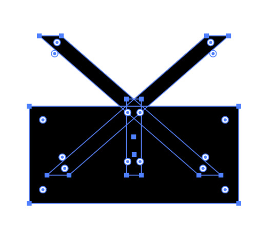
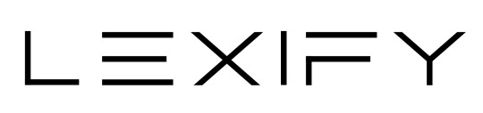
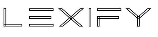
After re-designing the font the experimenting with different styles where made. Simply by duplicating the initial NEW made font and then trying it with different size strokes and fills along with different colors and also experimenting with half tones and the settings in which come with the half tones.
When finished with the text experiments I then had taken that into photoshop to combine them with the sphere I had made previously. That is exactly how I got to my final conclusion of my logo in its final state.
0 notes
Text
logo + branding digital work experiments (globe idea) ~
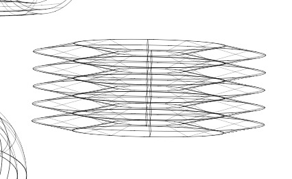
The first task when digitally creating my logo for the festival was to figure out how to create the cut in half globe. So i opened up Adobe Illustrator and started to figure out the different ways to design it.
Here are all of the screenshots of the beginning process of the creation of the sphere made in Illustrator to when hit was ported over to photoshop to cut it in hand and sort the text and type face out. (More about the type face will be talked about in the next post and how I refined it and made it to the perfect final state).
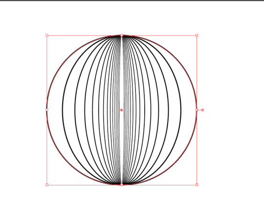
As you can see I had experimented with the idea of the sphere for a while trying different techniques and experimenting with different tools inside of Adobe Illustrator. This was a mix of the blend tool and also the extrude and bevel option to create the more thin wire looking effect to the sphere.
s this is going to be the main face of my festival I knew I wanted it to be right and I wanted to be 100% certain with how it looks before I go and add it into any other of my final outcomes. So I spent a good few hours experimenting with all of the shapes made in illustrator along with the type face I knew I wanted to use until I found the perfect combination and from then on I stuck with that.
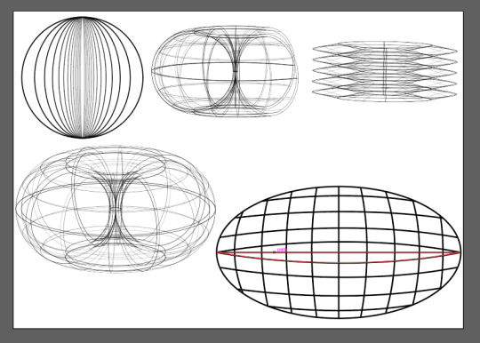
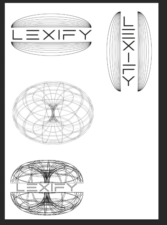
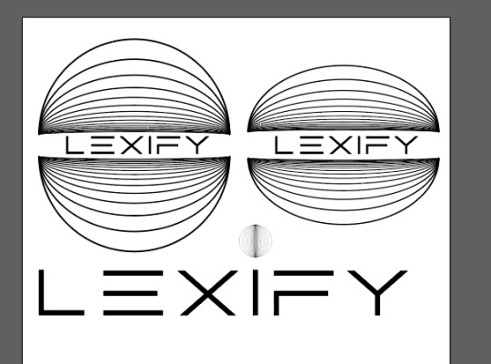
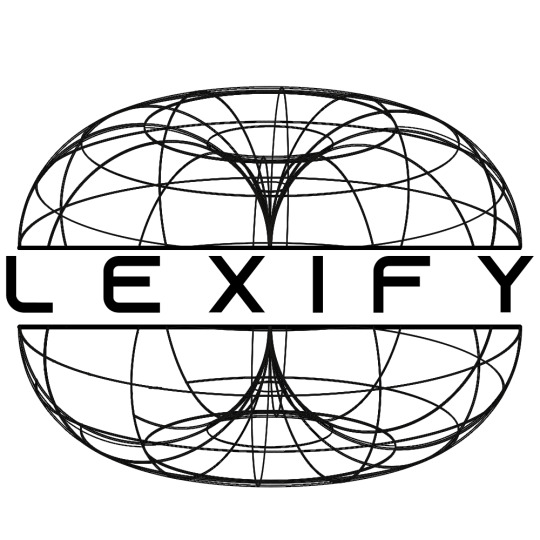
The final choice I went with is as seen below. After final thoughts and looking at all the options for a while I came to the conclusion that I liked the cleaner looking sphere made with the blend tool with the ‘specific step’ feature as I remembered back my logo and branding research of other festivals seeing that all of other branding uses a very simple shape with not a lot off detail to go along with there text of the festival. So with that in mind I knew my decision was locked into place.
0 notes
Text
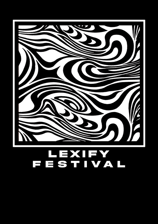
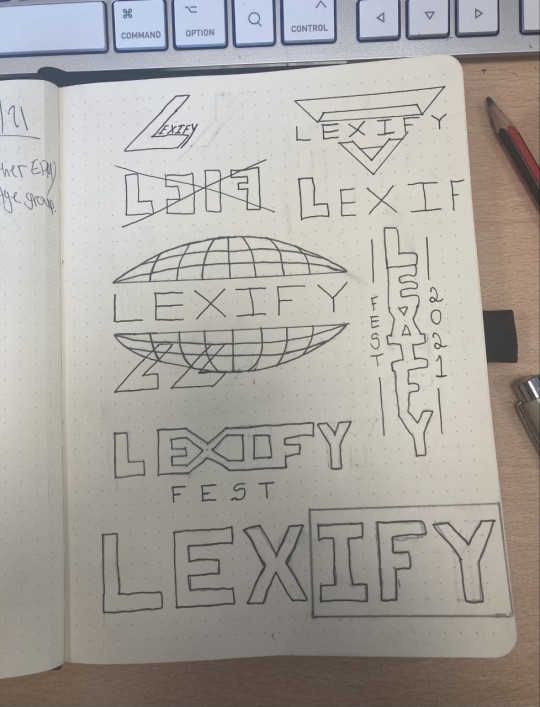
branding initial thoughts + logo design ~
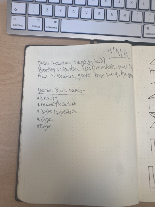
When starting to think of names for my festival i didn’t really go into it with much of a plan as i was just writing down any thoughts my mind came up with and writing them into the spider diagram. Although i wanted to get the name right and something that i am happy with i didn’t want to waste much time on the decision as i wanted to get onto the branding and logo design as quick as possible.
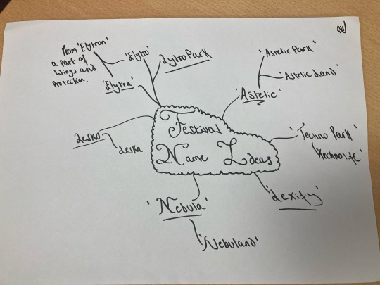
After a quick thought with myself i hand picked my favourite names from the diagram and wrote them one by one in note book to finally selected one what would not only fit the genre but also the feeling of the brand ideas i had already wanted to put into place in my head and start to sketch them down into the note book. I landed on ‘Lexify’.
I then started to brainstorm potential logo ideas, experimenting with shape, text and placement. All of the designs shown here where thought about and taken into consideration in the final choice. I wanted to follow on with the theme of festival logos having that clean look with the shape and the bold look with the text and thats exactly what i tried to showcase in each sketch.
The logo i landed on was the bold globe in middle of the page was it has the perfect balance of shape and text along side being abstract and sleek. (I will go into the design of the logo and the digital creation of it in many of the next blog threads).
0 notes
Text
logo + branding research ~
When looking at other EDM festivals branding there are a few things that stand out and stay consistent throughout all of them. That being that the text that is used in all of them is extremely bold, simple and minimalistic and to go along with that they come with a recognisable simple logo that can be associated with that brand when somebody looks at the branding.
Another thing to take into consideration when making my log and branding is that they all have monochrome schemes its either black OR white. This is so that when combining the branding with another piece of work eg. a poster or advertisement the other colors do NOT clash and therefore this allows the logo and tag line to stand out and be the main point of attraction so the viewer is aware of what it is.
Placement. This is something to take into consideration later when making my outcomes but it’s important to point out now. When placing my logo somewhere it needs to be the main vocal point so that exactly why its located i the middle in all of the posters below.

0 notes