Last Seen Blogs
into-daylight-hope
step into the daylight let it all go
koifishart
Koi_Fish_Art
onceuponatimealittlekid
Once Upon A Time
fundieshaderoom
Fundie Shade Room
Text
Communicating In Colour Part 3
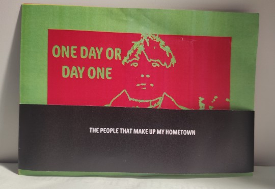
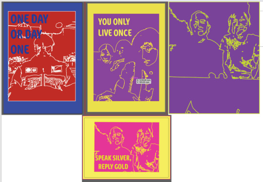
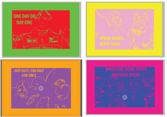
These are mock ups that I printed to check that I was happy with how the colour printed and that I was happy with the size of the bellyband (326mm x 40mm).
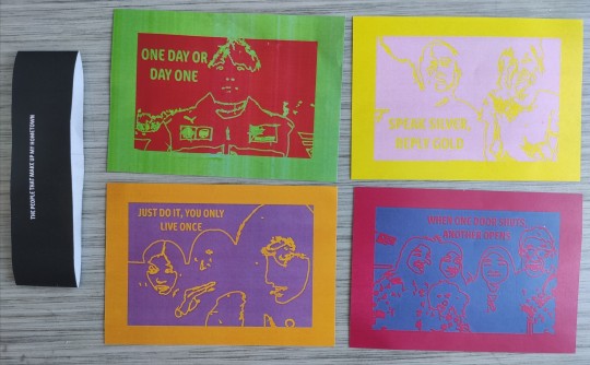
This top left one is of my boyfriend. I chose the colours red and green because for me, they represent confidence and stability. He's a very extroverted and confident person, hence I chose the colour red. Red for me also represents love. He also sees himself as red, as for him it represents protection and courage as someone who is always looking out for me. I chose the colour green as some of the characteristics from the book 'Surrounded by Idiots' reminded me of him, such as patience, relaxed, supportive and thoughtful. To me, it is a safety colour that also represents stability as I always feel safe and comfortable in his presence. 'Day One Or One Day' is something he always says to me when I feel unmotivated, so I thought it would work nicely on the postcard to also inspire others who feel unmotivated too.
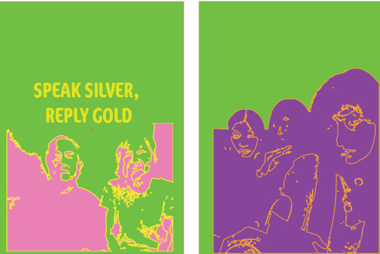
This top right one is of my grandparents. I think this one is my favourite out of the set. (It looks better in person!) I chose the colours pink and yellow, soft colours to represent the soft and gentle nature of my grandparents. To me, they are more gentle colours that could also represent my grandparents innocence. My grandma is a full time career to my disabled grandfather and despite the difficulties she faces, she always manages to have a smile on her face. Our family visit her every week and she's always happy and bubbly, hence I chose the colour yellow. Some of the yellow characteristics from the book I researched also mimics her personality. 'Speak Silver, Reply Gold' is my grandma's favourite quote so I included this on the postcard.
The bottom left is of my friends back home. I chose the colours orange and purple as to me they are colours of fun and joy, as well as support. They never fail to make me laugh and times with them are always full of excitement and cheerfulness, hence I chose the colour orange. For me, the purple represents support and growth, as they have always been there for me as we've grown up together during secondary school. 'Just do it, you only live once' is something that I always say to my friends when they are being indecisive, so I included this on this postcard.
Finally, the bottom right one is of my family. I chose the colours blue and bright pink because it represents wisdom and playfulness. Blue for me, represents knowledge and my family are always the first people I go to when I need advice. They're all rarely serious and somehow make everything so funny, hence I have chosen the colour bright pink. 'When One Door Shuts, Another Opens' is my mum's favourite quote and I think it works well with the use of colour and her being a wise and knowledgeable person.
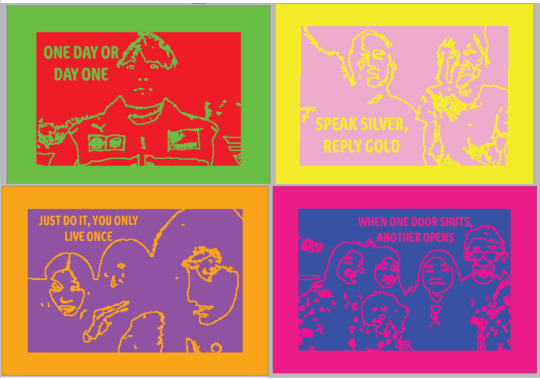
Final Outcome:
Evaluation:
Overall, I am quite happy with how the postcards turned out. I think I have used colour in an effective way to match what I think are my family and friends personality traits. I think that the postcards will also stand out due to the bright colours. I have tried to keep them quite open, so that other people may be interested in them despite the personal meaning. I started off using photographs, but to make them more open I image traced them so that they look more like line drawings. In this way, people can interpret them how they want and not as 'Natasha's boyfriend' etc. Also adding the quotes makes it more open and I hope that the audience will also feel inspired by them. I used a range of number of people in the postcards for this reason too so that other people could relate. For example, the one with 4 people could also remind the audience of their family. I also feel like the belly band works nicely with the postcards too, as it works with all of the colours, with the caption tieing them all together, as well as remembering the brief and meaning behind them.
0 notes
Text
Communicating In Colour Part 2
As this is only a weeks brief, I had to look through my camera roll for previous photos I had taken as I wouldn't have enough time to go back home where the majority of my family/ friends were. These are images that I tried that didn't work/ ones that I didn't include for my final outcomes. I hadn't thought about colour properly yet, I just wanted to see if this style would work for other imagery.
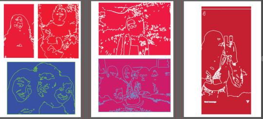
These are some of the imagery I used where I started thinking more about colour. I also realised some of my imagery was portrait and some was landscape so I had to think about either cropping my image or choosing different photos.
I also experimented briefly with removing some colour from the background/ parts of the imagery. However, I thought it was easier to identify the features of the person with just one solid block of colour and multiple colours might make the image look to busy.
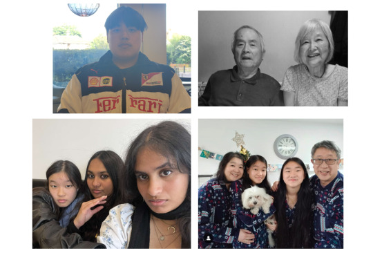
These are the 4 original photographs I decided to use:
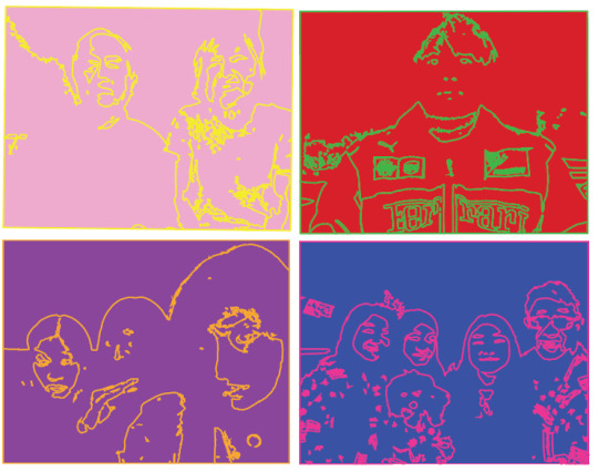
These are how they turned out to look after I image traced them, changed the colours and removed parts of the image that I did not like:
I decided to add a a border of colour to make the image pop out more:
After adding the border, I thought the outlines were kind of getting lost so I decided to make them slightly thicker:
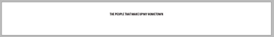
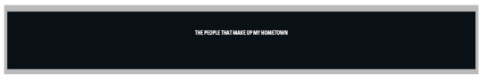
For the bellyband I needed to make sure it would not clash with any of the colours used for the postcards. Therefore I decided on keeping it plain white with black writing or plain black with white writing. I decided on a black background with white writing, a darker colour to contrast with the very bright postcards. I also decided to add 'The people that make up my hometown' to tie the postcards together.
0 notes
Text
Communicating In Colour
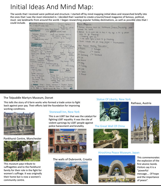
These are the initial ideas I had once I had received the brief. I'm from London but wasn't too keen on doing something to do with this as my Places Of Words project is all about this city. I was also thinking of doing something to do with my Chinese culture, however I also picked this topic for the Intersections project in term 1. I thought more into what 'home' meant to me and came up with an idea of doing something to do with friends and family. No matter where I am located, I feel like my home town would always be where my loved ones are- the friends and family that make up my 'home'. My only problem with choosing this topic was how I was going to express this through artwork. I thought about doing something with photographs but then thought about my target audience. I wasn't sure someone would buy postcards with random peoples faces on.
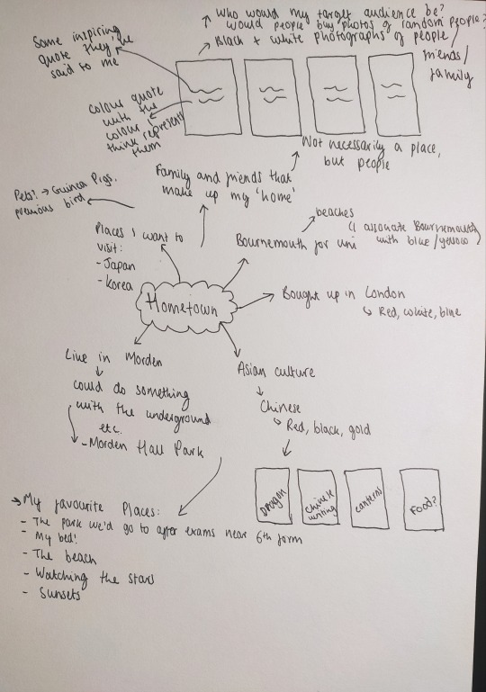
Inspiring Imagery I liked:
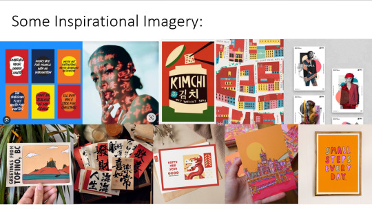
This was something I had visualized in my head of how I wanted the photographs to look like. I wanted to include an inspirational quote of something that my friends/ family frequently say/ something they want to say to the world/ their favourite quote. 'Day One Or One Day' is something that my boyfriend always says to me when I feel unmotivated. I wanted the quote to be red as for me it represents confidence and someone very extroverted, similar qualities to what my boyfriend has. It also represents love. When I asked my boyfriend what colour he saw himself as, he also replied with red because it represents protection and courage, supporting my decision with the colour as someone who always makes sure I am safe and comfortable.
As postcards, I wasn't sure if anyone would buy them so I started thinking about objects that could represent my family/ friends instead. My boyfriend loves basketball so I thought about using this object to represent him rather than an image. I began drawing a basketball on Illustrator and adding quotes. I hadn't thought about colour too much yet but just wanted to see what it would look like.
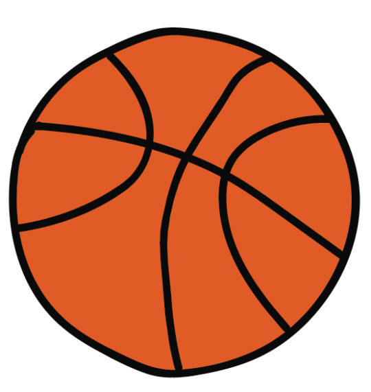
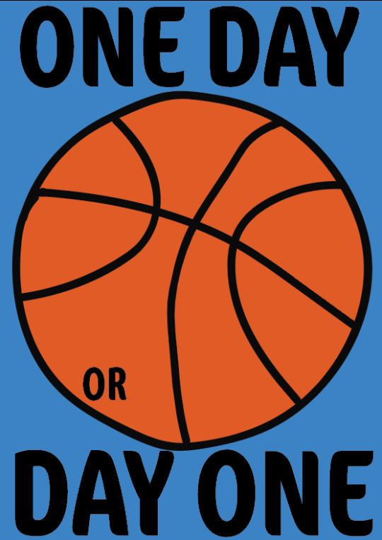
Overall, I wasn't too keen on how it looked as I thought that the basketball just looked a bit random.
I decided to go back to using photographs but editing them in a way that makes it more open for people to interpret them how they want to. I used Illustrator to image trace the images and then I changed the stroke and fill to create a continuous line drawing like image. I played around with a lot of different images I had taken to see which one would work best.
I liked these outcomes a lot more than the other two and decided to do the same with my grandparents, my friends and my family.
Typography Experimentation:
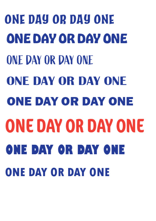
I wanted something bold to stand out from the line imagery, but not too bold that it would distract from the actual image. I also wanted something that looked quite structural, to contrast with the more sketchy, messy like line drawings, but also a little imperfect so that the artwork would look like one piece. In the end, I decided to go for the type in red called Cocon Pro.
I decided that I wanted my postcards to be quite bright to catch the audiences attention whilst also reflecting the different personalities of each of the different people I use.
My friend recently recommended me this book called 'Surronded By Idiots' by Thomas Erikson. I haven't been able to read the book yet but I found an article from it that breaks down the most common personalities into colours. I also found it very interesting how he explains the use of colours to represent personalities as they are easier to connect to and understand.
Surrounded by Idiots: The 4 Colors and Their Traits | Shortform Books
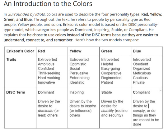
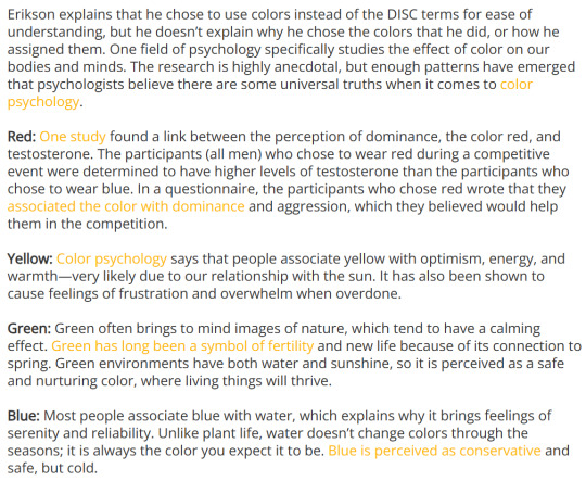
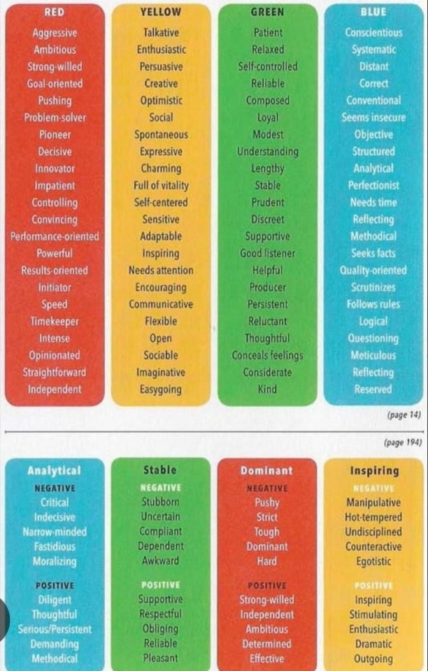
Using this and also my own opinion of what different colours represent to me, I decided to choose different ones for each of the people I was going to create imagery for.
0 notes
Text
Hot Glue Gun Induction
In this induction, we were introduced to perfect binding, which we will do to complete our process books. We used the crease machine to crease where the spine would be and also another one around 5mm away from it on the front cover so that the pages would open easier. We added paper and Jordy used the Hot Glue Gun machine to stick the papers together. We waited for the glue to cool down and then Jordy used the guillotine to cut down the books to size using the crop marks.
This is only a mock up of the front cover of my book, just so I could get a feel of what my process book may look like. It was also nice to see the size of my process book (17cm x 23.5cm) and to make sure I was happy with this.
0 notes
Text
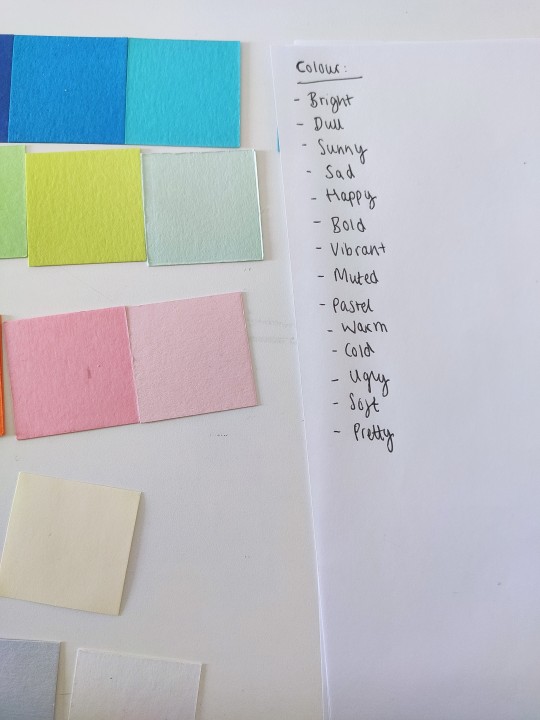
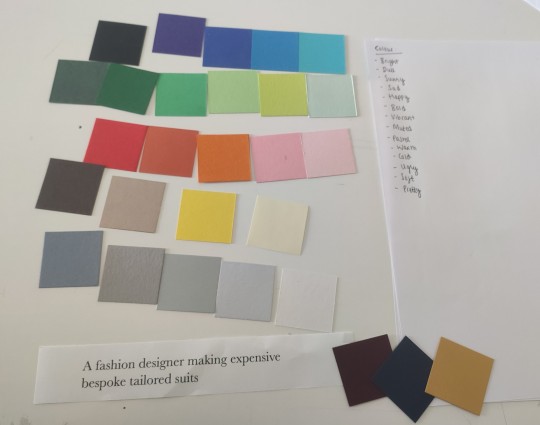
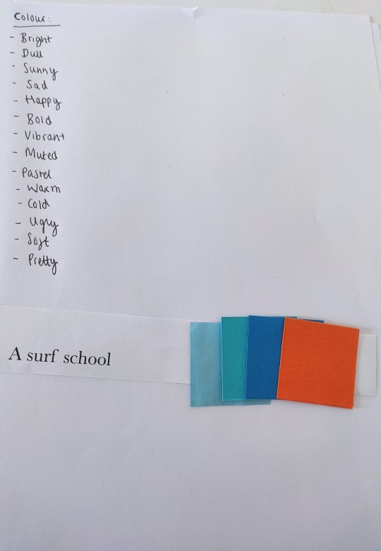
Colour Briefing And Workshop
We started off the workshop listing out words to describe colour. It's such a broad term, so almost any word could be related to it. We were then given short one sentence briefs and had to come up with a colour palette for it. It was interesting seeing everyone else's too and how they interpret different colours.
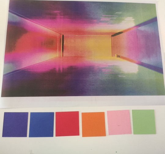
We were then given a picture and had to create a colour palette based on the picture. This was mine:
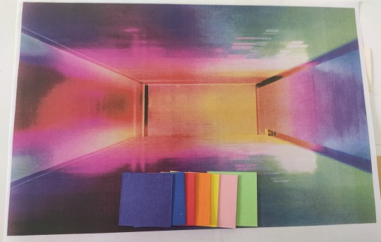
If I had to narrow down my choses further, I would choose to eliminate the yellow as this colour is very bright compared to the other ones and there is only a small section of it in the picture.
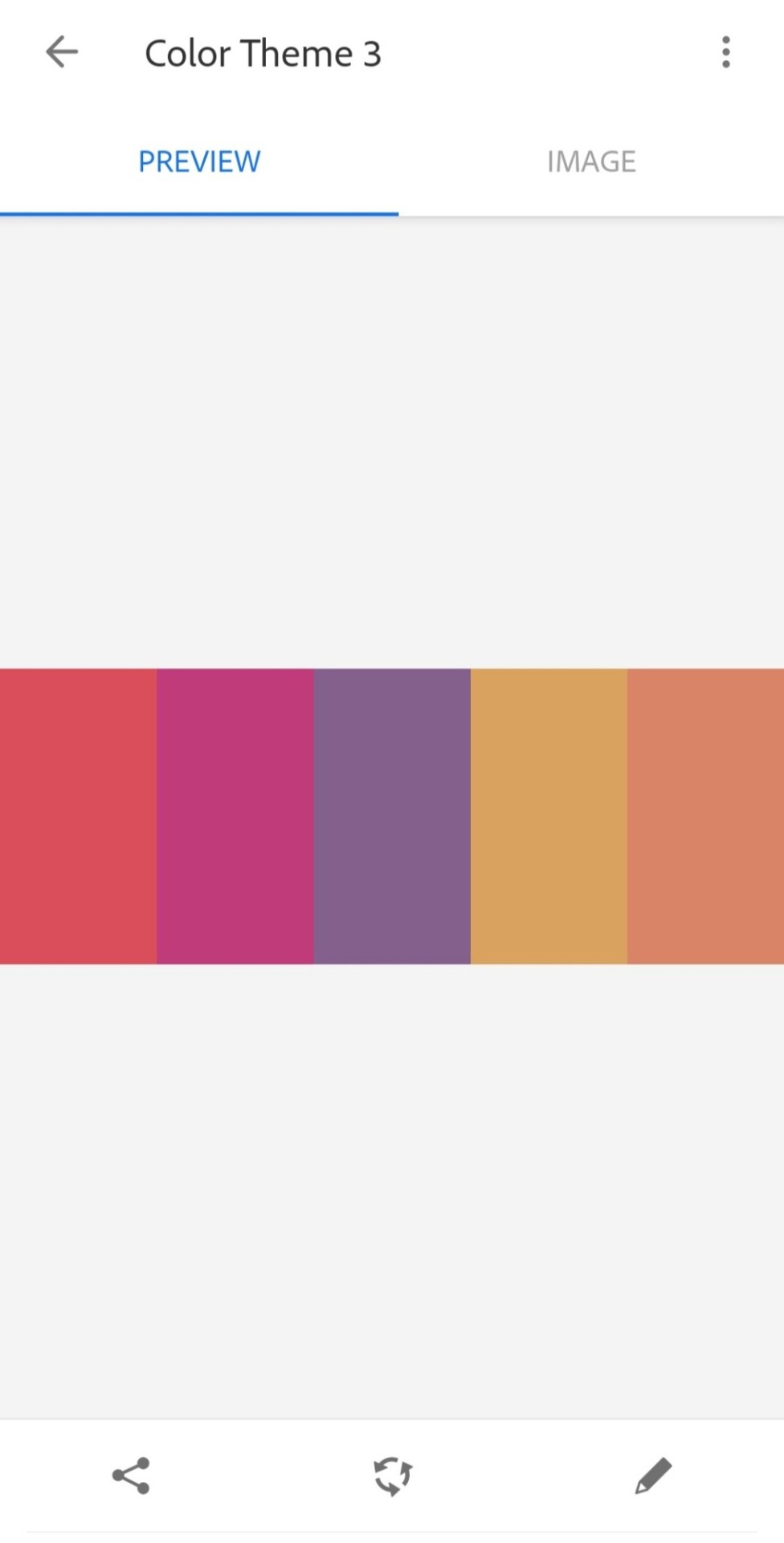
We then used Adobe Capture to create a colour palette:
We used these colours to edit the black and white images on InDesign:
0 notes
Text
Places Of Words Tutorial
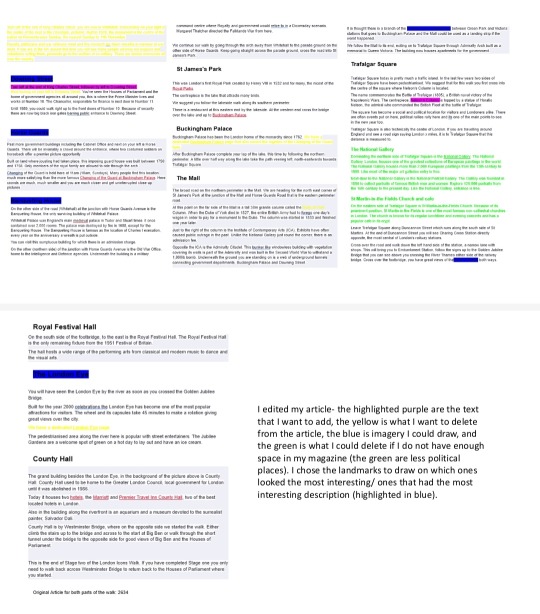

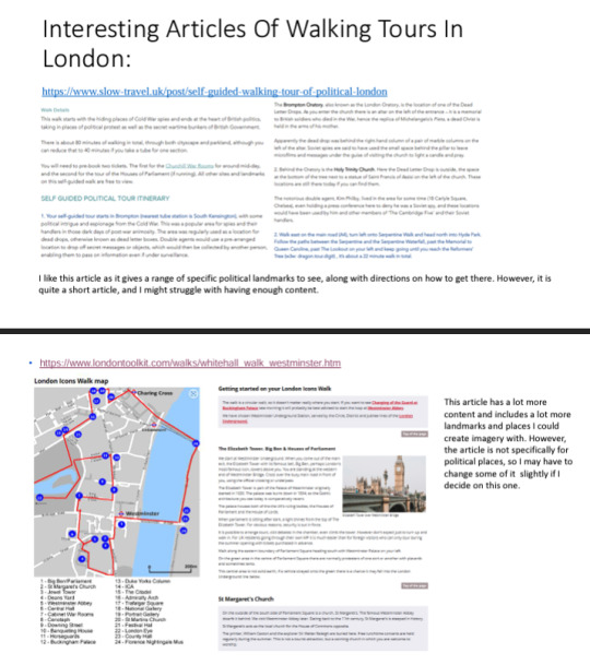
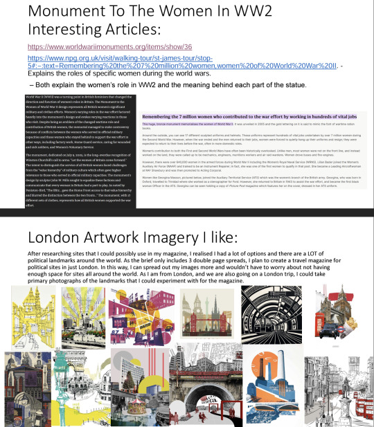
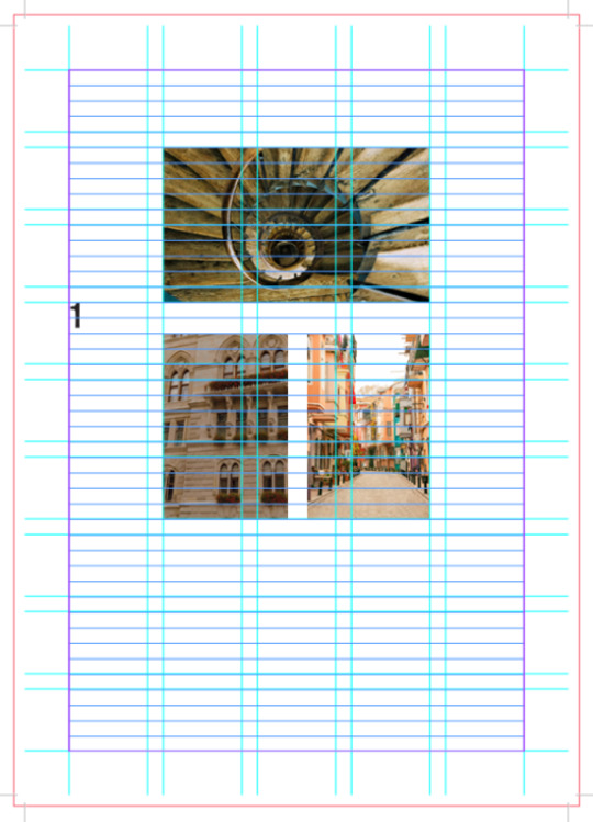
I was advised to think about what imagery I want to use in my magazine and to start laying it out. The photo of the landmark with the drawings that explains it in more detail looked cool, but also some parts of the photo is lost and it is hard to read the handwriting. If I choose this imagery, I could use type to make it more legible. The use of a cutout was a nice idea, and I could look into Rob Ryan. This artist could also help me with the chose of typography. However I was advised to just keep the cutout as it is and to not layer it on top of a photo as it would look too much. It also wasn't necessary for repetition in this instance. I could just do 3 cutout illustrations and include small thumbnail photographs of the other landmarks if I wanted to. I could complete the cutouts via laser cutting if I have enough time.
0 notes
Text
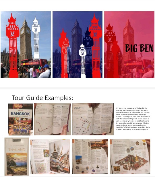
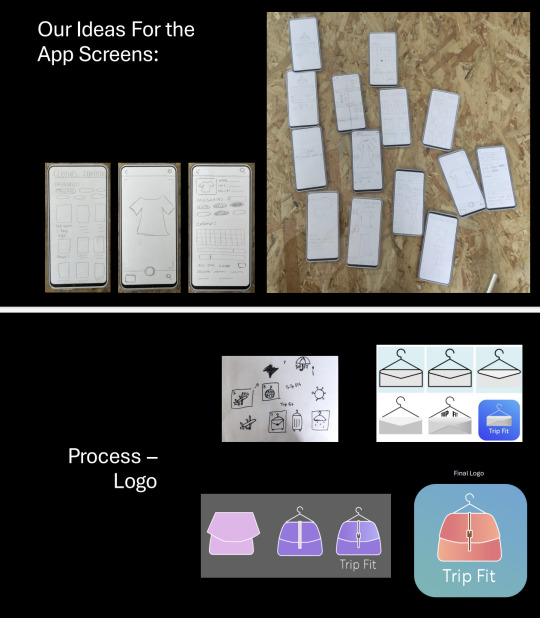
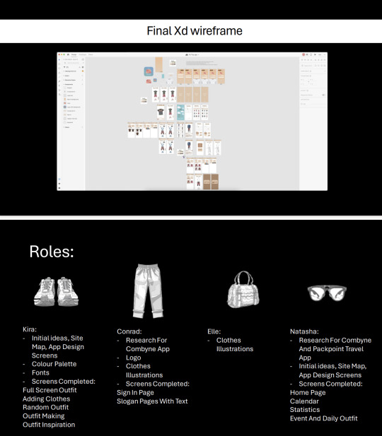
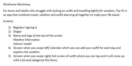
There's An App For That Final Presentation
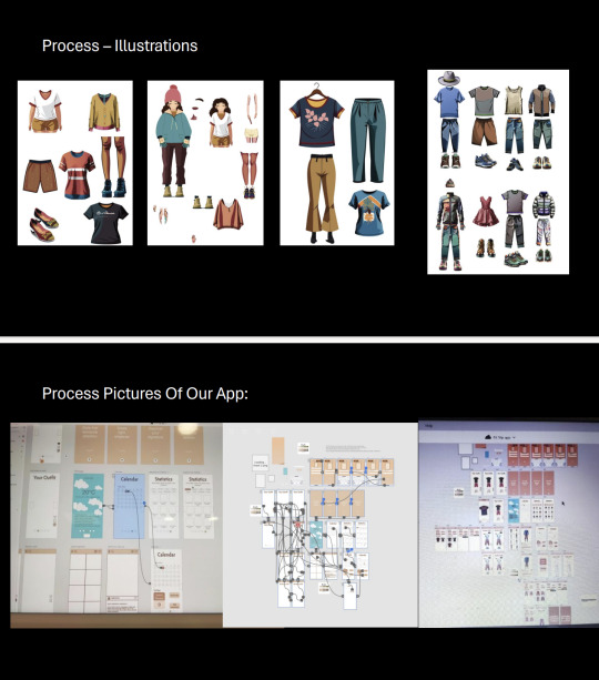
This was the presentation that Conrad, Kira and I completed to show to the other group. We included the brief as well as initial ideas, research the helped us to complete our app and the process such as the Site Map and sketches for the app screens. The process of the logo was included, as well as the clothing illustrations that both Elle and Conrad completed. At the end of the presentation we also included all of our roles in completing the App. Overall, I think we did a good job and the tasks completed were pretty evenly spread out. It was a shame Elle wasn't feeling too well, otherwise I think more would have been completed. However, I think our App answers the brief pretty well in helping people to choose what to wear. If we had more time, I would have maybe added a screen specifically for travel, for example a drop down button where you can select the holiday destination and the luggage allowance.
Presentation:
App Walk Through:
Overall, the other group thought that we answered the brief well. They liked the use of the weather on the home page giving advice on what to wear as this was hinted a lot on the brief, as well as the text slogans. They also liked the ability to see other peoples outfits to get inspiration and to be able to save and like them too.
0 notes
Text
Jordy Sign Up Sessions
Our group decided to go in on Wednesday and Thursday in order to finish our app together. We didn't assign roles to each person, we just worked on parts we wanted to and asked for each others opinions when we got stuck. Working on a shared document also allowed for us to see what everyone else was doing and to make suggestions. Overall I think our group worked really well together and we managed to complete a lot whist we working on these days.
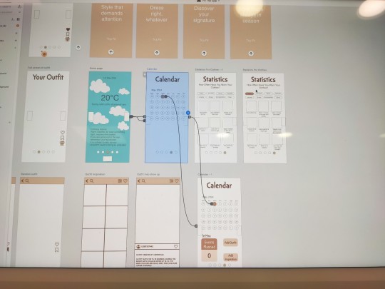
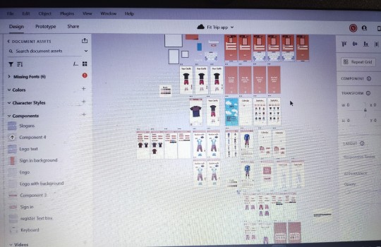
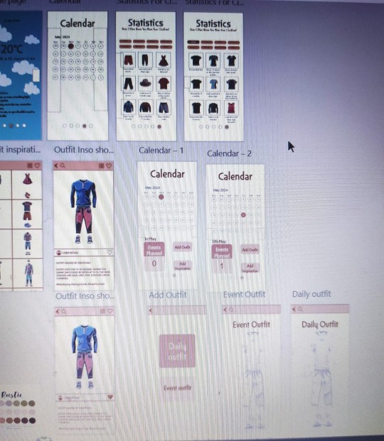
Overall Conrad worked on the register/ sign in pages, the logo, as well as creating the illustrations of the clothes and inserting them into the art boards, such as the statistics one. Kira worked on the Adding Your Clothes To The App, Full Screen Of The Outfit, Random Outfit Generator and Outfit Making art boards. Elle worked on creating some illustrations of the clothes. I worked on the Home Page, Calender, Statistics For Clothes and the Adding Outfit, Event Outfit and Daily Outfit artboards.
The logo represents both an outfit app with the hanger and travel with the small bag representing travel and being able to pack lightly due to it being not too big. We decided to go for natural toned colours so that the clothes would stand out more.
0 notes
Text
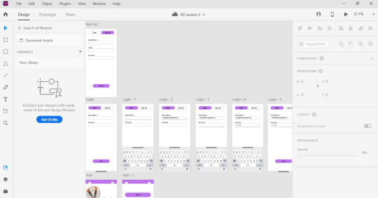
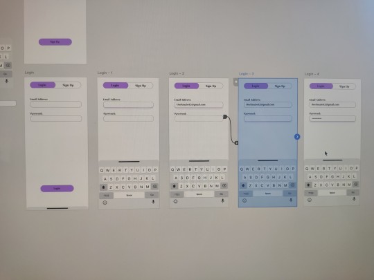
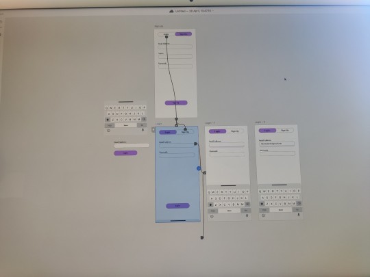
XD Session 2
In this session we created a sign in/ register page for an app. We created buttons, as well as adding image to it. We also used effects such as drop shadows to make it easier for the audience to know what they had clicked on. We also learnt how to create drop down options and how to animate them. I found this XD session a lot harder than the first session, but I think after playing around and experimenting with it more, I'll get the hang of it. This induction was definitely useful in helping create the sign in/ register page for the There's An App For That Project.
0 notes
Text
Places Of Words And Process Book Tutorials
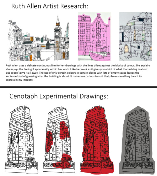
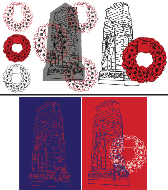
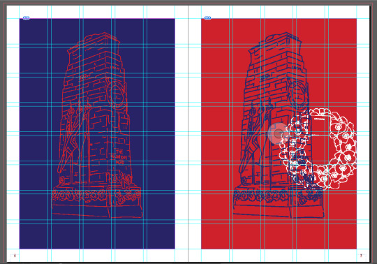
After my tutorial last week, I decided to change my article to one that included all sites and landmarks. I looked at an example of a guide to get inspiration and to help me create an easy to follow magazine too. Researching The London Transport Museum, I was able to get a feel of what style I wanted my magazine to be in. I researched Ruth Allen who creates continuous line drawings and creates illustrations of London. Inspired by this, I tried to create my own of the Cenotaph, one of the landmarks in my article. I experimented with colour, using red, white and blue to represent London, as well as the natural grey stone colour. I did the same with the poppy wreath and experimented with layering the two drawings on top of each other, as well as using plain blocks of colour in the background of my drawings. I also laid out my process book, an A4 size and composed my images. I tried to choose a font that was quite structural due to my architectural buildings but also not perfect, as the continuous line drawings I had completed were also not perfect, just rough sketches.
Process Book:
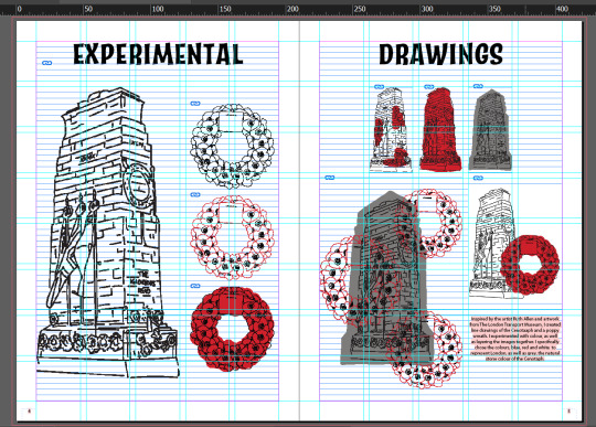
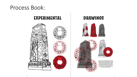
Receiving feedback from Briony, I was advised to try drawing another landmark to see if the same style works for it and to think about what landmarks I would actually draw. I could draw the ones that have more text written and draw them bigger, than ones with less information and draw them smaller. Or, I could do lots of small drawn images. I could draw the ones that look the most appealing, or the interiors of landmarks, such as the War Rooms. I was also advised to consider the layout of magazine, to have an idea of how many I would draw. For my process book, I was advised rethink my size, as A4 is quite a boring, standard size, so I could cut off a few centimeters from the top. I could layout some more of my text to see if the grid works, as this process book plan was very image based. It would also look better if my text was aligned to the left instead of the centre.
0 notes
Text
Wireframing Workshop
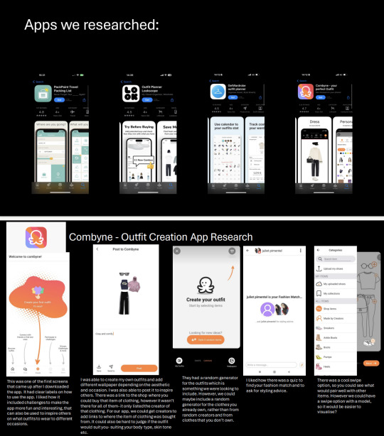
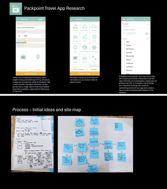
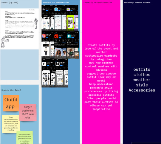
After last week, our group decided to do some research on other similar apps to do with both fashion and travel.
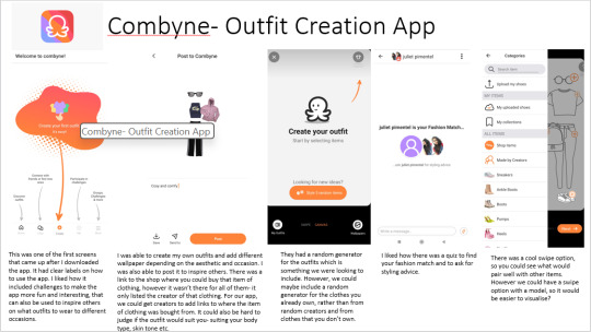
Conrad researched the app Combyne:
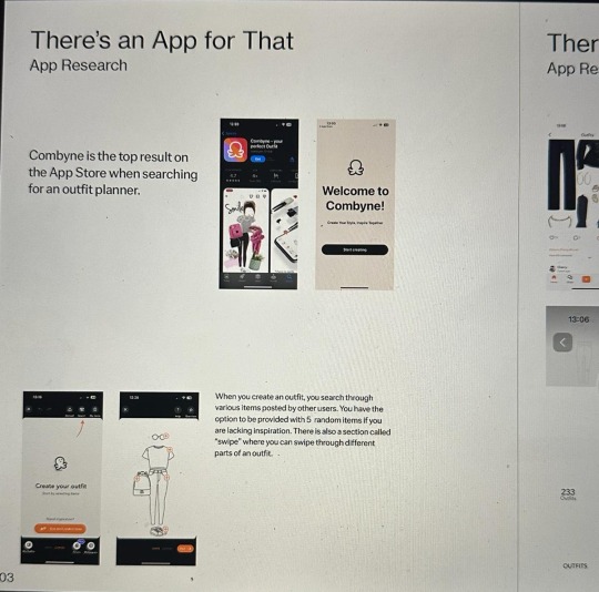
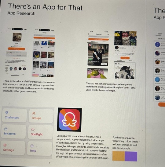
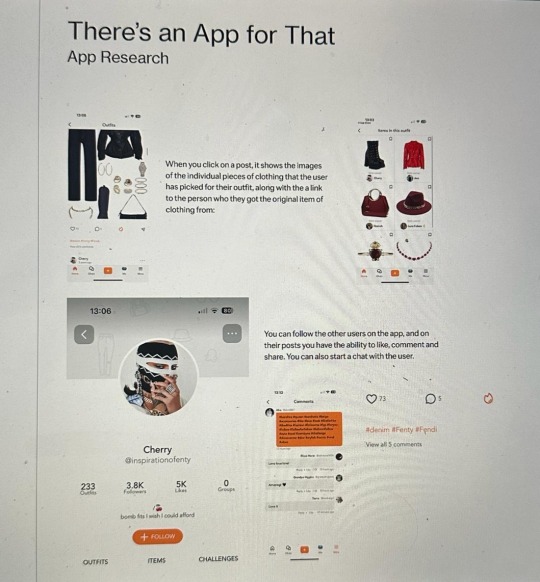
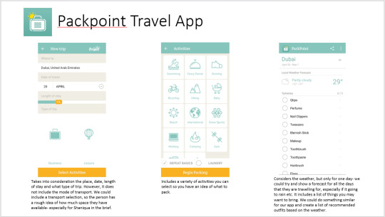
I also downloaded the app Combyne and Packpoint Travel. I analysed the apps and wrote down what I liked about each one and points of improvement for each one.
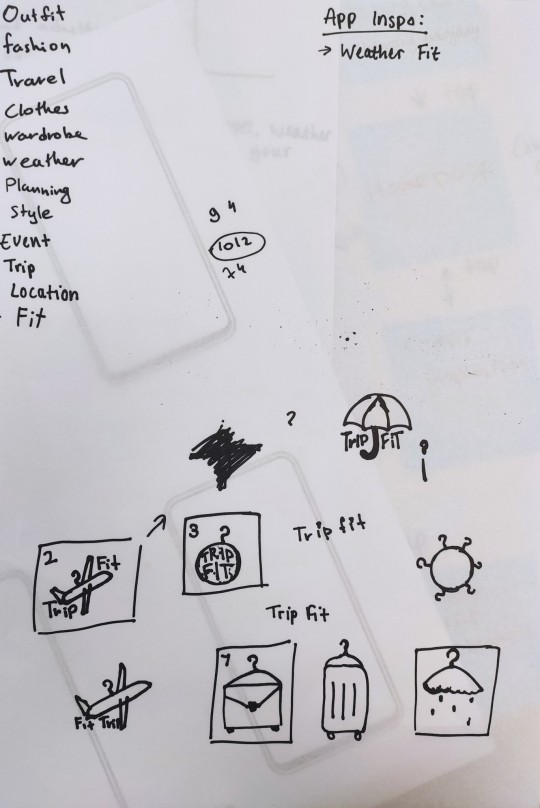
Kira also found the app Weather Fit which we used for a lot of inspiration for our own app.
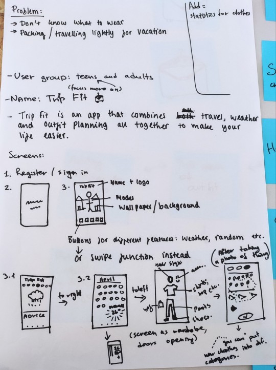
We started the Wireframing workshop recapping our given brief and identifying the problem. I came up with the name of our app with Kira's help of listing words related to the app. We decided to go for Trip Fit that represents both travel and outfits. We started brainstorming and sketching ideas for the logo, as well as getting inspiration off the internet for possible designs. Kira and I fused our ideas with the logo, her idea with the hanger and mine with the suitcase. After this, we created an Elevator Pitch.
Ideas Online For The Logo:
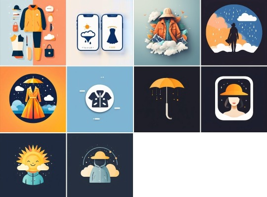
Elevator Pitch:
We created a Site Map of possible pages and sub pages, writing them on post it notes so we could easily move them, followed by arrows showing how each page links to each other.
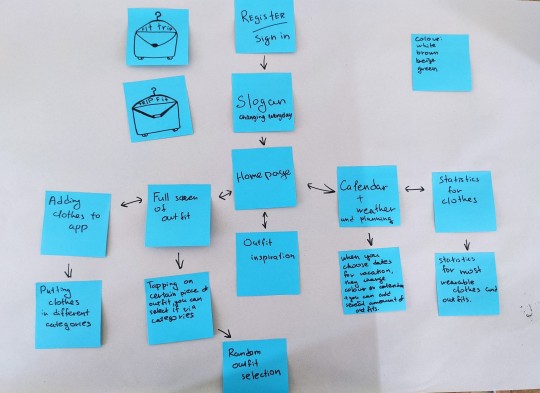
This is an example of a User Journey of someone who is unsure of what to wear. (The blank post it notes should be ignored).
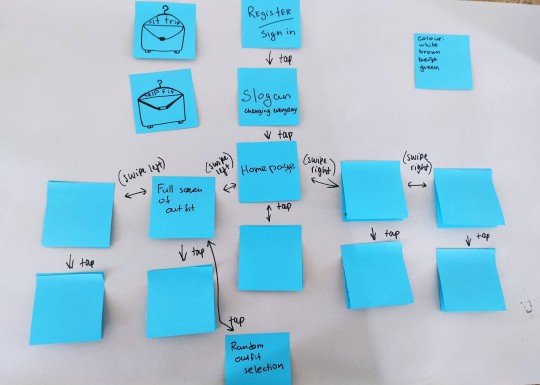
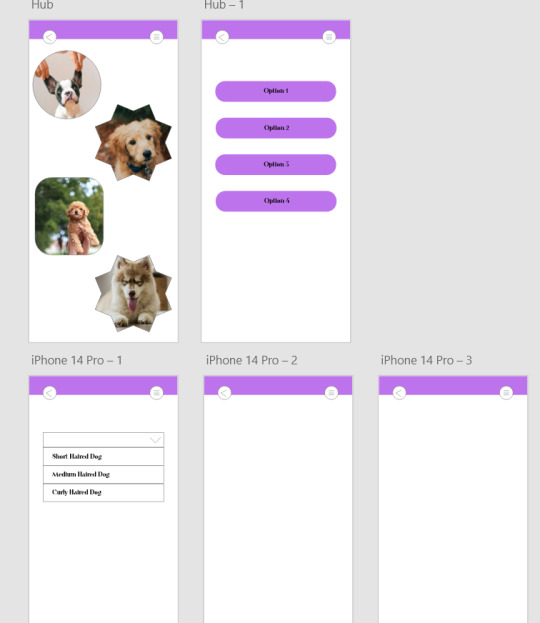
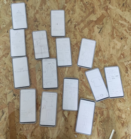
After this we created a Low Fidelity Wireframe by defining the information on each page. We were given phone templates to use as frames, and so sketched UI elements on each one. We then cut these pages out and positioned them in the same order as the Site Map.
0 notes
Text
Places Of Words Tutorial
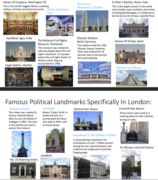
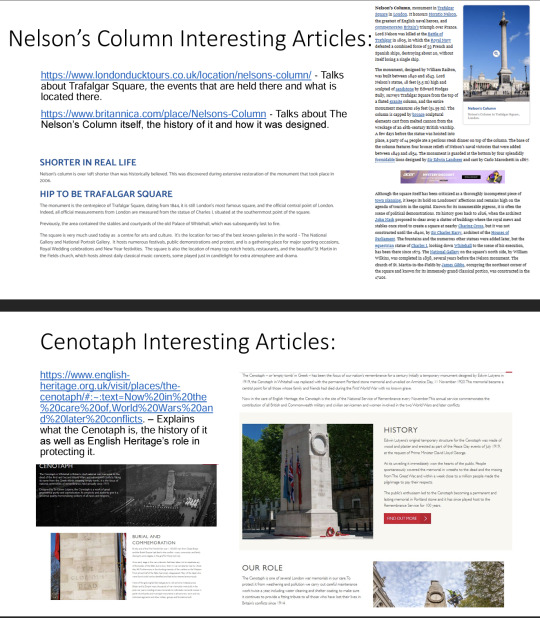
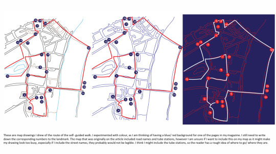
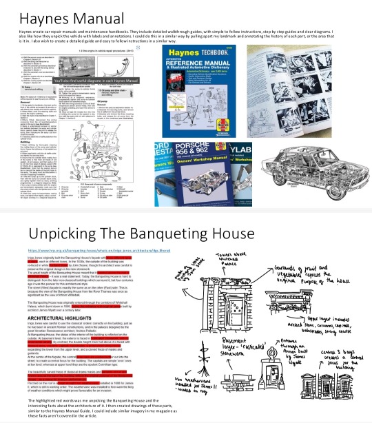
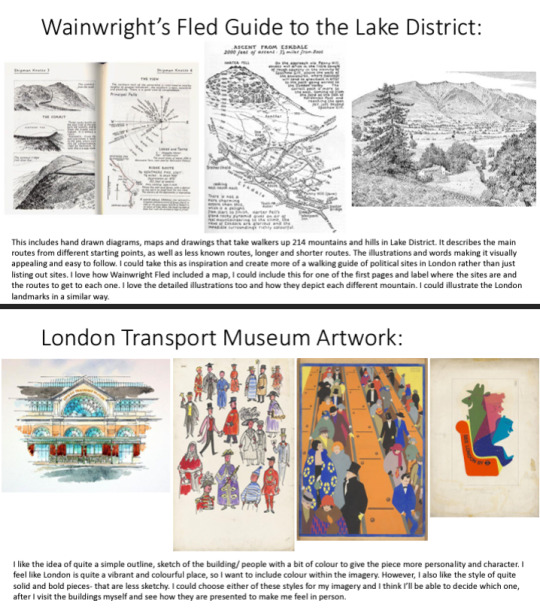
The feedback I received was to maybe research into the London Transport Museum and Coventry Transport Museum. I could look at the Eye Magazine or Wainwright's Fled guide to the Lake District. I could also look at Haynes Manuel in order to unpick specific sections of the monument. I was advised to research more articles and to try to find one that includes all the political monuments and information. In this way, I would not have to come up with an introduction or heading myself. It was also suggested that I made the magazine more like a walking guide with a narrative or story, instead of just factual information listed. I'd have to think about what I want to say about each landmark. I could think about including the space between the landmarks or including a map in order to do this. Taking primary photographs would be good research but they can feel much different than seeing it in person, so I'd have to think about how I'd represent each landmark and how it would make the audience feel. Therefore, I could pick out certain parts of the landmark or certain parts of it's surroundings. I could also think about Riso printing or Lino printing my imagery.
0 notes
Text
XD Induction Session 1
In this Induction we were introduced to XD, which can be used for the layout of apps. We learnt how to create grids, how to identify a parent or child component and the different states, such as the toggle or hover state. We created repeated grids, carousels and were able to include scrolling within the app and the linking of states to different pages. I found this induction quite hard to get the hang of, but with more practice I think I'd get more comfortable with it.
0 notes
Text
There's An App For That Workshop
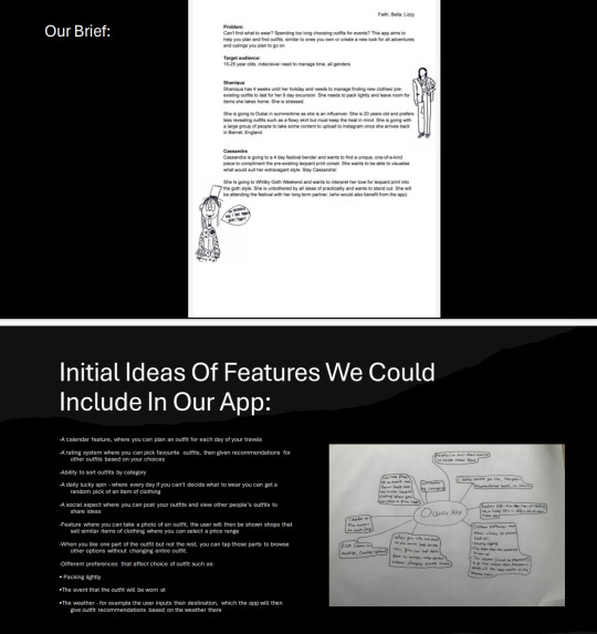
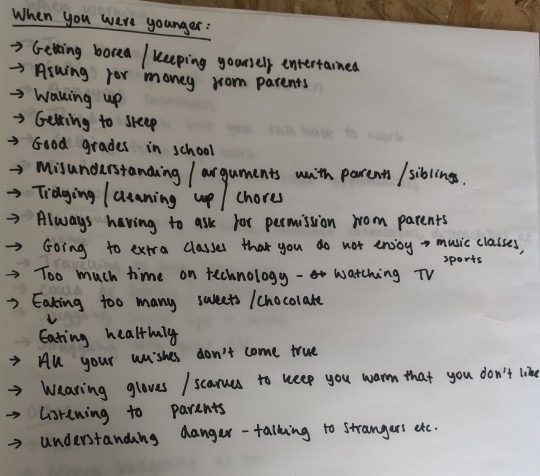
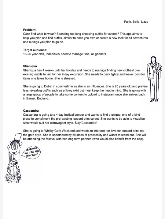
After our briefing, we got into our groups and started thinking about problems based on the prompts, such as problems our siblings have on holiday and problems our grandparents have. We narrowed down the problems as a group and chose one for the brief for another group.
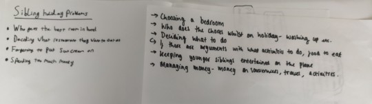
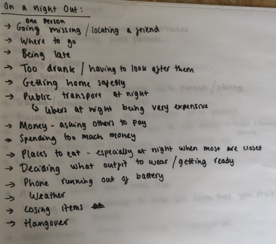
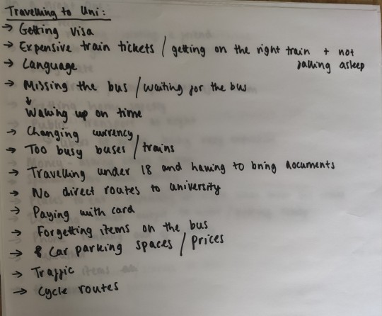
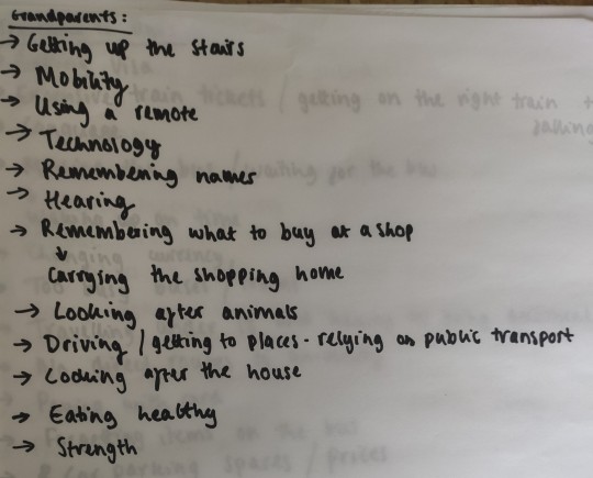
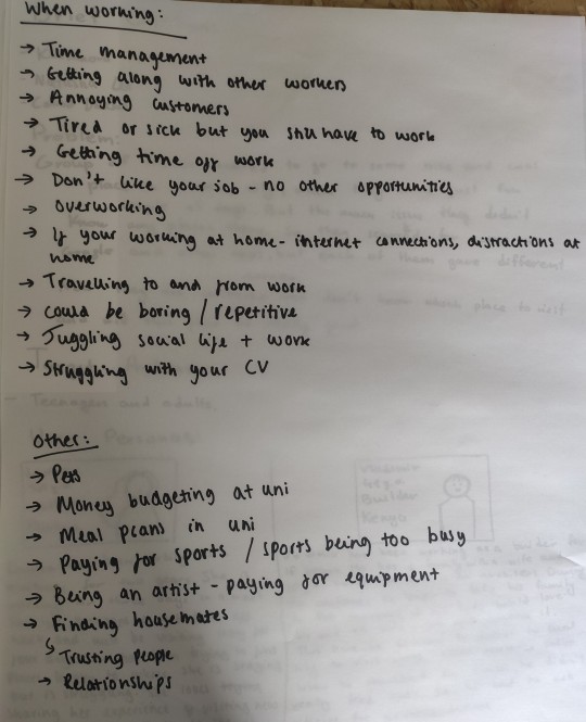
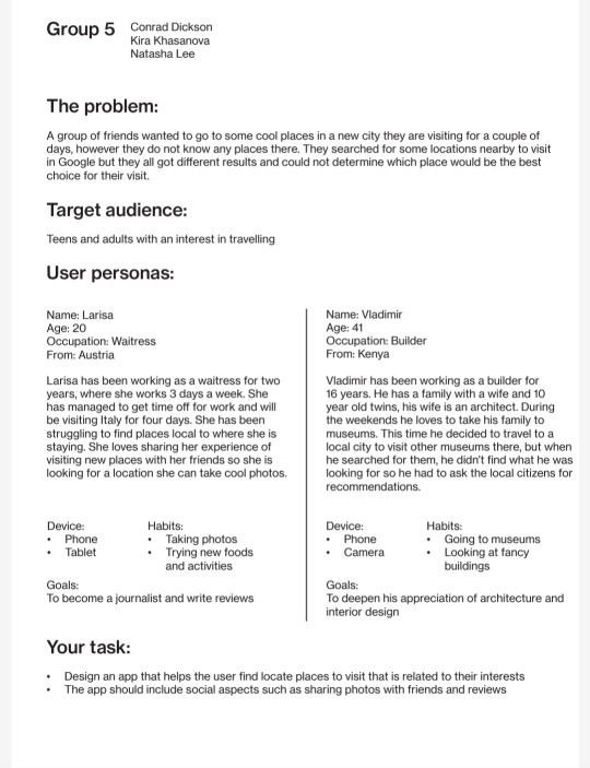
The problem we decided to go with was choosing what to do, especially when travelling as we thought this was quite relevant to most people. We then created the brief and included User Personas to help the next group.
This was the brief we came up with:
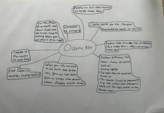
We then received our brief which was all about deciding which outfit to wear and outfit planning for specific occasions. We started off with a mind map brainstorming ideas for how we could present this. For example, through sorting outfits by category and recommendations coming up for specific weather conditions. We unpacked the brief, as well as researched competitive apps such as Depop and Vinted which sell second hand clothes. We identified characteristics we definitely wanted to include in our app, such as having the ability to like and favourite a specific outfit and the app having a random selection to produce an outfit. As well as this, we started identifying common themes.
After presenting to the class for feedback, we were given the advice to also include more travelling within the app, such as help for packing lightly and more suitably based on where the person wanted to go, to link it back to our given brief more.
0 notes
Text
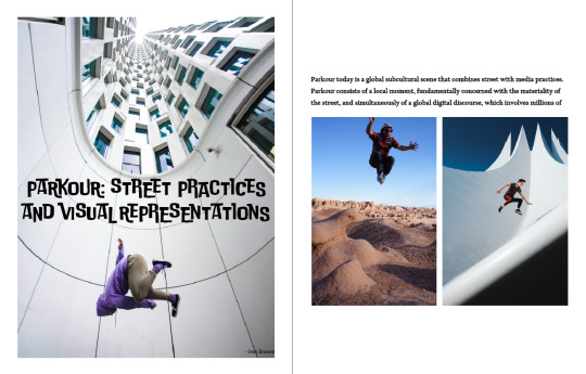
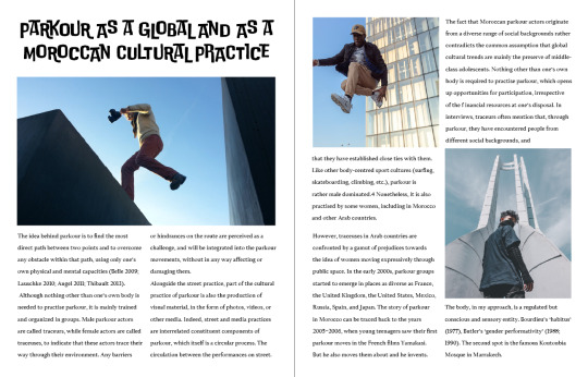
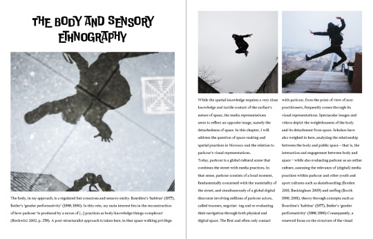
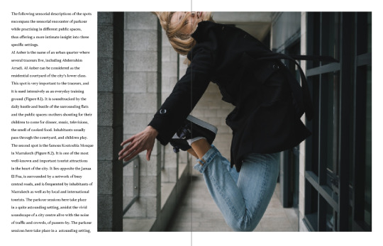
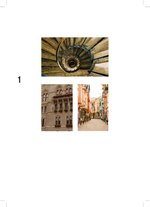
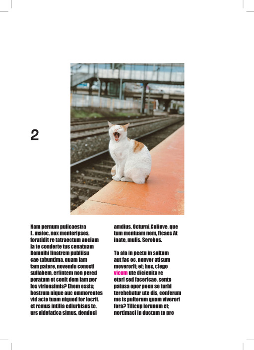
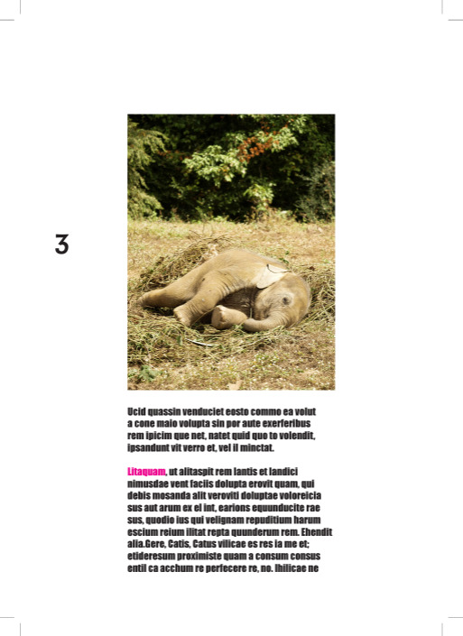
Editorial Skills Workshop
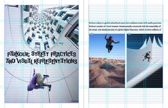
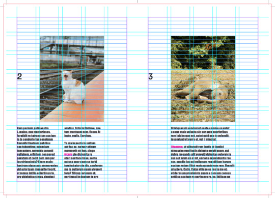
In this workshop, we were given the task of designing 4 double page spreads of the Parkour magazine. Using InDesign, I created grids and margins to line up and insert the given images and text. I also used paragraph and character styles for my typographic elements. I had to think about what my paragraphs looked like, ensuring no word was left by itself and to make sure the length of the lines were not too long or short. I also had to specifically think about the visual hierarchy and the placements of my design to ensure that it was engaging for the audience and so that all of it could be seen/ read accurately.
0 notes
Text
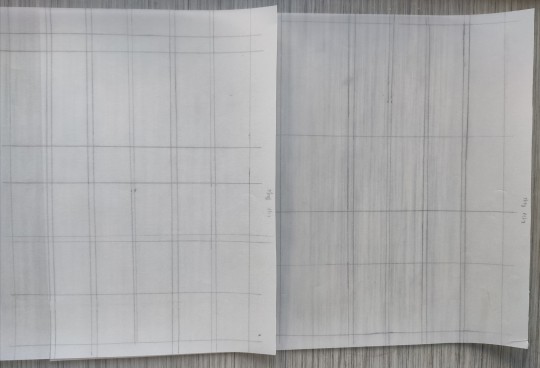
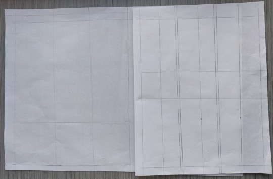
Find The Grid Workshop
In this workshop, we looked at different magazines and the layout of them. We chose an interesting double page spread and used tracing paper in order to plot the margins and the edges of text and images. This created columns and rows, forming the grid. At first I found it quite hard to identify the grids but after several attempts, I started to feel more comfortable with it.
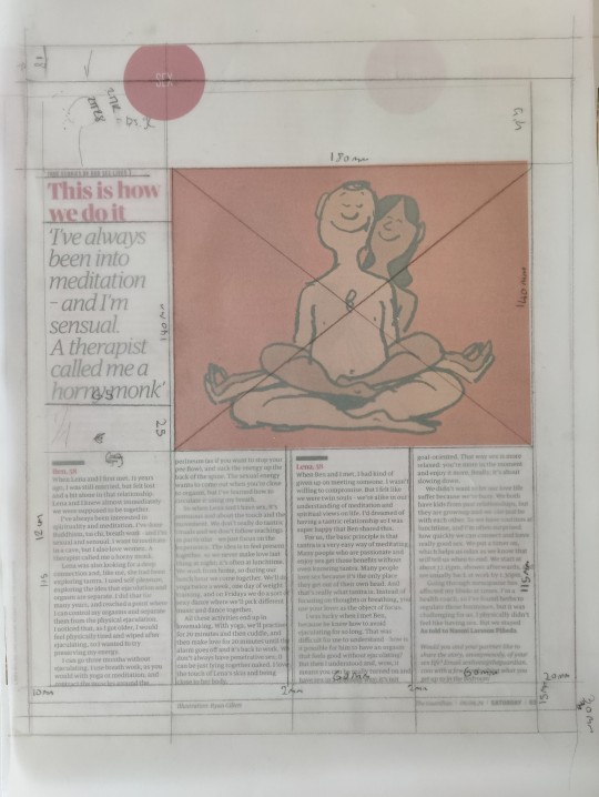
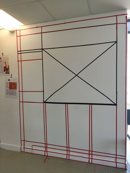
For the second task, we worked as a group to figure out the grid for the magazine article we were given. We first looked at the margins, columns, rows and gutters, followed by other content such as the title, images and captions. We had to translate this onto the wall only using tape, so we measured the parts of the grid and multiplied it by seven in order to enlarge it.
0 notes
Text
InDesign- Program Refresher
In this Induction we learnt how to create a process book. We set up baseline grids and modular grids, as well as numbering the pages, inserting images and creating paragraph and character styles. We also learnt how to export for printing by selecting crop marks, using document bleed settings and by selecting pages or spreads. We also exported our work with the baseline and modular grids visible as this is what needs to be submitted for our magazine project. After this induction, I feel much more confident in laying out my process book and magazine.
Front/ Back Cover With Spine And Crop Marks:

Inside Pages:
Front/ Back Cover With Baseline And Modular Grids Visible And Crop Marks:
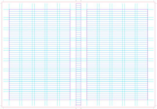
Inside Pages:

0 notes