oswinworks
oishika sen | graphic design portfolio
3 posts
Don't wanna be here? Send us removal request.
Last Seen Blogs

reddomino22-blog
Untitled

jaqhtambaram
Untitled

lavender--lullaby
Lavender Lullaby

benhvientaimuihong102
Bệnh Viện Tai Mũi Họng 102

ccorazoncito
dépaysement
Text

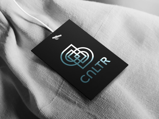

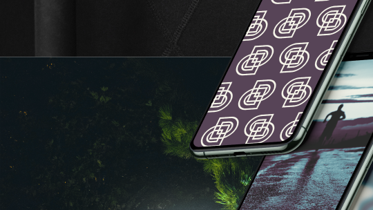
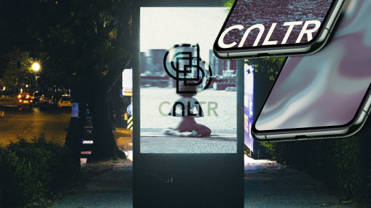


✧ CULTR by @briefhaus ✧
A neutral-palette inspired athleisure clothing label boasting sleek and versatile pieces for the modern person.
Combining elements of Bauhaus art and gradients made from Cultr's brand colours, We insist that sleek and modern does not have to mean boring. Cultr is for the multifaceted, goal-oriented individual who will have a flat white only if it's their coffee.
The inverted “U” in the logotype creates more visual interest and serves as the backbone of Cultr’s logomark. The dome-like symbol is reminiscent of many cultural landmarks around the world, such as the Florence Cathedral, Agra’s Taj Mahal, Abu Dhabi's Sheikh Zayed Grand Mosque, Roman triumphal arches and so on. The shape has been doubled and intertwined as a callback to Bauhaus art and to connote the blending of “cult” and “culture”.
The cool-leaning colour palette conveys modernity and sobriety, as does Avenir, the chosen typeface. The sharp edges of the font convey a sense of exclusivity (hence the ‘cult’r) and sleekness. The usage of the motion blur effect in the branding gives a sense of movement and activity that is apt for an athleisure brand.
CREDITS:
Embossed label mockup by Graphic Pear
Clothing tag mockup by Graphicsfuel
Label mockup by Graphic Pear
Phones mockup by LS Graphics
Runner photo by lucas Favre via Unsplash
Billboard mockup by mockupbee
Woman photo by todd kent via Unsplash
Athlete photo by *Ambitious Studio - Rick Barett via Unsplash
Smiling woman photo by tabitha turner via Unsplash
Male athlete photo by Arthur Edlemans via Unsplash
Packaging mockup by LS Graphics
0 notes
Text

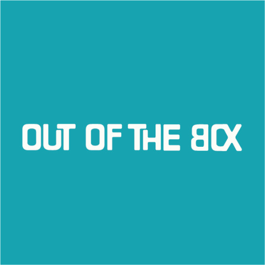
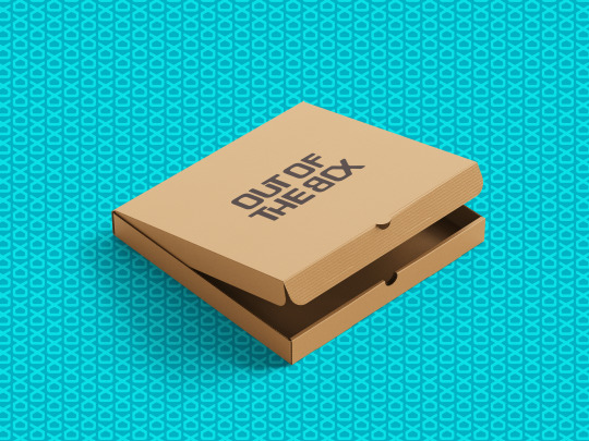
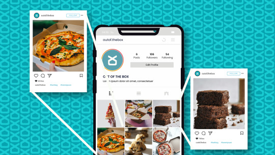
A family member approached me to commission a brand identity for their food startup. Named “Out Of The Box”, the aim of this business was to provide a limited menu of good quality and affordable food to the doorstep of young professionals aged 22-27. A service of this sort is called “tiffin service” in India, and the marketing would be carried out predominantly on social media platforms like Instagram. Unfortunately, this business was unable to launch.

Featuring a customised typeface, the logotype has rounded edges to connote the approachable attitude echoed by the brand. The geometric feature of the type makes it easy to tailor to packaging and social media material. Some of the letters fold into each other to symbolise food being packed into containers as well as the togetherness brought on by food. The "O" and the "X" in "Box" have been stitched together to resemble the abstract image of a food package. This is also the company's logomark.


Credits:
Fonts: 1 2
Mockups: 1 2 3 4 5 6 7 8 9
Photos: 1 2 3 4 5 6 7 8 9 10 11 12
0 notes
Text
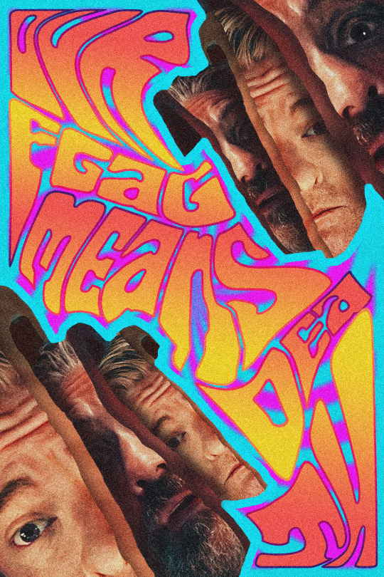
This is a self-prompted poster redesign project for the show Our Flag Means Death. I created this in honour of the show and the fan-led renewal campaign that has grown in the aftermath of its unfair cancellation.
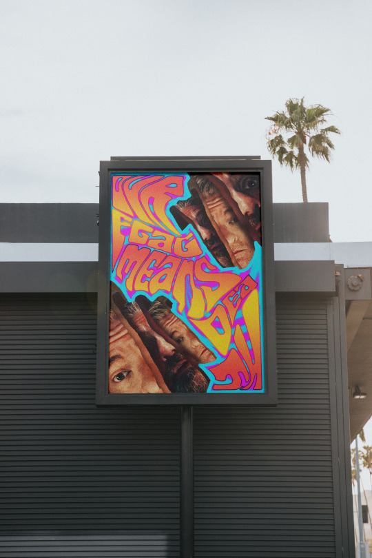
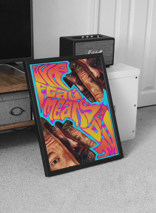
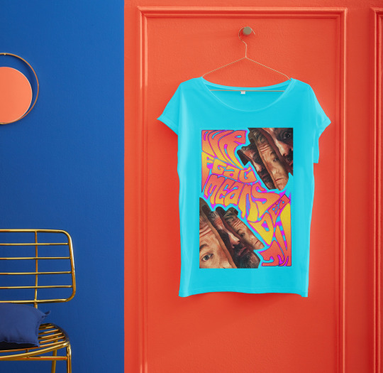
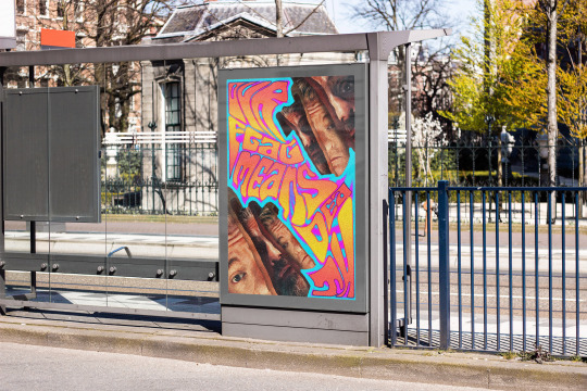
This is a poster that would easily stand out on outdoor billboards, catching the eye of the busiest passers-by with its bright colours. The lucky studio that picks the show up could even sell merchandise in the form of framed posters and catchy t-shirts made using this poster design.
Software used: Adobe Photoshop
Time spent: 10 hours (estimate)
Our Flag Means Death poster source: Rotten Tomatoes
Billboard mockup source: MrMockup
Framed poster mockup source: MrMockup
T-shirt mockup source: MrMockup
Bus stop poster mockup source: MrMockup
Detailed process below!

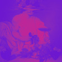
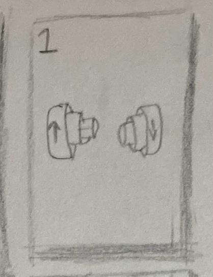
This is a thumbnail I sketched out to gauge the overall layout of the poster. I was heavily inspired by Mishka Westell’s “Ty Segall & Parquet Courts at Levitation Festival” and decided to imitate the halves of the subject's face emerging from its larger predecessor. This also pays further homage to the styles of classic psychedelic graphic artists like Bonnie McLean which is the driving force of my art.
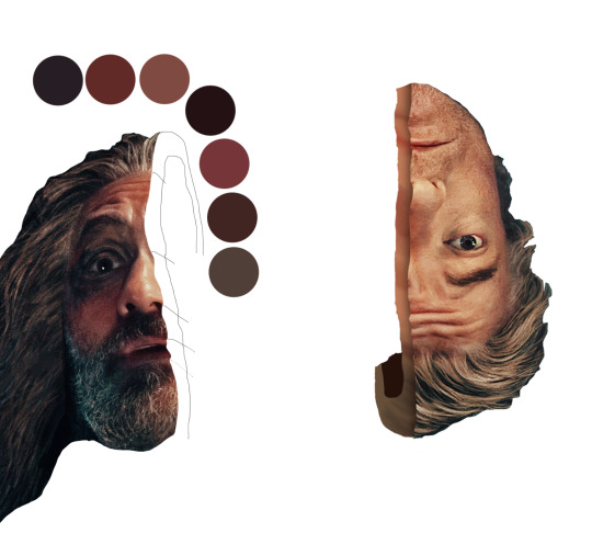
After experimenting with other styles, I settled on cutting out the faces of the leads and alternating their halves with each other. I chose this as this looked more dynamic and served as a callback to a letter Stede (Rhys Darby) wrote to Edward (Taika Waititi) wherein the former said that they are “joined to one another…intertwined”.
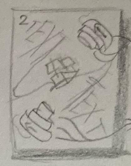
I sketched some more thumbnails to experiment with different positionings for the subjects’ faces and chose to place them diagonally along the poster as it created more visual interest and left enough room for the text. I painted the “crusts” of their faces by matching the corresponding tones of skin, shadow, highlight and so on and added shadows where necessary. I added a stroke to each group to match and blend with the colour of the border.
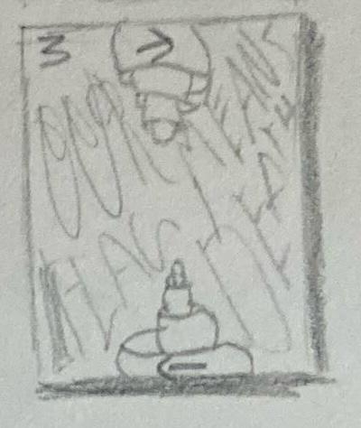
For the background colours, I chose a bright pink colour that matches the pink used in the show’s official marketing material and a bright blue colour that connotes the sea, the home to the show’s characters. Further, the near-complementary nature of the colours was in line with the colour style used in psychedelic graphics.
I chose the font “Euphoria Party” for the text. I chose this font as it is somewhat more legible compared to other psychedelic fonts even after warping and manipulating it.
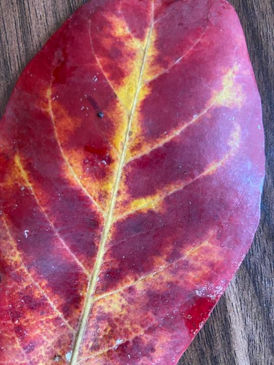
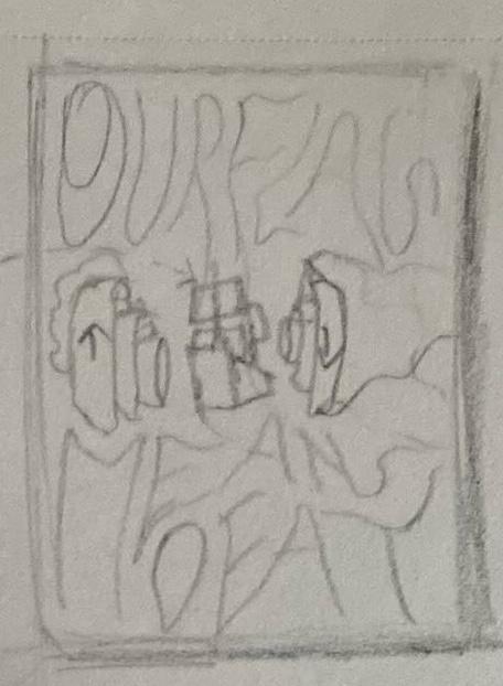
I came across this leaf while out on a walk and liked the colour combination and gradient present here. I thought incorporating such colours would prevent the text from looking too flat in comparison to the rest of the poster, so I colour-dropped the appropriate colours and added alternating gradients for each chunk of text. I added a gradient stroke to outline each text block.
I thought the poster looked too “clean” for my liking so I finished it by adding a noise filter over the entire creation to make it look grittier.
#our flag means death#ofmd#our flag means fanart#adopt our crew#save ofmd#graphic design#poster design#psychedelic#psychedelic art#trippy art#graphic art
1 note
·
View note