scribbledoodles
Art Dump
Collection of my design inspirations, art, sketches, paintings, WIPs, rants, and design work.
34 posts
Don't wanna be here? Send us removal request.
Last Seen Blogs

ogpptlltl55
제목 없음

artist1113
The Artist
ruthari-preacher
Hi welcome to Bible study. R U T H A R I.

sadbeautifultragicsblog
Sofía 🌙

anniesstories
Annie's Fanfics
Text
So Far...

I'm not impressed.
I got an iPad for UI/UX work. I thought it would be a great opportunity to try out Procreate and the Apple Pencil.
The Apple Pencil is just heavenly, especially compared to the jitter prone Surface pen. I can create beautiful marks with a feather touch. The last time I was able to do that was on a Wacom tablet/Wacom Tablet PC. If only Apple could work with Microsoft for their Surface line (yes, I know, fat chance, lol).
Unfortunately, so far my experience with Procreate isn't as impressive as the Apple Pencil. The user interface isn't very intuitive, especially versus Sketchbook. Within minutes of using Sketchbook I could create great works of art without having to stop and Google "how to..."
The brushes out the box in Procreate vs the brushes in Sketchbook aint even close. Just look at the gorgeous brush work between the two. Sketchbook completely puts Procreate to shame. And color? Forget it. Look how muted all the colors are from Procreate, now look at the vibrant collection of colors from Sketchbook.
Could my opinion change once I get more accustomed to Procreate? Sure. Is it a completely fair comparison? Probably not, since the toucan painting was done on a Surface Pro 4 and Surface Studio 2 with a desktop version of Sketchbook. I also want to point out I'm on a 10th gen iPad (not the pro version). I think once I'm done with the test portrait I will download the tablet version of Sketchbook on the iPad for a better/fair comparison. Considering all the hype, I expected Procreate to knock my socks off, it didn't.
0 notes
Text
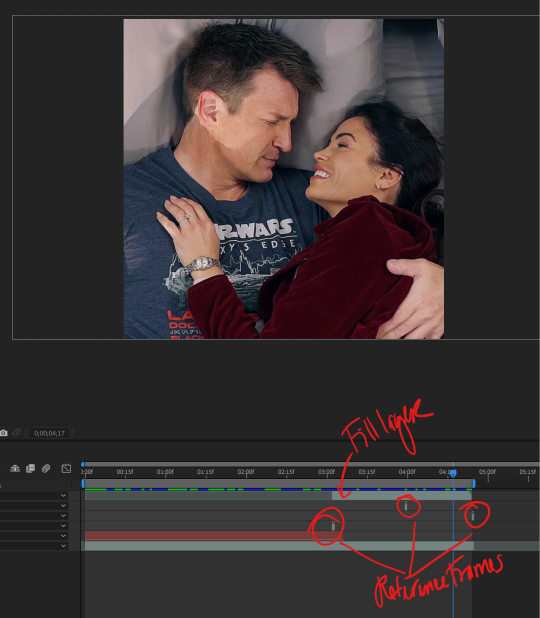
AH HA!


Instead of trying to generate a new section from scratch, I inverted the letter shaped mask in Photoshop for the reference frames. So when the content aware fill in After Effects generates a fill layer it will look much more seamless.
In both gifs I only used THREE reference frames compared to this 😄
PROGRESS!

2 notes
·
View notes
Text
DAMNIT

You know what that means...
0 notes
Text
And DONE!


They are not perfect (if I stare where the text/logo was I can see where it was removed), but considering this is my first time doing it, for the most part I'm happy with them.
I'm not going to lie the logo/text removal process was a real bitch. It was such a time consuming process. Sure I could've scaled up and cropped the text and logos out, but why not challenge myself? While these gifs look basic, the time spent on them was a valuable learning experience that I will take with me when editing work videos.
I'll post the episode recap with the above gifs over at my fandom account @hellostickerdoodle . I should be done with everything by tomorrow. Posts will be here: The Curse: Wedding Shenanigans | The Curse Continues
And now I need to sleep :)
1 note
·
View note
Text
HA! HA!

Yes, all of this (content-aware fill, tracker and reference frames) to remove a logo for a gif that's going to be approximately five seconds long.
Hahaha.
Why am I so anal-retentive?

Not bad. If you zoom in on some of the frames you can see where the logo was removed, but it's a low res gif so...eh.
2 notes
·
View notes
Text
Finally!

So I finally got my ass in gear and gathered all the video clips I need to make season 6 episode 1 gifs.
Yes, I should be using Premiere to edit down these things, but fuck it, lol.
Yes, I'm going to use one project file for The Rookie's shorten season, because fuck it.
I'm going to finally try out the content aware fill in After Effects to cover the ABC logo. That should be fun :)
0 notes
Text
Adobe CC 2024
If you're on 2023 DON'T UPGRADE, IT'S FULL OF WORK STOPPING BUGS (especially InDesign).
0 notes
Text
Tried Something A Little Different

Ok, so instead of using two separate gifs, I decided to place footage side by side using track mattes and freeze frame. Also, I wanted a transparent space in between so I opened the output file in Photoshop and added a layer mask. It's waaaaay more work doing that versus the first method of creating two separate gifs.
If I had extra footage of their reaction while the other is speaking it would have been far more successful. Next time I'll just stick with exporting out as two separate image files, lol.

0 notes
Text
I Will Take Two Please!


Audi USA
Had a stressful day of rush/last minute work stuff. Whenever I have a shitty day, viewing cars is my go-to destresser. By "viewing cars," I mean I pretend I'm in the market to buy a high-end luxury vehicle 😆
Today's pretend vehicle search is the 2024 Audi SQ8 e-tron. This SUV (crossover?) hits all the right spots for me except for price and well, it's kinda giving me 2023 Ford Explorer vibes...


Ok, on second thought they don't really look a like, just similar profiles and they are both mid/larger sized SUVs, lol at me.
My point? I really, REALLY want a 2024 Audi SQ8 e-tron like now...
0 notes
Text
Stupid Fonts
I just spent €254, which is about $268.43 in U.S. dollars on two fugly ass font families.
UGH!
FK Grotesk SemiMono and Reckless (Serif, not the brush font) is stupid.
Stupid ass corporate brand guidelines.
That is all.
1 note
·
View note
Text
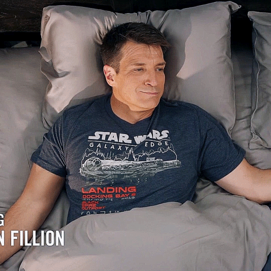
Mind Numbingly Boring
Batch editing these InDesign guides is so fuckin boring. Yes, it's easy, but so time consuming and BORING!!!
98% of my work day now consists of these boring edits.
UGH!
Freelance life. Whatever work you can get, do it, even if that means doing something that you did in your intern year, lol.
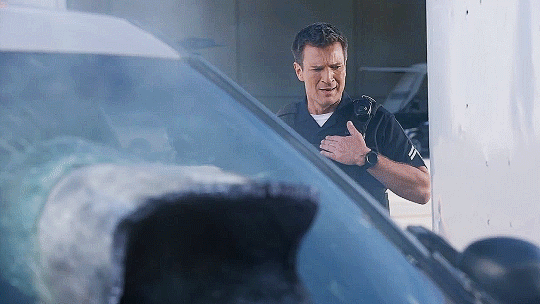
At least I have the OG Magnum P.I. to keep me company haha. God, that man was sooo sexxxy. If Nathan Fillion gets cast to play Thomas Magnum in a movie I would die of a thousand orgasms 😆
Anyways no one wants to read about my thirsty thoughts, lmao.
3 notes
·
View notes
Text
Absolutely SICK!!!!
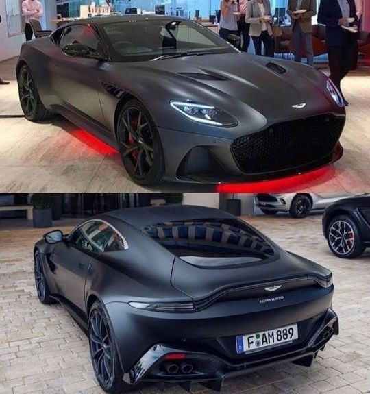
dreaming.cars
Oh @adder24 look what I found!
That matte black is EVERYTHING!!!
I would play the Knight Rider theme song as I drive down the 405 😆
10 notes
·
View notes
Text
Hmmm...

I love me some Volvo compact SUVs.
0 notes
Text
No Words Necessary
youtube
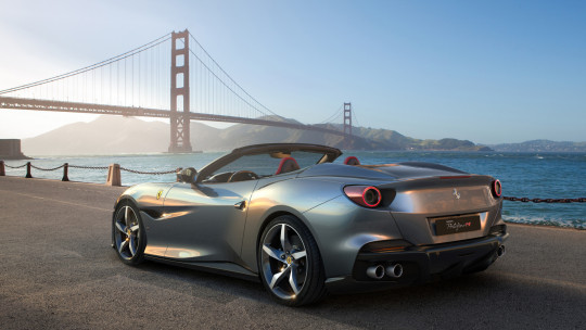
Looking at this sexxxy car because of this post.
3 notes
·
View notes
Text
Asana > Monday.com
The UI and features that I use is so much better on Asana. Why did I wait to make the switch?
Neither platform is perfect, but for now Asana is the better project management platform for me.
0 notes
Text
I Don't Hate It
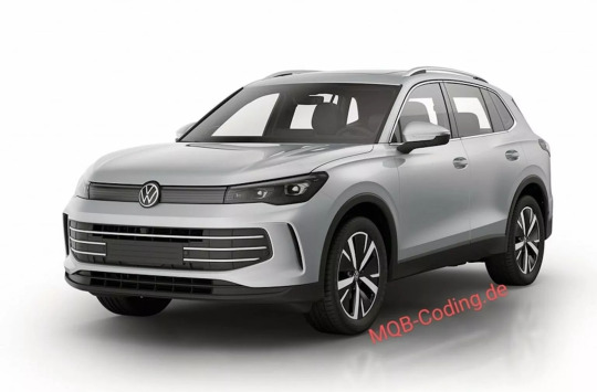
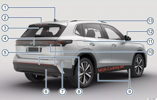
CarScoops
I committed so many errors in my InDesign doc, that I needed to take this break. I should just start over, lol. Something about colds really screw with my brain.
Anyways, I saw this and didn't hate it, which is a good sign, but I don't love it either.
The design stays true to VW's minimalist design aesthetic while incorporating the some of the Tiguan's last gen styling. I want to like the rear and it's lights, but I feel like something is missing/unfinished.
Don't get me wrong it's miles above the current Tiguan's design, but that's not saying much.
It's bland, but I'm sure with the right color and trim it'll look ok.
Would this be my next car? Eh. After the Taos' poor engine performance (crazy turbo/throttle lag, bordering on dangerous) I don't think I want another Volkswagen.
0 notes
Text
Annoying Little Things
So far I'm LOVING freelancing! It's such a wonderful change of pace.
I'm calling it a night for these edits. I'll continue tomorrow morning and work on my video edits that are due on Thursday. Starting Wednesday, I'll start knocking out flyers, banners and some poster concepts.
I don't anticipate having to work this weekend, except for the usual--job/client/contract search. So, I think I'll start knocking out personal art projects, not to mention I'm behind in reading @adder24 wonderful Reaper story (seriously people you should read it).
Anyways, I'm out.
3 notes
·
View notes