Last Seen Blogs
thcocrain
afterglow

mhabirthdays
My Hero Academia Birthdays
samanthaatodaro
Samantha Todaro PHO 101
bloomed-night-flower
YesNo
Photo
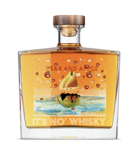
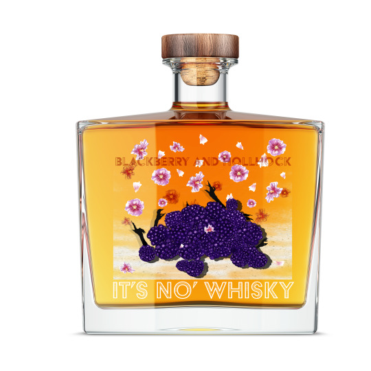
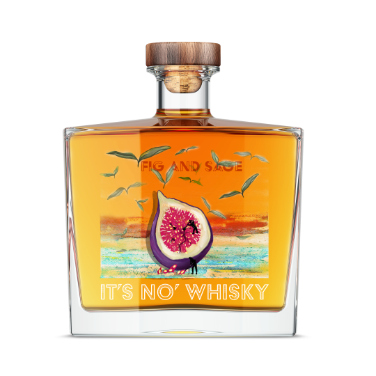
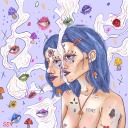
Overall im really happy with the final labels. From the beginning I had so many ideas and none of them were close to this I wanted to base it directly on the photos I took from Culross with imagery of the buildings but I realised quickly that this wasn’t going to stand out enough amongst other whiskey bottles and doesn’t appeal to the target audience as much ( the old buildings are cute in person but make the drink feel like its targeted to an older age group).
I chose to go with the theme of surrealist art playing with the scale of elements in the artwork, after looking into more surrealist work on a previous project of printmaking and because I want to bring in my own style of weird art into this project.
The labels are based on folklore and history of Culross, Fife. The first Pear and Apple flavour is based on a story of a princess who got pregnant before marriage and was disowned by her family she ran away and jumped off a cliff where she found a beaten-up boat. She sailed the boat and washed up on the shore of Culross where she was taken in by the lord of the land. Her son was adopted by him and he became St.Mungo Saint of Glasgow. I made the pear into a little vessel for her to be floating on and made her silhouette in black to keep the attention on the fruit which are the biggest elements but also have the story telling theme visible and intriguing enough for you to pick up the bottle
Blackberry and Hollyhock is based on the suspected witches who were locked up in the townhouse and tortured. Their hands are reaching out to be seen and heard.
Fig and Sage is to represent the fact that Culross was the first place to expand their coalmining to underwater, the little men digging are inspired by David Gilliver Little People.
The flavours chosen are based on the fruits and flowers that grow in the palace gardens of Culross and luckily all pair well with the natural occurring notes of Whiskey.
It’s No Whisky was based on brands that use the element of being blatantly obvious eg Its not chicken, and also plays on the Scottish slang which appeals to the target audience by being funny and straight to the point. It is similar to vegan and vegetarian alternative brands which is something the target audience is likely to be aware of, being environmentally conscious so it would stand out to them and make people question what it is and be drawn into the imagery and name.
I feel like this stands out from other whiskey brands because a lot of whiskey brands are more typography based with a small logo, whereas my labels are the opposite having the imagery as the focal point of the label design.
Weaknesses in my design; I wanted to add in more elements from Culross itself but when I placed them in with the artwork it just didn’t work on the front or back or background. I think to have them be part of the artwork I should have had them from the start rather than trying to fit them in after. Looking back I think I would bull back more of the apples and flowers and have them more similar to the sage because I feel like there’s a bit too much going on in the first 2 and the fig and sage feels more calm and tranquil. The fig and sage looks less uniform out of the 3.
Strengths; I feel like I’ve hit the brief on Nature and purity with the fruit being fresh juicy illustrations and the calmness of the watercolour sea and transparent label with elements floating off in the sky. I also think they would stand out on a shelf of whiskey bottles and would be appealing to the target audience with the visuals and name.
1 note
·
View note
Photo
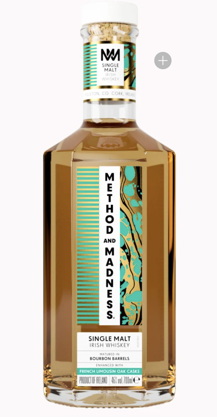
The Method and Madness bottle really caught my
attention because the label is vertical unlike the other
horizontal standard wrap around label.
On their website they mention the design is based on a
"touch of minimalism and a slight laboratory influence" They
wanted to capture the contrast between the craft and layers of
work along with the liquid itself. The design is made
from a marbling effect which is then edited and the
perfect slice of imagery is selected. I like the organic process of
how these designs are made without having much control over
the outcome before it is edited or work is made from the mark making.
It feels spontaneous and and fun and flows well.
The representation of the geometric lines for the layers
of the alcohol distillery process contrasts with the organic flow of the
blue spotted shapes as the air bubbles that are created when its
poured works really well. The imagery suggests liquid straight away and the
colours feel fresh vibrant and modern.
Method And Madness Whiskey. (n.d.). Method And Madness Whiskey. [online] Available at: https://www.methodandmadnesswhiskey.com/en/product/single-malt [Accessed 29 Apr. 2021].
0 notes
Photo
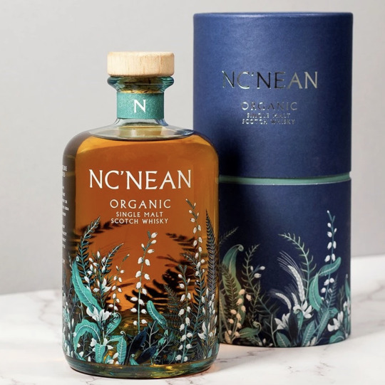
The NC'NEAN one is so pretty the layered floral botanical
elements layered on top suggests the drink has depth and has
floral tones. It gives a sense of the place and the composition
draws your eyes up to the branding. The branding name and
info is quite subtle and is a light colour which draws attention
from the name and more to the imagery, the name is more prominent
on the box so its not essential to be as visible
on the bottle inside. The ferns and white snowdrops give a
feeling of purity and are a nod to the Scottish countryside
where it is made. The brands ethos is to be sustainable and is
run by women who want to have an organic nature inspired
whiskey. This is portrayed well in the imagery.
Nc’nean Distillery. (n.d.). ORGANIC SINGLE MALT SCOTCH WHISKY. [online] Available at: https://ncnean.com/collections/all-spirits/products/organic-single-malt [Accessed 29 Apr. 2021].
0 notes
Text
Karren Lederer -Monoprint

I really like how she makes so many patterns and textures in one piece. Her work is always really vibrant and the shapes are quite simple but the combination of multiple textures and colours makes really pretty interesting prints.
1 note
·
View note
Text
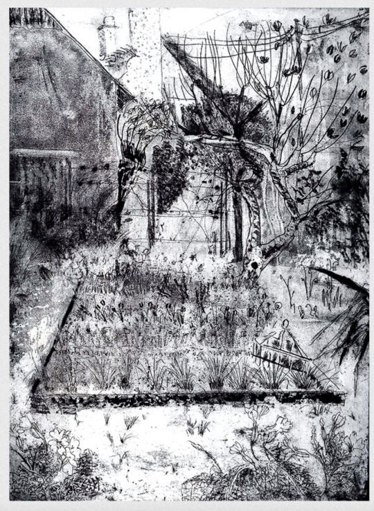
Bryan Angus- Relief-Lino Printing
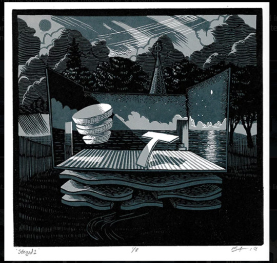
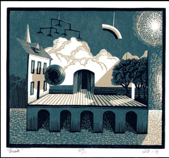
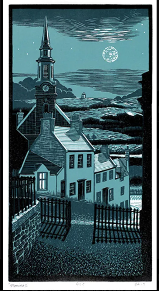

Bryan Angus is a Scottish artist who makes lino prints. His work interests me because of the textures and details he makes with just cutting into lino. The textures add different tones and colours to the piece. This brief also states that the images will reference to the landscape/ architecture so this caught my attention when looking for lino printing that contains these features.
4 notes
·
View notes
Text
Jude Freeman Intaglio-Etching
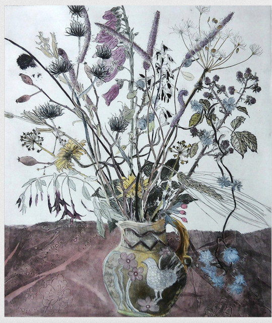
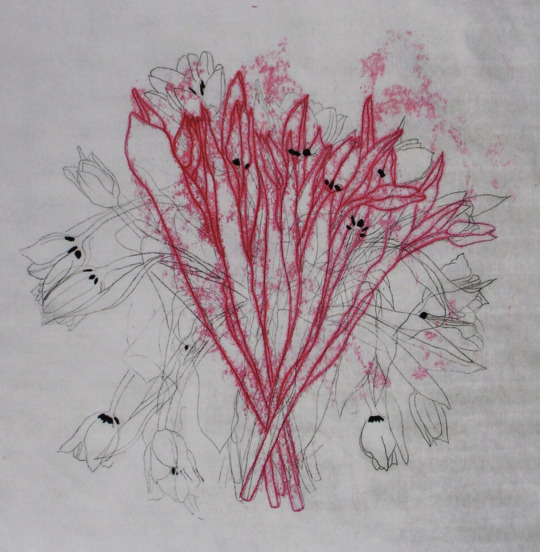
I really like how expressive this style of printing is, Freemans work consists mostly of flower arrangements or nature and he really captures the shapes and organic nature of the flowers. I like this style because you can do really scratchy loose lines to show movement and little dots or rubbing to create more texture.
1 note
·
View note
Text
Adam Pendleton
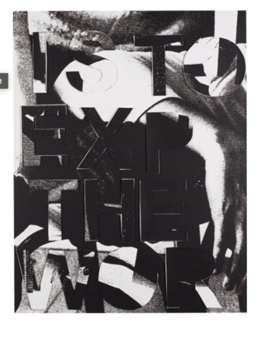
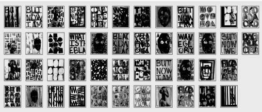

Adam Pendleton, a conceptual artist began studying in 2002 and works in New York Currently. He studied in an international art program in Italy. He works freelance and his work incorporates artistic painting with layered collage and fonts. His work is more bespoke as its made of abstract art and photography with lettering painted on top or layered in collage. For this work he uses silk screen printing, collage and spray paint.
His work is mostly minimalistic, he states that is work is an “archive that keeps building” A personal library of books, (Pace Gallery, 2019). His work often includes spray-paint and he allows the “limitations of his hands” create the work whether the pressure is soft or hard controlled our uncontrolled.
I find his work quite expressive because of this, it has a lot of feeling even though its restricted to black and white or purely monochromatic black.
His work “incorporates the artist’s own writings and drawings as well as found materials, such as historical photographs and pages from books in his personal library.” Pendleton, A. (2020). These Elements of Me. [collages silkscreened on Mylar]
His work is usually political and activist based he uses images from black history, slavery and racism. Pendleton “inserts his work into broader conversations about appropriation, representation, and political engagement” (www.pacegallery.com, n.d.)
His main font used across his work is Ariel Capital letters eg Black Dada” (2008–09)
I really like how his work portrays so much but is confined to a monochromatic colour scheme, yet still has such a strong impact, I fell like this is a good example of the work being strong enough to not need colour.
Greenberger, A. and Greenberger, A. (2018). Frieze New York Will Present Adam Pendleton–Designed Black Lives Matter Flag, Hank Willis Thomas Works on Gun Violence. [online] ARTnews.com. Available at: https://www.artnews.com/art-news/market/frieze-new-york-will-present-adam-pendleton-designed-black-lives-matter-flag-hank-willis-thomas-piece-works-gun-violence-10080/ [Accessed 12 Feb. 2021].
Pendleton, A. (n.d.). if the function of writing is to express the world , 2014. [Screenprint with hand-applied screenprint letters (slightly raised from the sheet as issued), on 4-ply Museum board, the full sheet] Available at: http://www.artnet.com/artists/adam-pendleton/if-the-function-of-writing-is-to-express-the-H7AFAw381SN1yoL6KLaslQ2.
Pace Gallery (2019). Adam Pendleton: Our Ideas. YouTube. Available at: https://www.youtube.com/watch?v=Ra8BSVyB6fQ [Accessed 14 Feb. 2021].
0 notes
Text

Sascha Lobe
Sascha Lobe is a London based graphic designer who has works in Germany France and Seoul, Korea. He initially studied electrical engineering but on a trip to New York where he started photography he came to the decision to switch to graphic design.
He studied graphic design in Pforzheim University (TypeRoom, 2018). He founded L2M3 in 1999 which focused on signage, graphic design and developing corporate branding.
He was appointed to Alliance Graphique International in 2009 and took over the chair of typography at HfG Offenbach the same year. Sascha Lobe is also a member of ADC Deutschland and the Type Directors Club New York. (Heller, 2014)
He joined Pentagram in 2018
His clients have included Mercedes Benz, Vitra, Adidas, Hugo Boss, Kunstsammlung Nordrhein-Westfalen, Kunstmuseum Stuttgart and Württembergischer Kunstverein. (Pentagram, n.d.)
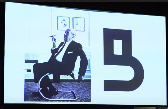
His work combines graphic design, architecture and 3D Design.He describes it as “architectural branding” (It's Nice That, 2018). His style is clean cut and structured. His approach is corporate and is inspired by architecture, Bauhaus and photography that he takes in his day to day life. His Tumblr blog consists of photography and graphic design so this could also be a source of his inspiration.
With his Bauhaus work he wanted to take heritage adapt it to modern day without losing the history but with a new perspective in honour to let it continue to live. In this it was very experimental and lead to developing a new Bauhaus-Archiv typeface.
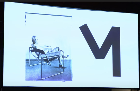
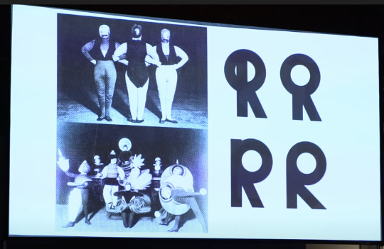
I really like how he has such clean cut typography but his inspiration for these are from photos of people sitting on a chair, objects people etc.
His fonts vary “every specific context potentially generates a new favorite font within the realm it is used for”
TypeRoom (2018). Pentagram recruits Sascha Lobe as its latest asset for more typographic brilliance - TypeRoom. [online] www.typeroom.eu. Available at: https://www.typeroom.eu/article/pentagram-recruits-sascha-lobe-it-s-latest-asset-more-typographic-brilliance [Accessed 13 Feb. 2021].
Pentagram. (n.d.). Sascha Lobe. [online] Available at: https://www.pentagram.com/about/sascha-lobe [Accessed 13 Feb. 2021].
Heller, K. (2014). Sascha Lobe. [online] segd.org. Available at: https://segd.org/sascha-lobe [Accessed 14 Feb. 2021].
It's Nice That (2018). Nicer Tuesdays: Sascha Lobe. YouTube. Available at: https://www.youtube.com/watch?v=dYCk0CKSm1k.
0 notes
Text
Louise Broinski

Louise Broinski is a Berlin based graphic designer. She studied Visual communication at University of the Arts Berlin 2014-2019, although she is quite new to the industry I like the simplistic look to her final pieces although they have a lot of background work that leads to this simplicity. She started out as a photographer but decided on visual communications as a way of being more creative and expressive with her work.
She is a freelance artist and is currently undergoing her masters in Tallinn at EKA Graphic Design.
She is influenced by sculptors such as Dan Friedman and Mike Goodlet
And printmakers such as contemporary artist Kobayashi Ikki. (Boddington, 2019)
In her process she starts with symbols and abstract shapes derived from the hieroglyphic alphabet along with inspiration from objects, sculptures and prints from pinterest then simplifies them in a sketchbook and digitalises them adding in textures eg metal clips from a hardware store (Boddington, 2019) Therefore her font isn’t specific but her projects do tend to have a similar look.
I think the abstract typography symbols are quite smart in grasping the viewers attention and holding it as they try to figure out the meaning.
Taking inspiration from symbols and hieroglyphics isn’t something in would have thought of so I’m glad I’ve found her work because this will be something I can look into further for this.

0 notes
Text

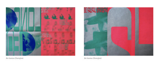
Kekfeng Lee is a Malaysian graphic designer based in Shanghai. He graduated from The Royal Academy of Art, The Hague in 2011 followed by 5 years in studio Dunbar. He works along with Ziefi Li in Kaukau Studio collaborating with other Asian studios such as Studio Huruf and briands such as Nike.
Their typography is based on Hanzi (Chinese alphabet) focusing on making “words into images that convey our concepts” (Neocha.com, 2020).
Outside of their commercial projects they worked on a series of printed works titled Be Kaukau where they used high contrasting colours that make me thing of thermal imaging
They use colours and patterns that highlight their team’s multicultural and multilingual integration (www.itsnicethat.com, n.d.)
They work across a range of sectors from the commercial, cultural and educational so their work varies with each project.
They use a”font designed in-house and the typeface Kedai-Kedai designed by Huruf” (Ong, 2019) and their work with Hejing Studio lead to them gaining a certificate of Typographic Excellence from the Type Directors Club. (Neocha.com, 2020)
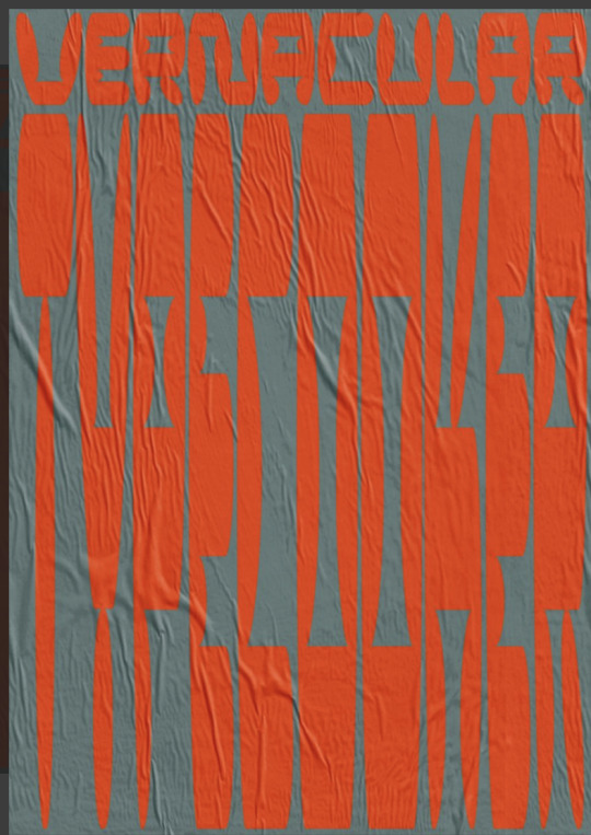
They use Type Cooker to translate vernacular typography on the street into a set of typefaces (Ibrahim, 2020)
I was drawn to their work because of the colours and textures they use and the movement created by digitally liquifying lines and letters. I really like the bold colours that they use and I want to consider being bold with my colour choice for this project.
Neocha.com. (2020). A Font of InspirationNeocha – Culture & Creativity in Asia. [online] Available at: http://neocha.com/magazine/a-font-of-inspiration/ [Accessed 14 Feb. 2021].
www.itsnicethat.com. (n.d.). “Hanzi is more than type to us”: KauKau’s design output is multicultural and multilingual. [online] Available at: https://www.itsnicethat.com/articles/kaukau-graphic-design-280519 [Accessed 11 Feb. 2021].
Ong, J. (2019). “Hanzi is more than type to us”: KauKau’s design output is multicultural and multilingual. [online] www.itsnicethat.com. Available at: https://www.itsnicethat.com/articles/kaukau-graphic-design-280519.
0 notes
Photo
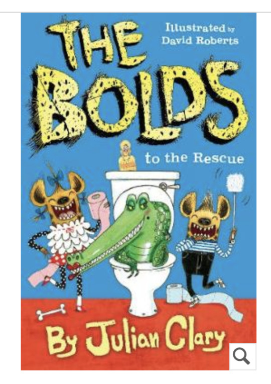
The 3rd book cover i chose is the bolds illustrated by David Roberts. I decided on this cover because i’ve chosen Talking Turkeys for my book cover which also mentions a few other animals throughout. I like the animal stylised typography, I feel like typography will be a difficult one for this cover because its not something i’m interested in but is required for the brief.
0 notes
Photo
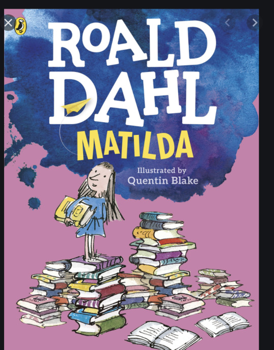
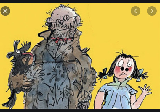


The Second cover ive chosen is Matilda by Roald Dahl illustrated by Quentin Blake.
I chose this cover because again it displays colour and a simple sketch. I like how he has added the texture of the ink splodge as a background to the title. I want to add some cleaver texture possible from analogue experiments to my cover so this is something that has sparked ideas.
Again the title and author are very prominent, everyone knows Roald Dahl is a great author for kids so his name being in large font is an eye catcher especially for adults or for children who have read his books before. It sells the author which is a smart move.
1 note
·
View note
Photo
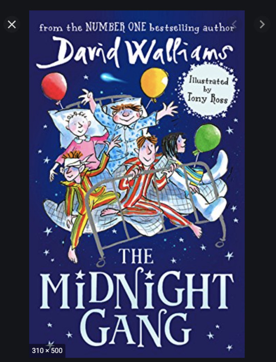
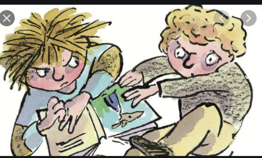

The first cover i’ve chosen is The Midnight Gang by David Walliams. This over was designed by Tony Ross along with the illustrations below.
David Walliams works with Tony Ross and Quentin Blake who both have similar styles of illustration. I chose these because these books are colourful and the drawings are sketchy which i think appeals to the target audience of 8-12 year olds. The characters are exaggerated and funny and the text on the book is clear and precise without being condescending to the age range; (big block words that would be more suitable for a younger age).
The cover gives an indication of what the book will involve and what kind of characters you will read about and the style and tone of the story, without giving too much away which entices the reader to want to know what’s inside.
0 notes
Photo
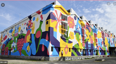
Milford Co.Donegal
Locate. Magical. Propellers
Overall, I am happy with my final mural. My strengths in this project were experimenting with photography and being more creative in thinking how to represent the words without directly drawing them This added depth and texture and challenged me to be more innovative. I’m happy that I incorporated the analogue work into the final digital piece. I’m proud that everything has thought and meaning behind it even small details.
Looking at the final mural again, it needs to be scaled down to give breathing space to the elements so it’s less overwhelming and busy. This would give it better readability.
I think in the future I need to work on scale and also document in my sketchbook along the way to show a more experimental process of ideas, because i ended up working backwards for the submission with digital screenshots, rather than showing a lot of thoughts and possibilities from my head.
1 note
·
View note
Text
Javier Mariscal
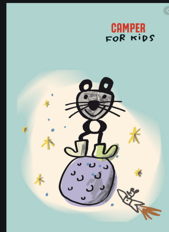
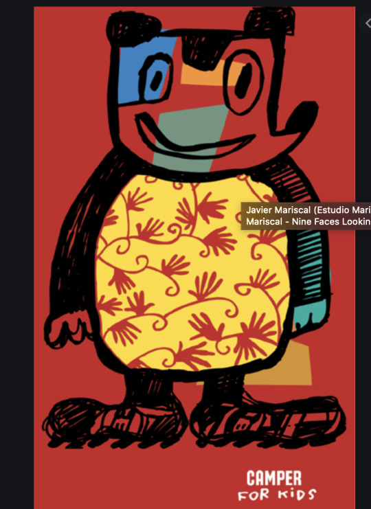
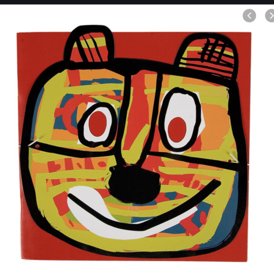
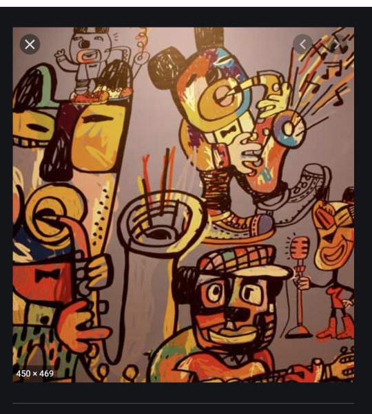
Reading Making Great Illustration by Derek Brazell i found the Javier Mariscal who they’ve quoted saying “its very important to play, play, play. And right now people are starting to understand”
His approach to illustration is to create fun lively exciting work while communicating feeling to the audience.
I feel like this reminded me to just have fun creating and not overthink the beginning process too much until it needs to be refined.
His illustrations for Camper a kids show company is fun and expressive and free, it’s also enticing to a child with its simplistic characters and colour which is great marketing because obviously as a kids shoe company they want the child to want it which inherently influences the adult to make the purchase
0 notes
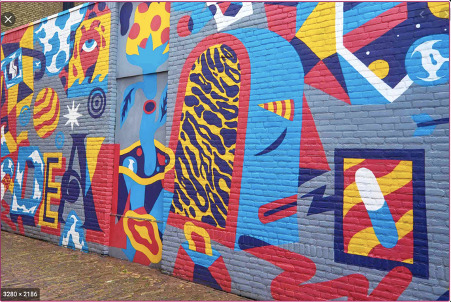


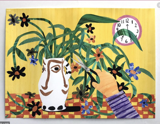
Photo
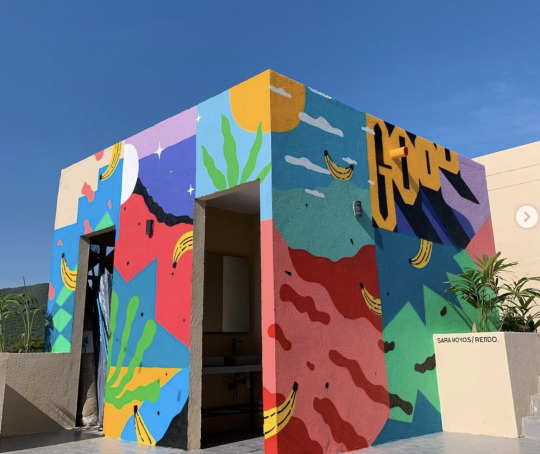
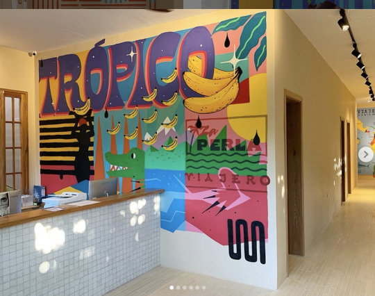
Sarah Hoyos is the second muralist i have chosen. I really like the eye catching colour pallets she uses and how she layers images together. The colours are all really bright and happy and inviting which i think is important when you want to grab someones attention.
She uses repetition of images and colours to tie it all together. I fell liek she is quite good at creating slightly abstract scenes which holds your attention for a little longer
https://www.instagram.com/sarahoyos_/
0 notes