#ALSO I AM SERIOUS ABOUT THE BRUSH SIZE THING SAVE YOUR WRISTS NOW. TODAY. DONT LET IT HURT THEN TRY TO FIX IT LATER
Note
hello hi!!! grfhvhghr i am in love with your artwork so much you cant believe-- i wanna ask if you have any tips on how you lineart and colourpick?? no pressure to answer tho, have a great day/night!! again, love your art <33
hi!! thank you for your kind words!! since i got asked about these a lot, im answering this for all the other ask asking about lineart and colour tips too! You can see some previous post here.
also i could only give out tips that work for my drawing style - which is heavy lineart / colours pop up the line (believe it or not it's American comic book style. ppl cant understand why my art doesnt really look like usual anime/ Asian webtoon style, even though it is still clearly anime / Asian webtoon style, but when i told them it's because im drawing these by studying American comics, no one believes it either lmao.
i do study but i do my own things too, so most of my art inspo is really unexpected to ppl, but they r really where i learn things from, cuz i dont even go to art school TT_TT).

Changing the brush size will help you achieve thick/thin lines better without having to put pressure on your wrists. Keep your hold relaxed and let bigger brush size give you the thick strokes.
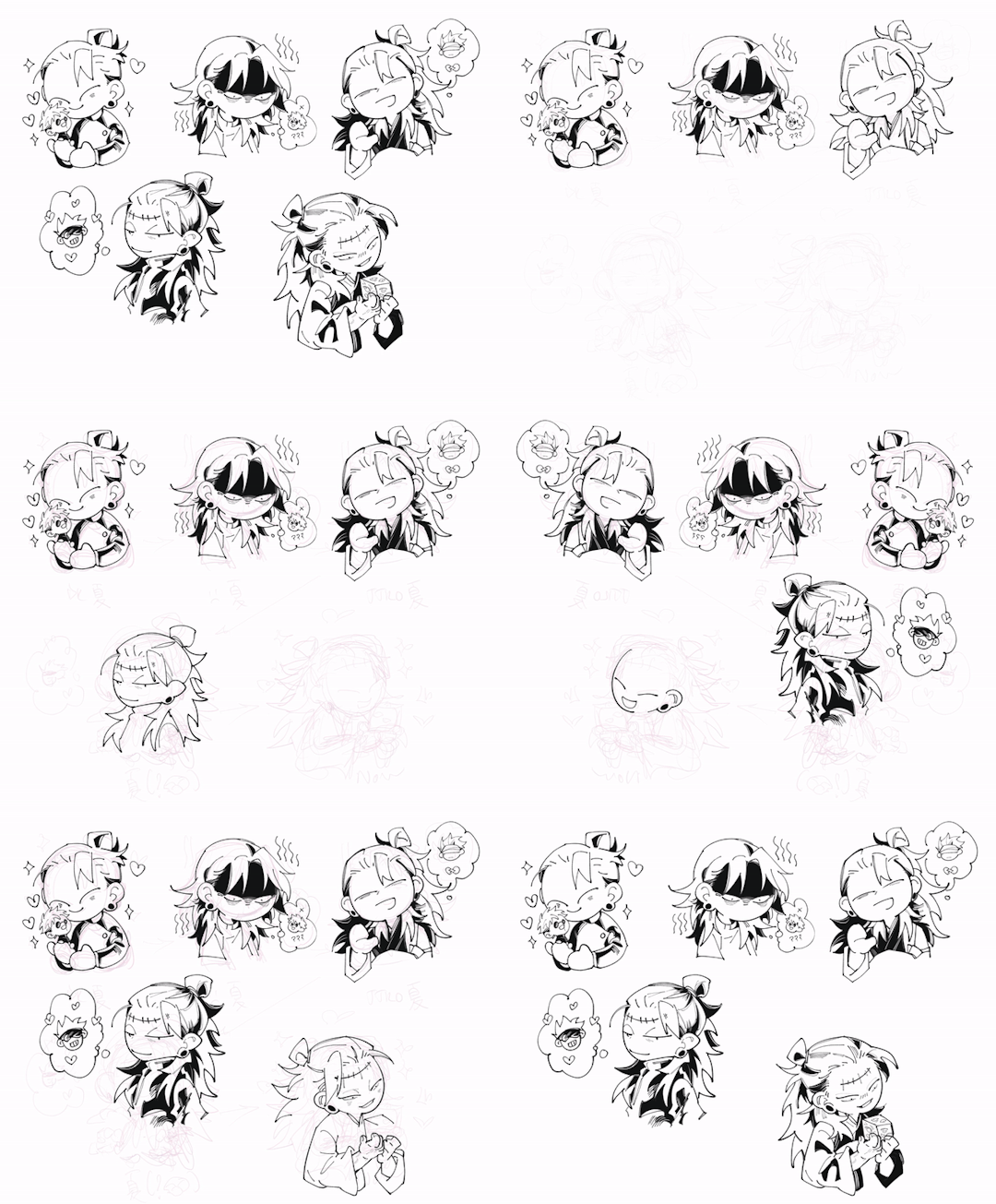
I like messy sketch, to me the sketch is just an outline shape to fill details in when i do the line, it also gives more freedom to wriggle as i draw! cuz i dont really plan out everything from the start, just wing it as i go, so a lot of my work is actually very spontaneous.
that leads to this point: when you do the lineart you should start deciding which colour style you want from it to adjust the details amount. the ink shadow blocks in my art aren't there randomly, i adjust them to best complement the shape language and colours.
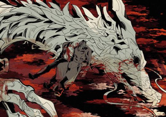
for piece where i want the line/shadow to...idk hit (?), the colours are almost flat with textured brush adding depth to them, so the inking is the shading, thus there are more details in the lineart / ink blocks.

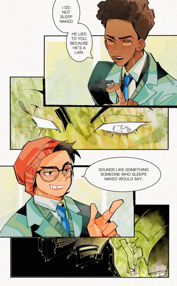
for the video above and piece like this where i want the colours to be clear and pop out, the use of ink blocks are minimized and i do the shading during colouring process. but! the ink blocks can still make some places pop very nicely! just use in moderation!

when doing the base it's good to keep the colour on the left side of the colour wheel (low saturation), but as you do shading and lighting, try to spread out evenly so it won't look washed out.
toggle around with hue and saturation slider as you go! the key is always adjusting! you're making hundreds of decisions at once, being conscious of your choice in why a line or a colour should be in a certain way will help improve your process a lot! (i think you can tell which art i turned off my brain and just draw for stress relief ........ which is also a valid way to draw and sometimes the result might surprise you! but for more serious stuffs i try to be aware of most of the move i make. it's problem solving, yeah?)
i find that one way to keep your art from appearing too...yellow in the end (which is sth that haunted my ass for a long while) is always aim for cold tone, so if you accidentally make it warm either way in the end it won't be too warm (and yellow :cry:)
well that's all the stuffs i can think on top of my head. sorry i can't give more advice on colour picking cuz it's sth i don't really know how to give advice on???? i think my colours now are still pretty lame haha........ if there are still any questions i'd gladly answer within my ability, though im very slow to answer ask ( i do read and be happy at all of them tho!)
#art tip#ask#anon#albi’s art#ALSO I AM SERIOUS ABOUT THE BRUSH SIZE THING SAVE YOUR WRISTS NOW. TODAY. DONT LET IT HURT THEN TRY TO FIX IT LATER#aughhhhhhhhh *rub my wrists*
291 notes
·
View notes