#ANF THE DRAMATIC CHANGE FROM YELLOW TO BLUE????????
Text
THIS is my favorite moment in the music video
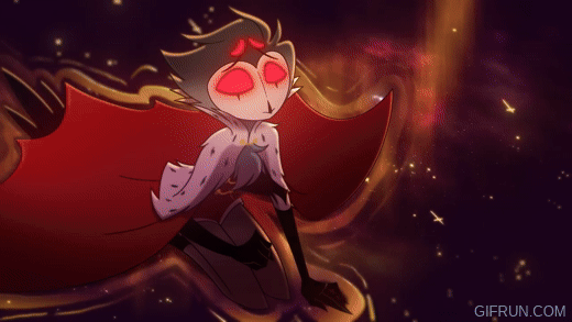
#THE COLORS ARE SO PRETTY#ANF THE DRAMATIC CHANGE FROM YELLOW TO BLUE????????#YES#stolas#stolas music video#stolitz#stolas goetia#helluva boss
5K notes
·
View notes
Text
10/05/20
Artist research
These are artists that I had chosen at the begining of the project, if I had gone another route with my project there would have been more of these types of artists in my work.
Dimitra Millan
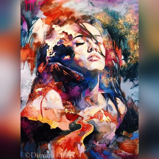


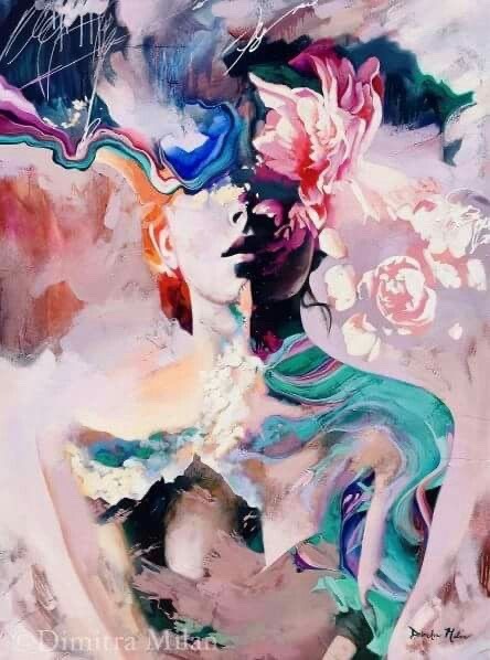

I love all of these pieces as whole finished canvases. I love how abstract the backgrounds are and how all the focal point is in the people and the objects in the main front of the piece, it is where your eyes are drawn to. My eyes are drawn to the colours, how bright they are, the way the colours are put together and what they are next to. In the first 2 pictures I love how vibrant the orange and the yellow is and how bright it is against the darker blacks next to it, the colours don’t get muddy because of the bright yellow. I love that both of the pieces use purple in the background. The second picture has more of a lighter greyer colour to the purple and the first picture uses a more pinker purple, and in this piece she uses a brighter more recognisable purple across the neck of the lady in the middle of the canvas. On the first image I love the way the artist has done the trees, as she has used a splattered effect with the yellow, it creates texture and layers up the paint. Whereas on the second picture the splatter looks more like dots and more delicately placed. On the 3rd picture more of the background was shown, this is where most of the colours come out and they really create the depth for the piece as they blend from really dark to the really light blues and the red I like the peach colour that is throughout the piece. The 4th picture the background is more of that one light pink shade and the colours come out in the body portion of the piece this allows the body area to stand out against the light background. The last picture has a very light coffee coloured background and the contrast was in the people and in the way she had decided to put scenes on the mans hair and body and the womans neck with the colours and the contrasts between the colours in the scenes and the colours against the background.
Dimitra Milan’s paintings can be found in private collection across U.S.A, Europe and Asia. Milans’ parents are established artists. Dimitra has been developing her style and ability from a young age, she studied at the Miliana Art Institute in Arizona, this is founded by her parents. She is now an instructor and the co owner of Milan Art Institute. Her paintings can be described as abstract realism with romantic elements to create a dreamy atmosphere where anything is possible. Dimitra artwork envokes deep emotion and is layered with symbolism, she uses love, hope, beauty and a sense of authenticity through her brush strokes.
Dimitra finds inspiration from her dreams at night. She also believes in a saying from Van Gogh, he once said “I paint my dreams, and I dream my painings”
Quotes from Dimitra Milan
“I’m inspired to paint beauty, and to bring more beauty into this world. The world desperately needs more light and truth. I hope my art inspires people to follow their own dreams and pursue their passions. I want my art to touch a deep place in people, and bring them into a higher mindset.”
Peter Terrin or @Terrinart on tumblr
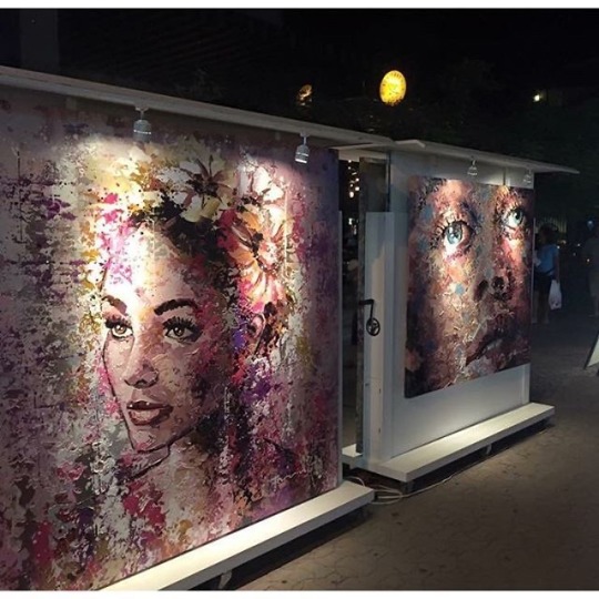
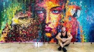


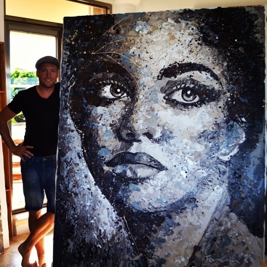
I love the way he uses explosive and dramatic vibrancy. The first picture is of the paintings hanging on the wall inside a gallery. With the lights from the gallery it really makes the colours in the piece pop, especially the whites and the lightest pinks. The darker colours create the shading on the cheek and in the hair and on that one eyebrow. I like on the canvas on the left as it has a abstract background, that reminded me of a grafiti wall background. I like how the piece on the right is further back in the picture but you can still tell it is a face and that it is directly proportional. The second picture is very colourful I am sure it uses every colour in the colour pallet. However it isn’t totally a colour bomb the way he has position the colours, with the green on the one side and then the blues on the other side. I believe the blue side has the most vibrancy between the bright blues and the orange, then all the colours with the dark black of the under beak and the neck. On the green side, the lighter lime green blends into the blues really nice. But the light green would blend in to the yellow of the beak if not for the white at the very edge to contrast it. The really darker colours come in to the sides of the lady’s face and then the bright blue of her irises and the bright white of her eyes really makes your eyes focus on that. The way that the artist uses pinks and oranges to create shading in the face is an amazing skill. The 3rd image is the only image that I picked that was the only square one I chose. I really love how the artist uses the lyrics to Your song by Elton John, in the top right corner of this piece to break up the background from being too pink. You really get contrast between the bright vibrant pink and the hair and the shading in her face. The whiteness of the headphones is what my eyes are drawn to first. I love how he uses blues in the face and neck to give it an abstract look throughtout. The blues creates contrasts and helps separate the face from the background, as there is shades pinks in both. The white on the side of the face and the lighter pinks in the background come together. The 4th picture the canvases have a similar backgrounds with the blues and the greens anf the slight pinks. I like the canvas in the left more as it has more darker pinks in the bottom on the piece, I like the way that the face is positioned in this piece with the hands give this piece depth and I believe that the piece on the left looks better than the piece on the right, it just looks more dynamic and it has more of a realistic look to it. The 5th picture is very dynamic as it is just black and white, with greys to blend the two together. It stands out as most of his work is colourful and this one is very striking.
Peter Terrin was born in Belgium on the 13/03/1974.
The concept of art has always been a part of Peter. There was never a defining moment in which art came in and changed his life and no one pushed him in to that direction. It was a very self directed move that determined the course of his life. He has always said “that need to paint has always been as vital as breathing and eating; providing necessary fuel for the mind and soul”.
His passion for creating his work with the subject of people was reinforced through years of travel after graduating from Textile Design School in Belgium. Peter uses his unique style and brushstrokes, also the way he applies the paint to the canvas to capture emotion, mood and feeling through his use of pallet knives and acrylic paint on large scale canvases allows for him to really get the detail in to the faces.
Peter has a very disciplined approach to his art and his practice. He believes it the the same dedication needed for his other passion as a triathlete and his core belief that life is beautiful, he believes that all of these things need the same amount of paitince and time.
0 notes
Last Seen Blogs

omarcperez
Untitled
dryeyeguys
Dry Eye Guys

shankarestates123
Property dealer in Bhiwadi

loming12345
Untitled

ballade-de-limpossible
Mes désirs sont désordres