#entm tumblr cycle 11
Photo


ENTM Tumblr Cycle 11 Winner
Hi again folks! I spent my Tuesday raid slot crunching numbers in Excel . The judges and the community winner are the same this cycle. I am proud to announce the winner of ENTM Tumblr Cycle 11 S Rank Model Search, with a combined score of 107.37. is:
Ni’ko Shae!
Congratulations to our newest S Rank winner!
In second place, with a score of 117.02, is Kota Tumet! From a humble beginning to a double win rally in the end, Kota also is our most improved this cycle.
In third place, with a score of 122.18, is Yomu Kazul! Yomu didn’t win a specific round, but he had a series of 2nd places finishes that were just shy of winning that helped carry him through to the top three.
In 4th place, with a score of 151.3, is Adam Evershot! Some early wins helped balance out lower ranks in later rounds.
The top four are invited to join Rongi Pongi’s All Stars cycle, hopefully starting up in late summer 2019!
Credits and Accolades
Thank you for following us for Tumblr Cycle 11. As we close out this chapter in ENTM history, I encourage all of you to follow us on our Instagram as well and join our Discord. I will be reblogging announcements made on our new website here to Tumblr, so this place won’t be dead any time soon!
Thank you to our Cycle 11 models for giving us your time, your creativity, and your love for these last eight weeks. I know all of you pour your heart and soul into your craft, and it shows with every beautiful shot you share with the world.
Also a heartfelt thanks to all our judges and guest judges for this final Tumblr cycle. We couldn’t make ENTM happen without your hard work and commentary each week.
This Cycle will be permanently archived on our new website, including all our critiques. Please look forward to it!
8 notes
·
View notes
Photo

ENTM’s Tumblr Cycle 11 Round 3
Boss Monster
Final shot/placeholder.
2 notes
·
View notes
Photo

ENTM Tumblr Cycle 11
Final Round 8: Spring Fever
Hi folks! For our final week this cycle, we’re book-ending it with another set of seasonal scenic shots. The models were asked to go out and share their love of spring in all its glory. They also had to use one of the bright or pastel filters to keep things colorful and cheery! Eight models have provided their takes on spring.
Links to the Imgur album and the Google Poll will be provided on the first reblog.
The polls will be open until 10:00 PM EDT on Tuesdaay, April 23rd. The winner for this round and also the winner of Cycle 11 will be announced on Wednesday, April 24th!
7 notes
·
View notes
Photo

ENTM Tumblr Cycle 11
Round 2: Faithful Steed
Hello folks! For our second round in this cycle, we brought back the old staple theme of Faithful Steed (the all-in-one pack of the Mount round), but this time with a twist! Our models had to take their favorite mount out into the world and somehow take a beautiful screenshot entirely in black and white or sepia tones. Free style was allowed for this round (scenic or battle.)
Our monochromatic models still sparkle and shine even with the lack of colors, though, so it’s that time again - to vote for your favorite!
The Imgur album and Google poll will be included on the first reblog.
Voting will be open until Tuesday, March 12th at 10pm EDT. The winner will be announced on Wednesday at noon!
13 notes
·
View notes
Photo

ENTM Tumblr Cycle 11
Round 3: Boss Monster
Hi folks! We’ve already hit week three of Tumblr Cycle 11. Things are running a little late today because your hostess Katarh Mest underwent surgery this morning. I’ll spare you the gory details but let’s just say I’ve got a lovely green bruise and Angelina Joli’s jawline for the moment.
For this week, I asked our models to go out and take a picture with a Boss Monster. If you are not familiar with the card game of the same name, it is an inversion of the classic D&D party vs monster setup - in which you play a monster trying to lure hapless adventurers into your trap.
Well, these adventurers may have fallen for the trap but that didn’t stop some of them from fighting back!
Please view the images on our Imgur album, and then vote for your favorites in the poll. Voting for this round will be open until Tuesday March 19th at 10PM EDT. The winner will be announced at noon EDT on March 20th!
Links to Imgur and Google will be included on the first reblog.
#ffxiv#ffxiv screenshots#entm#entm tumblr cycle 11#eorzea's neo talent management#yeah I had my two bottom wisdom teeth taken out today
11 notes
·
View notes
Photo

ENTM Tumblr Cycle 11
Round 4: Crystal Makeover Closeups
Now that we’re all done screaming over the first keynote address at JP Fan Fest, let’s take a breather and have some makeovers!
Crystal Makeover is a staple ENTM round that has three simple rules - throw on some striped face paint, swap out your usual hair color for something unnatural, and get UP CLOSE AND PERSONAL with the camera. Most importantly, this is a makeover, so our models were asked to deviate from their usual style and dig out some new duds from the bottom of their wardrobes.
Please view the images on our Imgur album, and then vote for your favorites in the poll. Voting for this round will be open until Tuesday March 26th at 10PM EDT. The winner will be announced at noon EDT on March 27th!
Links to Imgur and Google will be included on the first reblog.
10 notes
·
View notes
Photo

ENTM Tumblr Cycle 11
Round 6 - Cosplay: Fairy Tales, Folk Tales, and Legends from Around the World
Hi folks! For the Week 6 challenge, I brought back the ENTM staple of cosplay but this time with a twist. I asked our models to pick a fairy tale, folk tale, or legend from anywhere around the world, and cosplay that! (This was partly inspired by having to explain what Groundhog Day was during the February Monthly challenge, hehe.)
So the models have gone out and given us some great costumes and cross cultural promotion all at the same time. I highly recommend reading the listed stories if you are not familiar with them.
We also have special guest judge Momoko, co-host of Instagram Cycle 2, who engaged in this IG cycle’s guest judge tradition of playing along with the models for the round! So please be sure to check out her shot at the end of the album.
Links for the Imgur album and Google poll will be included as the first reblog.
Voting will be open until Tuesday, April 9th at 10:00 PM EDT. The winner of this round will be announced on Wednesday the 10th at noon!
8 notes
·
View notes
Photo

ENTM Tumblr Cycle 11
Round Five: Doors
Hi folks! For our Round Five theme, we have a new scenic shot inspired by Judge Ona’s entry into Round 6 during Cycle 10: Doors. I asked our models to go find a door - and door - and try to tells a story using the door as their primary prop. The result was a wonderful variety of shots, indoors and outside, brimming with emotion.
To view the images, please visit our Imgur album. And then go to our Google Poll afterward and vote for your favorites! Links will be included in the first reblog.
Votes will be open until April 2nd at ~11:00 PM EDT. (You get an extra hour this week because I have a work trip.) The winner will be announced on April 3rd at noon!
Also, a brief announcement: In preparation for ENTM’s new website home, we will be taking submissions for website art on our Discord channel, and also having a group photo shoot on Lamia server at 3:00 PM EDT on Sunday, March 31st. Submissions will also open on Sunday. A link to the Discord is also included in the first reblog.
8 notes
·
View notes
Photo

ENTM Tumblr Cycle 11
Round 8: Spring Fever
Hi folks! Our last round for this cycle - and on this platform - was a celebration of the warm weather and beautiful spring flowers. I asked our models to go out and take a pastel shot with some pretty spring plants. Our models all showed off their joy for the season, but the most joyous this round was:
Kota Tumet
Congratulations! The judges all loved how serene this shot was - truly the embodiment of a warm spring day.
Our guest judge this week was Twilight Dove of ENTM, the runner up of YouTube Cycle 2. Thanks Twilight!
The winner of ENTM Tumblr Cycle 11 will be announced in the NEXT POST.
In the meantime, for all our models, we have critiques and parting comments from our judges below the fold.
Judge Twilight
Adam Evershot: This shot feels a bit like I'm having a romantic spring stroll through a glade with a Prince Charming. I really enjoy the depth of the shot with you (or us?) walking toward the forest, but I wish that there was a clearer destination in those trees. The hint of the building just off to the side is a nice touch, but I wish it were a little less obscured by the foliage near the camera. I do think you've done a good job giving us a gentle action shot, and the overall feel of it makes your choice to be facing away from the camera work in your favor.
Kota Tumet: What a lovely screen shot! You look so serene, I can almost smell the flowers and feel the gentle breeze just looking at you! Great job, this shot really says "spring"!
Ni'ko Shae: I'm surprised you were the only one to take a photo in the rain! You're very on brand with your choice to take a photo with the purple flowers of the Sylphlands, I do feel like the background might be a bit too busy, and the lights behind you are a tiny bit distracting, but you placed yourself well in the frame and you lit yourself in a way that helps you stand out even though you're dressed nearly entirely in purple as well. Good job!
Peaceful Ursa: The softness of this photo helps make the bright, saturated colors feel more springy when they could have otherwise threatened to be a bit more on the summer side. I'm not sure how I feel about your choice to use the ripped paper border, it feels a bit distracting having such a jagged edge when everything in your picture is soft, it would be nice to have seen a version of this without the border or with a more pastel color filter to make the border a little less of a stark contrast. Your glamour is very pretty (My favorite glam of the round!) and fits in with your surroundings nicely without letting you fall into the background, nicely done!
Luma Lee: The colors in this picture are so nice, and I love the framing with the flowers and tree! My one gripe is that I feel that you're so far to the right that the left side of the screen feels a little empty. I really do like how this image feels though, like you're so happy to be looking at these flowers under a warm spring sky, good job this week!
Yojimbo Kasai: This photo is calm in a way that says spring to me, but the colors and the lack of any flowers or obviously green foliage make it feel a little cold. I'm torn between feeling like this image is early spring, or a warm summer's day, I really wish there was some more foliage around to really drive that spring vibe home for me. Your pose and the way you're framed in the picture are nice though, it makes me feel like pulling up a lawn chair and joining you in what I imagine is a very pleasant afternoon nap!
Yomu Kazul: Spring is the season of love, and that is what your picture looks to be all about! I love the concept of the botanist being seduced by the spring nymph, its a unique take on the theme and you did a good job with it. Your position is obviously front and center with your extra blending in with the scenery nicely without completely disappearing, the colors are nicely balanced, and you're both framed well in the shot. Nice job!
Haila Wetyios: The colors in this shot are very nice and vibrant, and your choice to use red was bold and sets you apart from most of the other contestants! When it comes to your pose and position in the frame, I like that it feels like you're welcoming the viewer to your spring garden, but I wish you'd positioned yourself in a more intentional looking way, right now you're inhabiting the space between center and 1/3d and it feels a little awkward to me. I like that you set up your garden for this shot and made sure it felt springy, and I feel like with a little bit of fiddling around with your surroundings and your position you'd have an even nicer image on your hands.
Judge Ona
Haila, my love! How beautiful you look in this image! Surrounded by such lush vegetation and greenery! You absolutely fit the role of Balmung’s flower lady! I absolutely love the variety of color and the outfit choice as well!
Things to consider: If you’re going to do a dead centered shot, make sure its exactly centered, otherwise it can just create just enough of a feeling of disquiet causing the image to appear weaker. Also, having the roses next to you with just a tiny bit of blurring, would have made you stand out much more.
Things I love: Your glamour is spot on for a spring scenic theme. I also love how you created a scene that highlights so many beautiful colors, and still allows you to be the focus of the image. The time spent to create the scene has helped to fit your own narrative, while also following the theme of the round.
Haila, it was wonderful to be able to be on this side of the table for this round of Tumblr and to be able to give you my critiques on your beautiful images.
Peaceful: You look absolutely adorable here Peaceful. I want to be sitting next to you smelling those wonderful flowers. I hate to say it, but you are the definition of Peaceful here.
Things to consider: When given the prompt of scenic, it is ok to include more of the background and have yourself be less of the focus. That being said, your use of the frame here, takes away from the overall image, and really the image would have been stronger without it. I would also caution you to use the sharpening tool wisely, as you are blurrier than the foreground flowers. This, unfortunately caused you to be less of the focus, putting the focus on the flowers and not you.
Things I love: I love how you dyed your clothes to match the color of the flowers. I also love your pose and expression. It really creates that calming feeling that I feel spring flowers deserve. Lastly, kneeling in front of the tree added an additional level of texture and dimension to the image.
Thank you for turning in such beautiful images this cycle and really taking a chance with your big Roe self. I have enjoyed following your progress and hope to compete against you in the future.
Yomu: When I first looked at your image, I was utterly confused. What is this 70’s show scene doing here and why is Yomu love drunk. Then I saw the girl in the background. I guess you’re taking after Bambi and are officially twitterpated.
Things to consider: Your extra blends in a lot. Because of this, I didn’t understand your emote. If the viewer isn’t analyzing the image, it may not be as strong as it could be. I would also try to keep all glam consistent, especially if you’re going for a theme in your image. Maybe try to put your extra in the same clothing style as your character next time.
Things I love: Your glam. You picked such a difficult theme to get right, but you pulled it off. And honestly, I have NEVER seen anyone use this hair style! The location is beautiful, and it definitely fits the overall Scenic Spring feel
Yomu, it has been so wonderful being able to see your images improve through the competition. I would love to see you try another cycle and continue to improve your images!
Ni’Ko: Another beautiful image Ni’ko, and finally a chance for you to use that signature color of yours. I would have expected nothing less of you then to find the most purple field and take the most purple picture you could get.
Things to consider: You have this very obvious purple theme, yet are wearing bright green pants. The blue butterfly seems a bit out of place as well. It blends too much, while also being this completely odd color that doesn’t quite match the rest of the image.
Things I love: Your pose is perfect for a cat who actually enjoys the rain. I also love that you chose rain showers for your image. Although we think of bright cheery flowers for the spring, we need to remember the importance of the rain through the spring and. I also love how you chose to do this image at night. It is definitely a different approach to Springtime then the other models. It was an excellent choice to say the least!
As you already know Ni’ko, it has been a pleasure to be your judge this cycle, and I cannot wait to compete against you in future rounds!
Judge Nadede
Adam Evershot: What wouldn’t be spring without a walk out in nature, taking in the fresh air of spring and seeing everything growing back anew. It is one of my favorite parts of spring actually. While a lovely shot, I feel that it is a bit on the overlit side, possibly due to a combination of outdoor lighting, filter and any extra lighting (if any) you used. You’ll just have to play around via trial and error to get the lighting to where it doesn’t look too washed out. That said, I do wish that there was some form of rim lighting used, especially around your head as it blends in with the tree and rock in the background. Nice job all-in-all and very glad to see you improving big time from last cycle to this.
Luma Lee: One thing that I enjoy about spring, all the pretty flowers that are in bloom. Not too bad of a job from you this week. The bottom half of your image, the lighting I feel is nicely done. The top half though is blown out from the sun being right over you, giving you that blinding flash of light in your image that is a bit distracting. From how your shot is set up, I feel as if though something should be in the foreground, like a minion or a bug that you’re trying to find in the flowers. Something like that would have given your image more of a story to tell. Just something to keep in mind, how can I tell a story within my image? Overall though, you’ve shown improvement throughout the cycle and feel that you’ve taken in from feedback given. Good job.
Yomu Kazul: Looking at your image, I was trying to figure out as to why you seem head over heels in love. Took quite a few times looking at your image and then I saw her, the forest nymph (?) in the background. It is an interesting play on the theme “Spring Fever” as it looks as if you are feverishly in love. Lighting around you I feel is pretty good. I do wish that your nymph had some lighting around her so that she didn’t blend in so well with grass. It took me a bit to even see her and wish I could’ve seen her sooner. Overall I think you did pretty well this week and throughout the cycle. You seemed pretty consistent in my book. Great work.
Kota Tumet: Such a lovely portrait of you this week. Your lighting, glamour, filter and pose compliments each other very well this week. Even the DoF (depth of field) is nicely done. This would be the epitome of what springtime means to me as it is something I try to do when possible (next to spring walks).Sitting outside, soaking in the sun with sketchbook, a good book in hand or have just music playing. I can say compared to your image from week 1 until now, all I can see is a vast improvement on your shots (I was blown away from last week’s image btw). Should be proud of yourself and keep up the great work.
Judge Terrini
Adam: This is a very pleasant stroll through the shroud and you have great framing here. I do have a couple of nitpicks here, one being the tower in the distance being a little hard to see, it would have a bit more impact if you could have had that a bit more prominent, the other thing being that your chosen filter seems to leave the shot's colors a bit uninspired. Something that made the colors pop more would have suited the warm colors in my opinion. It may have also brought out the yellow of your hair more instead of let your head fade a little into the background.
Haila: You seem to be all out into spring planting and I like that impression. The colors are really bright and bold but I would have liked to see you a bit more involved with the garden setting than simply being "welcome to my home." Also the choice of orange-red in your outfit makes the orange-red autumn trees in the background a bit more prominent and underwhelms the spring theme. A bolder red to match the roses or a more pastel or neutral color would have tied things together and downplayed the hint of autumn behind you.
Kota: Such a pastoral place to sit down and relax. I love the garden you found to take a seat in so much, but I think it might have been nice to have an outfit that was a slightly more pronounced pink or even a blue to tie in with the sky as you do fade a bit into the beautiful scenery. Besides that though, definitely a very strong shot overall. Lovely composition.
Yojimbo: I love this pose and the trees surrounding you are quite lovely, but the colors and contrasts do not leave me thinking spring. The abundance of white is more reminiscent of winter, the blue striped lounge is a hint of summer and the brown of your outfit seems more akin to fall. On top of this, your depth of field is focused on your torso when it would be best suited to be more focused on your face and arm in the forground. Individually I love all the elements here, but they do not come together well to fit the spring theme.
Judge Wulf
Well, you did it! You’ve reached the end of an ENTM cycle! I’m very happy and proud of all of you, and while I’m not fully able to give a personal message to each of you, I want you each to know how proud I am of you for following critiques, growing, and improving! You’ve made this another fun cycle for me to judge, and I can’t wait to see where you all go from here!
LUMA The first thing I really want to praise you for here how very in-focus the foreground is, and how much having those close-up plants really enhances the picture! The lighting is so bright here, and that’s a wonderful thing to communicate the feeling of spring. I feel warm and fuzzy all over just looking at this picture, and I’d say it’s one of your best so far! The up angle you have along with you crouching down makes me feel like I’m seeing this from the POV of a caterpillar or flower. I’m very happy with how far you’ve come throughout this cycle, and I want you to keep exploring new and creative ways to tell your story!
NI’KO You always have a knack for turning a theme on its head and showing me what I least expect, and this week is no exception! Yes, everything is dark and lacking the usual colors that one associates with spring, but in this picture? I am totally on board with it! The butterfly really stands out as a color contrast against everything else in the picture, including you! It’s a clash I can’t take my eyes off, and I’m willing to bet that’s the point! Also, after so much change, you’ve chosen to come to the final round in your signature Ni’ko look, which I certainly missed! Keep bringing your unique ideas to whatever you do I look forward to how you surprise us in the future!
PEACEFUL I love this frame – so much. It makes anything look like it was taken out of an old storybook. You do an excellent job with using this frame to create interesting edges to your photo. Your photo itself this week is also one of your strongest. You’ve clearly been listening when it comes to lighting, motion, and angles! One thing I super love about your photo this week is how you’ve made yourself compliment your surroundings – the purples and blues on you really serve to blend yourself in with the lavender around you! Peaceful, you’ve really improved over these past eight rounds, and I can’t wait to see you go further! Remember all you’ve learned this cycle, and make sure you keep trying new things!
YOJIMBO I can hear the soft piano and the breeze that accompanies this picture. I also think I hear the ocean, given a bit of your attire! Seriously, this picture is so relaxing! You very much take up most of the frame, but you’ve got a lot of little details on the edges that clue us into the full picture of what’s going on here. The blue sky, the corner of the umbrella, the tree branches, and the little bit of bench all come together and we fill the rest of it in with our mind. This is a good example of not needing to show everything, only what’s necessary. You’ve done an excellent job this cycle, and I hope you stick with us and keep showing us what you’ve got!
5 notes
·
View notes
Photo

ENTM Tumblr Cycle 11 Call for Models
Attention fellow screenshot enthusiasts!
Katarh Mest is looking for 10 models willing to commit to 10 weeks of high fashion, low fashion, silliness, and screenshot shenanigans for Tumblr Cycle 11!
Tumblr Cycle is the kinder, gentler ENTM. This contest focuses on not just taking shots of fabulous fashion, but on building a scene and telling a story using the in game camera tools.
This contest will run during the months of March and April.
8 weeks of images voted on by judges and the community each week
No eliminations - all models stay all 8 weeks!
No mods or reshade allowed. No edits or post processing. However, /gpose in all its current glory is encouraged. PS4 players are welcome!
You must have access to email to participate, as that is our primary communication method during the contest (along with Discord. Link to follow on first reblog.)
To audition, please take 3 screenshots of your character and email them, along with your character name and your server, to eorzeasntm at gmail dot com.
A scenic shot with your character and a nice background out in the world or a dungeon
A battle shot or battle effects shot with your character (and battle glitter!)
A head shot / waist up shot of your character. (Gimme a nice close up, as this will be your model card if you are selected to participate.)
Auditions are open until February 8th. Our judges will deliberate, and the cast will be announced by February 15th!
16 notes
·
View notes
Photo
ENTM Tumblr Cycle 11
Round 7: Action Movies
Hello everyone! I’m out at Six Flags so I had this set to auto drop today. This means the live links are included, so oh well no search hits for us today.
For our challenge this week, I told our models to go out and grab a still from an action movie - I wanted this most badass and epic looking battle shot that they could take. Our models fought primals, dungeon bosses, and even dragons, and the result was some pretty epic looking battle action as far as I’m concerned!
Our guest judge for this round is none other than the father of ENTM, Rongi Pongi.
Voting for this round will be open until Tuesday, April 16th, at 10 PM EDT. Results will be announced Wendesday the 17th at noon! (Good lord, where is the month going?!)
Link to the images on Imgur: https://imgur.com/a/9eBC4at
Link to the Google poll: https://forms.gle/rDoP6LdGwtmHYQcC8
5 notes
·
View notes
Photo

ENTM Tumblr Cycle 11
Round One: Winter Wonderland
Hi everyone! Katarh Mest here, bringing you the first round of ENTM’s 11th cycle! As I said in our introductory post two weeks ago, this cycle we have nine models competing, four full time judges, and a rotating guest judge every week.
The first round’s theme was Winter Wonderland. I asked our models to go out and find some visible snow, either in the air or on the ground. This round was designated as Scenic, so that also meant no enemies and no fighting - just our wonderful models against a beautiful background.
Our models took to this theme with cool confidence, and the result was nine stunning images with plenty of snow all around!
Community votes are a vital part of ENTM Tumblr Cycle, so please follow the link to the Imgur album (link will be included on the first reblog) and then go to the Google poll to vote for the images, in order of 1 through 9, with 1 being the strongest this week based on composition, theme adherence, and character placement.
Voting will close on Tuesday, March 5th at 10:00 PM EST. The winner of Round 1 will be announced by noon on Wednesday March 6th!
6 notes
·
View notes
Photo

Cast of Tumblr Cycle 11
This cycle, we have 9 models competing for 8 weeks to take home the crown in our 11th S-Rank Model Search!
Adam Evershot of Famrit
Bria Rirsa of Mateus
Haila Wetyios of Balmung
Kota Tumet of Zalera
Luma Lee of Balmung
Ni’ko Shae of Cactuar
Peaceful Ursa of Zalera
Yojimbo Kasai of Goblin
Yomu Kazul of Gilgamesh
ENTM Tumblr Cycle 11 will begin on March 1st, 2019
7 notes
·
View notes
Photo

ENTM Tumblr Cycle 11
Round 7: Action Movie
Hi everyone! I’m busy preparing the new ENTM website, but that kind of work doesn’t stop a cycle in progress!
Last week, I asked our models to go out and film a scene from an Action Movie - to get me a visible opponent and give me the coolest, most epic pose they could come up with to match it. Our models set things on fire, got revenge on their foes from Boss Monster, and even re-enacted an old samurai drama. But the model who put together the best action movie last week was:
Kota Tumet
Congratulations! The decision to use the cinema frame was a smart choice, and by narrowing it down you gave this shot an excellent panoramic feel. The judges liked the colors and lighting effects, as if you are seconds from everything behind you exploding. Great job!
Our judges this week was the original host and founder of ENTM, Rongi Pongi.
There is ONE MORE ROUND to go in ENTM Tumblr Cycle 11. For those not on our Discord, next week will be our final cycle that uses Tumblr as a platform. Tumblr Cycle will instead return next fall on our website, rebranded as ENTM Classic Cycle, with an integrated blog post, image galleries, and polls instead of using third party platforms. ENTM Instagram Cycle will continue to be hosted on IG, of course, and YouTube cycle isn’t going anywhere either. But the decision to move to a bigger blog means More Cycles! More models! More hosts! Overall, much more ENTM!
Stay tuned for an announcement regarding our launch party in May!
For the models (and everyone else), please continue along for critiques from our judges.
Judge Terrini
Luma: You have managed to capture yourself beautifully here. Your colors pop, your pose is fun, and the lighting makes things exciting. The explosion zeroing in on your opponent makes this shot seem tense and it's captured at a delicate time where it's still prominent and doesn't completely obscure your opponent. The framing and pose makes it hard to tell if you are attacking or running away in shear terror. A wonderful shot, but a bit more cause and effect in the posing would enhance the scene.
Ni'ko: It doesn't really come as a surprise that you love the pink and purple Mindflayer, Ni'ko, and the framing here his brilliant with the opposing sides in direct opposition and the action frozen with dynamic interaction. The only annoying factor is that the bowstring is running through your chest.
Peaceful: A lovely dynamic action pose you have here, and the setting and costume choices are all appropriately thematic. However, the biggest trouble is the light of your skill turns much too bright against your outfit and it matters all the more with the black and white filter not allowing color to shine through at all. It might have been a bit more bearable if the shot was in color, but I think the color of your robe being so bright and white would still be an issue. Also, with the framing, I feel the upper left corner of the picture feels empty since the angle promotes looking between the bottom right and lower left. Adjusting the angle to be less from the ground and more even might help frame the buildings better, or using the cinematic movie strips would help contain the empty corners more.
Yomu: This shot really grips me and makes me think of a simple shepherd picking up a spear to defend his flock from a giant predator. The fact that all the sheep are grazing peacefully in the bottom third, the threatening beast is in the middle third and you are aiming to strike in the top third makes this lovely pecking order that just adds to the intesity of this picture. My only disappointment is the black sheep's snout is cut off, but that's a nitpick for the sake of nitpicking, I honestly think you couldn't have arranged a better shot.
Judge Wulf
Adam! That’s a lot of fire! And it doesn’t look like you have much on, I hope you don’t get burned! I very much love the initial reaction I get from this picture: it’s very out of the box and surprised me! After that though, I find myself a bit...confused. Everything is pretty muddled, honestly, and I feel the fire is a major culprit due to this. I must admit, I am having a hard time seeing your enemy and even you to an extent. I’m very proud of you for taking a risk, but I’m not quite sure how well it paid off here. As a takeaway for this week, make sure your visibility is Priority Number 1! Even if this week didn’t do it for me, I know you’ve got some serious creativity, keep going!
Haila: I really love the shine that this shot gives, it almost has a sort of dreamlike feel to it! My eyes follow to the staff-crossing between you and Shiva, and that’s a really nice touch! Here are my notes for this week: while the opinion on back shots is mixed, I don’t think it was the best option for you this week. Since I can’t really see your face, and there’s only mostly the side of your body visible, a majority of my attention goes straight to Shiva.
Yojimbo: Ifrit is always a classic when it comes to fight scenes, I’ve noticed, and I think you’ve really taken the trope and made it your own! My favorite part of the picture is the cut line across Ifrit’s face, that has to hurt! It provides a nice line of sight to see both where you are and where the line of action is going. Here’s my note this week: you are very far away from us! I’ll admit being this far zoomed out from the action makes me as a viewer feel a little left out. It also doesn’t allow us to see you: who should be the star of the shot! I can tell you’re starting to explore outside of your comfort zone, though, so keep it up!
Yomu: PROTECT THE SHEEP! Seriously though I’d like to start off my saying that including the flock in this picture adds a level of story that for sure wouldn’t have been there without it, and for that I’m very proud of you for adding in that little detail. You’ve got a nice line of action here with each of your key players all looking in the right direction: Ratholos is looking at the sheep, and you’re looking at Ratholos. My eyes can either go up or down the picture and it feels nice to look at and tells a cohesive story. As is the nature with jump actions and some back shots, though; you are very hard to see. Yes, you are fighting a big dragon here but remember: you are the star, and how can you be if the viewer can’t even see your head? I feel like this picture in profile would have added that level of visibility to get around this, but from this angle I lose a bit of you in that regard. Awesome job this week, though, and keep your storytelling skills up!
Kota: This is the kind of shot I expect to see either right before and explosion, or before the logo flashes across the screen. I get a sense of punctuation here, this is either a major beat or straight up the end of something big, and the black bars really accent that with a widescreen view. This is a nitpick, for sure, but my eye keeps being drawn to the light behind the boss on the left side; it’s very bright. This is probably due to the filter used and also a necessary sacrifice for the image as a whole, but just something to watch out for. Good job this week!
Judge Nadede
Bria Rirsa: This is pretty nice shot from you this week. The expression that I see with your eyes are what one would expect to see when two swords are clashing together.The lighting within your image is nicely done. What I do find myself wishing is that you had chosen a background that perhaps felt more menacing or went with the outfits that are being worn. If/when you are trying to tell a story through the use of images, just ask yourself “do my surroundings work well with the story I’m portraying?” Another thing that does detract from your image is we have a furry little friend photobombing the lower right part of your image and what looks like might be a slight tear/clipping in the back of the other person’s outfit. It is sometimes the smallest of details that can detract from image, especially if it appears out of place. Overall good work.
Haila Wetyios: While I feel that this is a pretty shot from you, for some reason I feel as if though you are playing it safe. The image itself is done nicely with the lighting and the composition. You even managed to get a nice image of Shiva as well. To me, though, it does not say “action movie” much at all. I find myself wishing that there was more going on within your shot. To me, this appears as if you’re having a conversation someone and perhaps making some form of pact with them. I want to challenge you to play with your shots more. I’d like to see more of a variety from you than what you tend to go for… where your back is facing the viewer or giving us a ¾ back shot and an image that is vertical. There has been a very few times where it has been the opposite but I’d rather be surprised at what is different than seeing something the same, if that makes any sense to you. Like I said, this is a nice shot but it is too safe for me. I do look forward to seeing what you come up with for next week.
Ni’ko Shae: The scared little kitty isn’t so scared of the mean old monsters anymore! Heck it even appears that the monsters are not too thrilled with the blinding light the tip of your arrow is making. The angle of the bow and arrow and the direction of your face helps lead the eye to the monsters and how the monsters are looking back up and you brings the viewer’s eye back around. The lighting in your image is also nice done and I am glad that neither you nor the mobs blend into the background. It was kind of bold for you to use the same dungeon from an earlier shot for a different theme, but put the two together and they tell a story that works. Overall I think you’re doing a fairly good job and looking to see what you will do next week.
Peaceful Ursa: Out of all the images I have see from you this cycle, this one I really do like and has become a favorite of mine this week. It appears that you are taking feedback and putting what is said to use, and it shows in this image. I am happy that you paid tribute to the old black and white samurai movies. I do wish that you had used the cinematic border. I think it would have made an even bigger impact with your image. The lighting in your image is almost spot on even though just a bit more on your face could have helped. The fog in the background also helps with the mood of the scene and helps separate the mountains in the background with what is in the foreground. Having your image at an angle helps give your shot a more dramatic scene as well as help helping guide the viewer’s eyes around. Overall nicely done and good job on improving each week.
Judge Ona
Adam: If “epic fire battle scene” was a thing, Adam, this image would be the definition. There’s smoke and flames and a two people battling it out right in the middle of it all. But where all those things are epic, I don’t really understand what is going on. Are you being shot? Are you dodging the fire? Also, I am finding it very hard to see which enemy you are fighting. I hate to say it, but the effect is too strong, and I feel that I have lost Adam in the mix.
Things that I would work on, changing the viewpoint of the image. If you brought the enemy closer to the front, or yourself, and created a depth of field from the placement of yourself and the enemy it would have created a more dynamic image overall. Additionally, if you placed yourself farther from the camera point, we could have seen your face more.
Things that I love about this image, the glamour fits and I love the feeling of movement from you Adam. I wish I knew what was causing that movement though. I also love your use of the same effect through image, just be careful in the future that the effect doesn’t overtake the shot, and leave the viewer seeing more flame than Adam.
Bria: I don’t know how you managed to get the swords to stop so they were notched like this, but its an awesome screenie! I definitely feel the battle that is happening and the struggle that you and this unnamed assailant are having!
I am left wondering why you chose this location? To me, it doesn’t feel like it was chosen on purpose, and it doesn’t do much to add to the story. Likewise, it feels very constricted with the object in the background. With so much cut off I can’t tell if it is a ship, a landing platform, or something else. Finally, your minion is just chilling in the tall grass by your feet. I have a feeling they would have ran away if a fight were happening.
Things I love about this image: Your glam is beautiful. You kept two main colors, the black and dark red brown. I also love the use of this sword to create the notched effect with the other blade. I also like how you positioned the image so that you are facing the camera, but engaged with the enemy. I would make sure that you are paying attention to the entire scene and positioning of your weapon so that it doesn’t restrict so much of your face.
Luma: What a strong image this week Luma! That explosion is so powerful and definitely fits the definition of epic! I really love how you have put the judge’s critiques to use and grown. This week definitely shows that!
While this image is your strongest yet, please continue to be mindful of things such as cutting off limbs and other body parts, and the physics of your clothing. I know it’s a lapel on your jacket, but this angle puts it directly across your face, and it detracts from your expression.
Things I love about this image: Your glam. You are so very steam-punk-esque and it works with battling a big robot! I also love the lack of saturation in the colors of the image. The yellows and reds of the explosion are bright enough to make the viewer take notice, but that single whiteish flare brings the viewers eye back to yourself. I also love the use of the depth of field here, creating more focus on yourself and blurring the enemy in the back just enough to keep the focus on yourself. Just make sure your WHOLE self can be appreciated and include all limbs.
Kota: By the Twelve this is a gorgeous image! This long frame, and the use of purple tones throughout has created an epic steam-punk image for this round. It is a strong and well-crafted shot!
In looking over the image, I struggle to find much that could be improved upon. Even though everything shines with that beautiful purple sheen, your character has movement and sharpness to her that brings the eye back to her. I do wish I could see your whole body, and possibly a mask that we could see your eyes may have played to this stance more.
Things I love about this image: The color palette, especially since it creates a feel for the whole image. The glam goes perfectly with this type of boss and definitely plays into an epic movie battle. The lighting is spot on and is perfectly placed. The position of your body to the screen and the use of this frame are also very strong for this week’s theme. Overall, there really isn’t much I can say other than, Well done this week!!!
Judge Rongi
Haila: I knew this was Haila’s image before evening scrolling down enough to see her. Very signature Haila. Shiva is looking down at you, and the crossing of the staves shows some interesting interaction, so the viewer is looking back and forth and in between. The balance between you two is done really well, and the fade from white to dark blue not only in the background but also the two characters is beautiful.
Peaceful Ursa: I love the black and white old movie style of this shot. And this famous battle scene that everyone knows is really done well. I love the wisps of smoke we can still see that seem to be rising from the ground after you slid across it. The weakest part of this image is that I can barely see any faces, but everything is else is great.
Adam: I am not really sure what I am looking at in this image. I can’t tell if the fire is coming from you or the monster, what monster that is, or what your pose is. I think having everything a little bit more defined in the image through use of a different angle maybe would have been a stronger choice for this image.
Bria: I would have loved for this image to be twisted back behind the male model just a few inches more so we were looking over his shoulder and into your snarling face. The look between you all and the crossing of the swords is great. My only question is why this background choice? This shot would have been perfect in a fiery or purple-aether area.
Luma: I love how your character is riding the explosion and saying Yea!! As the boss explodes. Very movie scene feel to this shot. The straight lines coming out of the boss do make my eyes go back to him each time instead of you, but its still a strong enough image.
Ni’ko: This is a strong image. Great balance for all creatures involved. The lines bring my eyes all over the image, and since everyone is looking at you I am still brought back to you at the end of the day. The only part of the image that needed the tiniest tweak is that your character is looking perfectly right instead of inward, so while all the mobs are looking at you, you are looking past them. Still, very strong.
Kota: A Scene straight from a movie. It looks more like you and Alexander are a team then battling though, and that little explosion on his leg doesn’t scream action packed like the other shots do this week, but you do look awesome firing a shot and then looking back at us like “I’m gonna need a bigger gun” haha. I’d have gone all out with explosions to make this an even stronger image. Great colors.
Yojimbo: We’ve had Ifrit rounds in the past, so not only are you competing with all your fellow Cycle 11 models but also the memories of 2 past cycles. I really like that you have the camera in position so that we see the outer ring of fire and then the rest in the background, but I wish you had been closer to the camera because you are too small and far away. The right half of the image is entirely dead space. I’d have cut all that out and zoomed in more on you.
Yomu: Those little innocent sheep don’t even look scared as the dragon swoop in from above. Haha. Your shot this week has a great story with it, and is balanced well. Some judges don’t lie back shots, and others do, and I am one that does – but in this case not only is this a backshot, but we can’t even see your head! So I do wonder if there had been another way to at least the back of your head some how.
2 notes
·
View notes
Photo
ENTM Tumblr Cycle 11
Round 2: Faithful Steed
For Round 2 I brought back our classic “on (or with) a mount” round, in which our models were asked to go and take a shot with their favorite mount in land, sea, or sky. This cycle, we took out all the color to make it a bit more of a challenge. The model who showed us how faithful their mount is in black and white or sepia this round was:
Adam Evershot
Congratulations! That’s the second week in a row for a win, so this is a strong start this cycle for returning competitor Adam! The judges and the community were nearly unanimous this week - all the elements of this image came together, and the night sky made your sepia colored bird really pop out.
Our guest judge this week was Vederah of Aetherflow Media, who was a primary judge for Cycle 10 and a rotating judge during Instagram Cycle 1. Thank you, Vederah! Check out her blog, The 13th Deity of Glamour, if you haven’t read it before. And be sure to visit Aetherflow Media dot com, one of ENTM’s community partners via Hydalaen International.
For all of our models, and their beautiful steeds, the judges have some feedback below the fold.
Judge Vederah
Halia: I love the sense of regality this shot portrays- tells a story about the character through the glamour and mount choice alone. I do feel like the shot is a touch too dark. While I like the spotlight type effect, I think the lights could’ve been spaced out just a touch more so the details of the horse’s face aren’t lost in the background.
Adam: This was a very smart mount choice here. I love how the particle effect of the mount melds nicely into the starry night sky in a way that makes them look like constellations. The only thing is I wish the image was a touch more moved to the left- allowing the moon to move into the right portion of the shot. It looks a bit heavy in the lower left hand corner. Having the moon up to the right would tempt the eye to glide across the entire image more.
Ni’ko: This image reminds me of the last shot of an intro from a 70’s sitcom in the best sort of way. Like I expect someone to come up with some sort of clever theme song about a guy and his mischievous chocobo counterpart. Just makes me smile. I think I just wish a different expression emote would’ve been used on the character- something with a bit more personality to really capture the dynamic of him and his bird.
Yojimbo: I’m a sucker for sunbeams- so I find the lighting in this shot to be quite nice. There was so much potential here, but I think some of that got lost by being so zoomed in on the bird. I think if the camera was moved out more so we could really appreciate the wingspan of the bird (and potentially see what the character is looking at) this picture would’ve been much stronger. Careful with overly centered shots as well. Centered images are great for showcasing glamours, but for most other screenies tends to make the picture feel really cramped.
Kota: I really like how cohesive this shot is- everything from the glam, mount choice, and backdrop all look like they belong together. I just wish the picture was zoomed out some more and panned a bit to the left. That would prevent from clipping the mounts wing and would keep the eye moving across the entire image.
Bria: I know some people prefer high levels of contrast in their black and white images, but I’m the kind of gal who just loves that greyscale. So the coloring of this image is really a treat for the eyes. My only complaint is that the shot should’ve been zoomed out or moved much lower. When the prompt is for a duo mount/character shot, I prefer to see most, if not all, of the mount.
Yomu: I really like the backlighting effect of this shot. Typically Im more of a fan of seeing all the details and wanting them lit, but this just really works for the image. I just wish there was more happening in the background. The dense fog helps the contrast, but also makes the shot feel very stagnant.
Peaceful: I enjoy the level of greyscale here, as well as how the glamour used matches alongside this mount. However this image does seem very busy- mostly because of the background choice. Not only is the character in the center of the image, but so is a large building in the background and taller trees in the foreground. It’s just a lot competing for the eyes attention. A quieter background would’ve drawn more focus on the roe and his steed where it should be for a prompt like this.
Luma: I like the sense of humor in this shot- cat looks like it’s struggling to hold on for the ride of its life. I just wish that there was a bit more to the image. The background is very dark, and flat- so it removes some of the life and brightness that your characters movements are showing.
Judge Kusuh
Bria: I love how elegant your shot looks this week! Your black dress combined with all the frills and flowing mane of your horse makes it seem like you are a part of some great royal procession or something similar! Normally I’d be hesitant to use another photo in a winter landscape after it being last week’s theme, but I think that for this shot it works! I’m excited to see you outside of the cold environment next week though! Your head facing the camera is what makes the shot for me this week. This is a very simple and straightforward shot, so it’s the little details that are going to stick out! Can’t wait to see what you’ve got next week!
Luma: you instantly get points to uniqueness and making me laugh. I’ve seen many version of the “Noble Steed” theme and I must certainly say you’ve taken a very different approach to it! Now, let’s move on to the actual composition of the shot. Your expression alongside leaning back on the dodo really fill the picture with a sense of triumph and valor; a real juxtaposition of what we the viewer see! My main critique here is of two mall things: lighting and setting. For lighting, black and white can be tricky to ‘color balance’, but I notice your shot has a little bit too much brightness on the left hand side of your model. You can tell this my how the border between your white shirt and the background tends to get a bit fuzzy. Just play with the light balance a bit and see what happens! Next is setting: yes the joke is funny and I love it, but afterwards I have to ask, what else is going on here? With the way the shot looks, I can’t tell where you are or what you’re doing, you’re just kind of in a nameless void. Basically, I feel like I could be slotting out your background for anywhere, be it the fringes, Foundation, Kugane, or the like, and nothing would be lost, or gained. When the main theme of the shot is so simple and readily apparent, then I’m going to start looking at other things to keep me interested in the shot, and without any context given via a specific location, it just leaves me kind of lost. Those are only minor things, though, and I still know I’m going to remember your shot for quite a while!
Peaceful, if I was asked what your theme was outside of the given one, I’d say it was “Metallic”. The metal armor and wings on your mount alongside your own plate armor really tie you and your mount together, which I think is a very important thing; if you are with another photo subject, I like the idea of you all matching. The Shire Gear also matches the setting of the Hinterlands which is another thing that ties your picture all together. Here’s my main suggestion for you this week: you appear to be in motion, given that you are both flying and your mount is moving forward. However, you are centered in the shot, which actually cuts out any feeling of movement for me. This is where the Rule of Thirds comes in quite handily actually, as having yourself either to the left or right would preserve the sense of motion; it would look like you were either just entering or leaving the shot. As a rule of thumb to remember: center balance is good for portraits or still subjects, while off-balancing the photo is good for dynamic and mood shots. You’ve shown marked improvement already from last week’s shot to this one, so I can’t wait to see you go further!
Yomu: I’d like to start of by saying that you’ve really nailed the ‘menacing silhouette’ look here, both with your armor, and the way you’ve set up your lights! This plus the perfect placement of where you’re standing makes me imagine that I’m out on a dark and stormy night, I hear strange sounds in the distance, I’m all alone, and I look off into the distance to see this image! It’s spooky, but in a way I really enjoy and want to see more of! I’m sure I sound like a broken record at this point in the critiques but I feel my suggestion for you is one that I’ve found applies to few pictures here: the background doesn’t add to the picture. The theme of being on/near a mount is a very simple one, and to balance that simplicity, every other part of the picture needs to be a deliberate choice. I will say, for this one, the clouded background does feel very deliberate, but I’d need some sort of confirmation on that. If the stormy background was by choice, then my main suggestion would be to zoom out a bit so can see if you’re in the air or just on a really high hill, I feel like I need that knowledge. Either way, wonderful shot this week, and I can’t wait to see more!
Kota: Honestly, I didn’t think of the Manta Ray as one of the first things that comes to mind when I think “faithful steed” but you really convince me! Every element here plays into the tying the whole picture together: the Sui-no-Sato attire, the underwater elements, and the palace glowing in the background all remind me that in this setting, this guy is the typical faithful steed! The fact that your mount also takes up most of the frame also really conveys the size of this sea pancake. Here’s my main suggestion for this week: I know from experience that sepia is a filter that can be really hard to work with, and there are some parts around your face and body that are kind of dark. Having a softer light (like...type 2 or 3) closer to you would balance some of that out! My suggestion is pretty minimal this week because I’m really happy with what you put forward, and I can’t wait to see what you’ve got planned for the next shot!
Judge Terrini
Adam: You have really nice framing for this shot and I love the looks of this Sepia tone to keep things in with a sense of heaven and earth. Your glamour keeps you popping for the most part, but one down side is you legs don't stand out much and your bird fades into the rocks below you. If you had a little more distance between yourself and the rocks you would have avoided the blending from making the shot sepia.
Bria: I don't get much meaning out of this shot except a lady out for a leisurely ride in the snow. You look very striking, but the grayscale makes your mount fade into the landscape and I do not get a sense of comradery that the theme of "Faithful Steed" makes me think of. The Elemental does give a nice illumination for the composition but it doesn't add much for the story.
Haila: This is a very nice use of the Sepia tone by making the Underwaterscape look like it might be on land. The glamour choice connects you with your choice of setting and the coloring helps you keep a stark contrast to your background. The framing gives an impression of a Lady escaping from home but looking back with worry and concern, as if leaving something important behind.
Kota: Your appearance here makes me think of a warlord to rival Yotsuyu. Your lighting is used well to highlight yourself and your horse, but the glamour choice at this angle isn't the most flattering with the clipping. Still a nicely striking image.
Luma: The simplicity of your background is a bit underwhelming, but the expression and playfulness in riding the Dodo is just delightful. The story you're spinning just warms my heart with all the details on your glamour and lighting used to highlight in the monochrome.
Ni'ko: I love how you really brought home the idea of just starting out here in the Shroud, wearing your starter gear with a starter chocobo in the starter zone. Your framing is spectacular, but I think you might have been able to play with the lighting a bit more to pop out in the sepia. Still a lovely shot that plays with the nostalgic monochrome beautifully.
Peaceful: You look awesome with this regal bearing, but you still need to watch your composition. Pay attention to the flow of the picture and ask yourself about everything you see. Are you trying to frame something with the raised wings and do you want to do that? Make it meaningful. Does the dome add to the picture or should you angle the shot so that it's not in frame? Are there any elements of yourself that aren't standing out from the background? If there are, you can add lighting our adjust the angle so that element changes to have a contrasting backdrop. Keep improving!
Yojimbo: The shadowing outlining with the lens flare of light is a lovely effect here, but the pillar of rocks directly behind you ruins the effect a bit and detracts from your style. The left of the image is fairly empty and the framing would have been nicer shifted to the right with that pillar to the left of you than directly behind you.
Yomu: You are a striking figure in your dark glamour on your dark horse against the light backdrop on the light ground. I love the image of you climbing up from the right of the image but I would have liked to have something to the left to imply where you're going and give me a bit more to enjoy here.
Judge Ona
Haila: I am in love with this image. Your composition is spot on. Normally, I don’t like images that are super centered but this one works perfectly. I love the spotlight effect on this, highlighting your face and the horse. I love the shine across the top of his (her?) mane and the draping of the barding.
Your dress matches fantastically with the flowing barding of the steed. It compliments the other beautifully. Your headpiece may blend a tiny bit too much with the background, however it does not detract from the overall image. I love how you are not looking at the viewer. Its almost as if you are sitting on top of this noble steed, proud and wondering where the day will take you.
I would have loved to see a different background. I do not know how this location adds to your image, and although it does not necessarily take away, I feel as though a different location could have added more depth and told a larger story. It looks like it is outside of your home, but I cant quite see enough of it to tell.
Overall, however, I absolutely love this image! Amazing job Haila!
Adam: If someone asked me to capture a bird in flight, I immediately think of outstretched proud wings soaring into the sky. You have captured this idea in this one image! It is fantastically lovely and I am utterly impressed that you somehow managed to make the bird look, well, proud. Smug may be a better word!
Adam, this use of sepia tone is fantastic! It really helps to accentuate the moon and stars and provide a lovely warm feeling to the image. If this was done in a b&w color it would have definitely felt colder and less carefree. I absolutely love how the bird’s body follows the same curve as the mountain range. My only real nit-pick I have is that the birds right wing seems to be paper-thin at this angle. I don’t really know how to fix this, other than to rotate the image, but that may have ruined the composition altogether.
Your depth of field plays to this images’ strengths by sharpening just enough to have the small crisp stars, while causing the aural blur of the bird’s effect. I would have liked to see the tiniest bit of light or separation between the ridge and the underside of the bird, as they tend to blend together the littlest bit. Keep up the stunning images!
Yojimbo: Yoji! That sun flare is beautiful! I love playing with them myself! I love the use of them in JJ Abrams films, and I think that is why they are of special significance to me! Regardless, I love how the flare peaks through the space between Heaven on High and the bird’s wing. Its great placement! I would have liked to see more light on your face and the bird, however. I also would have liked to have you looking at the camera, or just not away from it. Don’t get me wrong, the sun flare is smexy and all, but this competition is about YOU! Next time, try spinning the camera around to throw a light on your face and the breast of the bird!
Final thing, when taking images of a bird in flight, it is important to capture them looking like they are actually flying. When the birds wings and pulled up as you have in this image, it appears to be landing, not necessarily taking off. If you pause the wings when they are outstretched more, it will appear more graceful and less constricted. Overall, I love your placement of the bird in the image, and I absolutely love the contrast in color. I look forward to seeing your next image!
Peaceful: You look so stoic in this image. Your glam and the armor on the horse, both heavier and more battle ready, pair well together. I imagine that you are flying to a battle on your faithful steed. I do love how the wings are outstretched, however they are clipped at the top of the image, and I would have liked to see the entire wing, especially with how centered the image is, to really put the focus of the image on the steed and you, not just you.
I am wondering why you chose this location, as it is a very busy location. With so much going on behind you, it almost causes your facial features to blend a little too much to the building behind. I love the Gubal Library for screenies, however, I think a different angle or a different location would have worked better for this image. I would like to see you play a little bit with the depth of field in your images. Everything is very clean and crisp, and I know too much can be just as bad as none-at-all, so I caution you to go all out and blur the entire background. However, if you play with it a bit, it might work enough to your benefit to give a slight blur to your surroundings and allow for you to shine a bit more.
I look forward to seeing your image next week!
Judge Nadede
Halia Wetyios: This is a nice image from you this week Halia and like how it is lit. However, your image this week is too centered and feels very static. Wish that you would have turned the steed towards the audience so we could get a profile of your mount instead of a side view. Also would have liked for you to maybe do an emote or have your mount moving so that the overall image not feel very static. I would suggest to find ways to make your image interesting and find a way to tell a story with it instead of just a pretty shot. I look forward to what you come up with for next week.
Adam Evershot: Adam your image this week was one of my favorites. I do wish that you had put a lil bit more light to bring out your face more and along the bird’s underside so that it did not blend in with the rocks in the background. Look into examples of rim lighting to get an idea of what I’m talking about. Keep up the good work and can’t wait to see what you come up with for next week.
Ni’Ko Shae: Another one of my favorite images for the week. It is a very cute, almost candid shot that you have taken. I do like how you and your chocobo are interacting with each other. The only thing that I found distracting in your image is the baby choco at the bottom of your shot. Always ask yourself if there is anything in your image that might even seem remotely out of place, and if so, should I chance it or take it out. Overall, good job.
Yomu Kazul: Yomu, another one of my favorites this week. When I think of black and white images, I tend to think of stark contrast between the lights and darks within the image, which you have going on here. Only thing I can think of that I would have liked to see you try would be figuring out how to bring out rim lighting casted onto you, especially on your face to bring it out just a bit more. Keep up the good work!
Kota Tumet: And yet another favorite of mine for the week. Good job Kota. I like this a lot more than what you had submitted last week. I actually like the use of space within your image. Only thing that I suggest working on is lighting, especially close to your face to bring it out just a bit more. I also like the fact that you were the only one that did a mount suited for underwater and have an underwater shot. Good job and keep up the good work.
3 notes
·
View notes
Photo

ENTM Tumblr Cycle 11
Round 5: Doors
Hi everyone! Last week I asked our models to go out and take a scenic shot with a door. This round proved extremely challenging because it’s, well, a door. How do you tell a story with just a door as a prop?
Turns out that all of our models found an amazing story to tell, and the judges were sincerely impressed. But the model who made their door into a true co-star was:
Adam Evershot
Congratulations! The judges were especially impressed with how you successfully integrated in the door, your extras, and your filters into a single cohesive mini action story. Just because the shot is “scenic” doesn’t mean it has to be serene!
For all the models, the critiques from the judges are below the fold. Our guest judge this week was Elessia of Fat Cat Chronicles, who is also a model competing in Instagram Cycle 2. Thank you Elessia!
For the rest of the ENTM community, please head on over to our Discord channel and submit a Monotone 3 shot for the new website, which is going live on May 1st!
Judge Elessia
Luma Lee: I love the faded out sepia tones you used in this shot to convey the story. I like how the door is a prop rather than just, well, a door. The movement in the shot gave the female miqote a ghostly feel, like you can’t stop her from moving through the door and disappearing. The blurred effects really work nicely in this shot. I really felt the emotion. No critiques really, except you can’t see your characters face but that works.
Yumo Kazel: The white of your sleeve leads the eye up toward your characters face to the door, which naturally leads your eye up, but the white draws you back down to the real focus, your character. I love the door you chose, it has a lot of detail and you captured it well with the vertical shot. Great composition. I enjoyed the warm tones in the shot and the lighting. I am not sure what you are trying to convey in the shot but overall nicely done!
Yojimbo Kasai: Is he waiting around for someone to come do his laundry 😊 I like the pop of color on your character that immediately draws the eye to him. Great glamour! The overall composition is ok but there is no drama, but it does make you wonder what he’s thinking. The lines in the shot do draw you back to him but the door doesn’t seem all that relevant; it’s just a door.
Adam Evershot: Is something going to burst through that red door that is chasing you?! The line effect you added adds to the pace of the characters and the expression on your character’s face conveys the fear. The colors you chose for the glamour of your extras really works, tying the entire scene together. You did an amazing job incorporating the prompt (the door) into your screenshot. And I love the expression on your character’s face.
Haila Wetyios: Without reading the caption, I was struck by the destitute feel of this image, her shoeless feet, her dirty face, her seemingly tattered appearance. It looks like she is texting someone to come help her but getting no response. The door is tightly shut behind her and the scene looks cold and uninviting, with the colors of her glamour. I love that her hair is light, so your eye goes straight to her face and back to her legs and then back up. The lines of the door lead the eye back to her, the true star of the photo. Well done on the composition. I really enjoyed the photo even without the caption about the matches.
Ni’ko Shae: The fence leads you straight to your character, with his lavender outfit. There is a lot to take in in this photo, but it works as far as composition. It’s technically a very well thought out piece. I love the sky and the lighthouse in the distance with the light shining. He looks to be a traveler passing through and doesn’t truly belong in the setting and the doors are closed to him. He is the star of this tranquil shot. However, because he doesn’t really fit in the shot with the colors of his glamour: I picture a more rustic outfit to really fit into the scene…it looks to be a farmstead, why not make him apart of the setting?
Kota Tumet: The colors in this shot are lovely. They tie the composition together. The oranges and the purples and reds really pop against the dark sky. My eye is drawn to the staff she holds because of the bright white and then the white of her sleeves leads me to the characters face. I like how the path leads up to the door so your eye naturally wonders up it to the orange door. Very well-done composition. The angel of the staff goes with the gothic church in the background. Nice job.
Peaceful Ursa: I love how you use the door in this shot, knocking. The entryway is well lit and welcoming with the warm light, so I would assume he will be let in. The door is massive which goes well with your character. I like the vertical perspective so you can take in the whole door and the intricate transom above. Very well done. I think you did a nice job with the natural lighting, with just enough light to see your character’s face.
Judge Kusuh
A note to all the models this week: The theme states that you use a door somewhere in the image. I’m going to address in each of my critiques how well I believe you utilized the door, and what its purpose is.
ADAM Your shot instantly fills me with fear-for you! I think this is a great use of motion and speed lines. I also thin the placement of your two companions (or pursuers???) in you picture also is really nice, as it tells the story that they aren’t too happy with you. Let’s look at the theme – you’ve included a door, so I’m going to examine it’s purpose in the shot as a whole. Instantly, it looks like you’re running away from it. If that’s correct, let me toss you a suggestion: get someone to stand near the other side of the door to have it open. Just having an open door will make your run seem so much faster and intense; like you’re running so fast the door hasn’t even had time to close yet! I’m very happy with the improvements you made so far with framing and telling a story, so keep it up!
HAILA The story of the Little Match Girl is one that absolutely CRUSHED me growing up, so your picture instantly evokes a lot of emotion for me right away. I almost never see that specific makeup used outside of a comedic context, so I’m really happy you used it to enhance your image. Using the tomestone emote was also a good choice, but I’d like to note that the caption provided made the emote make sense; it’d probably read a bit less if it weren’t for the context. Looking at the door- to me, it’s there, but it actually takes away from the harshness of the situation. With no indication that she can’t just go inside into the door behind her….I’m wondering why she isn’t. Maybe if you were sitting up against it or it was farther away in your shot it’d seem less like an easily accessed sanctuary? Once again, I love the emotional impact of your shot, so something like that would make it a knockout!
YOMU Yomu, my favorite part of this has to be your expression and how well you’ve lit it. You look like you’re either guarding something, or have just been woken up for something sinister! The tilt of the camera is something that I think works really well, and having a vertical frame also really crops the image around you, giving us your full attention! In terms of door usage – I think you’ve used it well to create a foreboding feel by having it seem so much larger and looming over you and especially the viewer! That plus the use of red color really unsettle me! Something to think about – the fact that you’re looking at something off screen makes me as the viewer feel slightly left out when I have no context of what you’re looking at. It’s not gonna destroy the image – I really like this one still!- it’s just something to keep in mind with future images, especially when trying to tell a story. Great job!
KOTA Not enough people seem to appreciate the Sanctum at night, and I’m glad you took the opportunity to show us how this area can be wonder at any time of day! For this image, it’s the little details all together that really let me enjoy this image, and that’s good for me because it keeps me looking! The first thing that catches my eye is of course you, but then I follow your eyes to the flowers. From there, I notice the sparkles of the cast, which, following them upward, lead me to the lit-up Sanctum against the night sky. In terms of the door usage, I think you’ve shown a good way to include a door without being super close to or interacting with it. Having you at the bottom of the stairs with the camera looking upwards allows my eyes to follow up to the door, and with your holy appearance, assume that you are a member of the church. My note for you this week is a fairly simple one: I’d put a little bit more light on you left side (the non weapon hand) to highlight you more against the background. Thank you again for showing us your work!
Judge Terrini
Adam: Looks like you got caught somewhere you don't belong. Maybe you should have gone to the Dutiful Sisters of the Edelweiss for some pointers on sneaking around town? I love the story being betrayed here, but the coloration just seems off because of the imbalance of bright and bold colors from the door, banners and Yellow Jacket, and duller colors from yourself and the Roegadyn. I can understand that you probably wanted the brown for a "camoflage" but it does seem to detract from you as a focal point with the color imbalance. I'd actually recommend a green because it would add to what I see as a Ranger poorly sneaking around a city. Every element of a picture says something about the story being told, but you also have to have an eye on how they all work together.
Haila: What a poor little match girl! I love how you glamor makes you seem all burnt up with a few embers still alive. It's a nice effext in popping from the image and blending in at the same time. The Portrait ratio does have the benefit of capturing all of yourself and the door, but I think a Landscape ratio with a close up of you while off center from the door would have had a greater emotional impact with the story your telling. It would crop the door and would be a risk on a round focusing on them, but I think the emotional effect would get you a better pay off.
Kota: The Sanctum of the Twelve certainly has one epic door! This is a lovely shot, but I feel like the elements don't tie together well and I don't really understand what makes this door and place so special with your glamor choice since the red is more jarring from the setting than tying you into it. An outfit with less red, or one dyed in pink, purple, or even blue would have tied you in with the flowers, and a staff with a nature motif as well, or maybe even just dimming your spotlight just so that the red isn't highlighted so sharply might have softened the effect. Looking to the door with that pose would also have made the door seem more important to the shot, because as it is now, it's just kind of there.
Luma: "No! Please don't go!" You've captured a lovely vignette here and it really grips me! There are so many little details here that unpack to a satisfying story. The dull filter makes it seem like a flashback, regretting whatever happened that made that lady walk out of your life. The back perspective makes it all the more visceral with the motion blur and limb darkening. The only suggestion I have is if you might be able to zoom in just a bit more and cut out that bit of your forearm? It feels a bit off in the composition.
Ni'ko: Another lovely shot from you this week! You have several doors and a lighthouse and with your expression it seems you're apprehensive about making a choice in life. Your usual palette ties in nicely with the cloudy twilight and the filter allows you to not overpower the shot and add to the thoughtfulness here. I'm not sure if you could have managed to capture the sense of internal struggle with a more dynamic pose though. Your back being turned to the doors does lessen their impact on the image though so if you could have managed to either look at the doors, or be turned to the doors and looking back towards the camera, there would have been more connection there.
Peaceful: I actually really like the look you're sporting this week with the red and white in the reddish blush of dawn. Your pose and gaze bring a lot to the picture with a sense of longing, and your expression makes it seem like it's something you're working towards, like "Someday." It's very simple, but it leaves a strong impression. If you had a pet minion it could fill the floor at your feet and bring a bit more lightheartedness here, since your expression is very subtle and before I looked close the image seemed sad, but your expression actual looks happy and full of wonder under close inspection.
Yojimbo: You look quite dashing here and have chosen an outfit that really makes you pop. I am left wondering though, why the door should be important here? You aren't looking at it, and you are dead center. If you were facing towards the door and were on the opposite end of the frame, the door would at least have some interest to the shot, but I still don't understand any significance here, unless you are trying to Tom Sawyer the laundry and skedaddle...?
Yomu: This is a nice shot and it seems you found something you have not quite been able to process yet, considering that stain on the floor in front of you and the blank look on your face. Using a gate like this instead of a normal door is definitely a nice choice, but like some of the other models, I'm not really seeing what makes this door important for this shot. Are you supposed to have just come through it to this surprise in front of you? That would have more effect if the door were open though... If you had shot this on the other side of the stain, looking at the door, it would seem like if you opened it, something sinister would be found inside.
Bria: (late entry) I like that you decided to go with an open door as so many others went with closed ones. It seems like you are a ninja going in to infiltrate Garlean territory, but I am only guessing at that because of your glamor. We need to be shown more in the vein of stealth and infiltration, like crouching or peering around corners - maybe there's Garlean troops you can be spying on around the corner? Conversely, you need to be careful not to lose the "door" in your framing because the downside of an open door is that someone might not be able to tell that it is a door and not just the edge of a wall. The idea here has merit, it just requires some more fine tuning.
Judge Nadede
Haila Wetyios
I appreciate what you are trying to go for here with the story of The Little Match Girl. While you are portraying the main character from the story just fine, I find myself wishing there was a bit more to your image so that you may better portray the story even more. I say that because it did take me a bit to get what you were going for. Trying to think here on what you could have done. Maybe try to get as much of the light onto your face as possible with the colors set so that it appears the light is from a source that contains fire? Maybe having your eyes looking more towards the ground than at the viewer itself? Maybe adding extras to your scene wearing prim and proper clothing walking/standing around you. I also find myself wondering if another filter would have fit more to the story than what you are currently using, like the echo filter. I again, I appreciate what you are trying for, I just find myself wishing for just a bit more to really tell the story, and I know you can do that. I do look forward to seeing what you do come up with for next week.
Ni’ko Shae
For the most part, this is a nice composition from you this week. That said, I do wish you didn’t cut off your feet in the image. Zooming out just a tad bit more would have helped. I do find myself wondering why you are looking at the door towards the lower left of the screen. Did someone going through it catch your attention? Are you anticipating someone to come out through there? I kind of want to find out the story here. I appreciate the lighting that you have going on here, I do wish that there was a smidge of backlighting to help separate you from the background a bit more. You are pretty close to blending in with the purples behind you and the buildings. Overall it is nicely done and looking forward to what you do for next week.
Peaceful Ursa
Your image this week made me chuckle some. Here you are, knocking on the door and you don’t even notice that the entrance is basically blocked off and what might be a “do not enter” sign attached to it. What is exactly behind that door that has you to the point of not paying attention that you can’t get into the room/building that way? The lighting is nice here. I do wish there was a bit more light on your character and maybe a small bit of backlight to bring you out from the background just a bit more. You are another that can easily blend into the background this week. Keep up the improvements and looking to see what you will do next week.
Yojimbo Kasai
Your image this week makes me really wish that there were full length mirrors in the game. If the game did, it would have helped your image be more interesting. Darn you SE lol. I do like the outfit that you have going. I wish that your image wasn’t so centered though. I would suggest to look into the rules of thirds to try to come up with more interesting compositions. Centered images can and have work, but there will need to be other elements in the image to help balance things out. That is another idea to look for too, composition rules. You appear to also be in a personal room or house. I would maybe suggest playing with the estate/room lighting and then lighting within gpose to see if that might help make something interesting. I see the proverbial hamster wheel going and would love to see those thoughts from the past few weeks come together for you to create a really interesting shot. Keep on taking feedback and looking forward to seeing what is done for next week.
Judge Ona
Luma – I am wondering what is going on in your shot, Luma? Are you saying “goodbye” or “don’t go” or something else altogether? Who is this mystery woman?
I wish you would have used a different filter. It feels as though you were trying to force the image to look towards the door, and although effective, it detracts from the overall image in the attempt to do what could have been done with a well-placed secondary light source. Likewise, the Dutch angle used here is a bit much. I also wish I could see more of your face.
What I do like, is your creativity here. You have used a neutral color scheme, which creates a feeling of despair, and I love how your friend is walking towards the door, creating a feeling that for whatever reason she is heading out instead of back in. I also do love that door as well, it’s a beautiful choice.
Try to use more lighting next time, as well as making sure that your co-star doesn’t steal your spotlight!
Yojimbo – You look like a young man, in his first apartment, unsure of what exactly to do first for a chore. A basket of laundry waiting to be washed, but you’re not worrying about that laundry, and from the outfit of choice, you are headed out. Not staying in.
The lighting is directed at your legs, and this could be something that if directed more towards your face, would make your expression stand out more. I also wish that the depth of focus was a little more utilized, so that the texture on the walls was a little less sharp.
I love the outfit for this image. It stands out, and the red makes you pop. I am confused by the face paint though, it seems out of place. This low angle shows off the whole room well, just be careful of overly pixelized and warping of the textures. I also love your expression here, you have plans, and honestly, I would like to join you!
Play around with focus, as well as accessories in your shots and don’t forget to use lighting to your advantage.
Adam – What did you do Adam? I thought we talked about this and how you shouldn’t go into town and make enemies?!
I don’t know that the filter works for you in this image. It definitely says “Oh no! Ack! Run!” but it doesn’t do much more than that. I also wish I could see a bit more of the big guy on the left. He tends to blend a little into the background.
I love the action in the shot, everyone is running. I normally don’t love Dutch angles, but this time it works. It plays to the feel that there is some action occurring and a need to feel unsettled. I love your expression too. It definitely tells a clear story! I love the lighting as well. Strong showing the week Adam!
Kota – I love this location, and the composure of the shot. I also love how content you appear in the image. I just don’t know that I know what story you’re telling me. What are you selling me?
The spotlight on the staff creates a strong glare which detracts from the image and draws my eyes towards it instead of towards you. I am also not sure what you’re looking at. There is no definite focus to your stare.
I love your outfit, and the overall ambiance to the scene. It’s a beautiful location and gives a peaceful feel. I would have liked to see you looking up instead of down, and change the spotlight direction for the next shot. This is a strong image, and I enjoy the colors as well as your outfit.
I look forward to your shot next week.
2 notes
·
View notes
Last Seen Blogs
wildtierrettungsblog
Wildtierrettung.de

towing-melbourne-wide
Towing Melbourne Wide
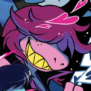
petsophi
Sophi
sadhours
sadhours